How to Use Electro Image With Text Section
About Image With Text Section
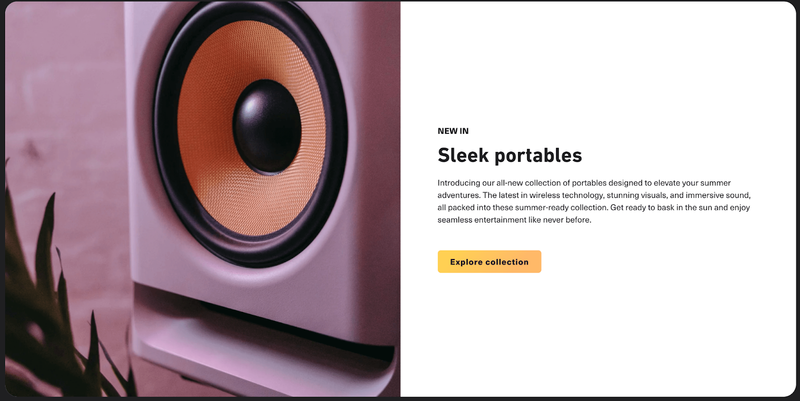
The Image with Text section in the Electro theme is a versatile feature that allows you to display a combination of images, text, and buttons. This section is ideal for highlighting products, services, or events, and can also be used to promote your website or blog.
How To Access The Image With Text Section
- Step 1: Go to Online Store > Themes > click on Customize
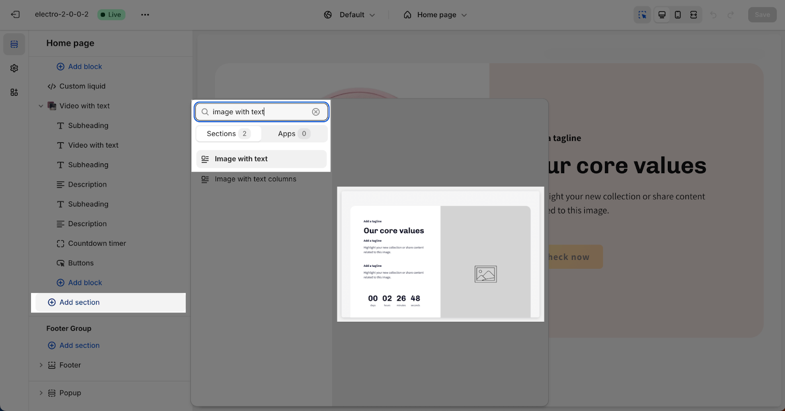
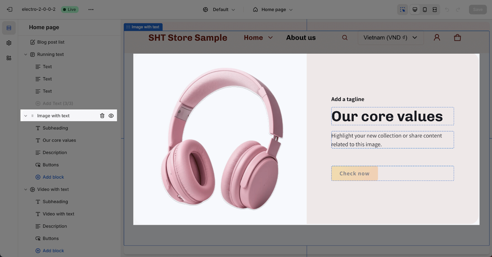
- Step 2: Click on Add section > search for “Image With Text” in the search bar and select it
How To Setting For Image With Text Section
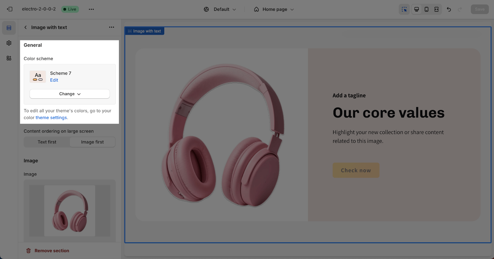
To configure the Image with Text section, click on the section to reveal two tabs: General and Image.
The Settings for the Image with text section has 2 tabs: General and Image.
General
In the general tab, you can:
- Select a color scheme for the section. These schemes can be edited or created in the Theme settings > Colors. The selected color scheme applies to all text components in the section, including subheadings, headings, background color, and buttons.
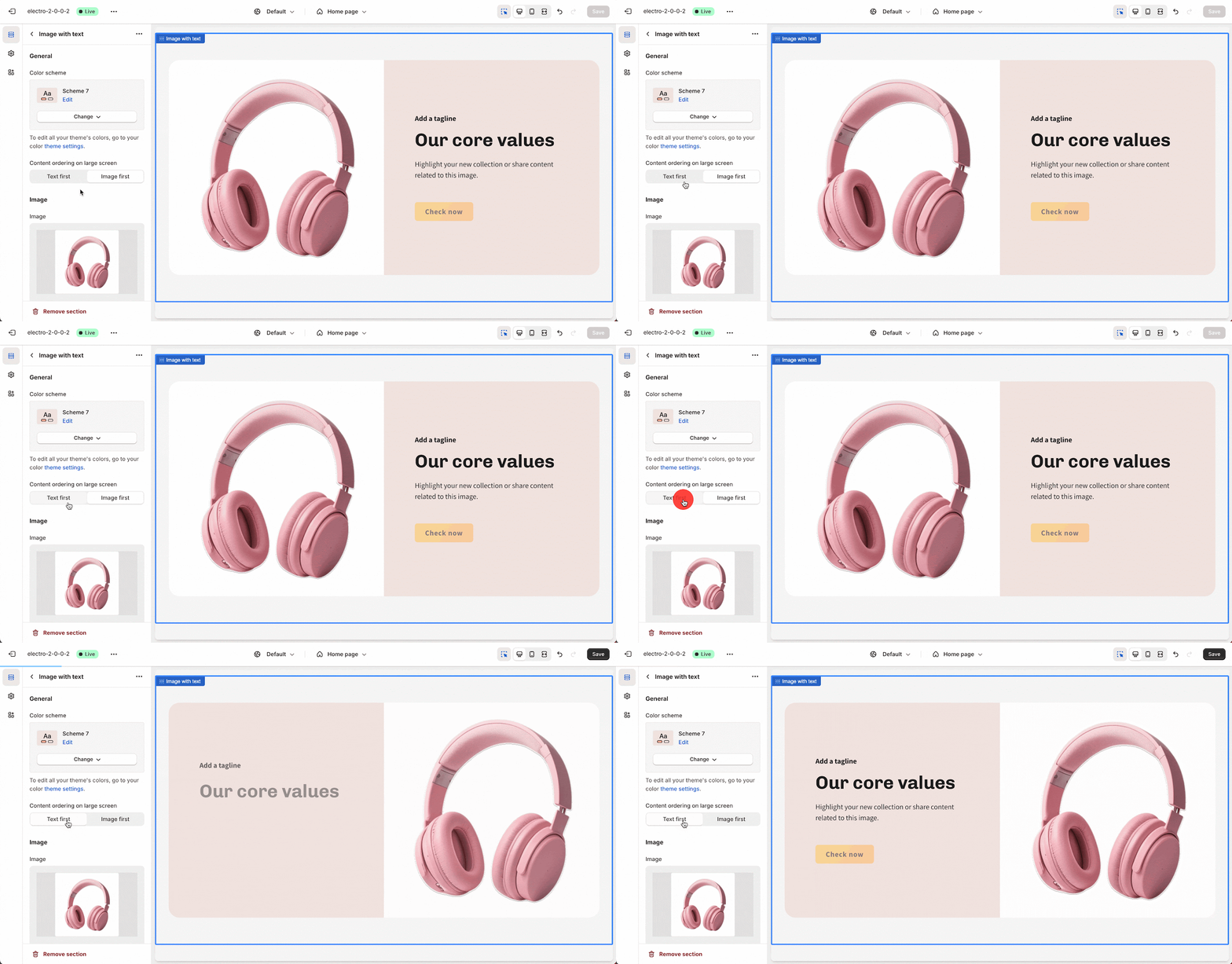
- Choose the content display order on large screens: you can choose to position the text first or the image first.
Image
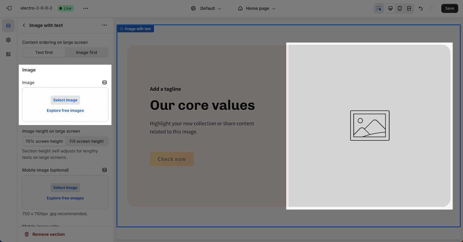
In the Image card, click on the Select image button to upload the image. The recommended size for the image here is 700x500px for large screen sizes.
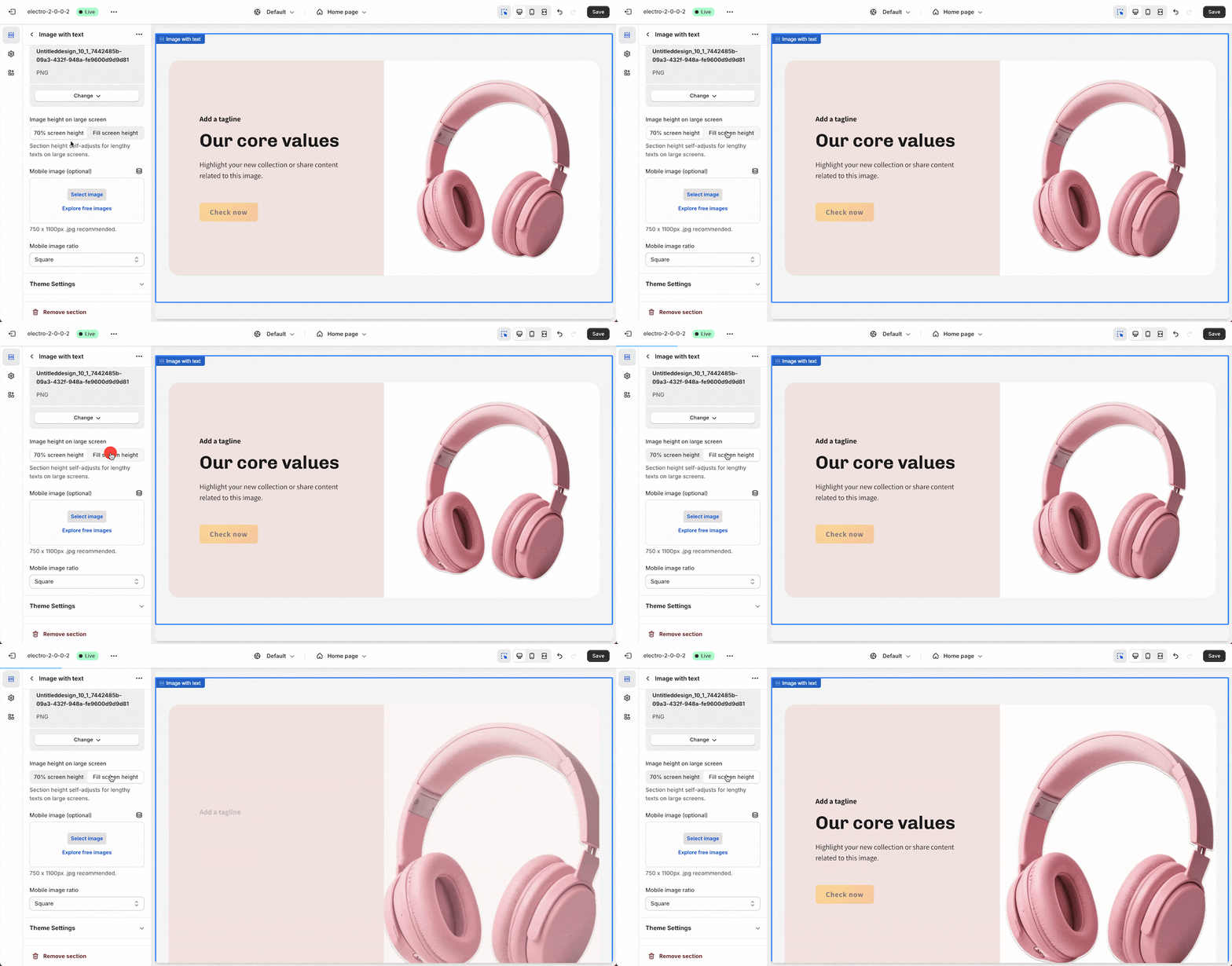
After uploading the image on a large screen, you can choose the “Image height on large screen” option from:
- 70% screen height
- Full-screen height
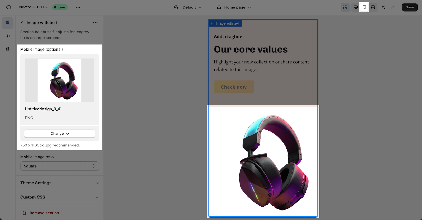
On mobile, the Electro theme has already adjusted the image to fit with the mobile layout. But you can use another image for the mobile layout for the Image with text section.
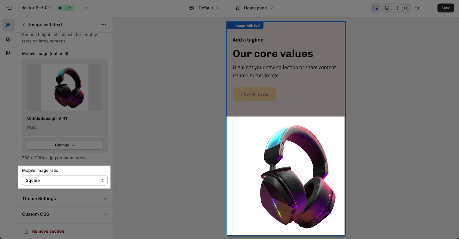
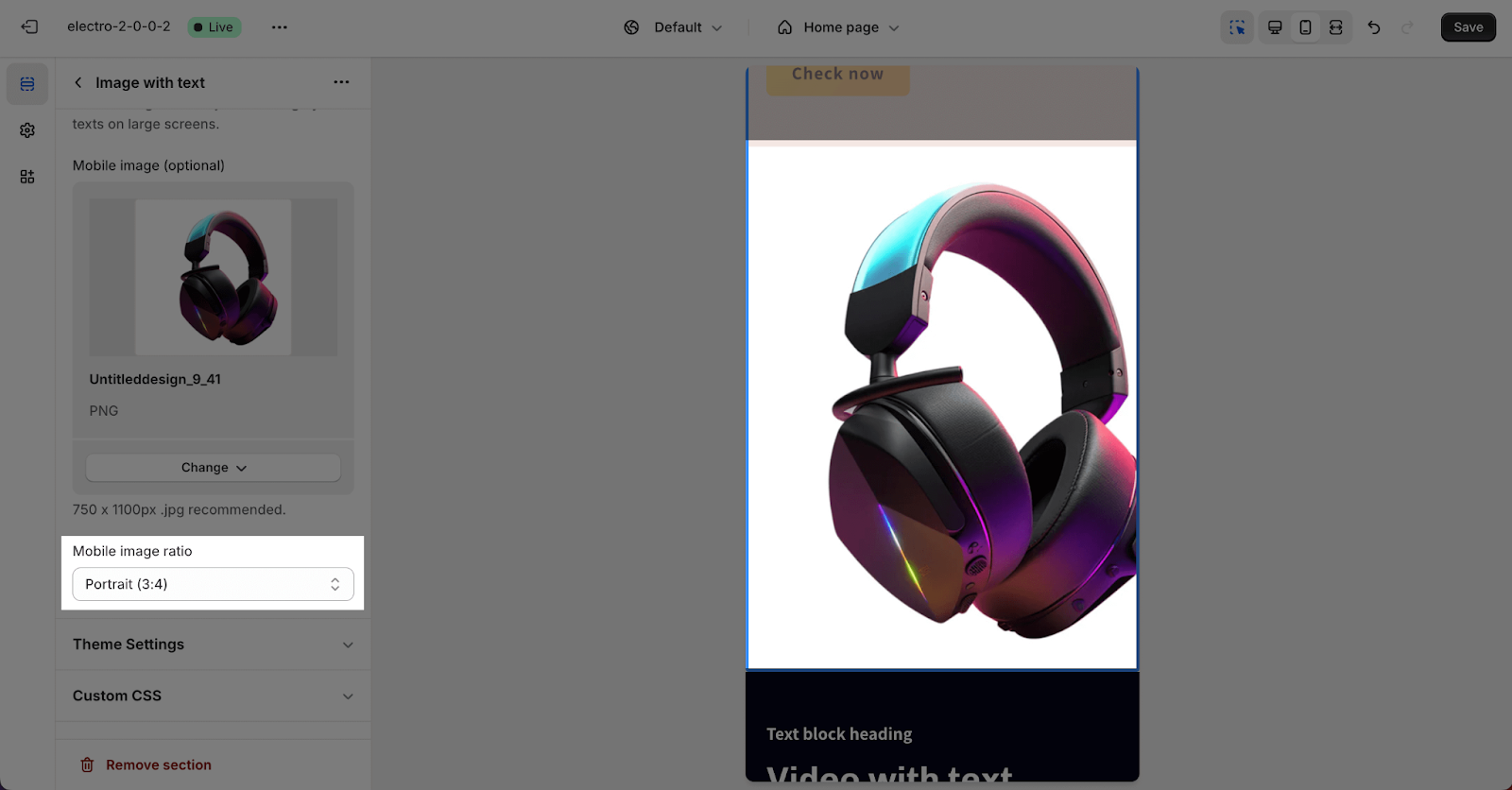
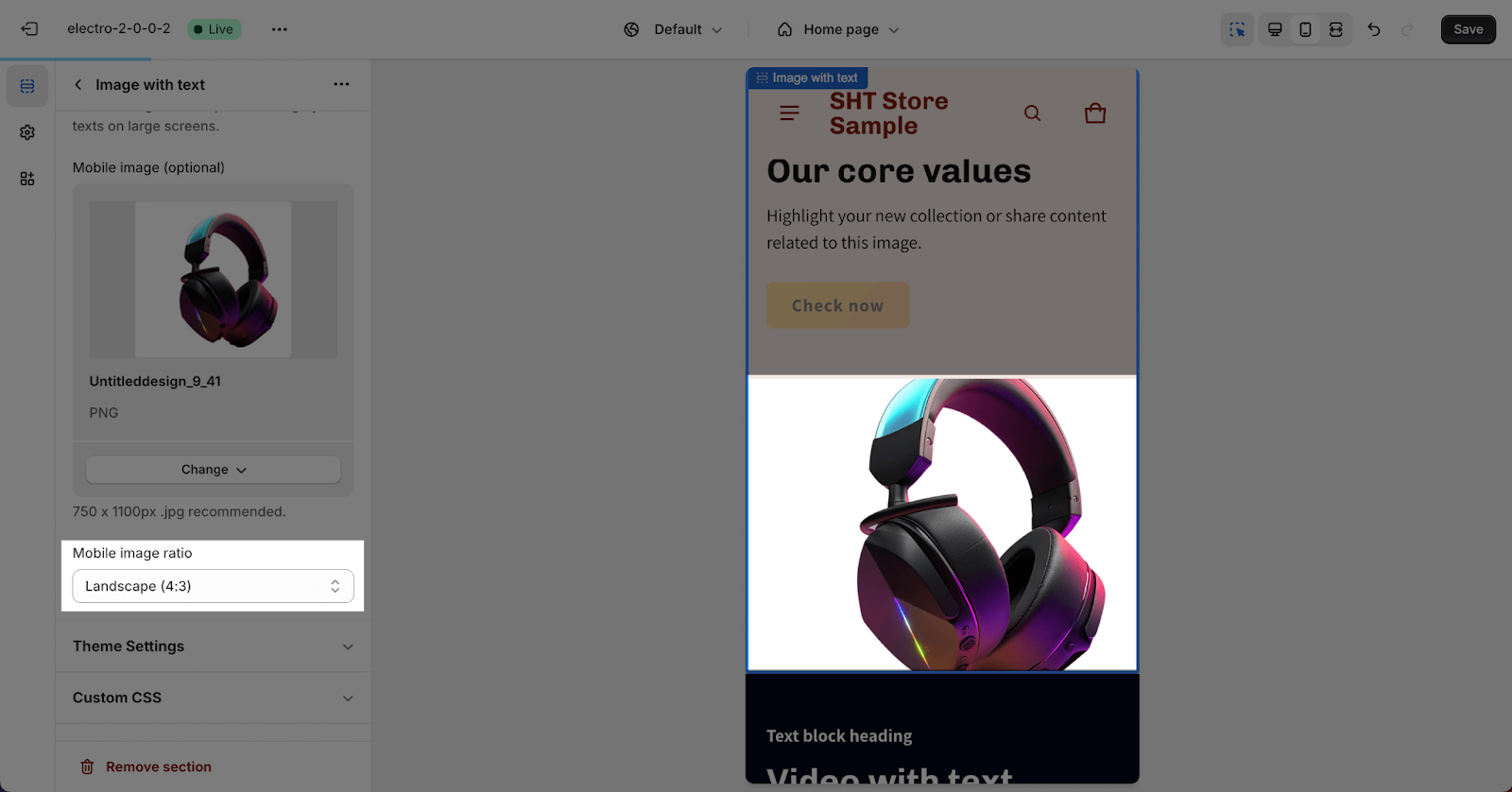
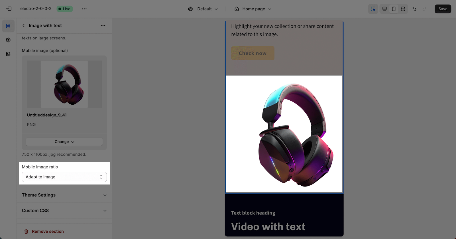
After uploading the image for mobile view, you can select one of 4 types of Image ratios. By default, the section is set for Portrait type.
- Square
- Portrait (3×4)
- Landscape (4:3)
- Adapt to image
How To Setting For Image With Text Section Block
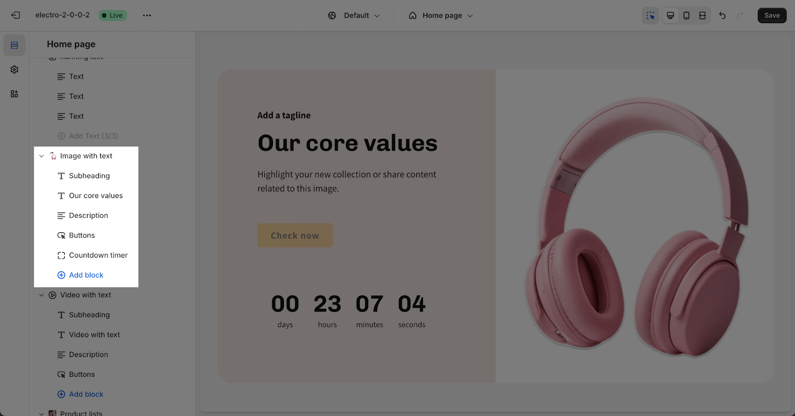
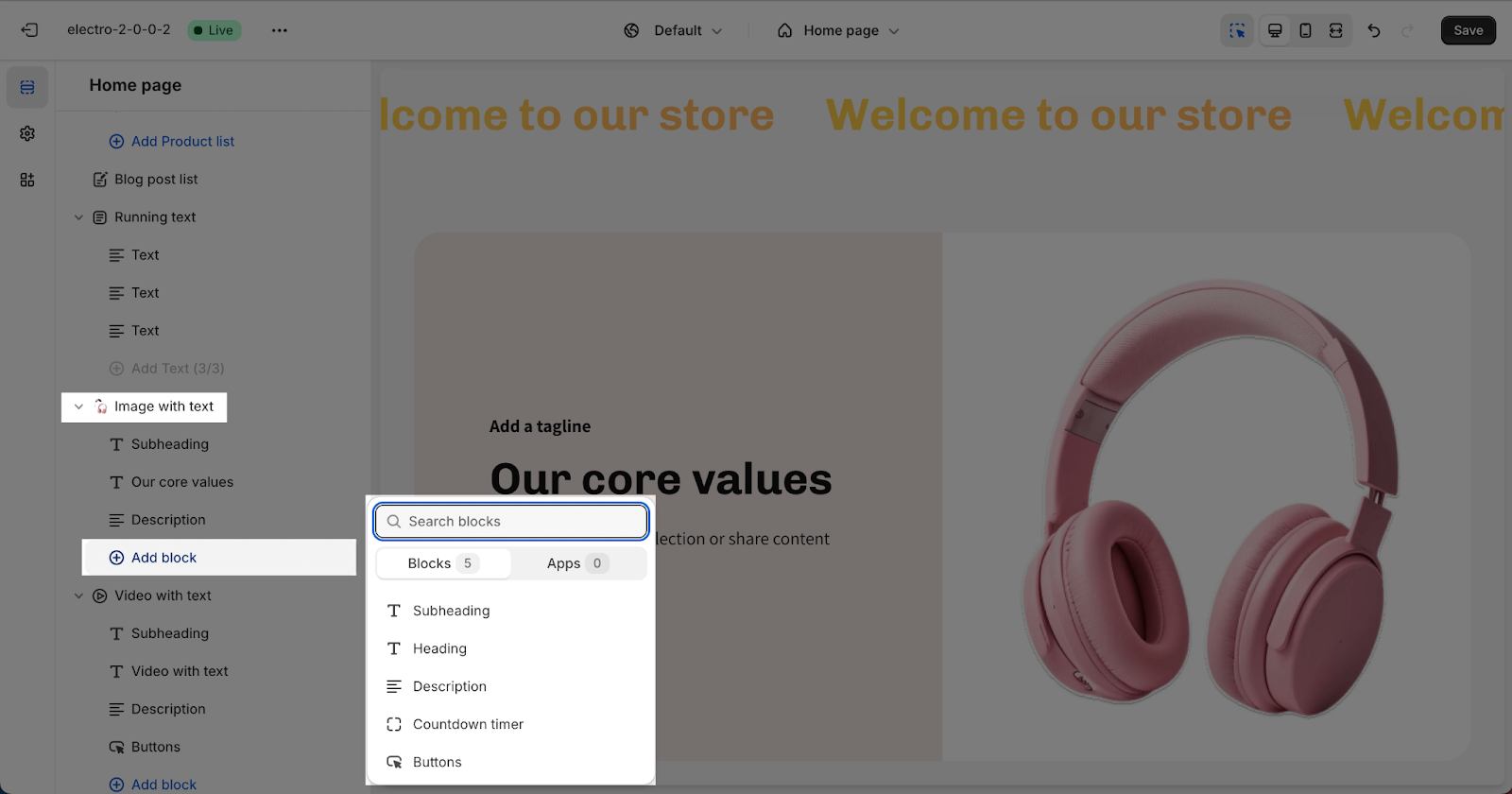
The Image with Text section supports five types of blocks: Subheading, Heading, Description, Button, and Countdown timer.
To add a block, click “Add block” and choose the desired type.
- Subheading, Heading, and Description blocks can be added multiple times
- Button and Countdown timer blocks can only be added once per section
To start settings for these blocks, click on the block you want to customize.
Subheading And Description
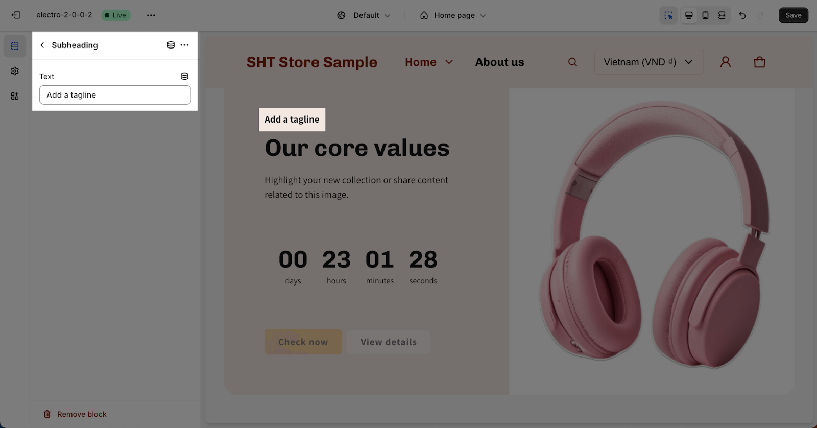
Fill in the placeholder to show the Subheading or Description text in the section. If you leave the placeholder blank, the Subheading or Description will be removed in the section.
Heading
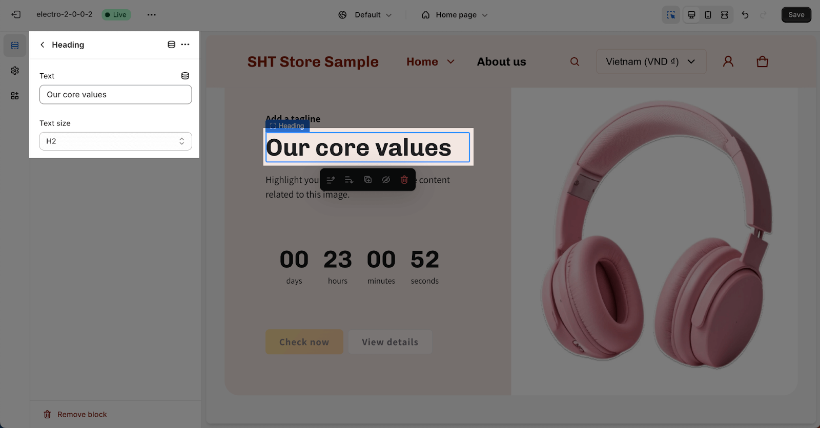
In the Heading block, you can fill in the placeholder to show the Heading text of the section. You can also choose the Text size from Headline, H1, H2, H3, H4, H5 and H5. These sizes are based on the Base text size that has been set up in the Theme settings > Typography.
Button
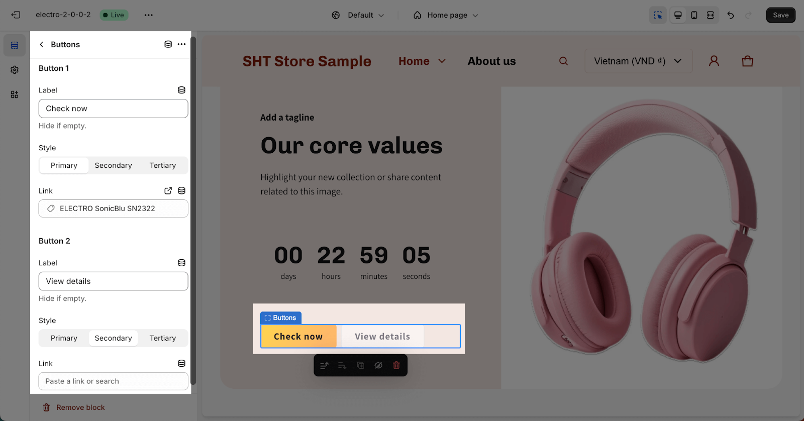
In the Buttons block, insert the button label name for the Button 1 and Button 2 to add buttons on the section. You can choose the type for each button from Primary, Secondary, and Tertiary in Styles. These styles can be adjusted in Theme settings > Colors.
Click on the button link to add a direct link for each button. If you want to remove a button, simply delete the text in its button label.
Countdown timer
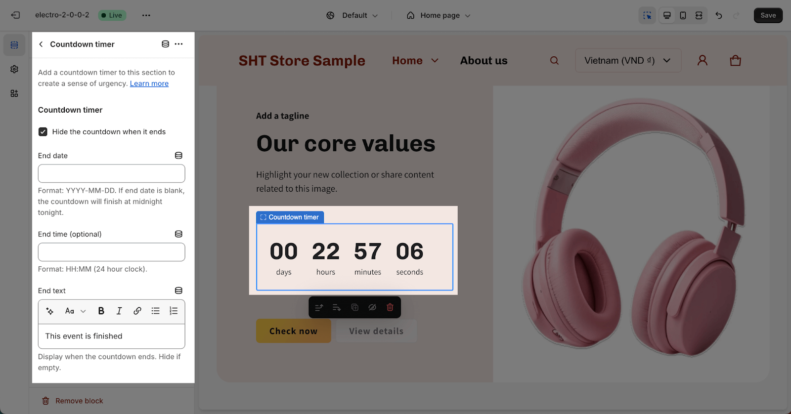
In the Countdown timer block, you can set up for the Countdown timer. Check full details about Countdown timer settings in this article.
Frequently Asked Questions
1. What is the Image with Text section used for?
The Image with Text section is a versatile tool that allows you to combine images, text, and buttons to highlight products, services, and events, or promote your website or blog.
2. Can I control the order of the image and text on large screens?
Yes, in the “General” tab, you can choose to display the text first or the image first on large screens.
