How to Use Electro Product Hotspot
About Product Hotspot Section
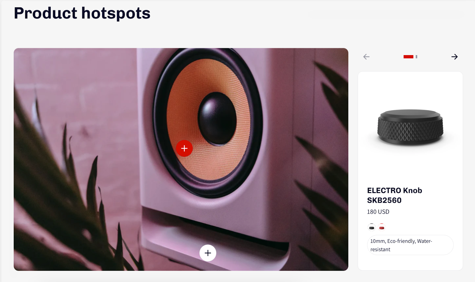
The Product Hotspot section enables you to create visually compelling product displays. By incorporating clickable hotspots into captivating images, you can effectively highlight featured products and drive customer engagement.
In this knowledge base article, you will know how to set up the Product Hotspot section in Electro theme.
How To Access Product Hotspot Section
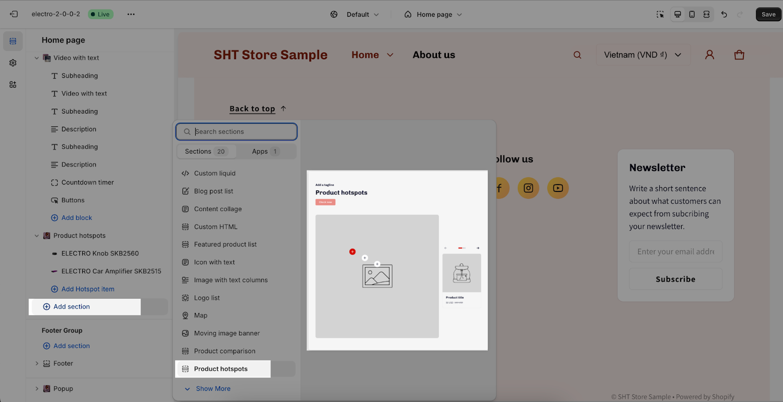
To access the Product Hotspot section, go to Online Store > Theme > Electro theme > Customize.
On the Customize page, choose the page where you want to add the Product Hotspot. Then, click the Add section button and select the Product Hotspot to use on the page.
How To Configure Product Hotspot Section
The Electro theme allows you to customize the Product Hotspot section with the following settings:
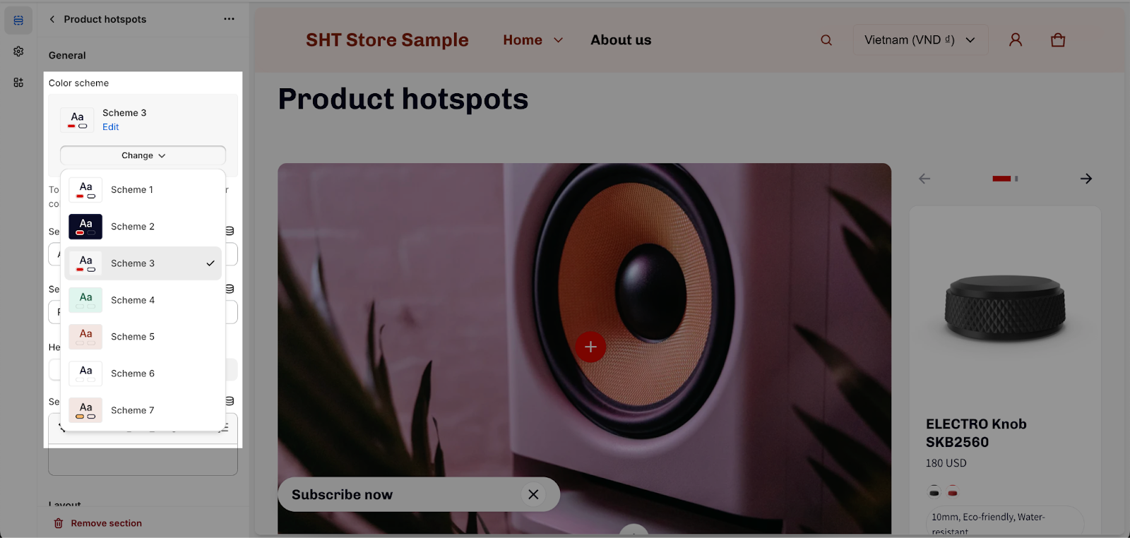
General
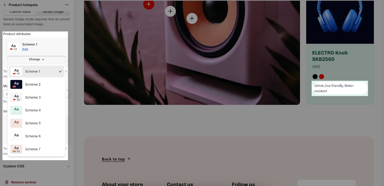
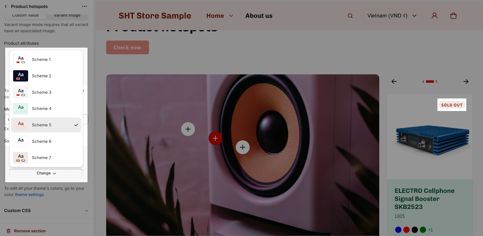
Under the Color Scheme, you can choose a specific scheme for the Product Hotspot section. To modify or add a new color scheme, go to Theme Settings > Colors.
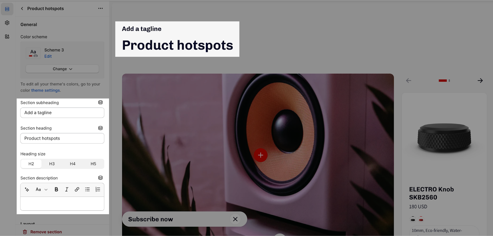
You can also add content for the Section subheading, Section heading, and Section description. If you want to hide any text, leave the placeholder empty.
To adjust the heading size, there are four options:
- H2
- H3
- H4
- H5
These heading sizes will be calculated based on Base text size. For more information, please check Theme settings > Typography.
Layout
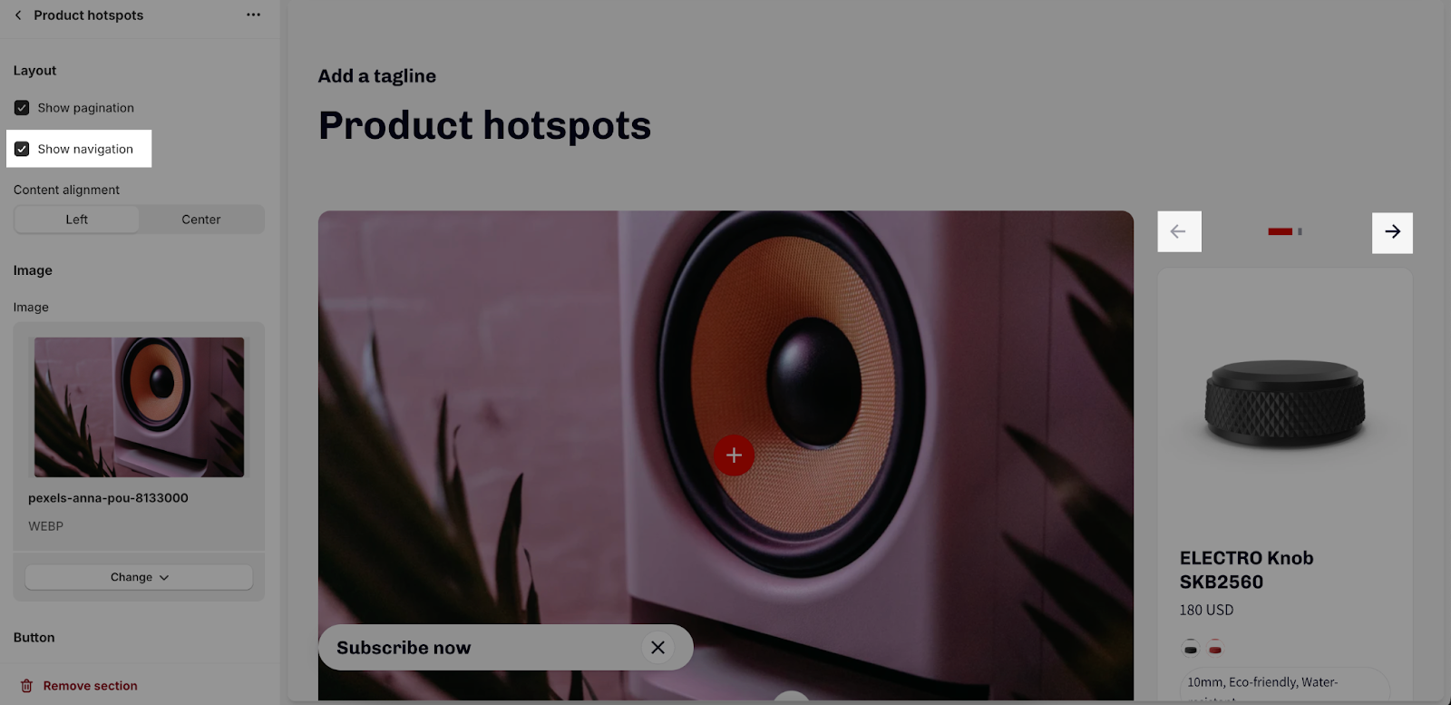
In the Layout tab, you can choose whether to show pagination and navigation for the product list.
- Show pagination
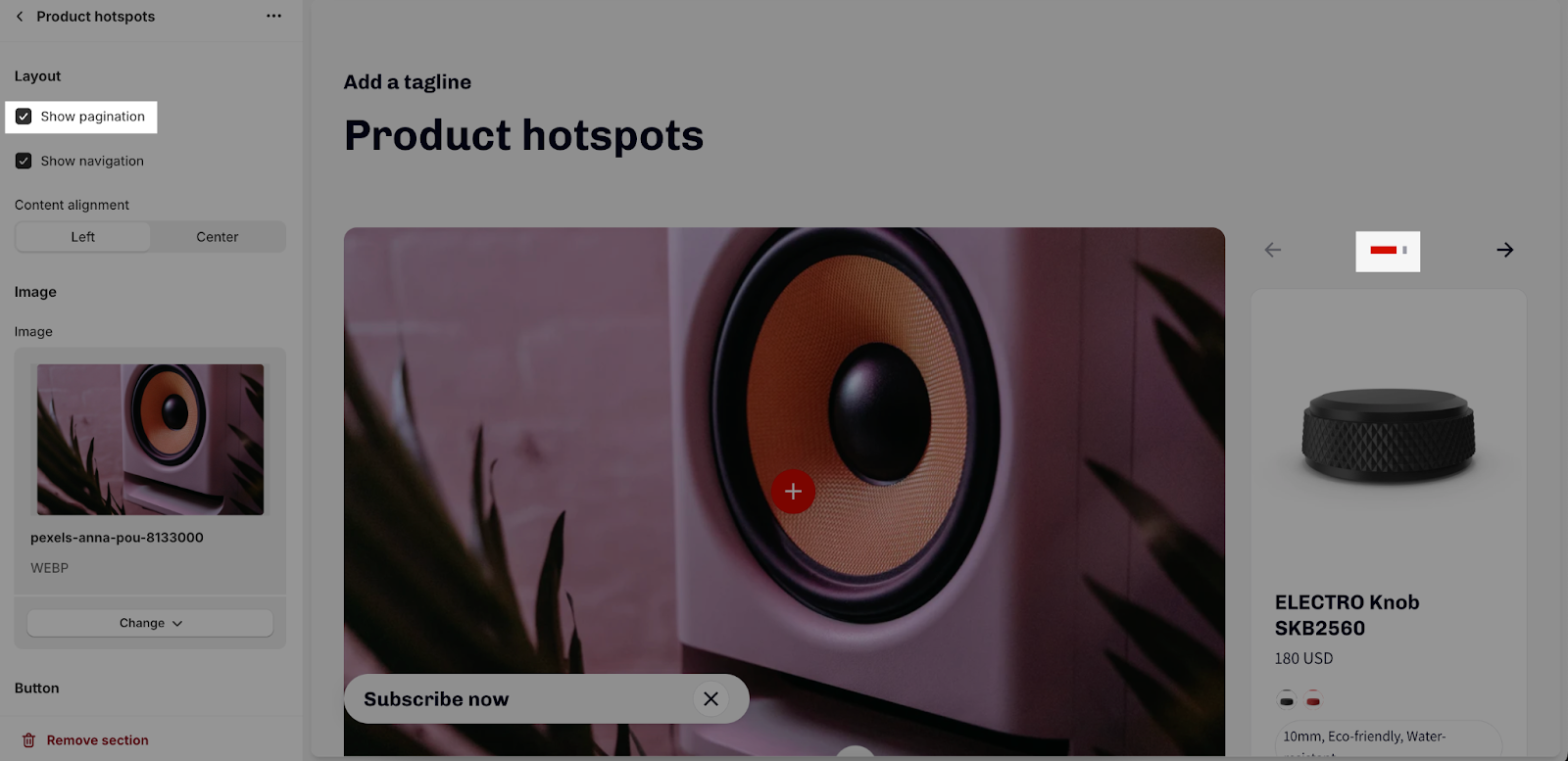
- Show navigation
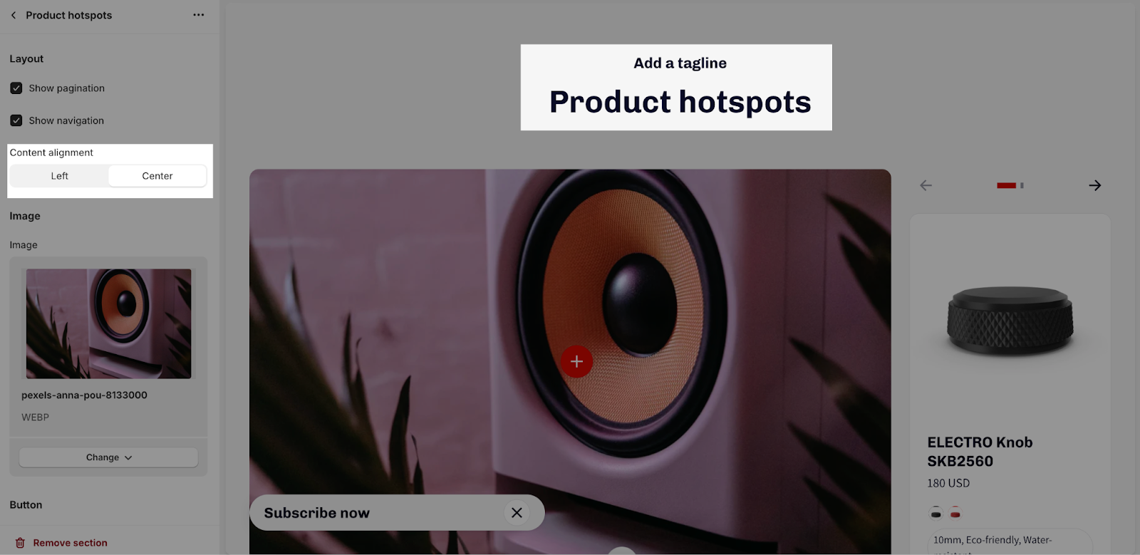
You can also choose the alignment of the section text content. The options are left or center.
- Left
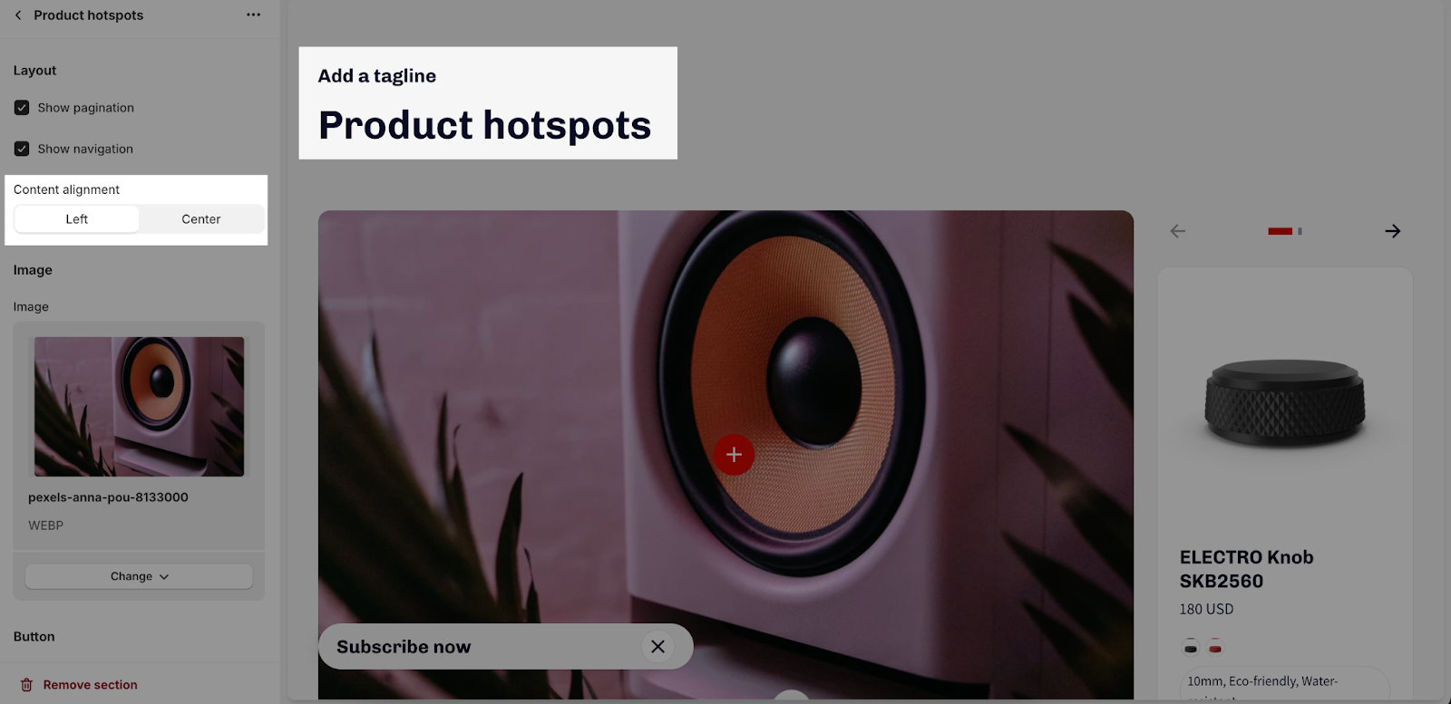
- Center
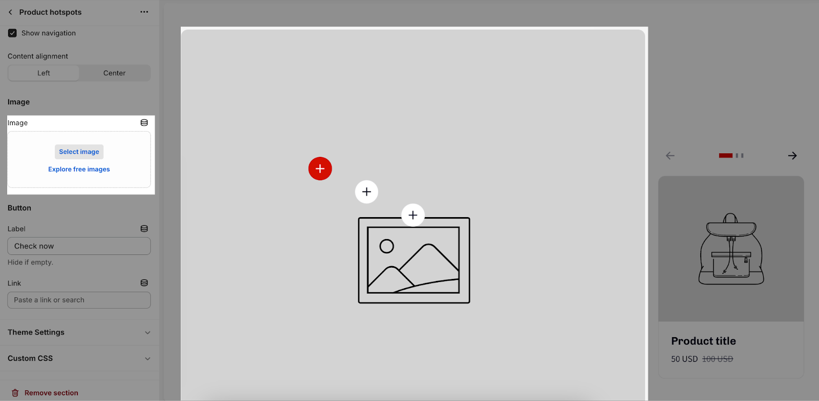
Image
The hotspot image is the image that will be used for the hotspot icons. It will be displayed on the left side of the section.
To add the image, click the “Select image” button. This will open the media manager. You can then upload a new image or select an existing image. The recommended image size is 800 x 500px in PNG format.
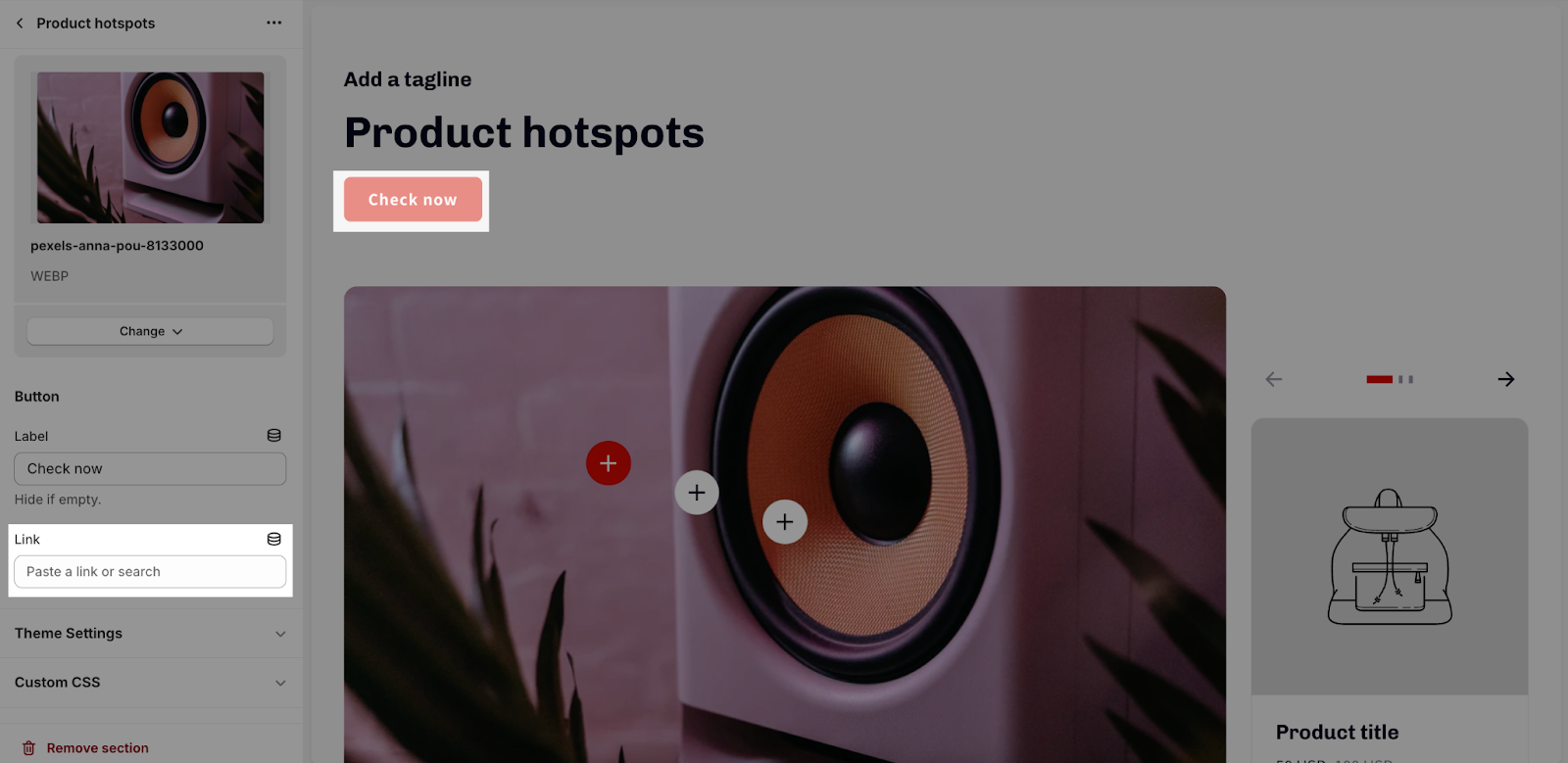
Button
To add a button label and link, click on the placeholder and enter the text. The button will appear below the text content and above the hotspot image and product list. To remove the button, leave the placeholder blank.
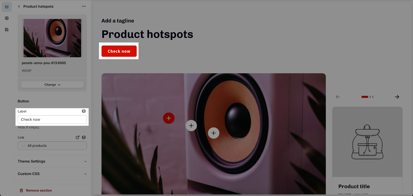
In the Link placeholder, you can select the page or link that the button will redirect to when clicked. If this field is left blank, the button will show disabled status.
Theme Settings
Updates to Theme Settings in this section will be also reflected in other sections in your store.
The theme settings of the Product Hotspot include:
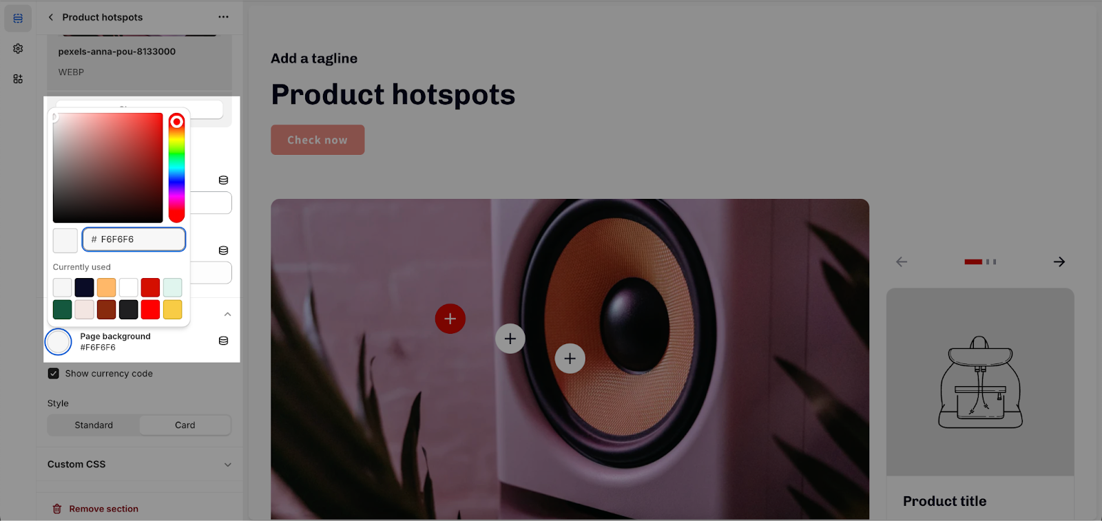
Page Background
Enter a Hex color code, select a color, or choose a brand color from your brand assets.
Product Detail Options
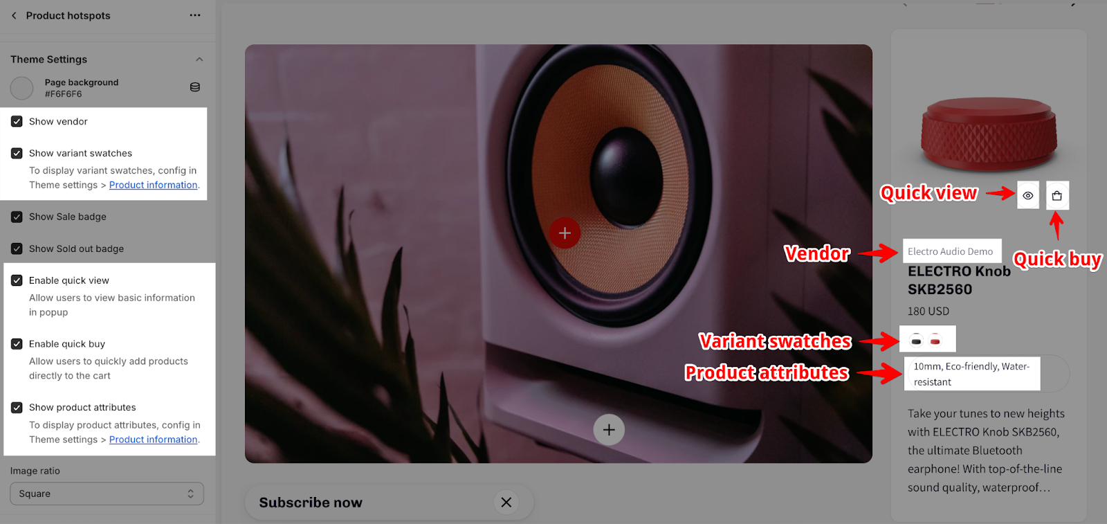
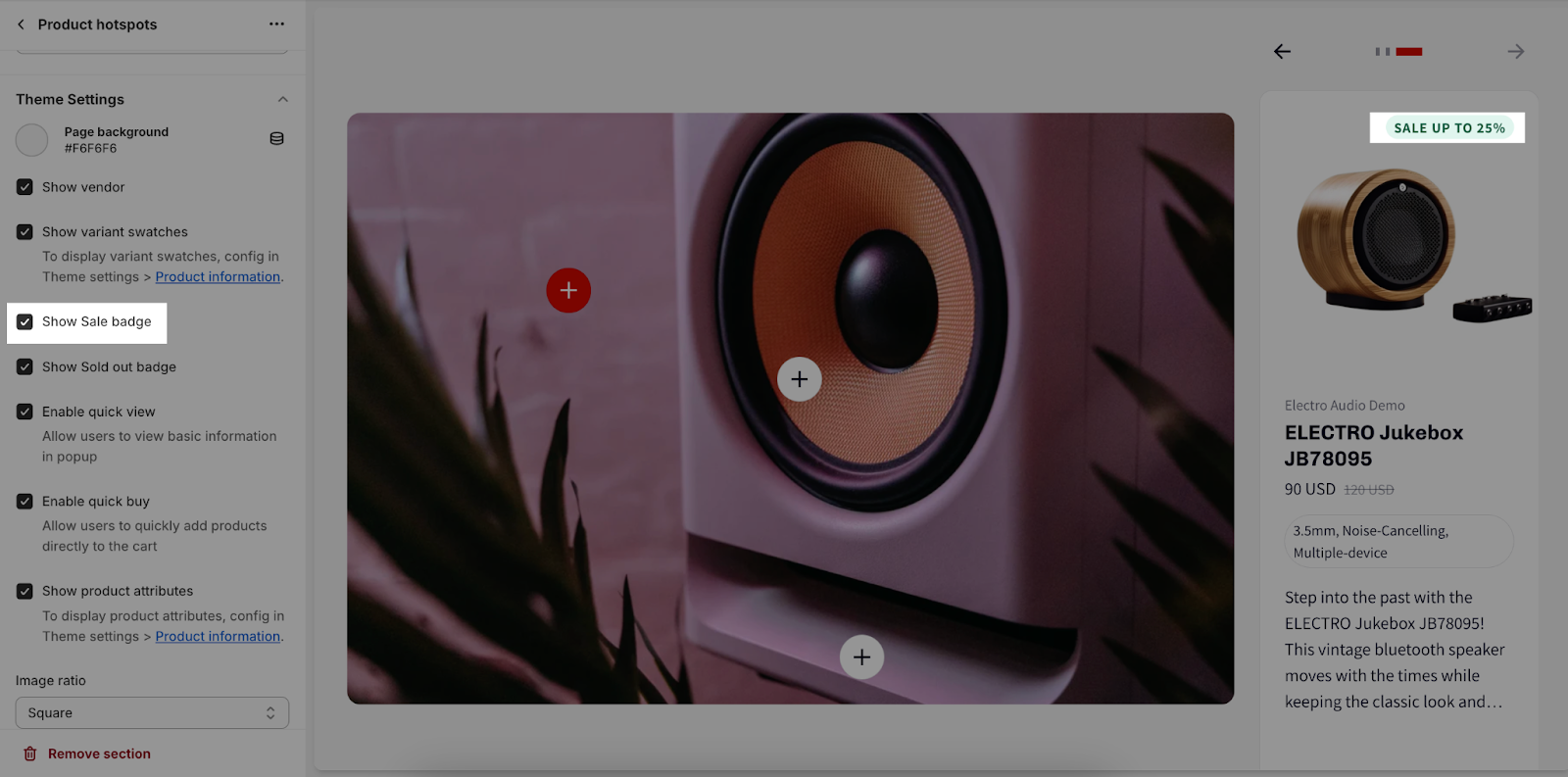
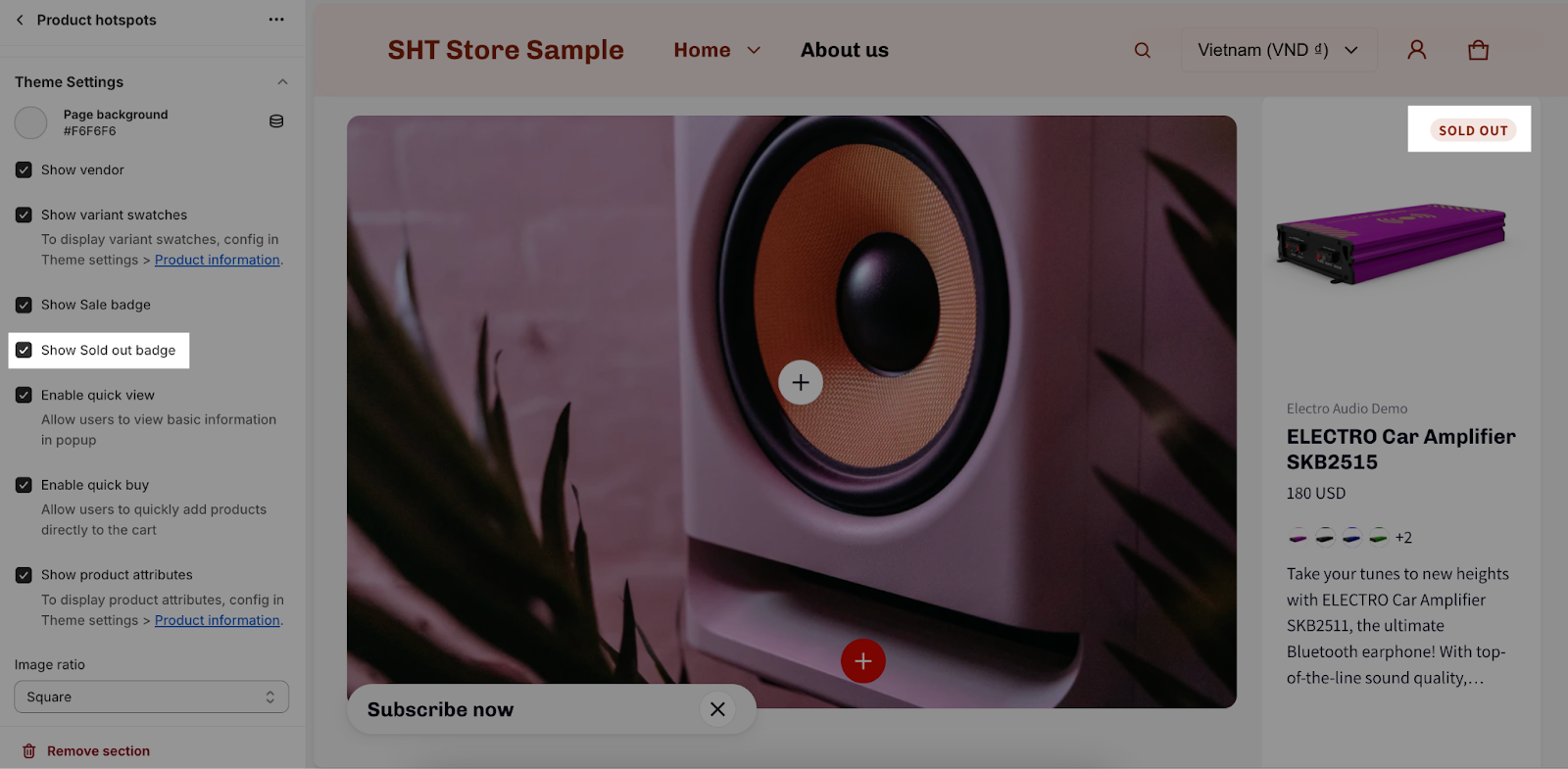
You can you can enable or disable the following features:
- Show vendor
- Show variant swatches
- Enable quick view
- Enable quick buy
- Show product attributes
- Show Sale badge
- Show Sold out badge
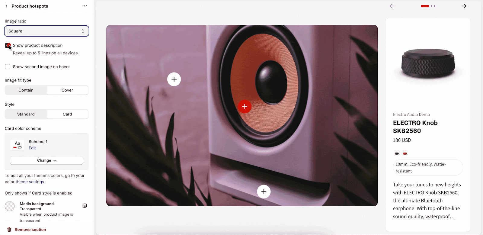
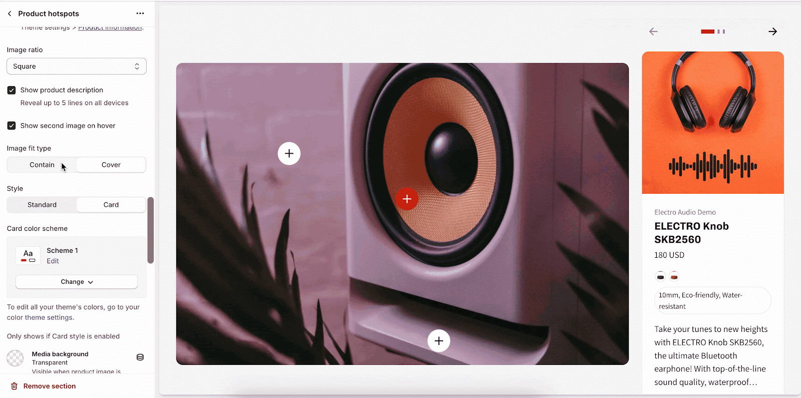
- Show product description
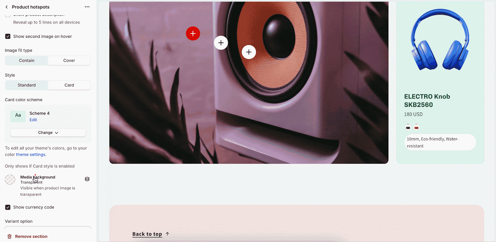
- Show the second image on hover
Product Image
You can choose the Image ratio for your products in the hotspot. There are 3 options: Square, Portrait (2:3), Landscape (3:2)
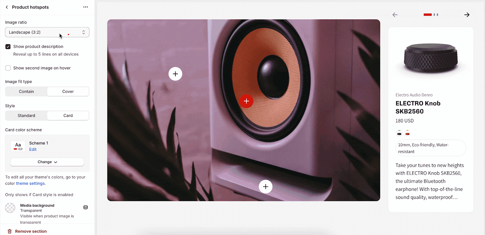
You can also choose the image fit type: Contain or Cover.
Product Style
There are 2 styles to choose from Standard and Card:
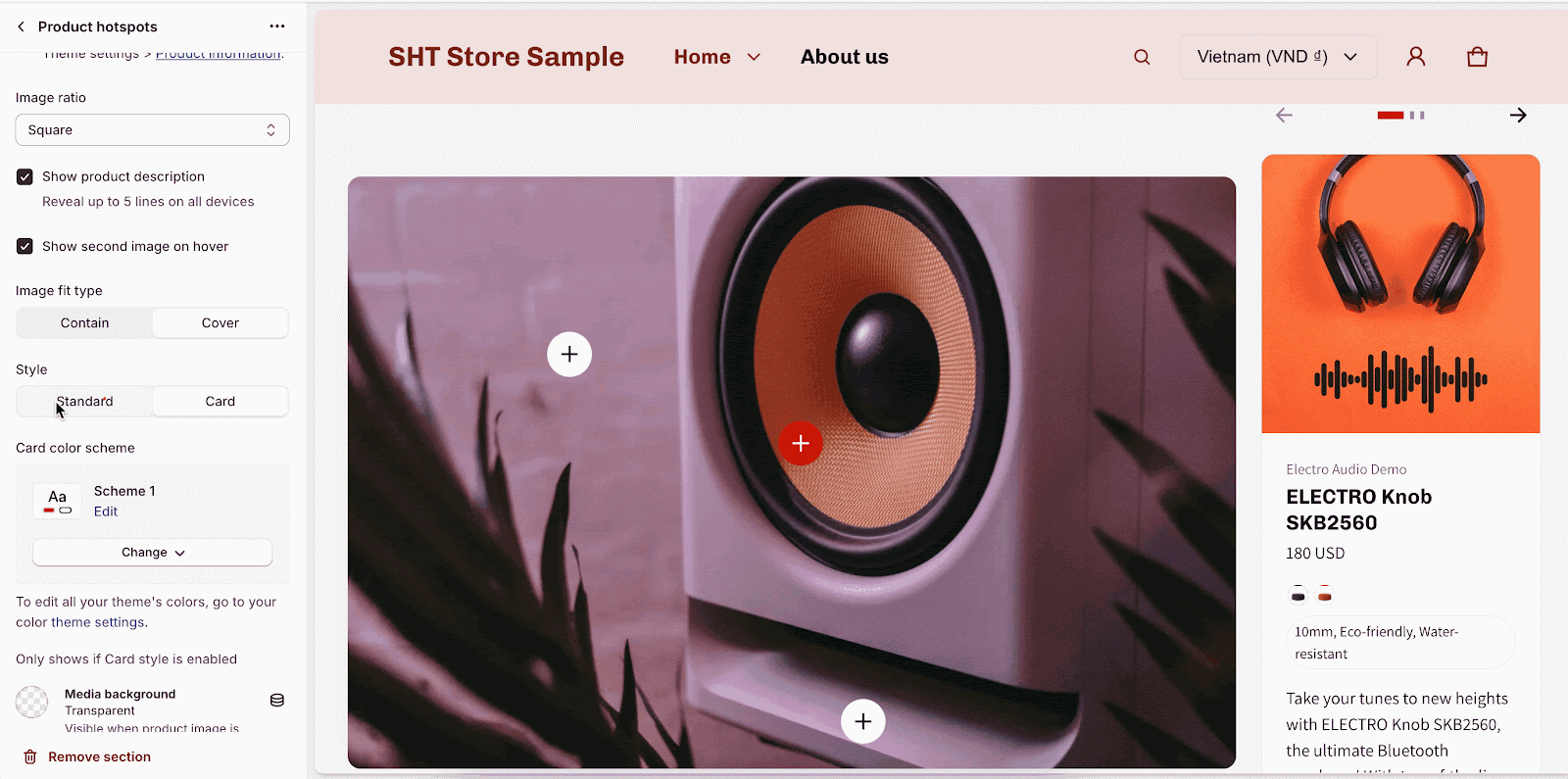
If you choose Card style, you can change the color scheme for the Product card and the Media background:
Please note that the media background is only visible when the product image has a transparent background.
Currency Code
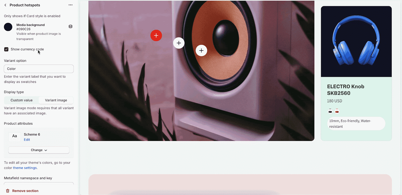
You can choose to show a currency symbol or code (for example: show $ or USD):
Variant
Firstly, you will need to enter the variant option like Color, Size, etc. The, you can choose Display type as Custom value or Variant image:
Product Attributes
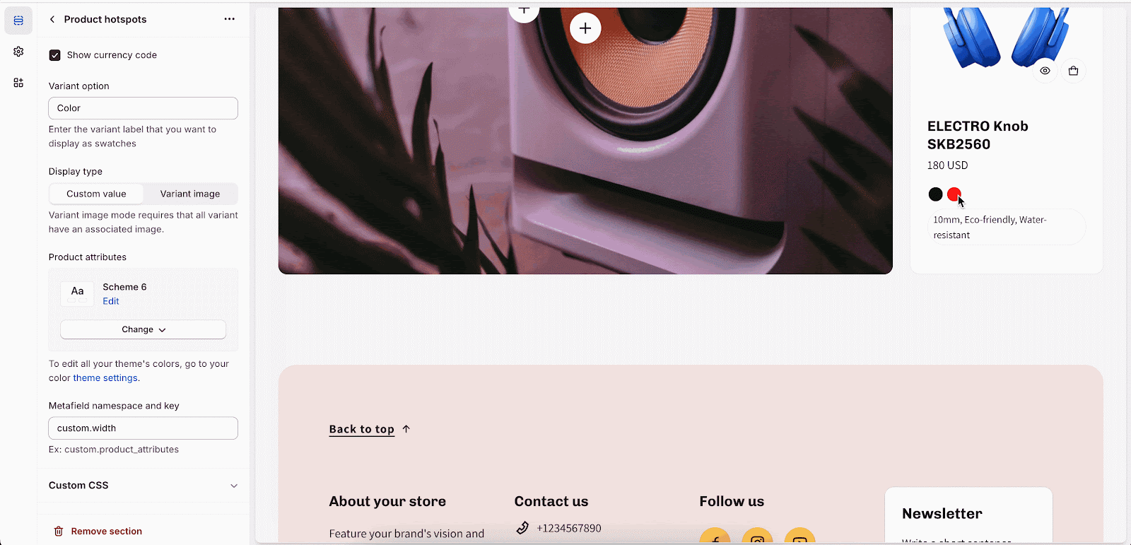
From Electro 2.0.0, you can display product attributes in the product details. Enter the metafield namespaces and key into the designated area: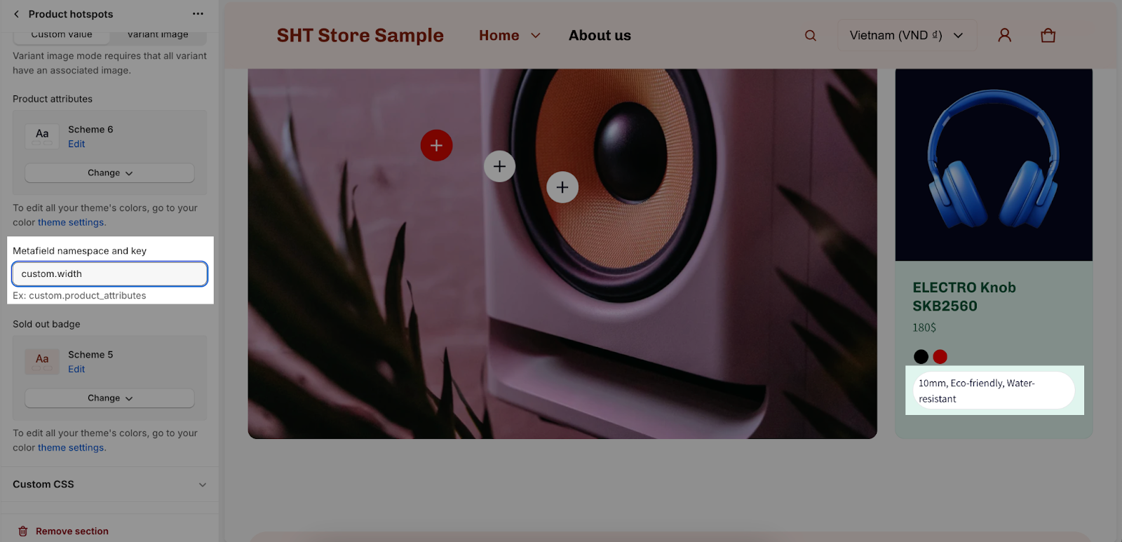
To learn more about Product attributes, please check this guide.
You can also change the color scheme for the product attributes:
Sold Out Badge
You can choose the color scheme for sold out badge in the Product Hotspot with the color scheme you created:
How To Configure Hotspot Items
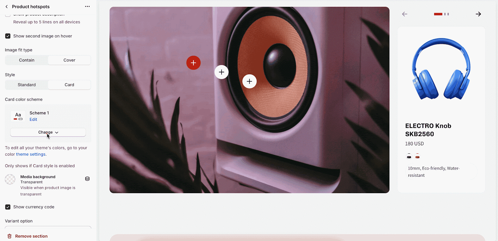
The hotspot items section allows you to customize the hotspot icons, including the linked product and the position of the icon on the image.
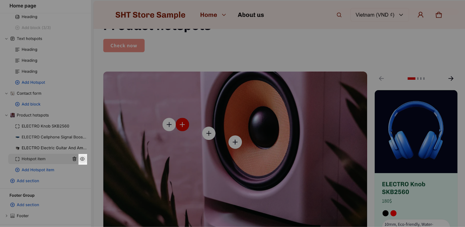
To access the hotspot item settings, click on the hotspot item.
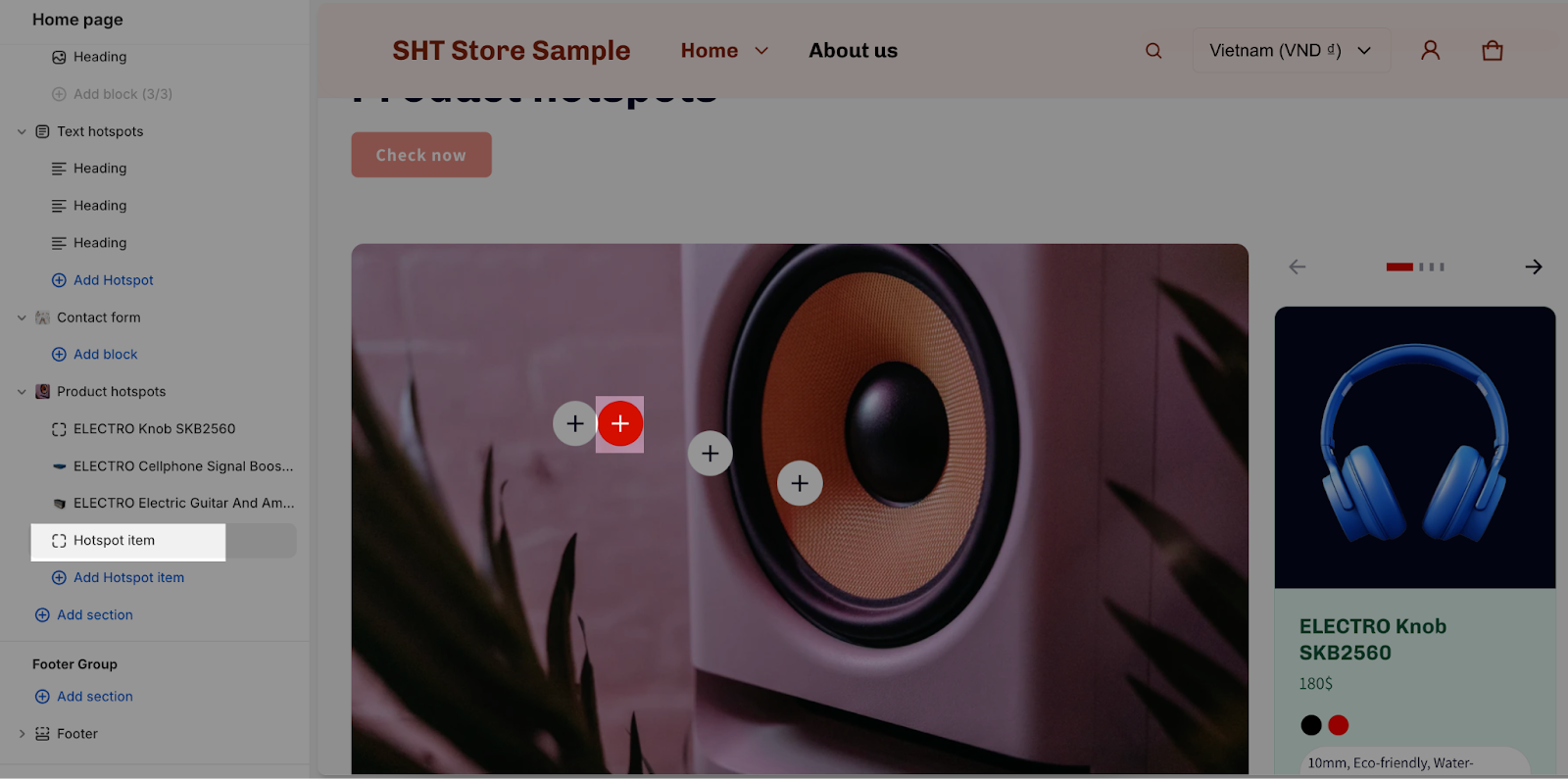
There is a maximum of 5 hotspot items that you can use in this section. You can freely show or hide them by clicking on the eye icon.
To select a product for the hotspot icon, click on the Select product button.
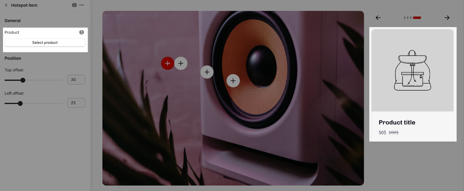
Once you have selected a product, you can set the top offset and left offset for the icon.
- The top offset is the distance from the top of the image to the top of the icon.
- The left offset is the distance from the left side of the image to the left side of the icon.
Here is an example of how to set the top offset and left offset:

Frequently Asked Questions
1. Why can’t I see the pagination or navigation for my product list?
Pagination and navigation will only be displayed if there are two or more hotspot items.
2. The button below the text content is not working. Why?
Make sure you have entered a valid link in the Link placeholder for the button. If the field is left blank, the button will be disabled.
3. I’m having trouble with the hotspot item positioning. Any tips?
Experiment with different top and left offset values in the Hotspot items to achieve the desired position. You can also use the image as a guide to help you place the hotspots accurately.