How to Use Electro Contact Form
About Contact Form Section
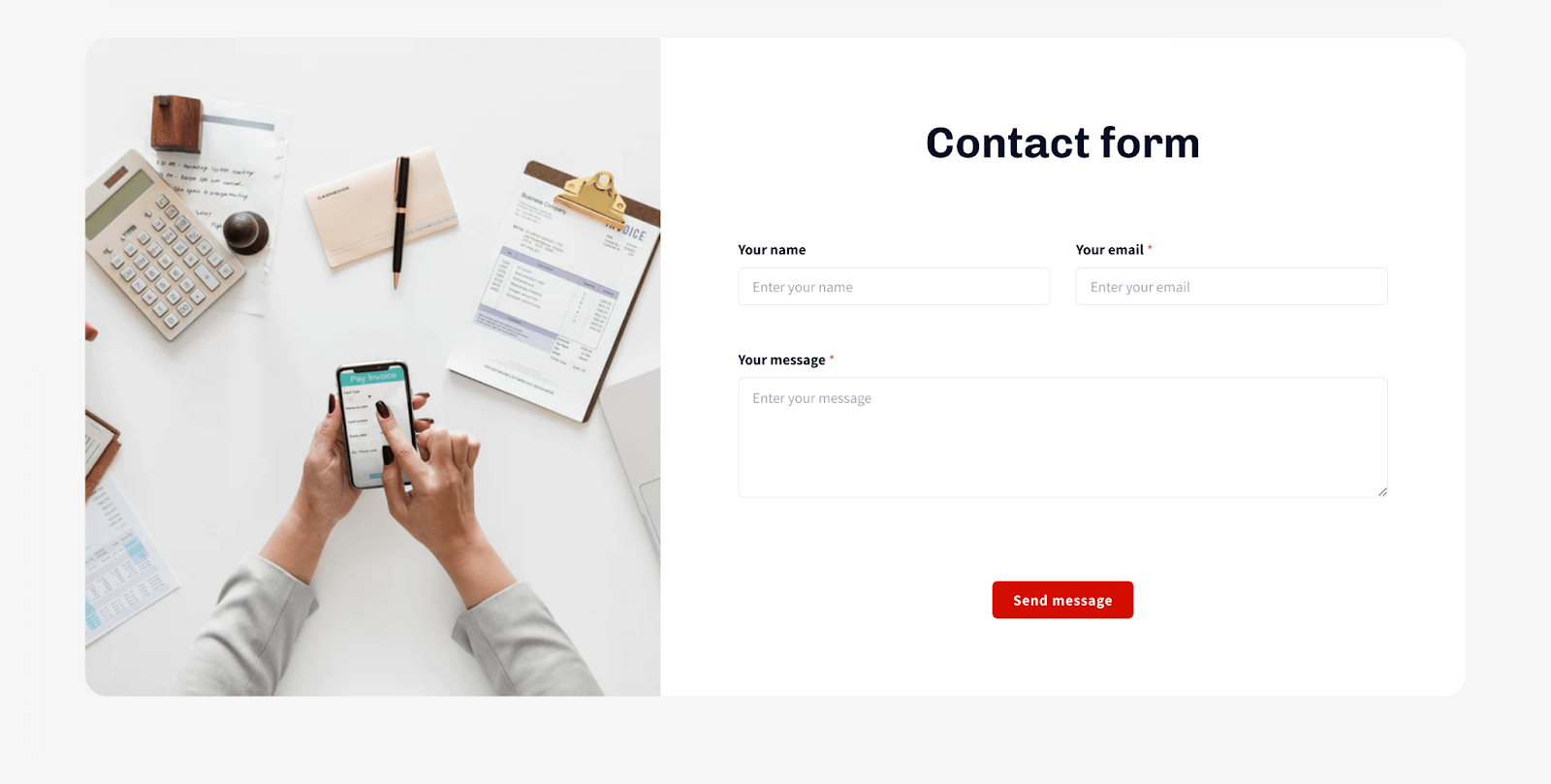
The Contact Form Section is a section that allows you to collect contact information from your website visitors. It is a versatile section that can be used to collect a variety of information, such as names, email addresses, and phone numbers.
How To Access Contact Form Section
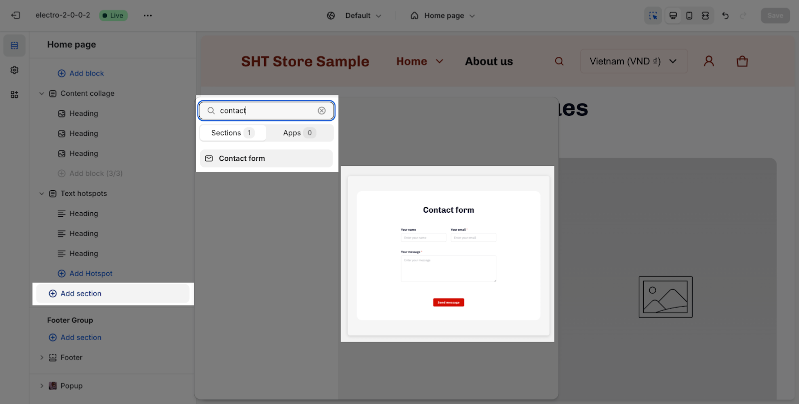
From any page, please click on ‘Add Section’ on the left sidebar, then choose ‘Contact Form’.
How To Configure Contact Form Section
The Contact Form section has several settings that can be adjusted. These include:
General
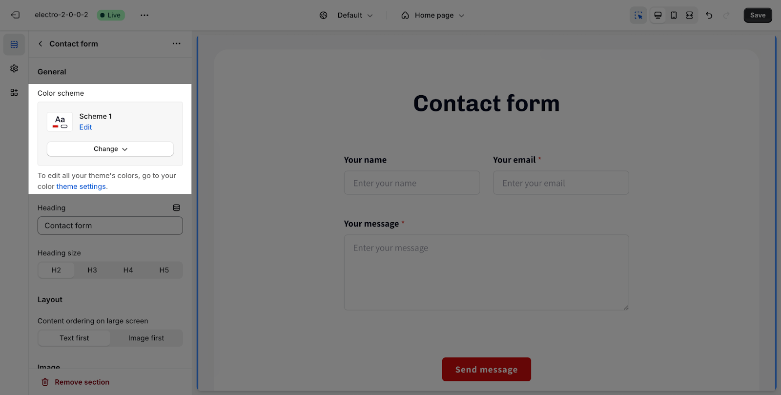
Under the Color Scheme, you can choose a specific scheme for the Contact Form section. To modify or add a new color scheme, go to Theme Settings > Colors.
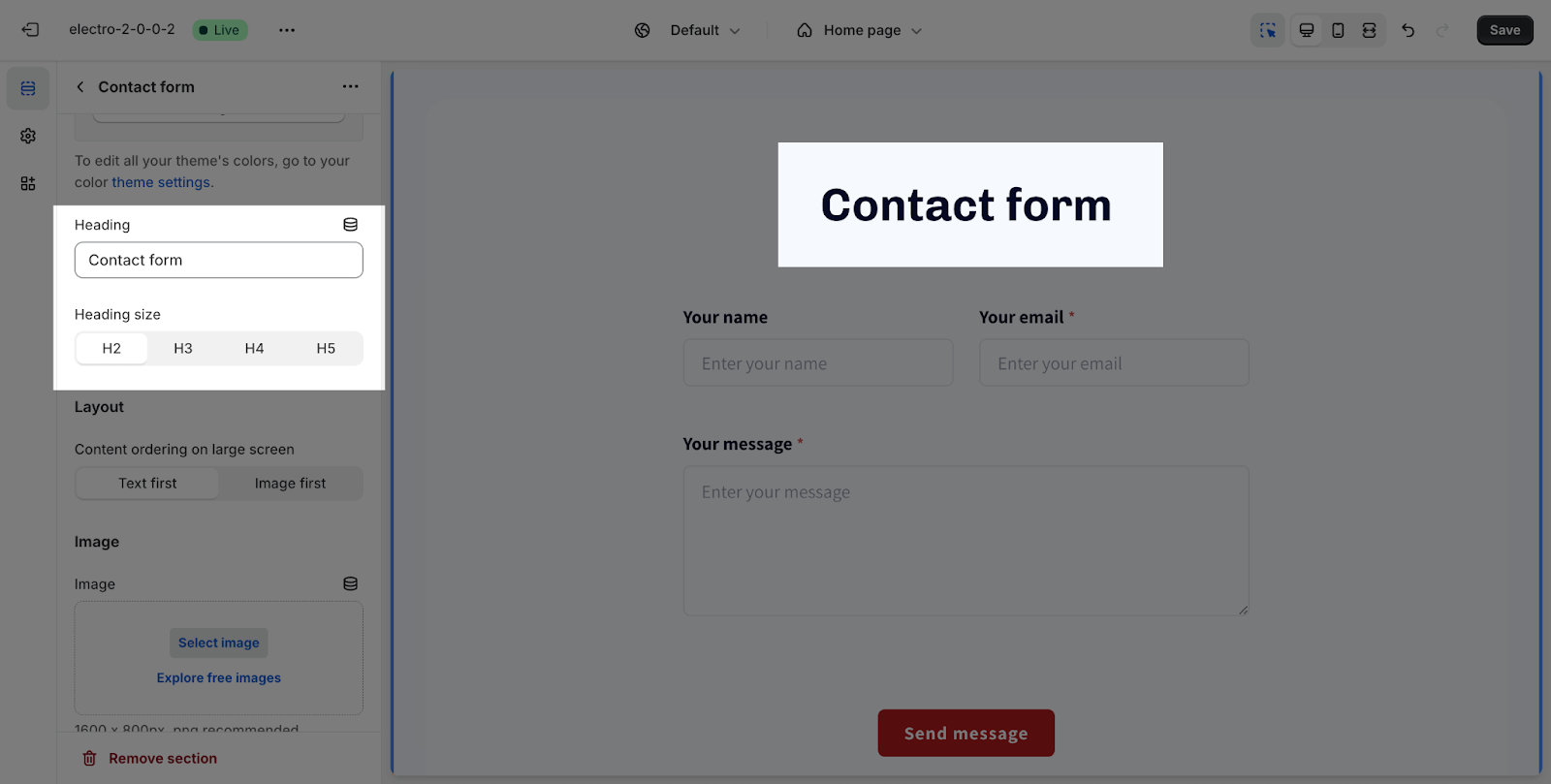
To change the content of the heading, you just need to type down the text into the text box.
Then, you can adjust the text size: H1 > H5. These heading sizes will be based on the Base text size established in Theme settings > Typography.
Layout
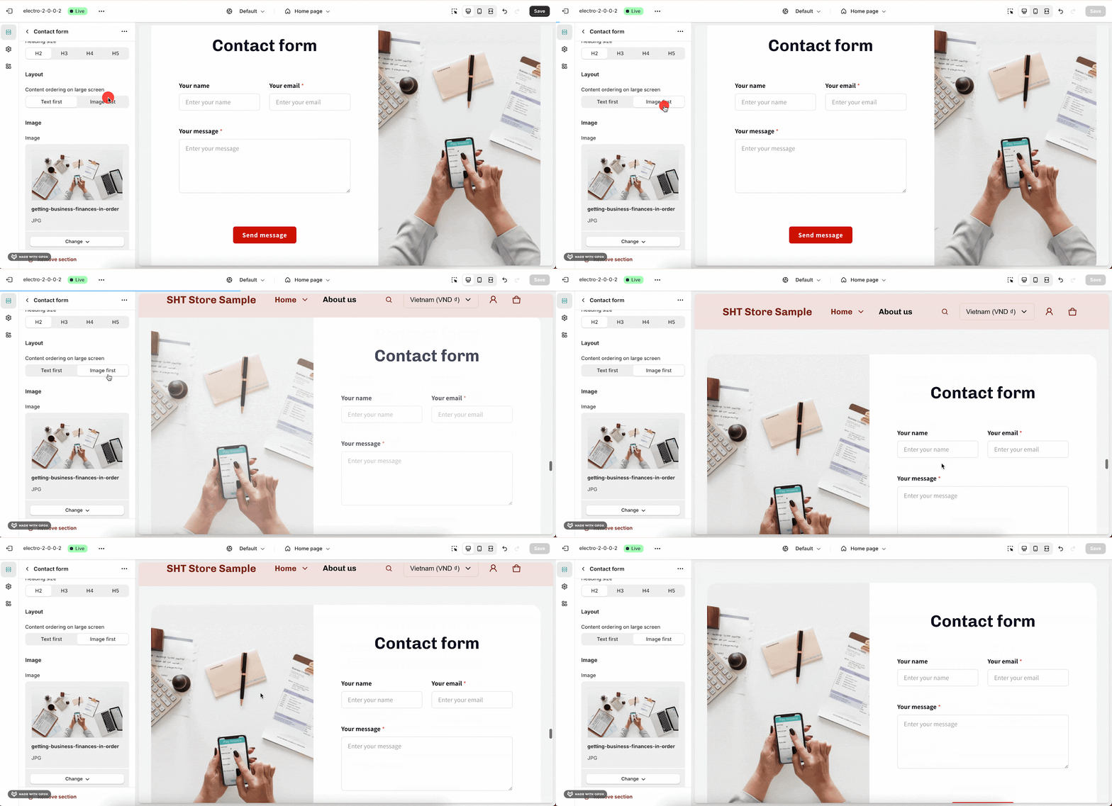
You can simply select Content ordering: Text first or Images first. Note that this setting only works on large screens.
Image
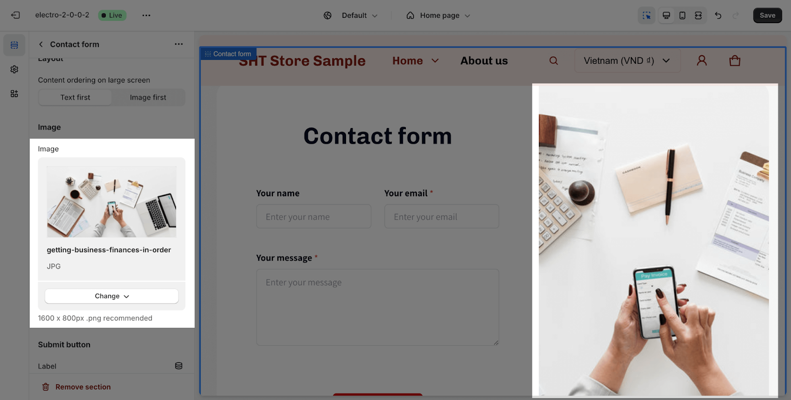
To add a background image to the section, click the Select image button. This will open the media manager. You can drag and drop your image into the media manager, or select it if it is already uploaded. The recommended image size is 1600px x 800px in PNG format.
After adding the image, it will appear in a column next to the heading and form.
Button
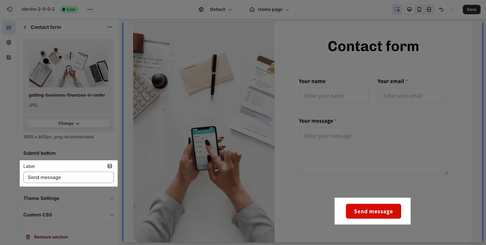
You can customize the text of the Contact Form button by adding text to the box.
Note: This button is needed to submit the form. Please add text to the box so that the button will show and the form can be submitted normally.
Contact Form Blocks
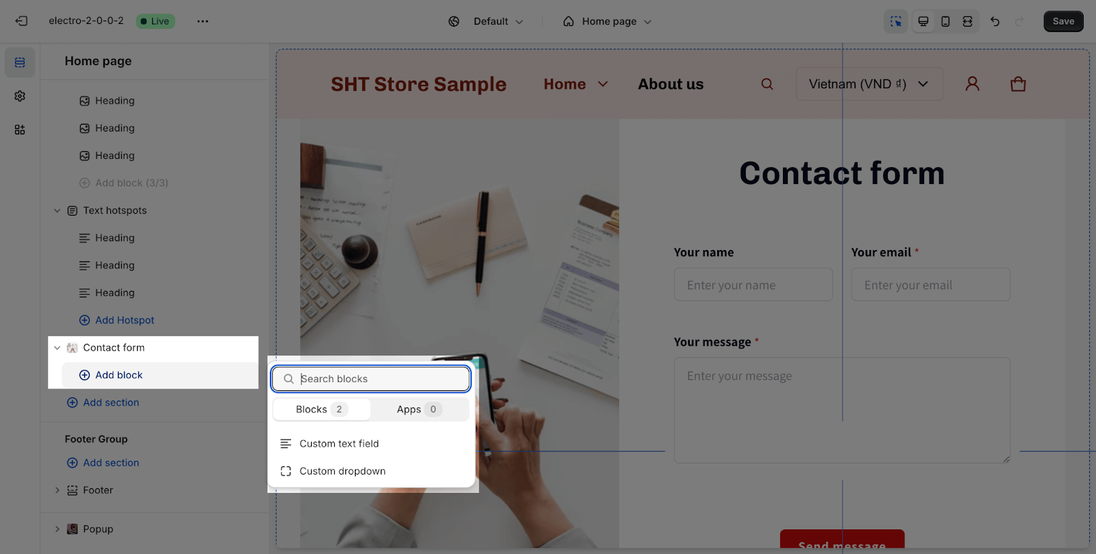
To add more blocks, click the “+” Add block icon.
There are 2 types of blocks that you can add on the Contact form section:
- Custom text field
- Custom dropdown
Note that you can add a maximum of 3 blocks for each block type.
Custom Text Fields
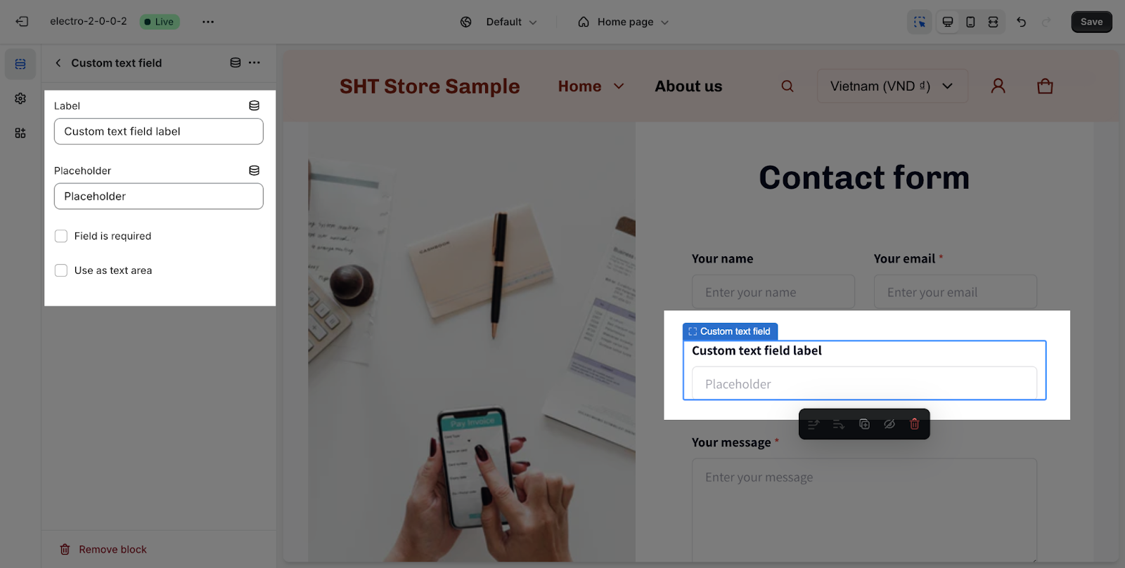
You can customize the text field label and placeholder. You can also make the field required or use it as a text area.
- Text field label: This is the text that appears above the text field. You can freely adjust it to fit your needs.
- Placeholder: This is the text that appears in the text field when it is empty. You can also freely adjust it to fit your needs.
- Field is required: This option makes the field required. This means that the user must enter a value in the field before they can submit the form.
- Use as textarea: This option makes the text field a textarea. This means that the user can enter multiple lines of text in the field.
Custom Dropdown
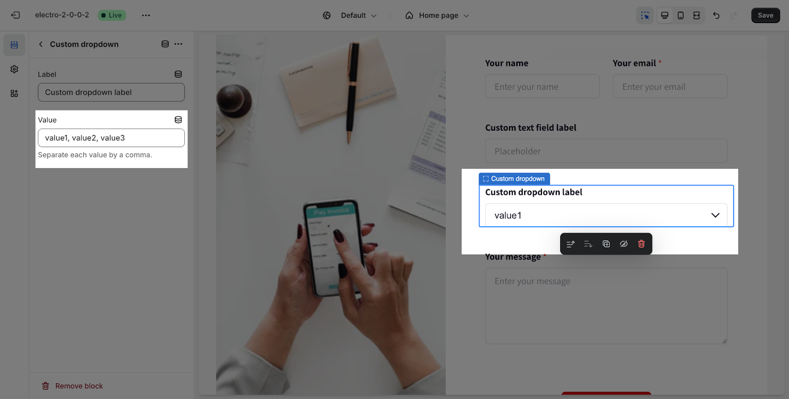
You can customize the dropdown label and value for each option. By default, the dropdown will have 3 sample values.
- Dropdown label: This is the text that appears next to the dropdown option. You can freely adjust it to fit your needs.
- Dropdown value: This is the value that is submitted to the server when the user selects the option. You can also freely adjust it to fit your needs.
To add more values or change the value names, simply add or change the text in the box. Remember to separate the values by commas.
Frequently Asked Questions
1. What is the Contact Form section used for?
The Contact Form section allows you to collect information from store visitors through a customizable form.
2. What types of fields can I add to the Contact Form?
You can add custom text fields and dropdown menus to collect various types of information.
