How to Use Electro Password Page
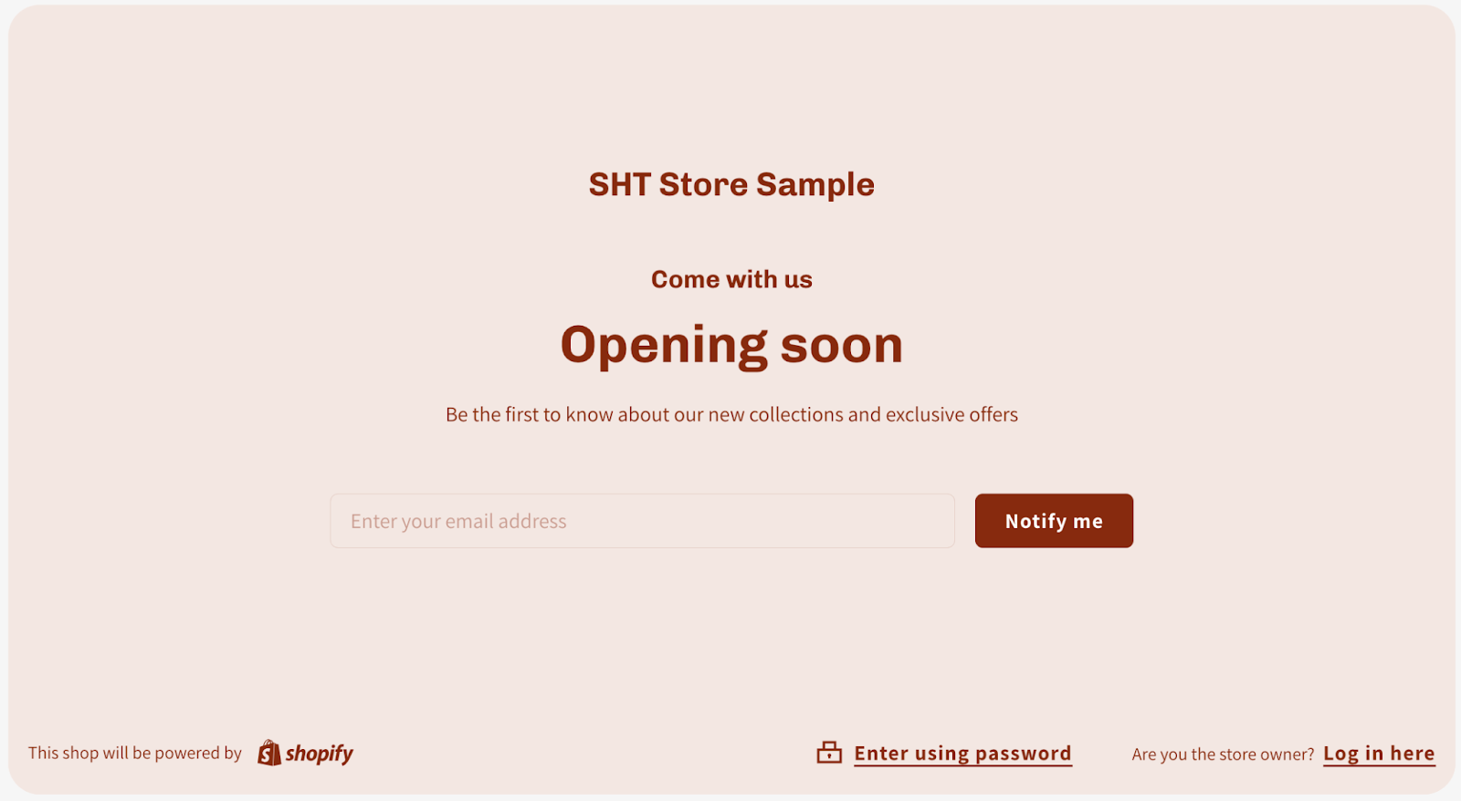
Password Page
A password page is a web page that is used to protect access to a website or web application. The page typically requires users to enter a password before they can access the content. Password pages can be used to protect a variety of content, including private information, premium content, or content that is still under development.
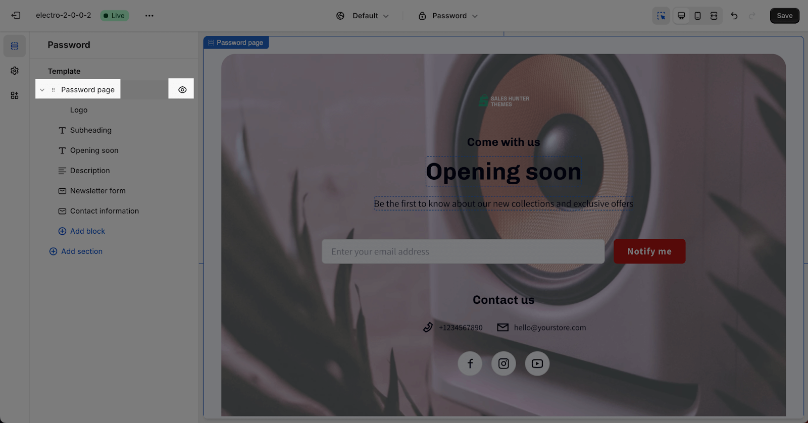
The Password template by default has one section: Password Page. This section cannot be removed, but it can be hidden.
You can freely add or remove any other sections to the template. The top bar, header, footer, and site popup are automatically disabled on the Password page to avoid distraction and unwanted redirection.
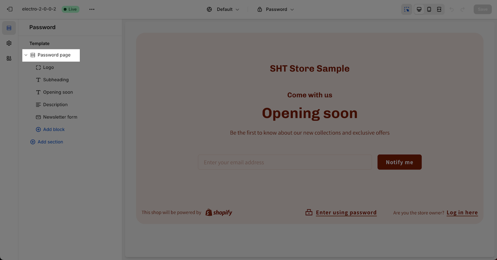
How To Access Password Page
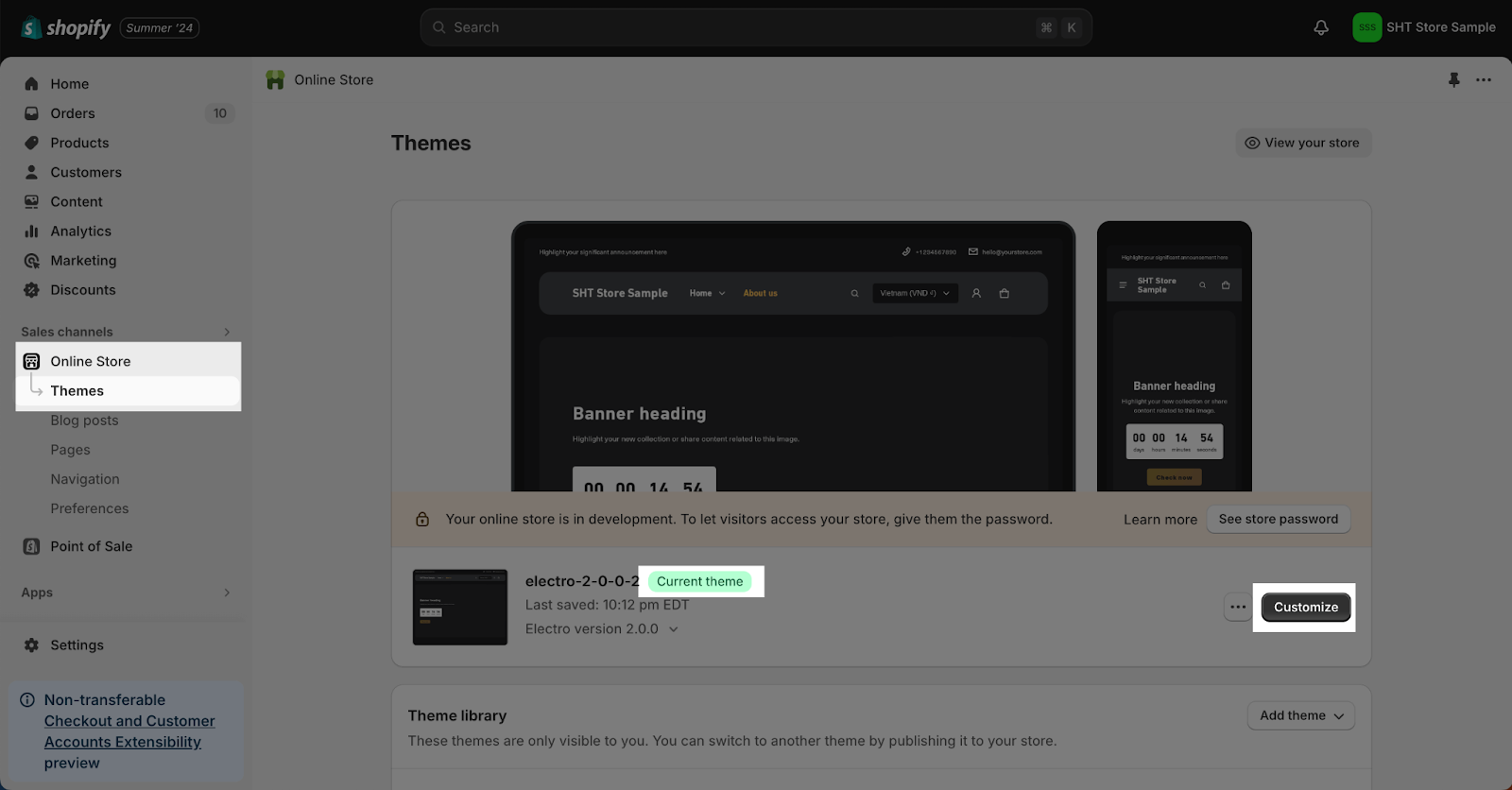
To access the Electro Password page, follow these two simple steps:
- Step 1: In your Shopify Admin, click on “Online Store”, then under “Current theme”, click the “Customize” button.
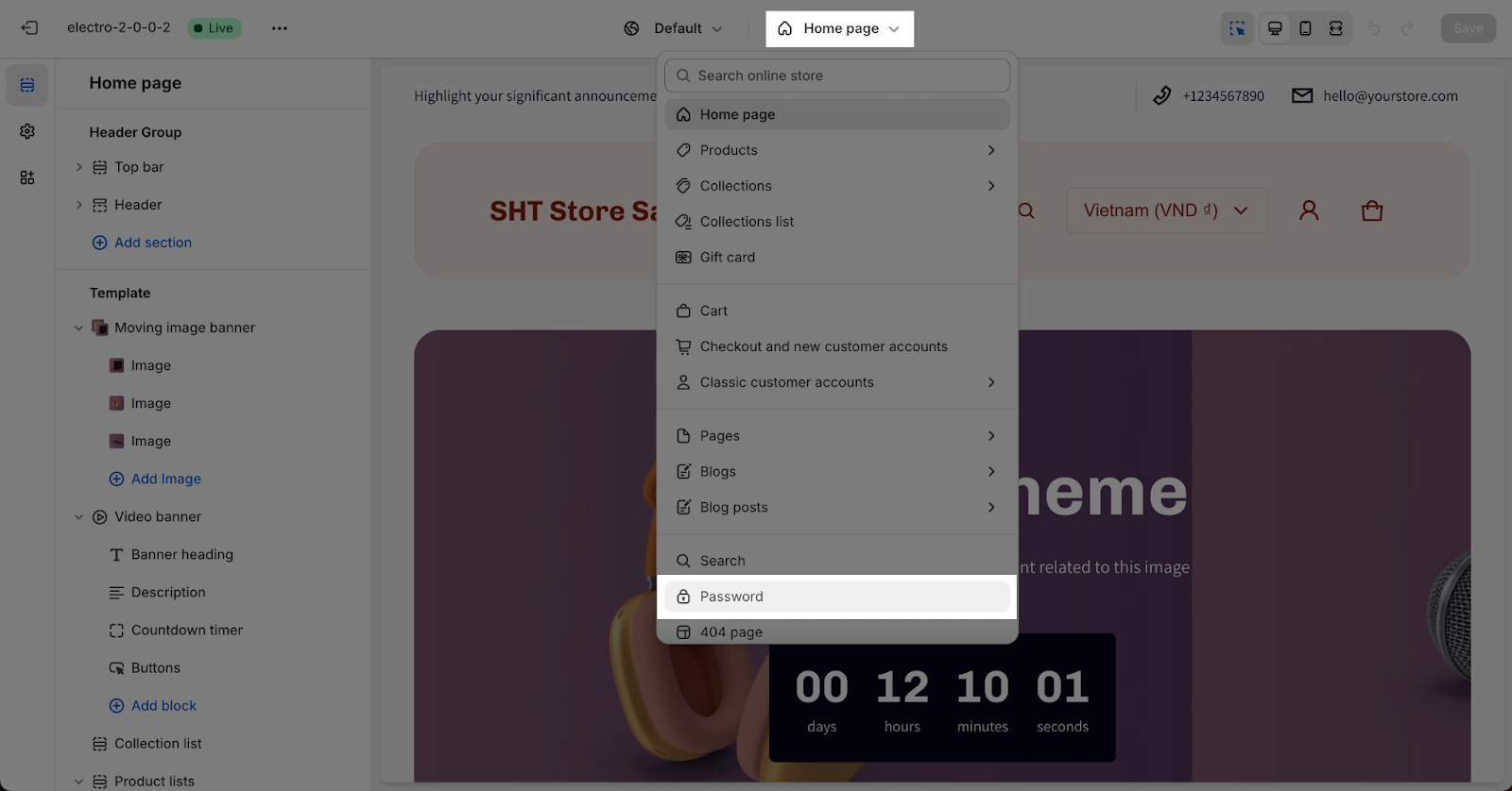
- Step 2: In the Theme Editor, click the page type dropdown menu and select “Password”.
How To Configure Password Page Section
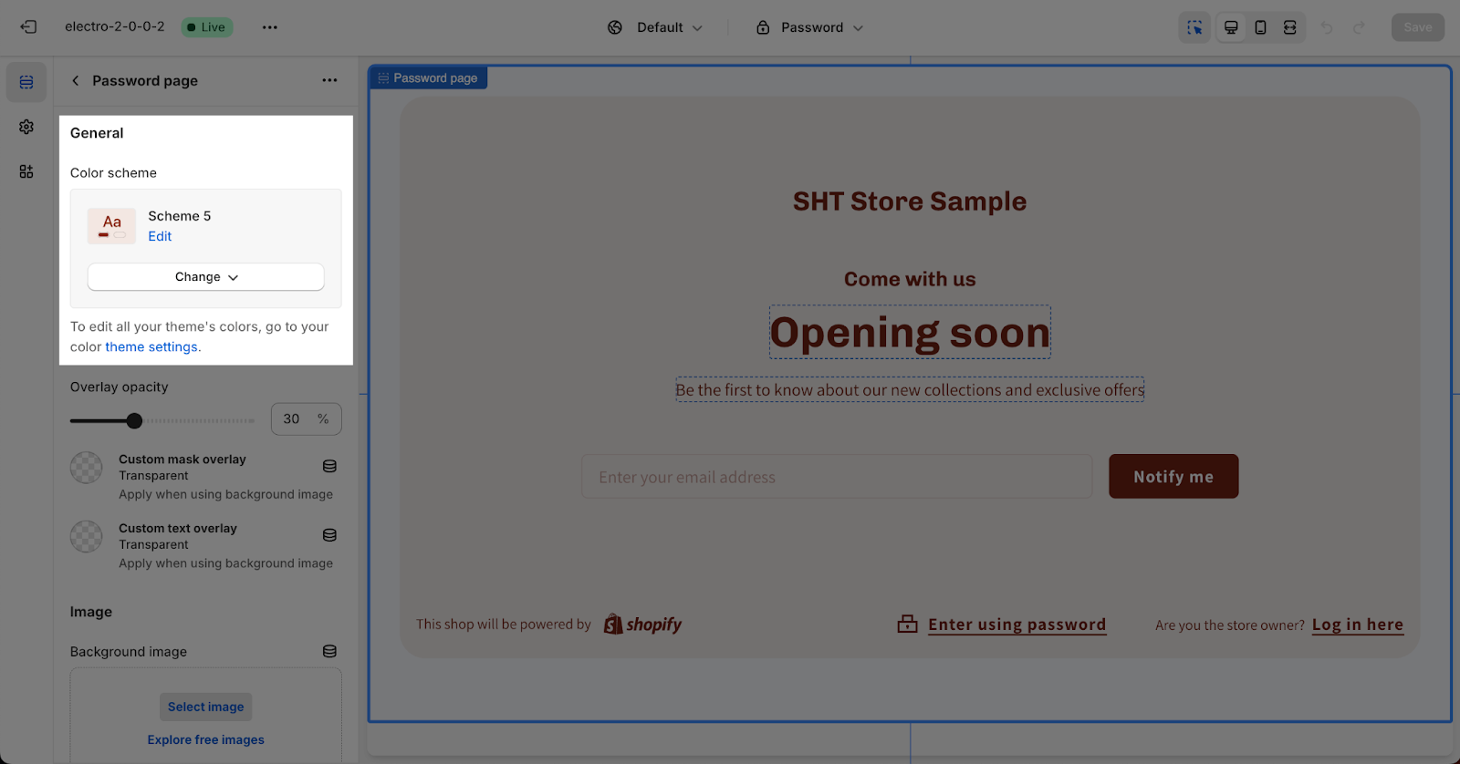
The Password Page section is the default section of the Password page template. Click on the section to start customizing it.
General
- Color scheme: You can select the color scheme for the section by clicking the dropdown menu. The color scheme will be applied to the content on the section. To change the color scheme, go to the Theme settings > Colors.
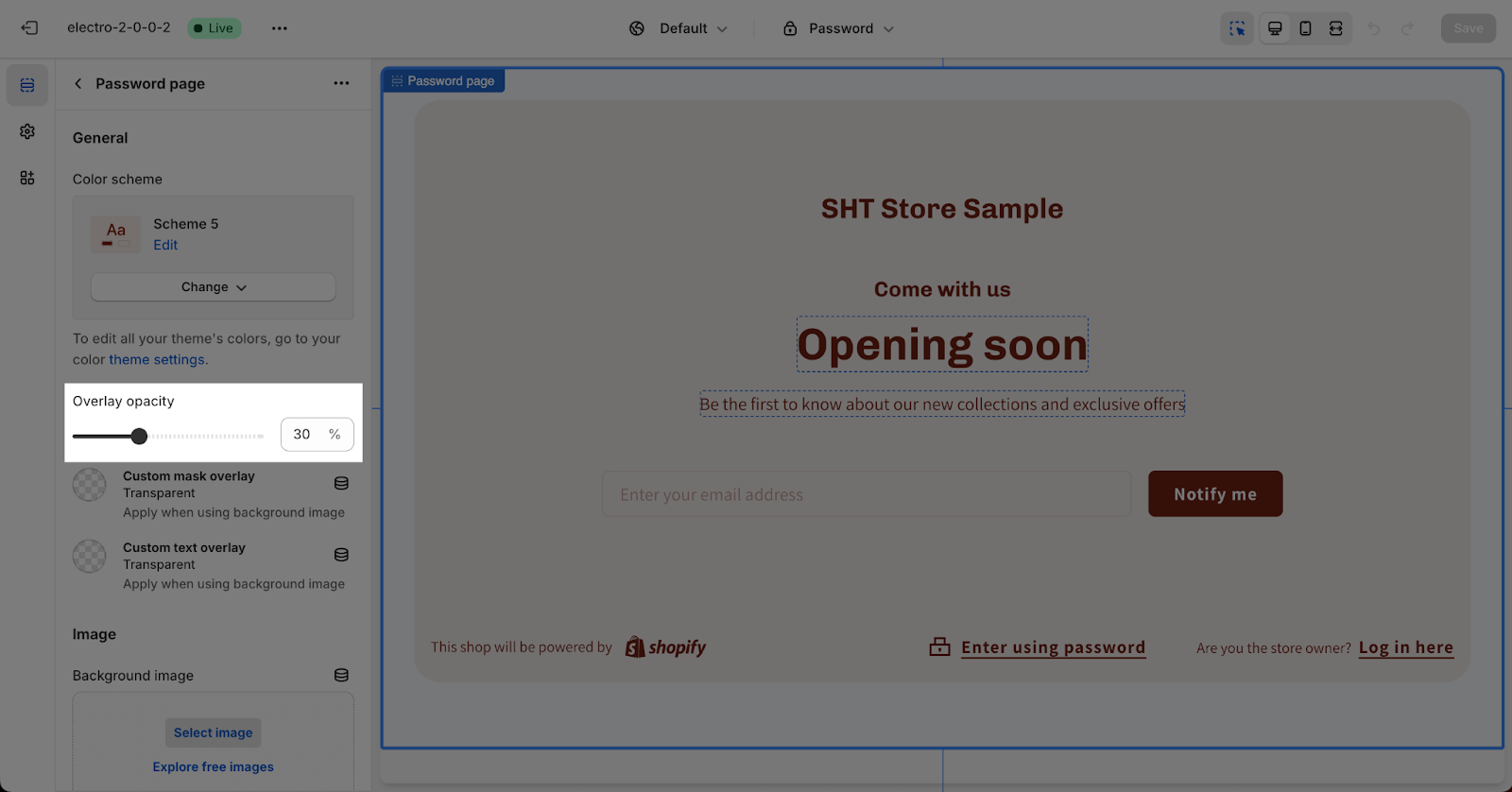
- Opacity: You can also change the opacity of the overlay for the background image of the section. The opacity can be adjusted from 0% to 90% in increments of 10%. The overlay color is applied from the color scheme you have selected.
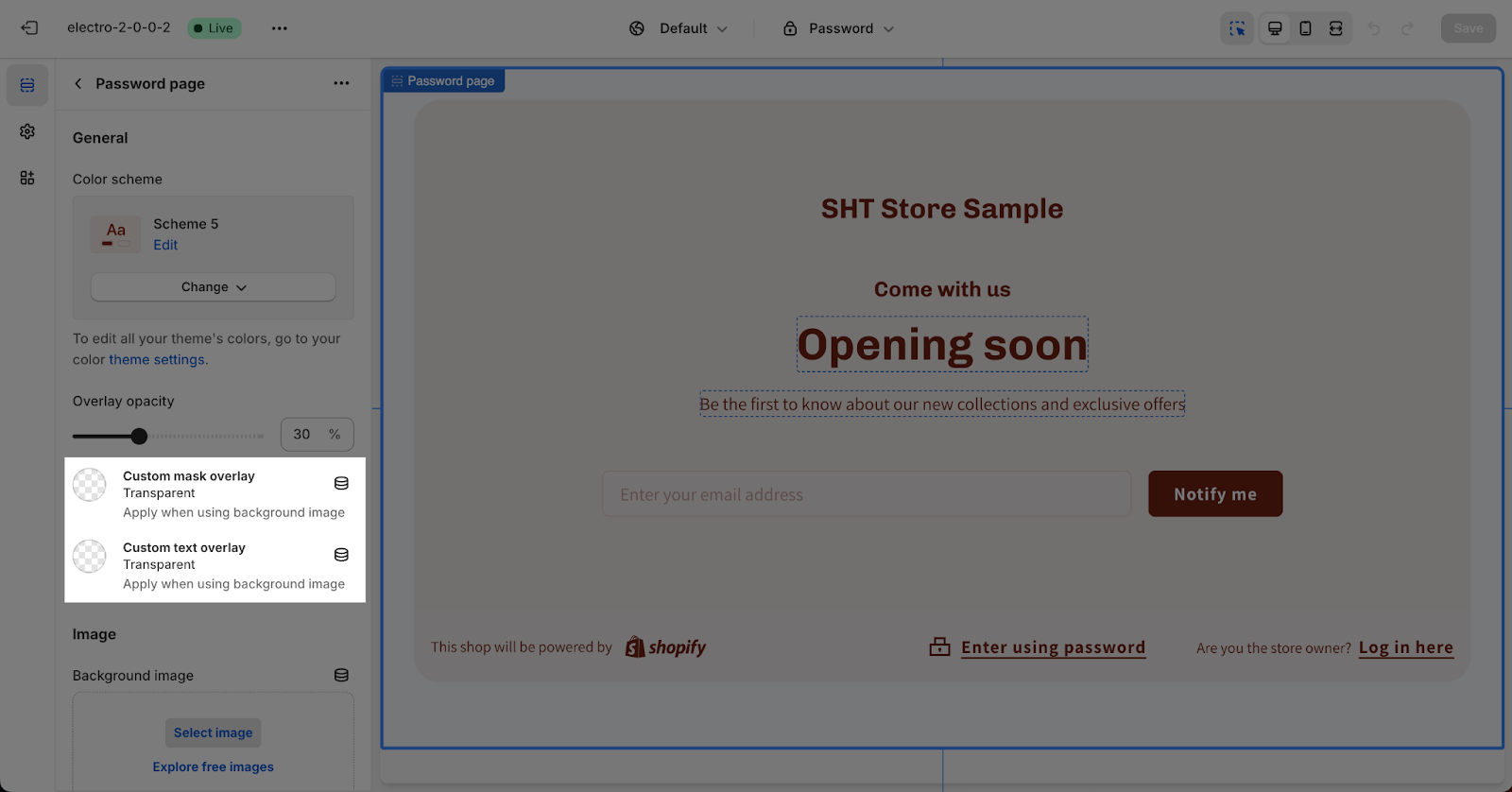
- Custom Colors: If your slide background is transparent, you can choose “Custom mask overlay” and “Custom text overlay” colors for better visibility and contrast.
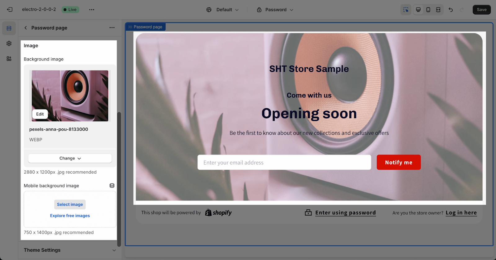
Image
To change the background image on the Password Page, click Select Image for the Background Image. For the best display quality, we recommend using .jpg images that are 2880 x 1200 pixels in size for most screens and 750 x 1400 pixels in size for mobile devices.
How To Configure Password Page Blocks
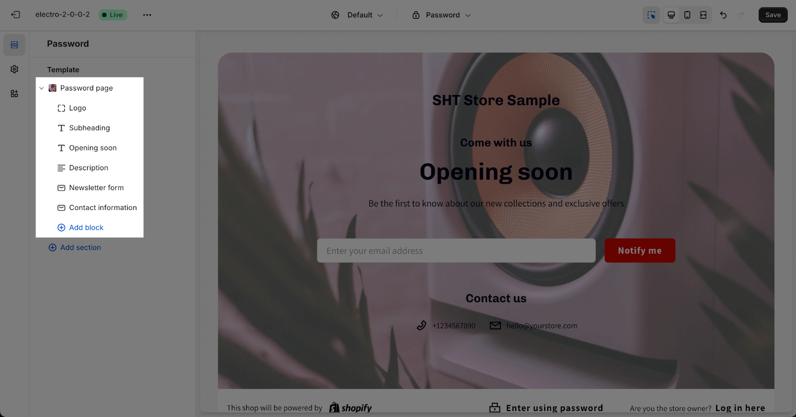
The Password page section includes 6 content blocks which are: Logo, Subheading, Heading, Description, Newsletter form and Contact Information.
Please note that 1 block type can only be added once on this page, except for heading, subheading and description block.
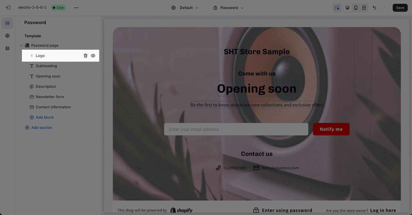
To adjust for the Block content, click on the block to go to the Settings.
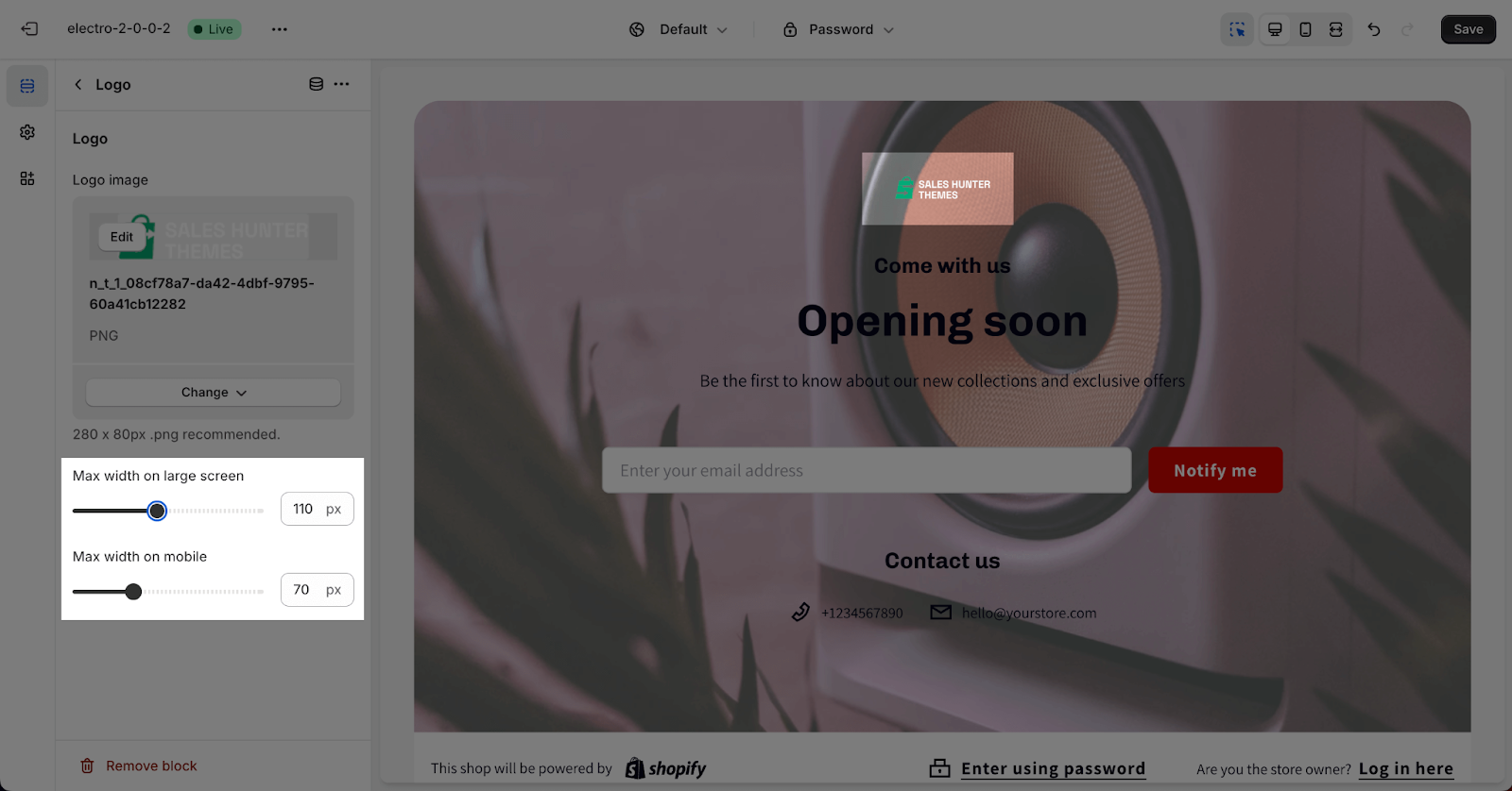
Logo
To change the logo on the Password Page section, click “Select Image” for the Logo Image. If no logo is added, the site logo will be used automatically. For the best display quality, we recommend using .png images that are 1620 x 1800 pixels in size.
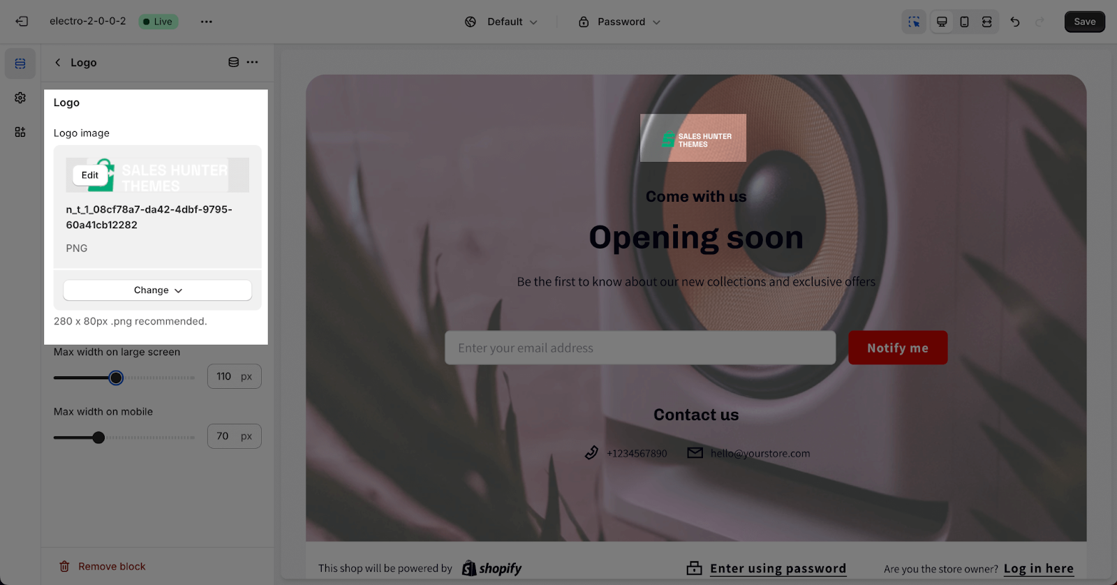
The maximum width of the logo on large screens can be adjusted from 40px to 200px. The maximum width of the logo on mobile devices can be adjusted from 40px to 140px. The default maximum width for large screens is 160px, and the default maximum width for mobile devices is 100px.
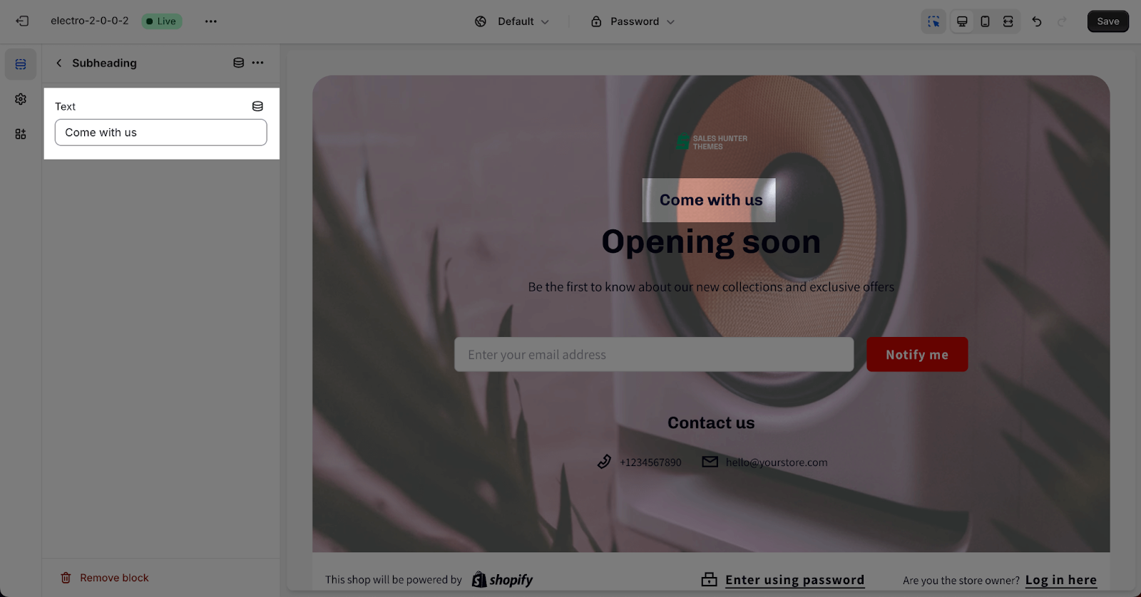
Subheading
In Subheading, click on the placeholder to add content for the subheading. If you want to remove the subheading, just leave the field blank.
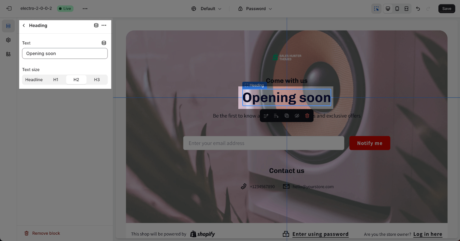
Heading
The Content tab allows you to customize the heading for the Password page section. Simply fill in the text boxes to add content, or remove the content by deleting it from the text boxes.
You can also change the Heading size from Headline, H1, H2 and H3. These sizes will be based on the Base text size that can be set up in Theme settings > Typography.
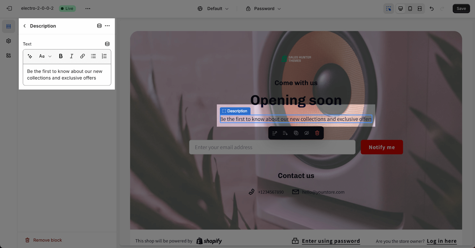
Description
In Description, simply fill in the text boxes to add content, or remove the content by deleting it from the text boxes.
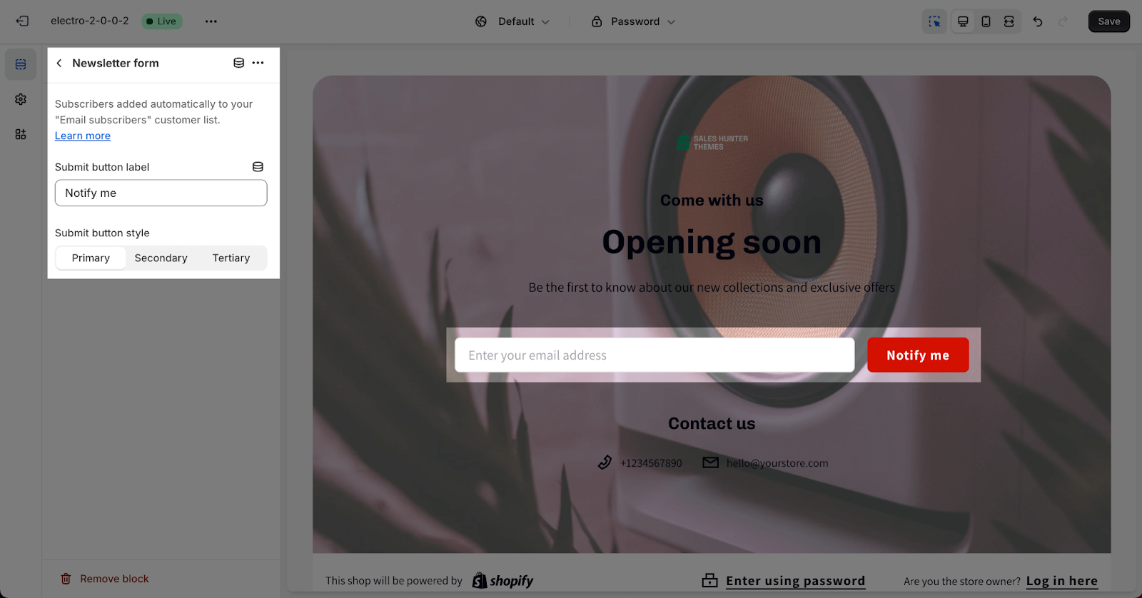
Newsletter Form
In the Newsletter form, you can change the text of the button. All data collected by the newsletter will be stored in the Customers area of your Shopify admin.
You can also choose the Submit button style from Primary, Secondary and Tertiary. These styles can be adjusted in the Theme settings > Colors.
Contact Information
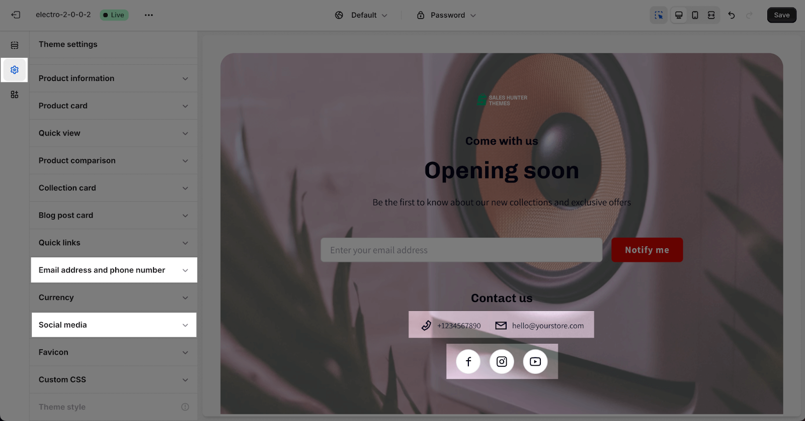
The Contact information allows you to show the social media icons, email address and phone number.
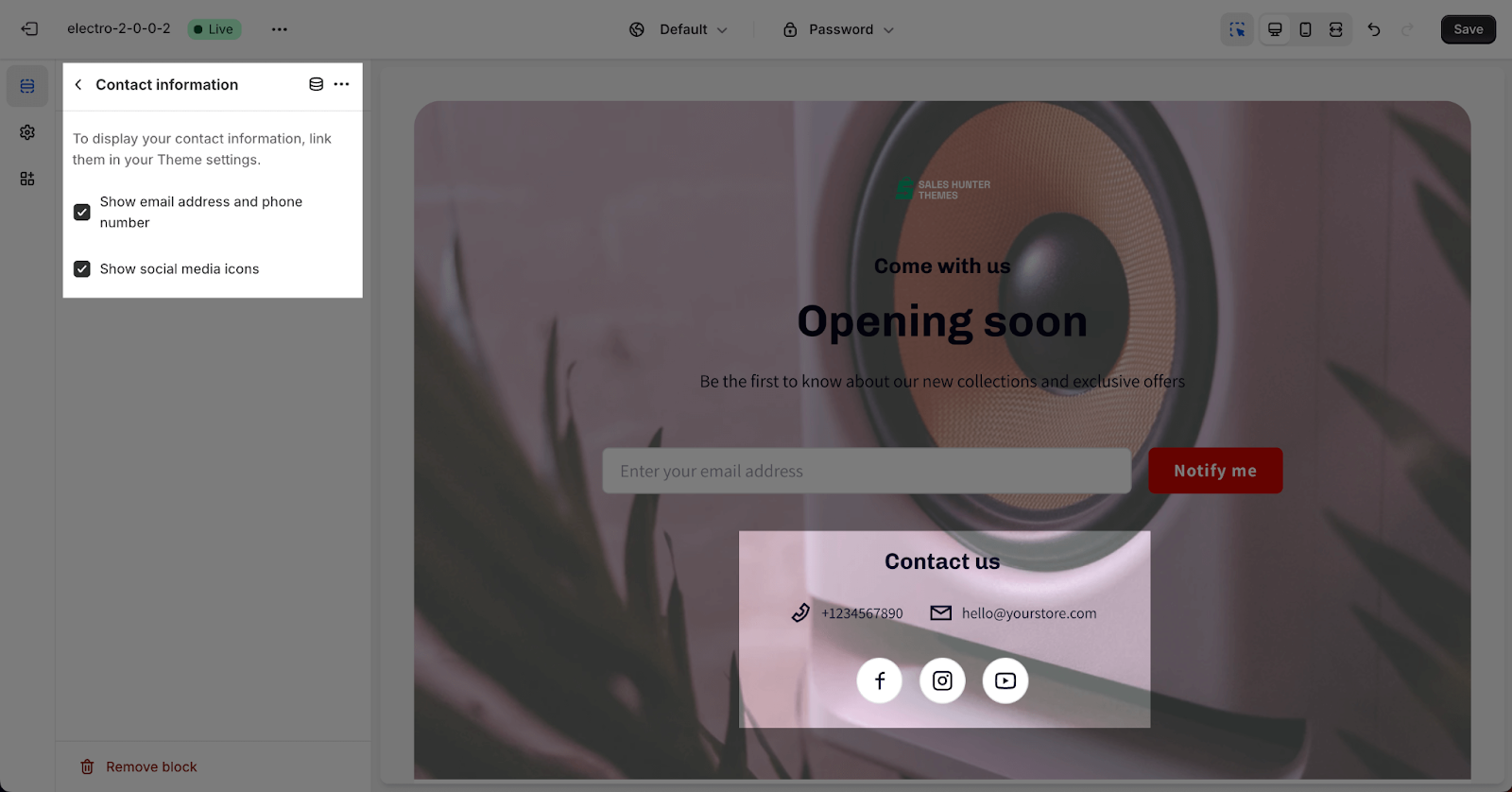
Please note that you must set up this information in your Theme settings > Social media and Email address and Phone number before you can show it on the Password page.
Frequently Asked Questions
1. Can I remove the default Password Page section?
No, you cannot remove the default Password Page section, but you can hide it by clicking on the eye icon next to the section.
2. Can I add multiple instances of each block type?
Generally, only one block of each type can be added, except for heading, subheading, and description blocks, which can have multiple instances.
3. Where is the data collected by the newsletter form stored?
All data collected by the newsletter form is stored in the Customer page of your Shopify admin.