Theme Settings
This article provides instructions on how to configure the theme settings in Electro theme. You can find the theme settings by clicking on the second icon on the menu bar.
On this page:
- Colors
- Typography
- Appearance
- Cart
- Search
- Product information
- Product card
- Quick view
- Product comparison
- Collection card
- Blog post card
- Quick links
- Email address & phone number
- Currency
- Social media
- Favicon
Colors
Color schemes
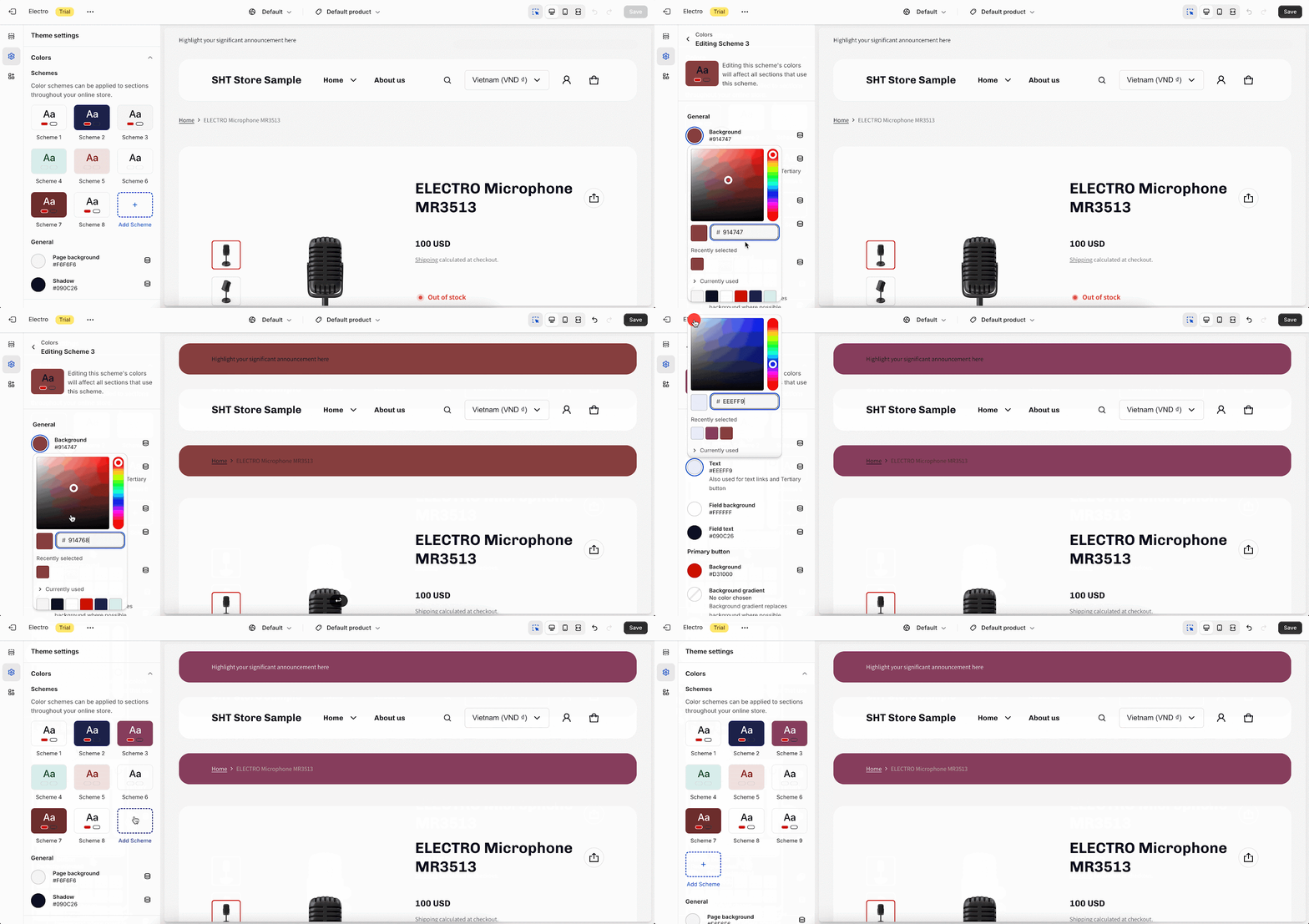
In Theme Settings, click the color circles under “Colors” to pick pre-made schemes or create your own.
A color scheme combines colors for text, background, buttons, and more. Apply them to different sections for a unified and attractive look.
Shopify lets you add up to 21 schemes, so you can match your brand and style.
To adjust a scheme, click it to open the color picker. Choose a color or enter a code. If the current schemes do not match your need, click Add scheme to customize new one.
After choosing a scheme you want, you can continue editing the value inside, including:
- In General, colors are only applied to sections that use a card scheme:
- Background: Apply for the background, when the section uses a card scheme
- Text (used for text links and tertiary buttons): The default text color is applied to all texts, including headings, text links and outline buttons when they are inside a card scheme
- Field background: The default field background color. This setting is only applied to sections that use a card scheme
- Field text: This setting is for text within the sections that use a card scheme
- In both the Primary and Secondary buttons, you can change the color of Background and Label. With the primary one, there is one more advanced feature to update Background gradient
- In the Accent, you can choose the color for:
- Accent: The default accent color, which is applied for header, footer, cart icon and dropdown menu
- Accent gradient: The default accent linear gradient
General Color
Besides of Color scheme, you can choose colors for the below items that are not applied to a card scheme:
- Page background: The default website background color.
- Shadow: The shadow of a popup, drawer, or modal such as cart notification, cart drawer, menu drawer, menu dropdown, or popup content…
- For sections that had color schemes before:
- For listing-type sections: The color scheme is applied to the cards instead of forming a card section. When you update to the new mechanism, the color scheme selected is Scheme 3. During migration, the cards in the listing will retain their old color scheme. For a newly dragged section, it will get the predefined value based on the selected theme style.
- For sections that already have a card form, the color scheme will remain as the previous scheme.
- For sections that did not have a color scheme before, Scheme 3 will be selected as the default.
Typography
To ensure consistency across all pages of your store and make it look more professional, the Electro theme provides a font family and an automatic font size adjustment system.
To modify the Typography, navigate to Theme settings > Typography, where you have the option to change the font family for headings and body texts, as well as adjust the font scale level universally. Check this article to learn more about the Typography settings in Electro theme.
Appearance
In Appearance, you can set up the content max width of sections, show section ID in the Product template and choose the color scheme for the popup.
Spacing
In the Spacing section, you can select the Spacing scale for the entire store. The Content max width drag-and-drop feature gives users the flexibility to adjust the page width according to their design preferences. You can set the minimum width to 1200px and the maximum width to 1800px and a step increment of 100.
Product Sticky Bar
You can also enable the Show section ID in the product template setting. This will add the section ID to the product template, which can be used to map the section with the product sticky menu item.
Popup
In this section, you can select the color scheme for popups. All schemes were set up on Theme setting > Colors can be chosen here. These settings apply to theme components that pop into the screen when activated, such as notifications, modals, drawers, menus, and more.
Cart
We theme supports 2 cart types:
- Drawer: The cart appears as a slide-out drawer on the right side of the page.
- Page: The cart appears as a dedicated page on your website.
By default, cart type is set at Drawer.
In this Theme setting part, you can select which details you want to display with the cart:
- Show product vendor: The name of the vendor who sells the product.
- Enable order notes: Any notes that the customer wants to add to their order.
- Enable dynamic checkout button: Displays a checkout button that changes color and text depending on the contents of the cart
- Show tax and shipping information: Displays the estimated tax and shipping costs for the items in the cart
Search
In this section, you have the option to enable the ‘Show product filter‘ on the pages. Product search filter lets customers use the search bar as a filter to select specific product types.
The product types are set up in Shopify > Products > Product organization, as below:
The Predictive search results allow you to choose which search results to show beside the product when customers are searching. There are 3 options: Blog posts, Pages and Collections.
In the Search results section, you can choose what will appear for customers on the search result page, including Blog posts and Pages. The products are selected by default.
Product information
General
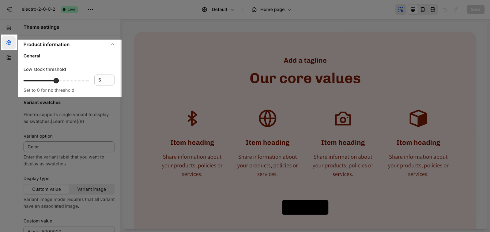
The default setting for displaying the low stock threshold is 5, and it can range from 0 to 10. If you wish to have no threshold, set it to 0.
Variant swatches
Electro supports a single variant to display as swatches. The default value is “Color“, but you can enter one variant label that you want to display as swatches.
Then you will have 2 choices to display the variants: Custom value or Variant image:
- If you choose Custom value: You have to customize them by code on the box below with the format: <Variant name>: <value> (separated by lines). For example: Deep Purple: #7000AA Plastic: plastic.png
- Variant image mode requires that all variants have an associated image in Shopify setting up.
- You can only add one variant type to the placeholder, and variant swatches will apply specifically to that type.
- The variant type entered in the ‘Variant option’ placeholder must exactly match the name of the variant you have defined for the product, and it must be in lowercase.
Check this video tutorial below to learn more about How to set up Variant Swatch (use Hex code and image for option swatch) in Electro theme:
Product Specifications
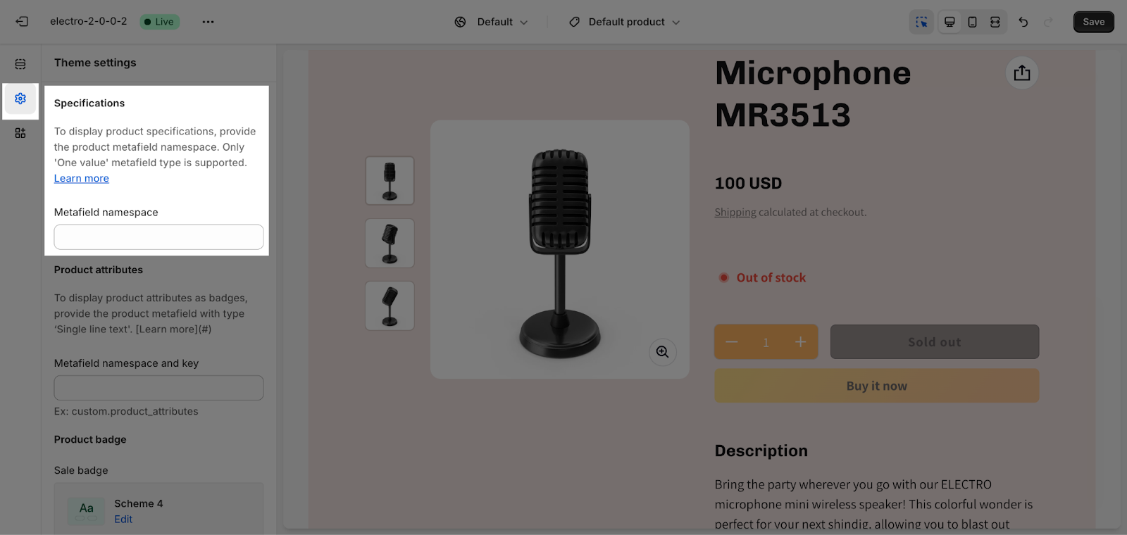
To showcase product specifications, provide the product metafield namespace. Please note that only the ‘One value’ metafield type is supported.
Product attributes
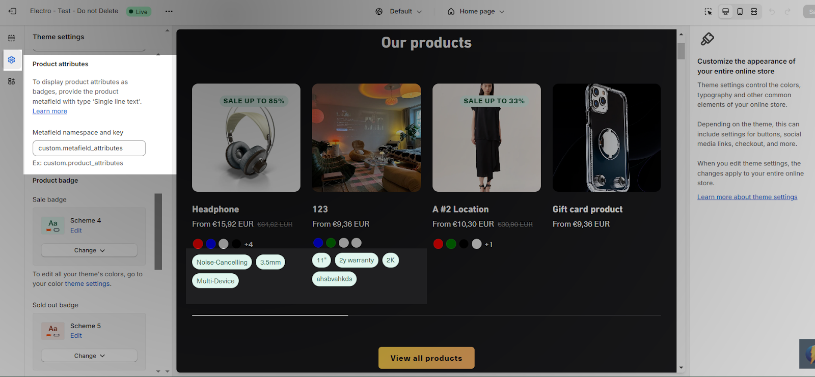
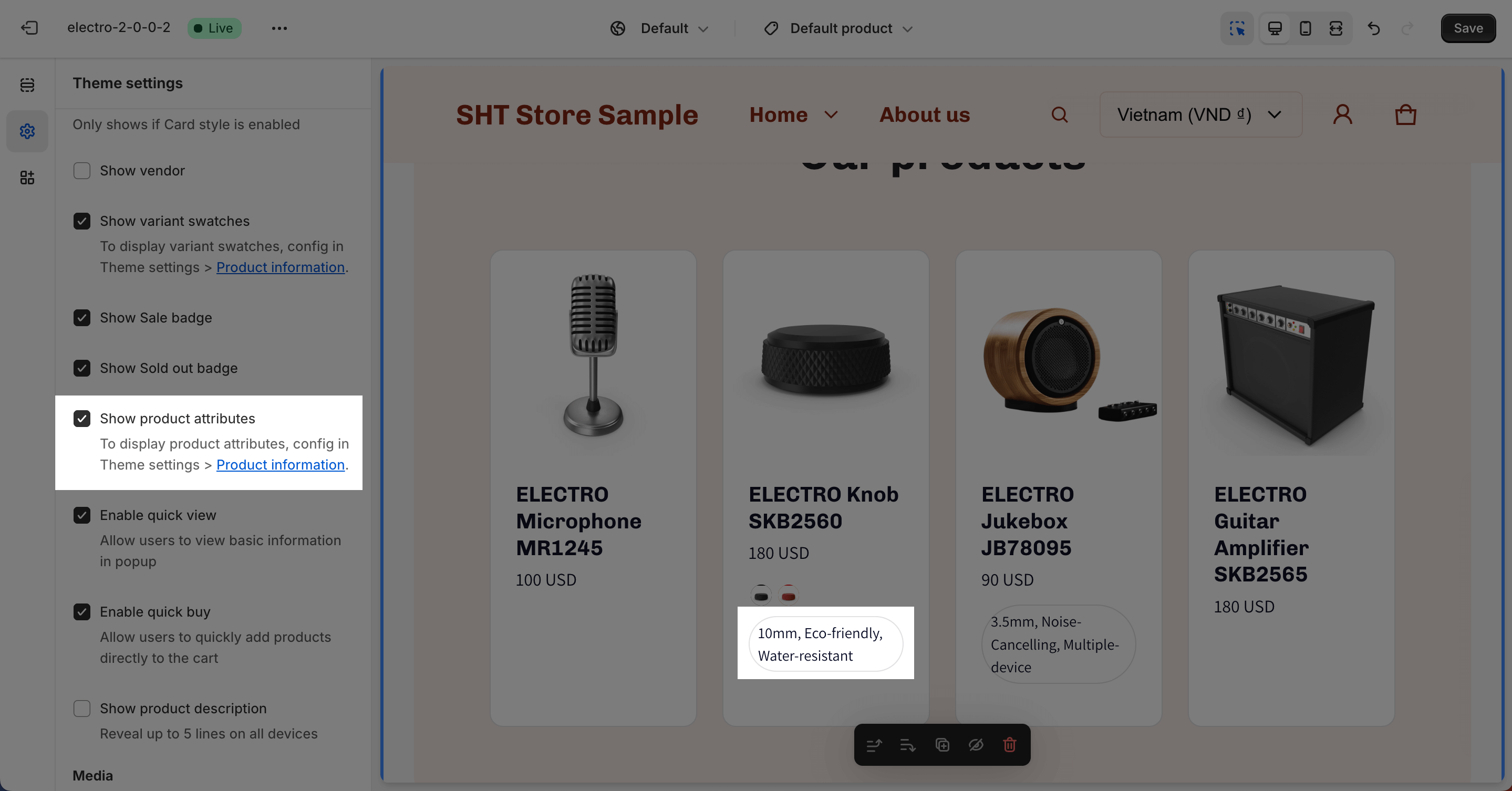
This feature allows you to display product attributes as badges, by adding the “Metafield namespace and key”. It only provides the product metafield with type ‘Single line text‘.
You can take a look at how to set up Product metafields to set it up for each product.
After setting all the metafield values, you fill the metafield namespace and key on Theme setting board, for example, custom.product_attributes to display this information on your product details.
You can get this badge by enabling this feature on Product card, Quick view, Product comparison.
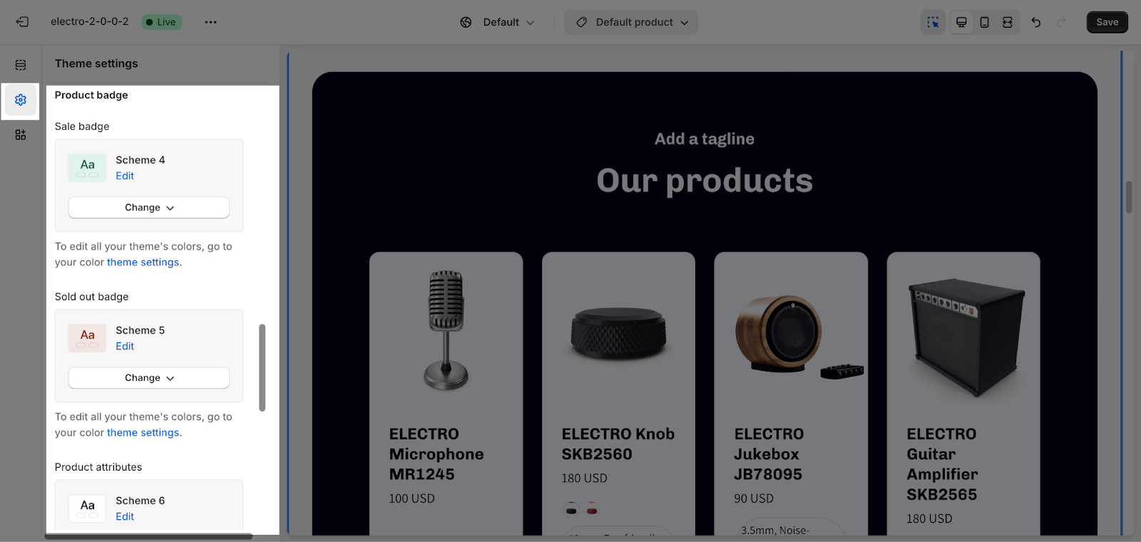
Product Badge
This section is where we can choose Color schemes for Sales badges, Sold out badge and Product attributes that we set up above.
Product Card
General
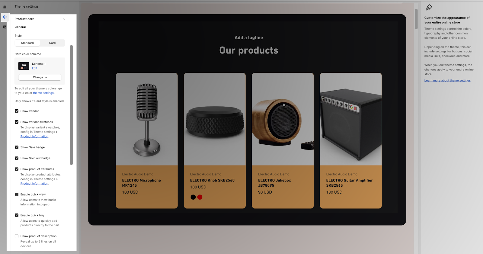
In this part, you can show the Product list section in non-card “Standard” or “Card” and set their style. The default value is standard.
The Card color scheme only shows if the Card style is enabled. You can change the color scheme for this section by selecting the scheme here. To change the theme color, please go to Theme Settings > Colors.
Then, you can also enable or disable various display options, such as:
- Show vendor: Display the vendor name of the product.
- Show variant swatches: Display the variant swatches for the product, if available.
- Show sale badge: Display the sale badge if the product is on sale.
- Show sold out badge: Display the badge if the product is sold out.
- Enable quick shop: Display the quick shop button.
- Show product attributes: Configure in Theme settings > Product information to display product attributes.
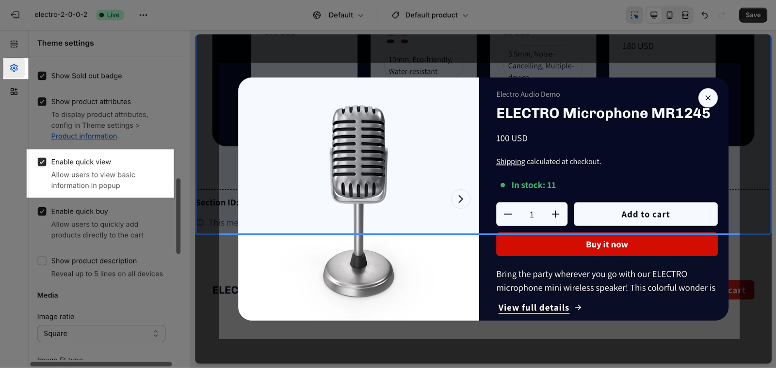
- Enable quick view: Display a quick view button that allows users to view basic information in a popup.
- Enable quick buy: Allow users to quickly add products directly to the cart.
- Show product description: It will reveal up to 5 lines on all devices.
Media
Electro theme offers three different product image ratios to accommodate your preferences:
- Square
- Portrait (2:3)
- Landscape (3:2)
The Image fit type setting has 2 options for image fit:
- Cover: The image will scale up to fit its container.
- Contain: The image will zoom in to show that all of the image will be contained in its container.
You can enable the “Show second image on hover”: When you hover over the product image, a second image will appear. If the product does not have a second image, the product image will be zoomed out.
If your product image is transparent, you can customize the color on the Media background.
Quick View
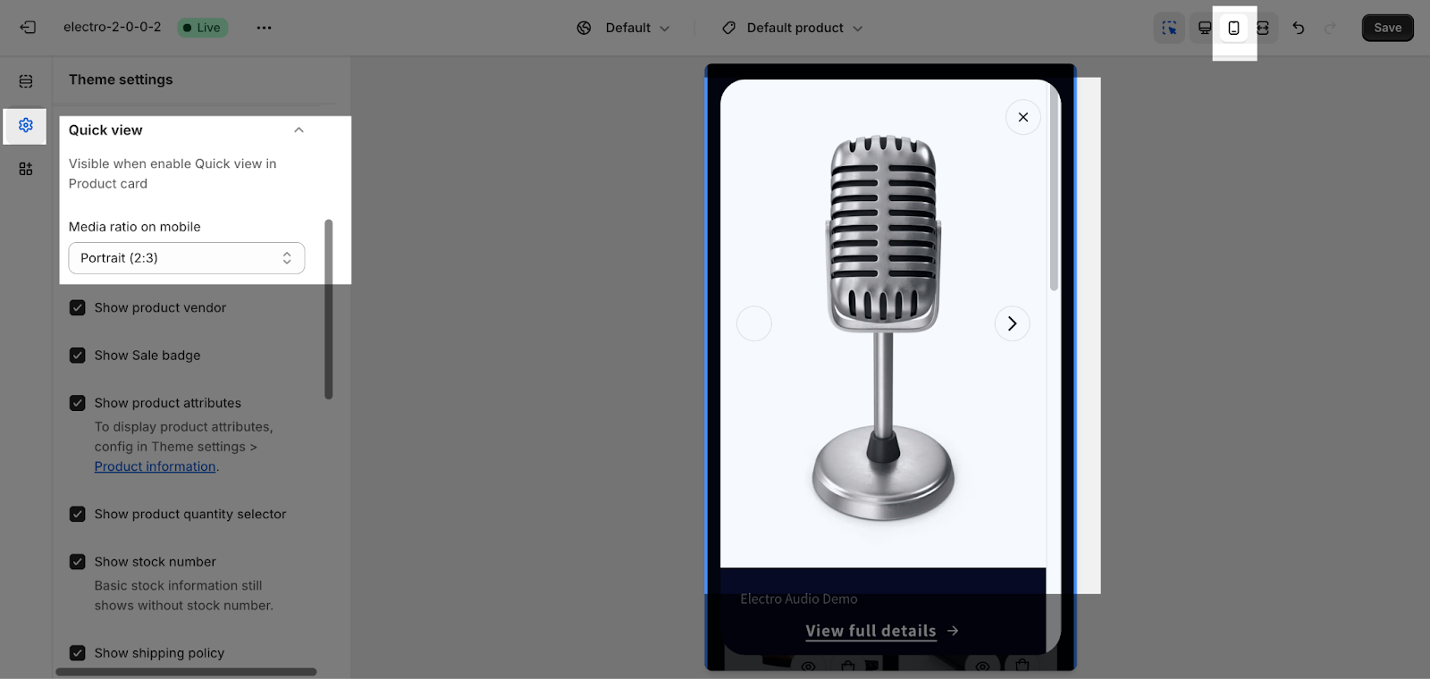
To add a Quick View button to each product card and display a pop-up when the button is clicked, you need to turn on the Enable quick view feature in the Theme Settings > Product Card.
Once you have enabled the Quick Shop feature, a button will appear in each product card. When a customer clicks the button, a pop-up will appear with information about the product, such as the product name, price, and image. The customer can then add the product to their cart from the pop-up.
In this section, you can choose which information to show on your Quick View pop up:
- For mobile view, there are 3 product image ratios to accommodate your preferences: Square, Portrait (2:3), or Landscape (3:2)
- Tick to show the product vendor, sale badge, product attributes, product quantity selector, stock number, shipping policy, dynamic checkout buttons, and product description.
- Decide to show the variant selector type in the “Button” or “Dropdown” menu.
Product Comparison
This part allows you to set up the information and style for the comparison section in your store.
General
In this part, you can choose to enable or disable various display options, such as:
- Product vendor: Display the vendor name of the product.
- Product attributes: Configure in Theme settings > Product information to display product attributes.
- Stock number: Basic stock information still shows without stock number.
- Product description: It will reveal up to 5 lines on all devices.
- Enable view full details: a button to explore more about that product.
Media
There are three different product image ratios to accommodate your preferences:
- Square
- Portrait (2:3)
- Landscape (3:2)
The Image fit type setting has 2 options for image fit:
- Cover: The image will scale up to fit its container.
- Contain: The image will zoom in to show that all of the image will be contained in its container.
If your product image is transparent, you can customize the color on the Media background.
Collection Card
General
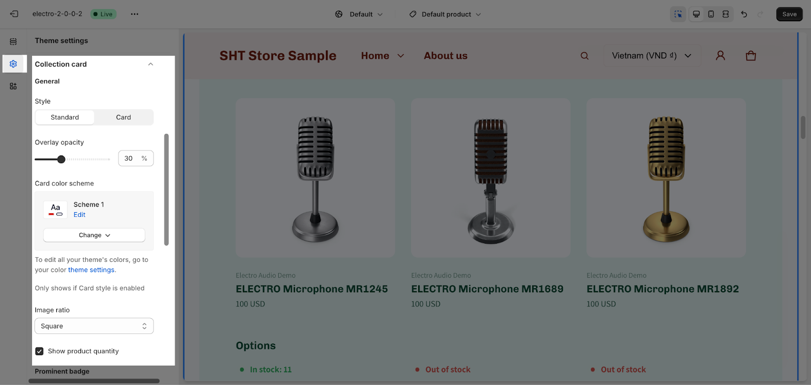
In General, there are 5 settings for the Collection card: Style, Overlay opacity, Card color scheme, Image ratio, and Product quantity.
- In Style, you can show the Product list section in non-card “Standard” or “Card” and set their style. The default value is standard.
- The overlay opacity setting allows you to adjust the transparency of the overlay that appears over collection images. The opacity can be adjusted from 0% to 90%, with 0% being completely transparent and 90% being completely opaque.
- The Card color scheme only shows if the Card style is enabled. You can change the color scheme for this section by selecting the scheme here. To change the theme color, please go to Theme Settings > Colors.
- Electro theme offers three distinct collection image aspect ratios:
- Square
- Portrait (2:3)
- Landscape (3:2)
- You can also choose to show or hide the product quantity in this section. The product quantity shows the number of products in the collection.
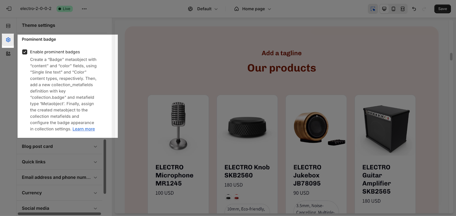
Prominent badge
To show prominent badges on the collection section, you can select the Enable prominent badges setting in the Collection card section. To use this feature, you will need to create a metaobject named Badge and assign it to the collection metafields. You can then configure the badge appearance in the Collection settings. For more information on how to create metaobjects, please see this article.
Blog Post Card
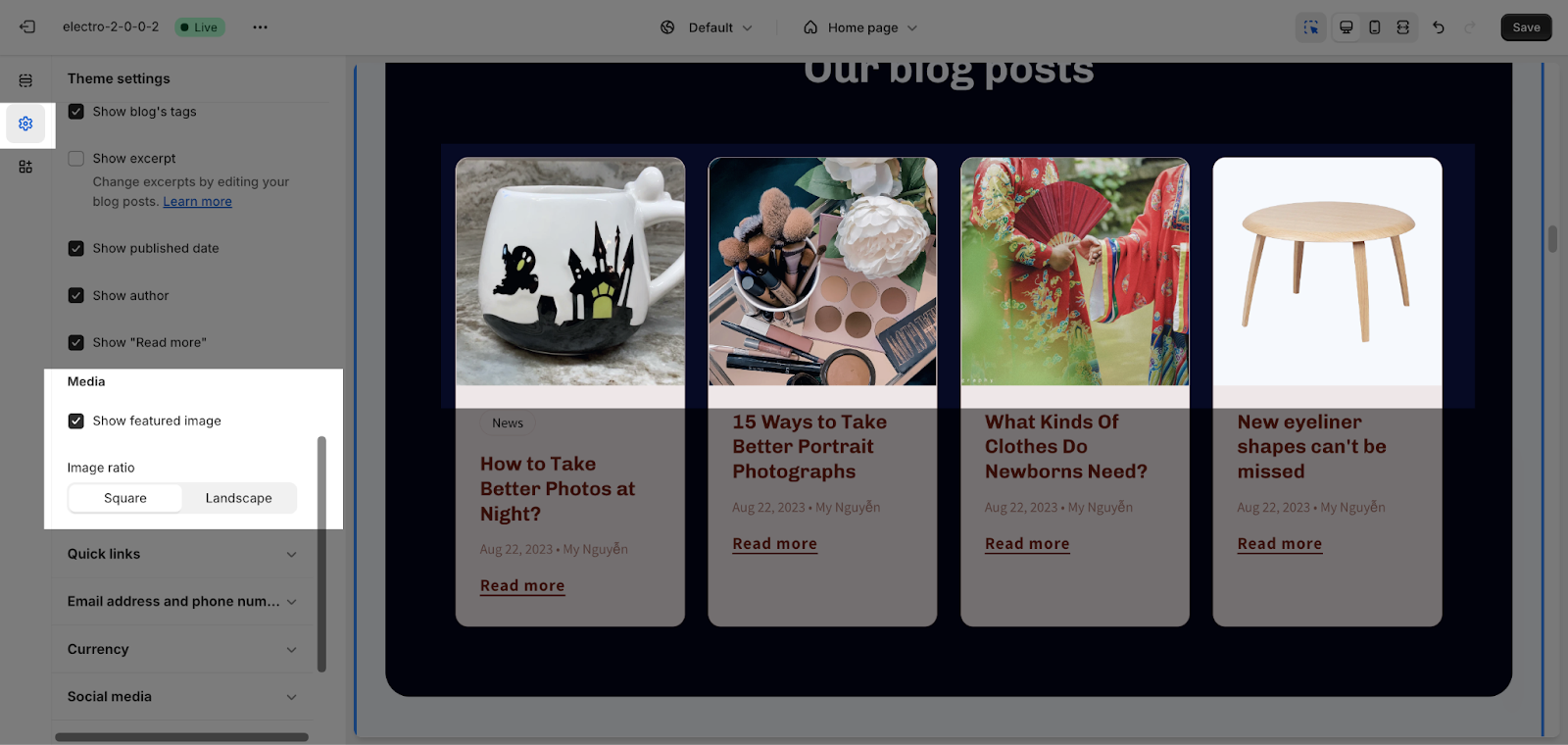
In this section, you can enable the featured image option to showcase an eye-catching image for your blog posts and simply tick to choose the content that will be displayed on your blog post card.
General
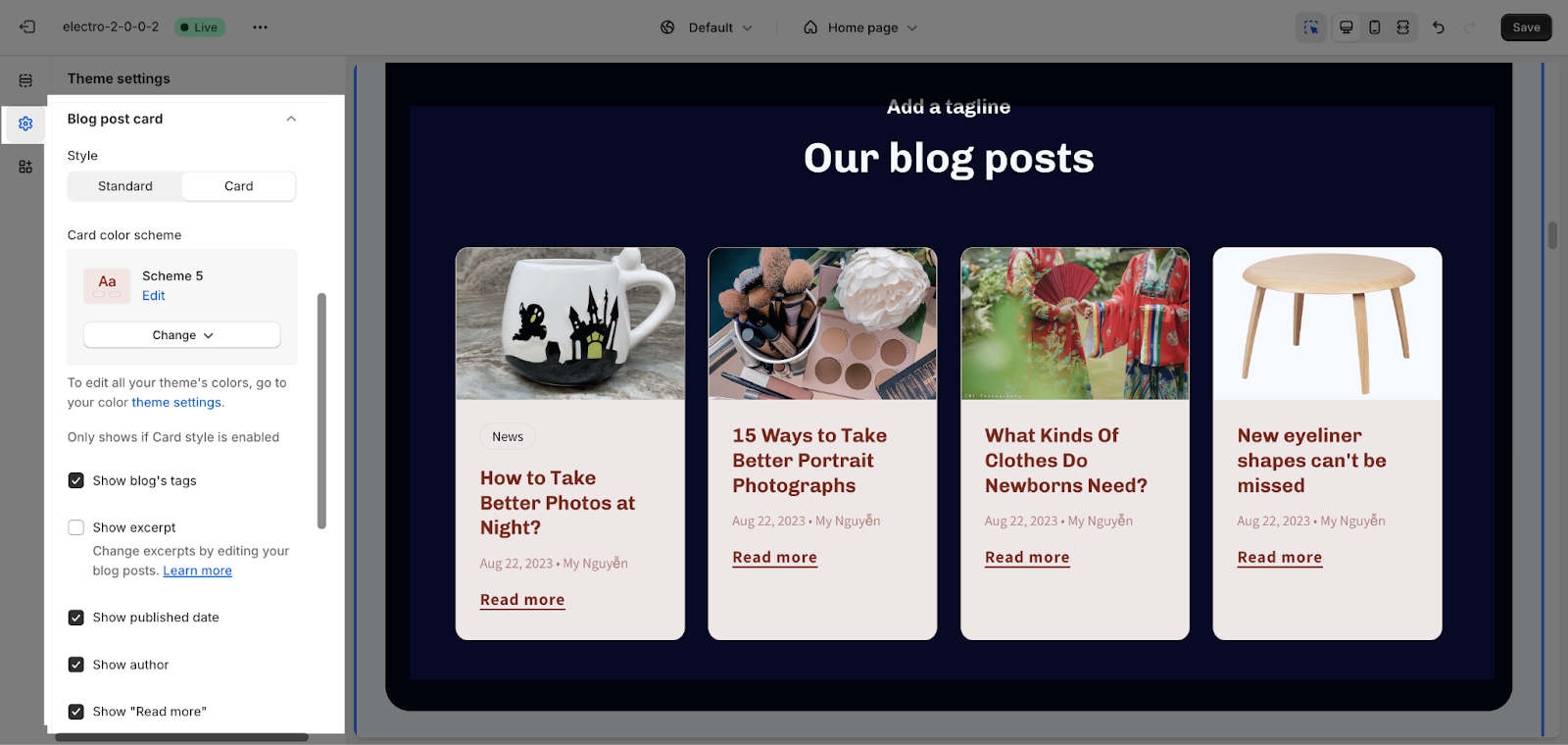
In General, you can choose to display the blog post in non-card “Standard” or “Card” and set their style. The default value is standard.
If the Card style is enabled, you can change the color scheme for this section by selecting the scheme here. To change the theme color, please go to Theme Settings > Colors.
In addition, you can enable or disable the following display options:
- Show blog’s tags: Only show the first tag of the selected blog.
- Show excerpt: Show a short summary of the blog post.
- Show published date: Show the date the blog post was published.
- Show author: Show the author of the blog post.
- Show “Read more“: Show a link to the full blog post.
Media
This section allows you to enable the display of a featured image and select the image ratio. You can choose from:
- Square
- Landscape
Quick Links
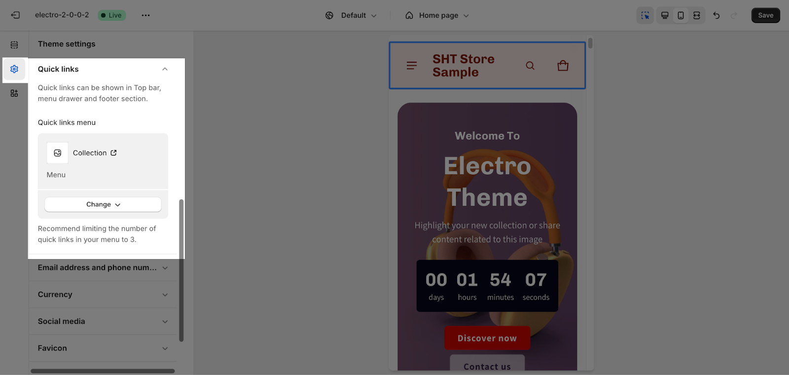
Quick links can only be shown in the top bar, menu drawer, and footer section. You can select a quick link by clicking on the Select menu button. We recommend limiting the number of quick links in your menu to 3. This will help to keep your menu uncluttered and easy to use.
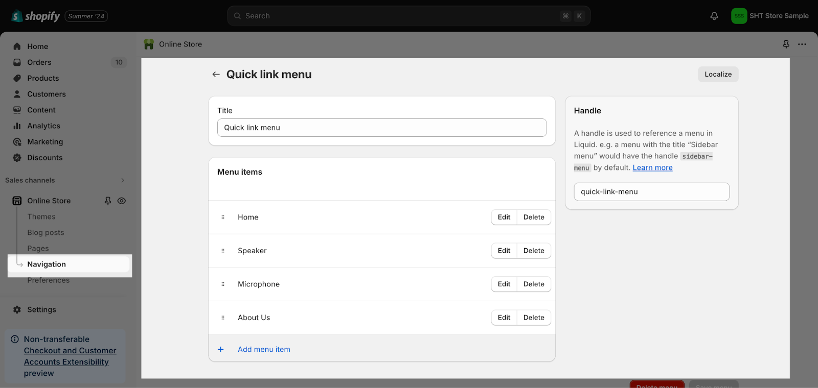
To make adjustments to the Quick Link menu, simply click on it. This action will redirect you to the Navigation settings, where you can customize its configuration:
Email address and phone number
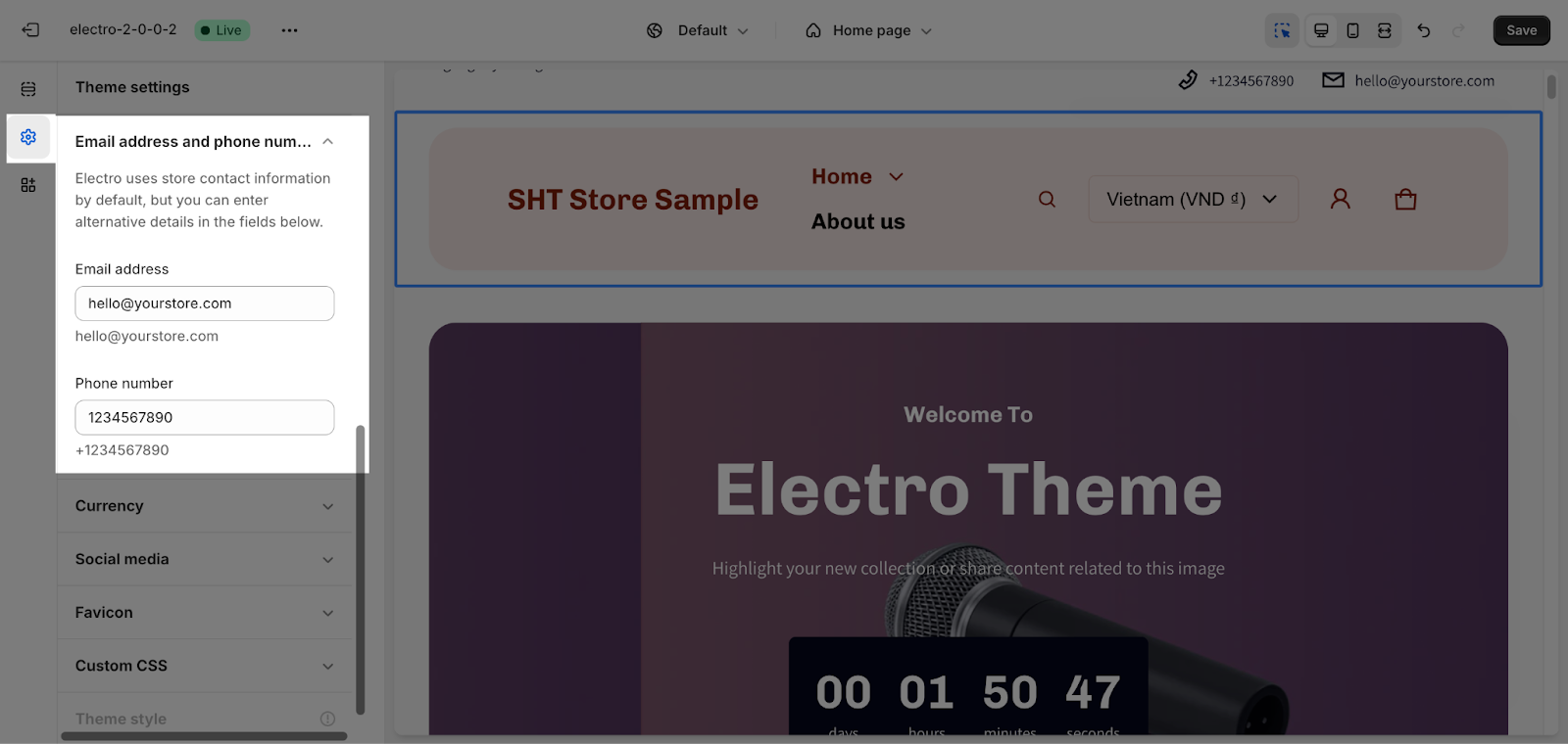
This is where you can enter your email address and phone number to set up your personal store. If you want to remove this information, simply delete the text in the text box.
Currency
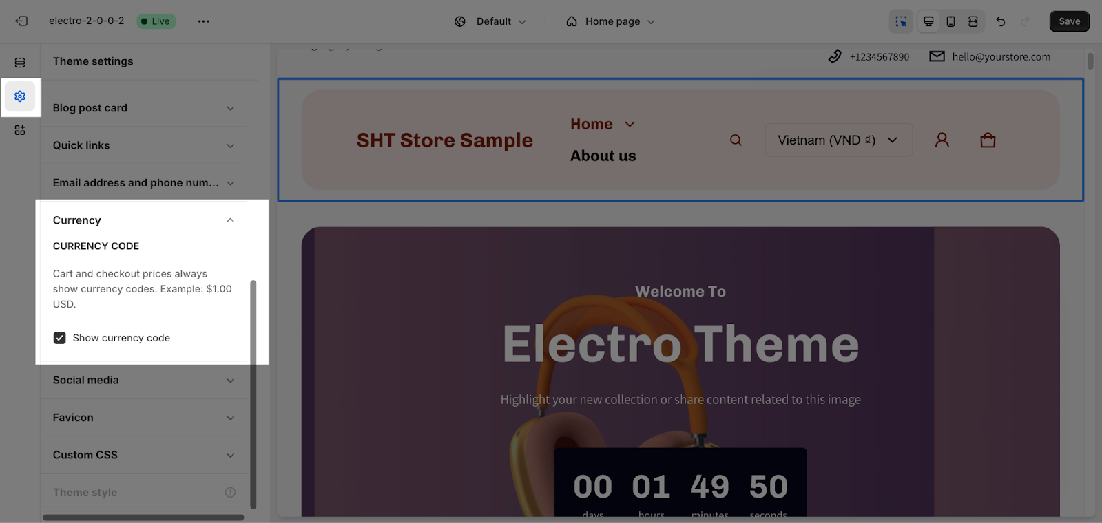
The currency code is always displayed on the cart and checkout pages. This option allows you to show the currency code on other sections of your store, such as product cards and product details. If you disable this feature, the currency code will only be shown on the cart and checkout pages.
Social Media
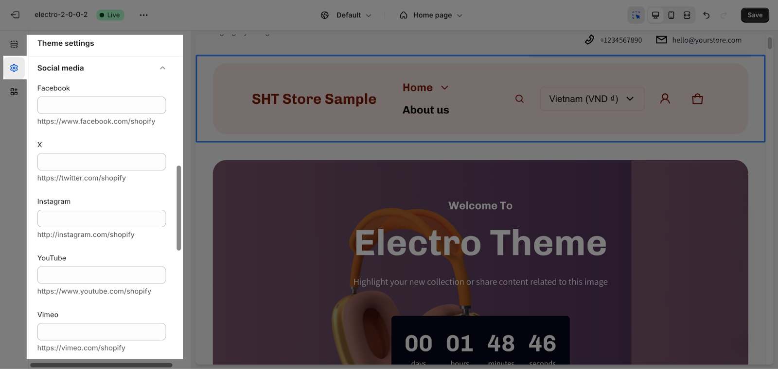
Electro theme allows you to connect with most of social media are:
- YouTube
- Vimeo
- TikTok
- Tumblr
- Snapchat
You can freely add or remove any social media accounts by connecting with their respective URL. If you do not want to connect with any of them, simply leave this part blank.
This can be used in multiple sections, such as the header, footer,…
Favicon
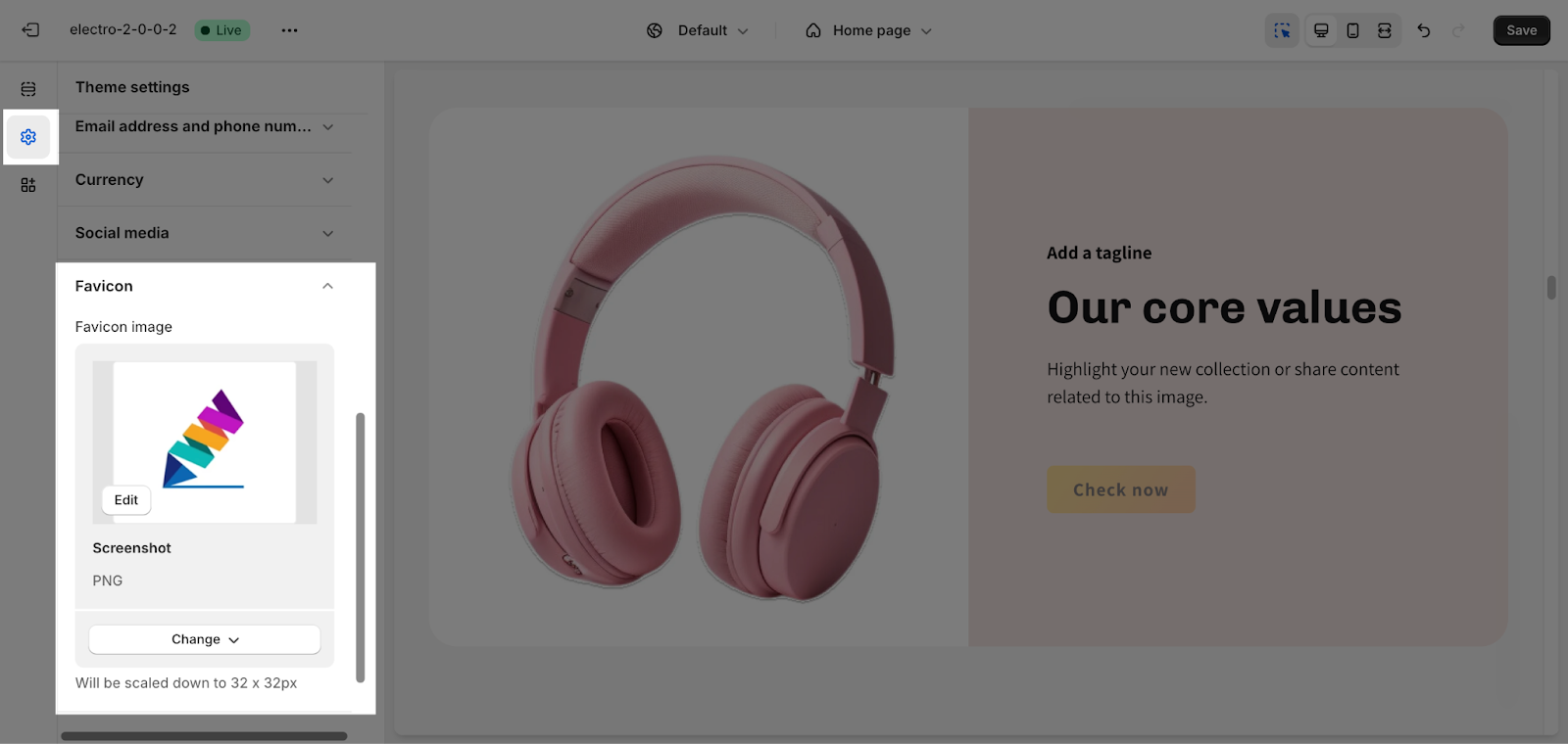
To add a favicon image, click the Select image button. This will open the media manager. You can either drag and drop your logo or select it if it has already been uploaded.
Frequently Asked Questions
1. Do I need any coding experience to use the Electro theme?
No, the Electro theme is designed to be user-friendly and does not require coding knowledge for basic setup and customization.
2. Can I customize the Electro theme to match my brand?
Yes, the Electro theme usually offers a variety of customization options, allowing you to change colors, fonts, logos, and layouts to achieve your desired brand identity.
3. Does the Electro theme have a responsive design?
A responsive design is crucial in today’s web environment. Most Electro themes should be responsive and adjust their layout for optimal viewing on all devices (desktops, tablets, mobiles).
