How to Use Electro Product Template
About Electro Product Template
Electro Product Template has four default sections:
- Product Details: This section includes the product name, description, price, images, and other key information about the product.
- Product Recommendation: This section recommends similar products that the customer might also be interested in.
- Product Sticky Bar: This bar stays at the top of the page as the customer scrolls down, and it can be used to promote a special offer or other important information.
- Details Specifications: This section provides detailed information about the product, such as its dimensions, weight, and materials.
- Product comparison (product page): This section is to compare the main product with other products, highlighting its standout features automatically and dynamically.
These sections cannot be removed from the product template but can be hidden.
Any other sections can be freely added or removed.
Access Electro Product Template Section
To access the Electro Product Template, follow these two simple steps:
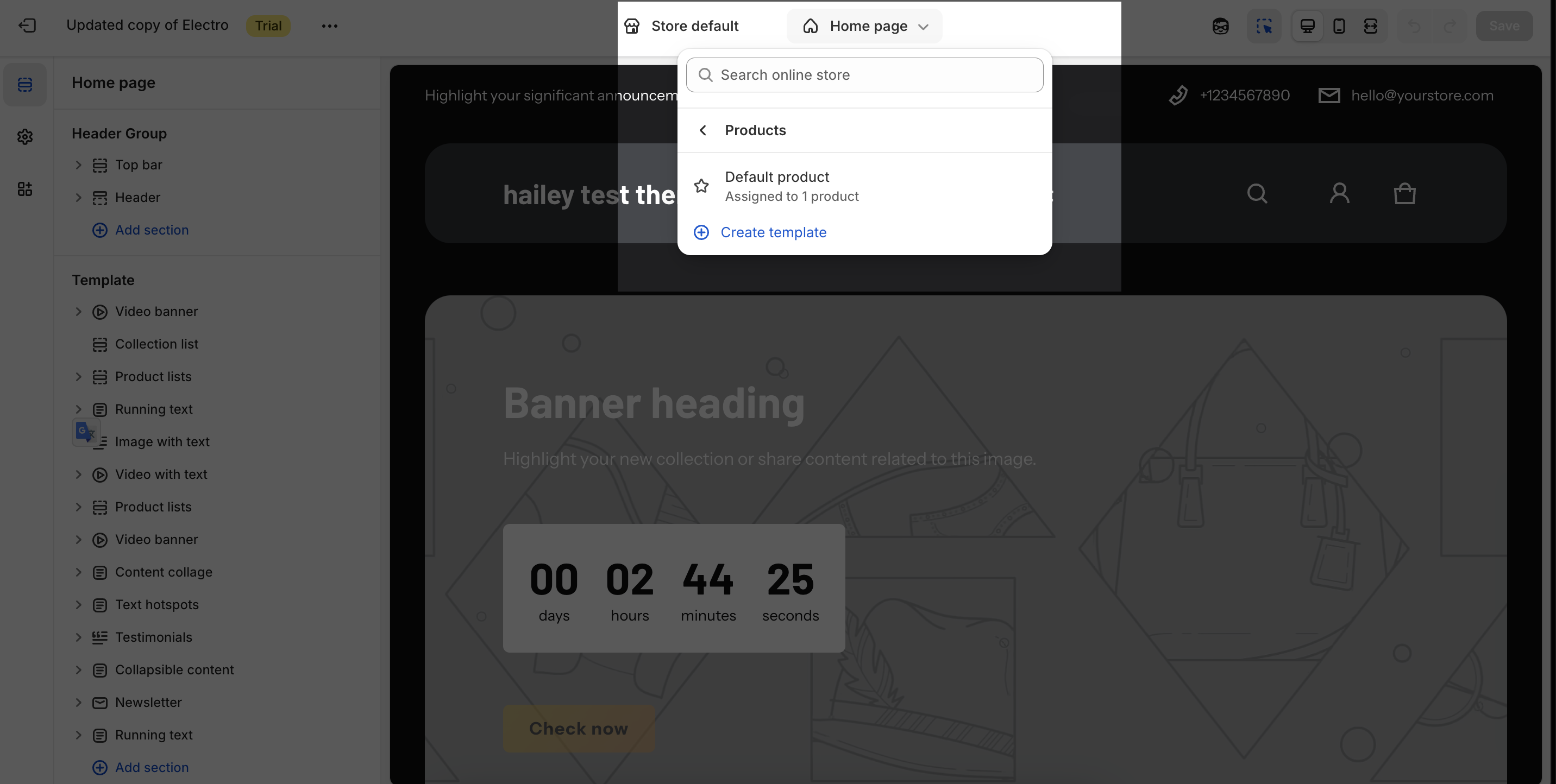
- Step 1: In your Shopify Admin, click on “Online Store”, then under “Themes”, find Electro theme and click the “Edit theme” button.
- Step 2: In the Theme Editor, click the page type dropdown menu and select “Product template”.
Product Details Section Configuration
This section includes the product name, description, price, images, and other key information about the product.
Product details will be added in the Product template as default. Click on the section and you can settings for this section with these options:
General
Under the Color Scheme, you can choose a specific scheme for the Product details section. To modify or add a new color scheme, go to Theme Settings > Color.
Media
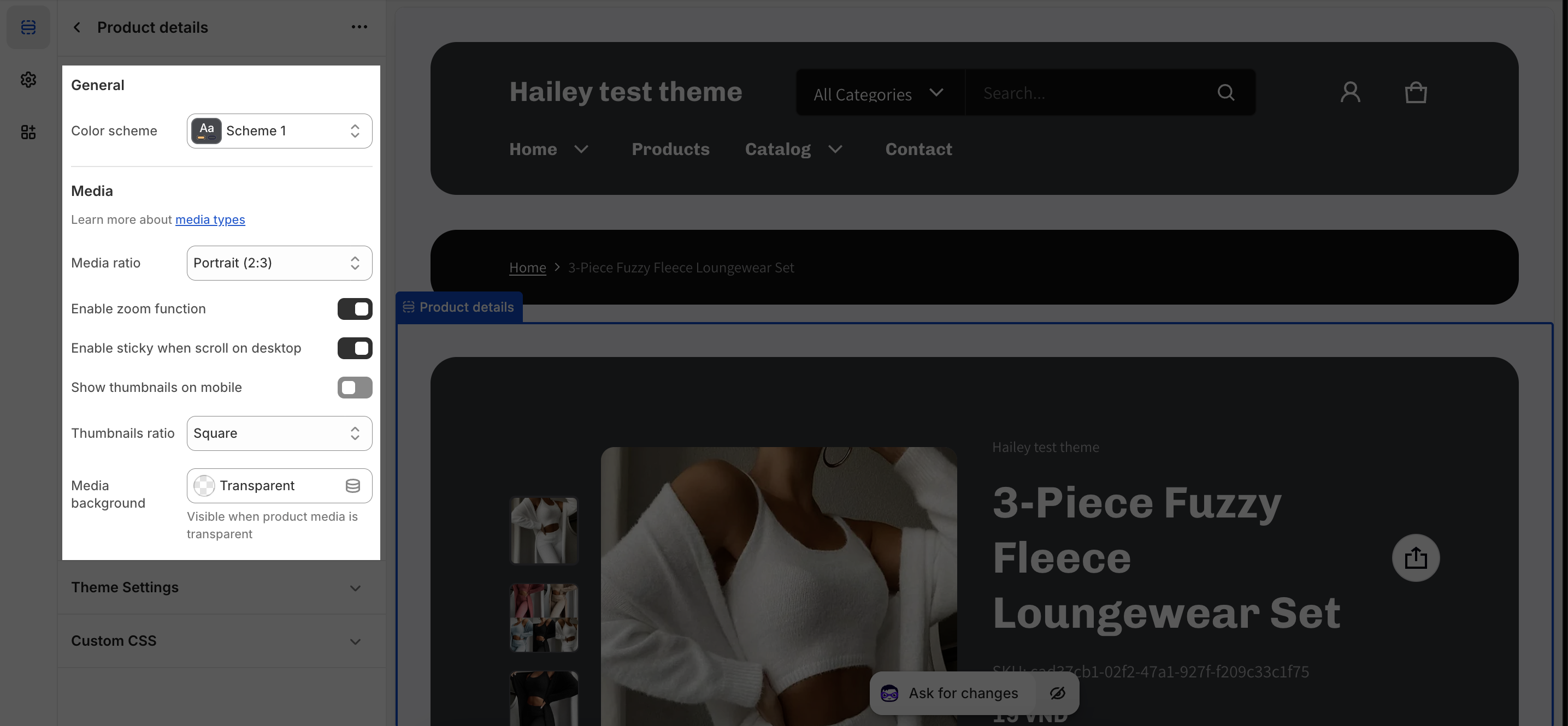
- Media Ratio – Controls the shape of the main product image
- Square: Image appears as a square
- Portrait (2:3): Image taller than wide
- Landscape (3:2): Image wider than tall
- Adapt to image: Keeps the original image shape
- Enable Zoom Function – Lets customers zoom in on product images (toggle on/off)
- Enable Sticky When Scroll on Desktop – Keeps the product image visible while scrolling down on computers (toggle on/off)
- Show Thumbnails on Mobile – Displays smaller preview images on mobile devices (toggle on/off)
- Thumbnails Ratio – Controls how thumbnail images look
- Square: Thumbnails appear square
- Fill/Fit: Adjusts how thumbnails fit in the display area
- Media Background – Sets the background color when product images have transparency
Blocks Configuration
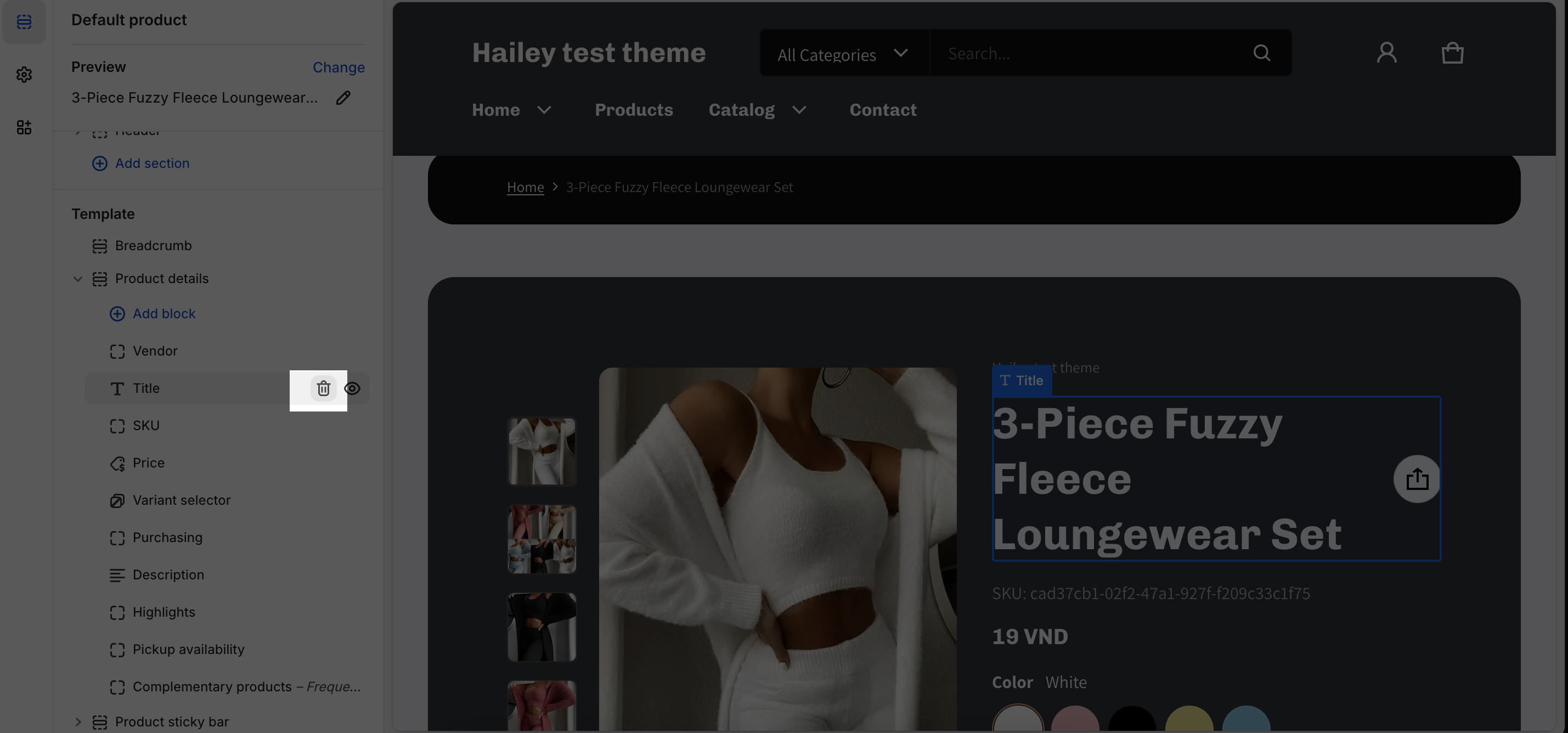
The Product Details section supports 15 blocks that you can use to show all information about your products. These blocks include:
- Title: The title of the product.
- Vendor: The seller of the product.
- SKU: The SKU of the product.
- Price: The price of the product.
- Variants selector: A selector that allows customers to choose different variants of the product, such as different colors or sizes.
- Purchasing: Information about how to purchase the product includes quantity, the Add to cart button, and the Buy now button.
- Description: A description of the product.
- Highlights: Key features of the product.
- Popup content: Custom content that appears in a popup window.
- Custom liquid: Custom code that can be used to add dynamic content to the product page.
- Custom text: Custom text that can be added to the product page.
- Pickup availability: Information about whether the product is available for pickup in-store.
- Complementary products: Products that are complementary to the product being viewed.
- Product Attribute: Display entry values as badges.
- Product specifications: Shows technical details and features about a product
You can remove any block by clicking on the block you want to remove and hitting “Remove block”.
The settings for these blocks are similar to the Feature Product’s blocks settings. You can learn more about how to set up these blocks by checking out the Feature Product documentation.
To customize each item in the Product Details section, simply click on the block you want to edit. You can also add new theme blocks by clicking the “Add block” icon.
The Product Attribute, Popup content, Pickup availability and Complementary products blocks have the following settings:
Product Attribute
This block can display entry values as badges based on the metafield namespace and key you have set up. This feature retrieves entries with the ‘Single line text’ type, including entries associated with Metaobjects.
To display product attributes, you need to config in Theme settings > Product information.
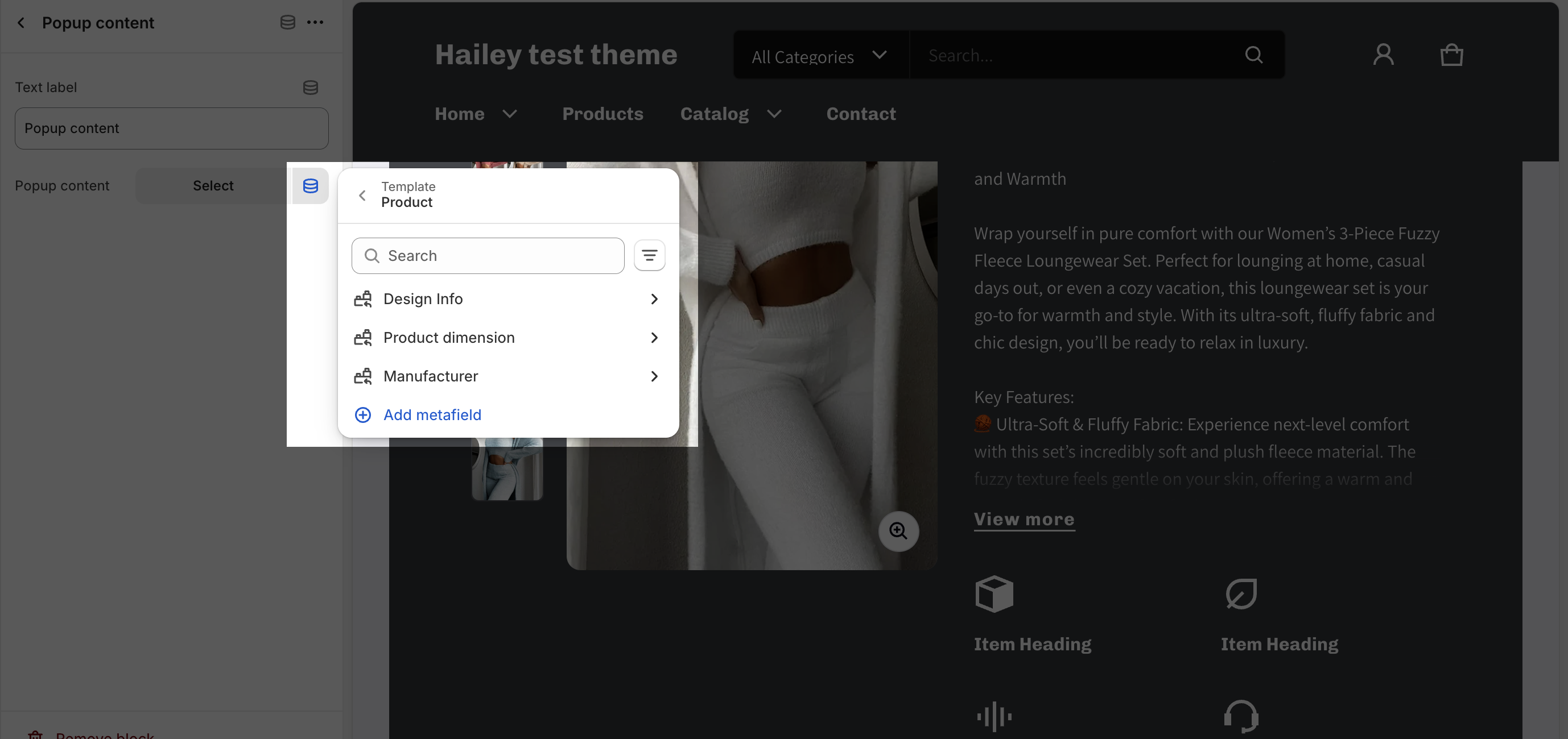
Popup Content
The Popup content section allows you to add a text button to your product page that, when clicked, will open a lightbox with a popup modal that contains the content of a product metafield or a page on your store. This section can be used for a variety of purposes, such as: Providing additional information about the product, promoting related products, generating leads to collect customer emails or other contact information or upselling.
- To change the button text, simply click on the text placeholder and type in your new text.
- To choose a page for the popup content, click on the “Select” button. This will open a modal window where you can select a page from your store.
- To show product metafield for the popup content, click on the icon in the top right corner of the block. This will open a modal window where you can choose a product metafield to display.
Pickup Availability
Pickup availability shows customers which of your physical stores have the selected product variant in stock. By default, the expected pickup time is also shown, but you can disable this option if you don’t want to.
This feature is helpful for customers who want to pick up their order in-store. It allows them to see which stores have the product in stock and how long it will take to pick up their order.
Complementary Products
The Complementary products block allows you to show products that are often bought together. To select these products, you need to use the Search & Discovery app. You can learn more about complementary products here.
Important: This section only displays products that have at least one item in stock.
In this block, you can:
- Set a heading for the complementary products.
- Adjust the number of products to show, from 1 to 10.
Product Recommendation Section Configuration
The Product recommendations section in the Electro theme displays a list of products that are similar to the product that the customer is viewing. The recommendations are based on the product information and orders, and they can be customized using the Search & Discovery app.
To learn more about product recommendations and related products, you can visit the following Shopify help article.
The Product recommendations section in the Electro theme includes two settings:
General
In the General settings:
- Color scheme: Select from available schemes set up in Theme Settings > Color.
- Heading:
- Enter custom content in the Heading box
- Insert dynamic sources to replace the Product Recommendation section heading
- Choose the Heading size from H2, H3, H4, or H5
Layout
The Layout settings for the Product Recommendation section allow you to control the following:
- Number of items to show: By default, the section will show 4 items. You can change this number from 1 to 10.
- Items per row on large screen: Select the number of products to display on large screen devices. Options are 3, 4, 5, or 6 items.
- Items per row on mobile: By default, the section will show 2 items per row on mobile devices. You can change this to 1 or 2 items per row.
- Enable carousel: This option will show the product list as a carousel instead of rows.
- Show progress indicator: This option will show a scroll bar at the bottom of the carousel.
- Content alignment: This option controls the alignment of the product images in the section. You can choose between “Left” and “Center.”
Product Sticky Bar
The Product sticky bar in the Electro theme is a section that appears at the top of the product page after the customer scrolls down. It typically contains information about the product, such as the product name and price. The sticky bar can be customized to include other information, such as product menu items, add to cart button, or dynamic checkout button.

The sticky bar only starts working after the customer scrolls past its position. This means that the sticky bar will not appear at the top of the page when the customer first opens the product page. Instead, it will appear when the customer scrolls over the sticky bar section.
This feature can be helpful for keeping important information about the product visible to customers as they scroll down the page. It can also be used to promote related products or encourage customers to add the product to their cart.
The Product sticky bar section in the Electro theme includes 3 settings:
General
You can choose a color scheme that best suits your brand and product pages. To adjust the color scheme, navigate to Theme Settings > Color.
Menu
The Sticky menu is a feature that allows customers to scroll to specific sections of your website by clicking on menu items. You can also choose to show or hide product menu items in the sticky menu.
Turn ON: Use for complex/long product pages with multiple sections (reviews, specs, FAQs) so customers can quickly navigate to specific areas via the sticky menu.
Turn OFF: Use for simple/short product pages where you want a clean, minimal sticky bar focused only on the Add to Cart button to drive faster purchases.
Purchasing
The Electro theme supports a Sticky Purchasing Bar.
For the purchasing button on the sticky bar, you can choose between:
- Add to Cart Button: This button adds the product to the customer’s cart.
- Dynamic Checkout Button: This button takes the customer directly to the checkout page.
Product Menu Items
When the Show product menu items option is turned on, you can customize the settings for each menu item that will appear on the Sticky bar section.
Each menu item is a text button that can be used to redirect visitors to any section on the page. To set up a menu item, follow these steps:
- Click on the menu item.
- Copy the section ID that you want visitors to scroll to. You can turn on the Section ID in Theme settings > Appearance
- Paste the ID in the Target section ID placeholder.

Once you have set up the menu item, it will appear on the Sticky bar section. When customers click on the menu item, they will be redirected to the section that you specified.
Details Specifications Section Configuration
The Electro Shopify theme has a built-in feature that allows you to add product details specifications to your products. This can be helpful for providing customers with more information about your products, such as dimensions, weight, materials, and other specifications.
To learn more about this section, please check out this article.
Product comparison (Product page)
In the Electro Product template, you can compare products sourced from the Related Products feature of the Search & Discovery app. This functionality allows products to be dynamically and automatically added to the Main product comparison. The purpose is to compare the main product with other products, highlighting its standout features. This comparison aims to increase conversions for the main product rather than the compared products.
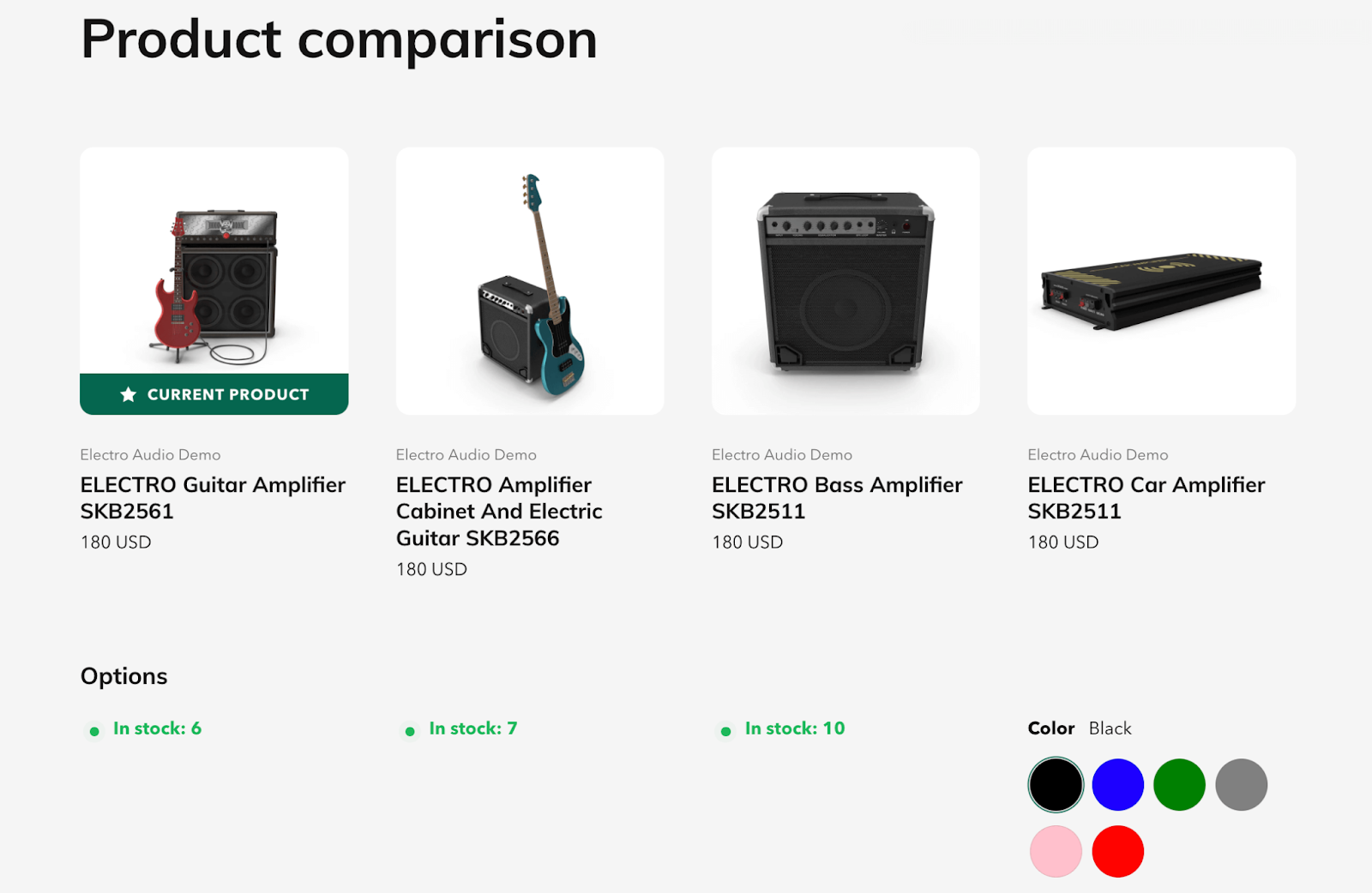
The settings for this feature are linked to the Product Comparison section settings.
Frequently Asked Questions
Overview
| How many sections could I add to the Electro Product Template? | 25 |
| Can I remove Breadcrumb from Electro Product Template? | Yes |
| Can I add collections to Electro Product Template? | Yes |
| Can I use the same Product Template for all products? | Yes |
1. What is the Product Template?
Electro Product Template is the default template page to display all products available on your store. By this way, you could create a consistent vibe to visitors, also to save time, as you wouldn’t have to check 1 by 1 to make sure that all your product pages are well optimized.
2. What is the difference between Electro Product Template and Page Template?
The Electro Product Template is used to display products, and the page template is here to different types of contents, for example: About Us, Contact Us, Collection Page…
3. Can I remove Product Details from Electro Product Template?
No, for the Product Details, Product Recommendation, Product Sticky Bar and Details Specifications, you can only hide it, but not remove it as they are parts of the basic product template!