How to Use Electro Product List
About Electro Product List Section
The Electro Product List Section is a list that displays products from multiple selected collections. You can use this section to boost sales by displaying products from multiple collections in a visually appealing way.
Access Electro Product List Section
To access the Electro Product List section, follow these two simple steps:
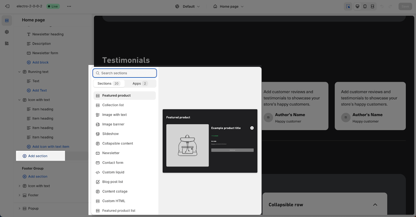
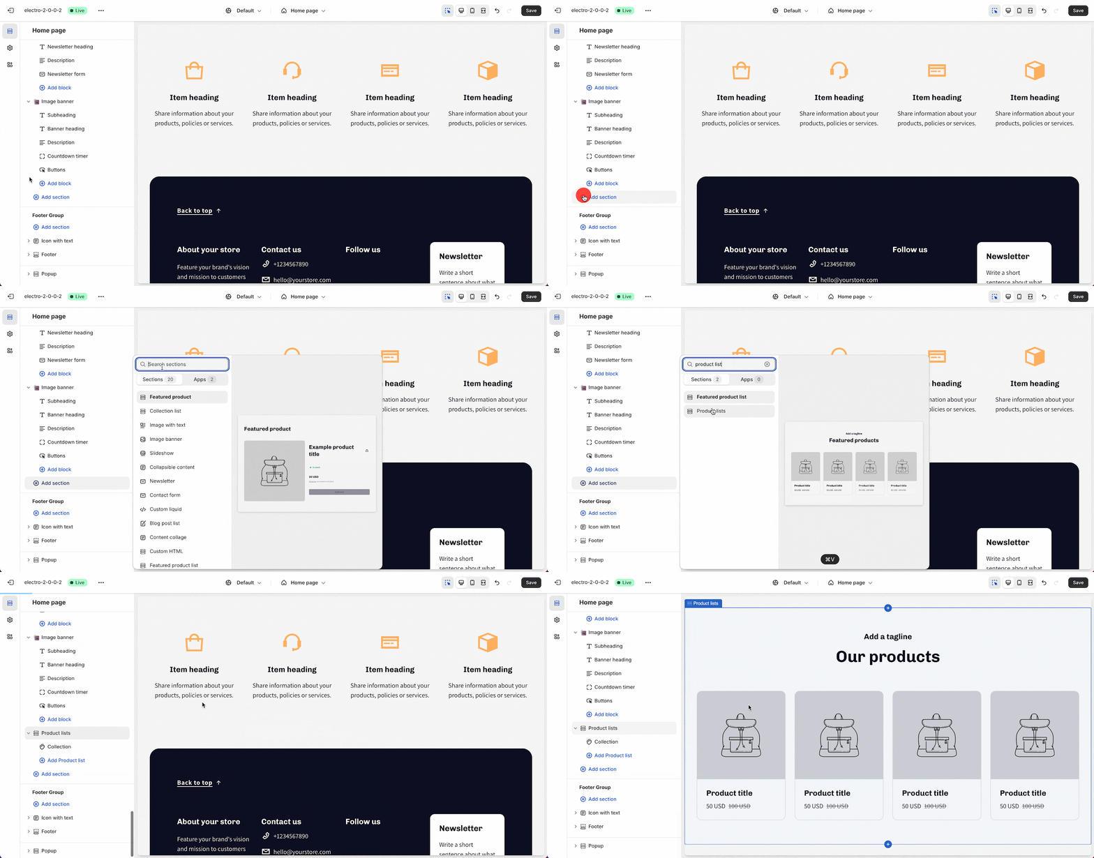
- Step 1: Access any page in Theme Editor, click the “Add section” button.
- Step 2: Search for “product list” in the search field > click on the section to add it.
Product List Section Configuration
The Product list section has 3 cards that you can configure: Text, Layout and Button.
Text
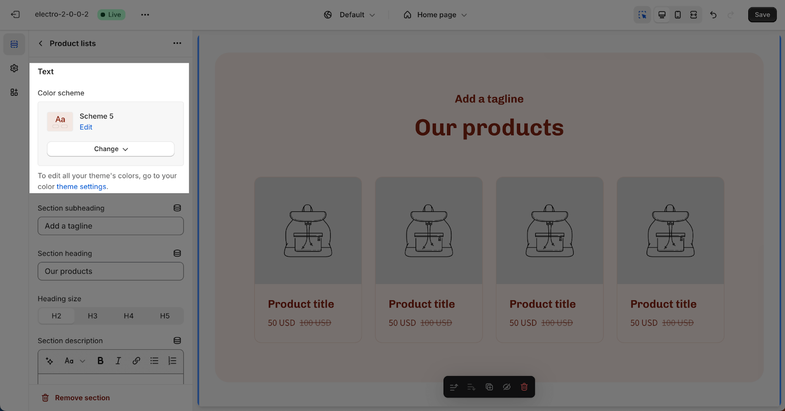
In the Text card, you can select the Color scheme for the section. This scheme will apply to the section background, text color, and button color. You can edit or manage Color schemes in Theme settings > Color.
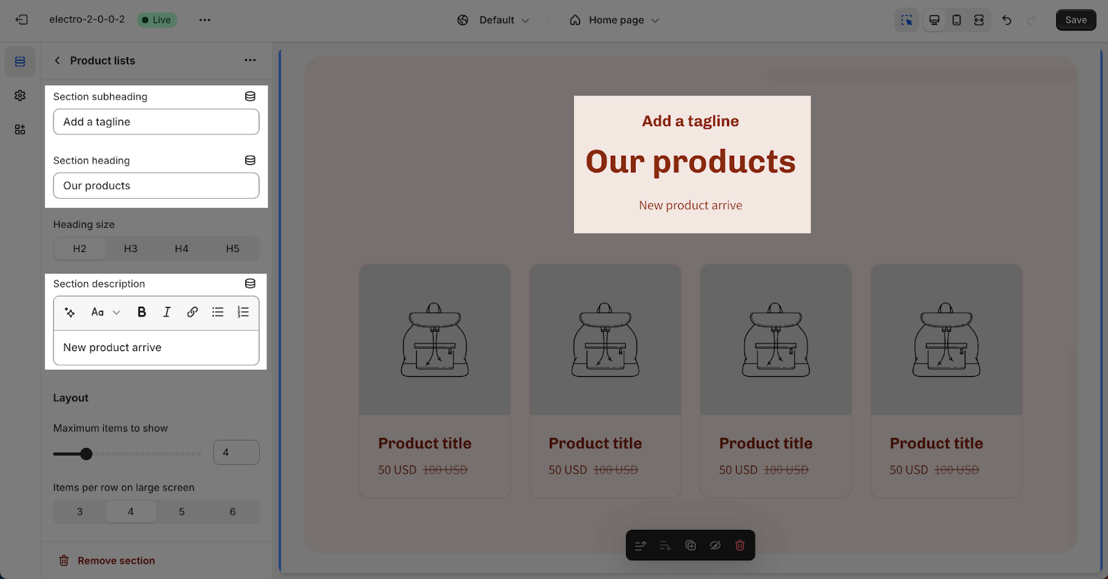
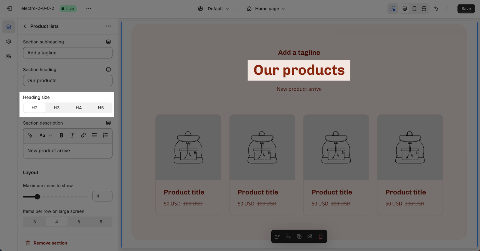
The Electro theme allows you to add three different types of content to this section independently: subheading, heading, and description. To change or delete text content, click on the placeholder.
To remove text from the section, simply leave the placeholder blank.
For the Heading, you can choose from sizes H2, H3, H4, or H5. These sizes are based on the Base text size set in Theme settings > Typography.
Layout
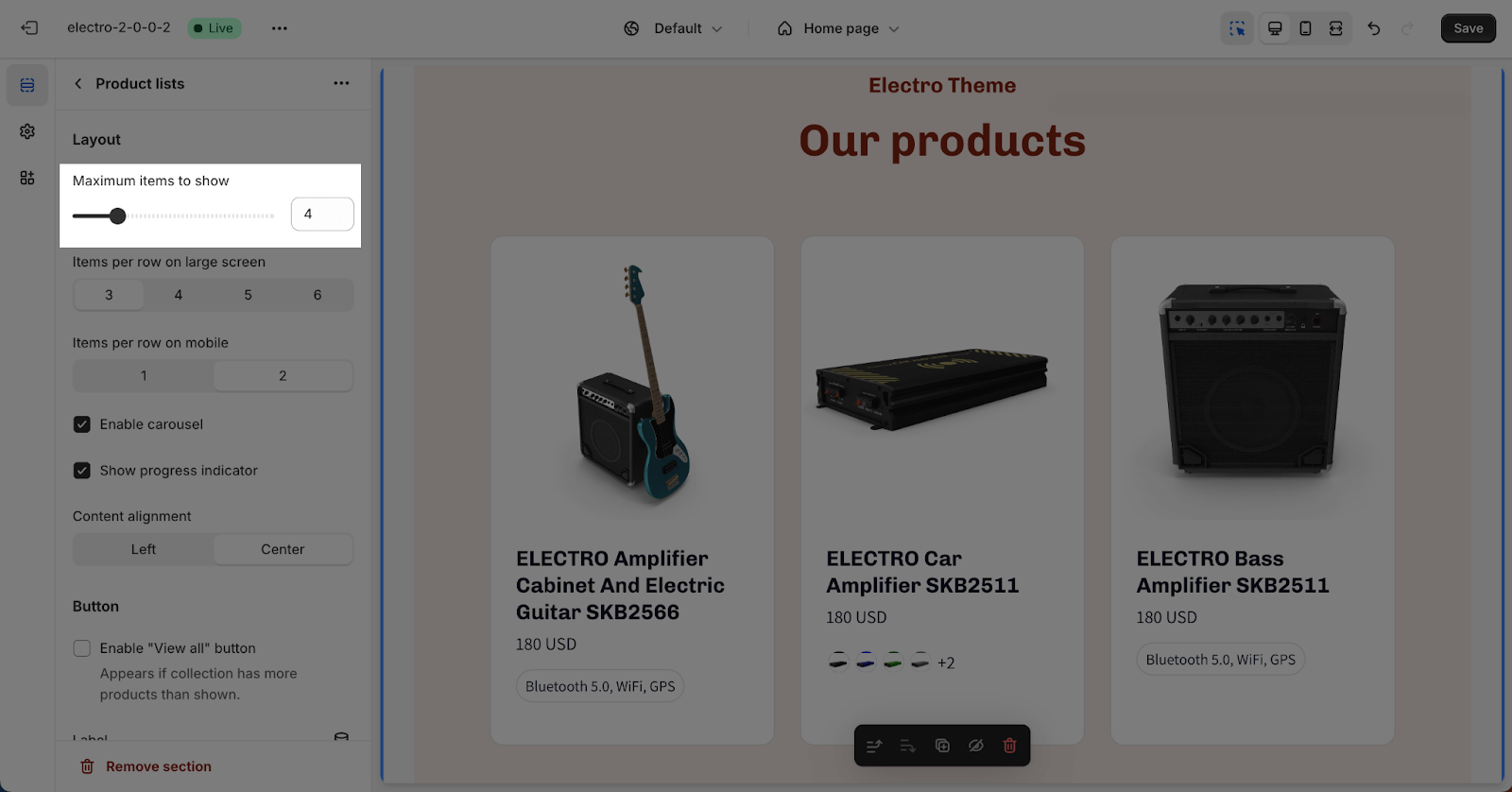
In the Layout card, you can set the ‘Maximum items to show’ in the product list. The default number of product items displayed is 4. You can adjust this number from 2 to 12 in increments of 2.
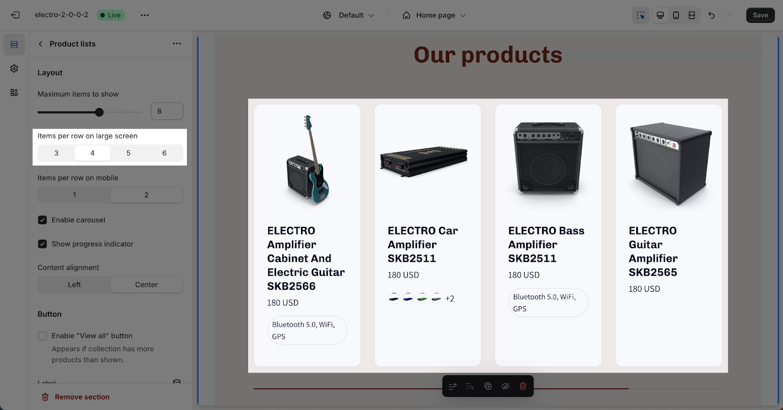
The ‘Items per row on large screen’ option determines how many items appear in a row on large screen devices (like desktops and laptops). You can choose 3, 4, 5, or 6 items to optimize the page’s conversion rate.
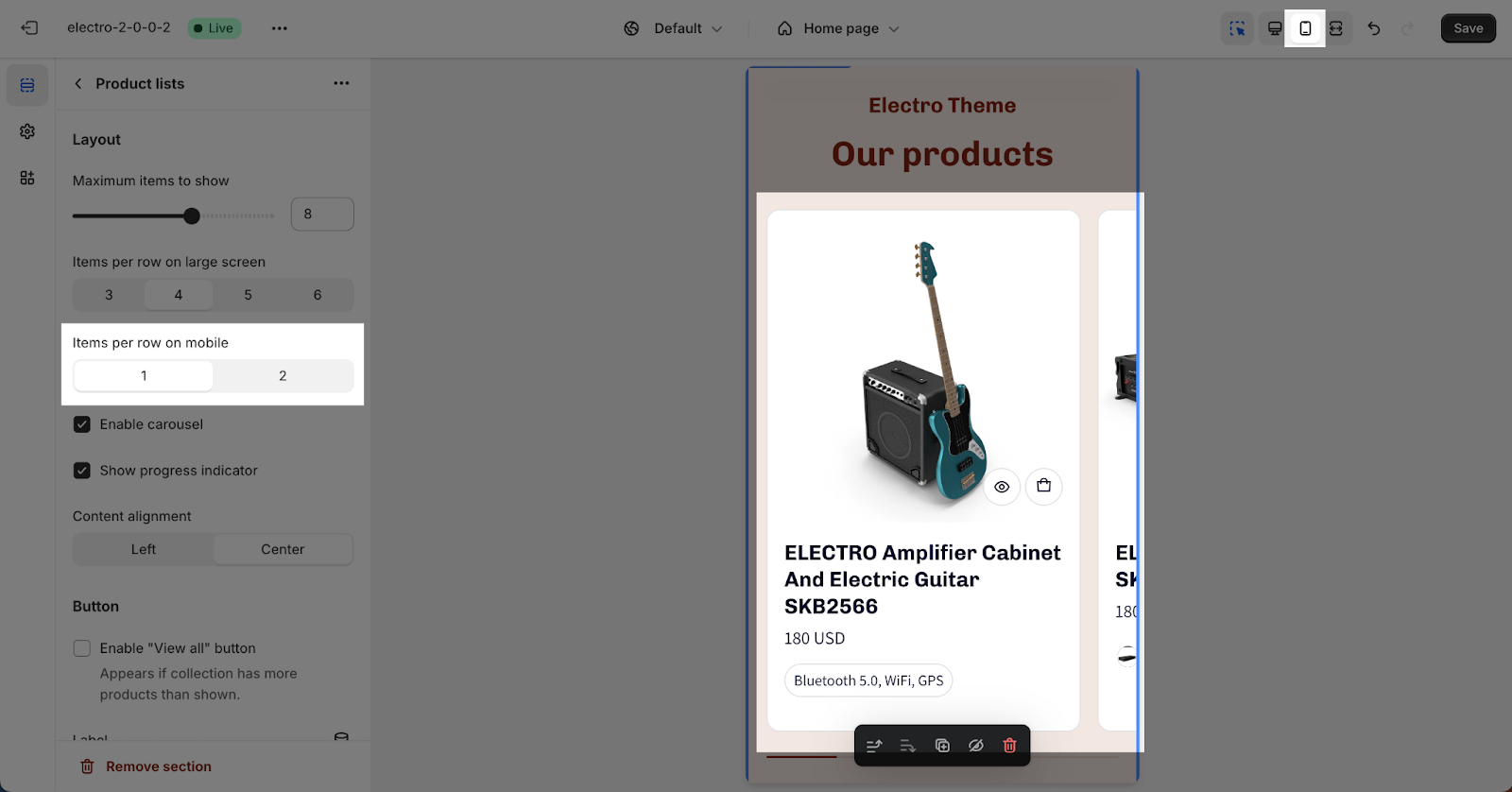
For mobile devices, you can select either 1 or 2 items per row. This number is optimized for mobile screen layouts.
Additionally, you have two display options for the item list:
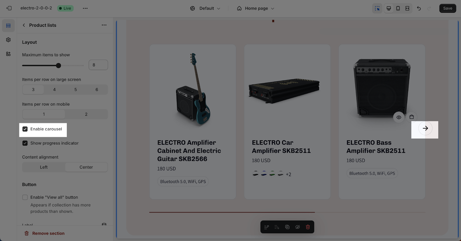
- Enable carousel: This displays the product list as a slideshow, showing the selected number of items per slide based on screen size.
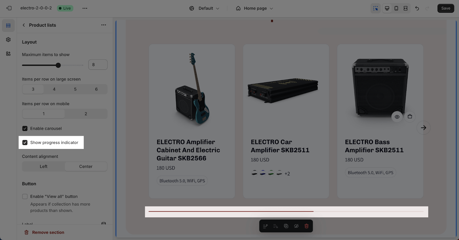
- Show progress indicator: This adds a progress bar at the bottom of the product list.
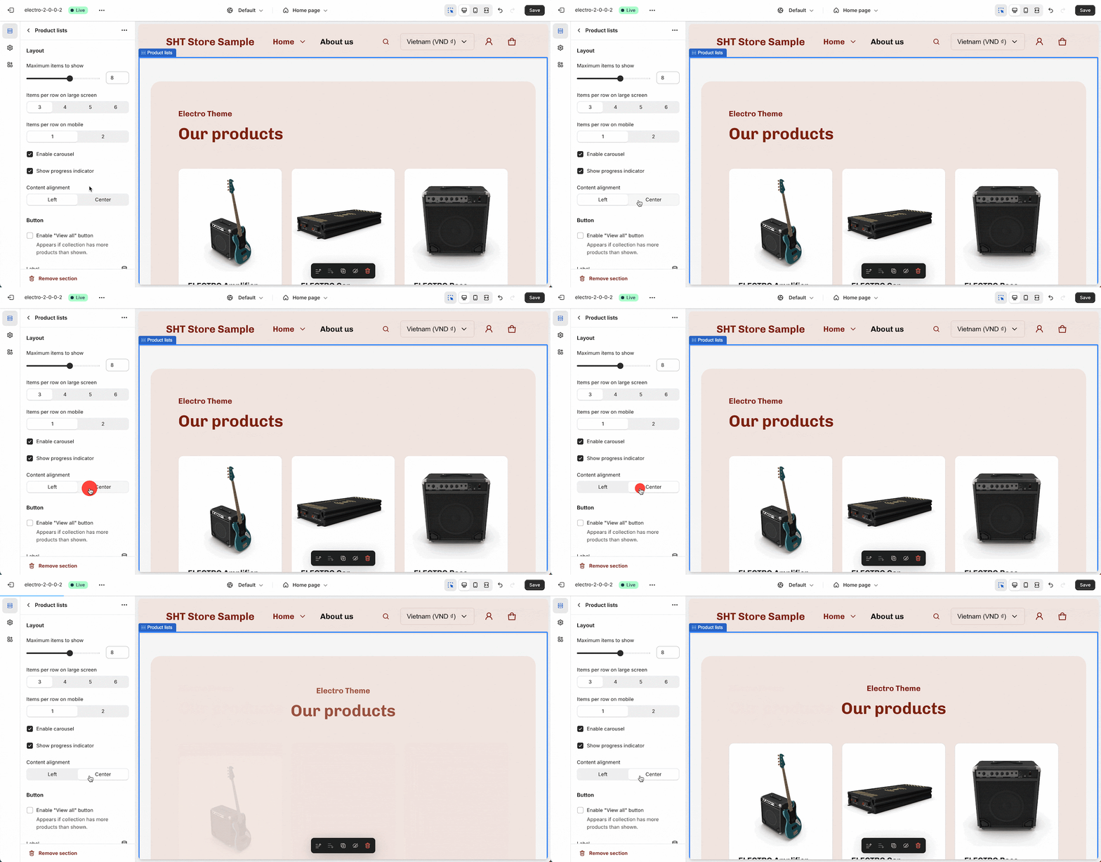
You can also choose the content alignment:
- Left: Text content aligns to the left side of the section.
- Center: Text content centers within the section.
The selected alignment applies to all text content within the section’s width.
Button
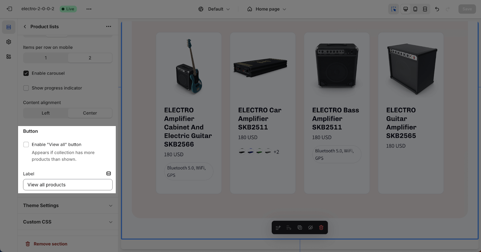
In this section, you can choose to show a “View all” button if the collection has more products than are being displayed. You can also customize the text for the button label.
Product List Items Configuration
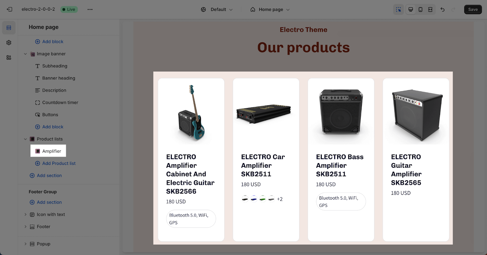
The Product list item is a component within the Electro Product list section.
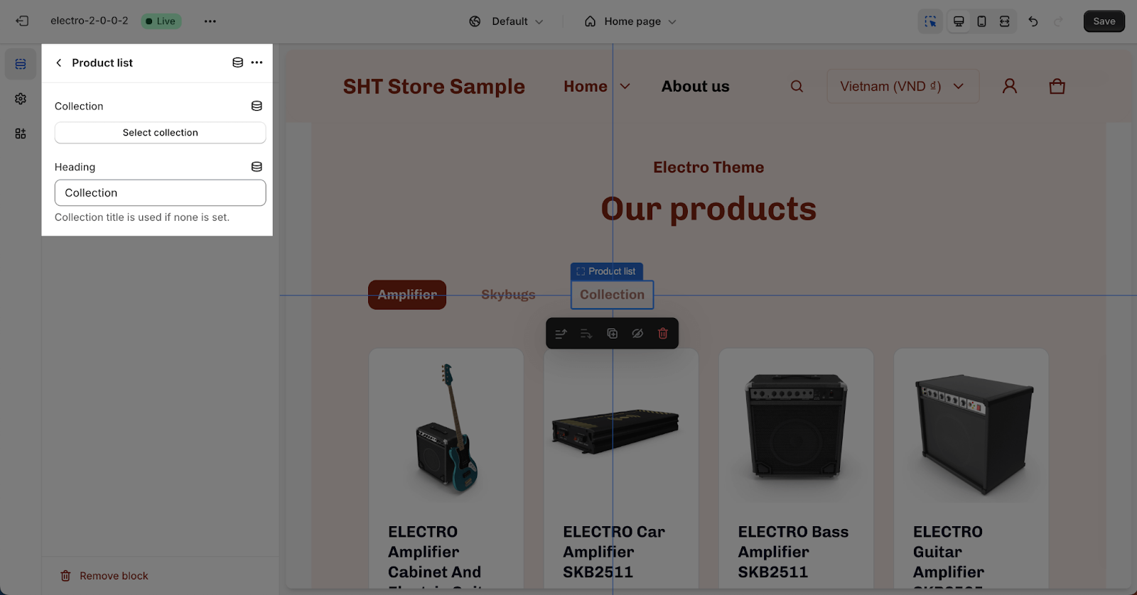
Product list items allow you to select collections to display in the Product list section.
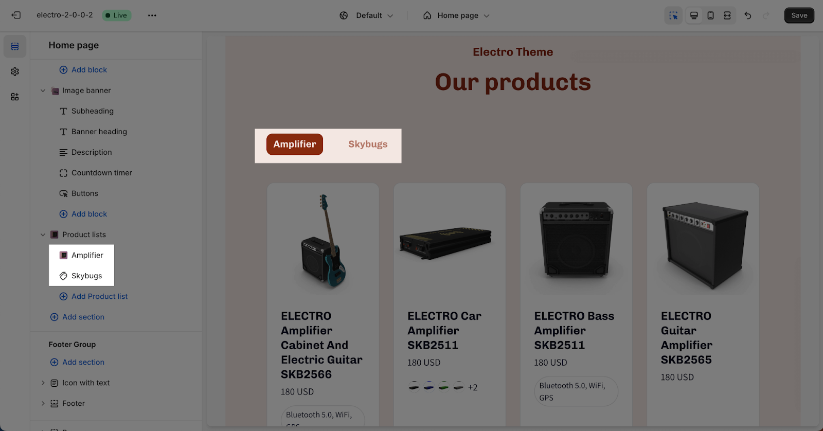
When you add more than one item, each item appears as a tab. The heading of each item serves as the tab header.
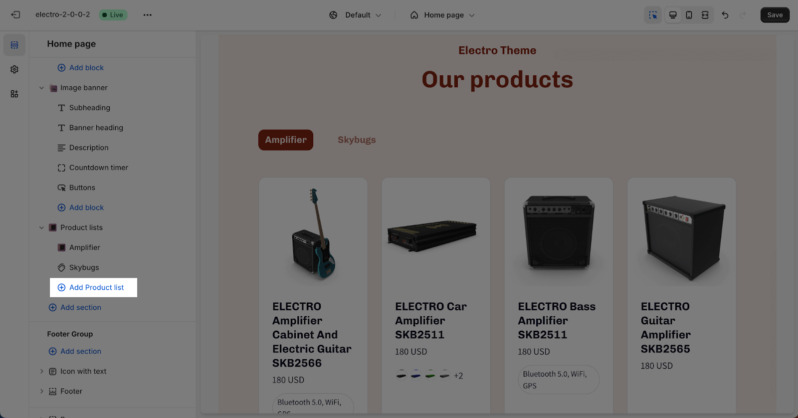
You can add up to 6 items to the section. Click the “Add Product list” button to add more items.
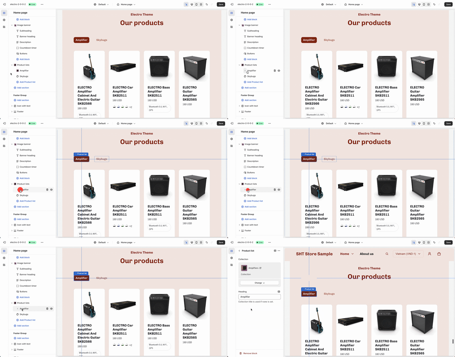
To set up an item, click on it.
To display collections, click the Select collection button and add a heading for them. If no heading is set, the collection title will be used automatically.
Frequently Asked Questions
1. Can I create a carousel effect for the product list?
Yes, you can enable a carousel display option in the Layout card.
2. How do I show multiple product lists in the Product List section?
To display multiple product lists, simply click the “Add product list” button to add more items to the Product List section. You can then set up each new list individually.
