How to Use Electro Popup Section
About Electro Popup Section
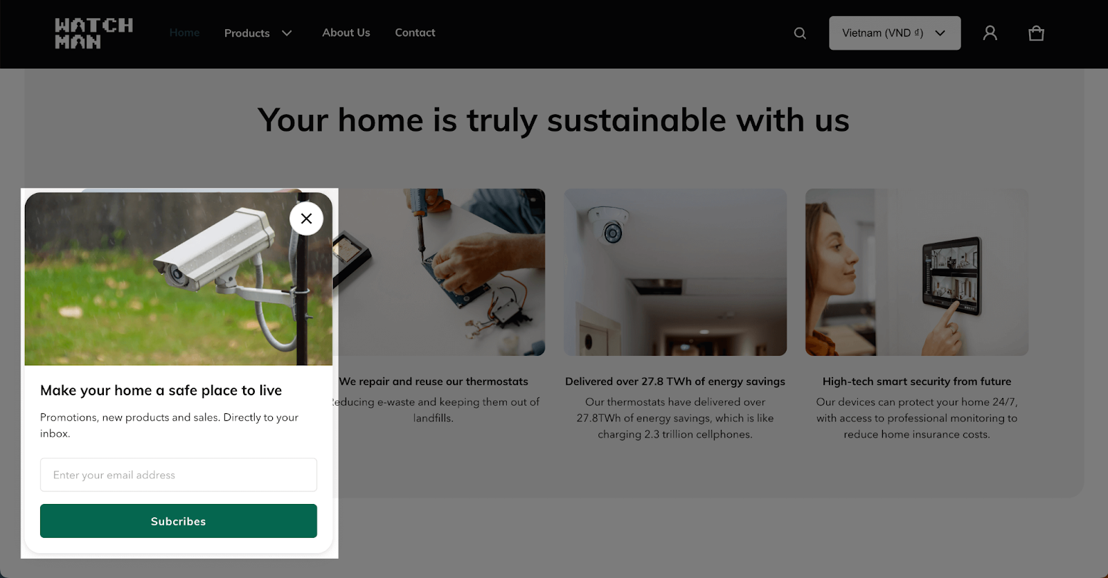
A popup is a small, overlay window that appears on top of your store’s main content. It’s a tool for delivering targeted messages, promotions, or notifications, and collecting customer information.
This guide will show you how to set up the popup in the Electro theme.
How To Access Electro Popup Section
- Step 1: Go to Online Store > Themes > click on Customize
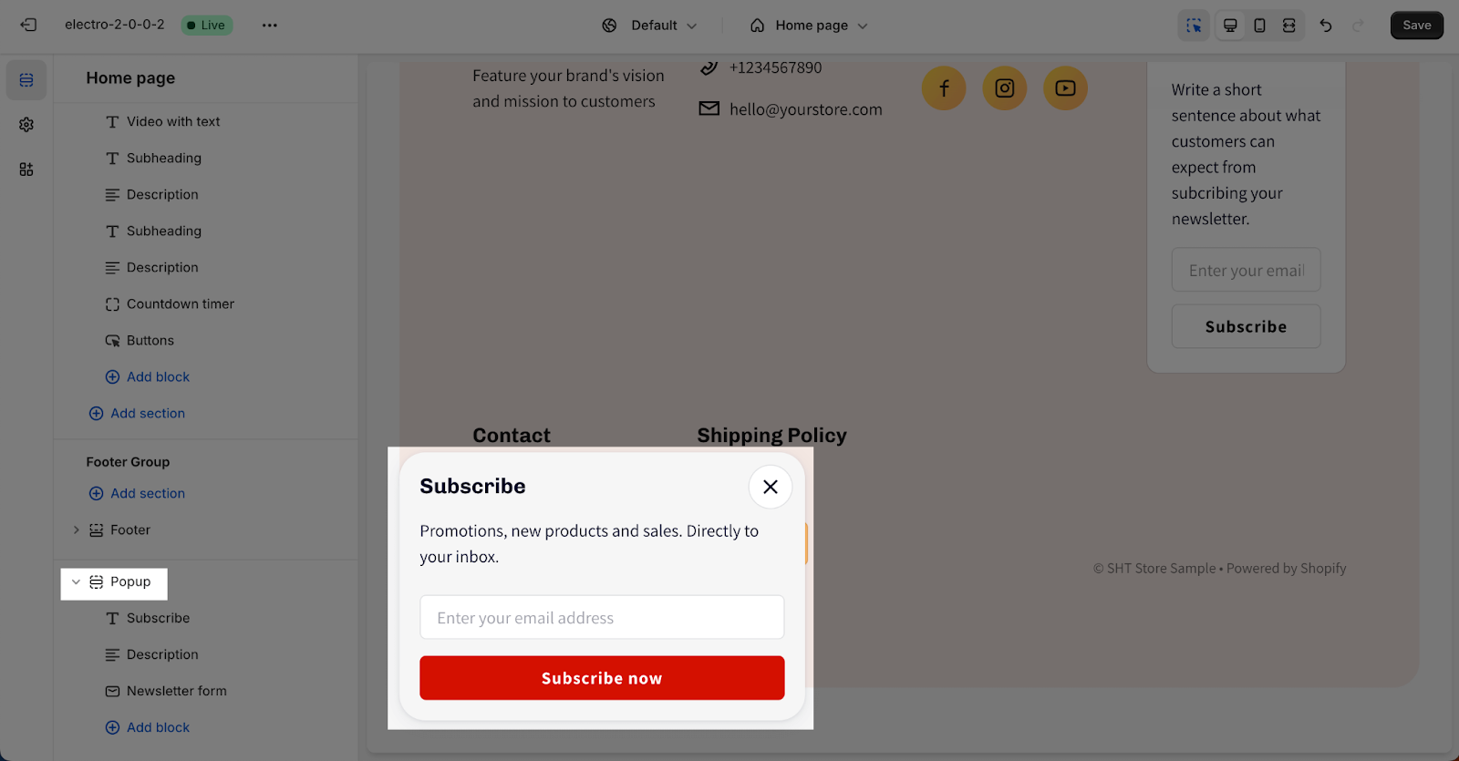
- Step 2: Scroll down to the bottom of the homepage to find the Popup section.
How To Configure Electro Popup Section
Clicking on the Popup section opens customization options:
General
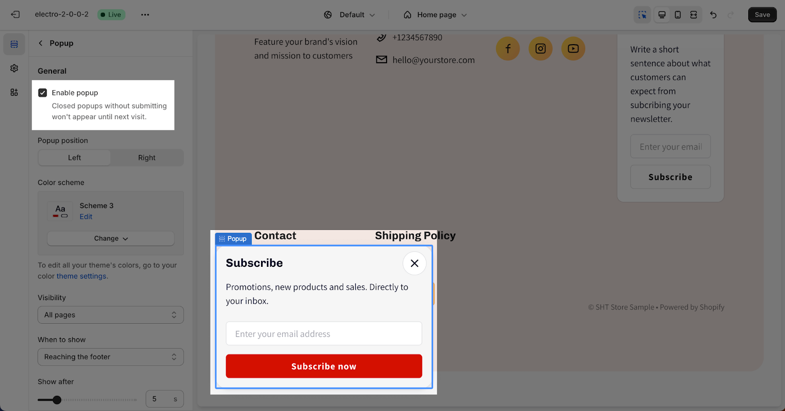
Most importantly, Electro theme lets you enable or disable popup on your Shopify store.
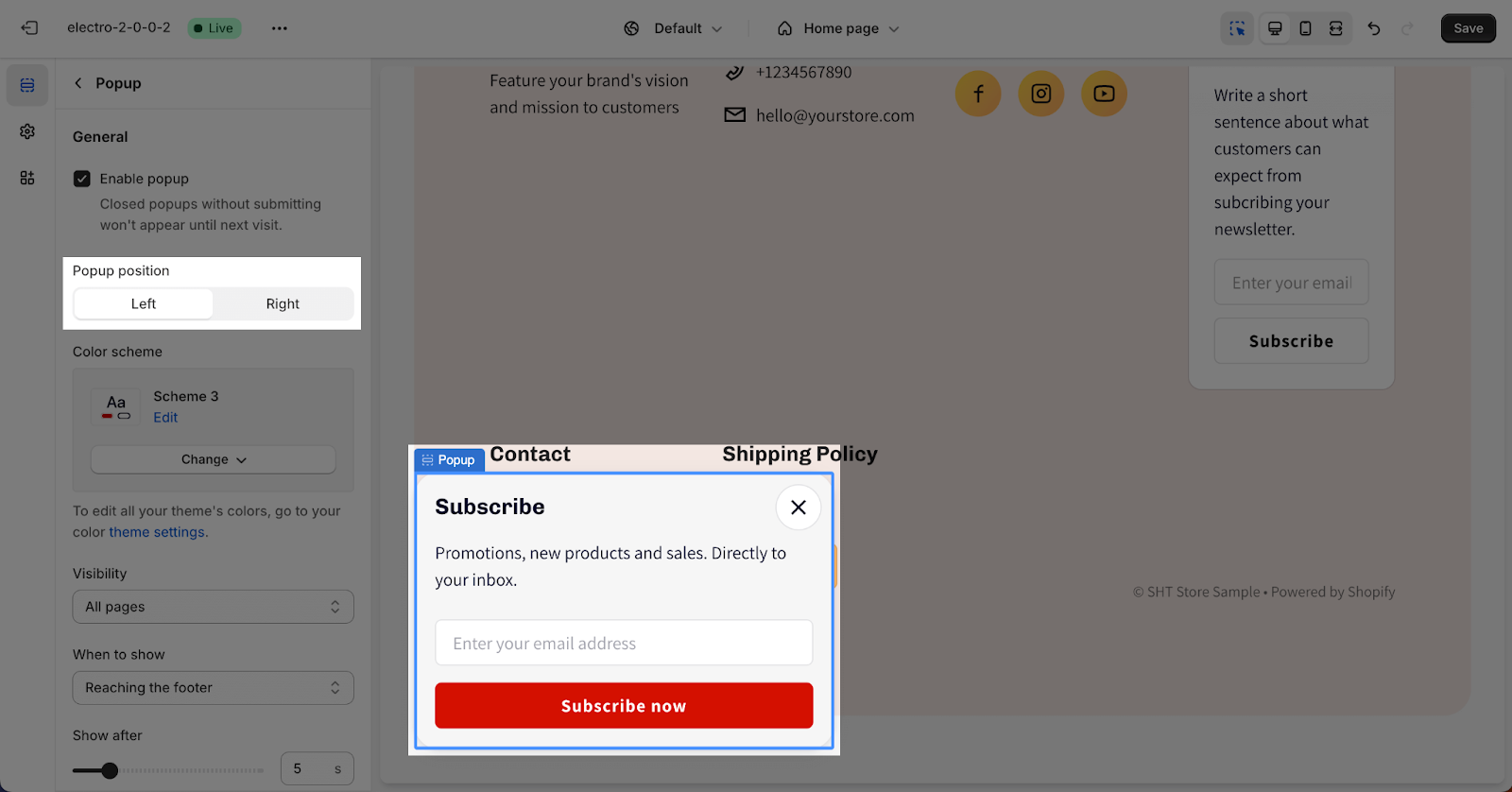
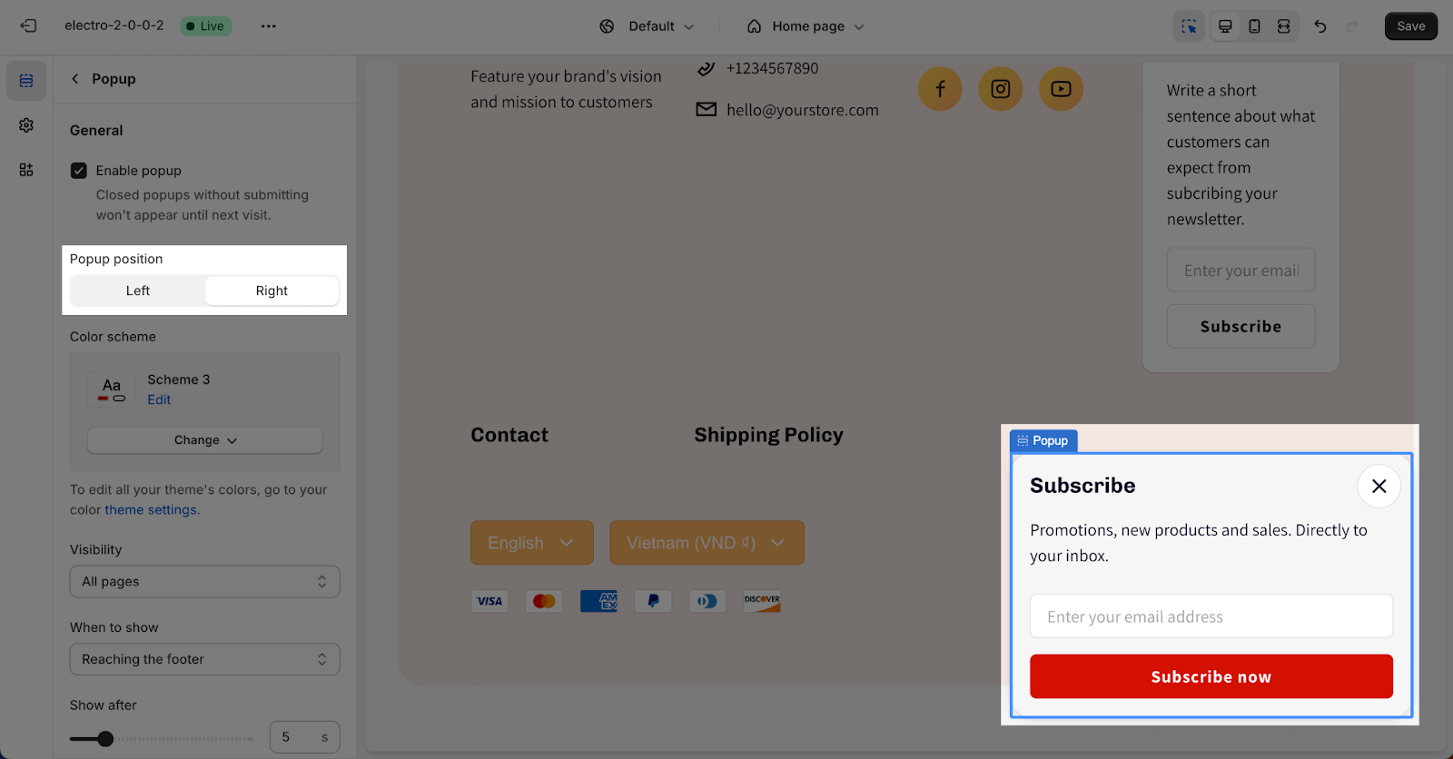
Next, you can set up the Popup position. There are 2 options:
- Left:
- Right
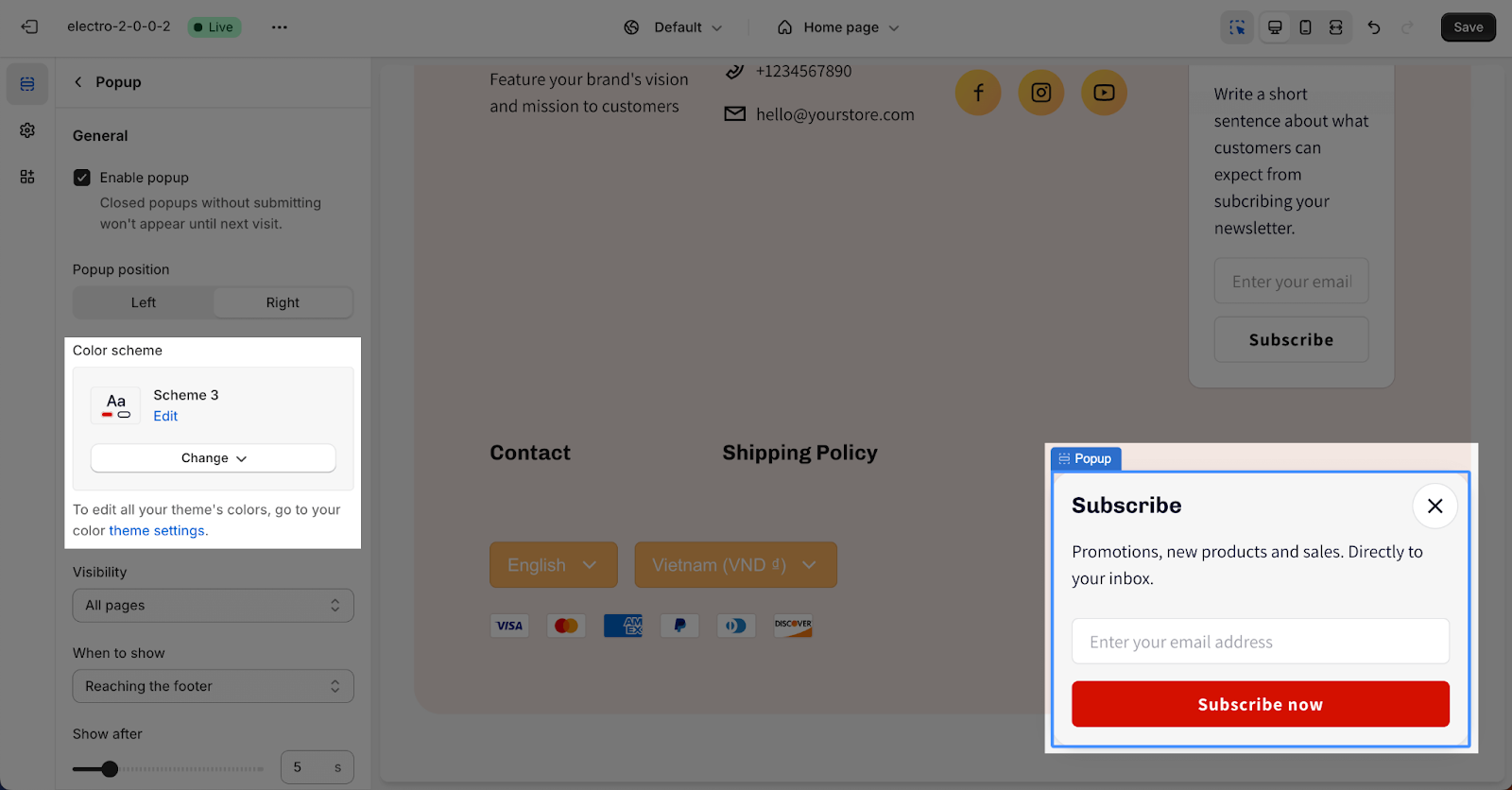
You can select the Color scheme for the Popup section by clicking on the dropdown menu. The scheme will apply for the background, text and button color. These schemes can be edited and created in the Theme settings > Colors.
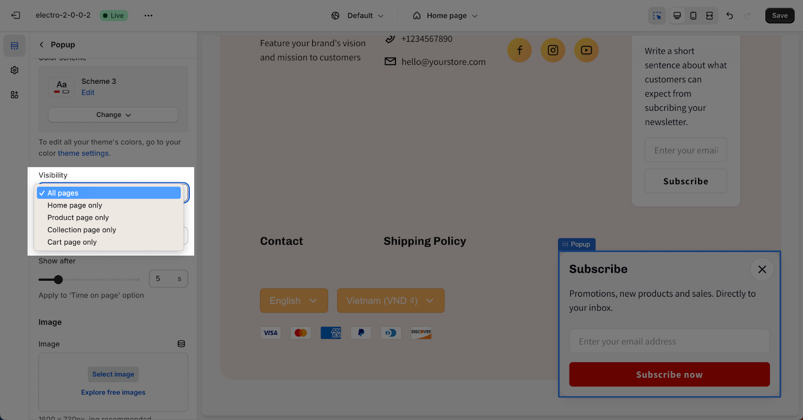
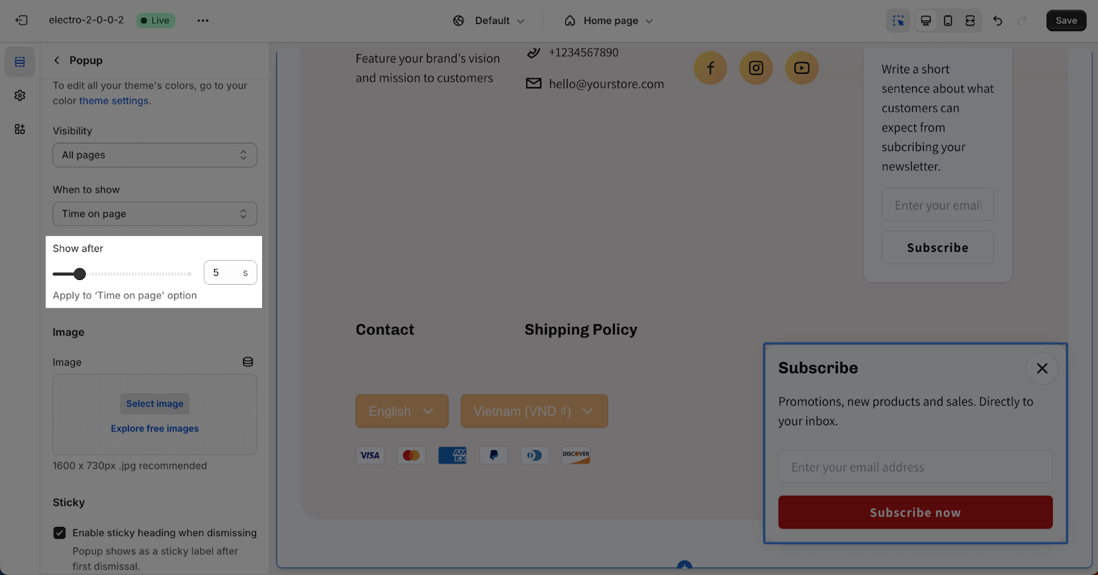
Under the Visibility downdrop, you can choose the page where you want the popup to show. There are 5 options:
- All pages
- Homepage only
- Product page only
- Collection page only
- Cart page only
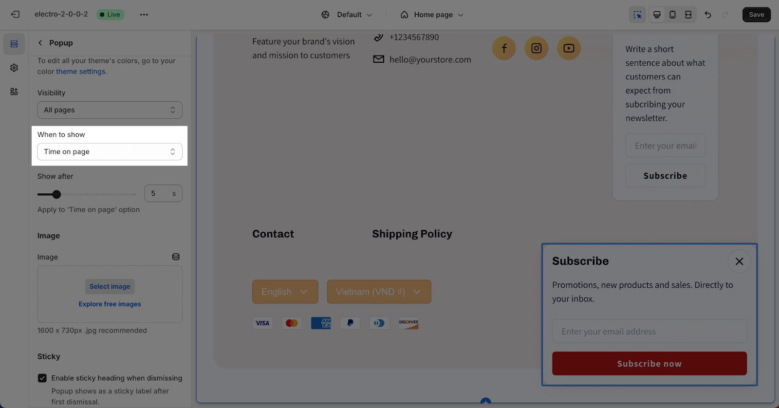
Along with the visibility options, there are 3 options to select for the popup to show here:
- Reaching the footer: when scrolling down to the bottom section of a page where the footer is located.
- Time on page: when customers stay on the page for a number of seconds.
- After closing cart notification: refers to a notification or message that appears to customers after they have closed or exited the shopping cart.
If you choose the “Time on page” option, you can choose the number of seconds that the popup will show in the “Show after” parameter.
Image
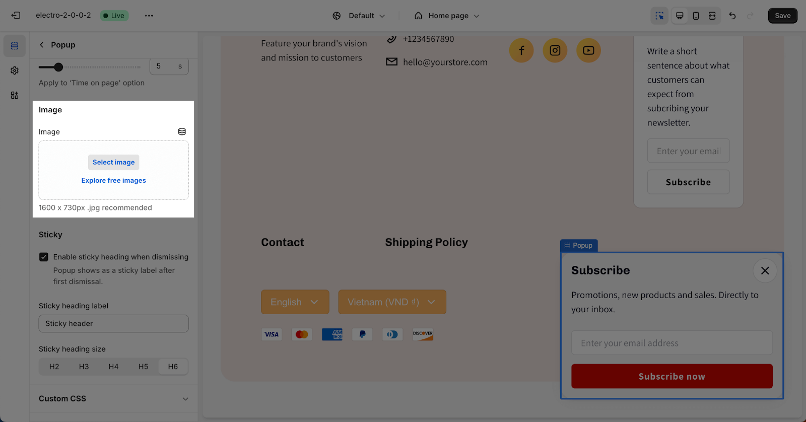
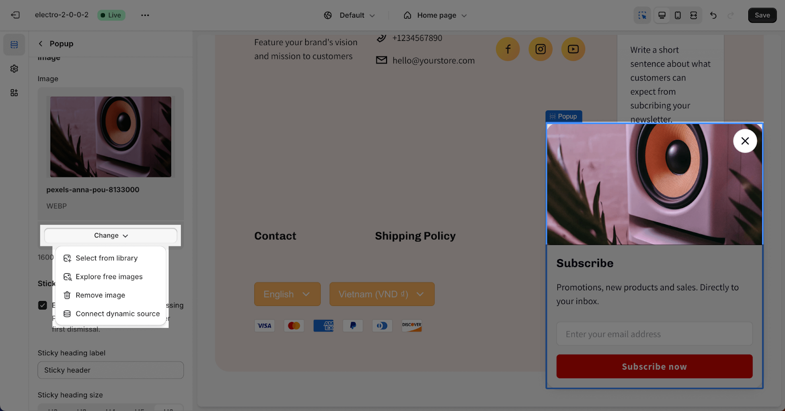
In order to include a background image, simply click on the “Select image” button. This will open the media manager, where you can drag and drop your image, or choose an existing image on the media manager. It is recommended to use a .jpg file with dimensions of 1600px x 730px.
Then, you can simply click on the Change button to reselect the image, remove image or even contact dynamic source.
Sticky
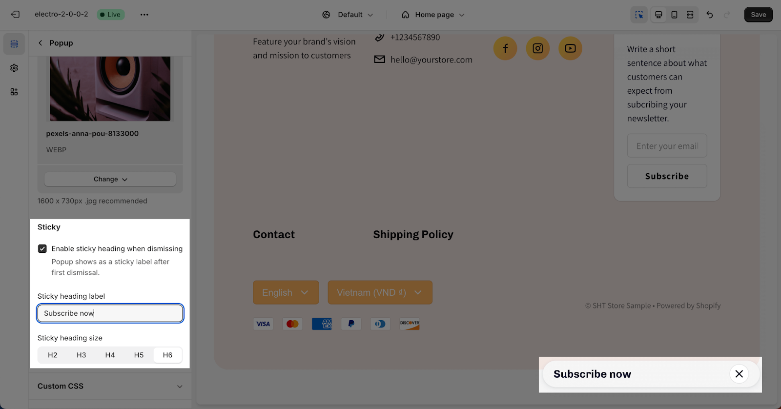
Here, you have the option to enable the sticky popup when dismissing it. Please keep in mind that once dismissed for the first time, the popup will be displayed as a sticky label.
After that, you can enter the Sticky heading on the field. If you want to remove the heading Text, simply remove the content in the text box.
You can also choose the heading size from H2, H3, H3, H4, H5 and H6. These sizes will be based on the Base text size that has been set up in the Theme settings > Typography.
How To Configure Popup Section Block
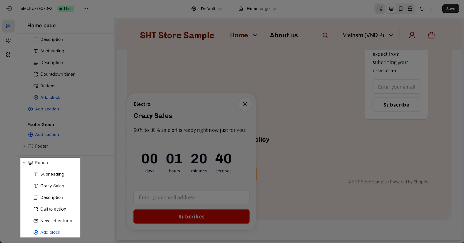
There are 5 types of blocks that you can add to this section: Subheading, Heading, Description, Newsletter form and Call to action. Click on the “Add block” button to add a block onto the section.
- Subheading, Heading and Description block can be added multiple times
- Newsletter form and Call to action block can only be added once per section
To customize for a block, click on the block that you want to edit.
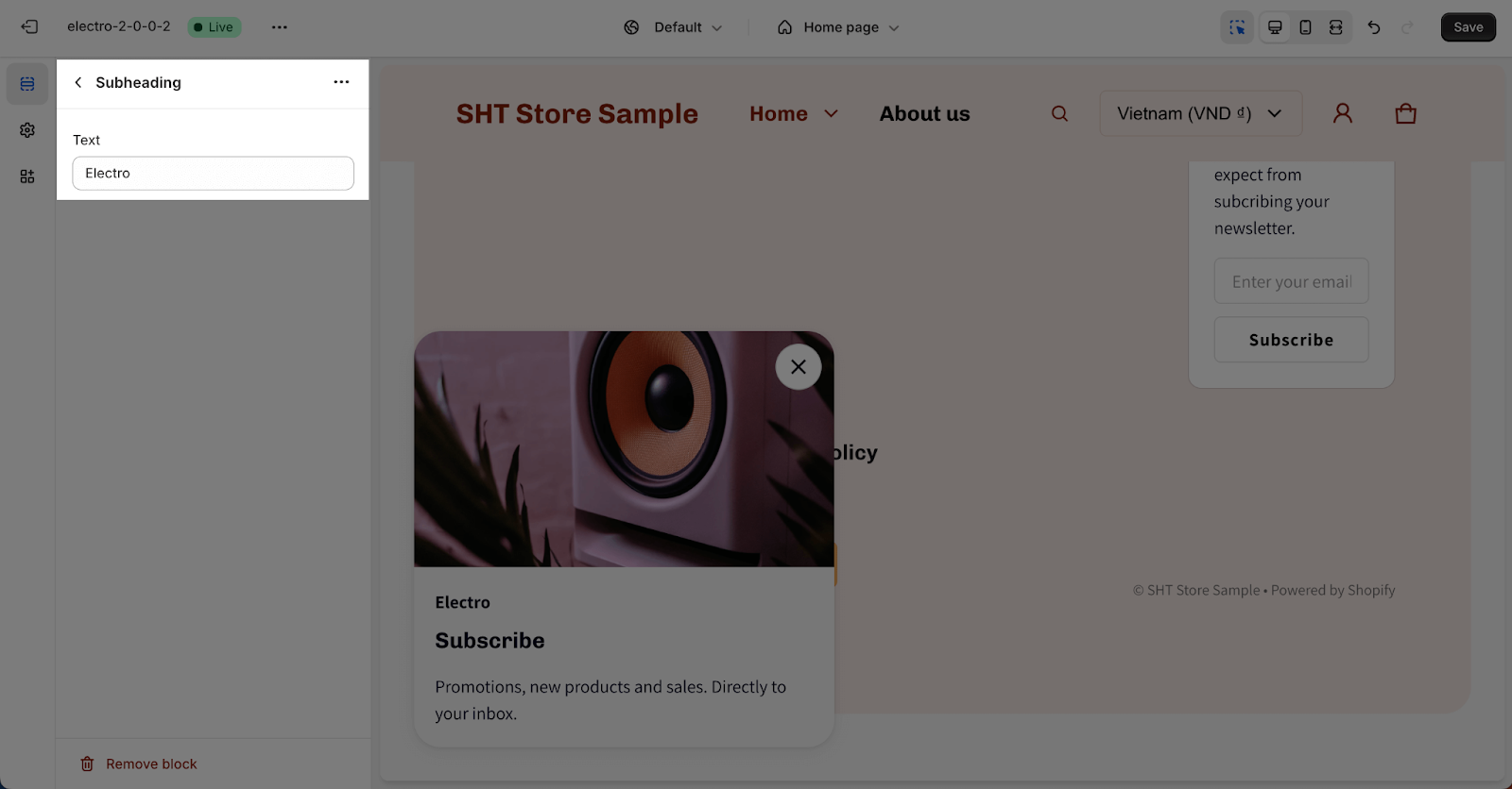
Subheading And Description
The Subheading and Description block support to add content for these elements by adding content in the text placeholder. If you want to hide the content in the actual store, simply leave the text box blank.
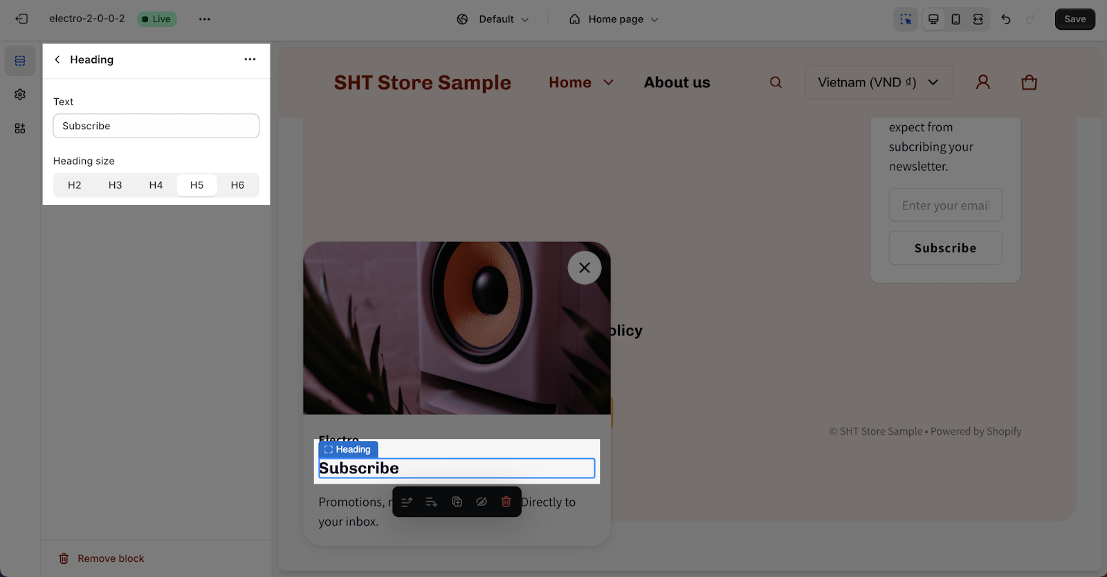
Heading
You can freely adjust content for the heading by entering the text on the box. If you want to hide it in the actual store, simply leave the text box blank.
You can also choose the Heading size from H2, H3, H4, H5 and H6. These heading sizes will be based on the Base text size that has been set up in the Theme settings > Typography.
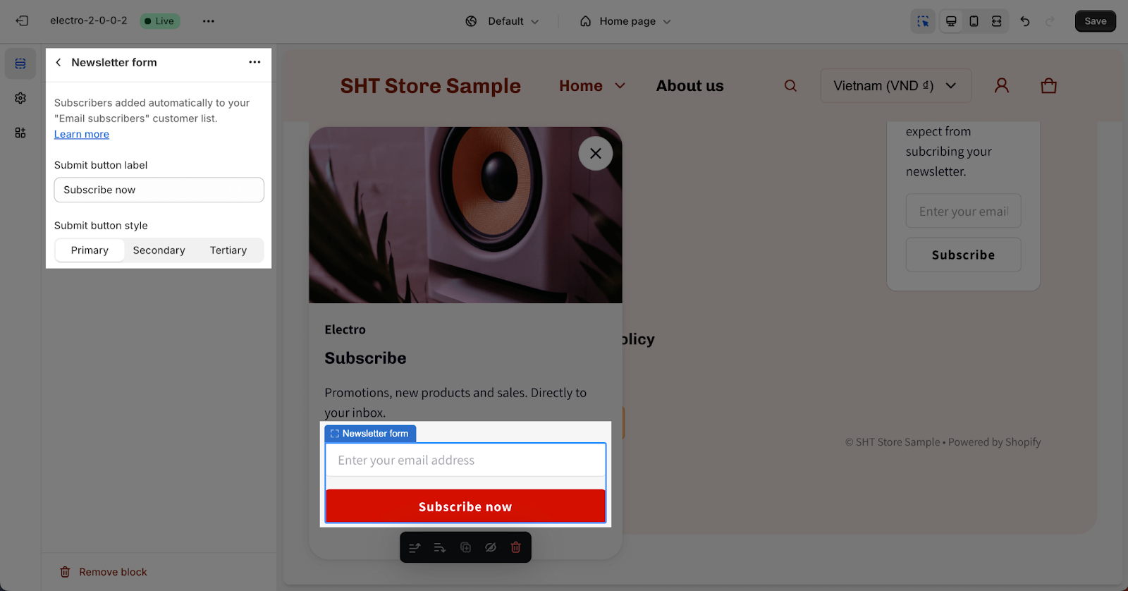
Newsletter Form
In the Newsletter form block, you can change the “Submit button label” and “Submit button style”. Enter the text in “Submit button label” to change the button text. Select button styles from Primary, Secondary and Tertiary. These styles can be edited in the Theme settings > Colors.
To adjust for this Newsletter, you can go to Newsletter from theme settings.
Call To Action
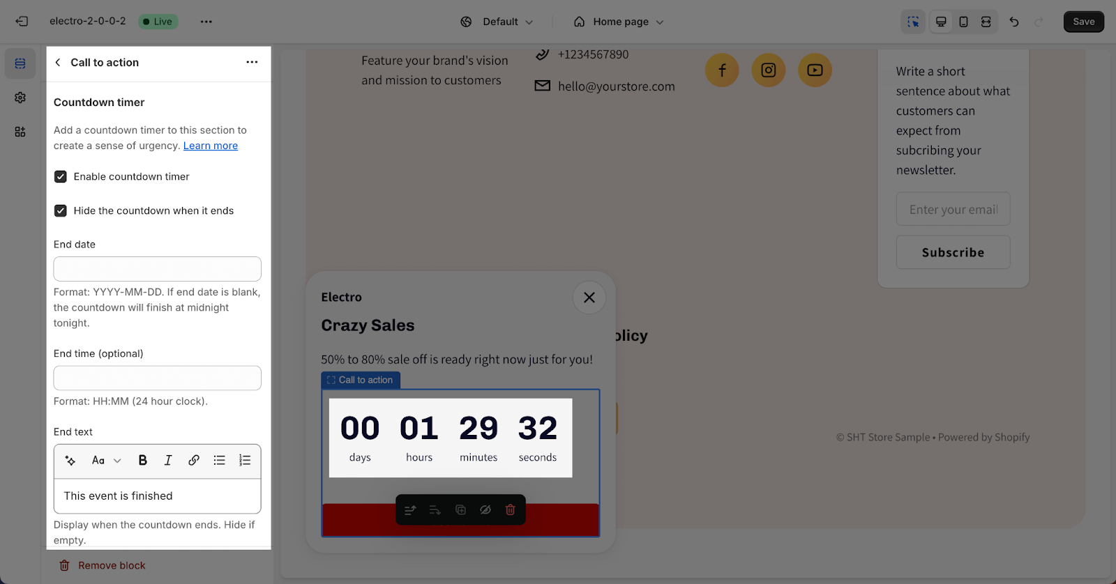
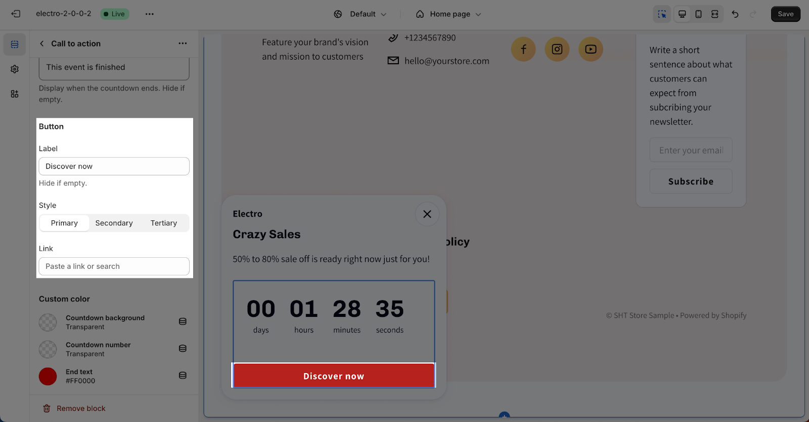
In the Call to action block, you can set up for the Countdown timer and Button.
You can read more about the Countdown timer settings in this article.
This block refers to a button that can be clicked to redirect customers to another page or a specific destination of your choice. It provides a convenient and visually prominent way to guide visitors to the desired location within your store or external resources.
You can also choose the button style from Primary, Secondary and Tertiary. These styles can be edited in the Theme settings > Colors.
To adjust the Block:
- Click on the block and go to the Settings, you can insert the button label name for the button to add a button here.
- Choose the button style.
- Click on the button link to add a direct link for it.
- If you want to remove one button, just delete the text in the button label.
Frequently Asked Questions
1. Where can the popup appear?
You can control where the popup appears by selecting options like “All pages,” “Homepage only,” etc., in the Visibility dropdown.
2. How do I trigger the popup to appear?
You can choose from three trigger options: “Reaching the footer”, “Time on page”, or “After closing cart notification”.
3. How do I change the newsletter form settings?
To adjust the newsletter form, go to Theme settings > Newsletter.
