How to use Electro Featured Product
About Featured Product Section
The Featured Product section in the Electro theme is a great way to showcase your best products and drive sales. It can be added to any page in your store, and it is highly customizable. This section focuses on introducing customers with the store’s flagship product. Buyers are encouraged to view the product and understand its basic attributes, if they get hooked, they will:
- Primary case: Go to the product details page to make a final decision (add to cart)
- Sub-case: Buyers are so convinced that they want to buy right away.
Access Featured Product Section
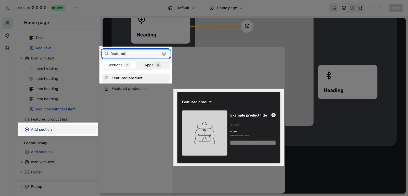
From any page, please click on ‘Add Section’ on the left side bar, then choose ‘Featured Product’.
Featured Product Section Configuration
You can then customize the section by changing the following settings:
General
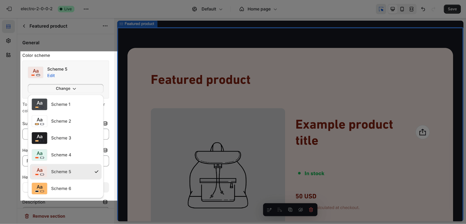
Firstly, you can change the color scheme for this section by selecting the scheme here. To change the theme color, please go to Theme settings > Colors.
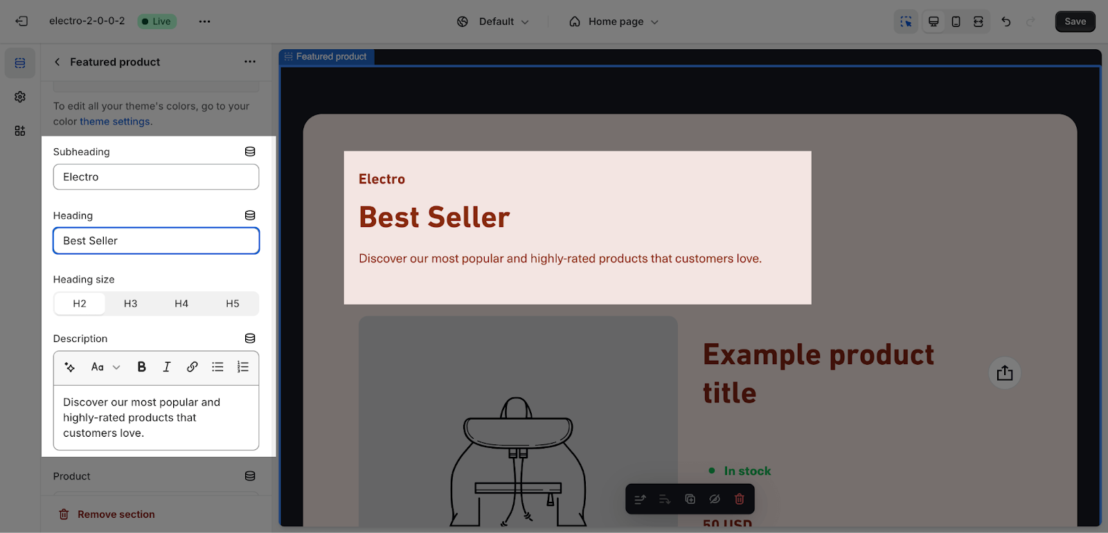
You can also apply content for the Section subheading, Section heading, and Section description. If you want to hide the message, leave the placeholder empty.
To adjust the Heading size, there are four options:
- H2
- H3
- H4
- H5
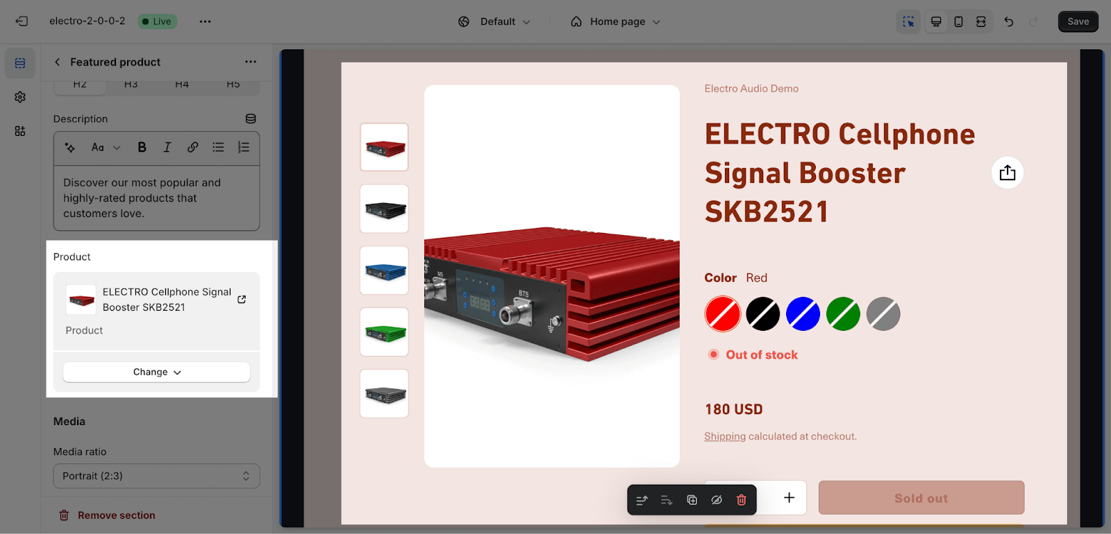
You can also click the Select product button to add a product from your Shopify store to this section. You can only select one product for this section.
Media
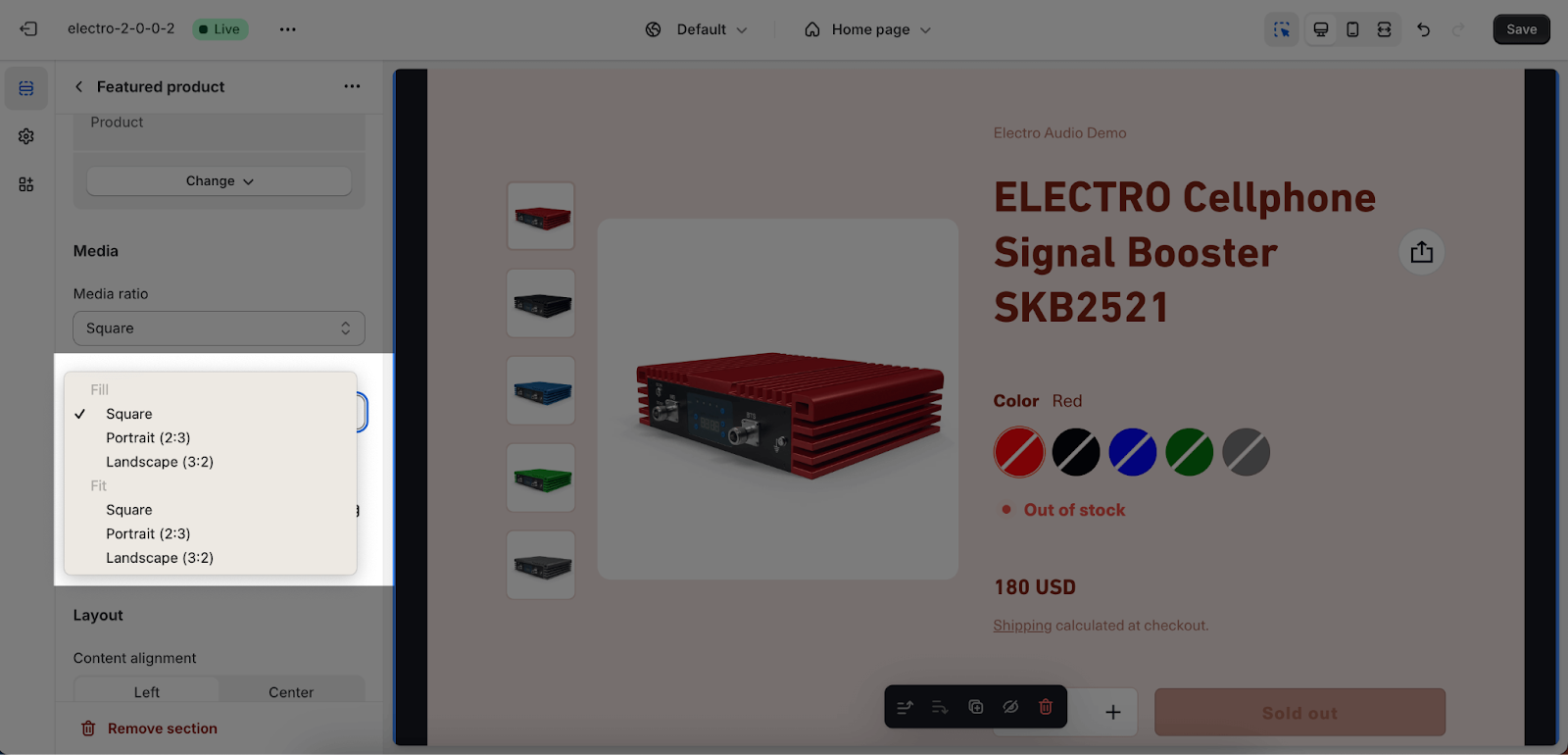
The Media settings in this section control the aspect ratios of the main product image and the thumbnail list.
- Media ratio: This determines the aspect ratio of the main product image. You can choose from:
- Square
- Portrait (2:3)
- Landscape (3:2)
- Adapt to Image.
- Thumbnail ratio: This determines the aspect ratio of the thumbnail list. You can choose from Fill or Fit.
- Fill will stretch the thumbnail to fit the width of the list
- Fit will crop the thumbnail to fit the width of the list
You can enable or disable the Show thumbnail on mobile option to display a slideshow of product images below the main product image on mobile devices. This is a great way to showcase more of your products to mobile users, who may have less screen space than desktop users. The slideshow will automatically scroll through the images, so visitors can easily see all of your products.
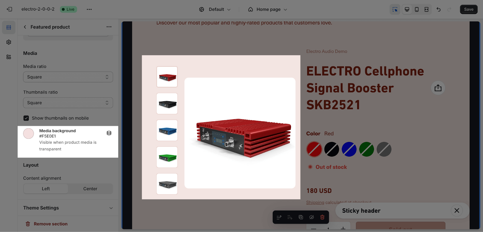
If you want to add background color for the product image, you can apply the color for the media background here. Please note that it is only visible when product media is transparent.
Layout
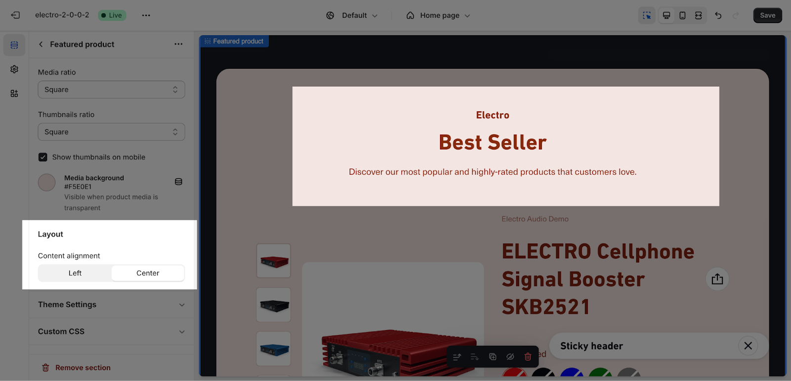
The content alignment of the Featured Product section can be set to Left or Center. This alignment will be applied to the heading, subheading, and description of the section.
- Left alignment: The text will be aligned to the left side of the section.
- Center alignment: The text will be centered in the section.
Featured Product Blocks Configuration
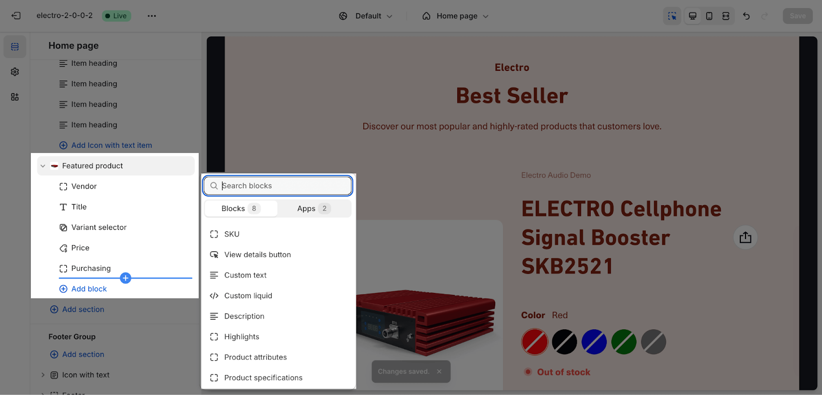
The Featured Product section has some blocks that are added by default. You can only add one of each of these blocks to the section:
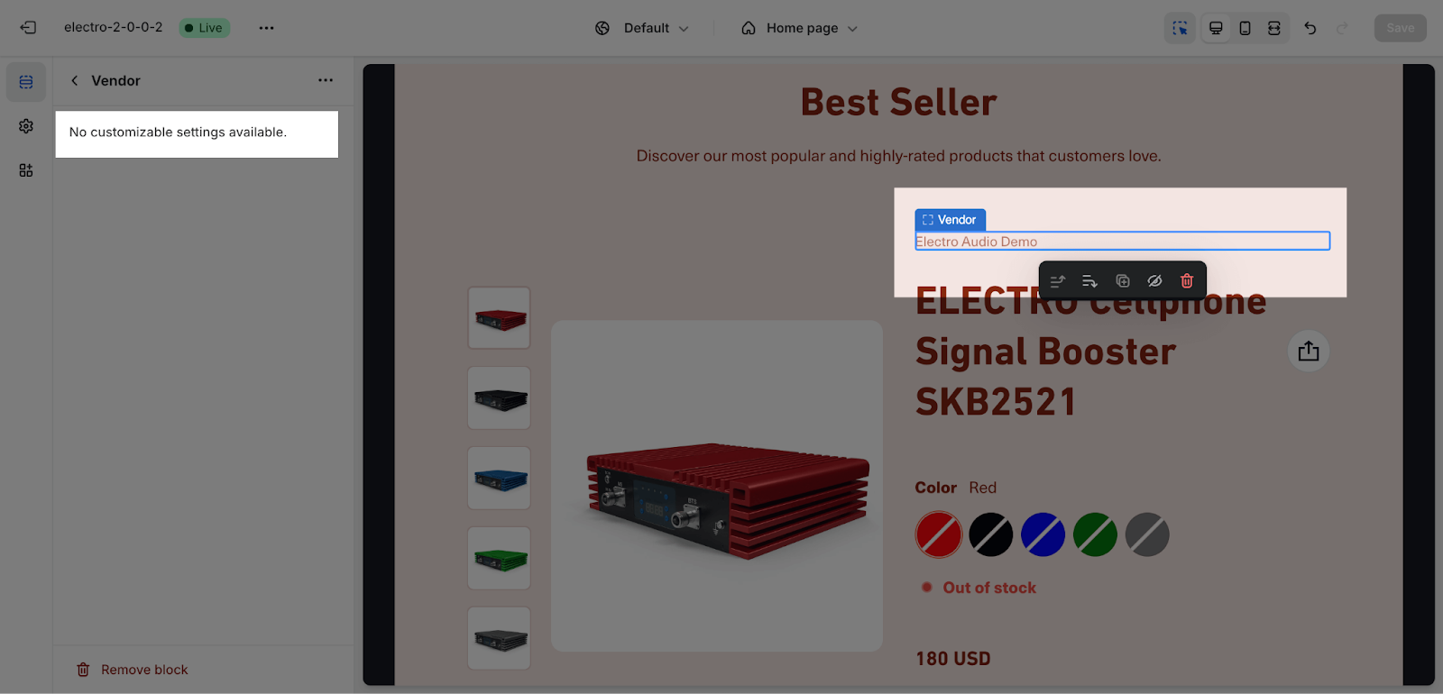
- Vendor: This block displays the name of the vendor who sells the product.
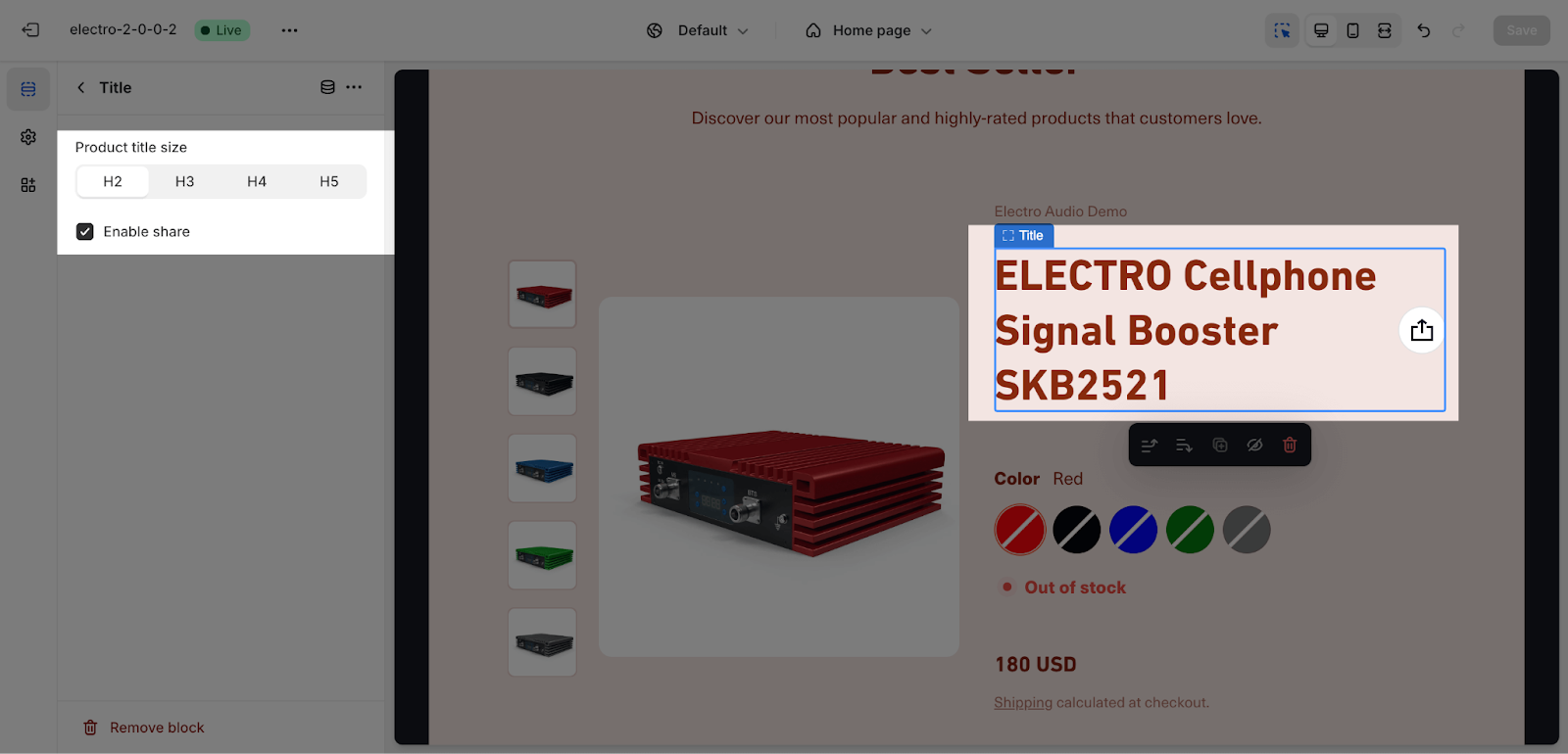
- Title: This block displays the title of the product.
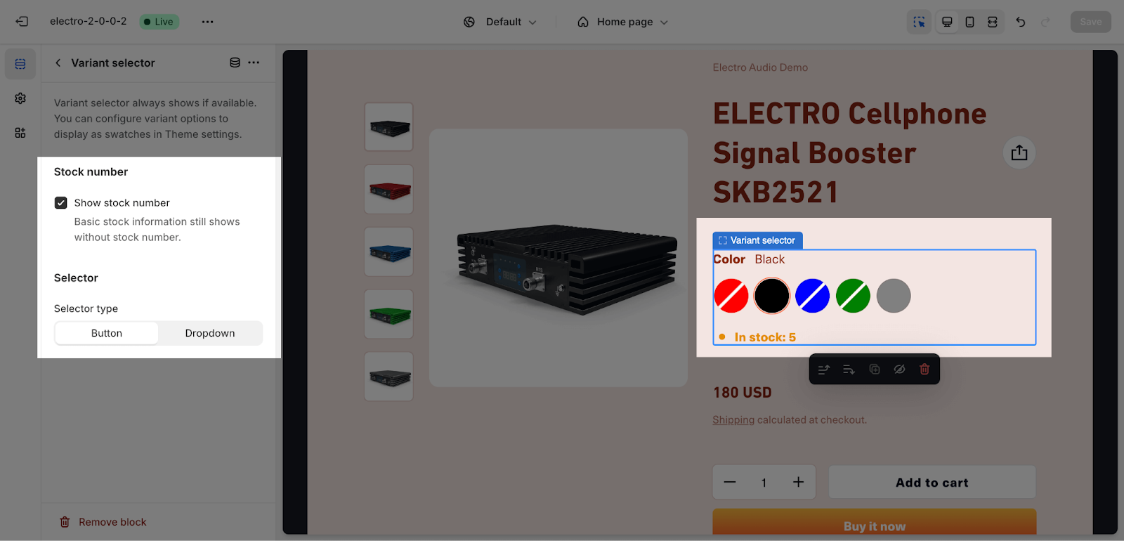
- Variant selector: This block allows visitors to select the variant of the product that they want to purchase.
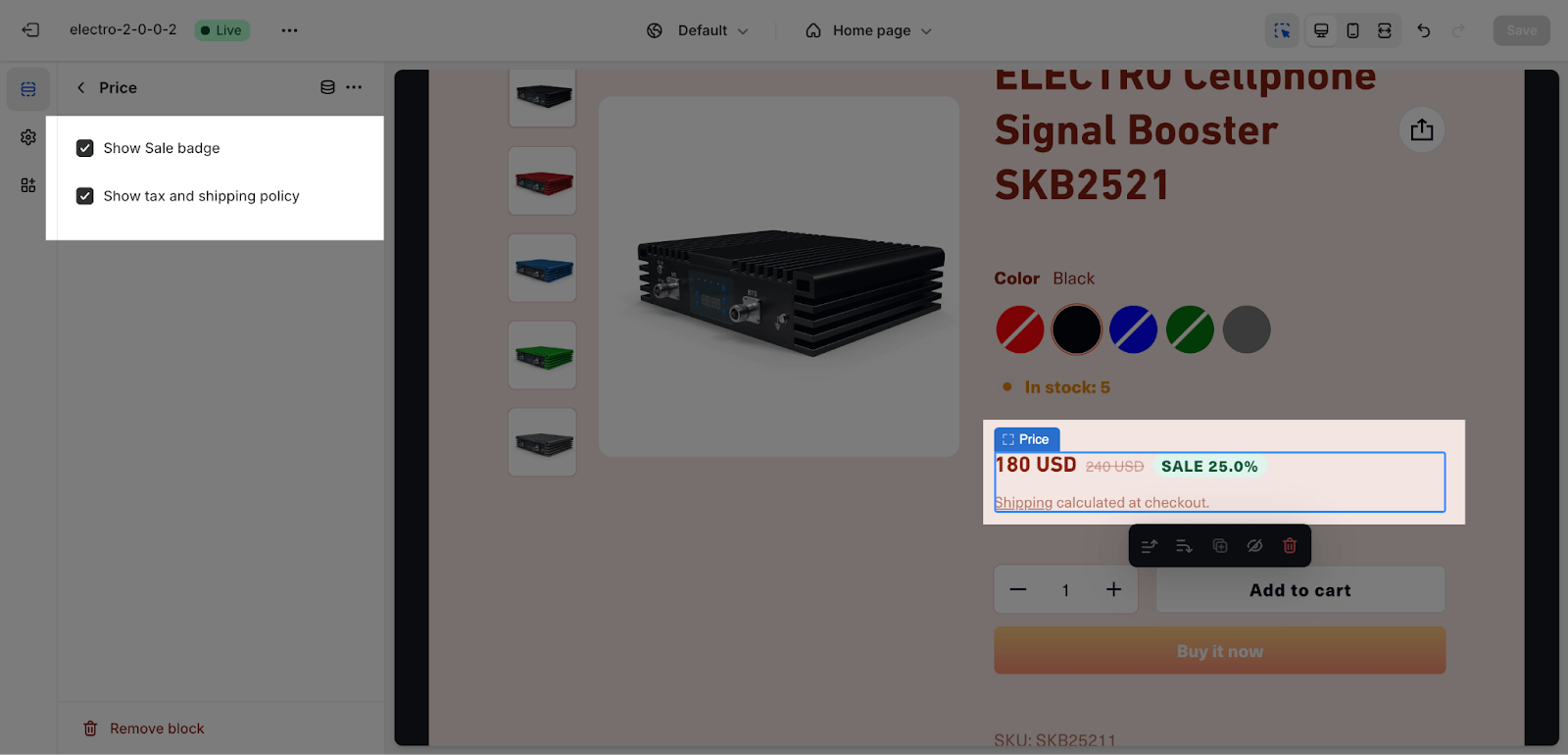
- Price: This block displays the price of the product.
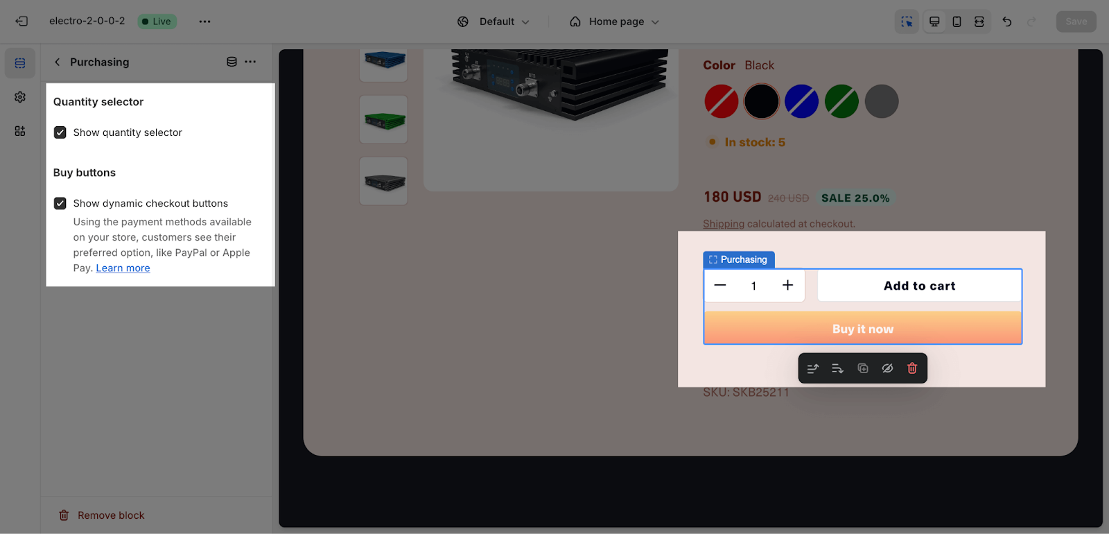
- Purchasing: This block displays the add to cart button and the quick view button.
You can add more blocks to the section by clicking on the “Add block” icon. The following blocks can be added to the section:
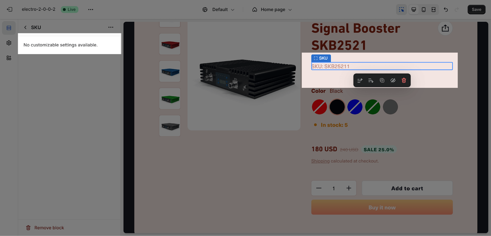
- SKU: This block displays the SKU of the product.
- Rating: This block displays the rating of the product.
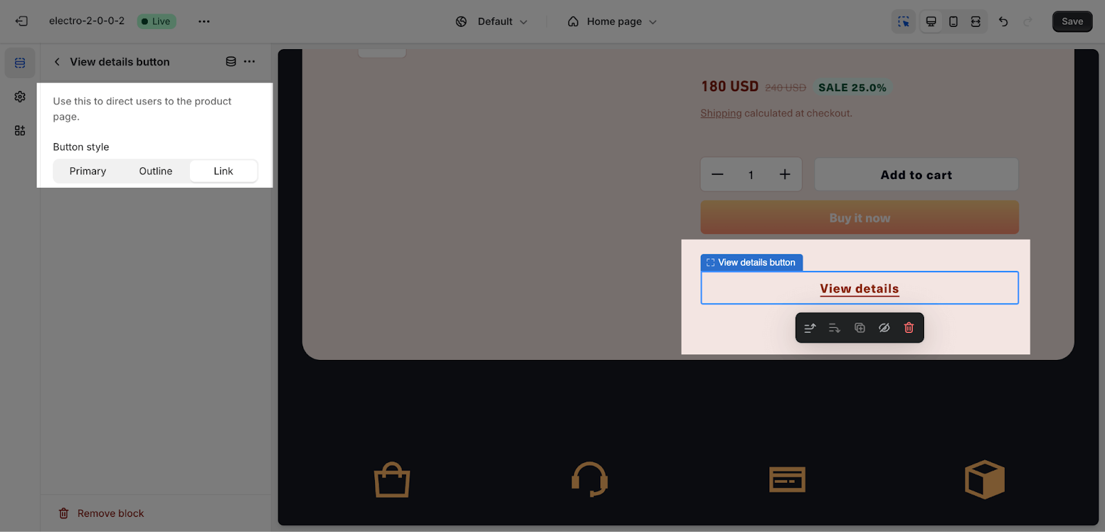
- View details button: This block displays a button that visitors can click to view more details about the product.
- Custom text: This block allows you to add custom text to the section.
- Custom liquid: This block allows you to add custom liquid code to the section.
- Description: This block displays the description of the product.
- Highlight: This block displays a highlighted section of the product’s description.
After you have added a block to the section, you can customize it by changing the following settings:
Vendor
The Vendor block does not have any settings in the Featured Product section. You can set up the vendor name for your products in the Product editor in your Shopify admin.
Title
You can enable the share button on the product title here. The share button will appear next to the product title.
Variants selector
Variant selectors always show if variants are available. You can configure variant options to display as swatches in Theme settings > Product Information.
You can also enable the Show stock number option to show the stock number below the variant selector.
There are 2 Selector type for you to select here: Button or Dropdown
Price
You can choose to show a sale badge and tax and shipping policy in this block. The sale badge will be displayed in the same line as the price and sale price. The tax and shipping policy will be displayed below them. If the product does not have a sale price or you have not added a shipping policy, these items will not be displayed.
Purchasing
The Featured Product section gives you the option to display a quantity selector or dynamic checkout buttons. You can choose to display them based on your preference.
In the section, the Add to Cart button will always be displayed by default and cannot be removed.
SKU
The SKU block in the Featured Product section does not have any settings. You can set up the SKU for your products in the Product editor in your Shopify admin.
View Details Button
The View details button redirects visitors to the product page. You can choose from three button styles: primary, outline, or link. You can only add one block of this type per page.
Highlights
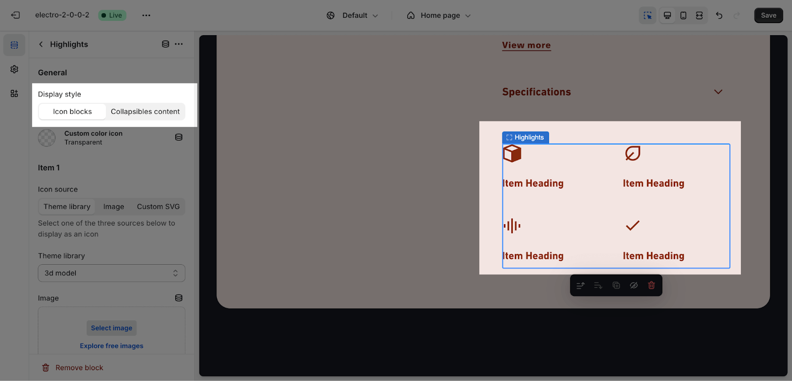
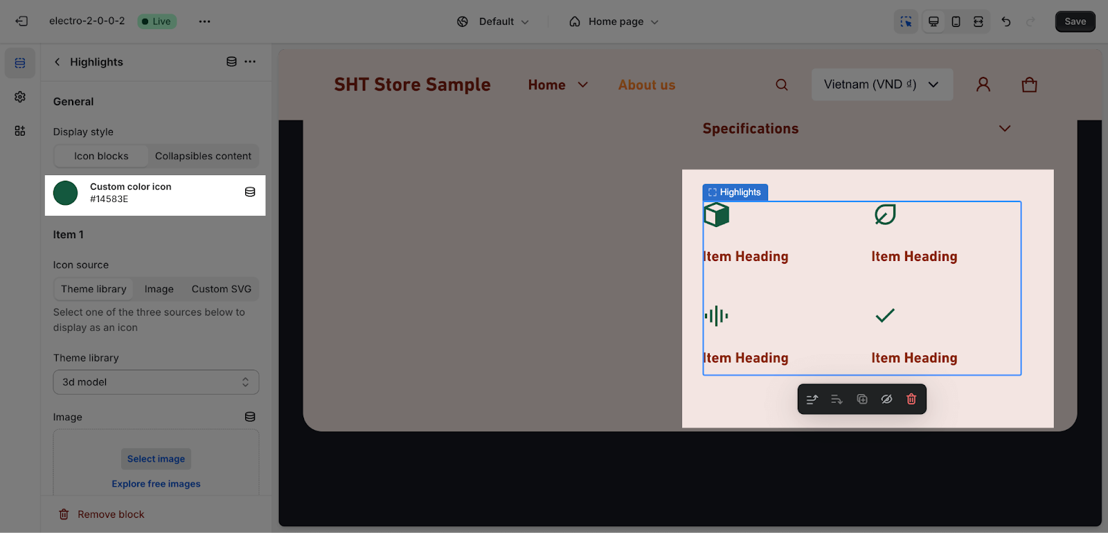
The Highlights block allows you to show up to 4 highlights items for your products. You can use this block to show trust badges or key information about your products.
The Highlights block settings include general settings and items settings.
- General settings: In general, you can choose the display style for this block, including icon blocks or collapsible content.
- If you want to change the color for the icon, you just need to click on the “Custom color icon” then apply the color code here.
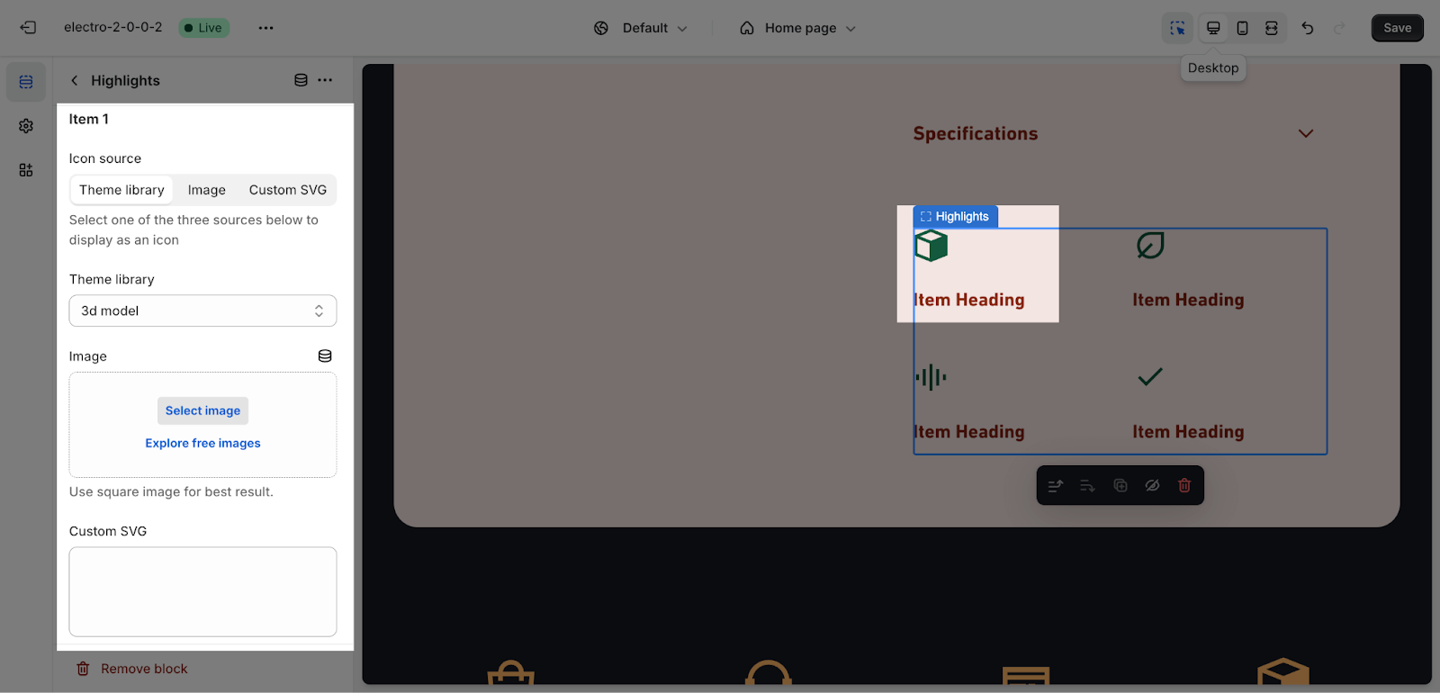
- Items settings: You can set up to 4 items to highlight for this block. Each item can have an icon, heading, and content. The items will be displayed on the live page after you fill in the contents.
Custom Text
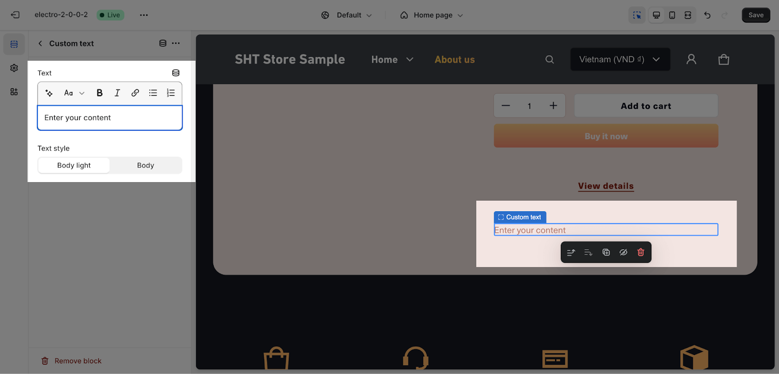
You can freely add content and adjust the text style in this block.
Note: This block can be added multiple times in the Featured Product section.
There are two text styles to choose from:
- Body: This is the default text style with normal font weight.
- Body light: This text style is lighter than the default text style with light font weight.
You can customize the body text typography in the Theme Settings.
You can add a metafield text on the placeholder by clicking on the icon next to the title placeholder.
Custom liquid
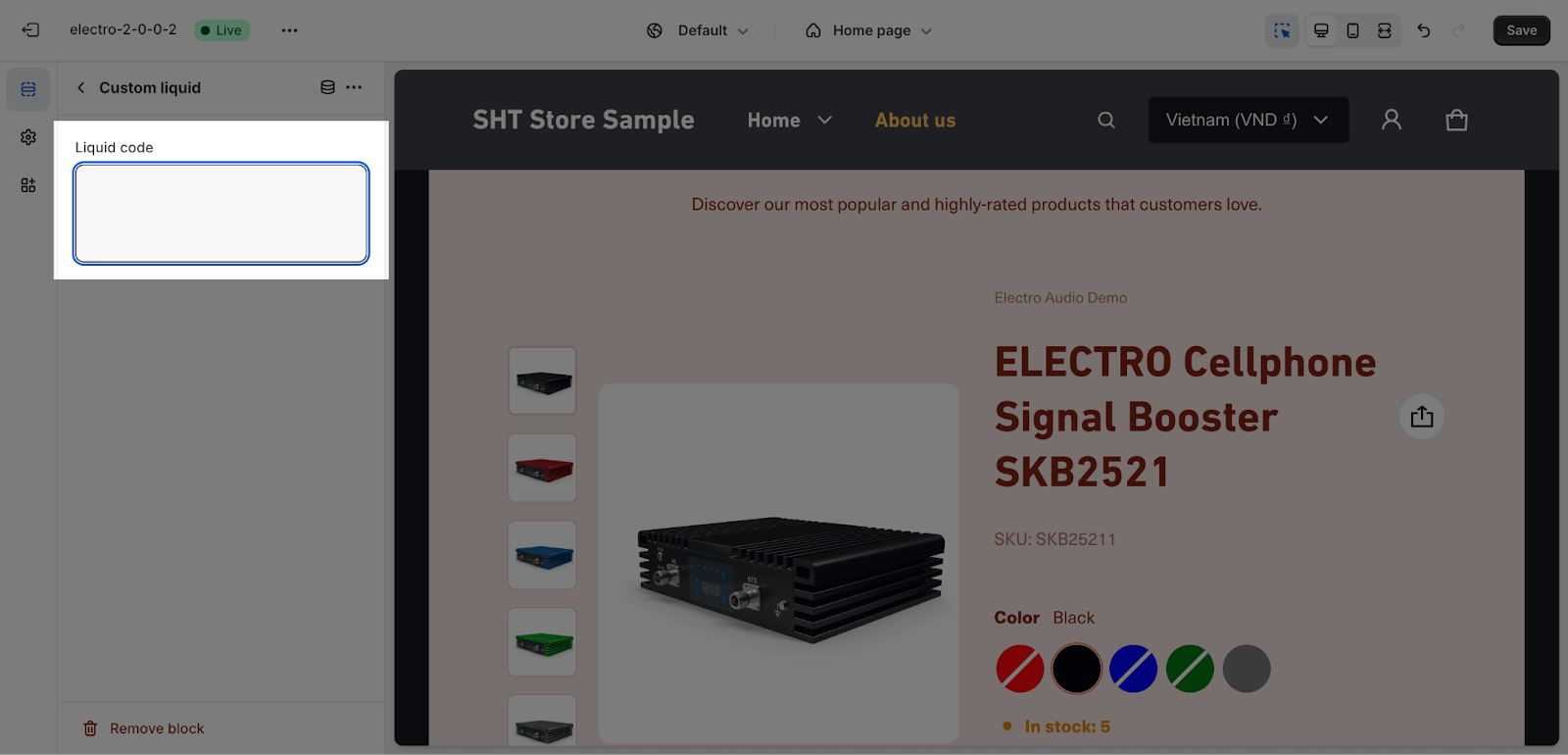
You can add custom code to show custom content on the Featured Product section. To learn more about Liquid, the language used to create custom code for Shopify themes, click here.
Description
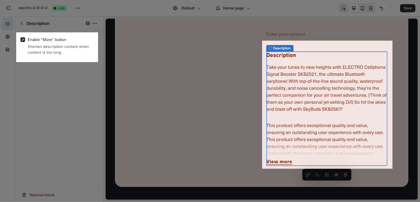
The Feature Product block displays the product’s description, which is rendered from the default Shopify product description. If the description is more than 50 words, a “More” button can be enabled to show the full description. To adjust the description, go to Shopify Admin > Products.
Product Attributes
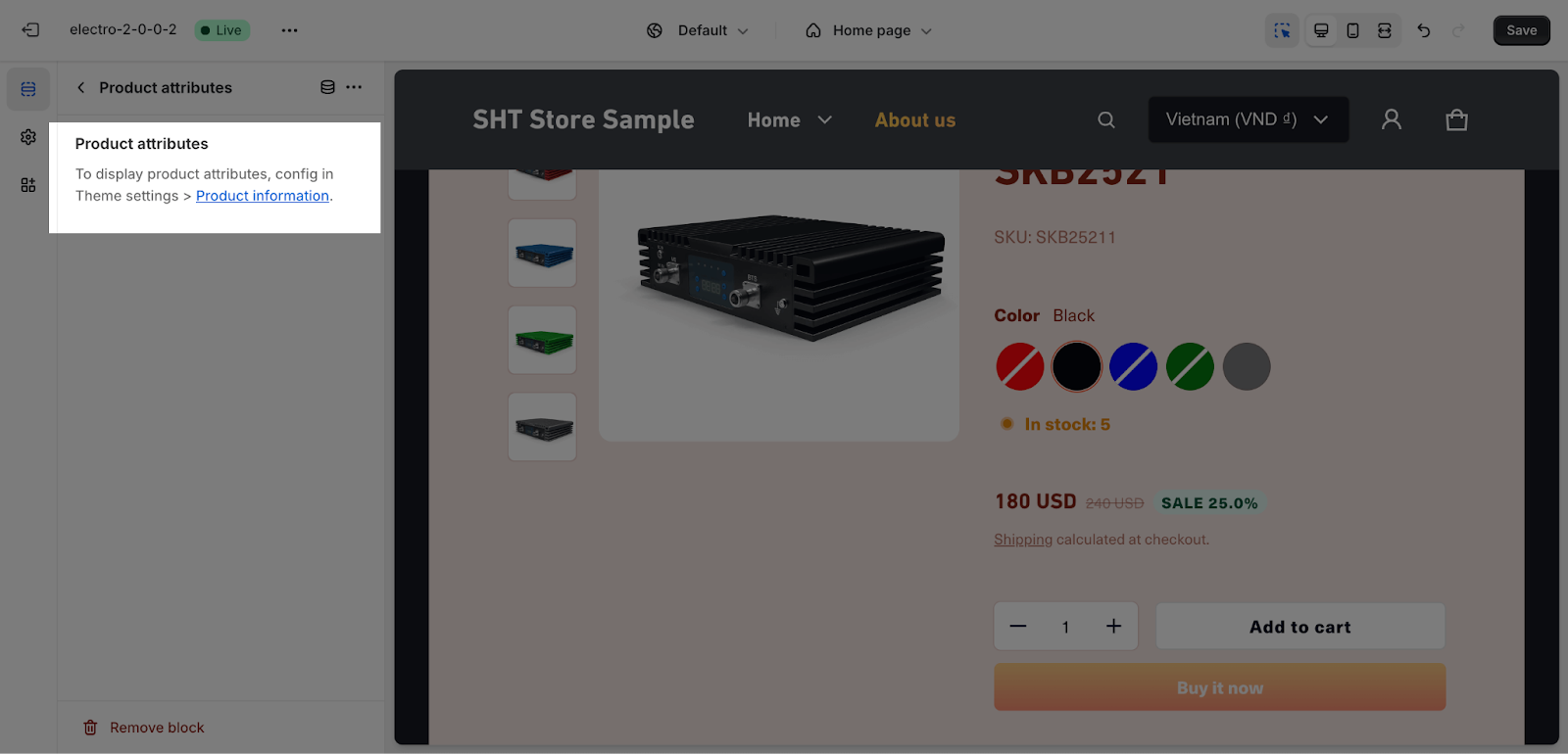
To display product attributes on this section, please config in Theme settings > Product information.
Product Specifications
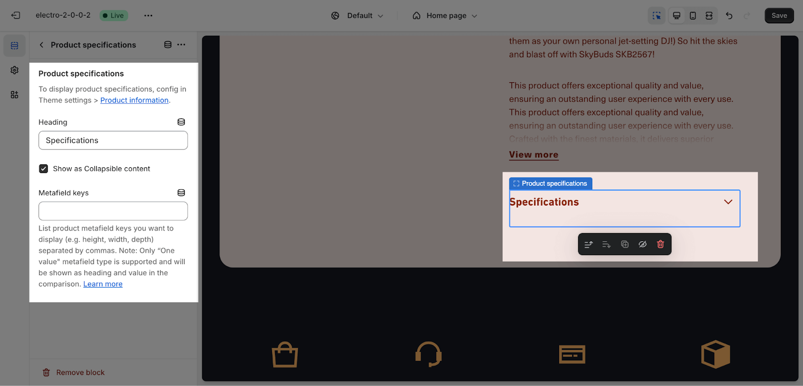
You can adjust the heading text by entering content on the text box, the other settings please config on Theme settings.
Then, you can add the metafield keys here to display the content you have been set up. For more details about setting metafield, please see this article.
Frequently Asked Questions
1. What is the Featured Product Section?
The Featured Product Section is a customizable area in your Electro theme store that allows you to showcase a single product and drive sales.
2. How many products can I feature?
The Featured Product Section can only showcase one product at a time.
3. What are “Highlights” and how can I use them?
The Highlights block allows you to showcase up to 4 key features or benefits of your product using icons, headings, and content. This is a great way to grab attention and convince potential buyers.
