How to Use Electro Collection Template
About Collection Template Section
By default, the Collection template consists of 2 sections: Collection Header and Collection Products. These sections cannot be removed, and can only be hidden on the Collection template.
Aside from these 2 sections, you can freely add or remove any other sections on the Collection template.
Access Collection Template Section
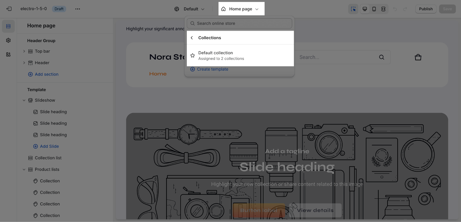
On the top center bar, click on the dropdown button > Collections > Choose collection.
Collection Template Section Configuration
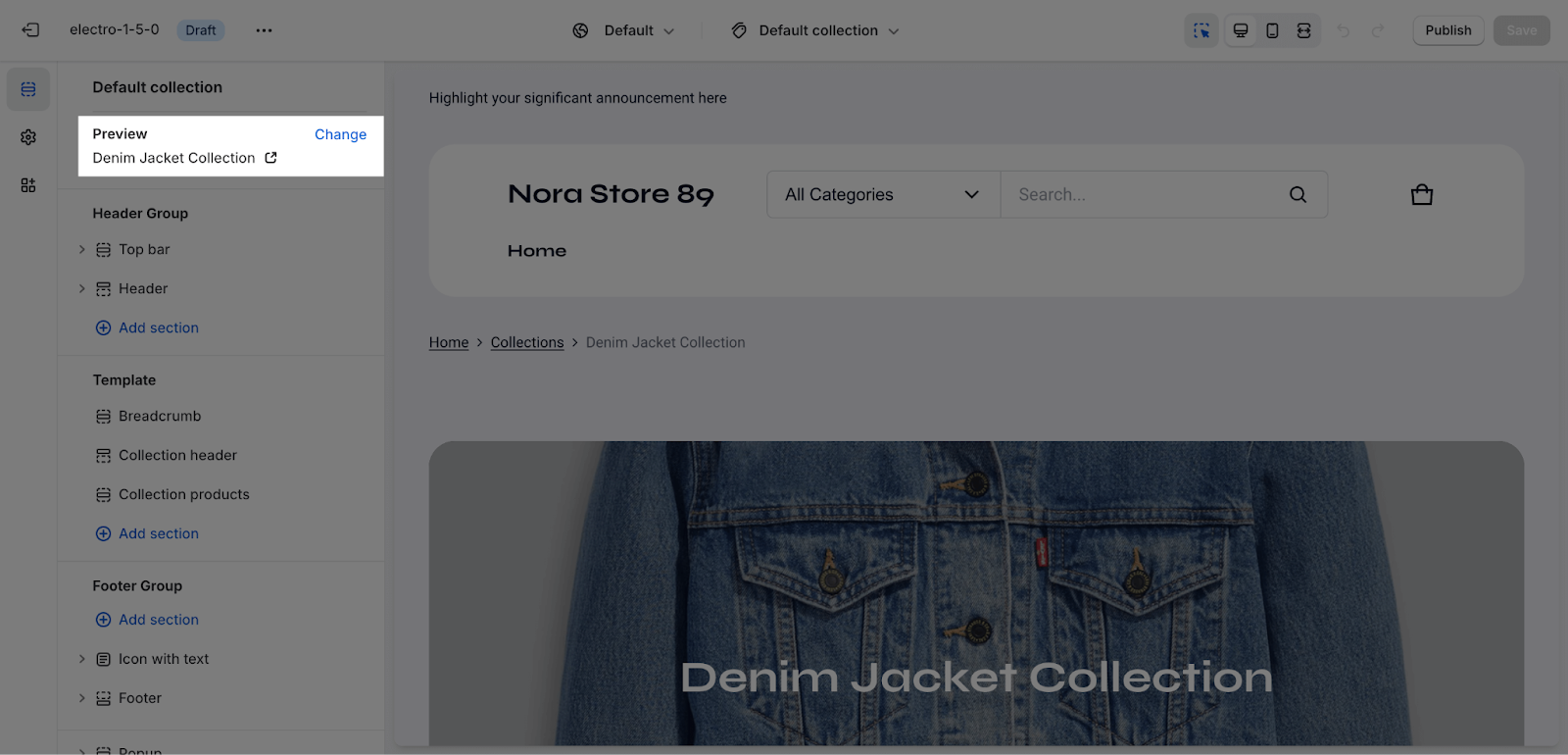
The Collection Template section has several settings that can be adjusted. To change the collection, on the top left sidebar, click on Change > Select collection.
Collection Header
General
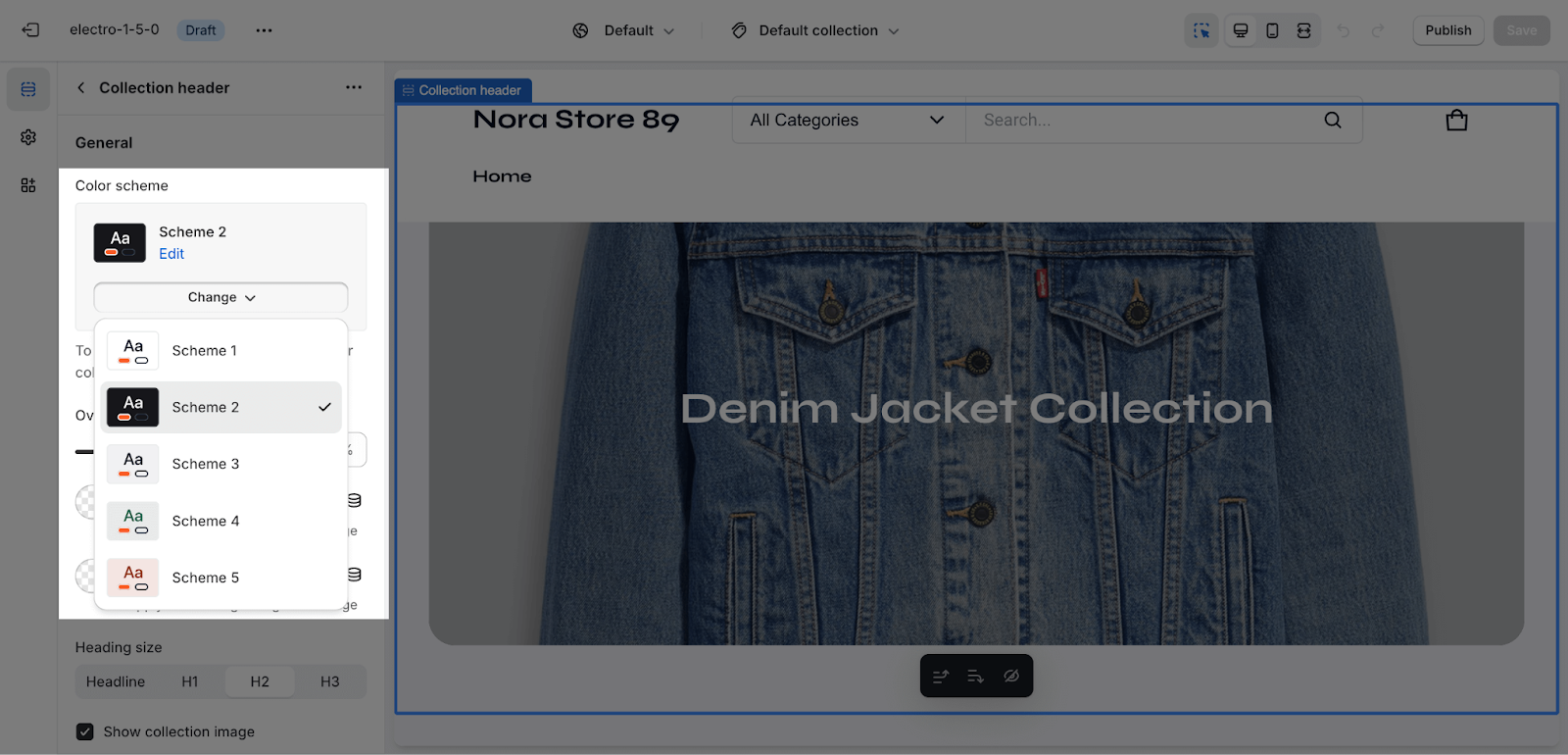
You can change the color scheme for this section by selecting the scheme here. To change the theme color, please go to Theme settings > Colors.
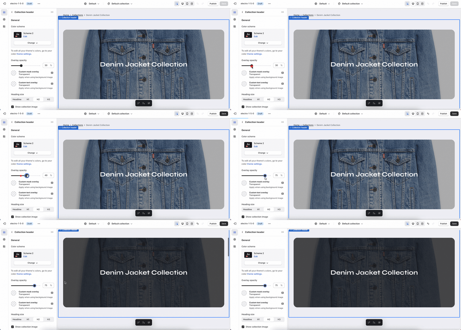
To change the overlay opacity of the collection header background, drag the bar to the desired opacity level. The opacity can be set from 0% to 90%. The default opacity is 30%.
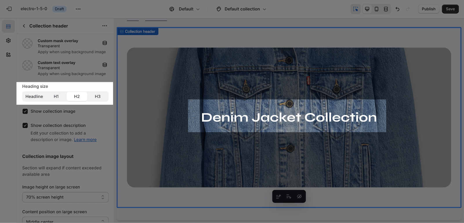
The Collection Header section automatically uses the Collection title as page H2.
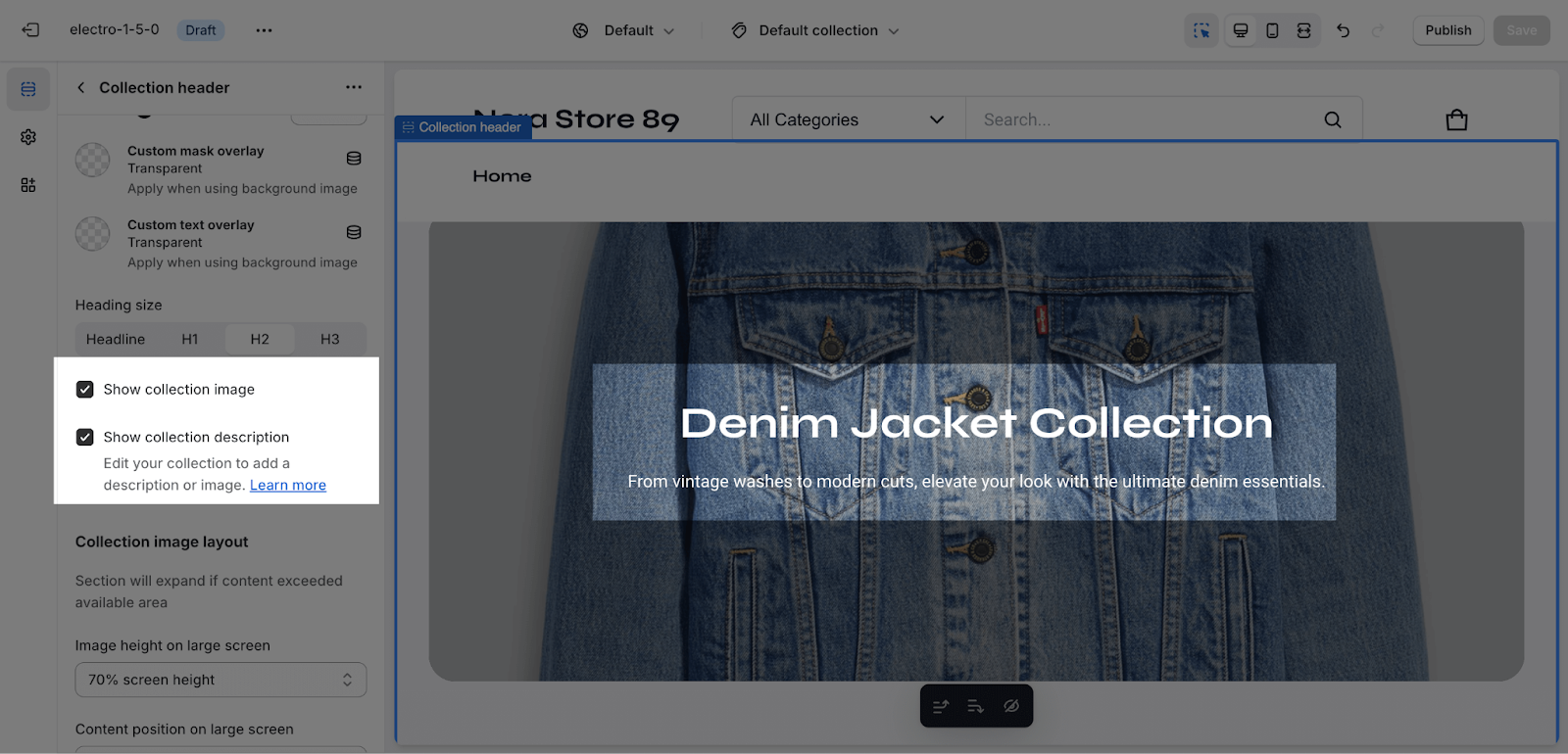
For the image banner, you can Show Collection Image option to render it as a hero banner. This option is enabled by default.
You can add more content to the header of your collection page by enabling the Show Collection Description option.
Collection Image Layout
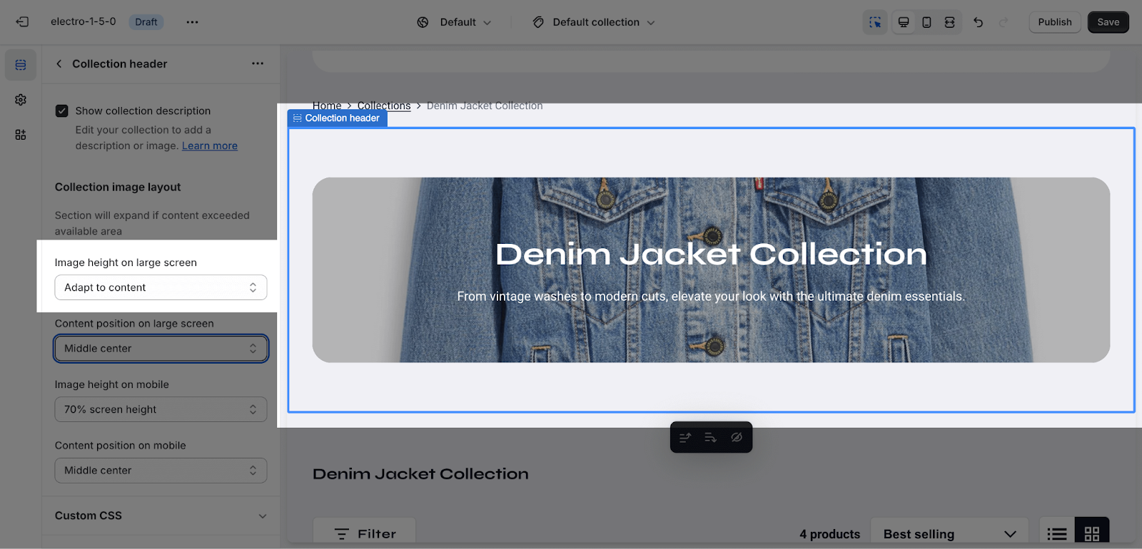
Image height on a large screen offers 5 adjustment options:
- Adapt to content
- 50% screen height
- 70% screen height
- Fill screen height
- Adapt to image
Content position on a large screen offers 6 placement options:
- Top left
- Top center
- Middle left
- Middle center
- Bottom left
- Bottom center
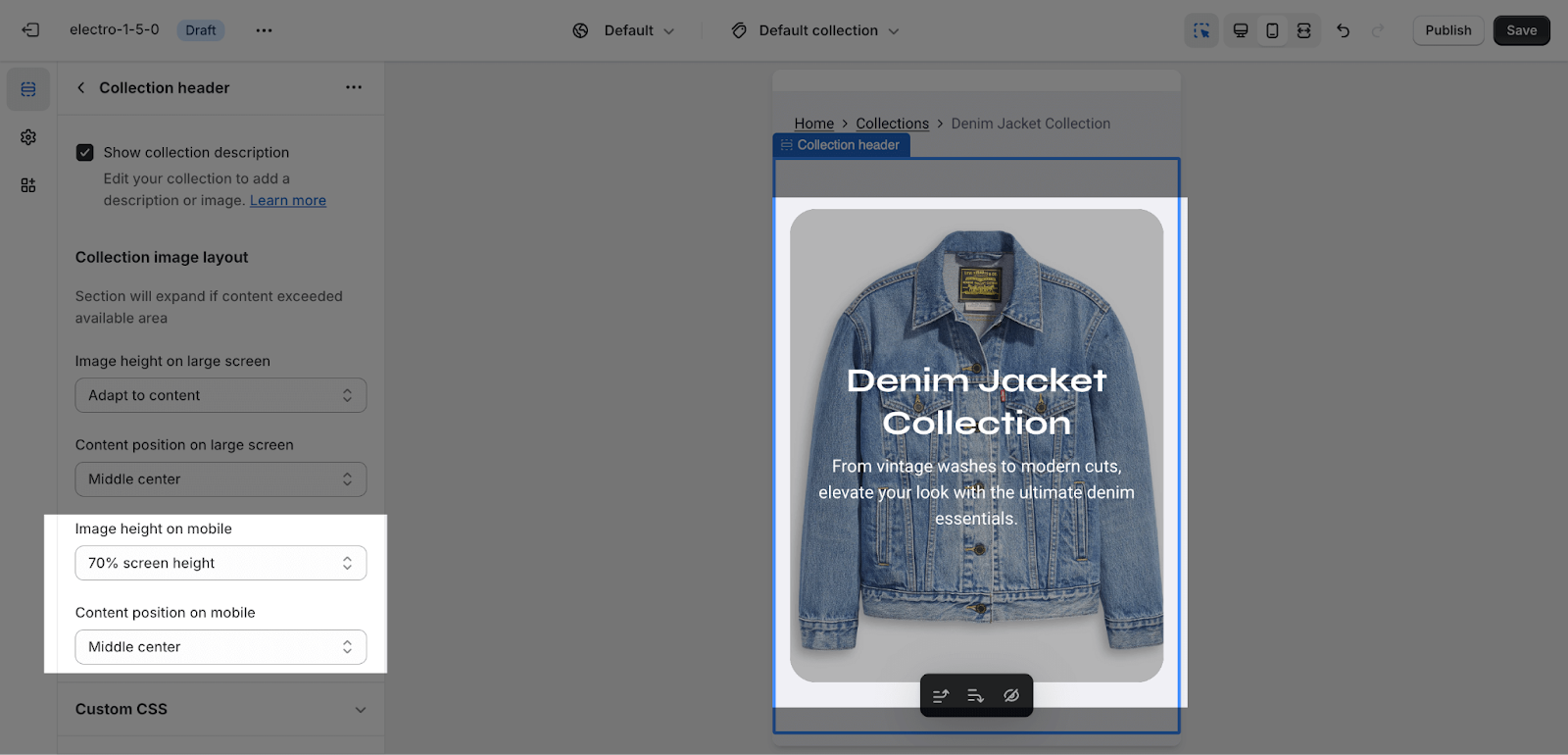
The options for image height and content position are the same for both large and mobile screens.
Collection Products
General
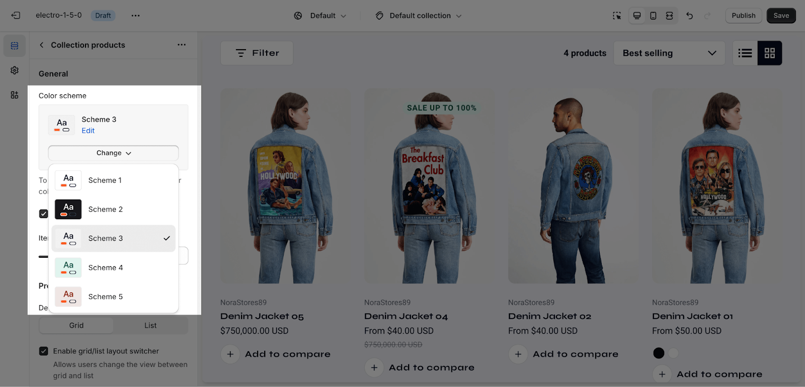
You can change the color scheme for this section by selecting the scheme here. To change the theme color, please go to Theme settings > Colors.
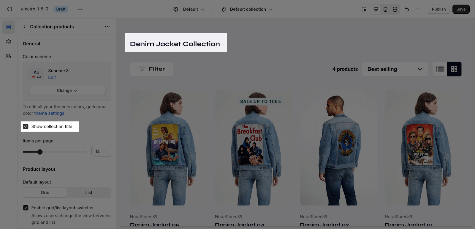
You can click on the checkbox here to show the collection title:
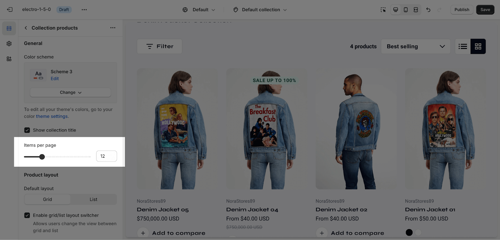
By default, the Collection Products section layout displays 12 products per page. You can change the number of products per page from 8 to 24, in increments of 4.
Product layout
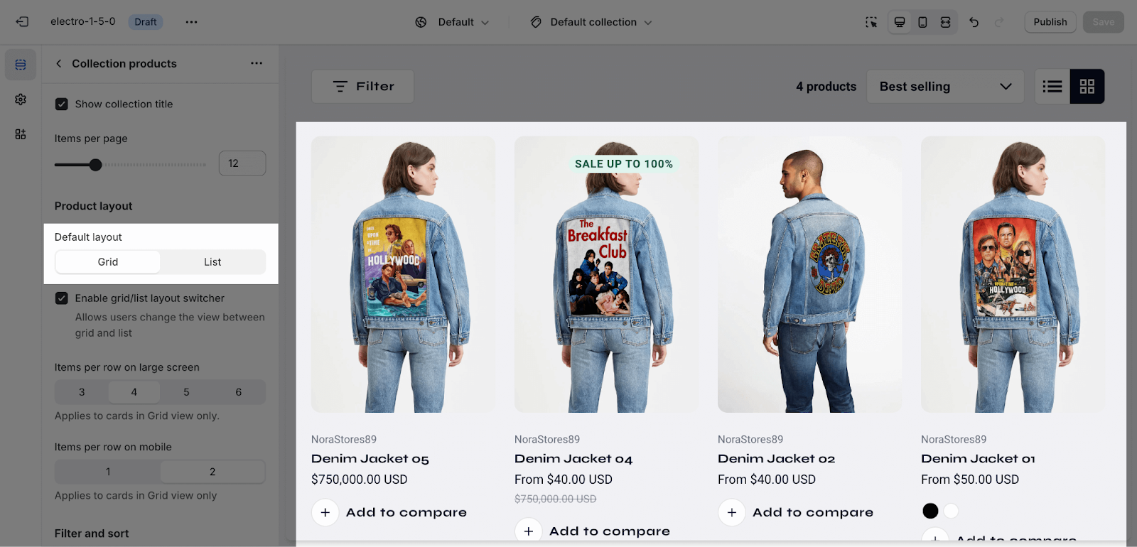
You can choose one of the default layouts:
- List View: Ideal for products with detailed specifications
- Grid View: Perfect for visually-driven products
You can enable the grid/list layout switcher here, allowing customers to toggle between grid and list views.
Items per row on a large screen: Choose from 3, 4, 5, or 6.
You can also choose to display 1 or 2 products per row on mobile. By default, 2 products per row are displayed on mobile.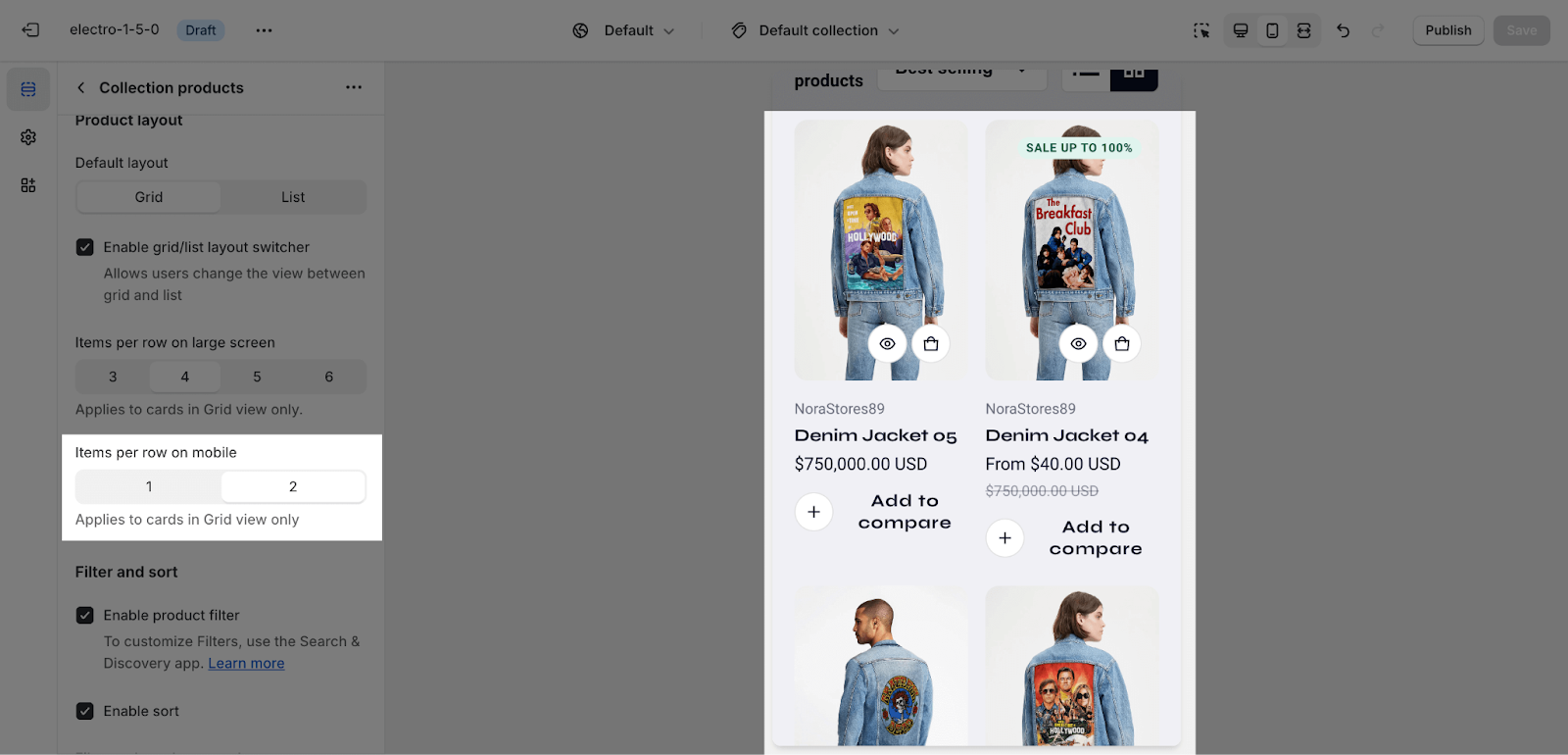 Pagination will appear when the Collection Products section has more than one page.
Filter & Sort
Collection Product section supports Filter feature to help customers quickly sort out their desired products. The filter, if enabled, can be customized on Shopify admin dashboard > Online Store > Navigation > Filters.
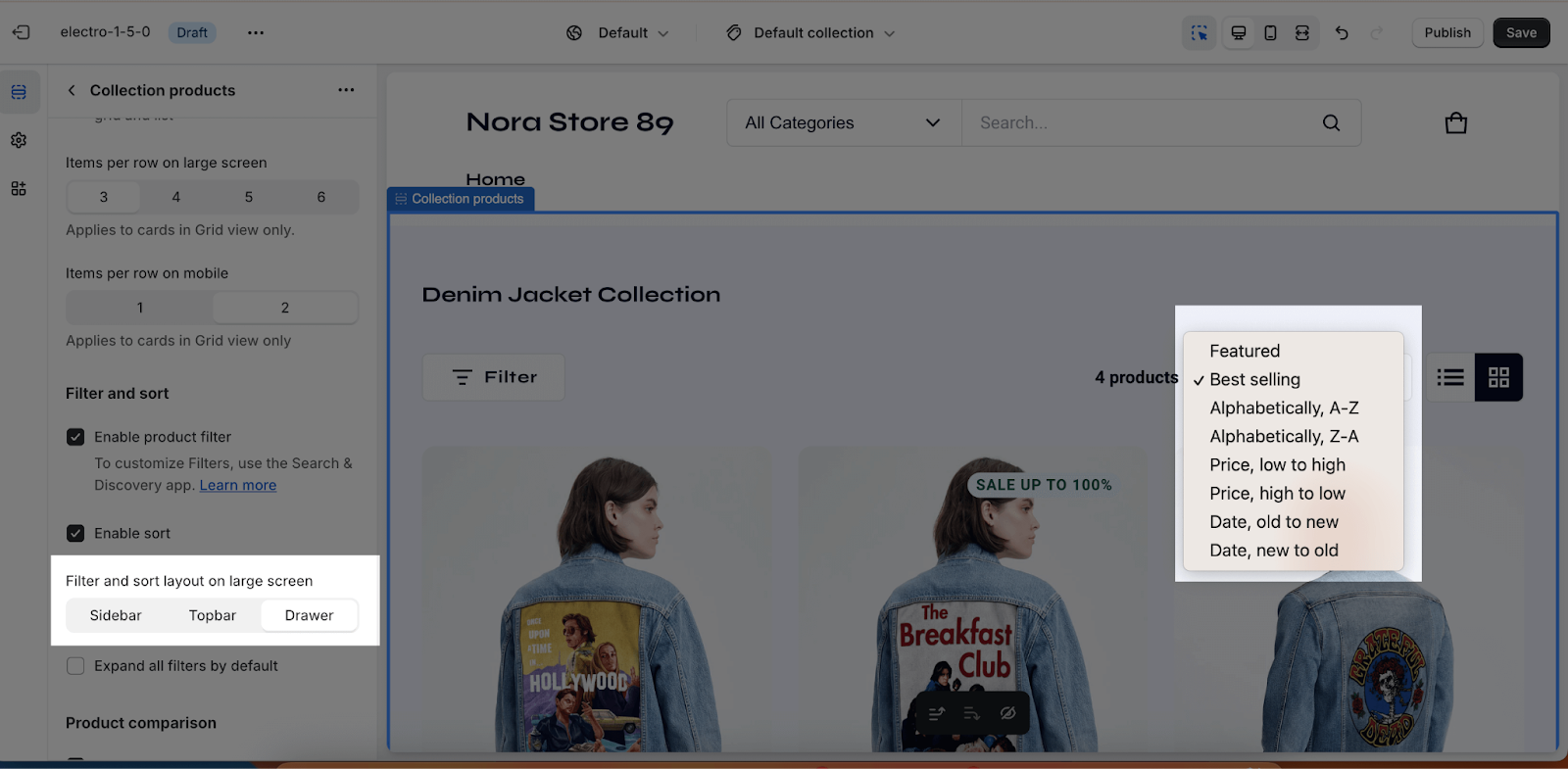
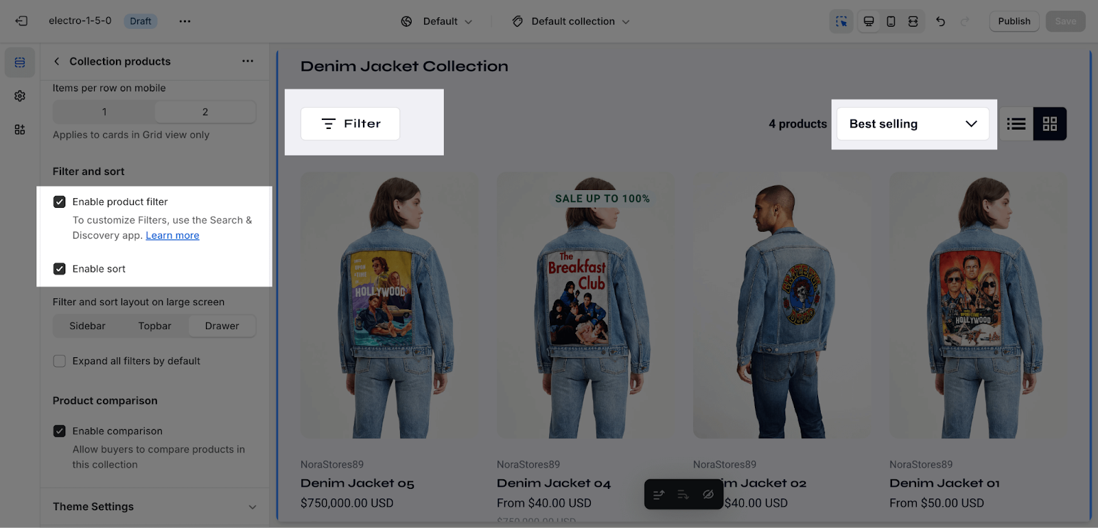 You can choose the filter and sort layout on a large screen from the following options:
- Sidebar
- Topbar
- Drawer
The sort feature allows customers to sort products by:
- Featured
- Best selling
- Alphabetically: A-Z
- Alphabetically: Z-A
- Price: Low to high
- Price: High to low
- Date: Old to new
- Date: New to old
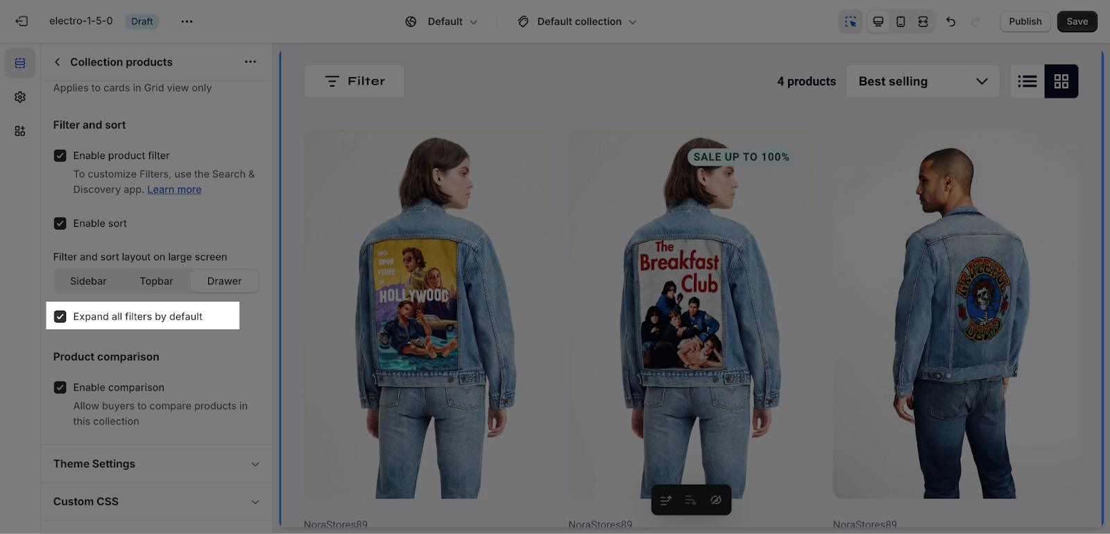
You can also enable Expand All Filter Options By Default to show all filter options once opened. Note that this feature only works on live view.
Product comparison
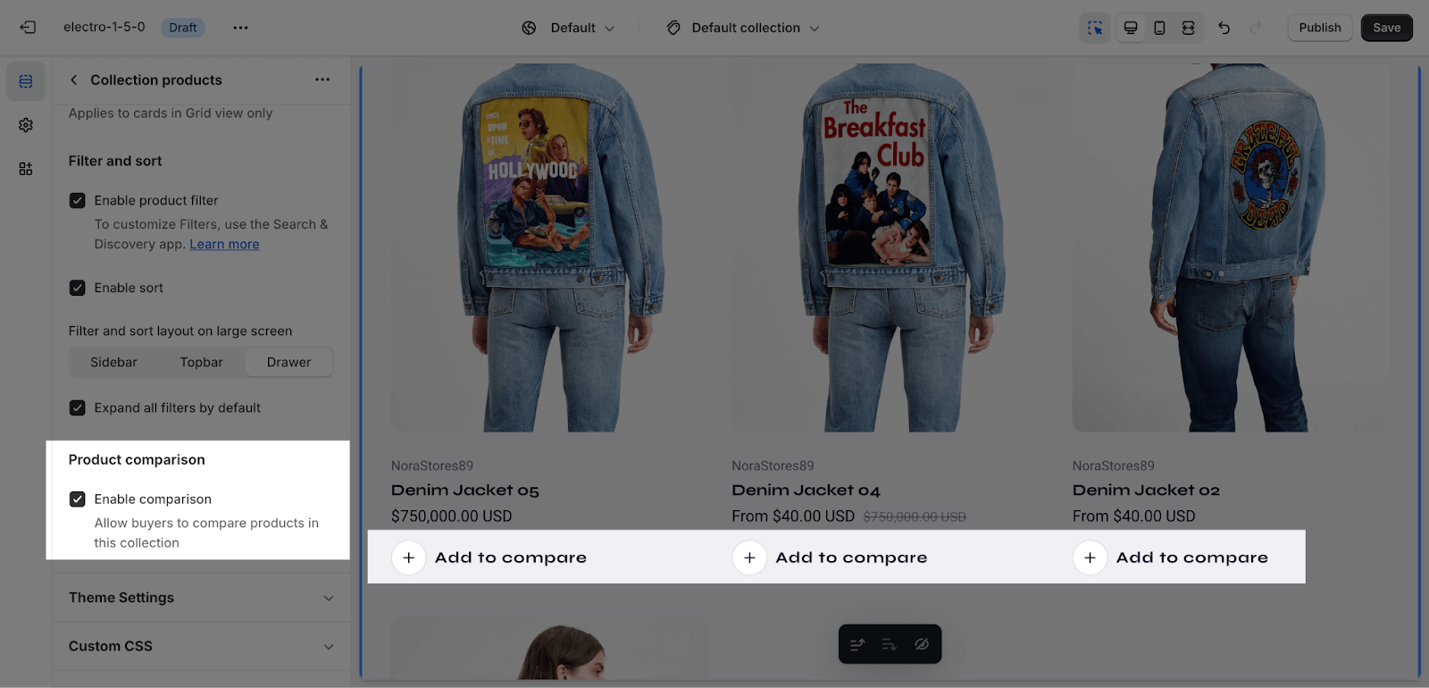
This comparison feature allows customers to compare products in this collection. You can check this article for more information about comparison.
Frequently Asked Questions
1. How can I change the background color of the Collection Header?
Use the color scheme dropdown menu in the Collection Header section configuration.
2. How do I display the collection description?
Enable the “Show Collection Description” option in the Collection Header section configuration.
3. What product layout options are available?
You can choose between List View (ideal for detailed specifications) and Grid View (perfect for visually-driven products).
