Collapsible Content
About Blum Collapsible Content Section
Blum Collapsible Content Section is a section that allows you to create a content area that can be expanded or collapsed. This is particularly useful when you want to display additional information, details or FAQ sections.
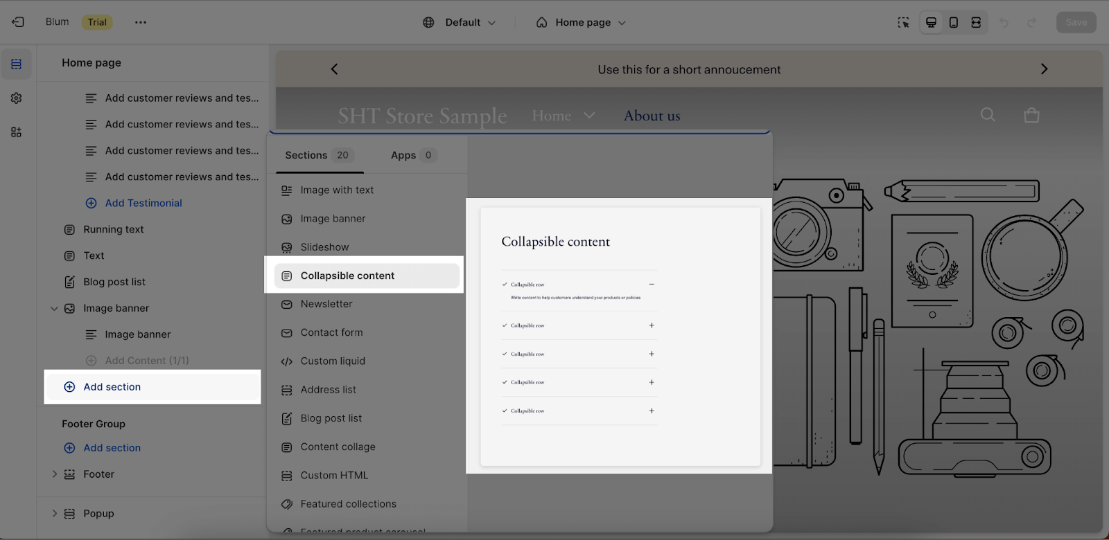
Access Blum Collapsible Content Section
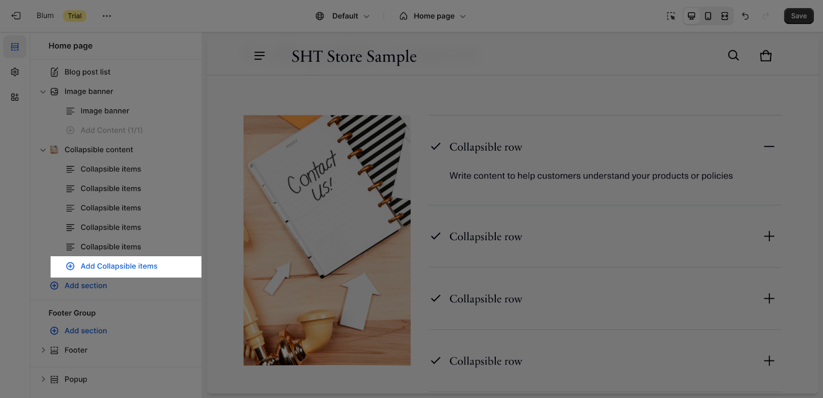
From any page, please click on ‘Add Section’ on the left side bar, then choose ‘Collapsible Content’.
Collapsible Content Section Configuration
Edit General
All the settings on this part are the same as the Icon with text section.
Firstly, you can change the color scheme for this section by selecting the scheme here. To change the theme color, please go to Theme settings > Colors.
After that, you can adjust Section subheading, Section heading and Section description for the section by entering content on the fields.
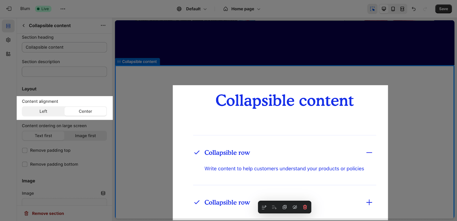
Edit Layout
There are 2 types of alignment that can be set for the heading and content items:
- Left
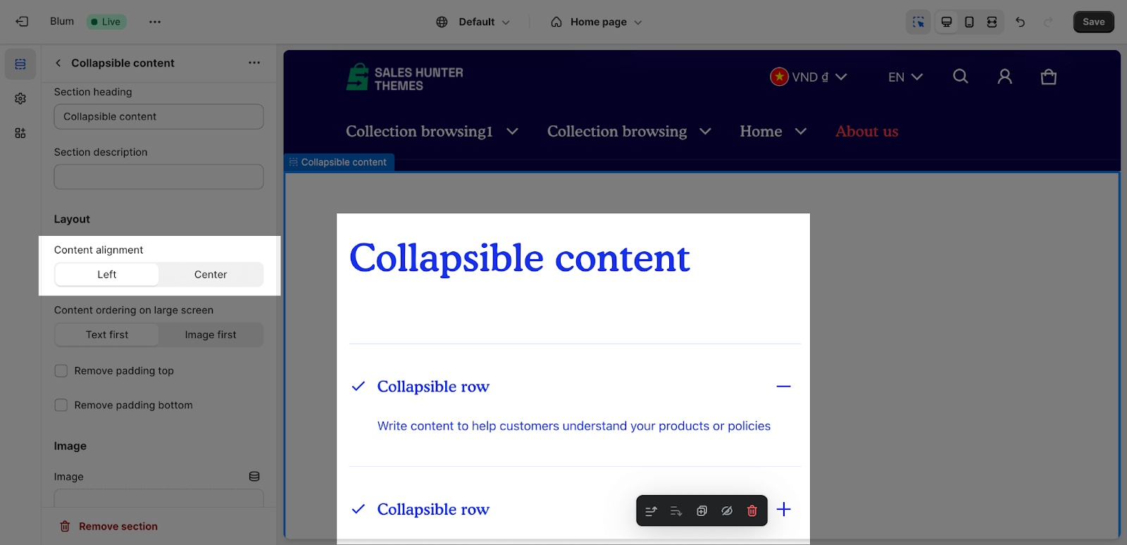
- Center
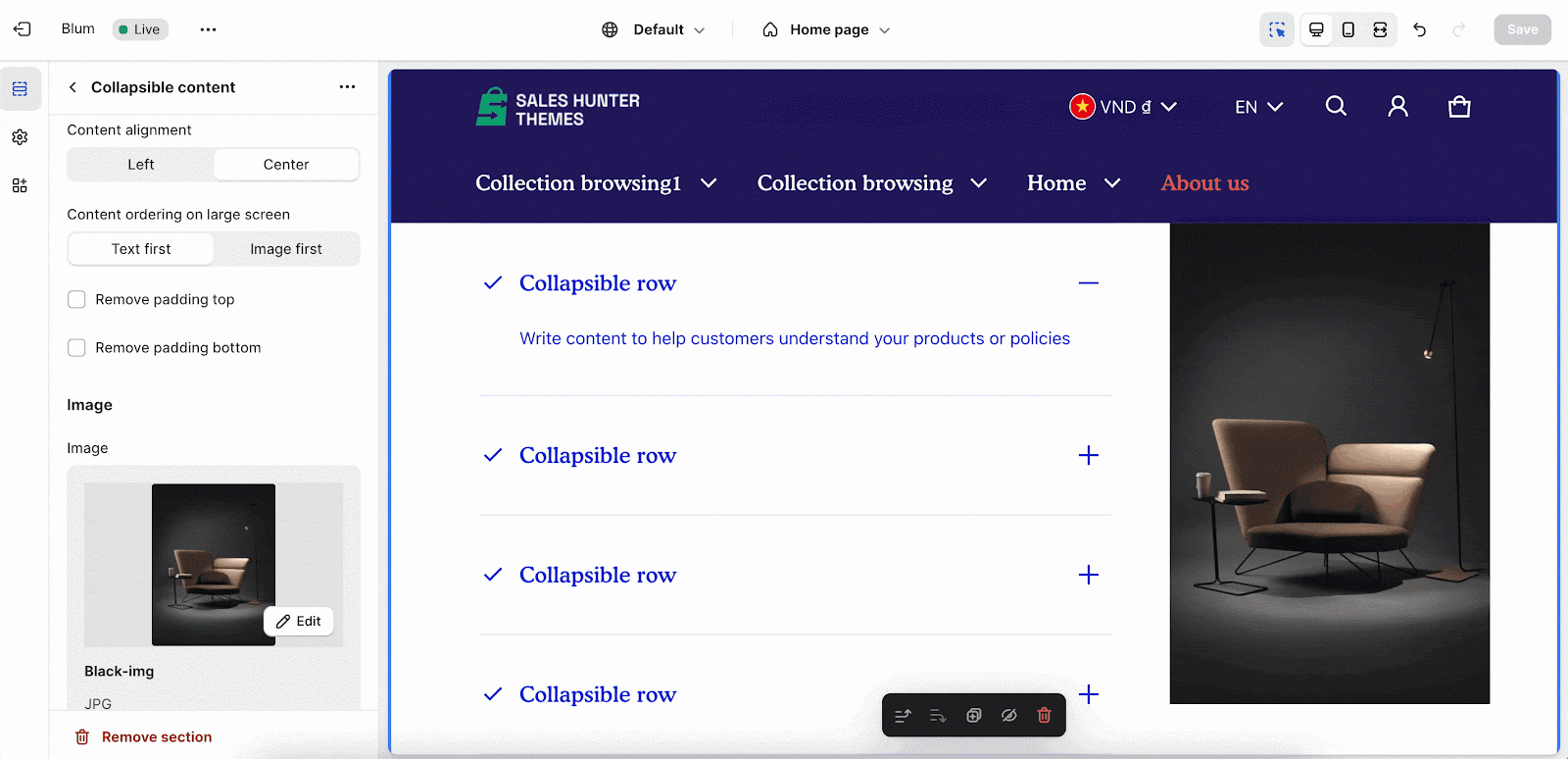
You can choose the order of the content on large screen size devices. This section supports 2 order types: Text first and Image first. By default, the Text first type is selected. For mobile screen size, the content automatically follows the Text first order.
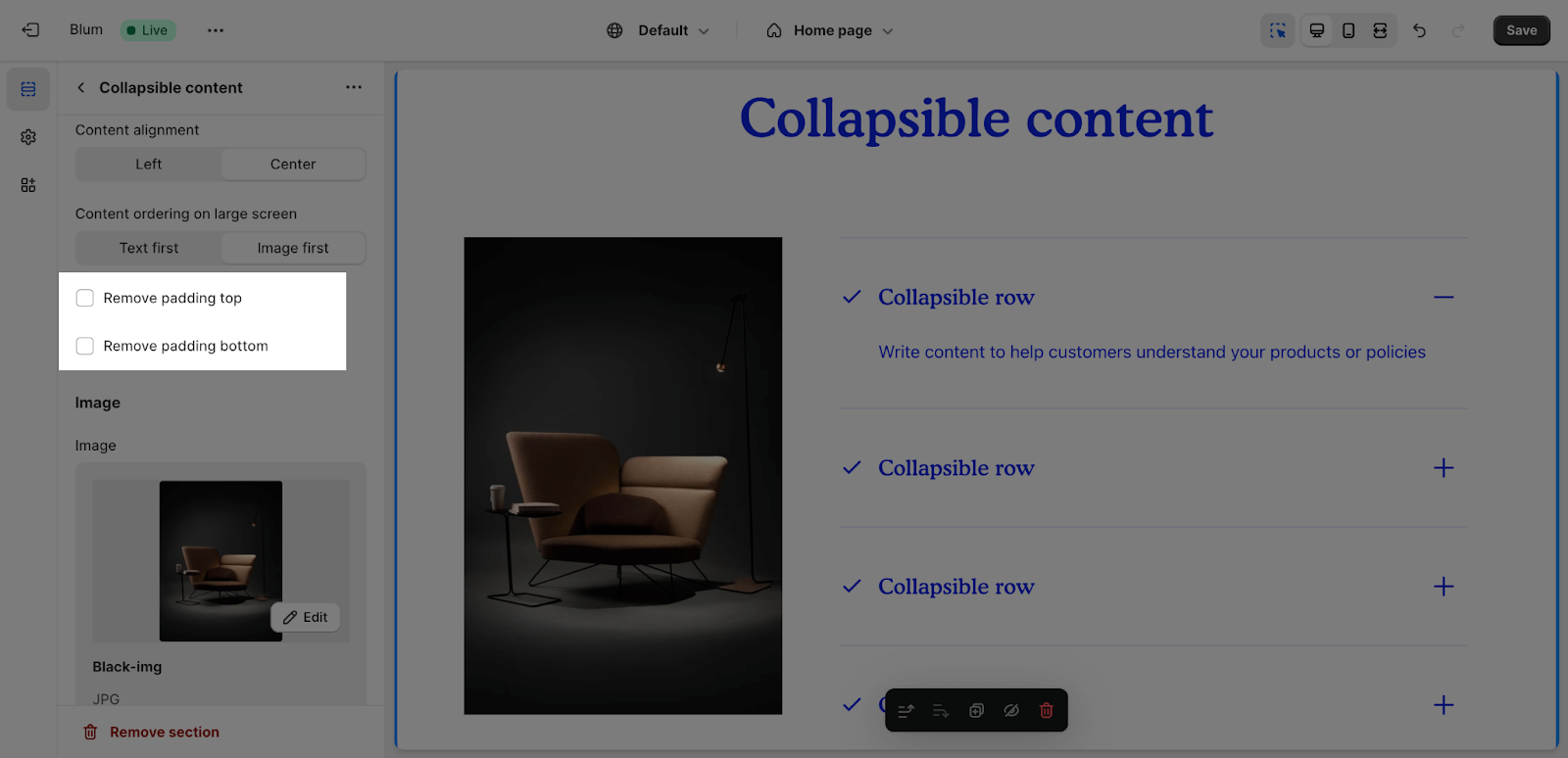
You can also enable ‘Remove padding top‘ and ‘Remove padding bottom‘ to delete the spacing at the top and bottom between the section and the elements inside it.
Edit Image
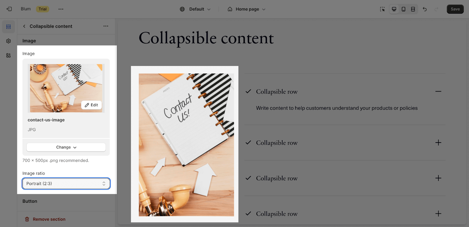
Along with text elements, you can also add an image to the section by clicking the Select image button to upload. The recommended size is 700x500px.
The Image ratio can be selected from: Square, Portrait (2:3), Landscape (3:2) and Adapt to Image.
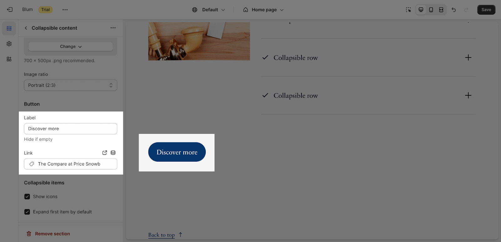
Edit Button
To add button text and button link, click on the placeholder and insert the content.
Edit Collapsible Items
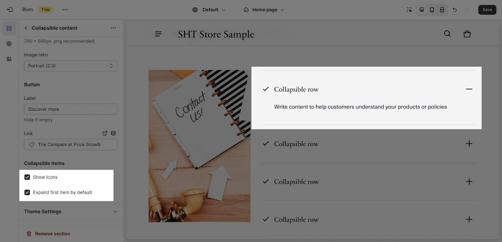
By default, the Collapsible section shows icons on each item; however you can disable the option Show Icons on the Settings.
You can select to expand the first item after the section is loaded on the Expand first item initially option.
Collapsible Items Configuration
The Collapsible Content section uses accordion items. By default, this section has 5 items.
To add more item for the section, click on Add collapsible items here:
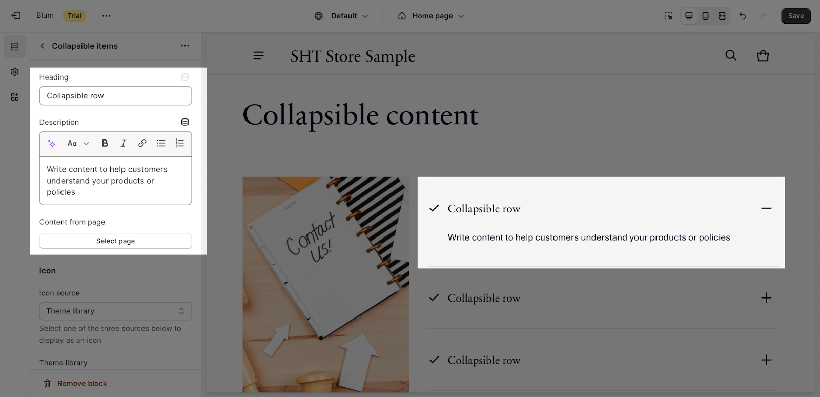
Edit Heading And Description Items
To add more content to each item, click on the item, you can select the icon shape in the Icon dropdown and add/remove Heading and Description for each item by adjusting content on the text box.
If you insert both item description and content from page, the item description will show above the content from page.
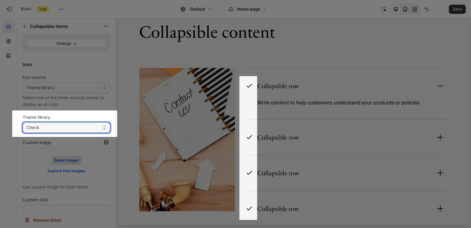
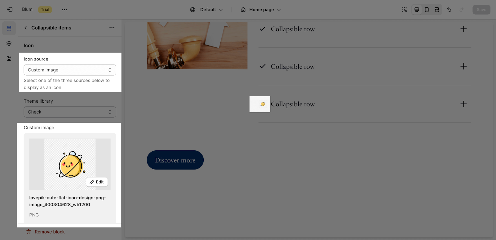
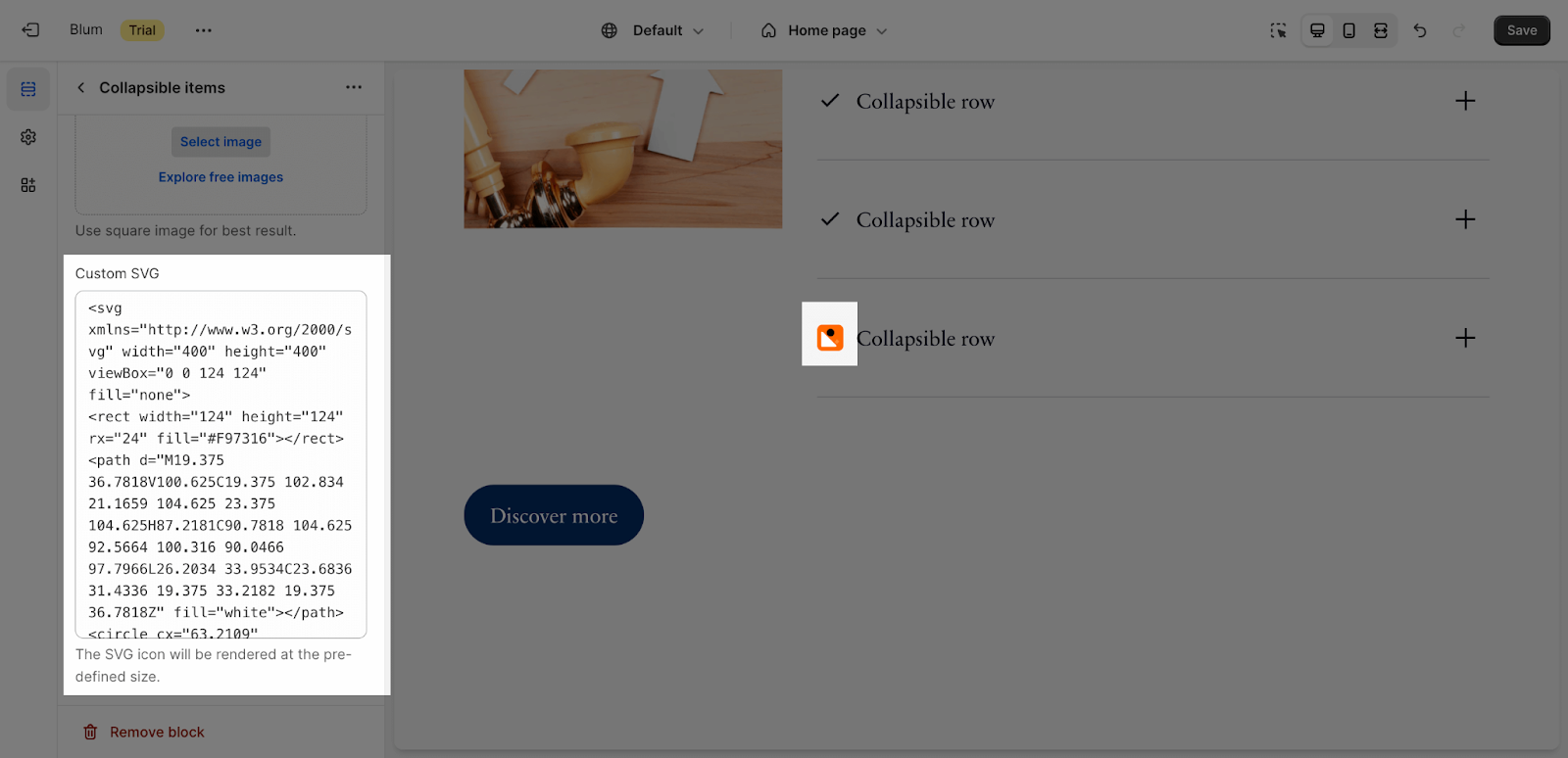
Edit Icon Items
To adjust each Icon in the section, click on the item. You can choose to use the Theme Library icons, add your Custom images, or use code to add Custom SVG files.
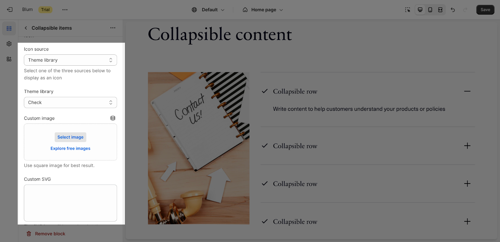
If you choose the Theme Library, you will need to choose from the dropdown list. Check the icon lists can be used on Blum theme here.
If you choose to add Custom images, click Select Image to access the Shopify Store Library of images.
If you choose to add Custom SVG, you will need to copy the SVG file code and paste it in this placeholder. Please note that after upload, the SVG icon size will automatically take the default icon size in this section, which is 24px.
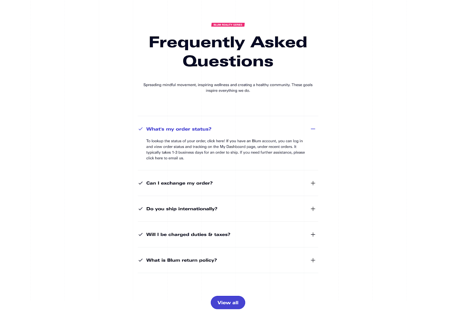
Frequently Asked Questions
Overview
| How many images could I add to the Blum Collapsible Content Section? | 1 |
| How many Collapsible Items could I add to One Collapsible Content Section? | Up to 50 |
When Is Blum Collapsible Content Section Normally Used For?
To display the Frequently Asked Questions section and complicated long contents.
Can I Add CTA Button To Blum Collapsible Content Section?
Yes, you can, simply click ‘Collapsible content’, scroll down to the Button Section, then fill in the ‘Label’ and ‘Link’.