Product Template
About Blum Product Template
The Blum Product Template is a powerful template for creating engaging and conversion-optimized product pages on your store. It enables you to showcase your products with rich media, detailed information, and customizable components that help drive sales.
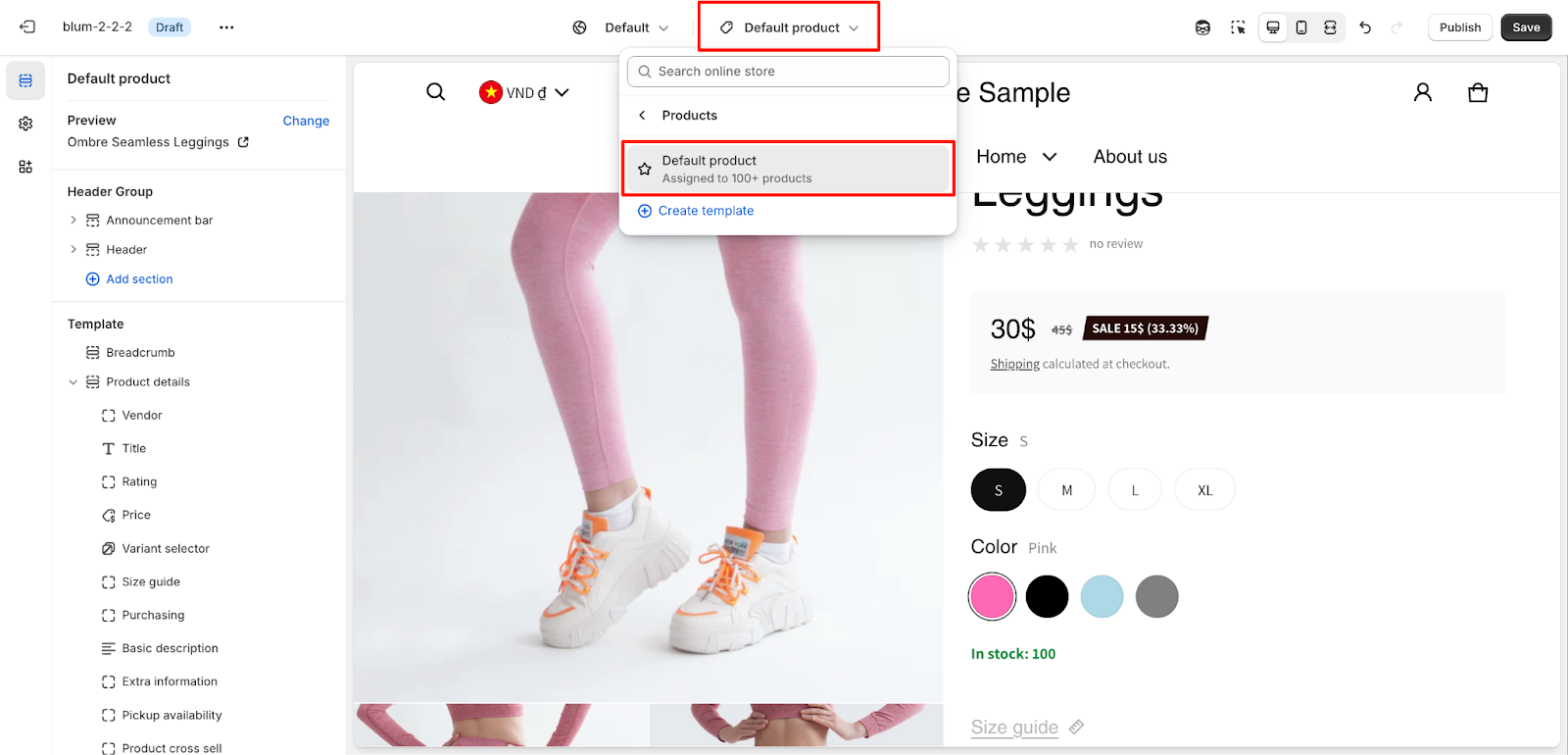
How to Access Product Template
On the top center bar, click the dropdown button > Products > Choose Default products.
How to Configure Product Template
This template includes two default core sections that cannot be removed (can only be hidden):
- Product Details section
- Product Recommendation section
Beyond these core sections, you have complete flexibility to add or remove other sections to create your ideal product page layout. Let us detail the settings of these sections.
Configure Product Details Section
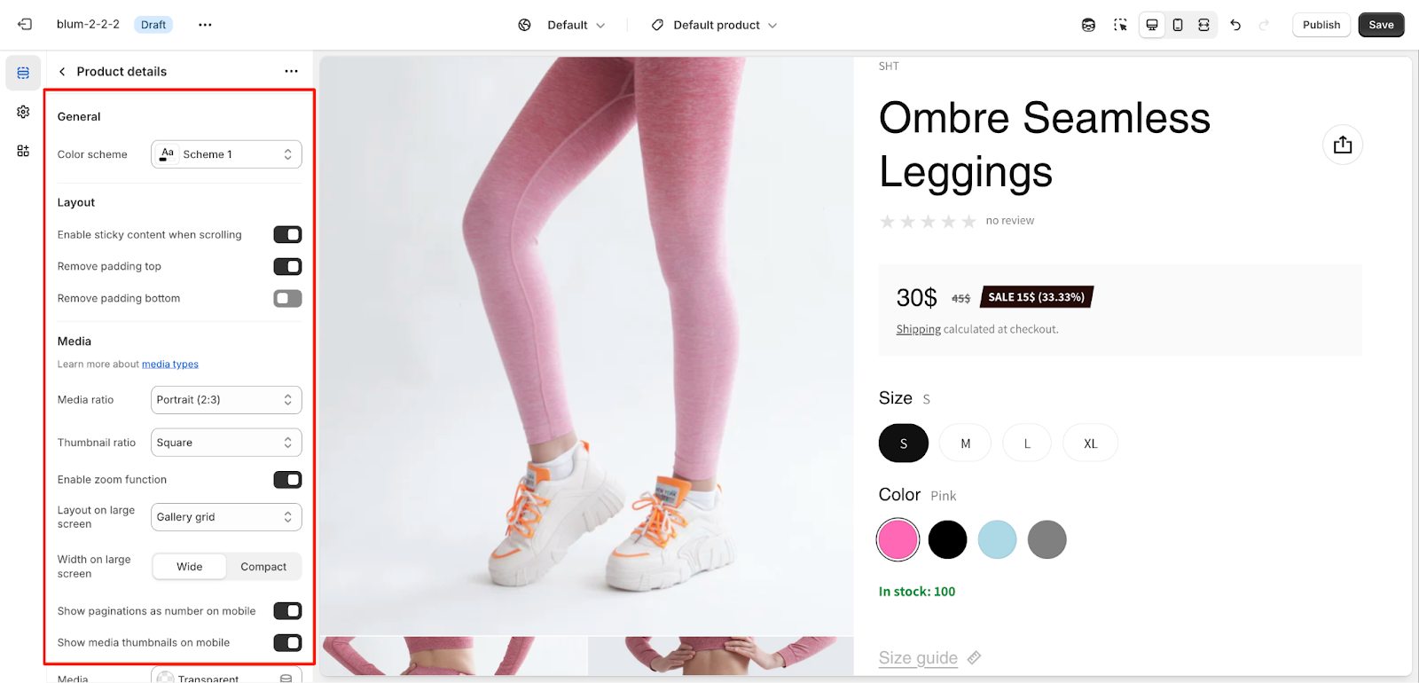
General
You can customize the color scheme for this section by selecting from available schemes. To modify the theme colors, navigate to Theme settings > Colors.
Layout
The section offers key layout options:
- Enable/disable sticky content when scrolling: This feature is enabled by default and serves to create a sticky effect for shorter content placed between product media and product information. When activated, it keeps the relevant content visible as users scroll. If this feature is disabled, the section will revert to standard scrolling behavior without the sticky effect.
- Remove padding top
- Remove padding bottom
Media
The Product Details section provides extensive control over your product media presentation to maximize conversion rate optimization:
- Select the media ratio style
- Choose thumbnail ratio
- Enable zoom function or not
- Select the layout on large screen: for Single with thumbnails (default) or Gallery grid
Advanced Description
In Advanced Description, you can show more content about your product using Static Page or Product Metafield in Content Source.
- Static Page: Render all content from a fixed page to display on all products. To use this option, select Static Page in Content Source, then click on Select page.
- Product Metafield: Merchant must configure the metafield of type “Reference” (which refers to a page for each product). Blum gets the metafield by name and renders the referred page content for each product. To use this option, select Product Metafield in Content Source, then enter Metafield Name.
Sticky Purchasing Bar
The sticky purchasing bar activates when scrolling down and appears after the Add to Cart button, disappearing after the product details end. Key features include:
- Toggle product information display for mobile
- Choose button type:
- Add to Cart Button
- Dynamic Checkout Button
- Position options (for screens wider than 459px):
-
- Bottom rightBottom left
-
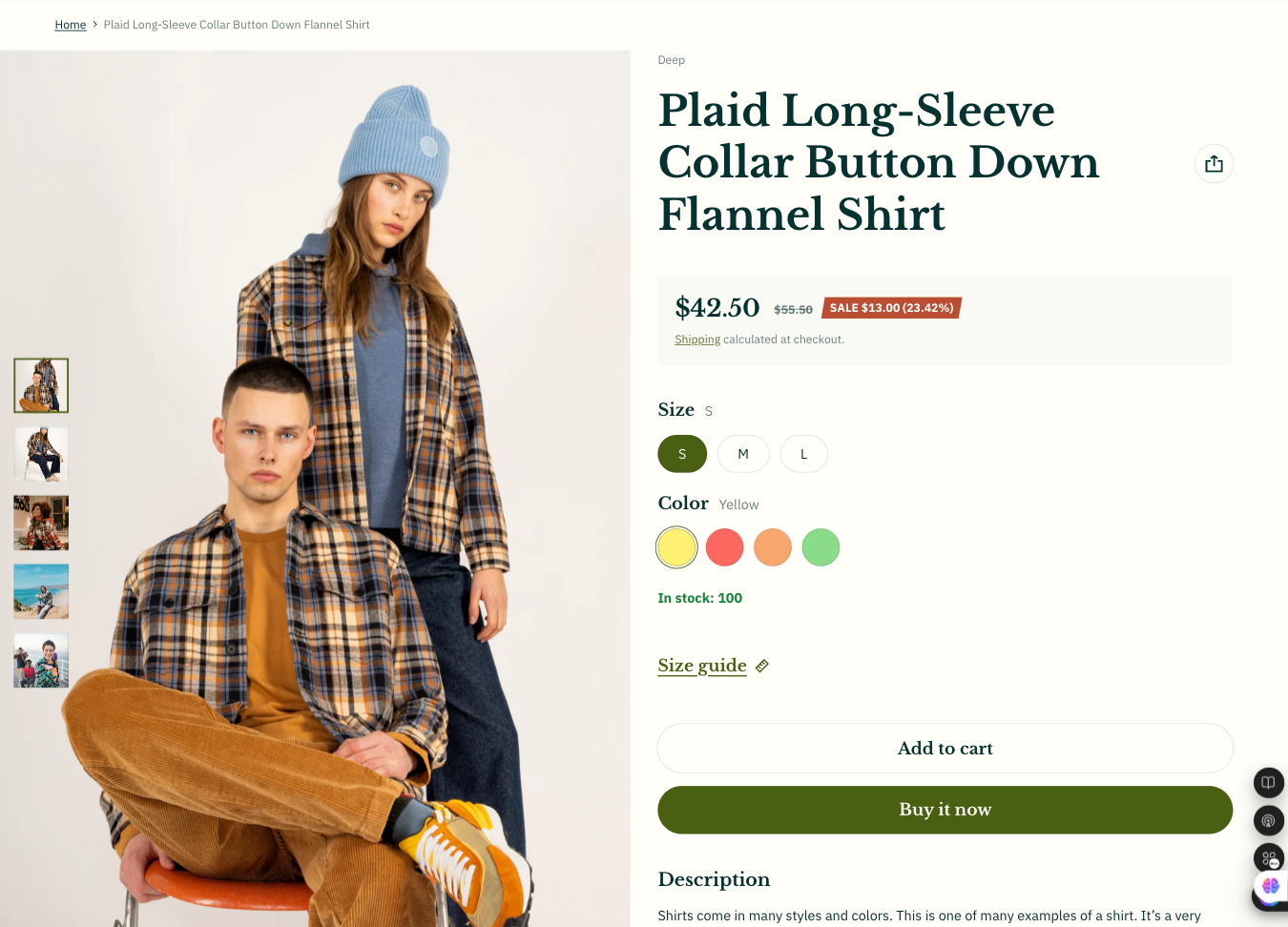
Basic Components
The Product Details section includes essential blocks to display comprehensive product information. These blocks are identical to those in the featured product section. You can find detailed setup instructions here:
- Title
- Vendor
- Price
- Rating
- Variant selector
- Size guide
- Purchasing
- Pickup availability
- Frequently bought together
- Extra information
- Basic description
- Custom liquid
- SKU
- Popup
- Custom text
- Share
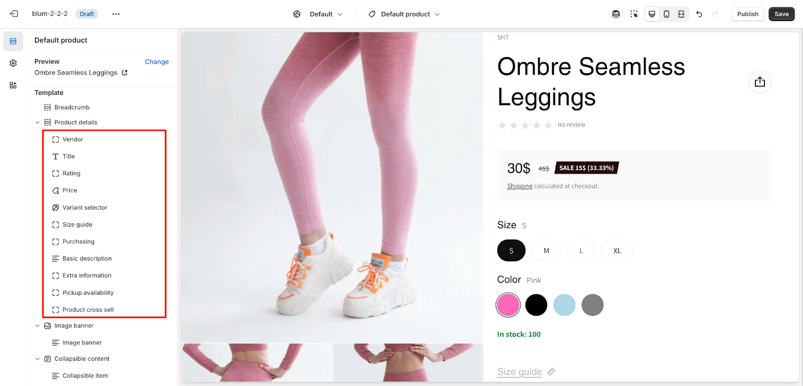
Important notes:
- Most blocks can only be used once, except for Popup content, Custom liquid, and Custom text
- Blocks can be freely added or removed as needed
- Click on any block to access its specific settings
Configure Product Recommendation Section
The Product Recommendation section intelligently displays related products based on product data and order history.
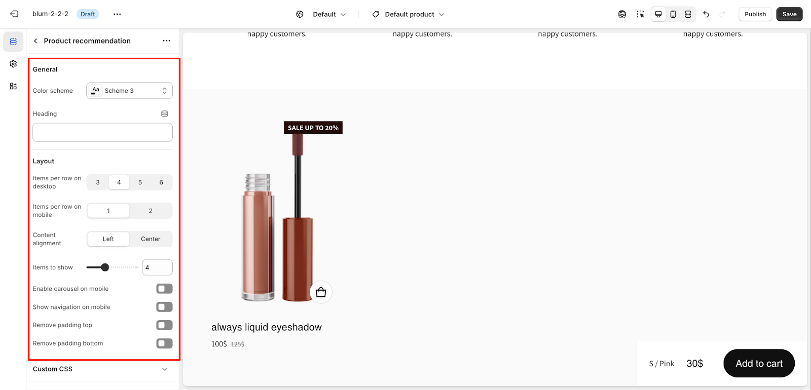
General
- Customize the color scheme
- Edit or customize the section heading with dynamic sources
Layout
Default configuration:
- Shows 4 items (minimum 2, maximum 12)
- Mobile-specific settings:
- 1-2 items per row option
- Optional carousel display
- Optional mobile navigation arrows
- Padding options:
- Remove padding top
- Remove padding bottom
Common Cases and FAQs
1. How can I remove the Product Details and Product Recommendation sections?
These sections are core components of the Product template and cannot be removed. However, you can hide them if needed while keeping other sections visible.
2. How do I customize the layout of product variants?
Access the variant selector block settings to customize the layout and display of your product variants. You can control how variants appear and function on both desktop and mobile views.
3. Why isn’t my custom content showing in the Advanced Description?
If using Product Metafield as your content source, ensure you have:
- Configured the metafield type as “Reference“
- Correctly entered the Metafield Name
- Created and linked the referenced page content
4. How can I optimize my product media for mobile viewing?
For the best mobile experience:
- Enable “Show Paginations As Number On Mobile” for easy navigation
- Use the mobile-specific image option when your desktop image doesn’t translate well to smaller screens
- Consider enabling the carousel feature for smoother browsing
- Test your media display across different mobile devices
5. Why isn’t my sticky purchasing bar showing up?
Check these common solutions:
- Verify that “Enable sticky content when scrolling” is turned on
- Ensure you’re viewing the page below the Add to Cart button
- For mobile devices, confirm that product information display is enabled
- Check if your screen width matches the position settings (>459px for custom positioning)