Featured Product
About Blum Featured Product Section
The Blum Featured Product section is a versatile tool for showcasing a single product in detail on your website. It enables effective product presentation with customizable elements, ideal for:
- Product launches
- Special promotions
- Best-selling items
- Seasonal highlights
- Limited-time offers
The section stands out for its ability to display comprehensive product information, including variants, pricing, stock status, and purchasing options, while maintaining full customization control for both desktop and mobile displays.
How to Access Featured Product Section
From any page in your Blum Admin Dashboard, click the “Add section” button, search for “Featured Product” and select it.
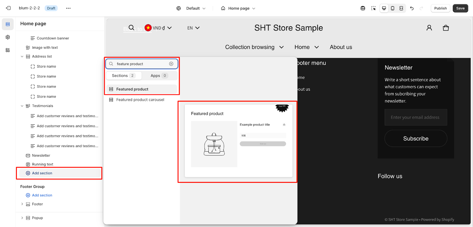
After adding the Featured Product section, customize its appearance and functionality using the available settings.
How to Configure Featured Product Section
Basic Components
Each Featured Product section includes these default components:
- General Settings
- Media
- Layout
- Prominent Badge
- Blocks
To begin customizing, click the “Featured Product” section to access its settings.
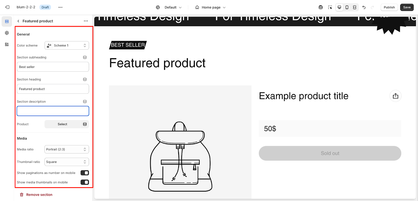
General
Within General settings, you can:
- Change the color scheme
- Edit Section subheading
- Edit Section heading
- Edit Section description
- Change or remove assigned product
Media
The Media settings allow you to:
- Choose Media ratio
- Choose Thumbnail ratio
- Show paginations as numbers on mobile
- Show media thumbnails on mobile
Layout
Configure two main padding options:
- Remove padding top
- Remove padding bottom
Prominent Badge
The Prominent Badge of this section has the same setting as the Icon With Text section.
Configure the badge settings for your featured product:
- Text customization
- Color scheme: Main accent or Extra accent
- Position: Left or Right
- Shape: Star, Diamond, or Asterisk
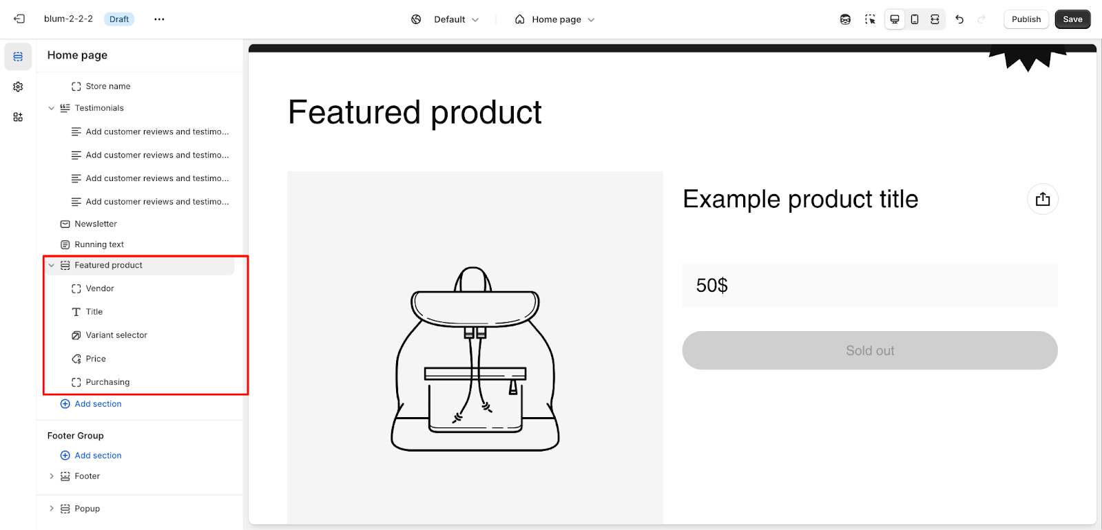
How to Configure Featured Product Section’s Blocks
Each Featured Product section includes these default Blocks:
- Vendor
- Title
- Variant selector
- Price
- Purchasing
- Share
You can choose “Add block” to add more blocks to provide additional product information.
Variant Selector
You can set up stock display options:
- Enable Show stock number: Displays exact inventory count
- Disable Show stock number: Shows basic stock status
Choose from two selector types:
- Button
- Dropdown
Additional options include showing variant swatches, which can be further configured in theme settings.
Price
Configure price display settings:
- Show sale badge
- Show tax and shipping policy
Purchasing
Set quantity selector visibility:
- After adding the cart once
- Always
- Never
Enable “Show dynamic checkout buttons” to allow customers to proceed directly to checkout.
Extra Information
Customize information display:
- Accent scheme for icon colors
- Display style options:
- Horizontal blocks
- Vertical collapsible
For each item, configure:
- Icon source
- Heading
- Content
View Details Button
Choose from three button styles:
- Primary
- Secondary
- Link
Size Guide
Configure size information display:
- Heading
- Content source
- Selected page
- Product metafield name
- Icon options:
- Theme library
- Custom Image
- Custom SVG
Rating
It helps potential customers gauge how well the product is received by others, giving them a sense of trust and confidence in their purchasing decision.
By adding the Rating block into this section, you can show star ratings for the product. Then, you can customize the color of the stars here.
Custom Options
Additional customization features:
- Custom liquid code
- Custom text with style options:
- Body light
- Body
- Social sharing with platforms:
- X
Common Cases and FAQs
1. How do I change the featured product?
In the Blum theme, click “Change Product” within the section settings to select a different product to feature.
2. Can I customize the appearance of the Featured Product section?
Yes, you can fully customize the section through:
- Color scheme selection
- Layout configuration
- Font style adjustments
- Display options for both desktop and mobile views
3. How can I optimize product information display?
Configure the display elements based on your product type:
- Use variant selectors for products with multiple options
- Enable stock display for limited quantity items
- Add custom text blocks for detailed product information
4. When should I use dynamic checkout buttons?
Enable dynamic checkout when:
- Your product typically sells individually
- You want to streamline the purchase process
- Your target audience prefers quick checkout options
5. How do I ensure mobile responsiveness?
The Featured Product section automatically adapts to mobile devices, but you can enhance the experience by:
- Enabling mobile thumbnails for better image navigation
- Configuring pagination display
- Optimizing text content for smaller screens