Image With Text
About Image with Text Section
Blum Image With Text Section is a common layout design used in online stores. It pairs an image with accompanying text to provide a more engaging and informative presentation of a product, service, or promotional message.
Blum Image With Text Overview
| Recommended size for Primary Image | 700x500px |
| Recommended size for Secondary Image | 250x250px |
| Image Ratios Available | (1:1) (3:4) (4:3) |
Access Image with Text Section
From any page, please click on ‘Add Section’ on the left side bar, then choose ‘Image with Text’.
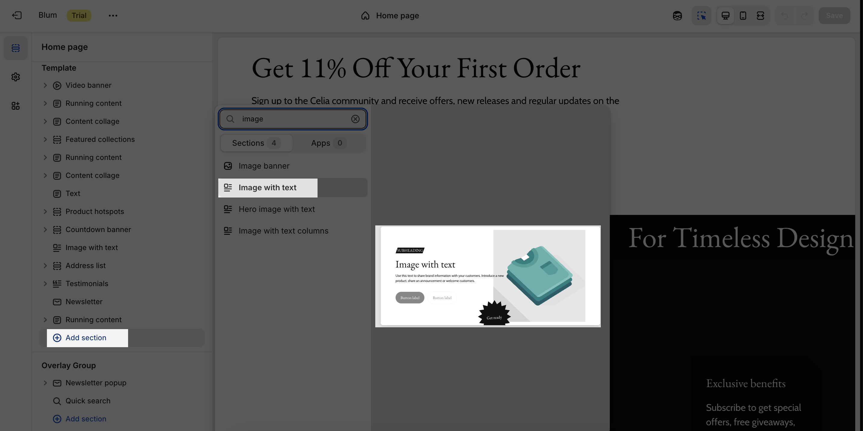
Image with Text Configuration
This section shares the same settings with the Hero Image with Text section in:
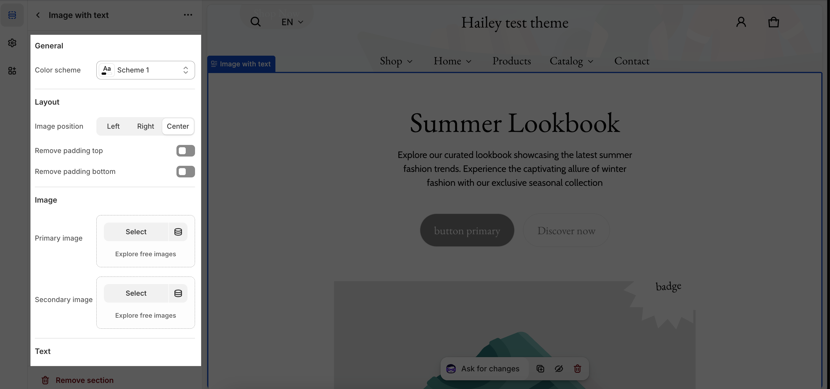
General
- You can change the color scheme for this section by selecting the scheme here. To change the theme color, please go to Theme settings > Colors.
Layout
- Choose Image position of this section with 3 options: Left, Right and Center
- Ability to enable ‘Remove padding top‘ and ‘Remove padding bottom‘ option
Image
In Image tabs, you can set up for the Primary Image and Secondary Image. Click on the Select button in Primary and Secondary image to add your images in the section. If you just want to show one of the images, simply keep the other image type blank.
The recommended size for Primary Image is 700x500px and 250x250px for Secondary Image. With Primary and Secondary Image Ratio, you can select one of 3 types: Square, Portrait (3×4) and Landscape (4:3). By default, the section is set for Portrait type.
Text
- Add content in the Section Subheading, Heading and Description
- Enable large heading: Enable when creating a hero section at the top of your page that you want to dominate the view
Button
- Add button text and button link
Prominent badge
- Text: You can enter the name on the field
- Accent scheme: Main accent or Extra accent (Set up in the Theme settings > Colors > select one Color Scheme > find Accent)
- Position: Left or Right
- Shape: Star, Diamond or Asterisk