Theme settings
Welcome! Let’s set up the Blum Theme Settings by reading this article. To contact us, please drop us an email via: hi@saleshunterthemes.com for more support.
Accessing Blum Theme Settings
After installing Blum Theme to your Shopify account, you can find the theme settings by clicking on the second icon on the menu bar.
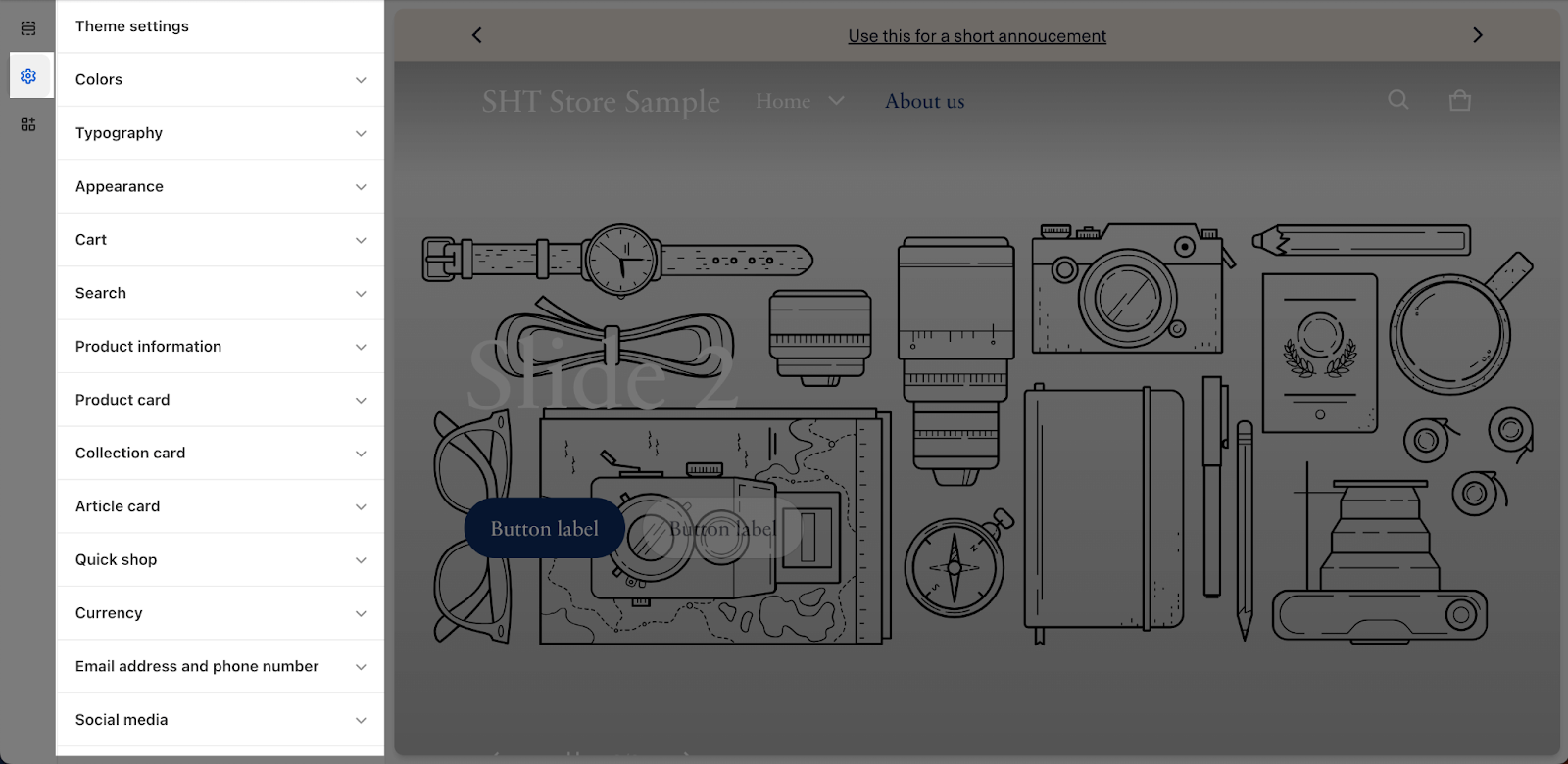
Table Of Contents
- Get Started
- Colors
- Typography
- Appearance
- Cart
- Search
- Product information
- Product card
- Collection card
- Article card
- Quick shop
- Currency
- Email address and phone number
- Social media
- Favicon
- Custom CSS
- Theme Presets
About Editing Blum Theme Settings
Blum Theme settings let you define a unified style across your entire store. From fonts and colors to text and product displays, everything takes on a consistent, professional look. This saves you time and effort compared to setting individual styles for each section and page.
| How do I NOT add subheading? | Simply leave the field blank |
| Can I add my own color scheme? | Yes, including editing background, contents and buttons colors |
| Favicon Logo Size | 32px x 32px |
Get Started
The Get Started section acts as an onboarding guide to help you set up your store quickly. Here’s the list of essential settings for initial settings:
-
Start with your brand’s Look & Feel: Quick links to upload your logo, choose a preset (Theme style), set colors & fonts, and adjust spacing.
-
Build your Homepage: Guidance on using presets or customizing with banners and blocks.
-
Set up Key Pages: Tips for setting up Product Pages, Collection Pages, and Cart & Checkout.
-
Explore advanced built-in features: Information on features like Mega menu, Product siblings, Infinite scrolling, and more.
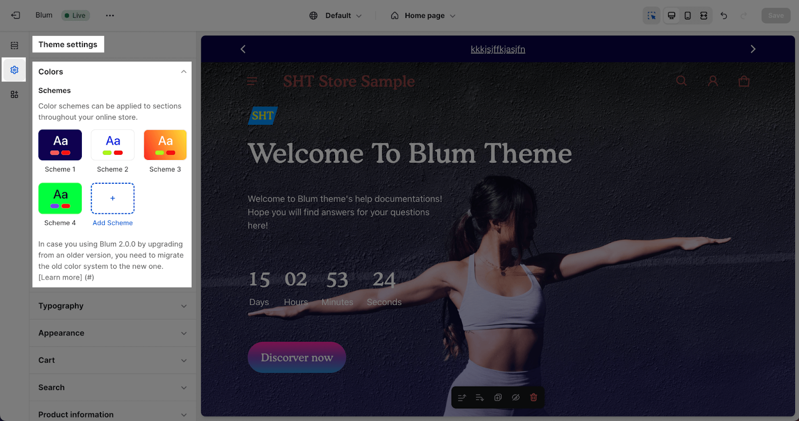
Colors
Personalize your store’s colors with ease! In the Theme Settings, simply click on the colorful circles under the ‘Colors‘ category to access a range of pre-designed color schemes or create your own.
A color scheme is a collection of harmonizing colors for your store’s text, background, buttons, and badges. Apply these color schemes to various sections of your store to achieve a cohesive and visually appealing look.
According to Shopify, you have the flexibility to add 21 color schemes to your store, allowing you to tailor the look and feel to your unique preferences and branding.
How to use: Instead of picking colors for every section, you assign a “Scheme.” If you change the color in the Scheme settings, every section using that scheme updates automatically.
To customize a color scheme, click on the desired scheme to open the color selection modal. Here, you can either choose a color from the palette or enter the specific color code. When selecting colors, keep accessibility guidelines in mind to ensure your store is inclusive and easy to use for everyone.
-
Schemes List: You will see a list of available schemes (e.g., Scheme 1, Scheme 2, Scheme 3…).
-
Edit Scheme: Click on any scheme to customize its specific colors.
-
Add Scheme: Click the + Add Scheme button to create a new color palette.
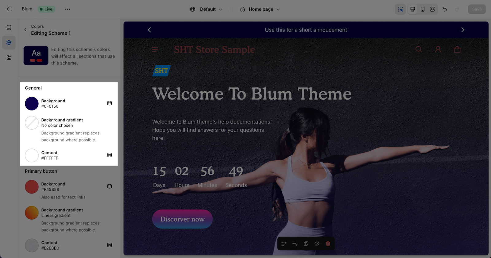
General Color
General colors are only applied to sections that do not use a card scheme.
- Content: The default text color is applied to all texts, including headings, text links and outline button, when they are not inside a card scheme.
- Background: The default website background color.
- Background gradient: The website background color with a gradient effect. This will replace the solid background color when selected. If the visitor’s browser does not support gradient backgrounds, some section backgrounds may revert to the default background color.
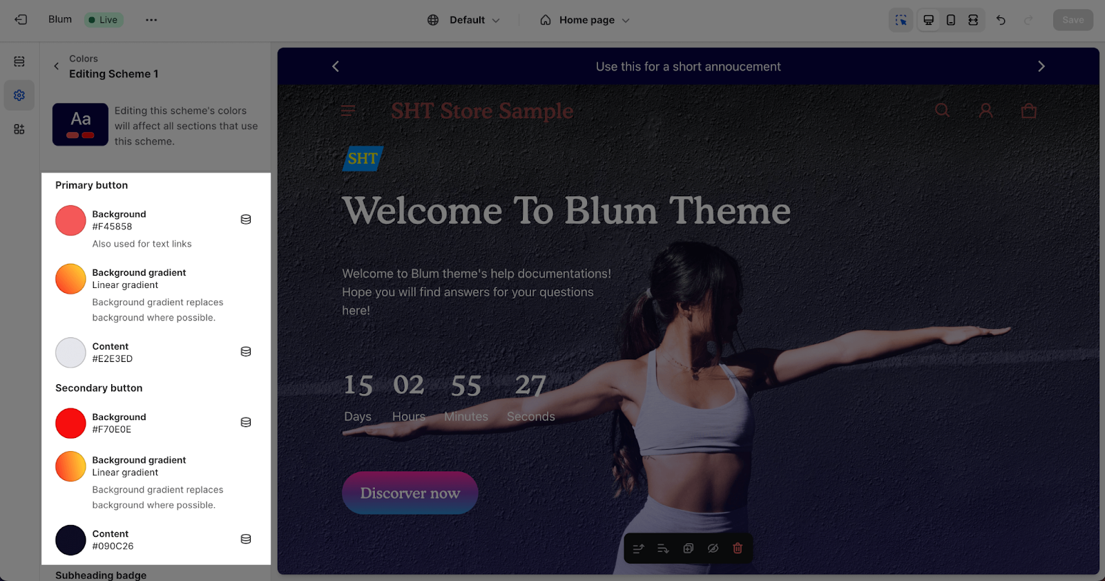
Button Color
Button colors are used for both the Primary and Secondary button.
- Background: Apply for the button backgrounds, borders, and also labels
- Background gradient: This setting applies to the button background color with a gradient effect. It will replace the solid background color when selected.
- Content: Apply for the button text.
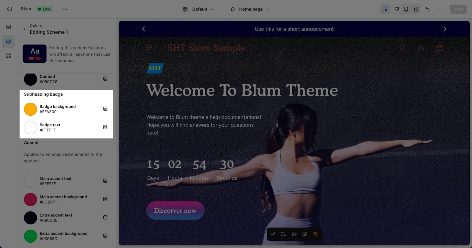
Subheading Badge
Subheading badge colors are used for both the labels and backgrounds of subheading when it in badge type.
- Badge background: Applied for the background used in the badge style of the subheading.
- Badge text: Applied for the text used in the badge style of the subheading.
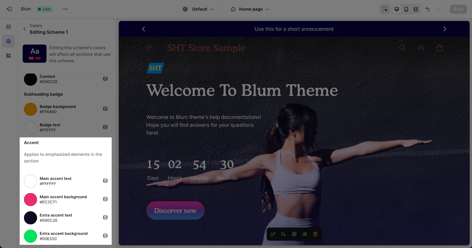
Accent
The Blum theme supports two accents for elements that choose the accent color like Prominent badge, which are applied when the section uses a card scheme. There are two accents that can be set which are Main accent and Extra Accent.
-
Main accent text / background: Colors for emphasized elements.
-
Extra accent text / background: Additional accent colors.
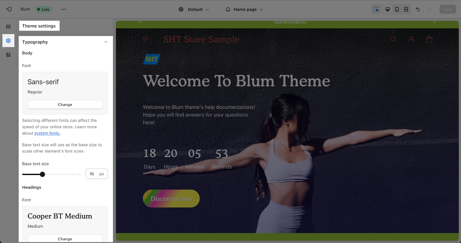
Typography
To change Typography, we can go to Theme settings > Typography, where you can universally change the font family of headings and body texts, as well as font scale level. Check this article to learn more about the Typography settings in Blum theme.
Appearance
This section controls the layout, spacing, and language orientation of your store, as well as the appearance of Components and Animations.
Spacing
- Enable content max-width: Enable or disable the content max-width. When enabled, the maximum width of the content container will be limited to the value you put in the Content max-width setting. This change will be visible on your desktop screen. When disabled, the content container expands to its default width.

- Spacing scale: In the Spacing section, you can select the Spacing scale for the entire store. This will affect all spacing between elements in a section, the padding of the section, and more. The Spacing scale will vary depending on the screen size. Below are the examples of Large and Small Spacing scale
- Enable content max-width: Limits how wide your site appears on large desktop screens to prevent content from looking “stretched.” It also provides a global slider to increase or decrease the Content max width.
- Choose between small, medium, and large spacing scales.
The Spacing scale will vary depending on the screen size.
| Spacing scale | Phone | Tablet | Desktop regular | Desktop extra large |
| Small | 6px | 9px | 12px | 15px |
| Medium | 7px | 10.5px | 14px | 17.5px |
| Large | 8px | 12px | 16px | 20px |
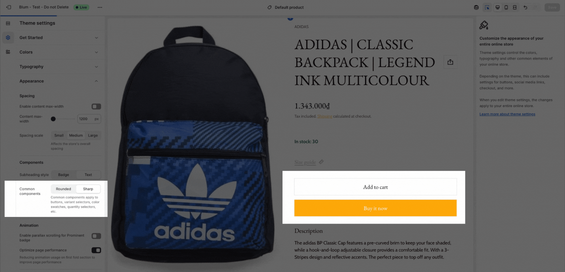
Components
- Subheading style: This option allows you to display the subheading as a badge or as text. After you choose an option, the subheading will be styled according to the settings for badges or text that have been set up in Accent color.
- Shape of Common components
Languages & RTL (New Feature)
What it is: Right-to-Left (RTL) support for languages like Arabic, Hebrew, or Persian.
-
What it controls: When enabled, it flips the entire layout (Logo moves to right, Menu to left).
-
Beginner Tip: After enabling, check your Typography. Some fonts designed for English may not support RTL scripts properly.
-
Setup Steps:
-
Go to Appearance > Languages.
-
Enter your language code (e.g.,
ar) in the Languages support RTL field. -
Toggle Enable RTL to On.
-
*You must ưnter ISO language code, separated by a comma. Leave blank to enable all languages. Make sure you check ISO language code.
Animation
You can freely enable or disable parallax scroll for the prominent badge in the Animation settings. When parallax scroll is enabled, the prominent badge will rotate and move along with the page content, creating a more dynamic and immersive experience for your users.
When parallax scroll is disabled, the prominent badge will stop scrolling along with the page content, but will continue to rotate as usual.
Additionally, you can choose to enable the Optimize page performance option to reduce the loading time of all animations when the first three sections of the page appear.
Cart
In Theme settings > Cart, you can customize how the cart show. From your Theme settings, click on the Cart tab in the sidebar menu.
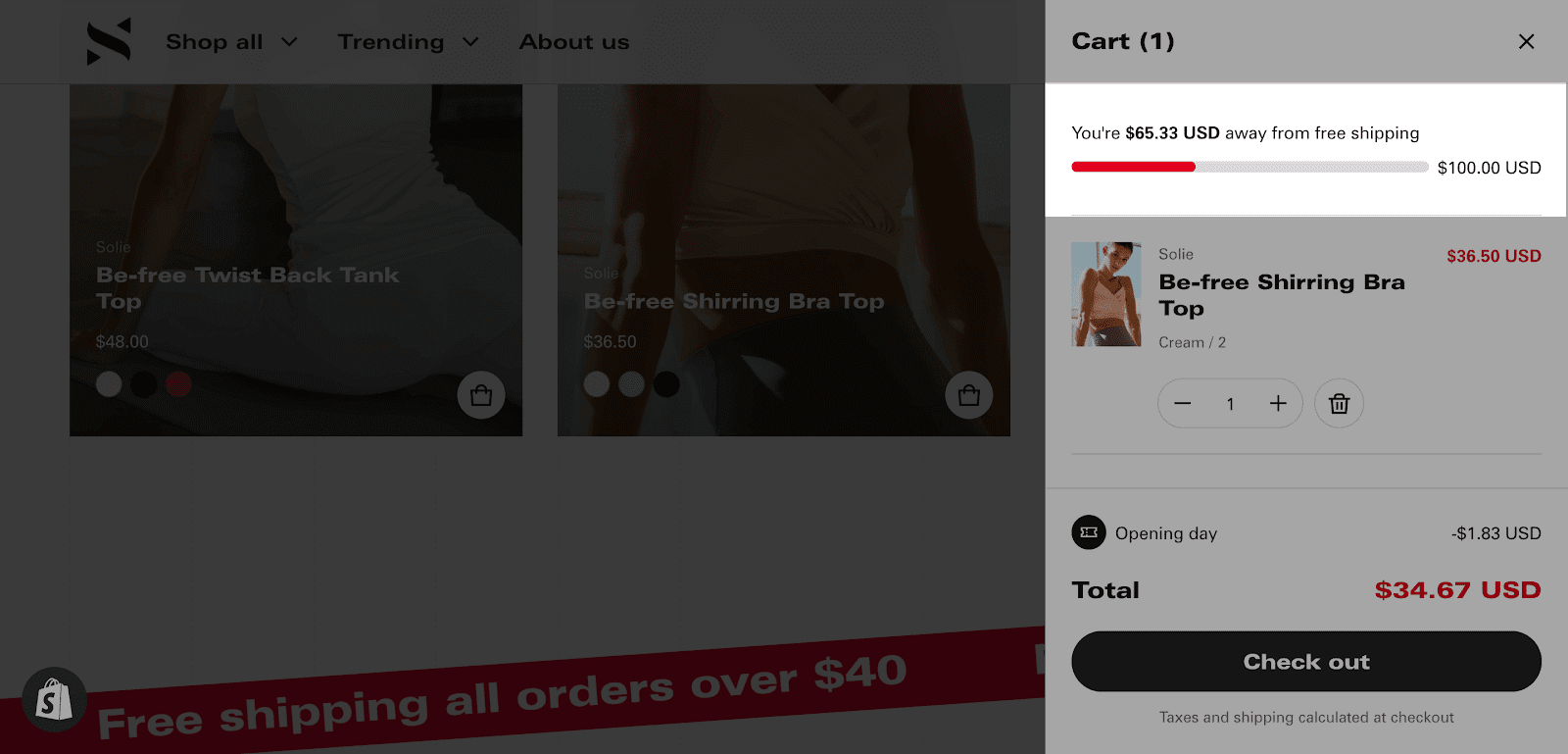
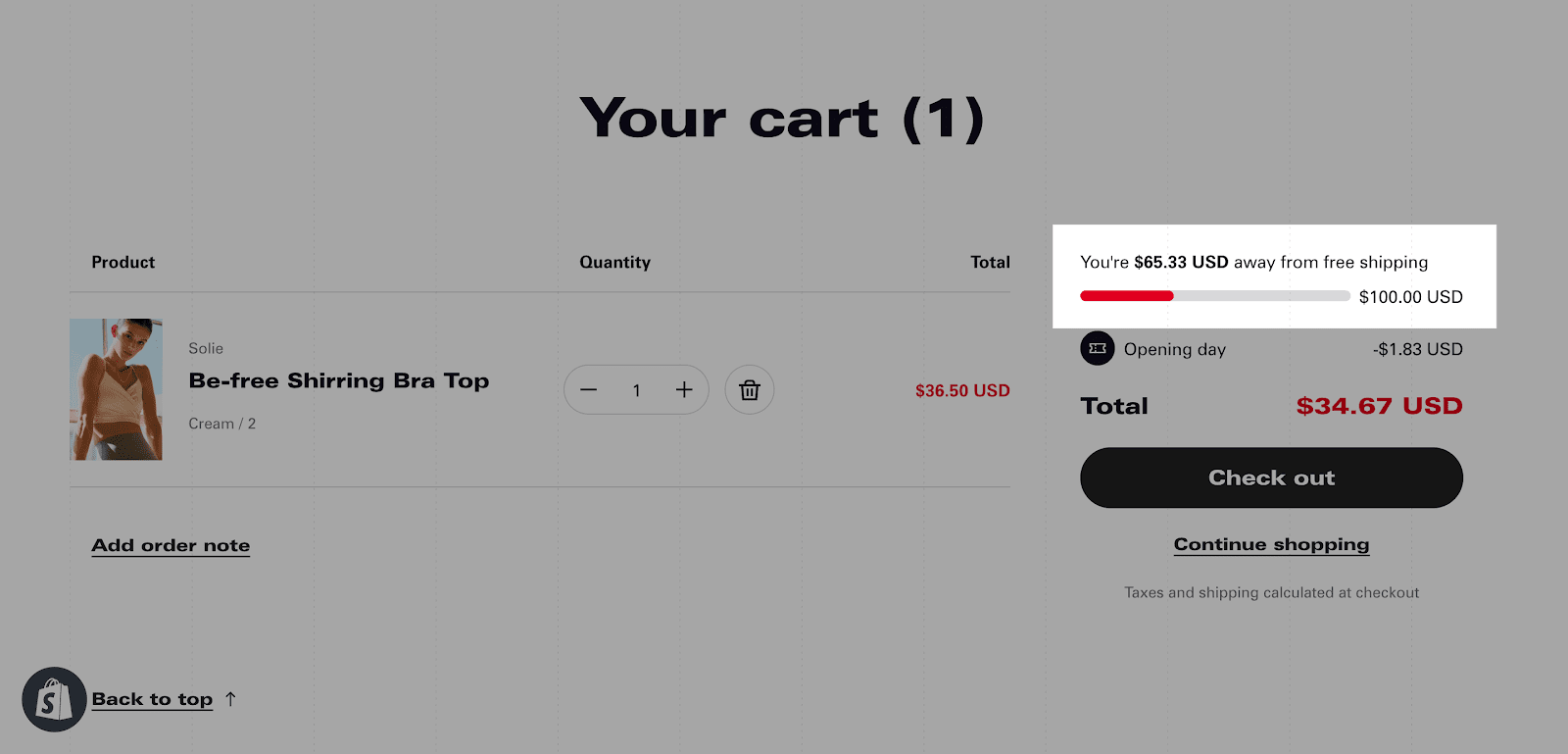
There are two ways to display the cart page in Blum:
- Drawer: The cart appears as a slide-out drawer on the right side of the page.
- Page: The cart appears as a dedicated page on your website.
By default, cart type is set at Drawer.
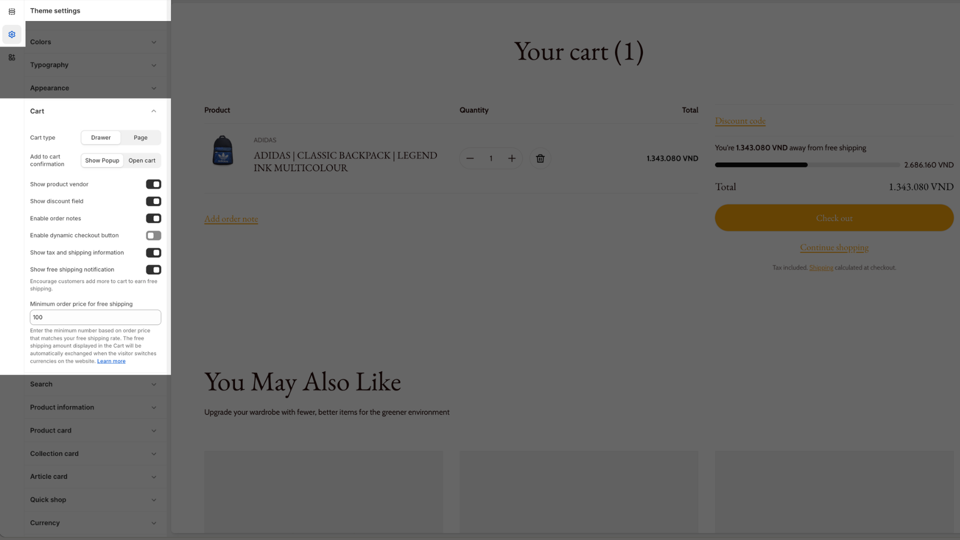
You can select which type of cart you want to use, and you can also select which details you want to display with the cart.
- Show product vendor: Displays the vendor of each product in the cart.
- Enable order notes: Allows customers to leave notes for their order.
- Enable dynamic checkout button: Displays a checkout button that changes color and text depending on the contents of the cart.
- Show tax and shipping information: Displays the estimated tax and shipping costs for the items in the cart.
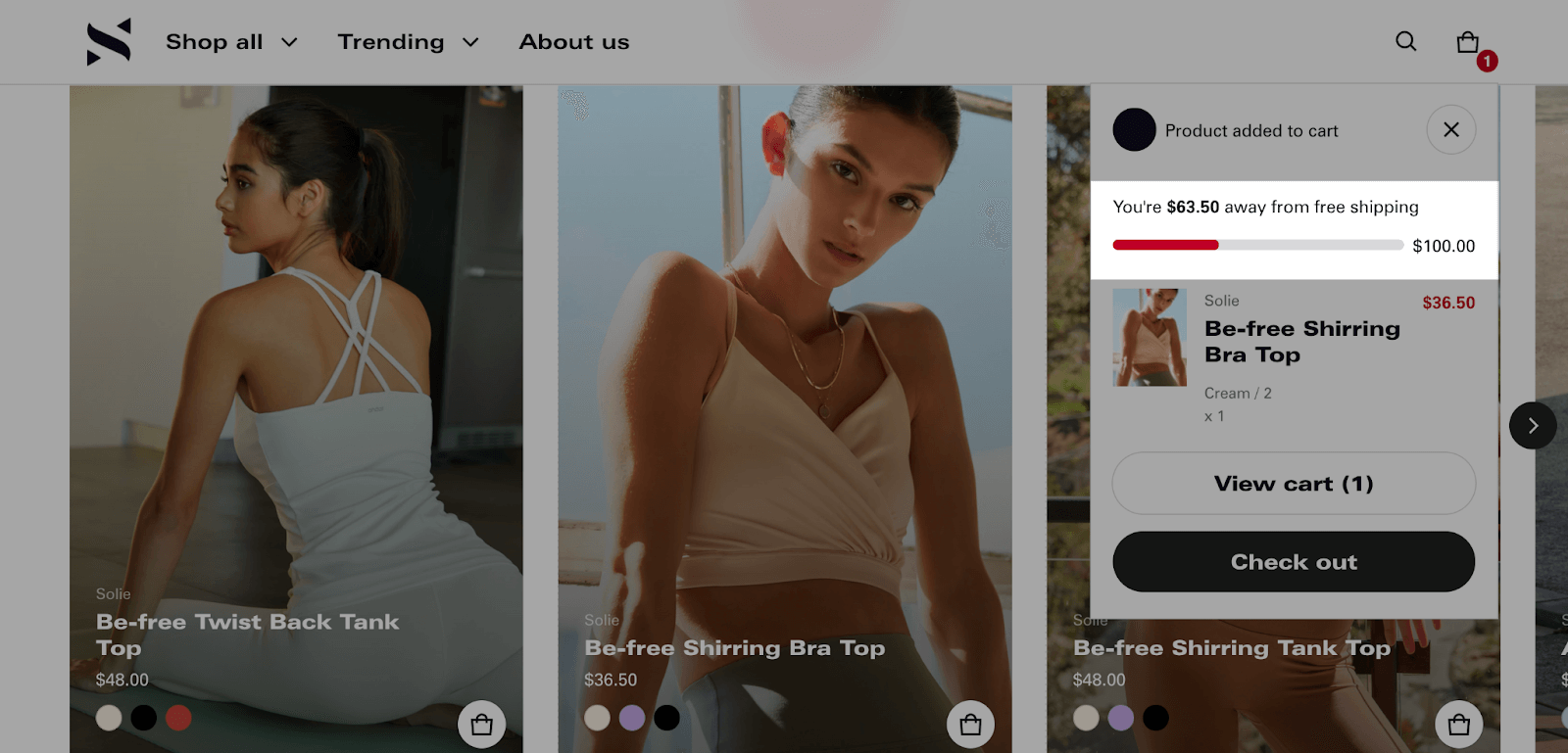
- Show free shipping notification: Displays a message encouraging customers to add more items to their cart to reach the free shipping threshold.
- Add to cart confirmation: Choose Show Popup to show a confirmation window, or Open cart to take the user directly to their drawer/page.
- Show discount field: Allows customers to apply coupons directly in the cart drawer. This is helpful for reducing cart abandonment.
You can also set a minimum order price for free shipping by entering the minimum order amount that qualifies for free shipping. If you enable both the “Show free shipping notification” and “Minimum order price for free shipping” options, a free shipping bar will be displayed as follows:
- On notification message: A message will be displayed on the cart page notifying customers of the free shipping threshold and how much more they need to spend to reach it.
- On Cart Drawer: A message will be displayed in the cart drawer notifying customers of the free shipping threshold and how much more they need to spend to reach it.
- On Cart page: A message will be displayed at the top of the cart page notifying customers of the free shipping threshold and how much more they need to spend to reach it.
By default, Free shipping amount will display currency based on your settings inside Shopify dashboard > Settings > Store details > Store currency.
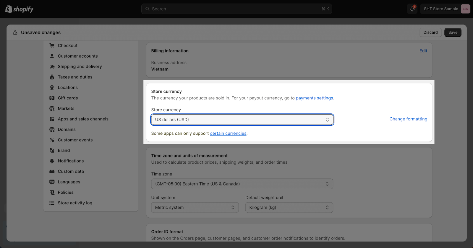
In case the currency is changed, the value of Free shipping amount will also be automatically exchanged based on Shopify mechanism. The live exchange rates will be applied.
Search
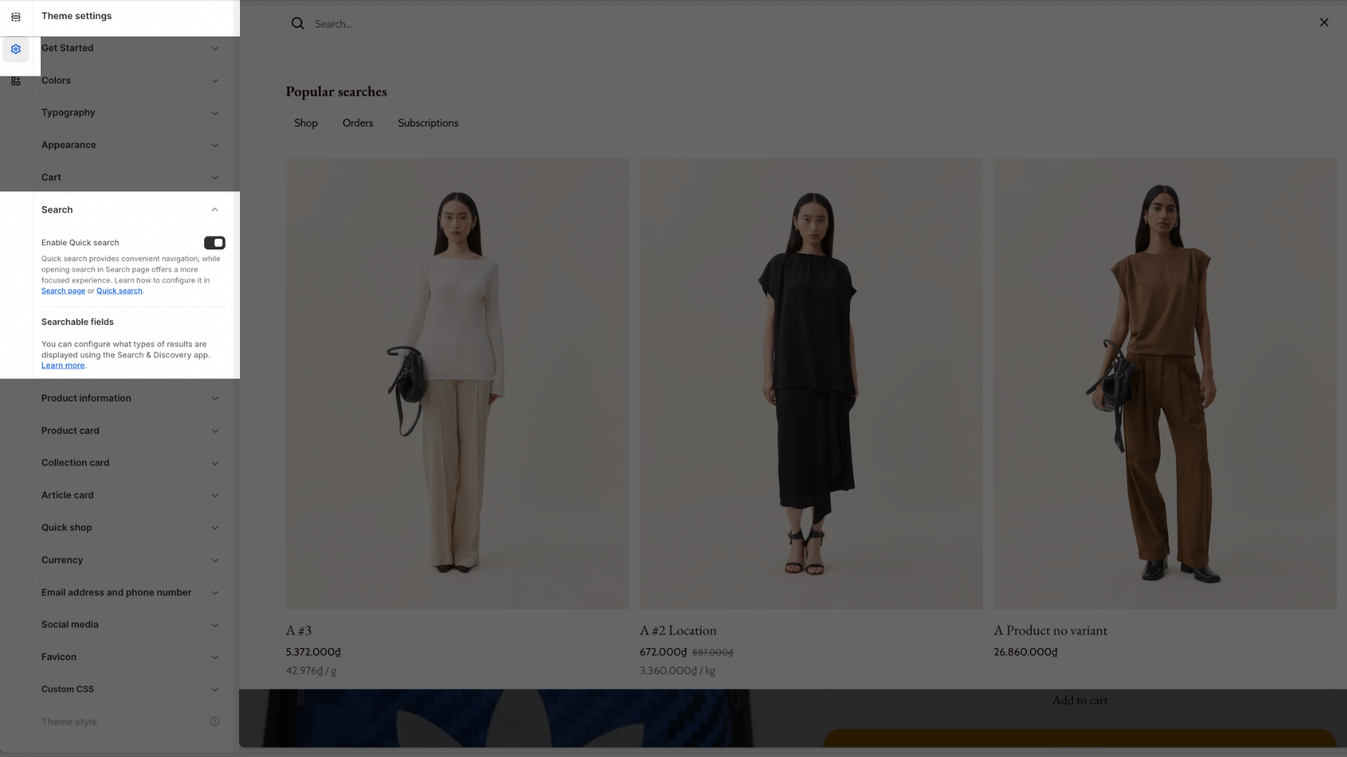
You can enable/unable Quick Search in Search settings.
Quick search provides convenient navigation, while opening search in Search page offers a more focused experience. Learn how to configure it in the Search page or Quick search.
For further Quick Search and Search Result settings, please refer to this Blum Search Result Template Manual Article.
Search result types/Searchable fields (Products, Collections, Pages, Blog posts/Articles, etc.) are managed via the Shopify Search & Discovery app. Use the link in the Search settings to open the app and configure your searchable fields and filters.
Product Information
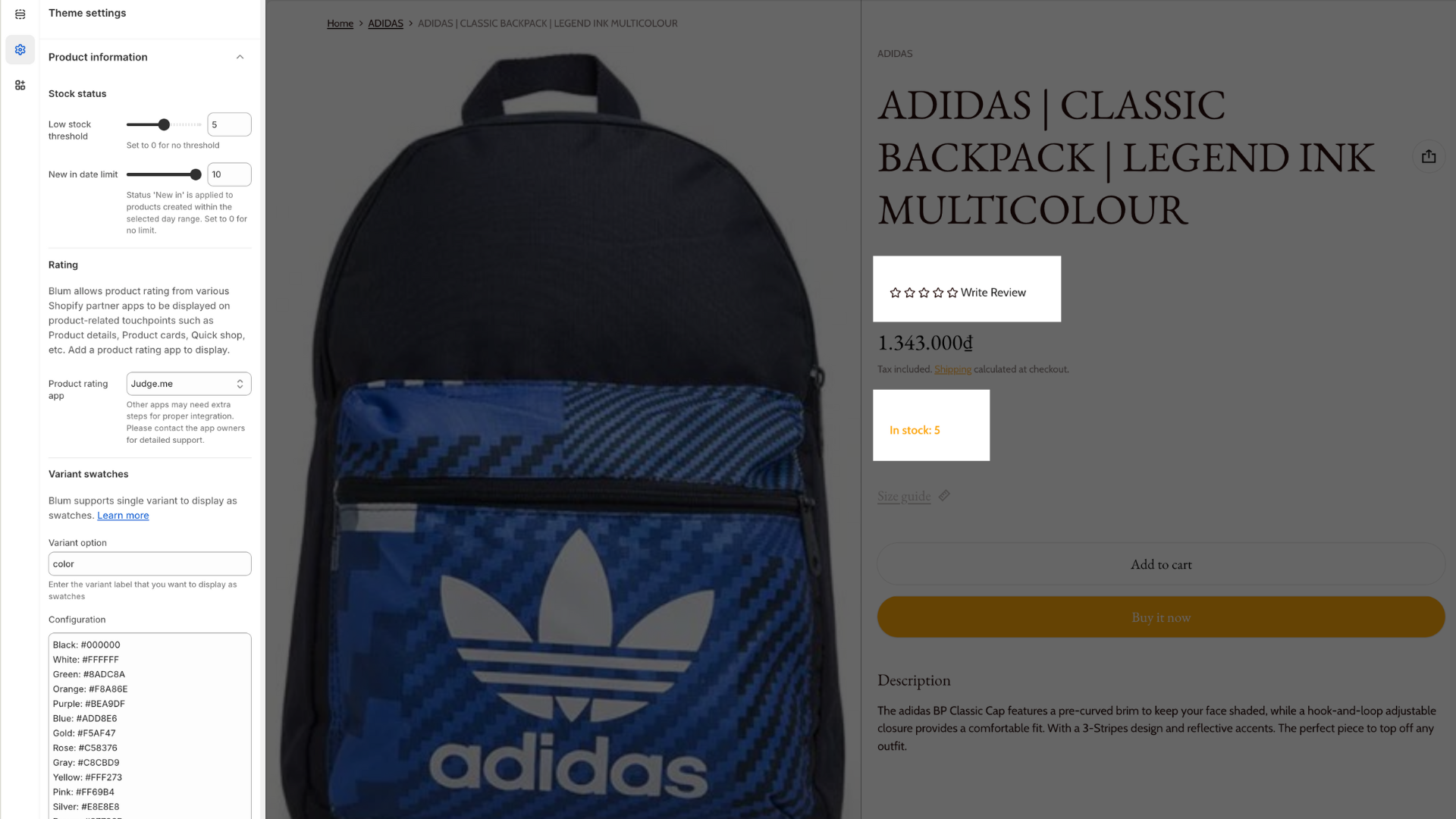
Stock Status
Within the Stock status settings, you can configure:
- Low stock threshold: It can be displayed from 0 to 10 low stock threshold and the default is 5. Blum supports variant options that display as swatches. You can choose to Enable variant swatches to display. Set to 0 for no threshold
- New in date limit: Configure the day range (shown as “10” in the screenshot)
Rating
Blum allows product rating from various Shopify partner apps to be displayed on product-related touchpoints such as Product details, Product cards, Quick shop, etc.
To use this feature:
1. Install the rating review app. We have supported for the rating app:
- Judge.me
- Air review
- Loox
- Okendo
Other apps may need extra steps for proper integration. Please contact the app owners for detailed support.
2. Select your preferred app from the dropdown menu. Be aware that other apps may require additional configuration steps
3. Now you can back to the related section and customize it styles. We can use this rating on:
- Theme setting > Product card/ Quickshop: checkbox “show rating” and customize star rating color
- Product details/ Featured product section > Add Rating block: change the star rating color
- Content collage section > Product block: checkbox show rating and customize star rating overlay color
- Featured product carousel section: have an additional feature to select the rating color. The star rating overlay color here overrides the color setting in Theme settings > Product card.
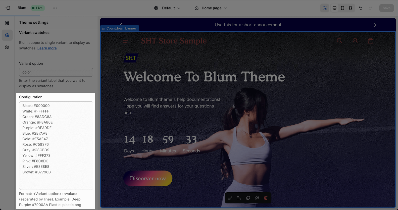
Variant Swatches Mechanism
By default, Blum theme supports variant swatches for all types of variants you have in your store. Data of variant can be collected after filling the Variant option placeholder.
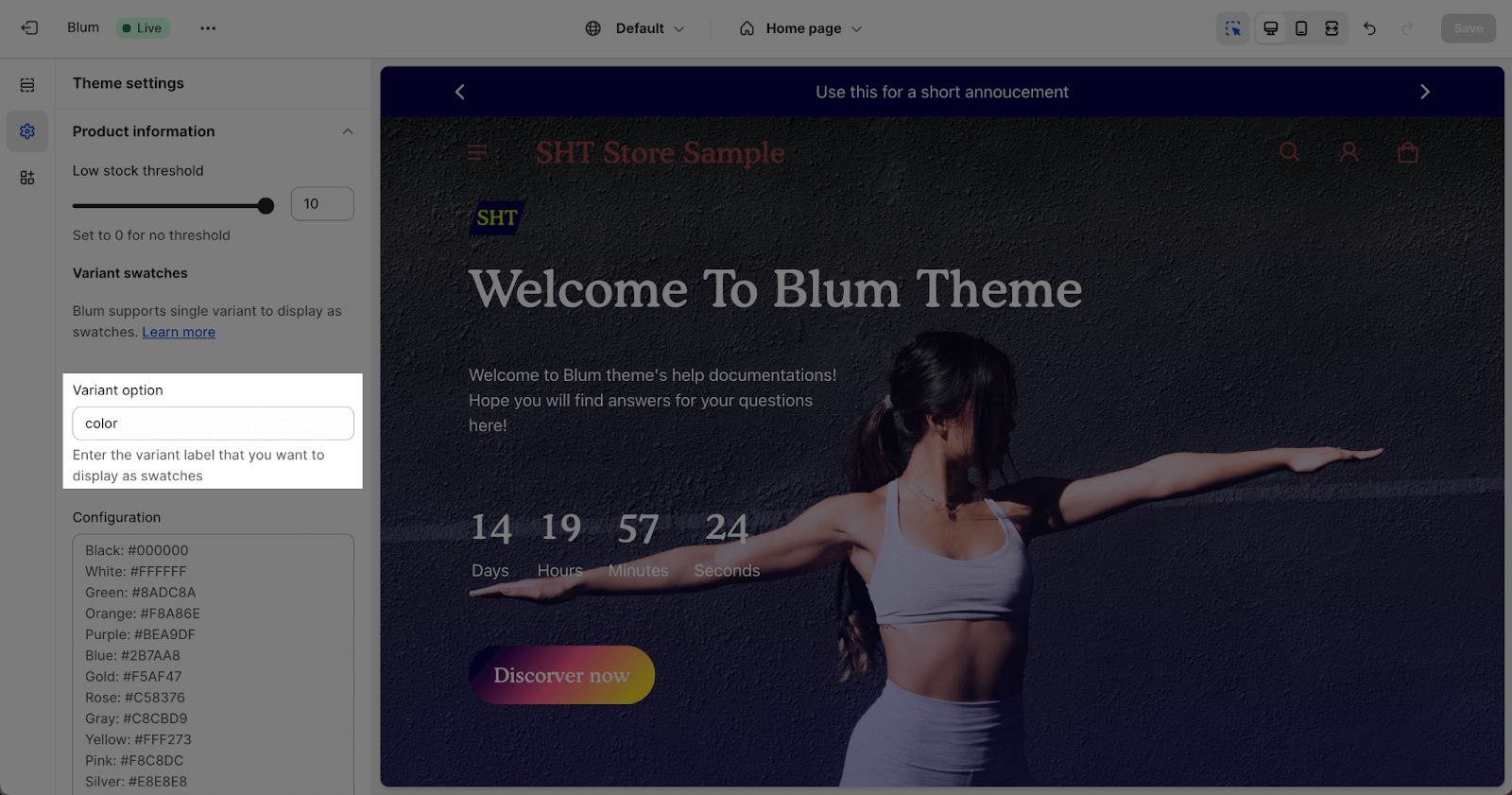
- You can only add one variant type to the placeholder, and variant swatches will apply specifically to that type.
- The variant type entered in the ‘Variant option’ placeholder must exactly match the name of the variant you have defined for the product, and it must be in lowercase.
Variant Swatches Rules
You can be able to custom color or other options for your store. You can enter variant name with HEX code into field Variant swatches rules. If it matches with an existing variant from your store, this variant will be set custom value.
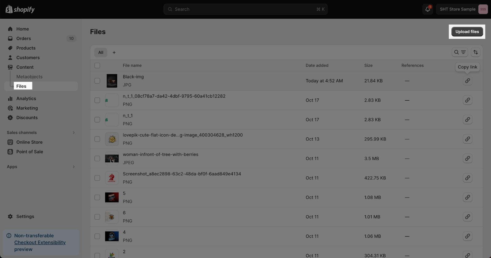
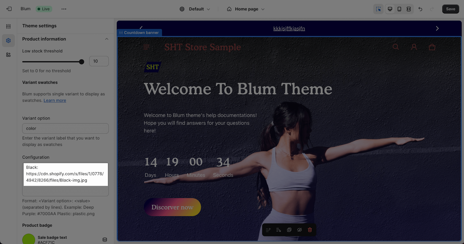
If you want to use image for variant swatches, you will need to upload the image png file onto the Shopify Files. Blum theme supports for PNG and JPG file.
Then enter the Name of the variant with the image URL. For example, I have uploaded the image file with the URL ” https://cdn.shopify.com/s/files/1/0778/4942/8266/files/Black-img.jpg ” and want to add it for the “Black” color so I need to add in the Variant swatches rules: ” Black: https://cdn.shopify.com/s/files/1/0778/4942/8266/files/Black-img.jpg ”
You can check the video tutorial below to learn more about the way to set up Color Swatches in Electro and Blum theme:
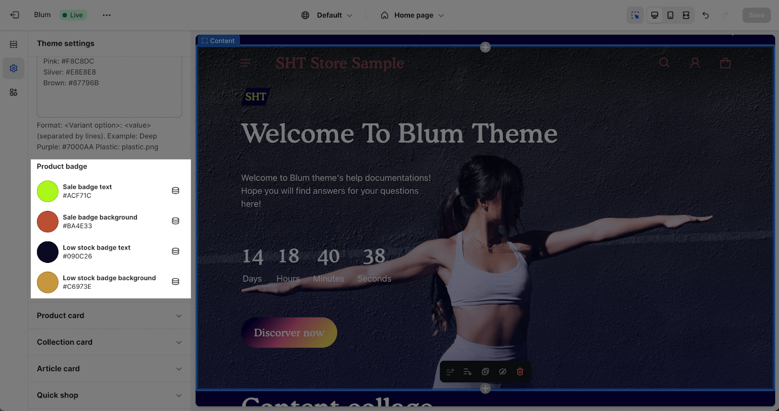
Product Badge Color
Product badge colors are used for both the labels and backgrounds of product badges.
- Sale badge label: Applied for the label used in the product sale badge.
- Sale badge background: Applied for the background used in the product sale badge.
- Low stock badge label: Applied for the label used in the product low stock badge.
- Low stock badge background: Applied for the background used in the product low stock badge.
Product Card
Product card is a customizable section that showcases product information. It also controls how products look in your catalog/collections. You can adjust image ratios, enable hover effects, display vendor and variant information, and add custom badges to highlight features like ‘Best Seller’ or ‘Limited Edition’. Additionally, you can control the visibility of ‘sold out‘, ‘sale’, and ‘new in’ badges.
To configure the Product Card, please check more details here.
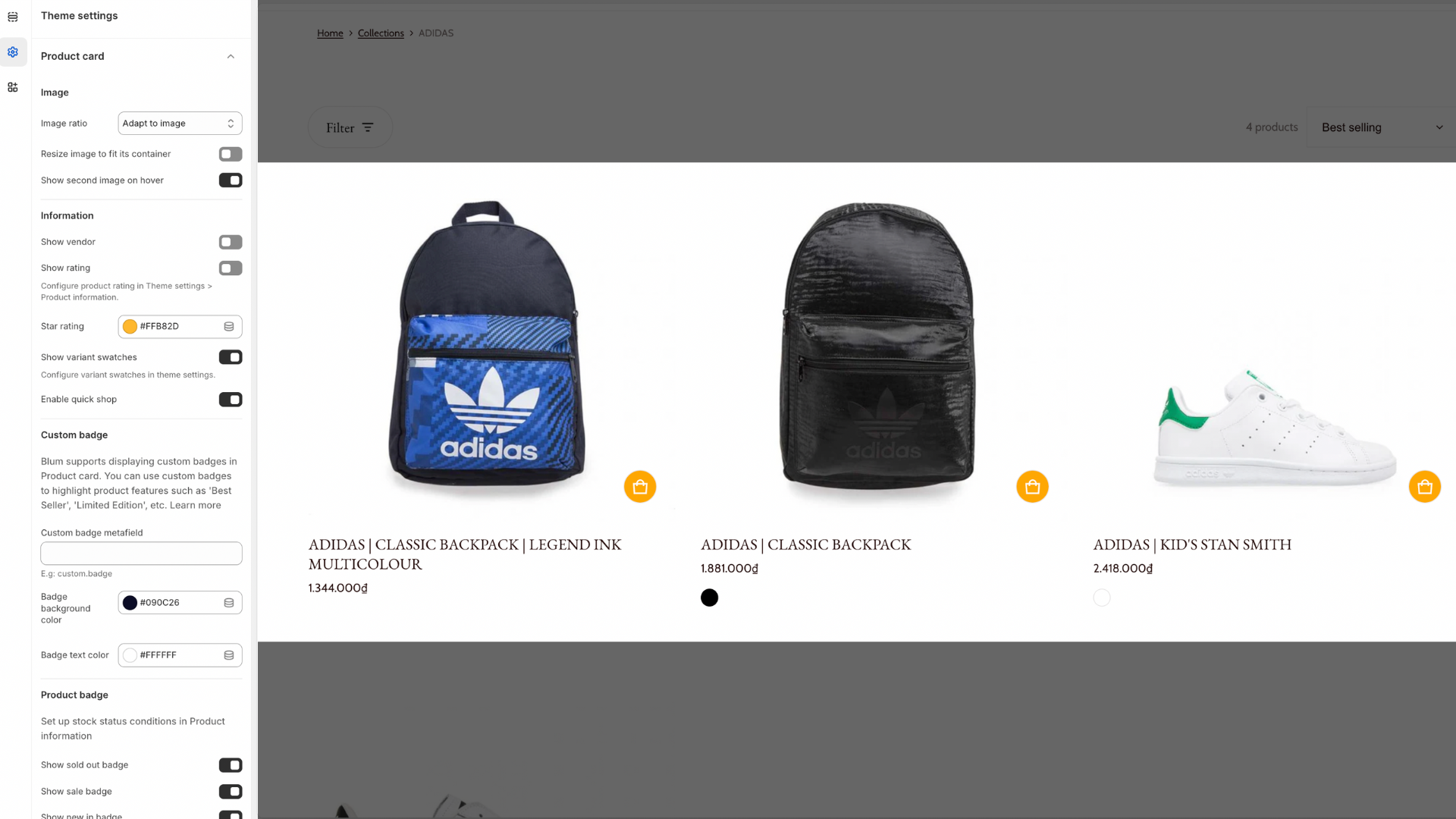
-
Image: New Resize image to fit its container option.
-
Information: New settings for Star rating (with color picker) and Show variant swatches.
-
Custom badge: You can now define a Custom badge metafield and set its Badge background and Badge text colors directly here.
Blum supports displaying custom badges in Product card. You can use custom badges to highlight product features such as ‘Best Seller’, ‘Limited Edition’, etc.
-
Badges Style: Choose between Default (straight) or Tilt (angled). The Tilt style is perfect for a modern, high-energy brand look.
-
Blum also allows you to enable/unable: Show sold out badge/Show sale badge/Show new in badge/Show custom badges
-
Badges Position: Move badges to different corners to ensure they don’t block important product details. Choose between “Image top left” or “Image top right”
-
Star Rating: Now includes a dedicated color picker. Note that ratings require a supported app like Judge.me or Loox.
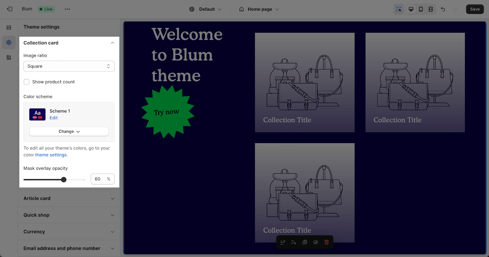
Collection Card
The Blum theme offers four collection image ratios to suit your preferences:
- Square: A classic and versatile option that ensures a consistent look across your collections.
- Portrait (2:3): Ideal for showcasing products with vertical emphasis, such as clothing or accessories.
- Landscape (3:2): Perfect for highlighting products with horizontal elements, such as furniture or appliances.
- Adapt to image: Automatically adjust the image ratio to fit the original dimensions of your product images.
Additionally, you can enable the “Show product count” option to display the number of products in each collection, providing customers with a quick overview of the available options.
Furthermore, you can select the color scheme for the collection card by selecting from the defined scheme. To customize the color scheme, access Theme Settings > Colors.
Additionally, you can adjust the overlay opacity for your collection cards. The overlay opacity controls the transparency of the overlay color, allowing you to create a subtle or more pronounced effect. The opacity can be adjusted from 0% (fully transparent) to 90% (partially opaque)
Article Card
In the Article Card, you can enable the featured image option to showcase an eye-catching image for your blog posts. Then, simply select the desired featured image ratio from the dropdown menu:
- Square: Ideal for blog posts with images that are symmetrical or have a centered composition.
- Portrait (2:3): Perfect for blog posts with images that are taller than they are wide, such as fashion photography or landscape images.
- Landscape (3:2): Great for blog posts with images that are wider than they are tall, such as group photos or product shots.
- Adapt to Image: Automatically adjusts the image ratio to match the dimensions of the uploaded image, ensuring a consistent and visually appealing display.
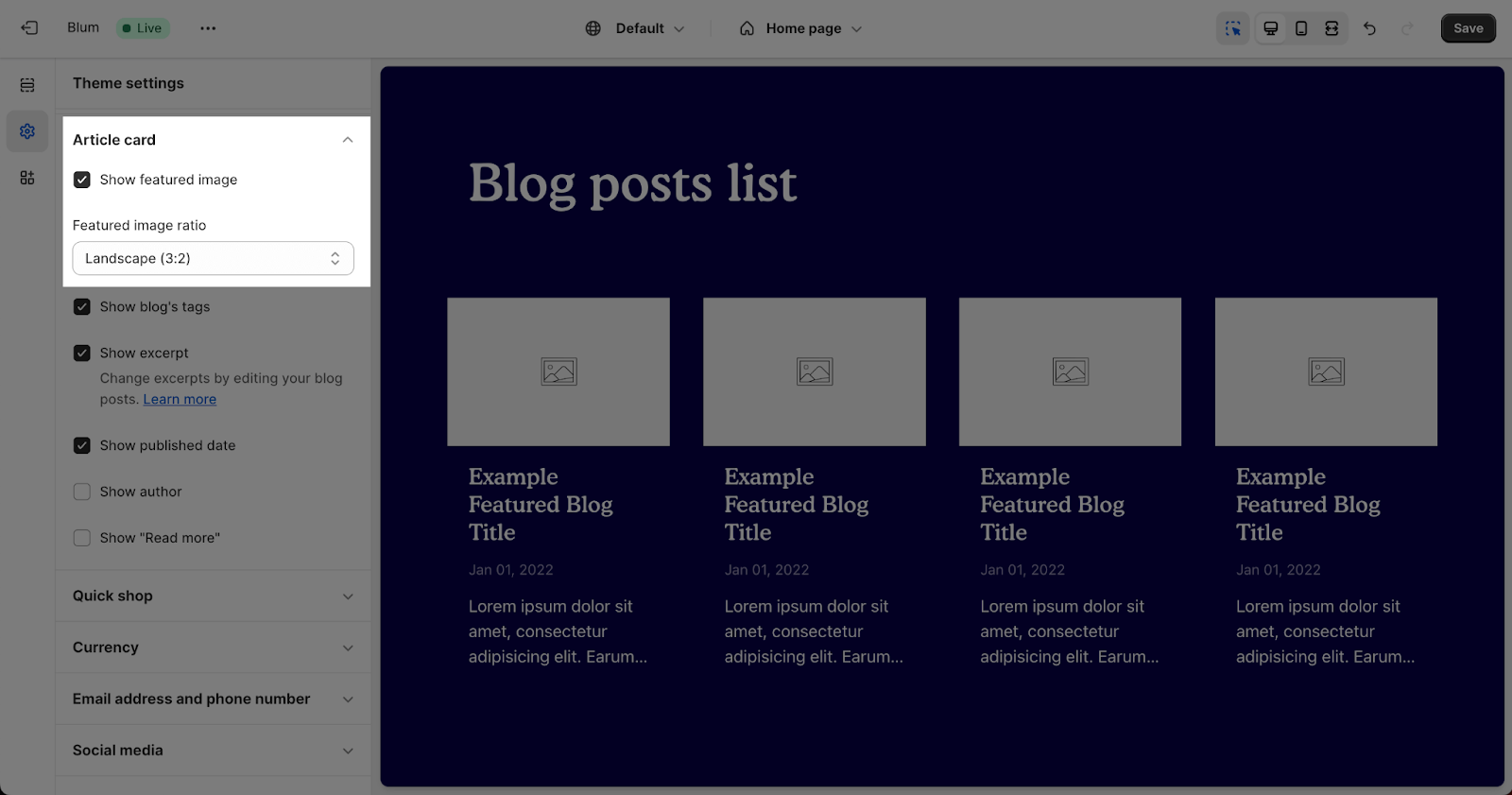
Apart from the featured image, you can also choose to display the following information on your blog posts:
- Show Blog’s Tag: Only the tag of the first blog post in the category will be displayed. Clicking on the tag will show other blog posts with the same tag.
- Show Excerpt: Change the excerpts by editing your blog posts. You can find more details here.
- Show Published Date: Display the date when the blog post was published.
- Show Author: Display the name of the blog post’s author.
- Show “Read More”: Display a “Read More” button that links to the full blog post.
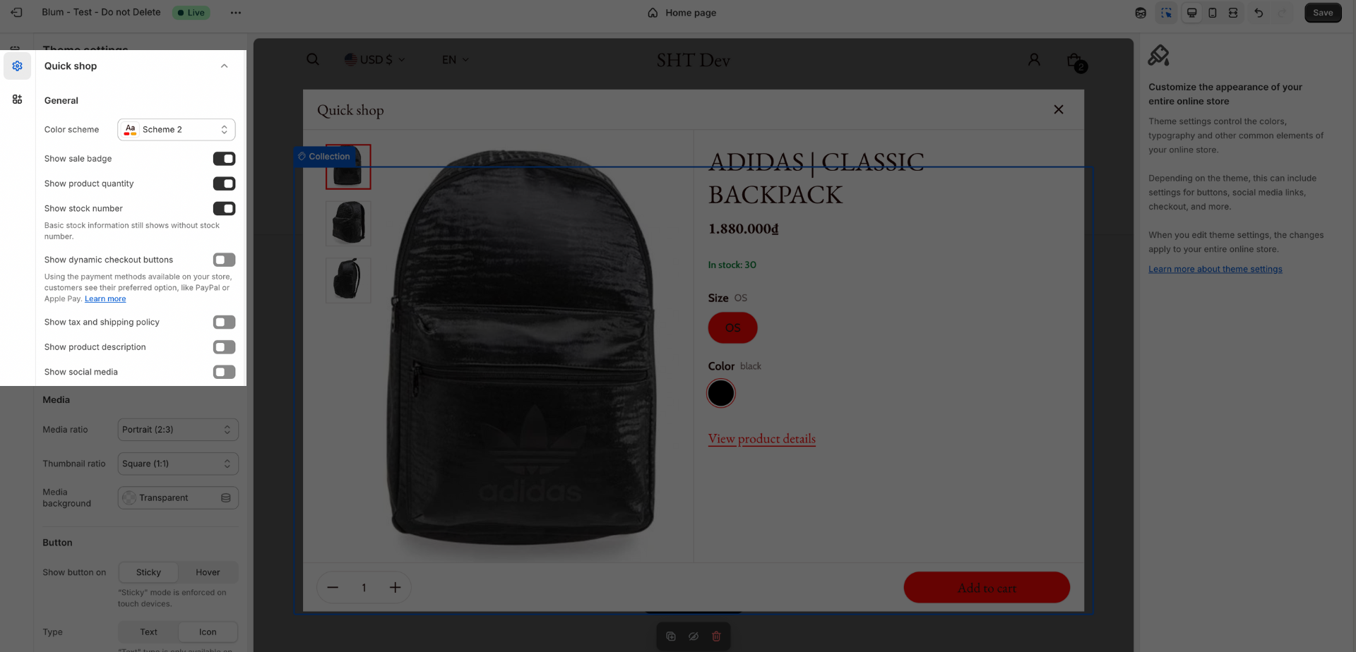
Quick Shop
Quick Shop is a convenient pop-up that displays essential product information when a customer clicks on the “Quick Shop” button. It allows customers to quickly review product details and make informed purchase decisions without leaving the current page.
To configure Quick Shop settings, navigate to Online Store > Theme > Blum Theme > Customize > Theme Settings > Quick Shop.
In Quick Shop settings, you have the ability to select:
General

- Color Scheme: Select the desired color scheme for the Quick Shop pop-up from the defined schemes. To customize color schemes, go to Theme Settings > Colors.
- Show Sale Badge: Display a sale badge for discounted products to attract customer attention.
- Show Product Quantity: Display the available quantity of the product.
- Show Stock Number: Display the exact stock number of the product.
- Show Dynamic Checkout Buttons: Display payment options available on your store, such as PayPal or Apple Pay.
- Show Tax and Shipping Policy: Provide customers with information about tax and shipping policies.
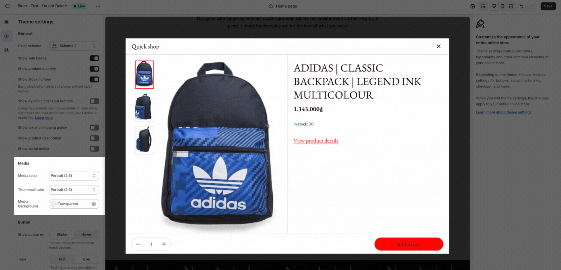
Media (update from 3.6.0)
-
Select image and thumbnail ratios (Square, Portrait, Landscape, Adapt to Image).
-
Toggle media background transparency as you wish.
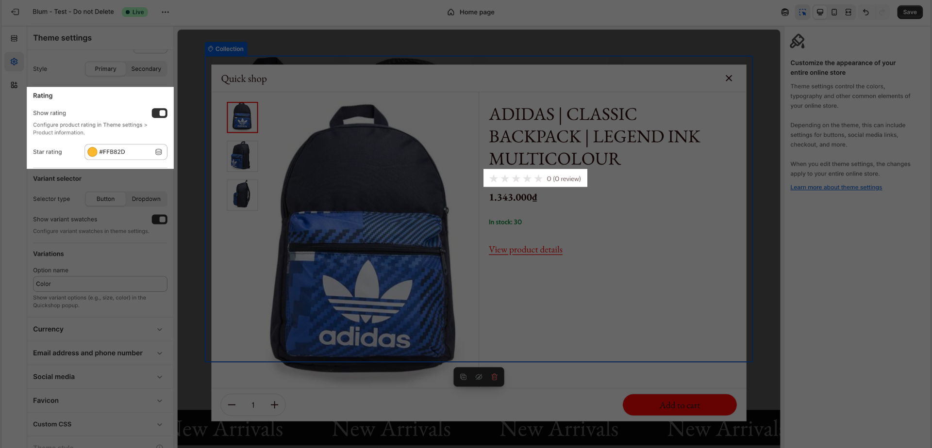
Rating Configuration:
- For product rating display, install a supported app (Judge.me, Air review, Loox, Okendo).
- Configure in Theme Settings → Product Information, then go back and enable “Show rating” toggle in Quick Shop.
- You can adjust the rating stars color by a Star rating color picker here.
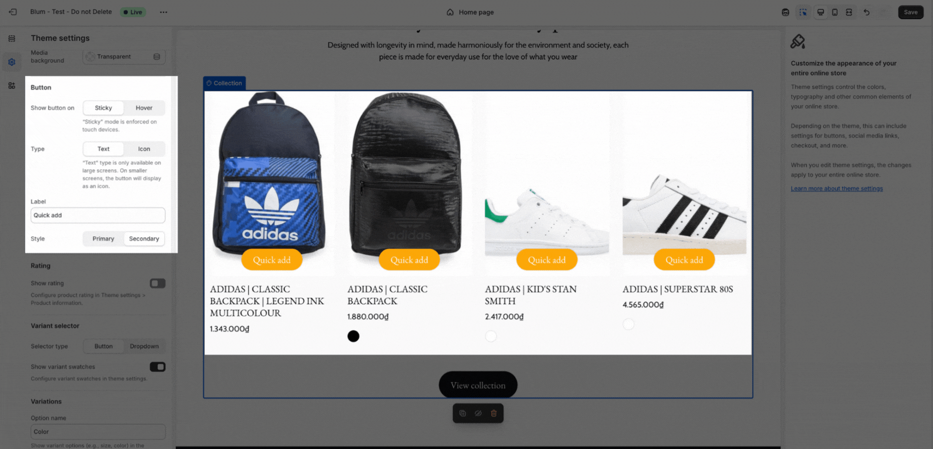
Button Controls:
- Choose when the button appears (“Sticky” for touch, “Hover” for desktop).
- Set button style (primary/secondary), type (text/icon), and icon size.
- Button style (Primary/Secondary)
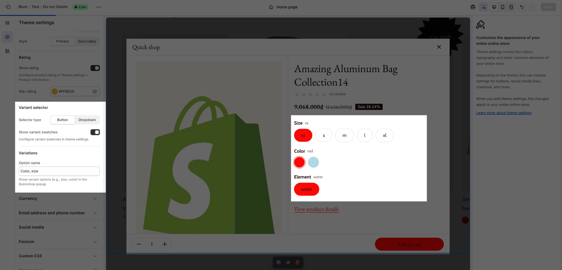
Variant Selector
Choose how product variants will be displayed in Quick Shop:
- Button: Variants are displayed as individually clickable buttons.
- Dropdown: Variants are displayed in a drop-down menu.
- Show Variant Swatches: Display colorful swatches representing available product variants.
- Variations: A new section to define the Option name (e.g., Color) for swatches.
From Blum 3.6.0, You can dispay multiple variants in quick shop:
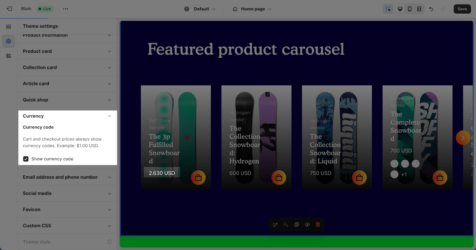
Currency
By default, currency codes are displayed for cart and checkout prices, ensuring clear pricing information. You can optionally enable currency codes for product cards, product details, and other areas of your store. If you disable currency codes, they will only be shown for cart and checkout prices.
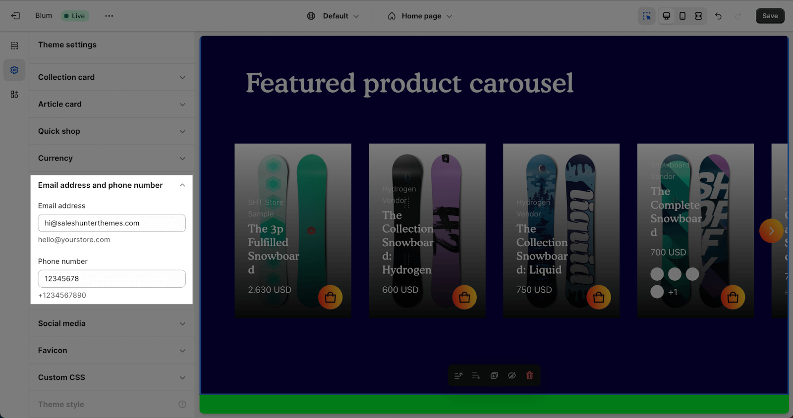
Email address and Phone number
This is where you can enter your email address and phone number to set up your personal store. If you want to remove this information, simply delete the text in the text box.
Social Media
Blum theme allows you to connect with most of social media, including:
- X/Twitter
- LINE
- YouTube
- Vimeo
- TikTok
- Tumblr
- Snapchat
You can freely add or remove any social media by connecting with its URL account. If you do not want to connect with any of them, simply leave this part blank.
This can be used in multiple sections, such as the header, footer,…
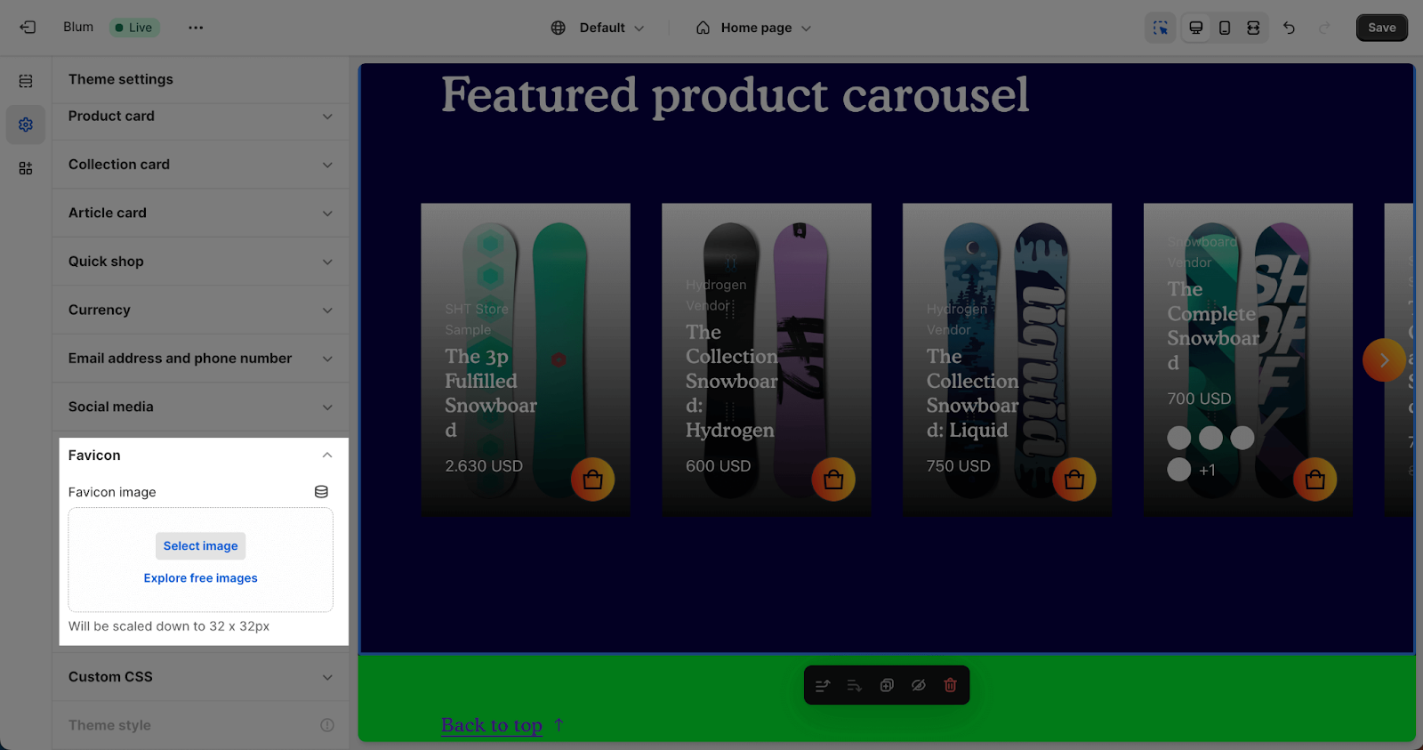
Favicon
Adding your favicon is simple and quick. Just click the “Select image” button and the media manager will pop up. From there, you can drag and drop your logo or select it if it’s already uploaded. For the best results, use a 32 x 32px .png image
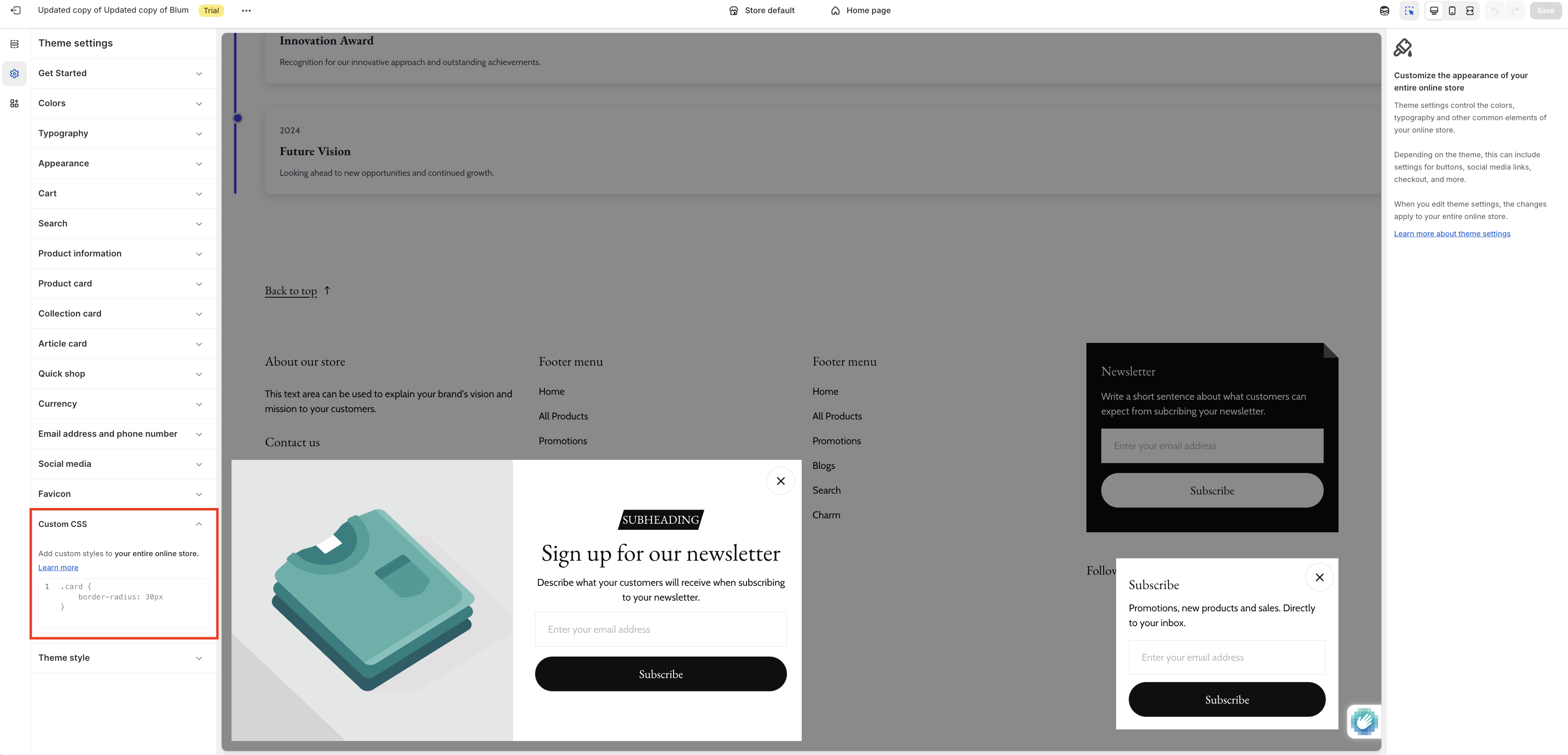
Custom CSS
The Custom CSS feature in Blum Theme allows you to add your own custom CSS code to personalize and enhance your store’s appearance beyond the default theme settings. This powerful tool is perfect for making specific style adjustments without modifying the theme’s core files.
To add custom CSS to your Blum theme, navigate to Theme settings > Custom CSS. You’ll find a text area where you can input your CSS code directly. Your custom styles will be applied site-wide and will take precedence over the default theme styles.
Note: Custom CSS requires knowledge of CSS syntax. Make sure to test your code thoroughly before publishing. If you’re not familiar with CSS, consider consulting with a developer or using the theme’s built-in customization options first.
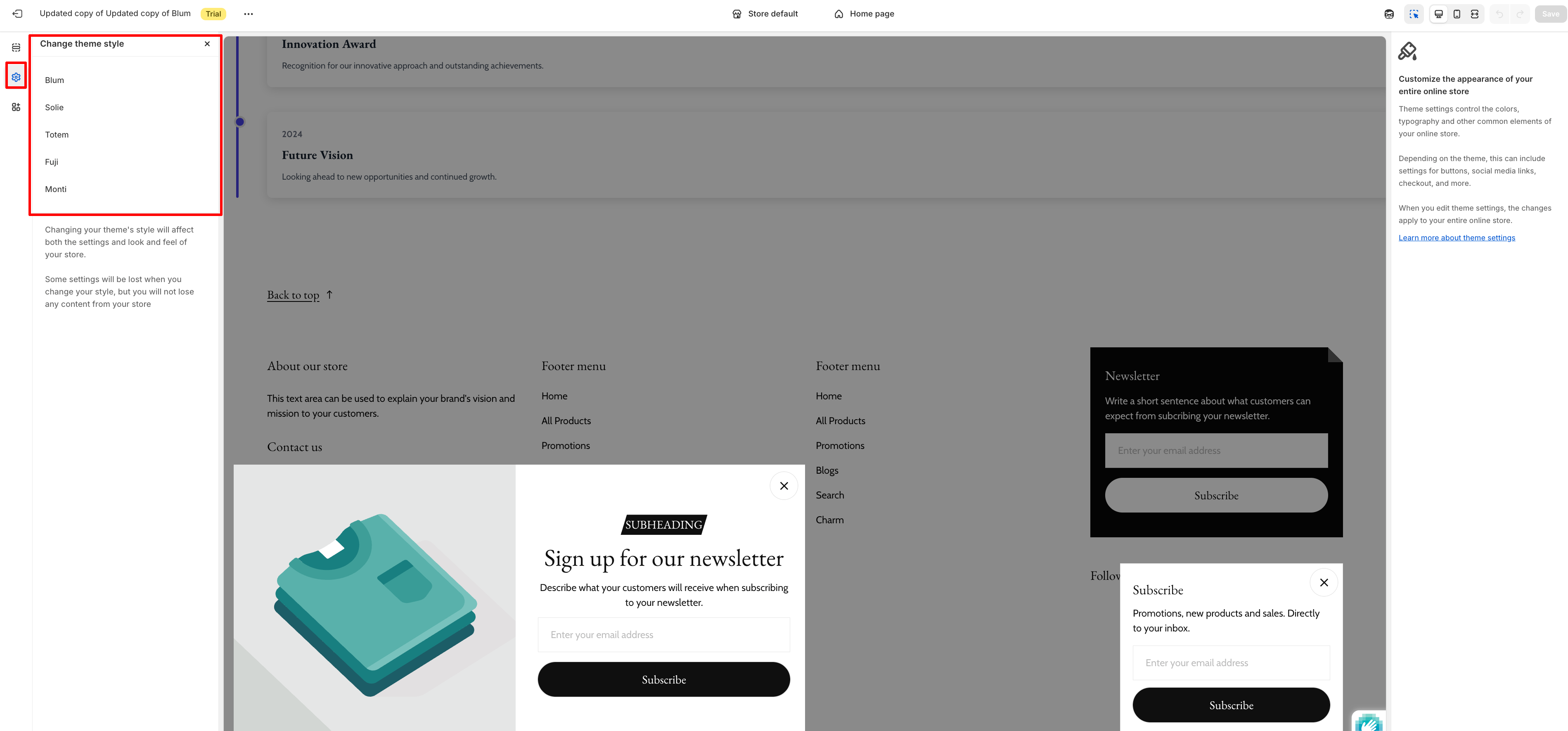
Theme Styles
Theme style allows you to quickly switch between different pre-designed visual styles for your Blum theme. This feature provides an easy way to change the overall look and feel of your store with just a few clicks, without needing to manually adjust individual settings.
To change your theme style, go to Theme settings > Theme style. You’ll see a selection of available style presets, each offering a unique combination of colors, typography, spacing, and other design elements that work harmoniously together.
When you select a new theme style, it will automatically update multiple theme settings at once to match the chosen aesthetic. This is particularly useful if you want to refresh your store’s appearance or experiment with different design directions. You can always switch back to a previous style or make additional customizations after applying a new theme style.
Note: Changing your style will affect both the settings and the look and feel of your store. Some settings will be lost when you change your style, but you will not lose any content.
Takeaways
It’s not too complicated to set up Blum Theme Settings, but if you’re still having difficulties, feel free to drop us an email for more support.