Icon With Text
About Blum Icon With Text Section
Why do we need Blum Icon With Text? In web design, the use of icons alongside text has become a popular way to enhance content and improve user experience.
By combining icons and text, you can effectively convey information, guide users, and make your content more visually appealing.
In this article, we will explore Blum Icon with text section in Blum theme and how to configure each element detailedly.
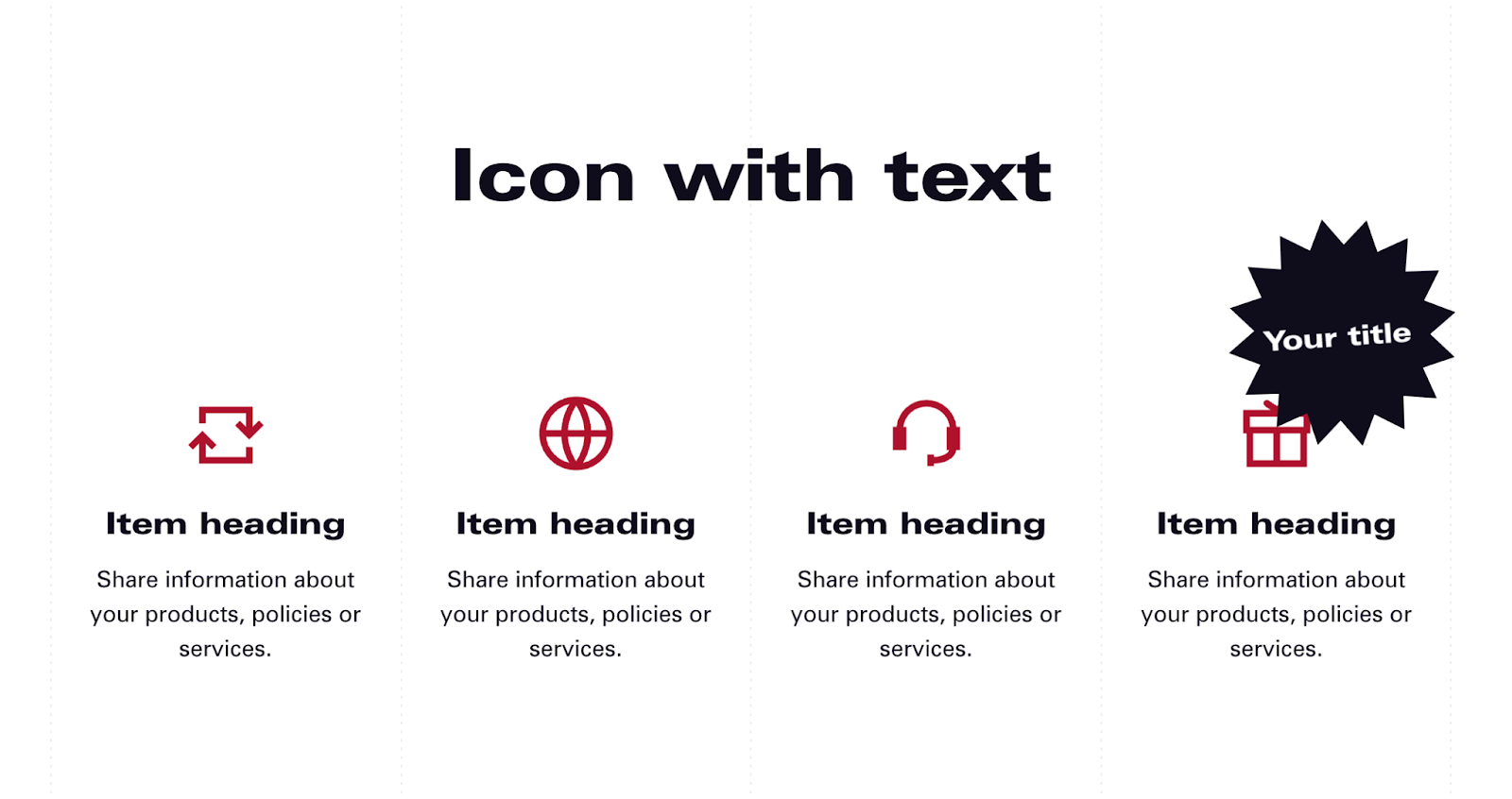
Blum Icon With Text Section Overview
| Custom Image File Options? | SVG, PNG, JPG |
| Recommended Size for Icon? | Square (1:1) |
| Can I edit uploaded icon colors? | No, please edit offline and re-upload |
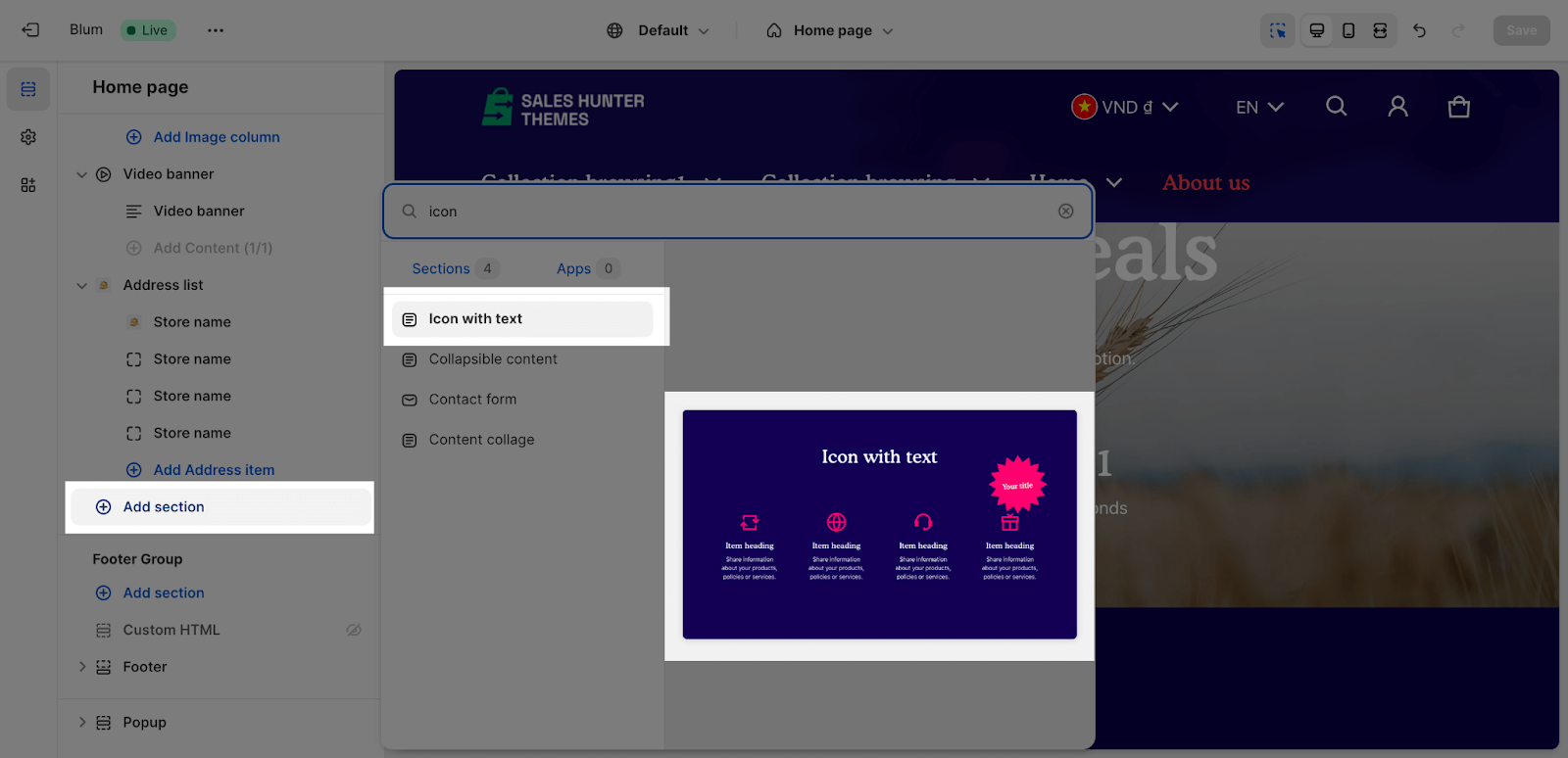
Access Blum Icon with Text Section
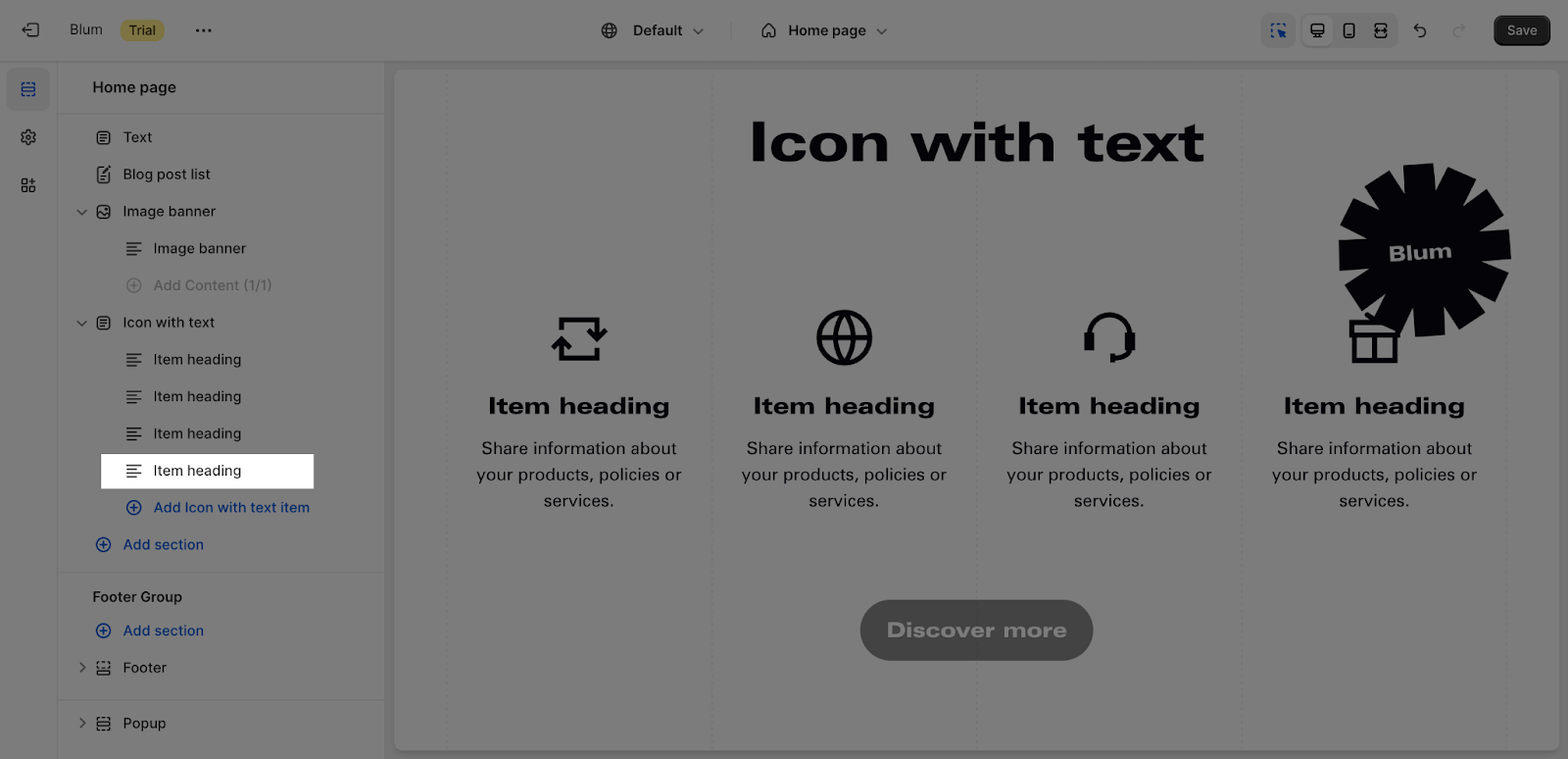
From any page, please click on ‘Add Section’ on the left side bar, then choose ‘Icon with Text’.
Blum Icon With Text Section Configuration
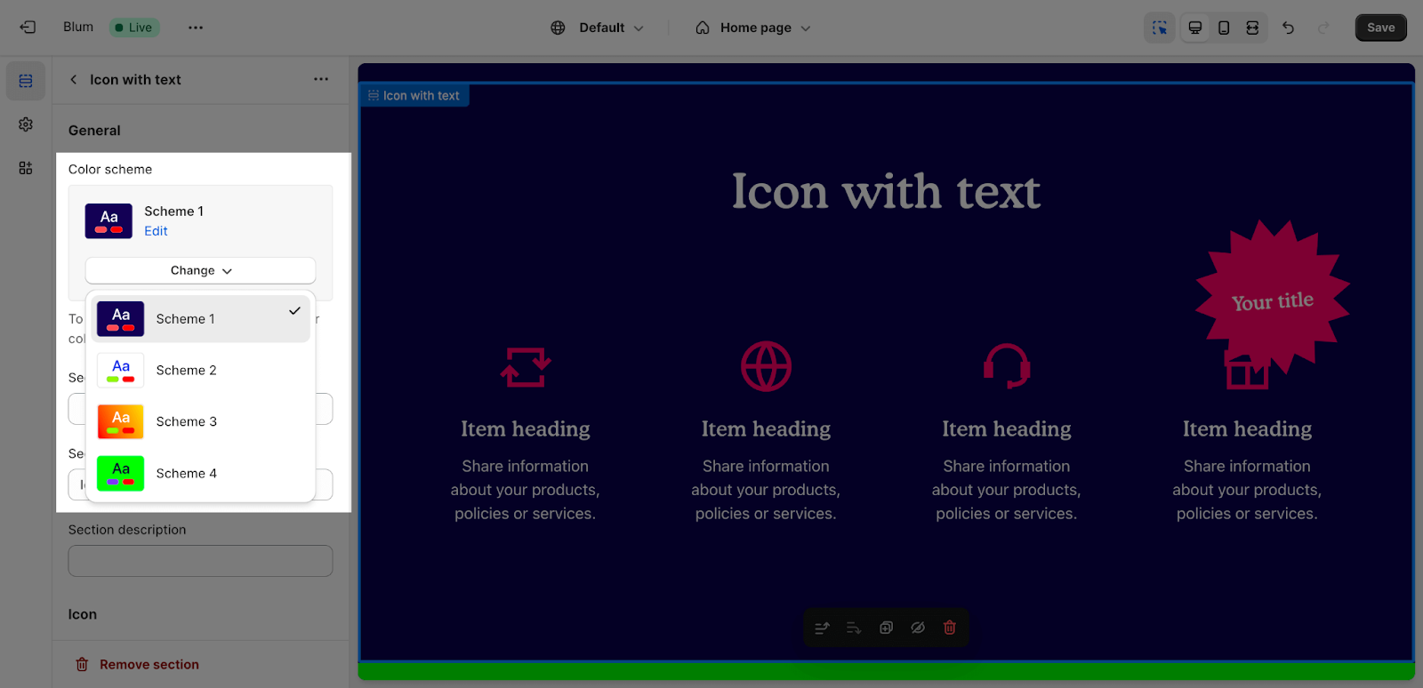
Icon with text section comes with 4 tabs: General, Layout, Icon and Button.
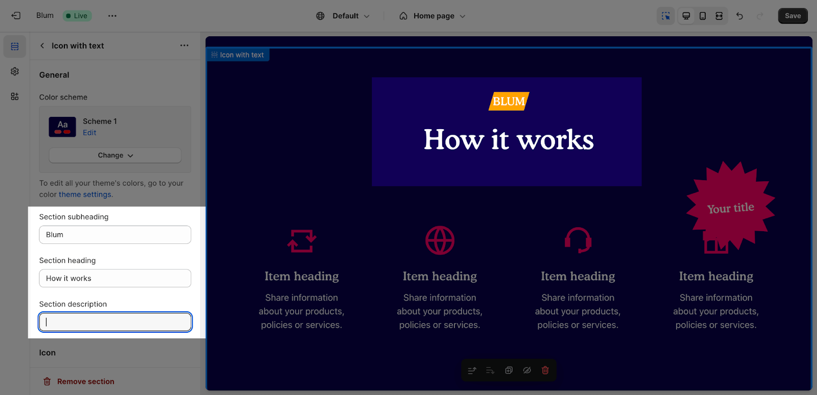
Edit General Option
Firstly, you can change the color scheme for this section by selecting the scheme here. To change the theme color, please go to Theme settings > Colors.
After that, you can adjust Section subheading, Section heading and Section description for the section by entering content on the fields.
Edit Icon
You can select the Main, Extra accent or None for the Icon Accent Scheme.
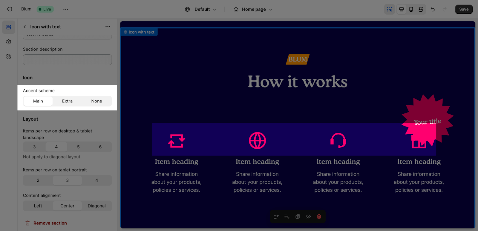
If you want to change style for these accents, please go to Theme settings > Colors > Accent.
Edit Layout
To select items per row on desktop and tablet landscape, you can select 3, 4, 5, or 6 items, each as you want.
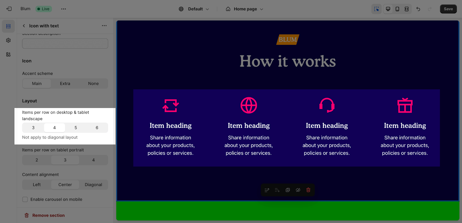
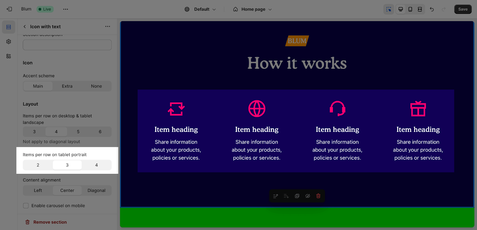
For the items per row on tablet portrait, the range is 2, 3, or 4 items.
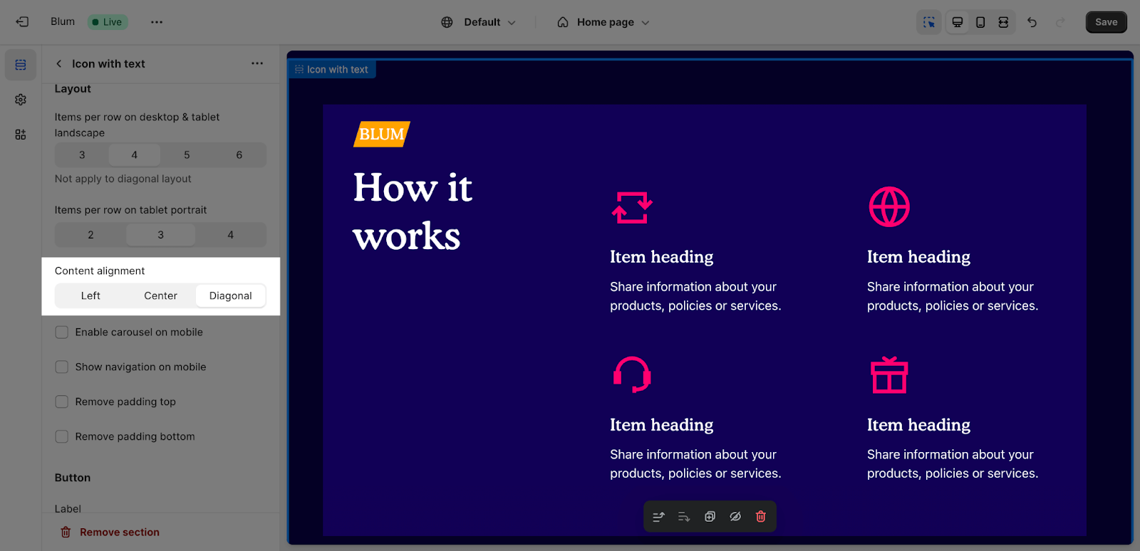
After that, you can select the position to display for the content of the section:
- Left
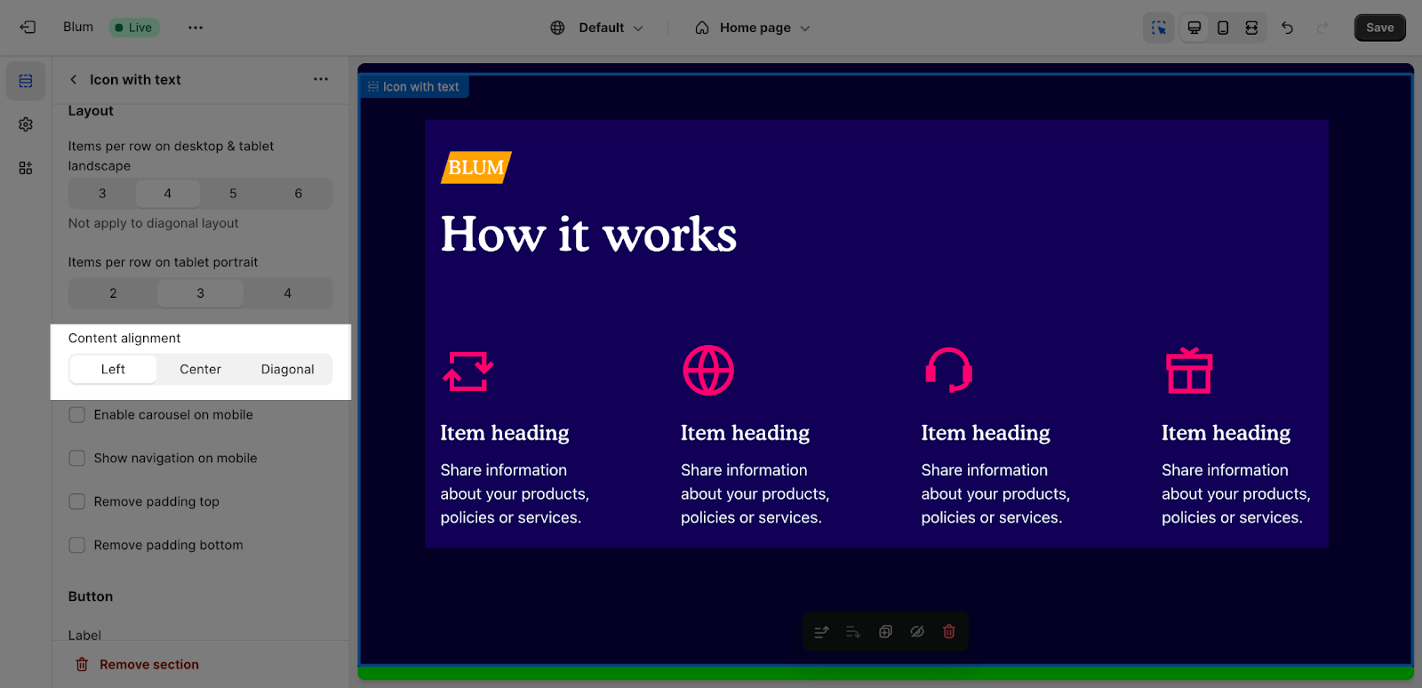
- Center
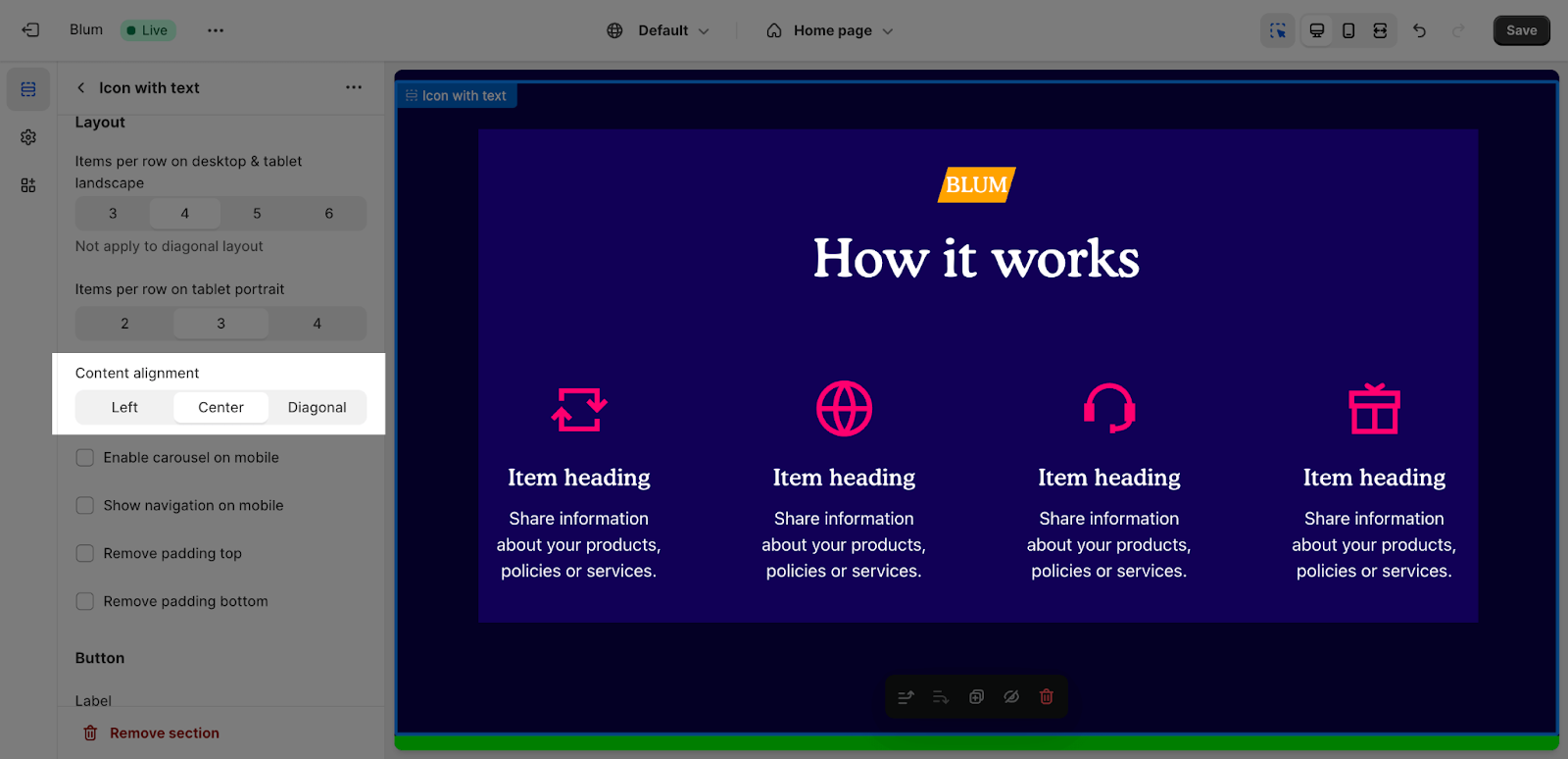
- Diagonal
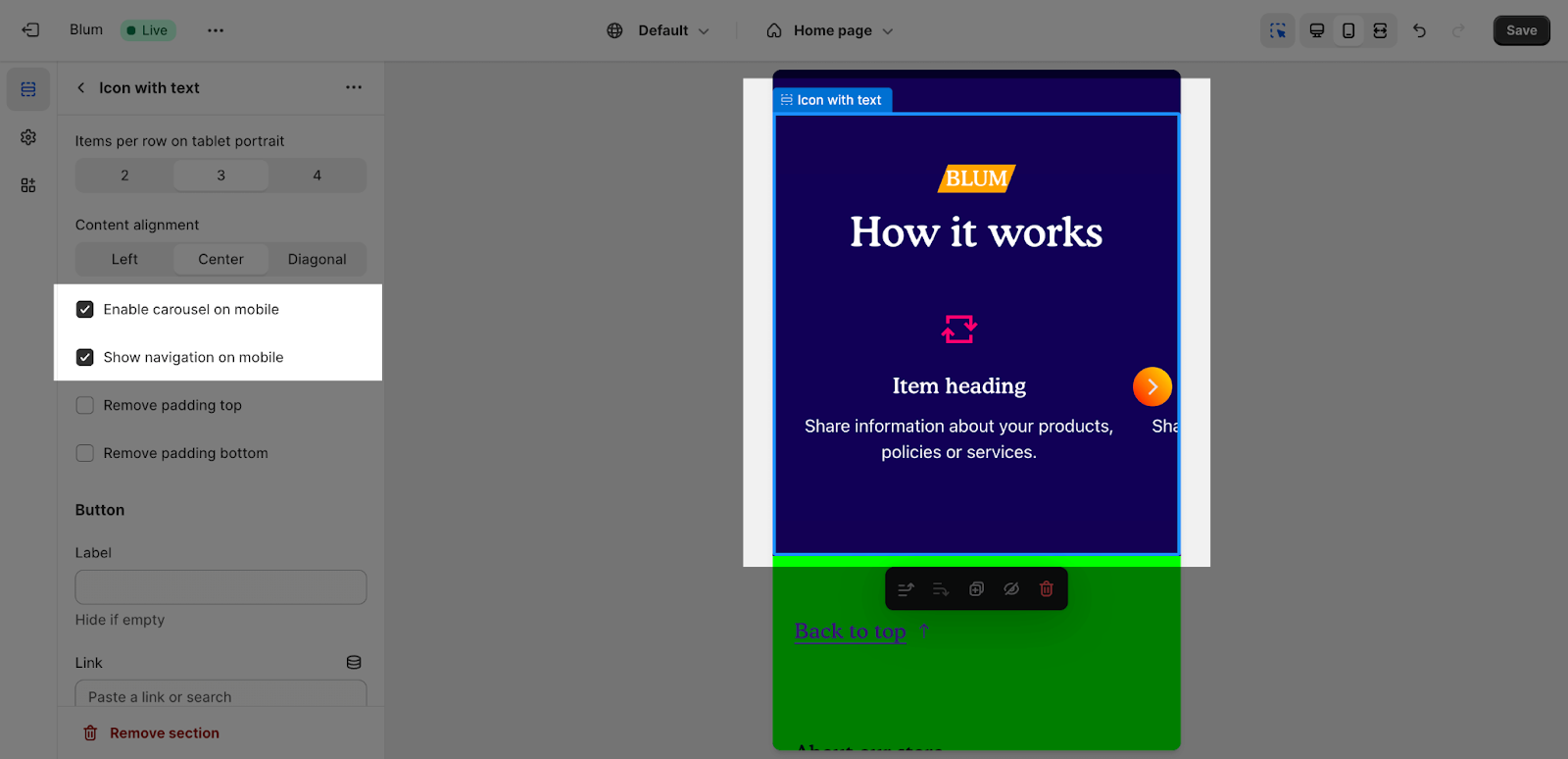
Next, The Enable Carousel On Mobile and Show Navigation On Mobile options can be selected or deselected based on your choice.
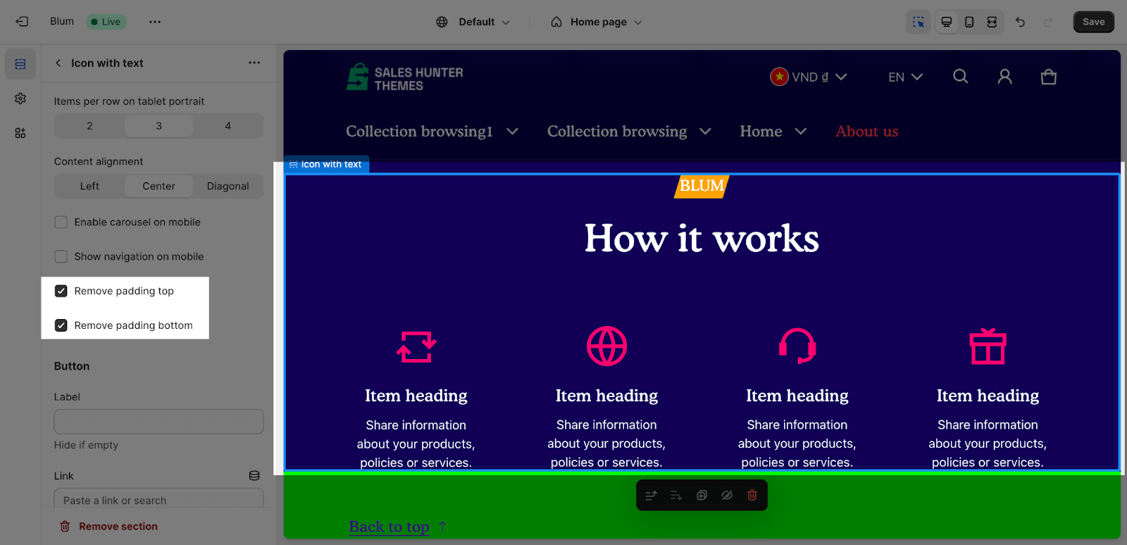
You can also enable ‘Remove padding top‘ and ‘Remove padding bottom‘ to delete the spacing at the top and bottom between the section and the elements inside it.
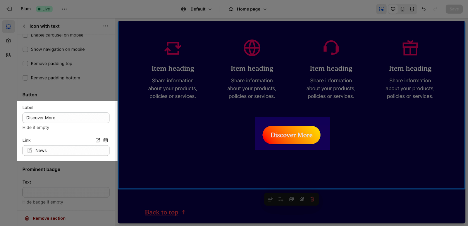
Edit Button
In the Buttons tab, insert the button label name for the button to add a button on the section. Click on the button link to add a direct link for it.
If you want to remove one button, just delete the text in the button label.
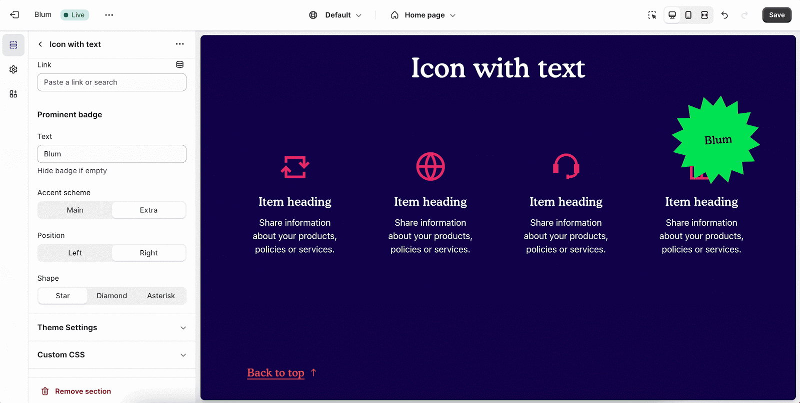
Edit Prominent Badge
You can set up these settings for the Prominent badge:
- Text: You can enter the name on the field
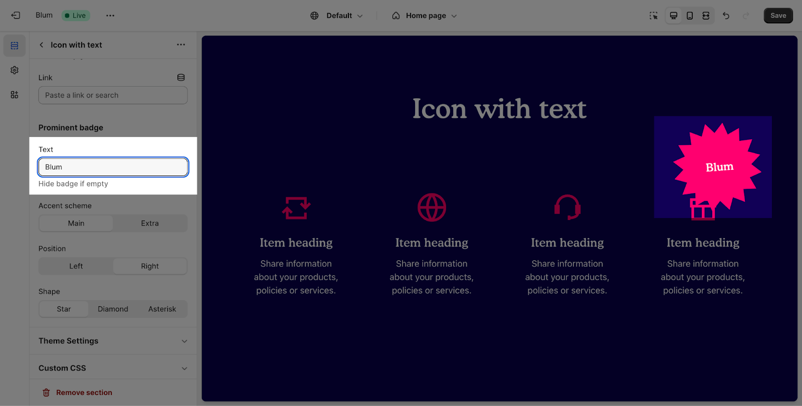
- Color scheme: Main accent or Extra accent
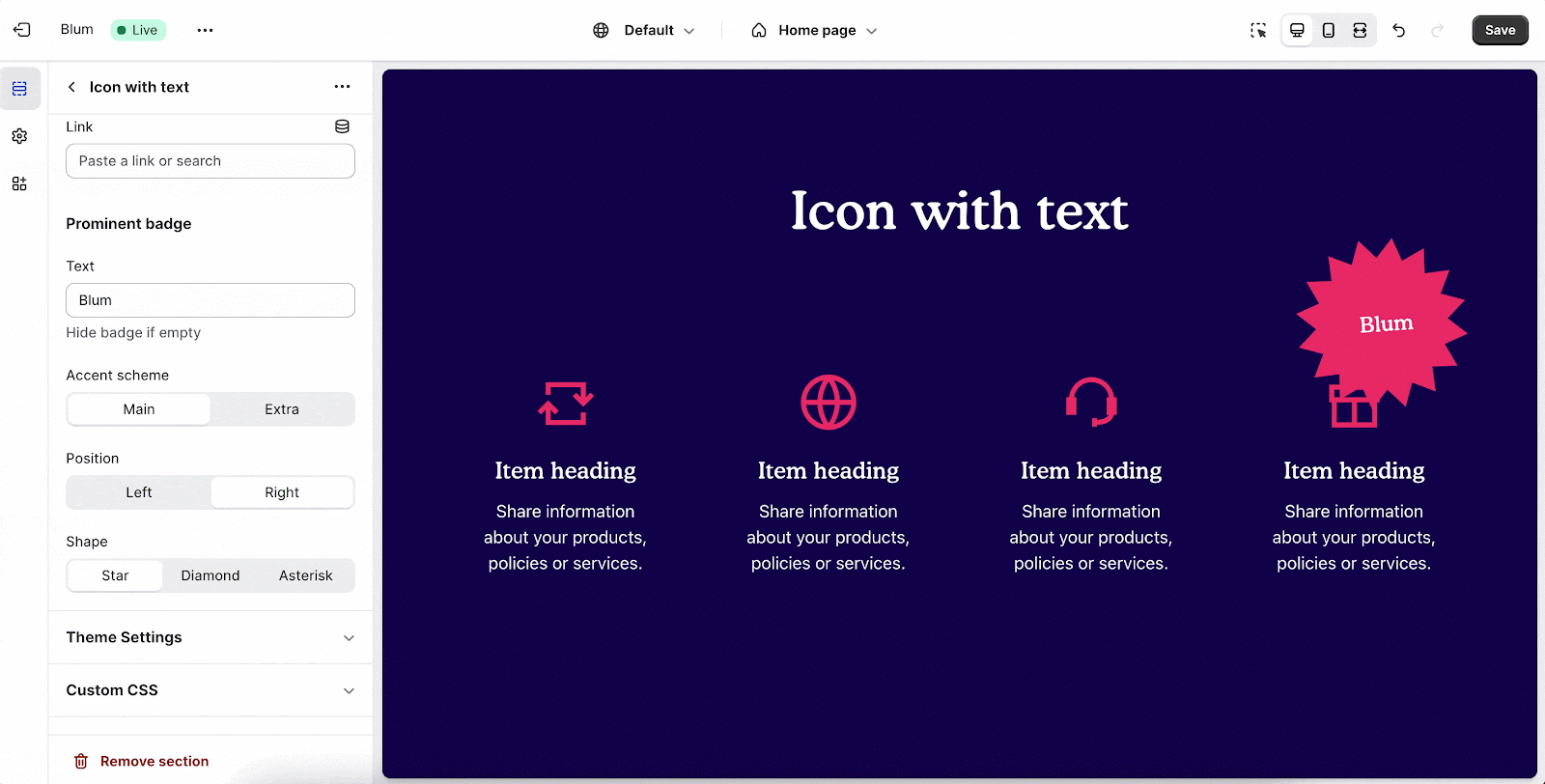
- Position: Left or Right
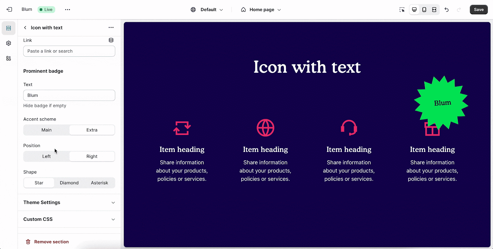
- Shape: Star, Diamond or Asterisk
Blum Icon With Text Item Configuration
To adjust for the Block text, click on the block and go to the Settings.
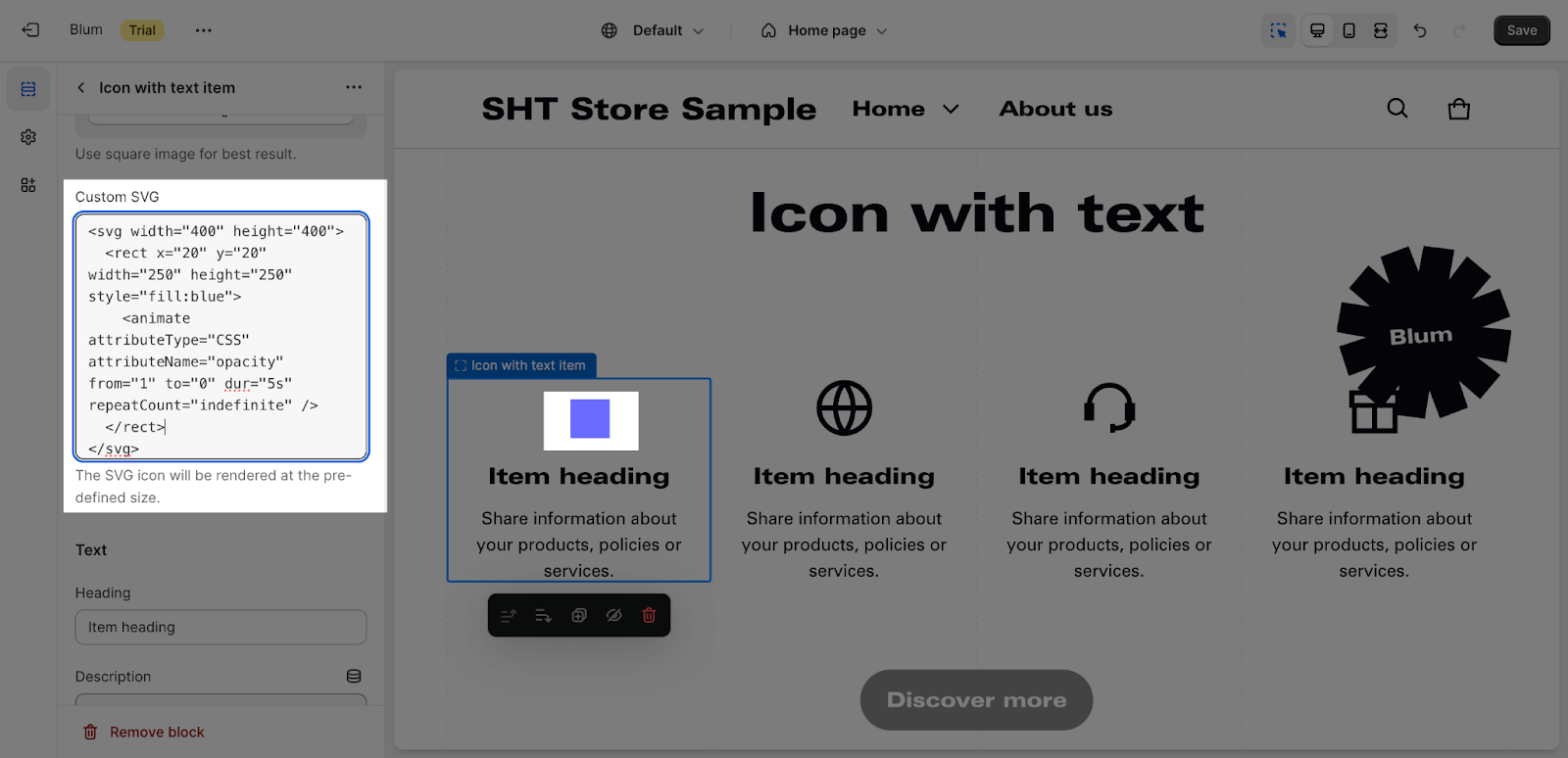
You can change the icon for each Icon With Text item with the icon library or custom your own icon by uploading it as image or SVG:
- Theme library
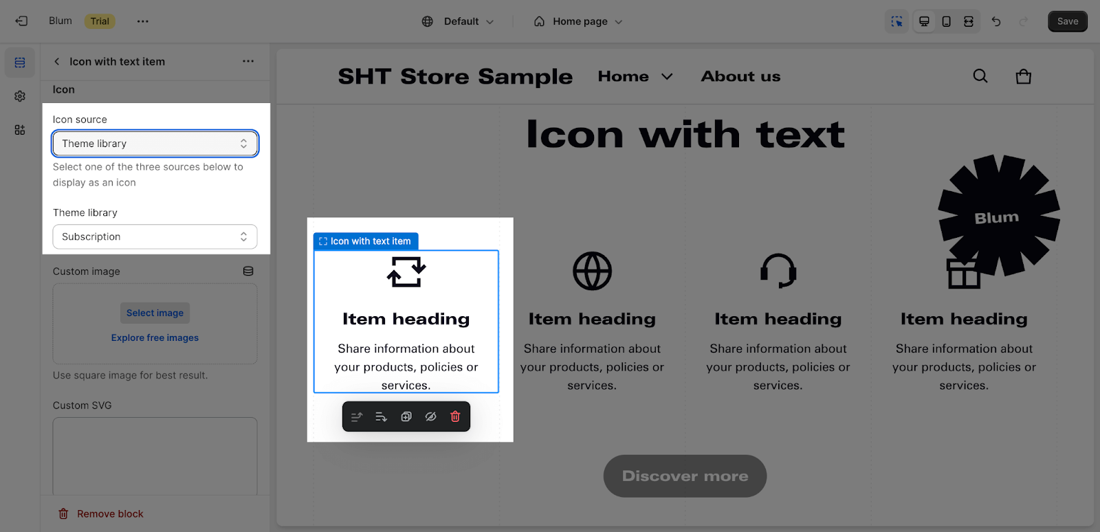
- Custom image
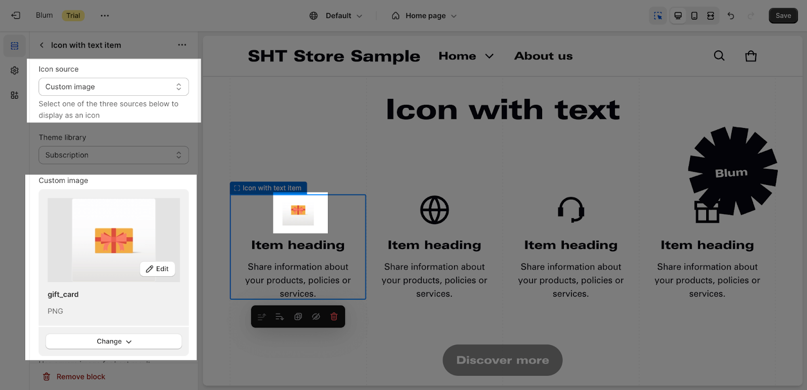
- Custom SVG
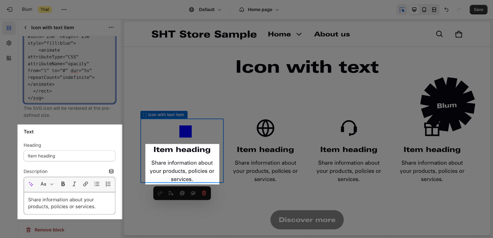
Edit Text
You can adjust the content by entering heading and description here:
Frequently Asked Questions
1. What are the recommended icon sizes and formats?
For best results, it’s recommended to use square icons with a 1:1 aspect ratio. Supported image formats include SVG, PNG, and JPG.
2. Can I change the color of the uploaded icons?
Unfortunately, you cannot directly edit the color of uploaded icons within the Blum theme. You’ll need to edit the icons using an image editing software and then re-upload them.
3. How many icons can I display in a row?
You can customize the number of icons displayed per row on various screen sizes. You can choose from 2, 3, 4, 5, or 6 items on desktop and tablet landscape, and 2, 3, or 4 items on tablet portrait.