Hero Image With Text
About Blum Hero Image with Text Section
Blum Hero Image With Text section should be the first thing which visitors see when they land on your online store. It is a large, high-quality image that is paired with text to introduce your brand, products, or services.
Blum Hero Image Text is important because it can make a big impression on visitors and influence whether or not they stay on your site and explore further.
Overview about Blum Hero Image with Text
| Maximum number of Highlighted Collections? | 50 |
| Options of Content Alignment when editing layout? | Left and Center |
| What are the Image Ratio Options? | (1:1); (2:3); (3:2) |
Access Blum Hero Image with Text Section
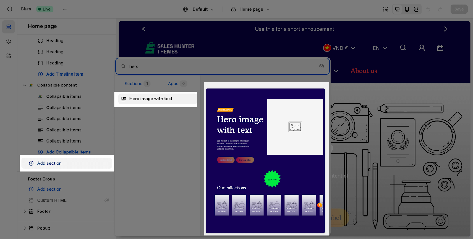
From any page, please click on ‘Add Section’ on the left side bar, then choose ‘Hero Image with Text’.
Blum Hero Image with Text Configuration
Edit General Option
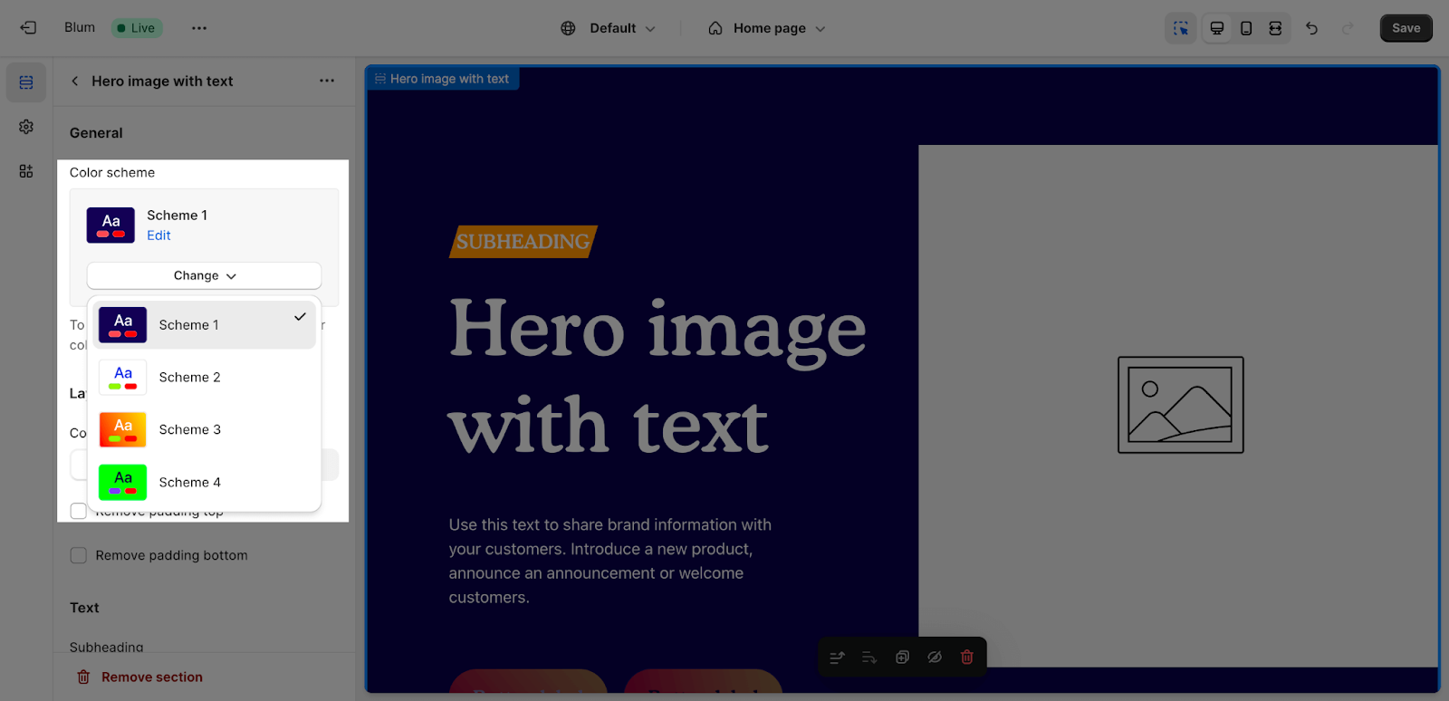
Firstly, you can change the color scheme for this section by selecting the scheme here. To change the theme color, please go to Theme settings > Colors.
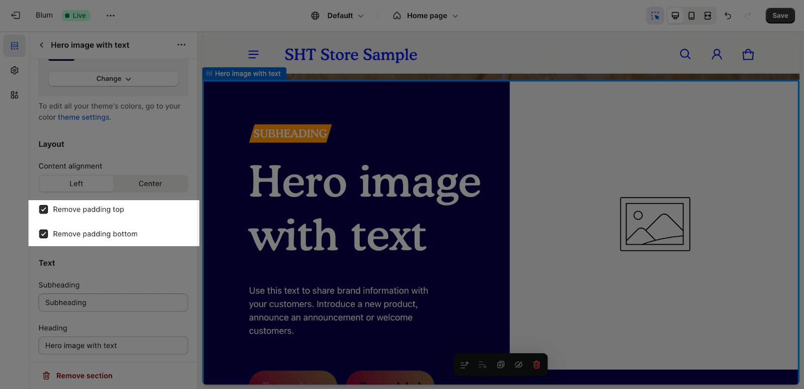
Edit Layout
There are 2 options for Content alignment of this section here: Left and Center.
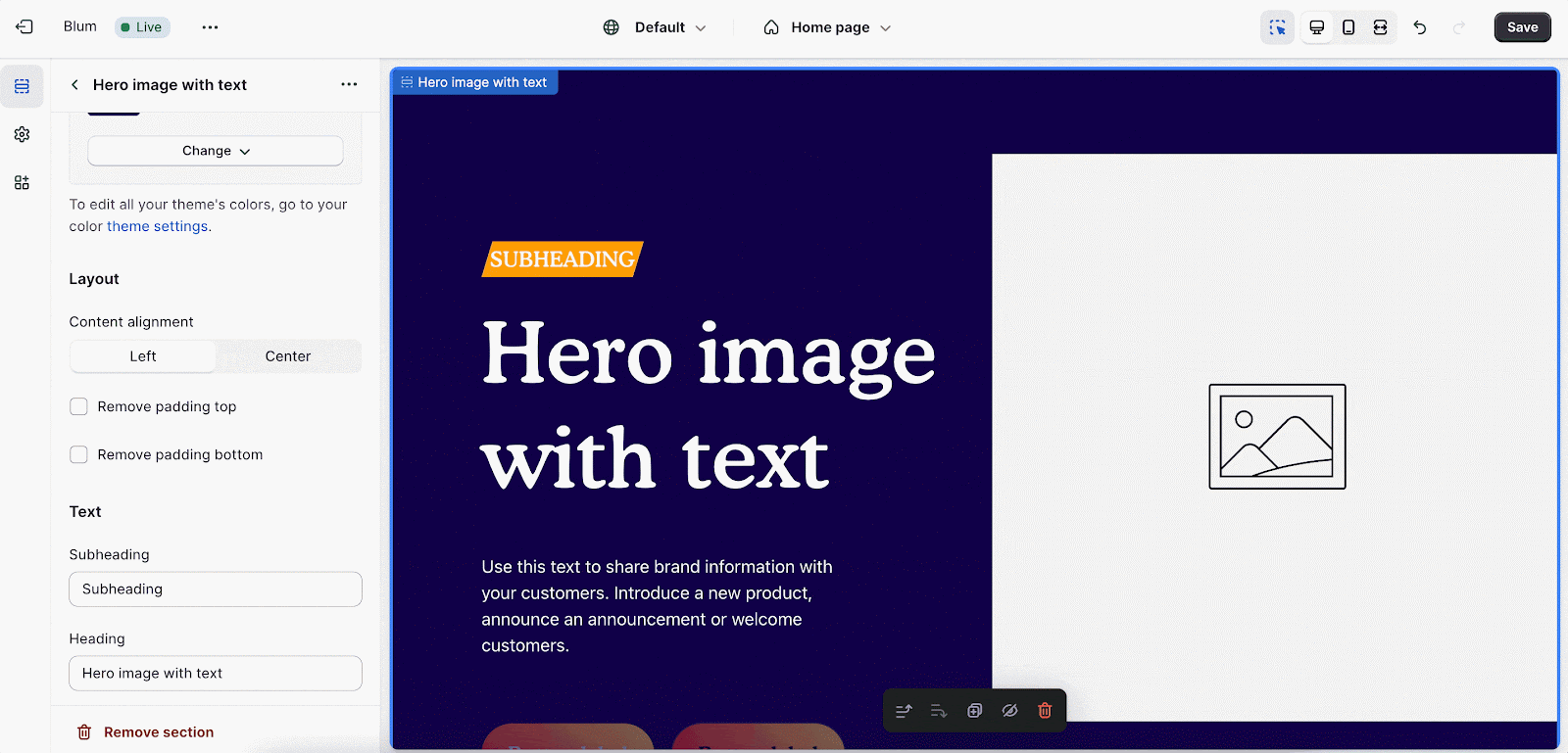
You can also enable ‘Remove padding top‘ and ‘Remove padding bottom‘ to delete the spacing at the top and bottom between the section and the elements inside it.
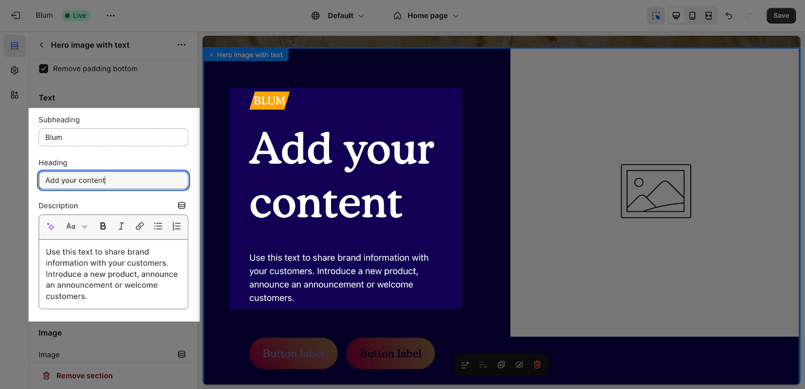
Edit Text
To add content in the Section Subheading, Heading and Description, click on the text box and insert the content. If you want to remove these contents, just delete the text in the text box.
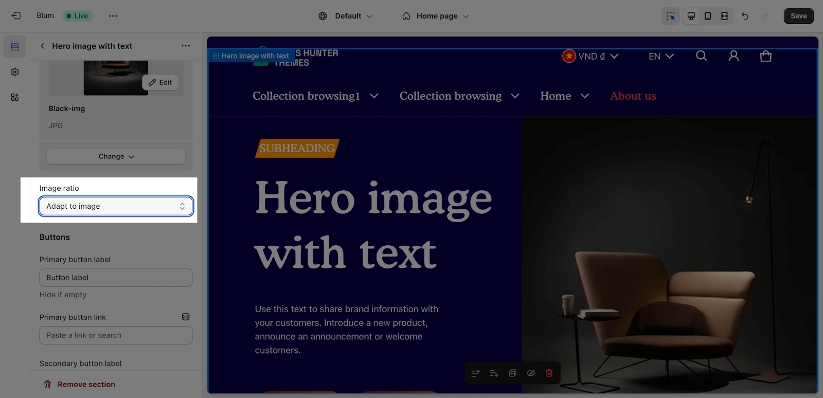
Edit Image
You can click on the ‘Select image’ button to upload the image to the section.
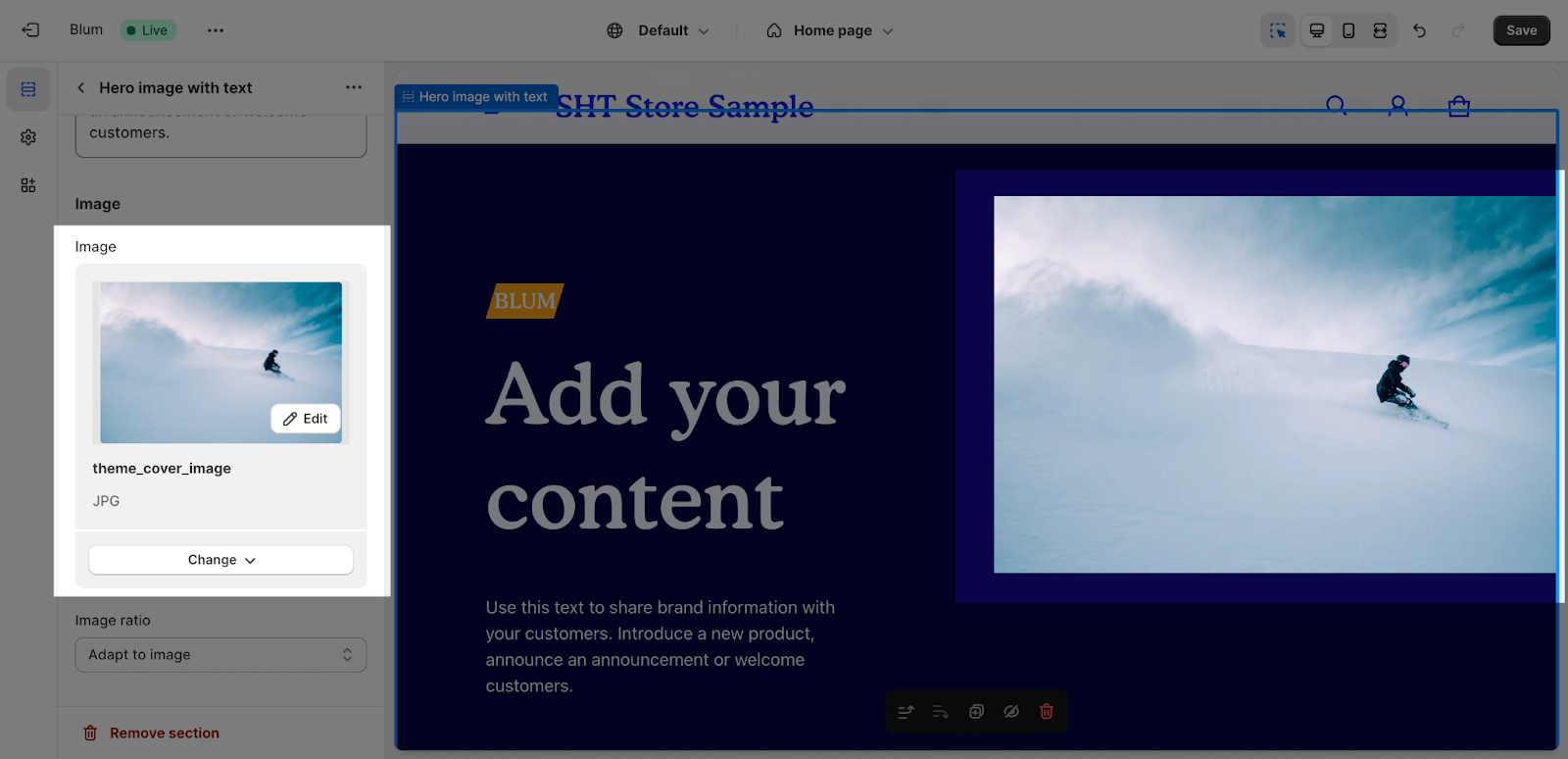
After that, you can change the image ratio from these option: Square, Portrait (2:3), Landscape (3:2) and Adapt to image:
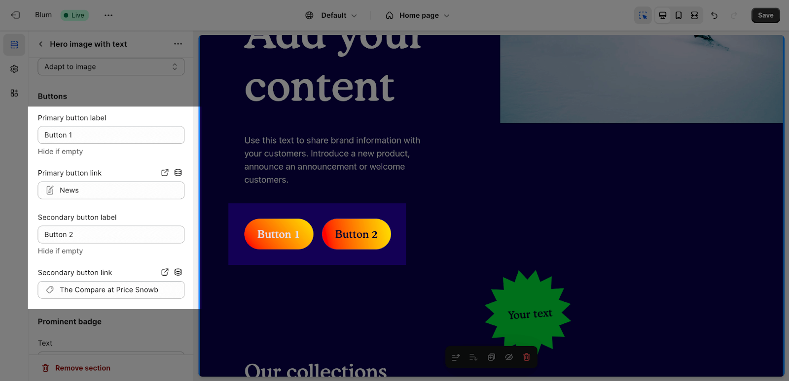
Edit Buttons
To add button text and button link, click on the placeholder and insert the content. If you want to remove the button, you just need to leave the button text blank.
Edit Prominent Badge
The Prominent Badge of this section has the same setting with the Blum Icon With Text section. You can set up these settings for the Prominent badge:
- Text: You can enter the name on the field
- Color scheme: Main accent or Extra accent
- Position: Left or Right
- Shape: Star, Diamond or Asterisk
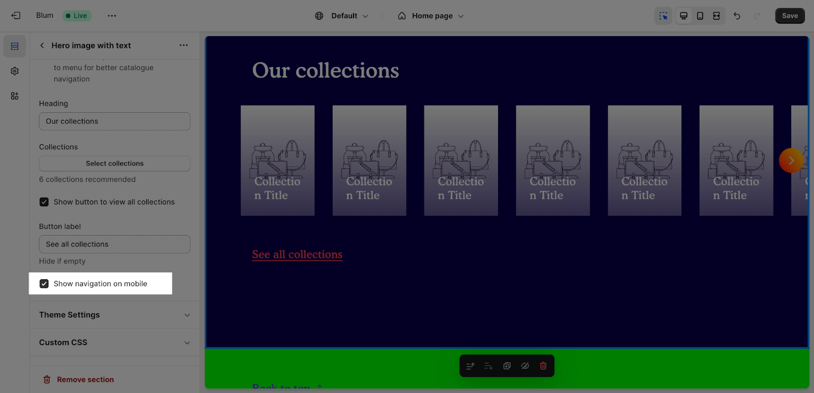
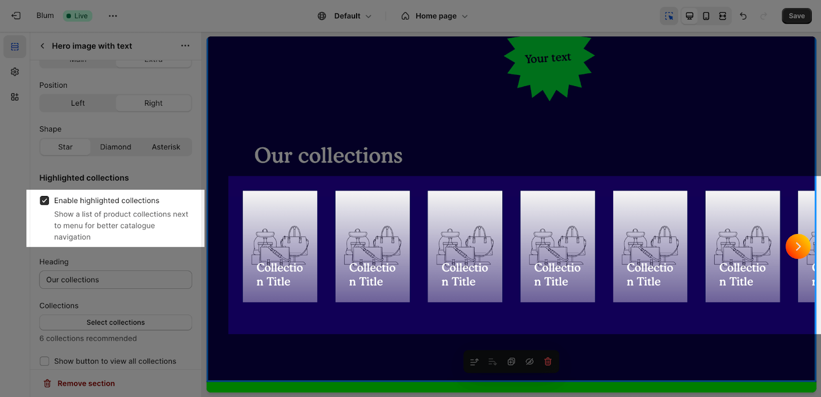
Edit Highlighted Collections
This list display a list of collections next to the menu for improved catalog navigation, you can enable or disable these collections by selecting the checkbox.
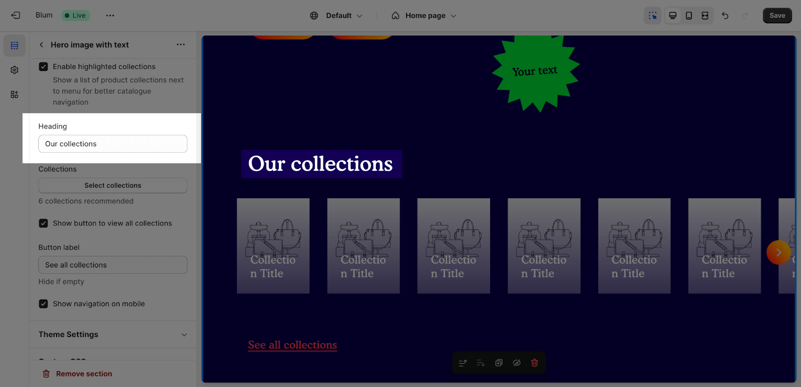
Next, you can add content for the heading on the content tab. If you want to remove the content, you just need to leave it blank.
Click on the ‘Select Collections‘ button to choose which sections to display on this list. The maximum number of collections is 50. On desktop, it will automatically display as a slideshow if there are more than 6 collections.
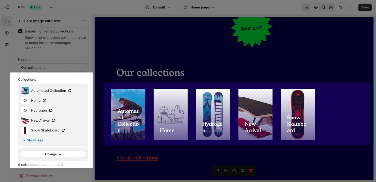
After that, you can add text for the button here, this button will be direct to the collection list page.
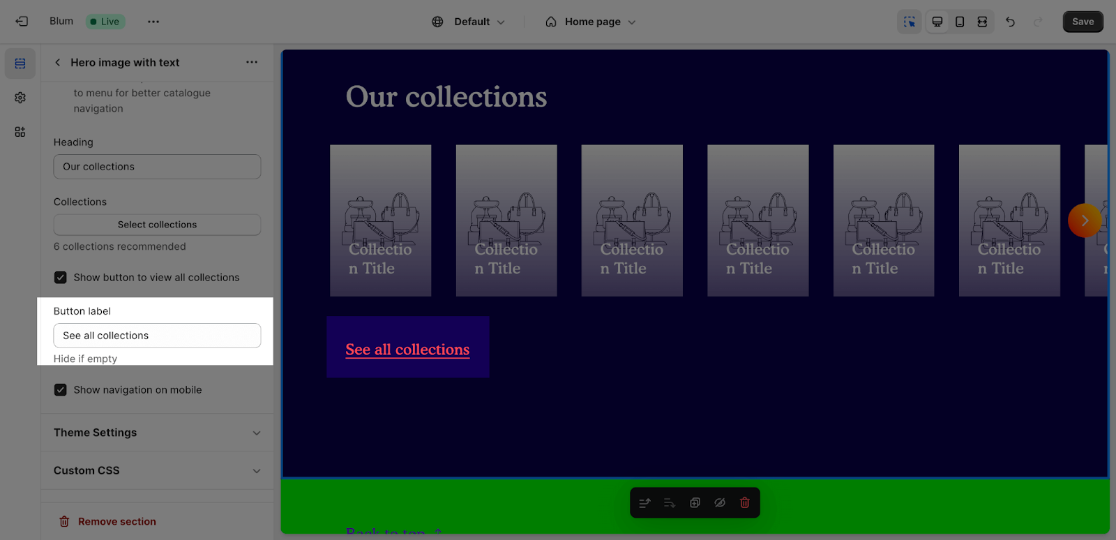
The last option: you can enable to Show navigation on mobile here.