Featured Product Carousel
About Featured Product Carousel Section
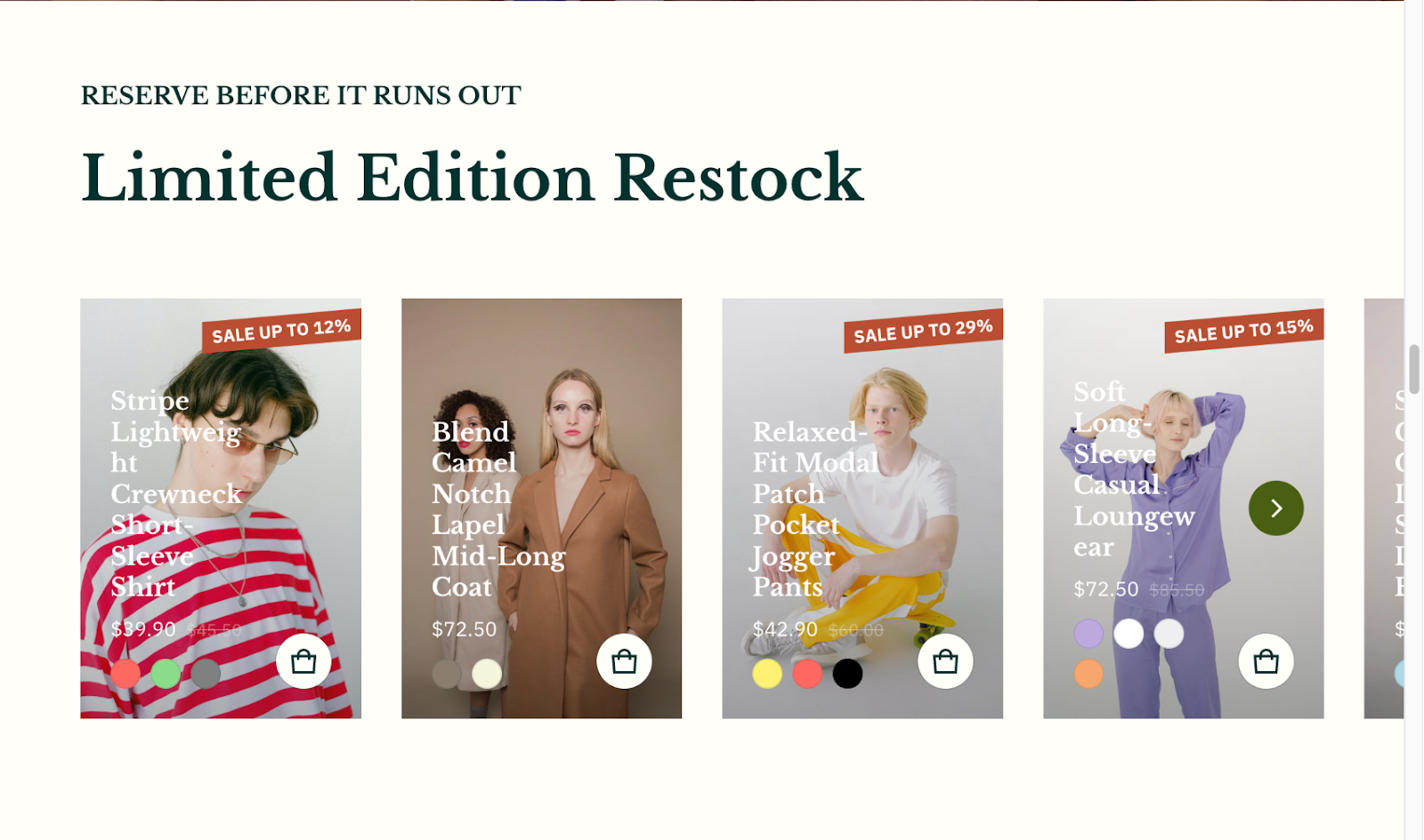
The Blum Featured Product Carousel section is a powerful tool for showcasing your best-selling or promotional products in an engaging, scrollable display. It enables you to highlight selected products in a visually appealing carousel format, ideal for:
- Homepage featured collections
- New product launches
- Seasonal promotions
- Limited-time offers
- Special discounts
The section stands out for its ability to display products in a customizable carousel layout while maintaining full control over product presentation, badge displays, and mobile responsiveness.
How To Access Featured Product Carousel Section
From any page in your Blum Admin Dashboard, click the “Add section” button, search for “Featured Product Carousel” and select it.
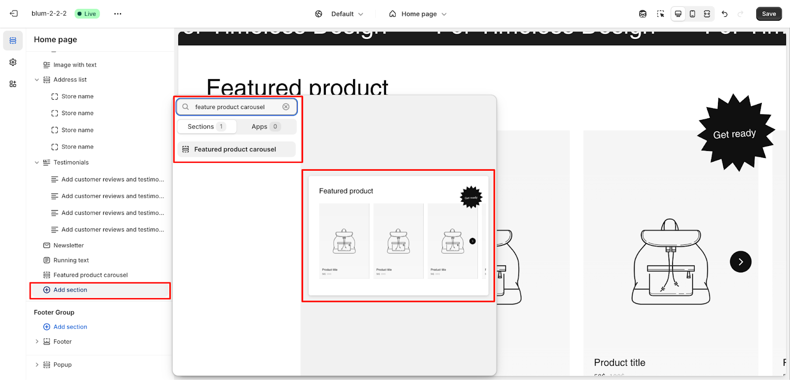
After adding the Featured Product Carousel section, customize its appearance and functionality using the available settings.
How To Configure Featured Product Carousel Section
Basic Components
Each Featured Product Carousel section setting includes:
- General settings
- Layout
- Product item
- Prominent badge
To begin customizing, click the “Featured Product Carousel” section to access its settings.
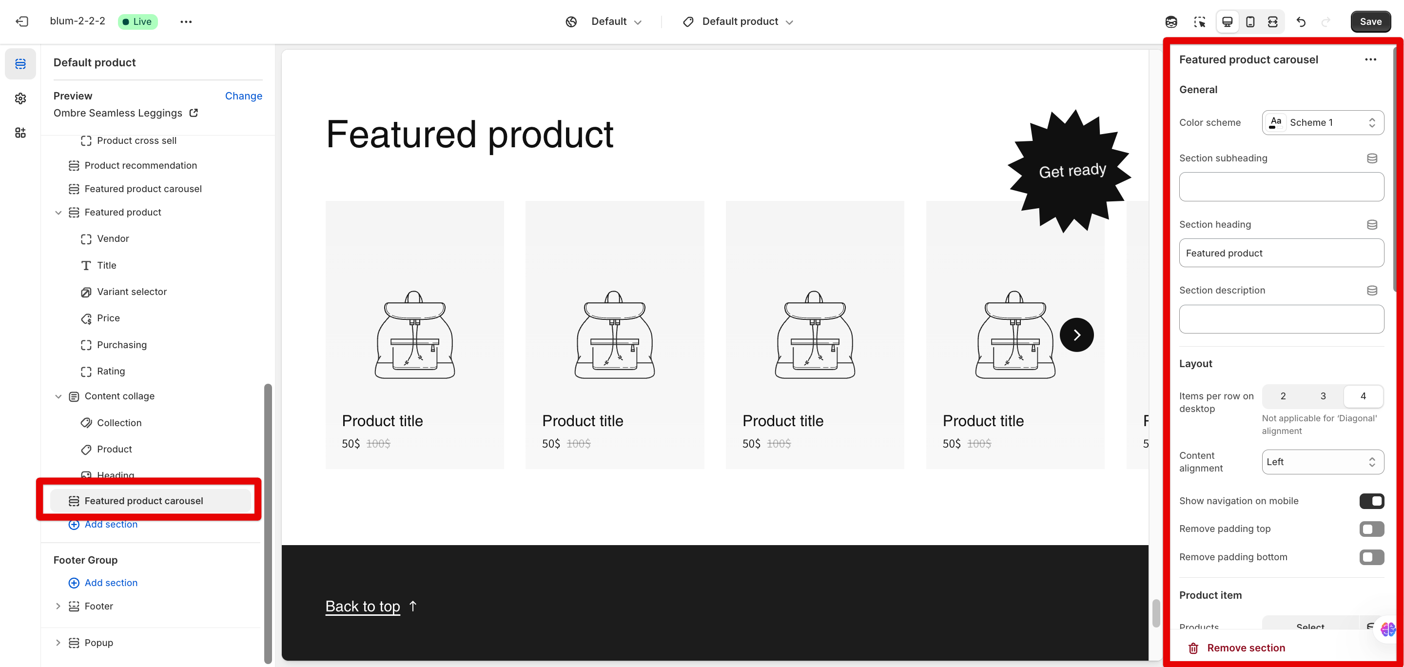
General
Within General settings, you can:
- Set color scheme
- Edit section subheading
- Edit section heading
- Edit section description
Layout
The Layout settings allow you to customize:
- Items per row on desktop (2, 3, or 4)
- Content alignment (Left, Center, or Diagonal). Items per row is not applicable for ‘Diagonal’ alignment
- Show navigation on mobile
- Remove padding top
- Remove padding bottom
Product Item
Under Product Item settings, you can:
- Select products to display in the carousel
- Show ranking badges on products.
- Choose the ranking badge shape (Ribbon or Rectangle)
- Select ranking badge accent scheme (Main or Extra)
- Select image ratio (Portrait (2:3), Square, Landscape, etc.)
- Set mask overlay opacity
- Customize mask overlay color. This color will override the banner mask overlay
- Customize the content overlay color, which overrides the banner content overlay
- Set the star rating overlay color. You can configure product rating in Theme settings > Product information
Prominent Badge
The Prominent Badge of this section has the same setting as the Icon With Text section.
Common Cases and FAQs
1. How should I feature specific products in the carousel?
In the Product Item settings, click “Select” under Products to choose which items you want to display. You can select multiple products that will appear in your carousel.
2. How can I display product ratings in the carousel?
First, ensure you have a product rating app installed. Then, enable “Show product rating” in Theme settings > Product information. You can customize the star rating overlay color in the carousel settings.
3. How do we make the carousel stand out with promotional badges?
Use the Prominent Badge feature with eye-catching text like “New”, “Limited”, or “Sale” and position it strategically (Left or Right). Choose a distinctive shape (Star is highly effective) and select a contrasting accent scheme to grab attention.