Product Card
About Blum Theme Product Card
Product cards are the “face” of your products on collection pages and search results. They provide a quick snapshot of the product image, title, price, and badges to help customers decide what to click.
Blum theme product cards are the way your products are displayed on your Shopify store’s product pages. They include the product image, title, price, and other relevant information.
How To Access Product Card Settings
Product Card settings can be configured through your Blum Theme settings. To get started, go to Themes > Customize > Theme settings (gear icon) > Product card.
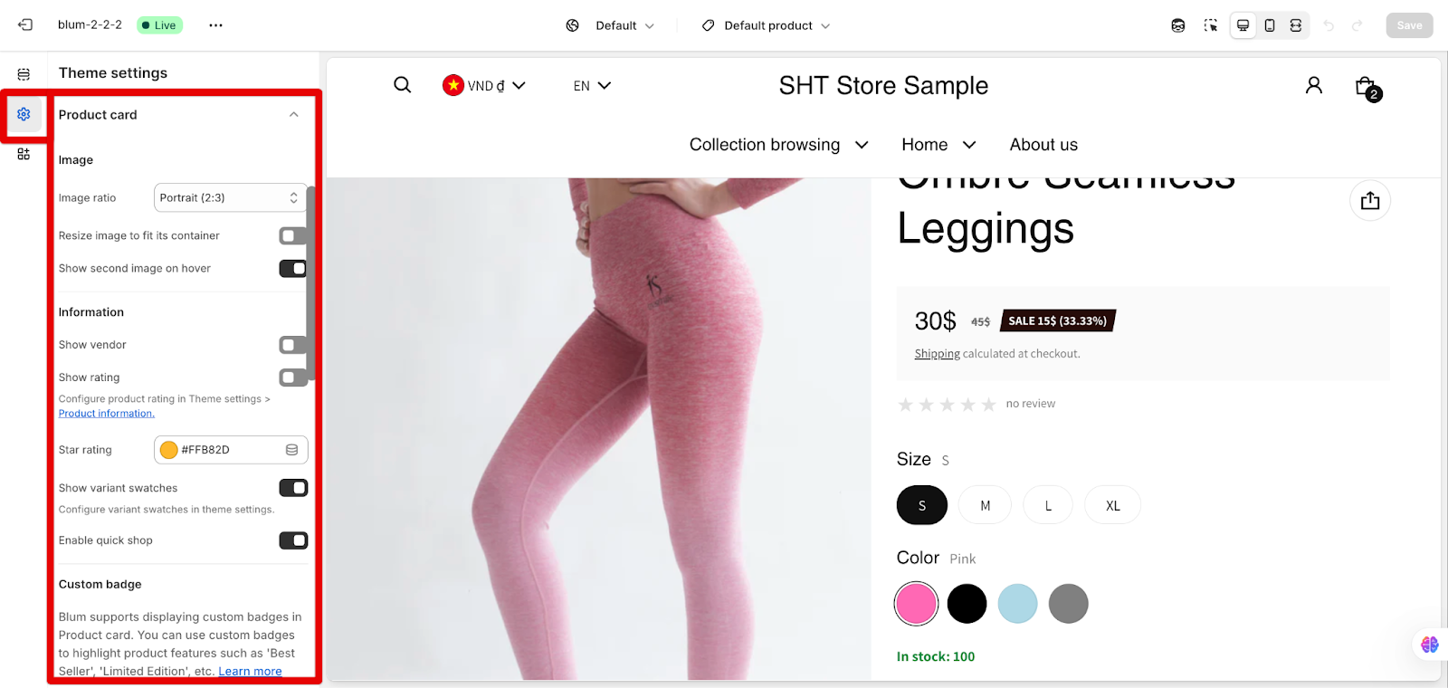
How To Configure Product Card Visuals
The Product Card section includes several customizable components:
- Product Image
- Product Information (title, price, vendor)
- Custom badge
- Product Badges
Image
Within Image settings, you can:
- Choose Image Ratio: Controls the shape of your product images.
-
- Square
- Portrait (2:3)
- Landscape (3:2)
- Adapt to image
- In addition to choosing the image ratio, you can also enable or disable the following display options for your product cards:
-
- Resize image to fit its container: The image will scale up or down to fit its container.
- Show second image on hover: Hovering over the product image will show a second product image, if available. If the product does not have a second image, a placeholder image will be displayed.
- For square-shaped images, the recommended size is 2048 x 2048 pixels. This ensures your images look sharp and detailed.
- If you want to enable the zoom feature, which allows customers to take a closer look, your images need to be at least 800 x 800 pixels or larger.
- If your images aren’t square, no worries! Just use 2048 pixels as the height, and the width will adjust based on the aspect ratio:
-
- For portrait-style images (taller than wide), use 2048 x 1365 pixels.
- For landscape-style images (wider than tall), use 2048 x 3072 pixels.
Following these simple guidelines will make sure your product images look their best on Shopify. High-quality visuals can make a difference in catching a customer’s eye and convincing them to purchase.
Information
In the Information settings, you can configure:
- Show vendor: Display the vendor name of the product.
- Show rating: Enable product ratings display. If you want to show the product rating here, you need to configure product rating in Theme settings > Product information.
- Star rating: Customize the star color for ratings (default: #FFB82D).
- Show variant swatches: Only displayed if variant swatches are enabled. You can set up variant swatches in Theme settings > Product information.
- Enable quick shop: Displays a quick shop modal when the product image is clicked. The quick shop function is setting up in Theme settings > Quick shop.
For quick shop settings, refer to this article: Blum Theme Settings – Quick Shop
Custom badge
Custom badge settings allow you to highlight product features such as ‘Best Seller’, ‘Limited Edition’ from product metafields and customize its background color as well as text color.
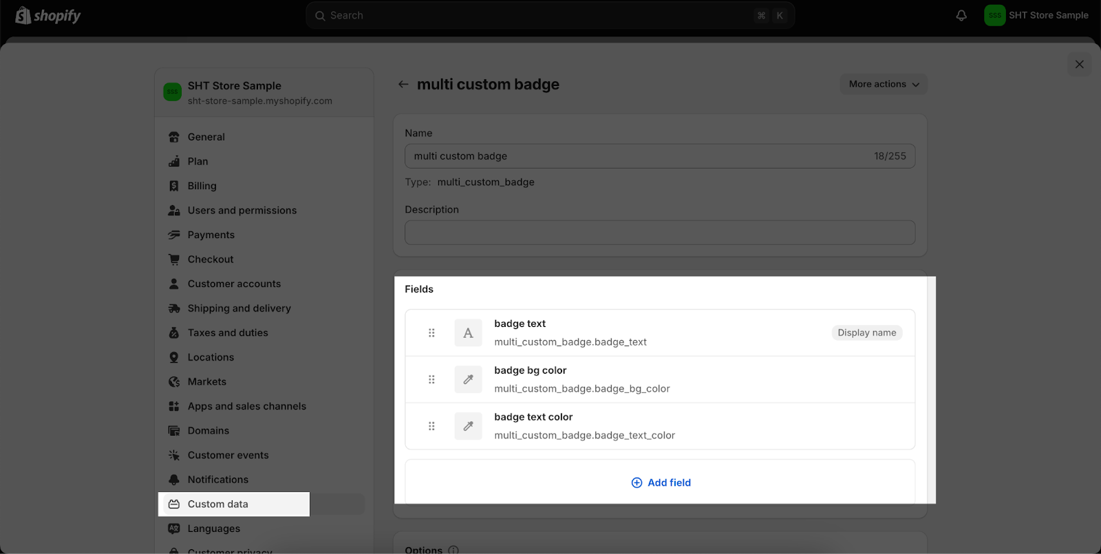
Advanced: If you want to show many custom badges in different text and background colors, you can use a product metafield linked to a metaobject.
Please make sure that your metaobject contains the following three fields:
- badge text: Single-line text type. Content is rendered case-sensitive.
- badge background color (badge background color): Color type.
- badge text color: Color type.
You must use the exact name such as ‘badge text’, ‘badge bg color’, ‘badge text color’, and the metaobject must contain all 3 fields; otherwise, it cannot be displayed on the page.
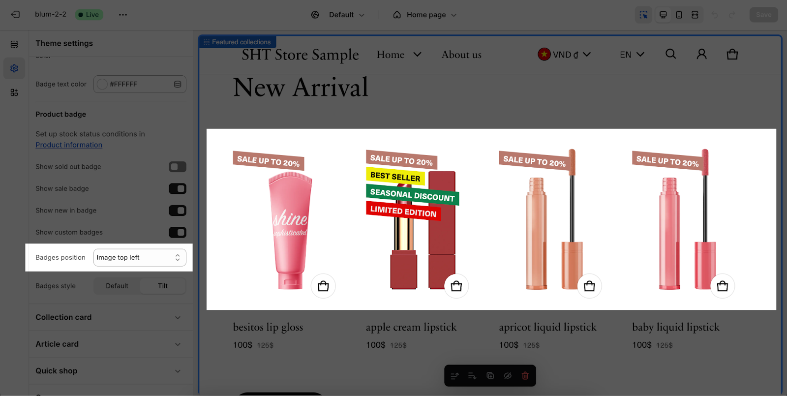
Product badge
In this setting, you can choose to:
- Show ‘sold out’ badge
- Show sale badge
- Show ‘new in’ badge”: this badge will show up based on settings in Theme Settings > Product Information > Stock status
- Show custom badges
BONUS: For a more visual guide on How to Use the Custom Badge Feature in the Blum Theme, please refer to the accompanying video tutorial below:
You can also change the badge position on top left or top right. In this example, product badges are placed on the top left:
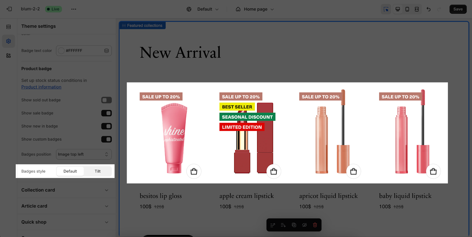
Additionally, badge style can be chosen between default and tilt.
Common Cases and FAQs
1. Which product image ratio should I use?
The best product image ratio for your store depends on the type of products you sell and your store’s overall aesthetic:
- Square (1:1): Creates a uniform look, ideal for stores with diverse product types
- Portrait (2:3): Better for clothing, accessories, or tall products
- Landscape (3:2): Suitable for wider products or lifestyle imagery
- Adapt to image: Maintains original proportions, but may create inconsistent grid layouts
2. Why aren’t my variant swatches showing on product cards?
If your variant swatches aren’t displaying, check that:
- “Show variant swatches” is enabled in Product card settings
- Variant swatches are properly configured in the Theme settings
- Your products have color/size variants with swatch images or values assigned
3. How can I optimize product images for mobile devices?
For optimal mobile performance:
- Use consistent image ratios across all products
- Keep file sizes under 200KB when possible
- Ensure images are at least 800px wide for proper display
- Test your product cards on various mobile devices before publishing
4. Can I customize the “Quick Shop” feature on the Product card?
Yes, the Quick Shop feature can be:
- Enabled/disabled in the Product card settings
- Customized to show specific Theme settings > Quick shop
Quick Shop is especially useful for mobile shoppers who want to view product details without navigating away from collection pages.