Password template
About Blum Password Template
By default, the Blum Password Template consists of 1 section: Main Password. This section cannot be removed, and can only be hidden on the Password template.
Aside from this section, you can freely add or remove any other sections on the Password template.
On the Password page, Announcement bar, Header, Footer and Site Popup are automatically disabled to avoid distraction and unwanted redirection.
Access Blum Password Template Page
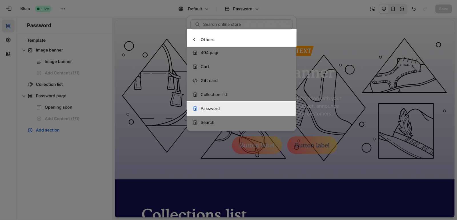
To access Blum Password Template, please visit the Top Bar Menu > Others > Password Page
Configure Blum Password Page
Edit General
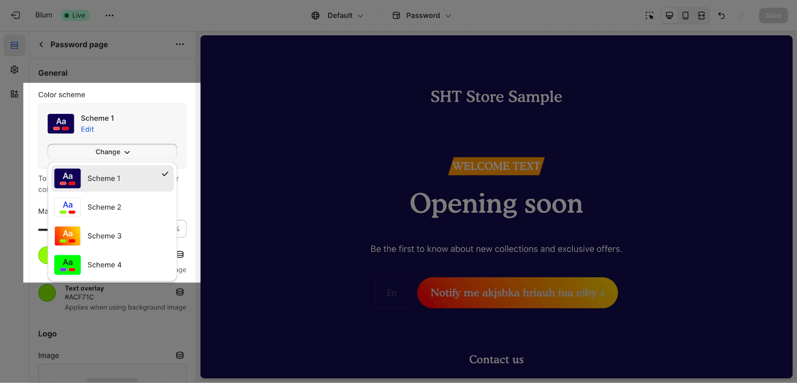
Firstly, you can change the color scheme for this section by selecting the scheme here. To change the theme color, please go to Theme settings > Colors.
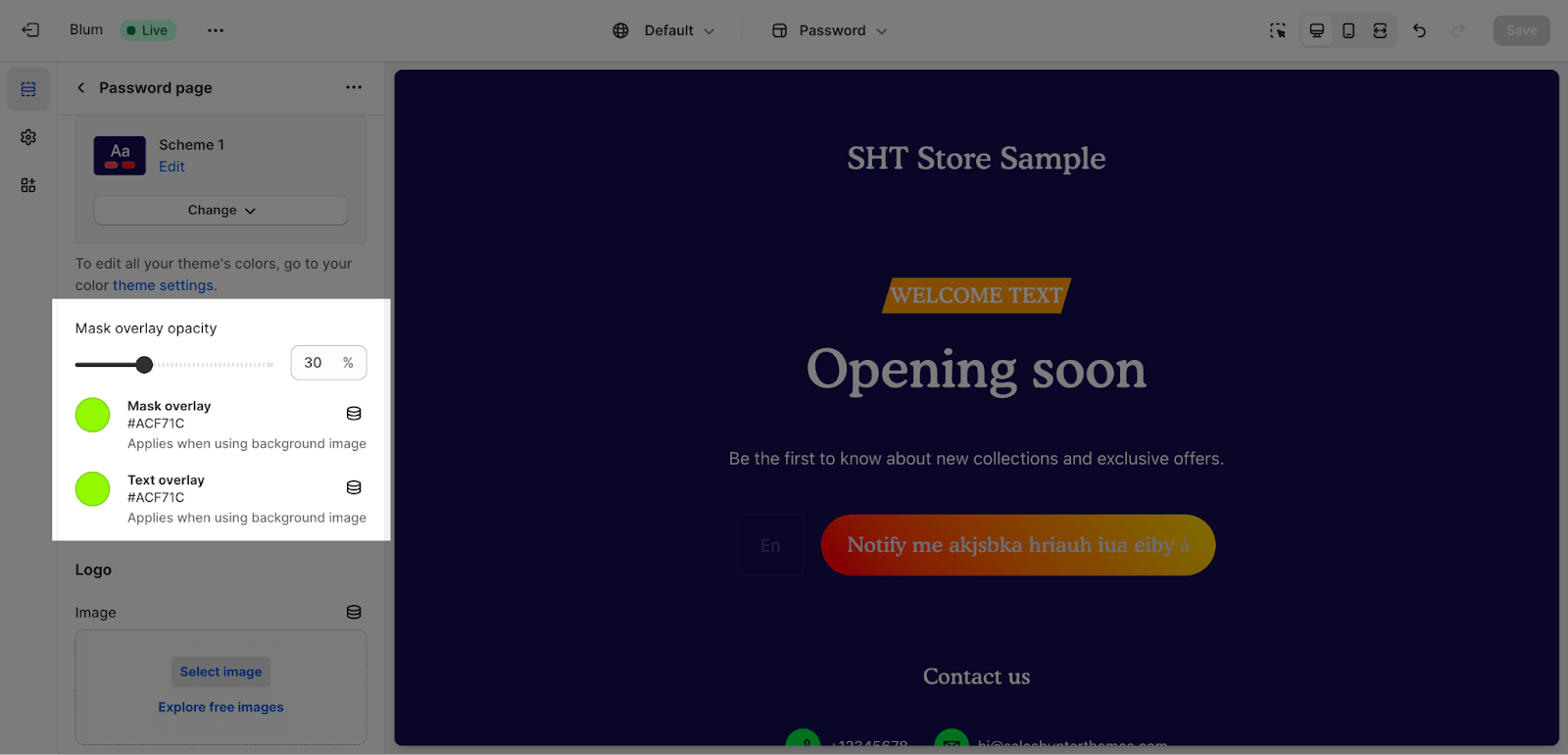
In the General tab, Blum supports adjusting the Overlay Opacity for the background image of the Password Page. The Overlay Opacity can be adjusted from 0% to 90%. The default setting is 30% for the best experience.
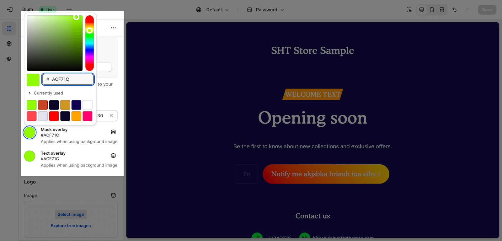
Next, you can change the color for mask overlay and text overlay by entering the color code here.
Edit Logo
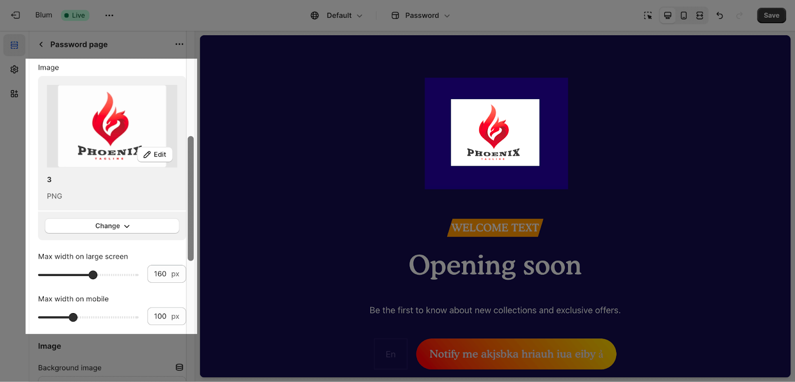
To change logo on the Password Page section, go to Password Page’s Section Settings, then choose Select Image at Logo Image. Site logo will be used automatically if no Logo is added here. For highest display quality, we recommend using images with 140 x 50px size in .png file.
By default, max width on large screen is set to 160px while on mobile is set to 100px.
Edit Background
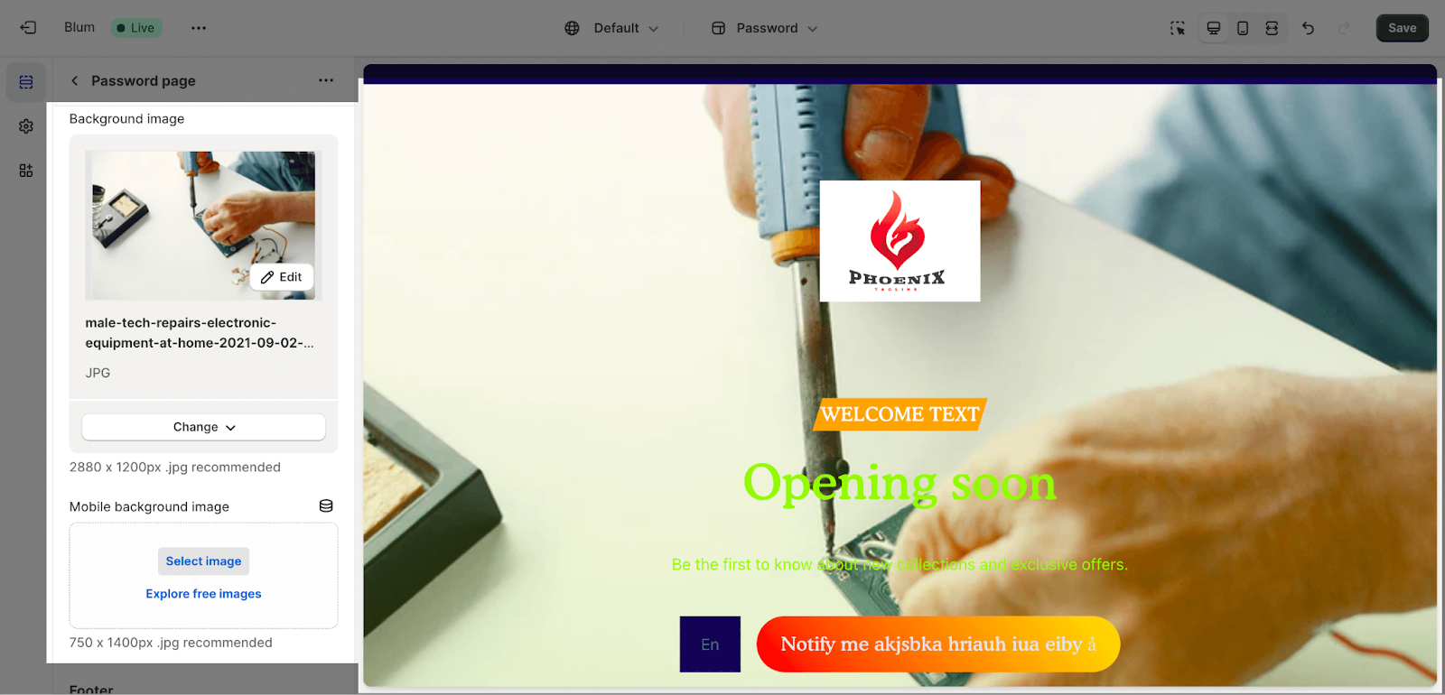
To change the background image on the Password Page, choose Select Image at Background Image. For highest display quality, we recommend using images with 1600 x 800 px in .png file for most of the screen and 750 x 1100 px in .jpeg file for mobile screen.
Edit Footer
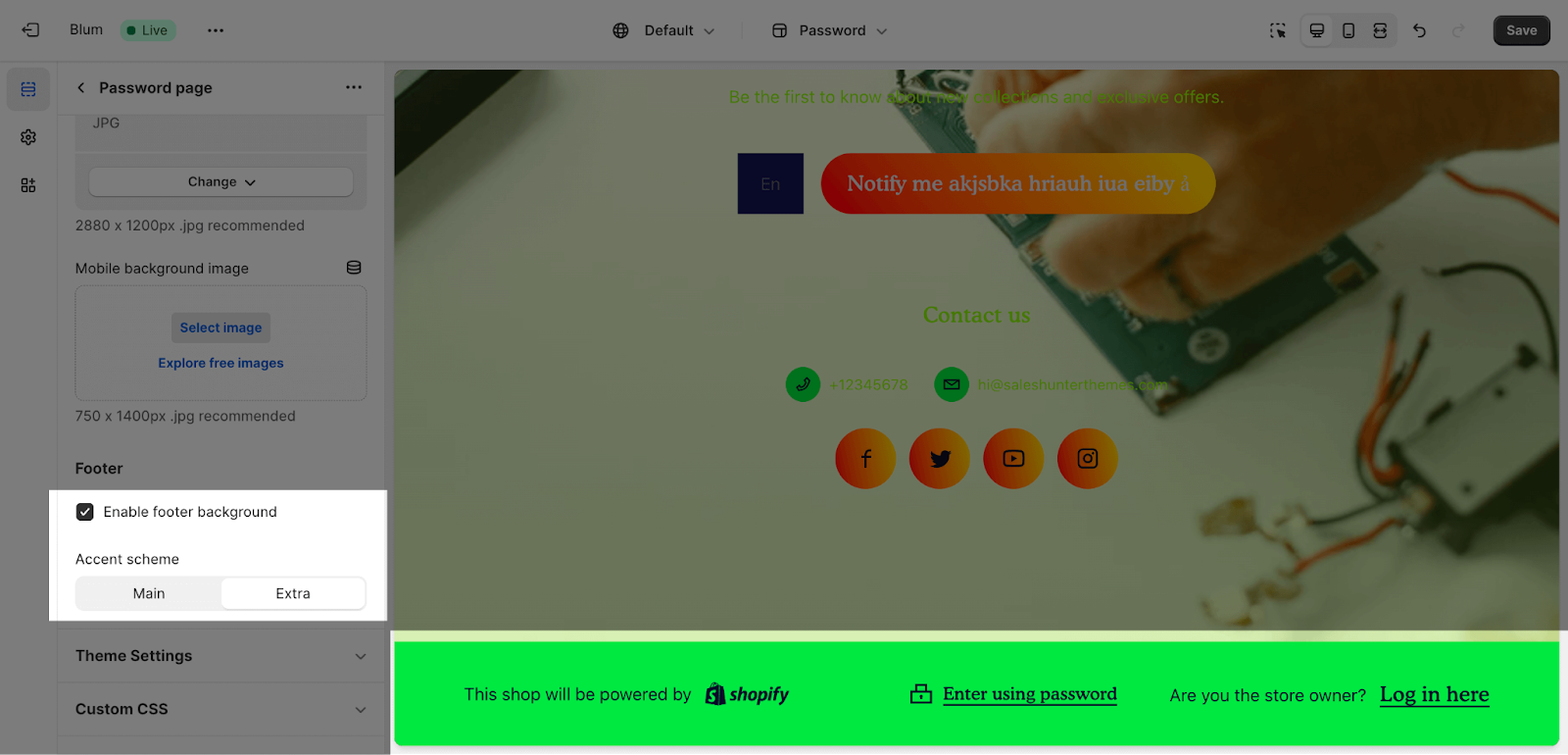
The footer of the password page is automatically enabled which allows you to set the background color for the footer. You can either choose either Main accent color or Extra accent color. You can customize these 2 colors in Theme Settings.
You can opt to enable the Background grid lines and adjust its overlay opacity from 0% to 90%. 30% overlay opacity is set by default.
The Password Page section consists of 1 default block: Content. This block can only be used 1 time on the same section. If 1 element has been added, you will not be able to add more elements from the same type. There are components in the Content blocks: Text, Prominent Badge, and Email Form.
Configure Blum Content Block
Edit Text
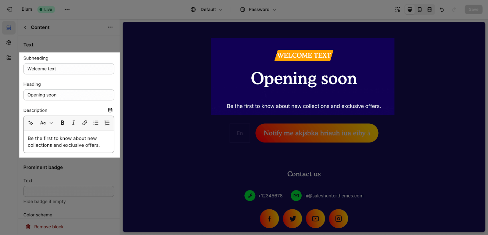
You can customize the content like Heading, Subheading, Description for the Password page section by filing in the text.
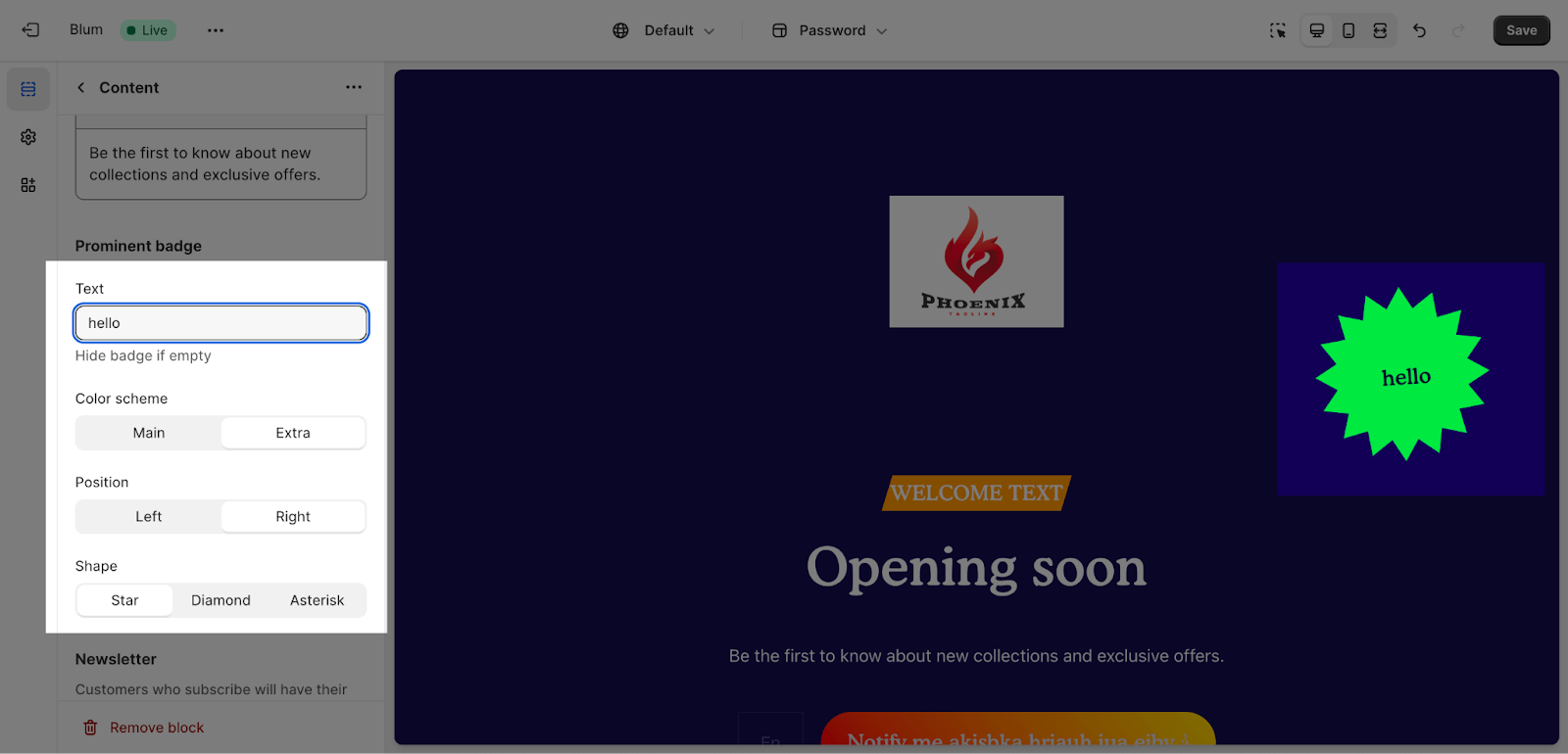
Edit Prominent Badge
The Prominent Badge of this section has the same setting with the Blum Icon With Text Section.
You can set up these settings for the Prominent badge:
- Text: You can enter the name on the field
- Color scheme: Main accent or Extra accent
- Position: Left or Right
- Shape: Star, Diamond or Asterisk
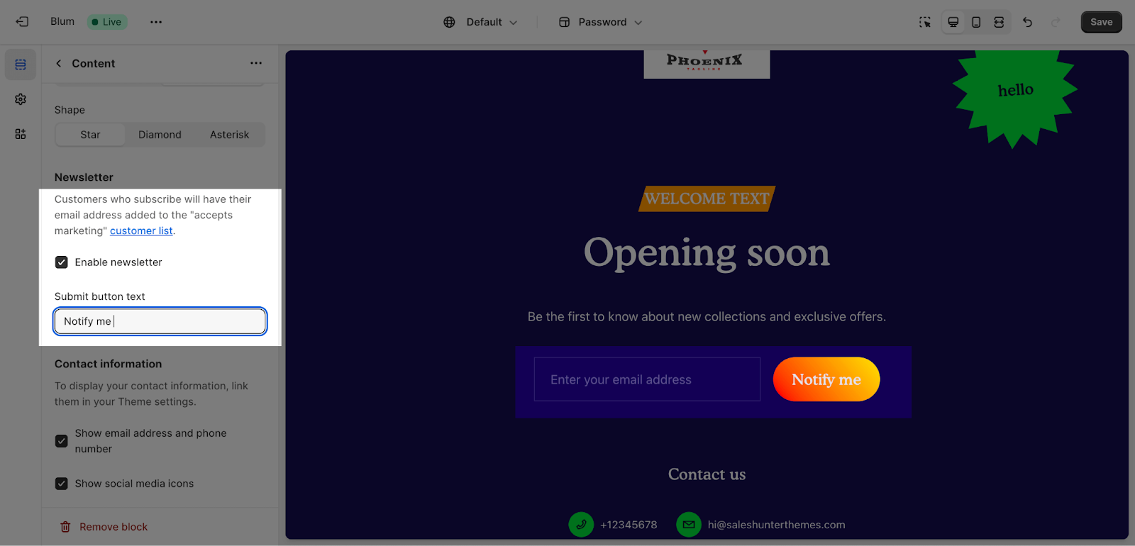
Edit Newsletter
The Newsletter tab allows you to activate or deactivate the newsletter. If you activate the newsletter, you can also change the button’s text. All data collected by the newsletter will be stored in the Customer’s area of your Shopify admin.
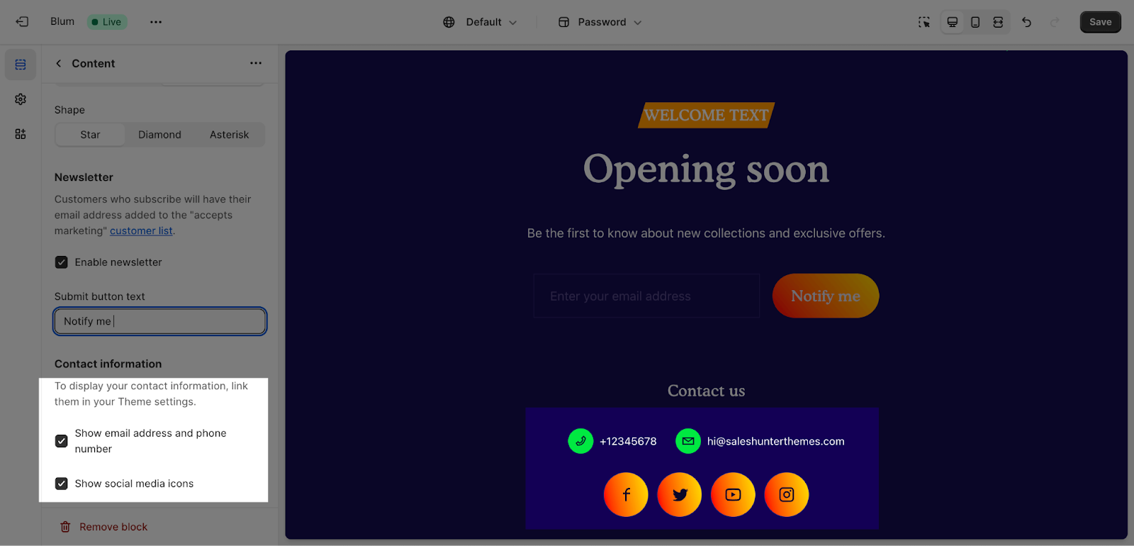
The Contact information tab allows you to show the email address and phone number, and social media icons.
Frequently Asked Questions
What Types Of Content Blocks Could I Edit In Blum Password Template?
I could customize the contents, including Heading, Subheading, Description for the Password page section.
What Is The Logo Size In Blum Password Template?
For highest display quality, the logo is recommended at 140 x 50px size in .png file.
By default, max width on large screen is set to 160px; on mobile is 100px.
