Image Banner
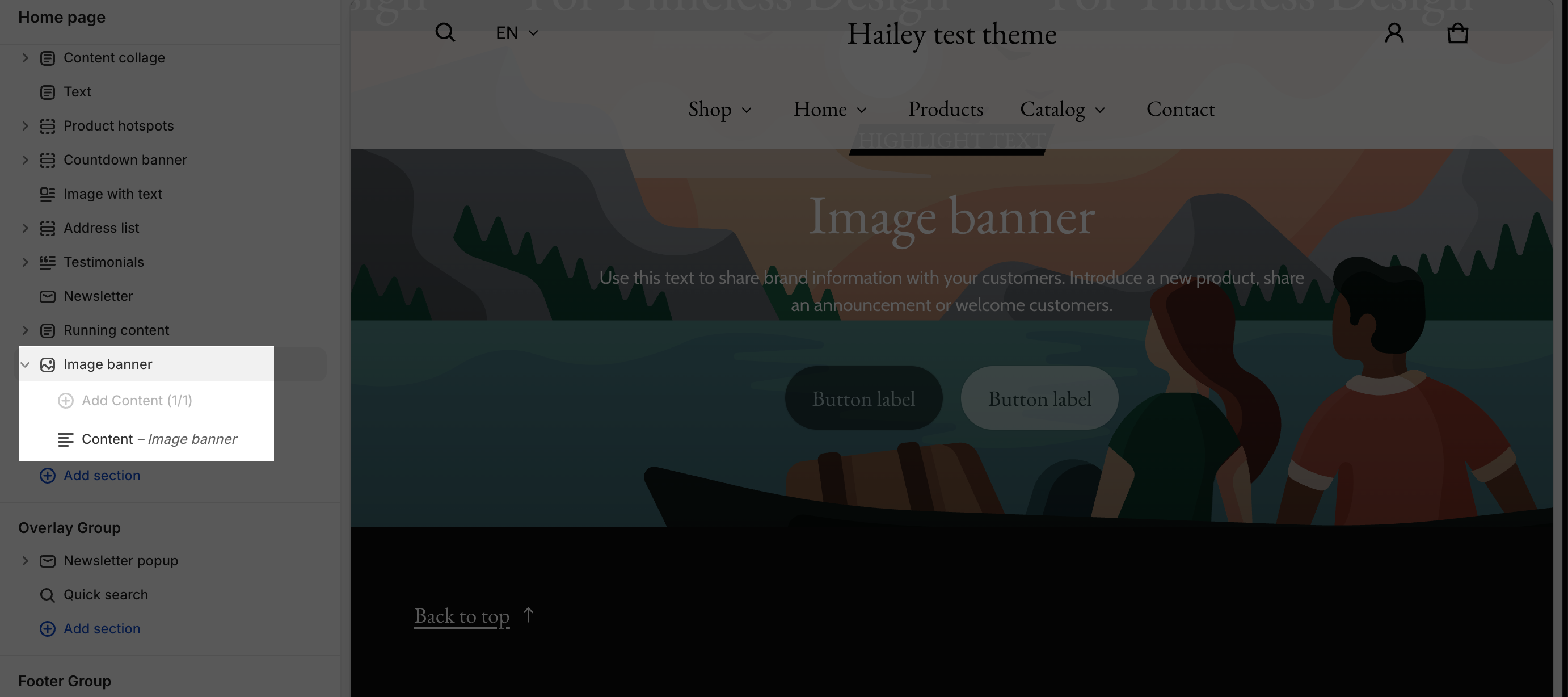
About Blum Theme Image Banner Section
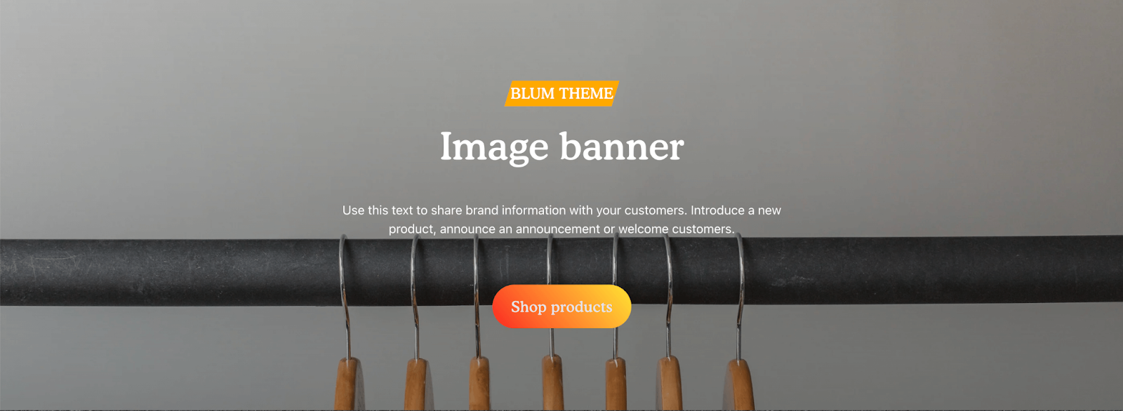
TheImage Banner section is a prominent section on your website that displays a large background image accompanied by a heading and a call-to-action button. This section serves as an effective way to grab the attention of visitors and encourage them to take action.
Tips for Creating Effective Image Banner Sections
- Use high-quality images: Choose visually appealing and relevant images that align with your message.
- Keep it concise: Avoid cluttering the section with too much text.
- Craft a clear call-to-action: Use strong verbs and make the button prominent.
- Optimize for mobile devices: Ensure the section displays well on different screen sizes.
Access Image Banner Section
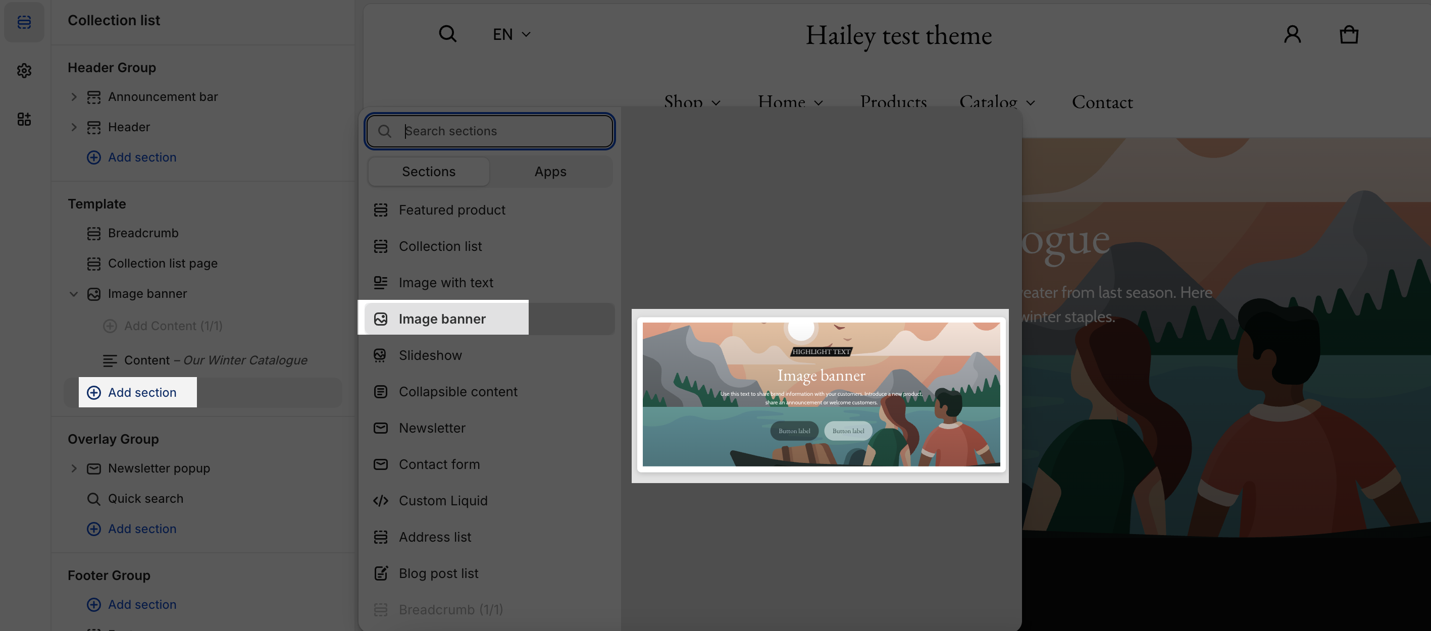
From any page in your Blum Admin Dashboard, click the “Add section” button, search for “Image Banner,” and select it.
Once the Image Banner section is added, you can customize its appearance and functionality using the various settings available.
Image Banner Section Configuration
To start customize your Image Banner, Click on the Image Banner section to access its settings.
The Settings toolbar has 4 tabs: General, Layout, Image, and Prominent Badge.
General
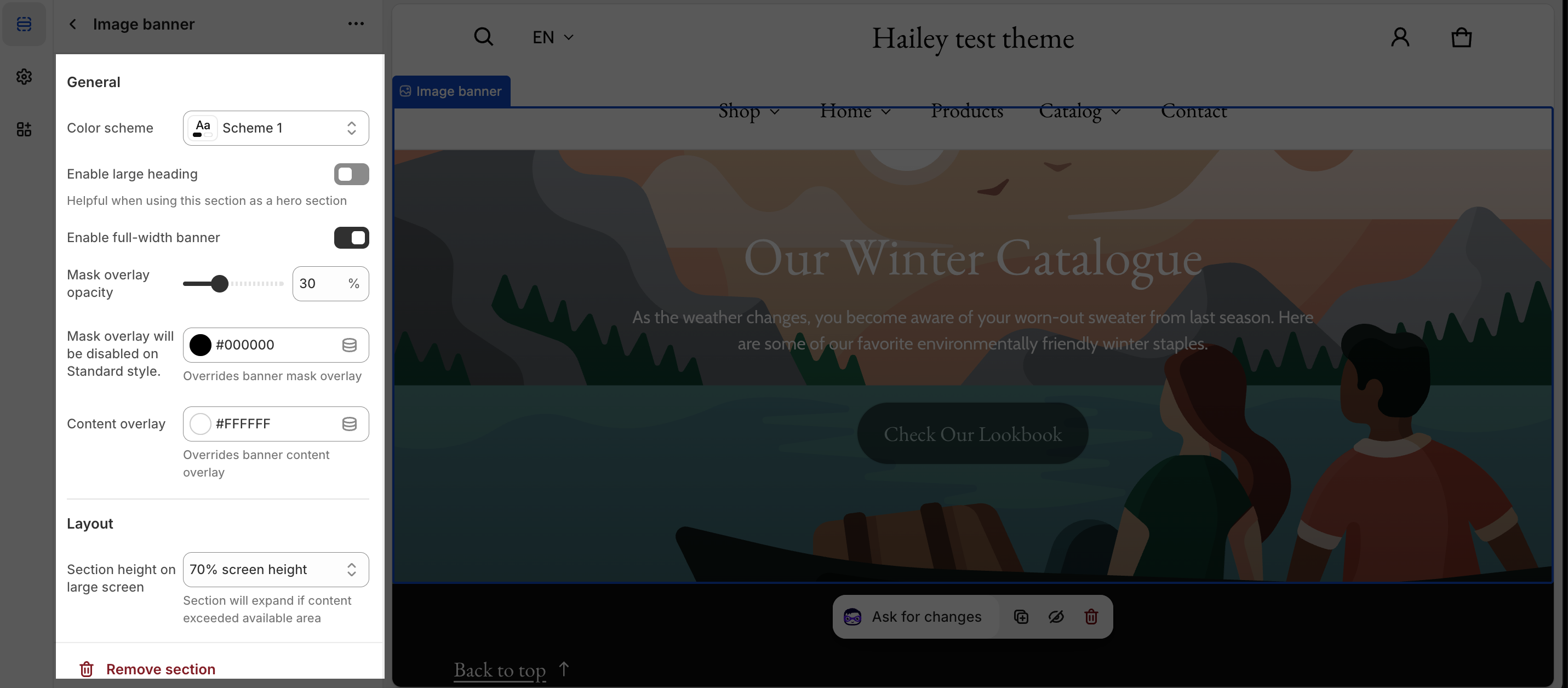
- Color Scheme: Select the desired color scheme for the Image Banner section. These schemes have been set up in the Theme settings > Color.
- Enable Large Heading: Enlarge the heading font size to match the headline’s style.
- Enable full-width banner: Select enable full-width banner to get full-width otherwise Image banner will be applied according to max width of theme settings.
- Overlay Opacity: Adjust the transparency of the banner’s overlay from 0% to 90%.
- Mask Overlay Color: Customize the overlay color of the background image.
- Content Overlay Color: Modify the color of the text within the Image Banner section.
Layout
In the Layout tab, the section has 6 options for the height of the Image banner section:
- Adapt to content (Resize the banner to fit the content): This can be useful for the compact promotion
- 30% screen height: This can be useful for the compact promotion
- 50% screen height: This can be useful for the regular promotion
- 70% screen height (default setting for optimal quality): This can be useful for the regular promotion
- Fill screen height (Show 100% screen height): This can be useful for the hero image promotion
- Adapt to image (Resize the banner to fit the background image size to avoid cropping image)
For mobile devices, you can set the banner height for mobile devices independently of the large screen settings. The setting options are the same with large screen settings.
At the bottom of the layout, we will have two options: “Remove padding top” and “Remove padding bottom.” When we disable these options, there will be additional space above and below the section to increase the distance from other sections. If we enable these functions, the space above and below that section will be removed.
Image
- Background Image: Upload the background image for all devices. Recommended size: 1600x800px.
- Mobile Background Image: Upload a separate background image specifically for mobile devices. Recommended size: 750x1100px.
You can set background images separately for large screens and mobile.
Note:
- If you set the background image for the large screen and don’t upload the image for mobile screen, the mobile view will automatically inherit the image of the large screen.
- If you set the background image only for the mobile screen, the large screen will not inherit the image of the mobile screen.
Prominent Badge
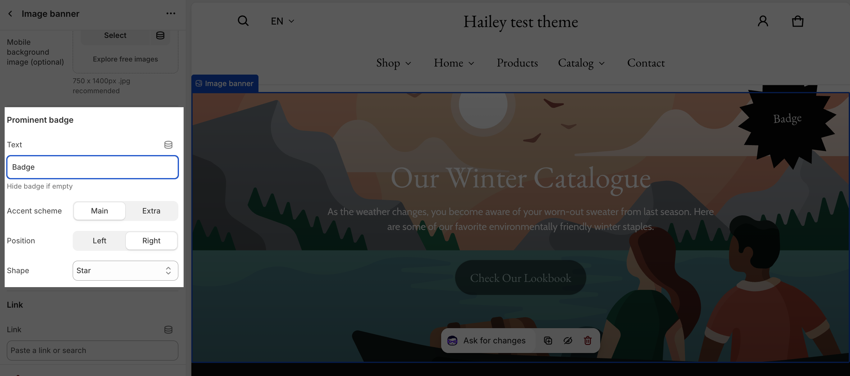
With Prominent Badge of the Image Banner section, you can add the content for the badge in the Text placeholder.
You can change the color of the text and content of the Badge by selecting main scheme or extra scheme. To settings for these schemes, go to Theme settings > Color.
You can also choose to show the badge to appear on the left or the right side of the banner.
Based on your brand aesthetic, you can choose the shape of the badge as Star, Diamond or Asterisk
Link
The link section here applies to the whole banner without a button. You can link your Image Banner to:
- Collections
- Products
- Pages
- Blogs
- Blog posts
- Policies
Theme Settings
-
Enable parallax scrolling for Prominent badge:Enable parallax for eye-catching promotional banners; disable for minimal, professional looks
- Subheading style: This option allows you to display the subheading as a badge or as text. After you choose an option, the subheading will be styled according to the settings for badges or text that have been set up in Accent color.
Content Block Configuration
Along with the settings of the Image banner section, this section also supports settings for Content that overlay the background image as the Slideshow section. The Image banner section has 1 content block only.
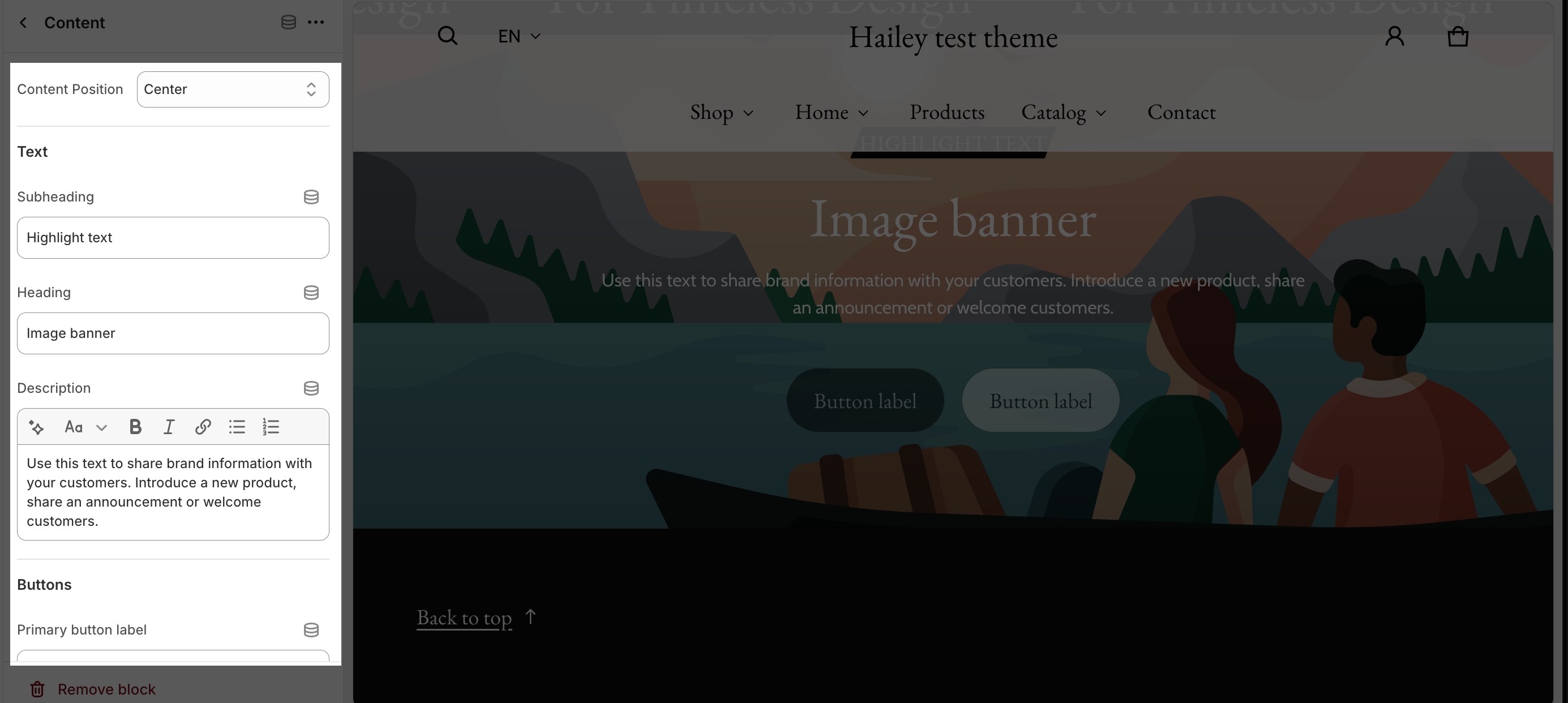
Click on the Content block of the Image Banner section to adjust the setting for the block.
Content Position
For Content block, you can change the Content position in the dropdown selector. There are 3 types:
- Center
- Left Center
- Left bottom
Text
In text, you can change the subheading, heading and description of the Image banner section by filling in the placeholder text.
Buttons
In the Buttons card, insert the button label name for the Primary and Secondary button to add buttons on the section. Click on the button link to add a direct link for them. If you want to remove one button, just delete the text in the button label.
Frequently Asked Questions
What is the different between Blum Slideshow and Blum Image Banner?
With Blum Slideshow, all your images should be auto-slide by the time you’ve set. With Blum Image Banner, you will have to scroll to see the images yourself.
What are the three contents position to display texts hovered the image banner?
Center, Left-Center and Left-Botton
What are the image sizes displayed in Blum Image Banner?
Recommended size for default background image is 1600x800px and 750x1100px for mobile view.
