What Icons Can I Use On Shine Theme?
The Shine theme’s extensive icon library empowers you to visually enhance your website’s content structure, effortlessly communicate information, and elevate the overall user experience. Icons serve as powerful visual aids, highlighting key points and captivating your audience.
How To Find An Icon In Shine Theme
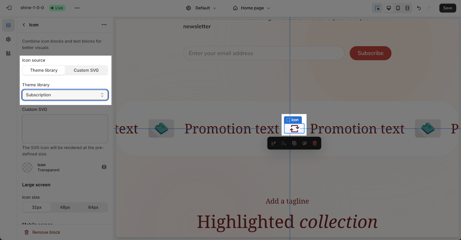
Upon clicking the Icon Theme Library dropdown selection, you will discover that icons are conveniently organized by their designated names, enabling you to swiftly locate your desired symbol.
What Icons That Shine Theme Supports
You have the option to choose from 6 distinct categories of icons:
- Functional
- Social
- Shop
- Shipping
- Fashion
Functional
Search:  |
Play:  |
Full screen:  |
Hamburger menu:  |
Drag:  |
Exit full screen:  |
Cart:  |
Close:  |
3D:  |
Ellipsis:  |
Minus:  |
Mute:  |
Arrow right:  |
Phone:  |
Unmute:  |
Arrow left:  |
Mail:  |
Quote:  |
Arrow down:  |
Pause:  |
Spinner:  |
Arrow up:  |
Share:  |
Page:  |
Chevron right:  |
Play circle:  |
RSS:  |
Chevron left:  |
Check circle:  |
Sort:  |
Chevron down:  |
Save:  |
Grid 1:  |
Chevron up:  |
Info:  |
Grid 2:  |
Map pin:  |
Next:  |
Grid 3:  |
Check:  |
Warning:  |
Grid 4:  |
Account:  |
Zoom in:  |
Grid 6:  |
Star:  |
Zoom out:  |
Eye:  |
Star half:  |
Filter:  |
Home:  |
Star line:  |
Filter 2:  |
Trash bin:  |
Plus:  |
Social
Facebook:  |
Tiktok:  |
LinkedIn:  |
Youtube:  |
Pinterest:  |
Vimeo:  |
X – Twitter:  |
Tumblr:  |
Snapchat:  |
Instagram:  |
Shop
Heart:  |
Like:  |
Discount:  |
Percent:  |
Storefront:  |
Subscription:  |
Gift:  |
Shipping
Truck:  |
Global:  |
Clock:  |
Return:  |
Plane:  |
Box:  |
Fashion
Iron:  |
Dress:  |
Ruler:  |
Shirt:  |
Washing:  |
Pants:  |
Shoe:  |
Health & Beauty
Bottle:  |
Cream tube:  |
Makeup brush:  |
Lipstick:  |
Hand:  |
Best Practices for Using Icons
To ensure an optimal user experience, consider the following best practices when incorporating icons into your Shine theme website:
- Consistency: Maintain a cohesive visual language by using icons consistently throughout your website.
- Clarity: Choose icons that clearly represent their intended meaning, avoiding ambiguity.
- Size and Visibility: Ensure icons are appropriately sized and visible for their intended usage.
- Accessibility: Consider accessibility guidelines when using icons, providing alternative text or descriptions for users with disabilities.
Frequently Asked Questions
1. Which section in the Shine theme can I use the icon element?
You can use the Icon element in the following sections:
- Icon with text
- Text hotspots
- Running text content
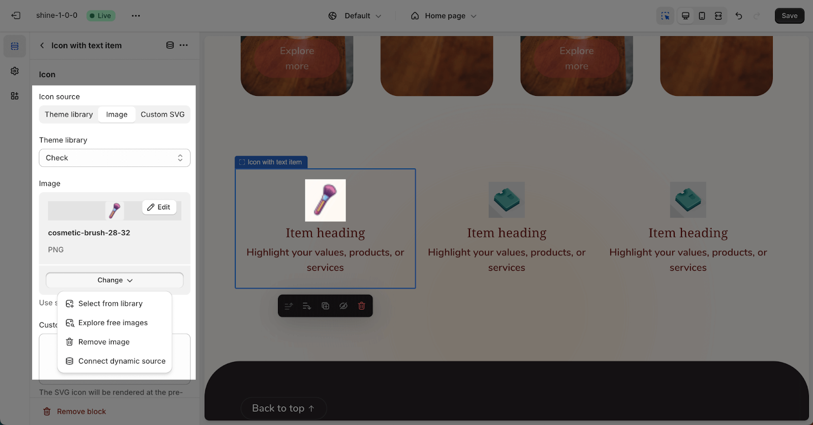
2. Can I upload my own image to use as an icon?
Absolutely! The Shine theme allows you to use the ‘Custom Icon’ setting to upload and use your own image as an icon, replacing the default theme icon. If you wish to revert to the original theme icon, simply remove the selected custom icon.
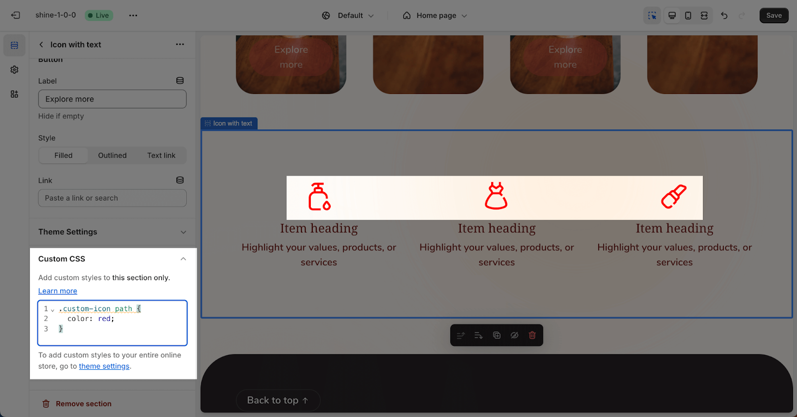
3. How can I change the color for an icon?
By default, the icon color matches the body text color. However, you can customize the icon color by adding the following code to the custom code field in the section settings:
.custom-icon path {
color: red;
}
Change the ‘red’ to the color that you want to custom for the icon