Theme Settings
Welcome! Let’s set up the Shine Theme Settings by reading this article.
Table Of Contents
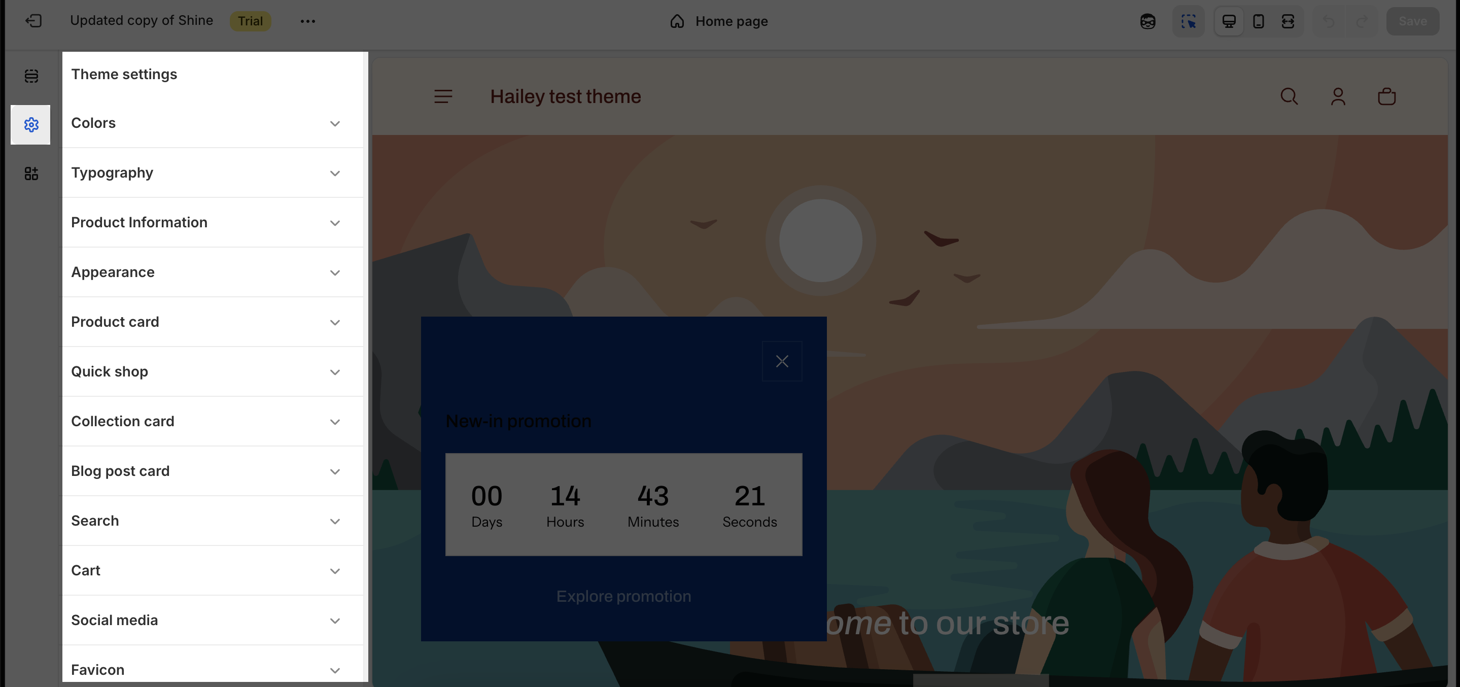
Accessing Shine Theme Settings
After installing Shine Theme to your Shopify account, you can find the theme settings by clicking on the second icon on the menu bar.
Colors
To adjust the color scheme, go to Theme Settings and select “Colors”. Here, you can choose from pre-set color schemes or design your own.
A color scheme is a collection of harmonizing colors for your store’s text, background, buttons, and badges. Apply these color schemes to various sections of your store to achieve a cohesive and visually appealing look.
According to Shopify, you have the flexibility to add 21 color schemes to your store, allowing you to tailor the look and feel to your unique preferences and branding.
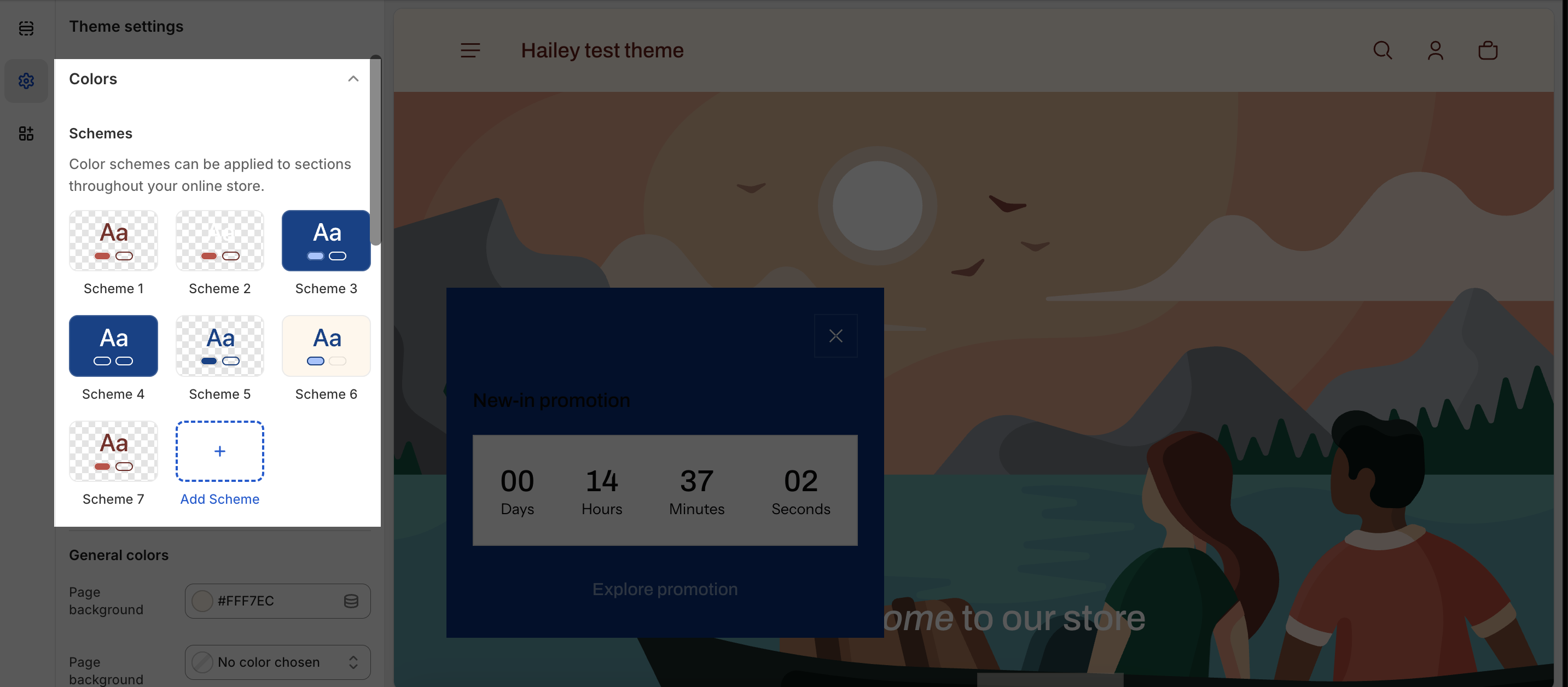
To change a color scheme, just click on the one you want. This will open a window where you can pick a color or type in a color code. Remember to choose colors that everyone can see easily, so your store is welcoming to all:
- In general, you can edit color for background and content on the page or section.
- In Solid button, you can edit color background and content for button.
- In the Outlined button, you can edit color for content and outline.
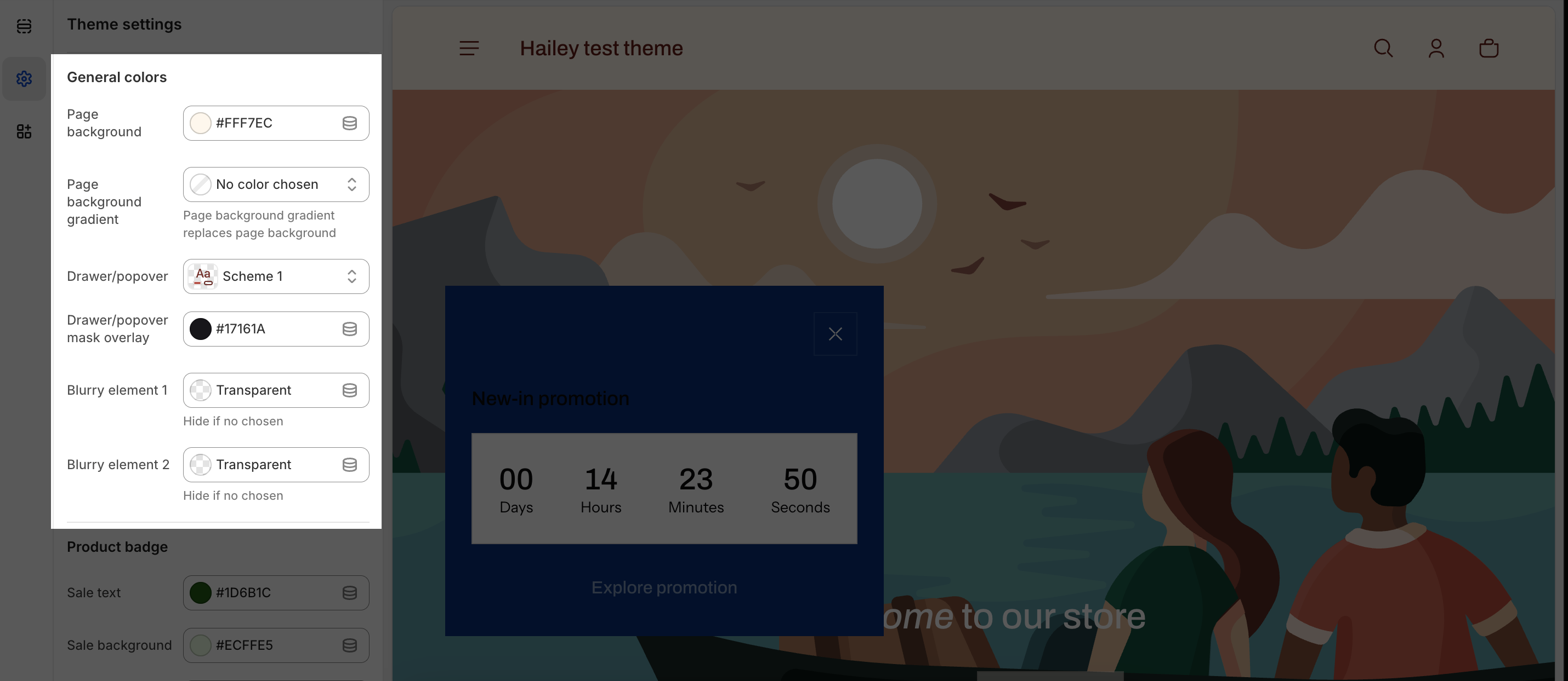
General Colors
- Page background: The main website background color
- Page background gradient: Optional gradient overlay on background
- Drawer/Popover section: This refers to a section that pops up, like the prompt to enter a password on a password page, or the display that appears when you use the search function. It’s a type of overlay that shows up over the main content, typically used for short, focused tasks like searches, logins, or additional information.
- Drawer/popover mask overlay: When you open a drawer or popover menu (like a sidebar menu or a cart summary), the rest of the page is often covered with a slightly opaque layer, which is the mask overlay. This overlay helps to focus the user’s attention on the drawer or popover by visually muting the rest of the page. You can change the color code to the color which you want to match with the color scheme.
- Blurry element 1 & 2: Background blur effects for layered elements. To see this layer, you will need to use a transparent background for the section.
Product Badge
- Sale text: Text color for “Sale” badges
- Sale background: Background color for sale badges
- Sold out text: Text color for “Sold Out” labels
- Sold out background: Background color for sold out badges. It’s typically used to distinguish sold-out items from those that are available, often using muted or distinct colors to indicate the unavailability of the product.
- “New in” text & background (colors for new products, if applicable)
Typography
To change Typography, we can go to Theme settings > Typography, where you can universally change the font family of headings and body texts, as well as font scale level. Check this article to learn more about the Typography settings in Shine theme.
Product Information
It controls:
- How product options display (as dropdowns, color swatches, etc.)
- Stock status alerts for customers
- “New” product indicators
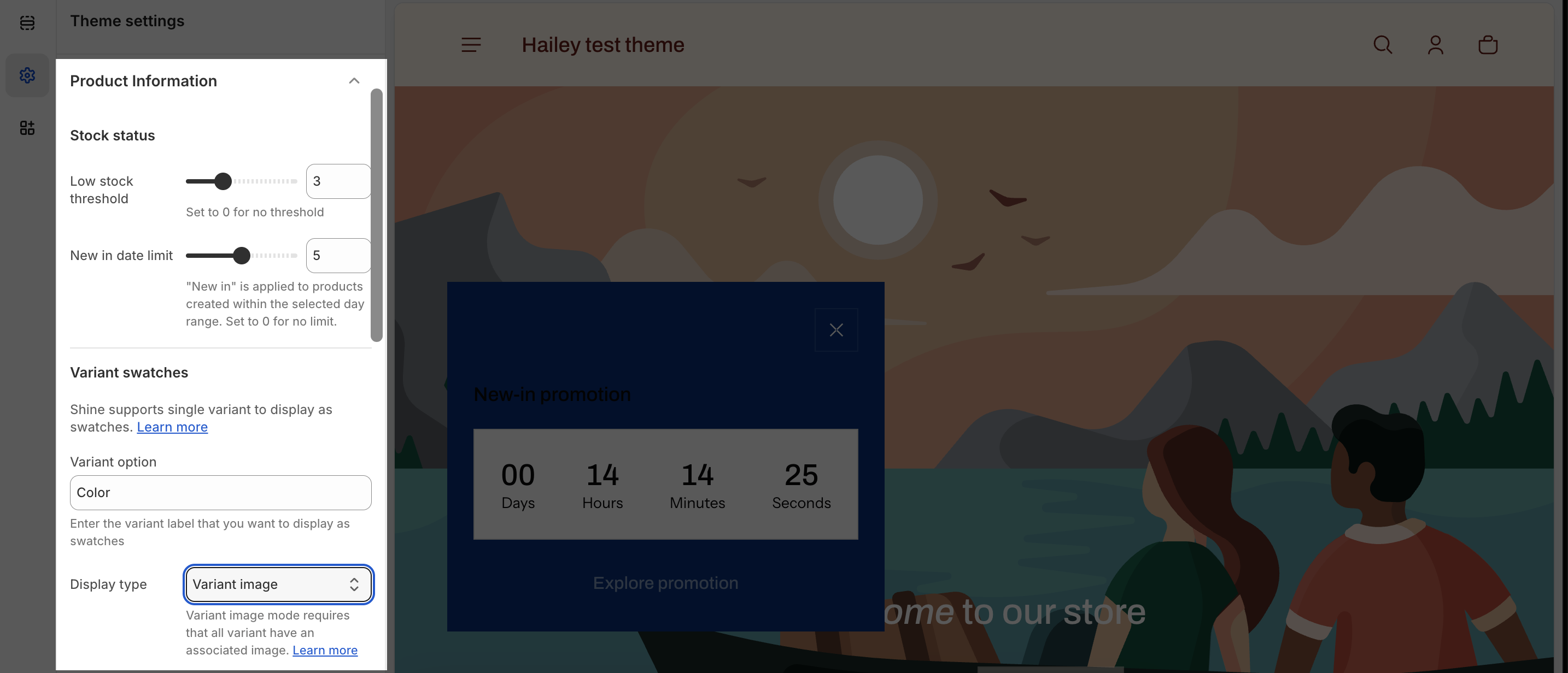
Stock Status
- Low stock threshold: Set a number (0-10). When inventory drops below this number, show “Low Stock” alert.
- Example: Set to 3 = Show “Low Stock” alert when only 3 items remain
- Set to 0 = Never show low stock warnings
- New in date limit: Specify how many days a product stays marked as “New” after being added.
- Example: Set to 7 = Products show “New” badge for 7 days after upload
Variant swatches
Variant swatches let customers click colors/sizes instead of using dropdowns
To set up variant swatches:
- Variant option: Enter the exact name of your product variant (must be lowercase)
- Example: “color” or “size”
- Display type: Choose how swatches show:
- Color swatches: Manual color codes or images
- Variant image: Use product images automatically
- Custom values for swatches: Enter color codes
- Example: “Black: #000000” or “White: #FFFFFF”
- Or upload image files: “Red: https://cdn.shopify.com/…red-image.jpg”
Important Notes:
- Only ONE variant type per theme (e.g., just “color” OR just “size”, not both at once)
- Variant name must EXACTLY match your product setup (lowercase)
- Images must be PNG or JPG files uploaded to Shopify Files
Appearance
Controls the overall visual design and layout of your store – spacing, rounded corners, icon styles, and link behavior.
It controls:
- Page width and spacing
- Whether corners are sharp or rounded
- Icon appearance (thin or bold)
- How links behave when customers hover over them
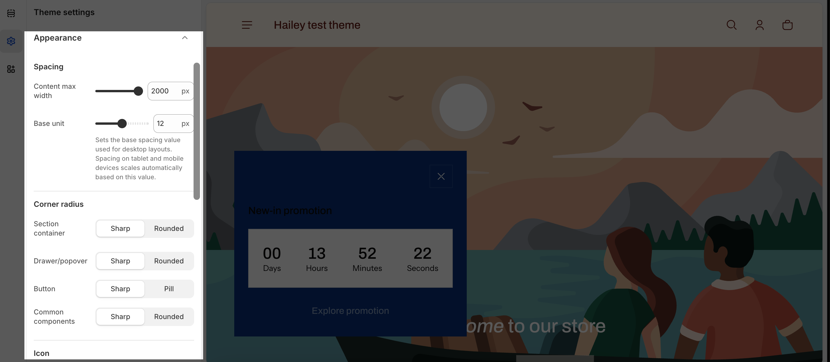
Spacing
- Content max width: How wide your content is
- Range: 1300-2000 pixels
- Default: 2000px (wider = content spreads across more of screen)
- Beginner tip: 1600-1800 is usually best for readability
- Base unit: Sets the basic spacing measurement for all elements
- Default: 12px
- Higher number = more space between elements
- This automatically adjusts spacing for tablets and phones
Corner radius
Choose between Sharp or Rounded corners for:
- Section container: Cards and content boxes
- Drawer/popover: Pop-up windows and modals
- Button: All buttons (also affects pagination buttons and tags)
- Common components: General UI elements
- Example: If you choose “Rounded” for Button, all buttons will have rounded corners
Icon
- Icon thickness: Choose Regular (thin) or Bold (thick) for all icons in your store
Link
- Preload links on hover: When enabled, the next page starts loading when customer hovers over a link (faster page loads)
- Good for: Improving perceived speed
Product Card
Controls how individual product boxes look when displayed in collections, search results, or product grids.
- Card layout style (simple box vs. detailed card)
- Image size and aspect ratio
- Sale badge display
- Availability status badges
Product cards appears on collection pages, search results, related products sections, featured collections
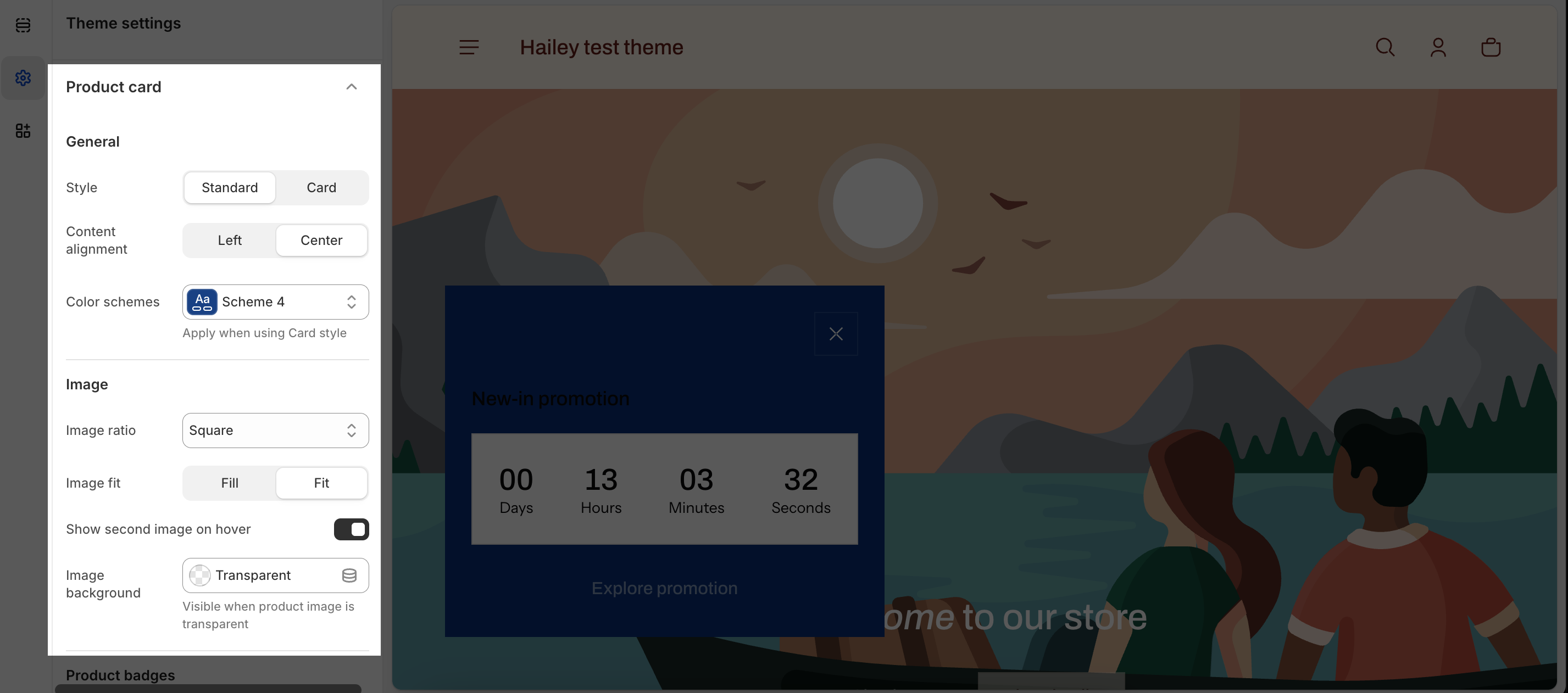
General
- Style: Choose between:
- Card: Product info below image in a bordered box
- Standard: Just shows product image (minimal design)
- Color scheme: Select which color scheme to apply to product cards
- Content Alignment: Left or Center alignment for product text
Image
- Image Ratio: Choose how the product image appears:
- Square: 1:1 ratio (most common)
- Portrait: 3:4 ratio (tall/vertical)
- Landscape: 4:3 ratio (wide/horizontal)
- Adapt to image: Uses original image proportions
- Image Fit:
- Fill: Crops image to fit container
- Fit: Shows entire image (may have empty space)
- Show second image on hover: (Toggle) When enabled, shows alternate product photo when customer hovers their mouse
Information
- Show sale badge: Three options:
- Never: No sale label
- Text Only: Shows “Sale” text
- Text + Sale Amount: Shows “Sale” + discount percentage
- Show sold out badge: (Toggle) Displays “Sold Out” label on unavailable products
Quick Shop
Quick Shop is a convenient pop-up that displays essential product information when a customer clicks on the “Quick Shop or Quick Add” button. It allows customers to quickly review product details and make informed purchase decisions without leaving the current page.
Check this article to learn more about the Quick Shop settings in the Shine theme.
Collection Card
Controls how collection boxes/tiles appear when showcasing multiple product collections.
Collection card appears on collection showcase sections, category display areas
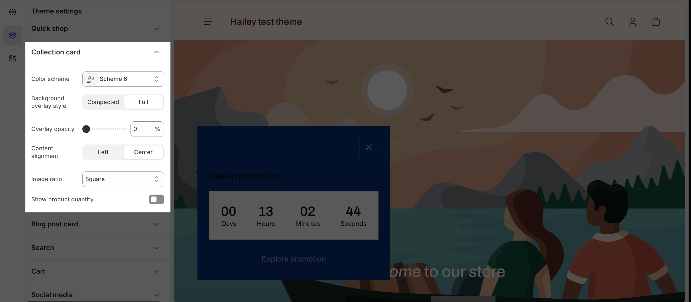
- Color scheme: Select the color scheme for collection cards
- Overlay opacity: Slider from 0% (fully clear) to 90% (mostly opaque)
- Controls how much the text background shows through
- Default: 30%
- Content Alignment: Left or Center
- Image Ratio: Three options:
- Portrait: 2:3 (tall format, good for fashion)
- Square: 1:1 (balanced look)
- Landscape: 3:2 (wide format, good for home goods)
- Show product quantity: (Toggle) Displays “12 products” inside the collection til
Blog post card
Controls how blog post previews appear when displayed in blog listing sections or related posts areas.
Blog post card appears on blog pages, blog post listing sections, related posts sidebars
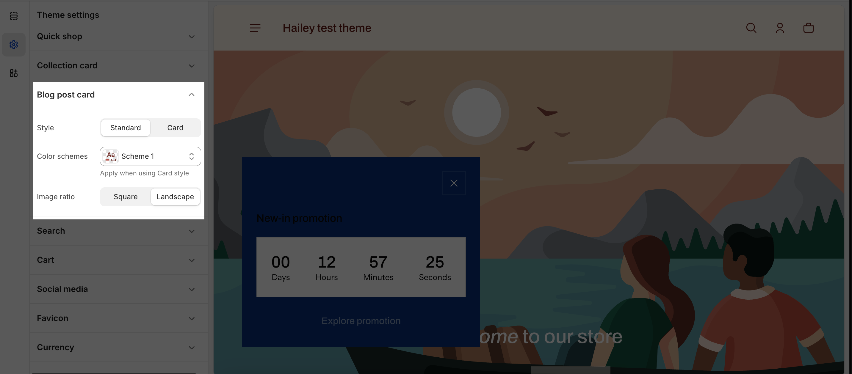
- Style: Standard or Card.
- Use “Standard” for a very minimal, editorial blog where the page background is already clean and you want posts to flow together.
- Use “Card” if you want each post to stand out as a separate tile, especially on busy backgrounds or when you use multiple background colors.
- Color scheme: Select the color scheme for blog post card
- Image ratio: Square or Landscape.
- Choose “Square” when your article images are varied and you want a consistent grid look.
- Choose “Landscape” if your images are wide and you want a more editorial feel.
Search
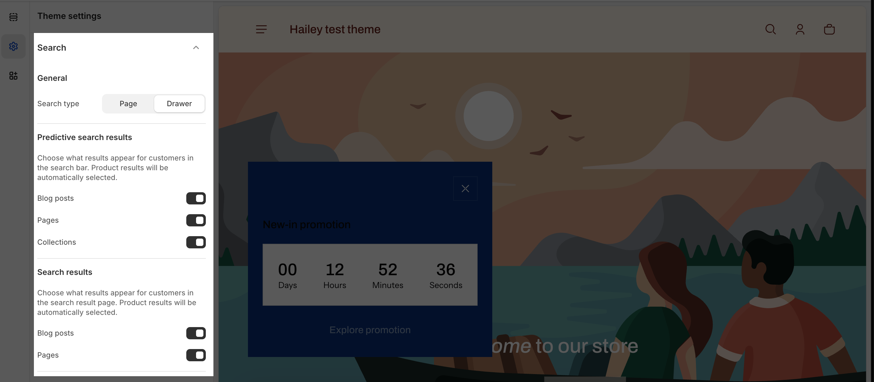
General
Controls where the search box and results appear on your store.
- Page: Search results appear on a dedicated search page (customers are taken to a new page)
- Drawer: Search results slide out from the side as an overlay (customers stay on the same page)
Predictive Search Results
Quick suggestions that appear in a dropdown while customers are typing in the search box (before they press enter).
- (Products are ALWAYS shown automatically)
- Blog posts: Turn ON if you have a blog and want to help customers discover blog articles
- Pages: Turn ON if you have important pages (About, Contact, FAQ) you want easy access to
- Collections: Turn ON if you want to surface product collections
Search Results
Controls full results page that displays after customers press Enter or click search. C
- Blog posts (turn on/off)
- Pages (turn on/off)
- (Products are ALWAYS shown automatically)
Product Result
- Image Ratio
- Controls how product images are shaped in search results
- Square (1:1): Works for most products; gives a clean, uniform look
- Portrait (3:4): Best for fashion/clothing (tall images)
- Landscape (4:3): Best for wide items (furniture, home goods)
- Adapt to image: Shows products in their original shape (varies by product)
- Controls how product images are shaped in search results
- Image Background
- If your product images have transparent backgrounds, this color shows behind them
- Usually white is best so images look clean
Collection Result
- Image Ratio
- Controls how collection thumbnail images appear in search results
- Portrait
- Square
- Landscape
- Controls how collection thumbnail images appear in search results
- Show Product Quantity
- Displays the number of products in each collection
- Turn ON to help customers know how many products are in each collection
Blog Post Result
- Image Ratio
- Controls how blog featured images appear in search results
- Landscape: Better for wide blog header images
- Square: Better for consistent thumbnail looks
- Controls how blog featured images appear in search results
- Show Blog Post Tag
- Displays the blog post category/tag below the title
- Turn ON if you want to show blog post topics (e.g., “Tutorial”, “News”)
- Displays the blog post category/tag below the title
Cart
The Cart settings control how customers view and interact with their shopping cart. It affects what information they see, how they’re notified about items added, and how shipping information is displayed.
General
Cart type:
- Page: Cart appears as a full dedicated page (traditional experience)
- Drawer: Cart slides out from the side as a panel (modern, stays on site)
Add to Cart Notification
- Popover notification: A small notification box appears in the corner (toast-style)
- Show Cart drawer: The cart panel slides open automatically showing the item added
- Direct to Cart page: Takes customer directly to the full cart page
- Do nothing: No visible feedback (not recommended; customers won’t know if item was added)
Show Discount Field
- Turn ON: Customers can enter promo codes to apply discounts
- Turn OFF: Customers cannot manually enter coupon codes (only automatic discounts apply)
Enable Order Notes: Allows customers to add special instructions or notes to their order.
- Turn ON: Customers can write notes (e.g., “Please leave at door” or “Gift for Sarah”)
- Turn OFF: No note field appears
Enable Dynamic Checkout Button
- Turn ON: Shows fast checkout options (Apple Pay on iPhone, Google Pay on Android)
- Turn OFF: Only shows standard “Proceed to Checkout” button
Show Tax and Shipping Information
- Turn ON: Shows “Estimated shipping: $X” and “Estimated tax: $X”
- Customers see the total cost early (no surprises at checkout)
- Turn OFF: Tax and shipping are only shown at checkout
Empty State Button Link
- Default setting: “All Products” (links to your full product catalog)
- What you can change it to:
- Collections page (browse by category)
- Sale/Featured Products page (push promotions)
- New Arrivals page (show latest products)
- Your homepage
- Any custom page or collection
Product
Image Ratio: Controls the shape and size of product images displayed in the cart.
- Square (1:1) – Equal width and height; clean, uniform appearance
- Portrait (3:4) – Taller than wide; good for fashion or vertical items
- Landscape (4:3) – Wider than tall; good for furniture or wide items
- Adapt to image – Shows products in their original dimensions (may vary)
Free shipping bar
- Show Free Shipping Amount: Displays the dollar amount customers need to spend to qualify for free shipping.
- Turn ON:
- Shows the free shipping minimum amount
- Customers know the exact target to reach
- Turn OFF:
- Hides the dollar amount
- Shows only progress bar
- Less clear what customers need to spend
- Turn ON:
- Free Shipping Minimum Amount: The dollar threshold customers must reach to qualify for free shipping.
- Enter the minimum order amount (example: 100 = $100 USD)
- This should match your shipping rate settings in Shopify
- Different currencies are automatically converted
- Free Shipping Bar Color: The color of the progress bar that shows free shipping progress.
- Click the color picker
- Choose a color matching your brand
- Or enter a specific hex code (example: #FF0000 for red)
Social Media
Shine theme allows you to connect with most of social media, including:
- X
- YouTube
- Vimeo
- TikTok
- Tumblr
- Snapchat
You can freely add or remove any social media by connecting with its URL account. If you do not want to connect with any of them, simply leave this part blank.
This can be used in multiple sections, such as the header, footer,…
Favicon
Adding your favicon is simple and quick. Just click the “Select” button and the media manager will pop up. From there, you can drag and drop your logo or select it if it’s already uploaded.
Currency
By default, currency codes are displayed for cart and checkout prices, ensuring clear pricing information. You can optionally enable currency codes for product cards, product details, and other areas of your store. If you disable currency codes, they will only be shown for cart and checkout prices.
It’s not too complicated to set up Shine Theme Settings, but if you’re still having difficulties, feel free to drop us an email via hi@saleshunterthemes.com or leave us a message on this page for more support.