Side-by-side Images Slider
About Shine Theme Side-by-side Images Slider
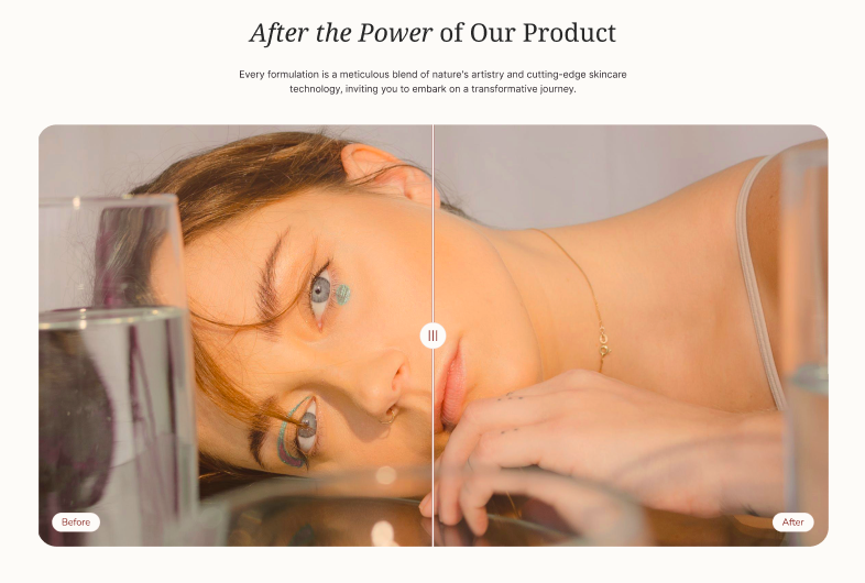
The Shine Theme Side-by-side Images Slider section is an amazing way to visually showcase drastic changes while using your products in a two-grid collage.
With the Shine theme, you can easily customize the Side-by-side Images Slider both on desktop and mobile screens without any coding skills.
Access Shine Theme Side-by-side Images Slider
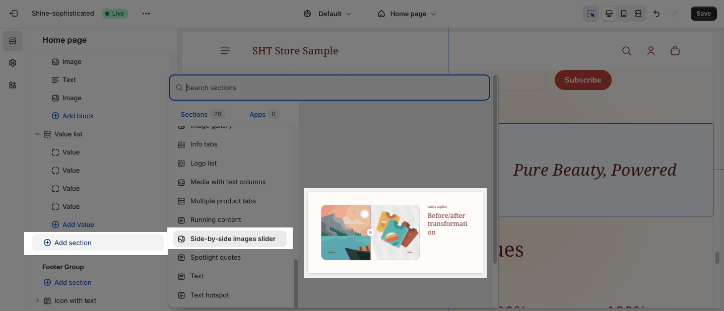
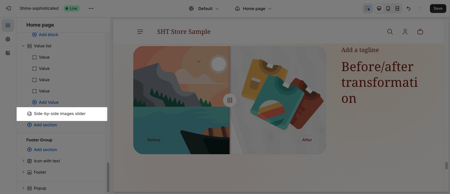
From any page in the Shine Admin Dashboard, click on the Add section button > Search for Side-by-side Images Slider > Click on it to add the Side-by-side Images Slider section to your page.
Shine Theme Side-by-side Images Slider Configuration
To configure the Side-by-side Images Slider section, click on the section to access the configuration settings.
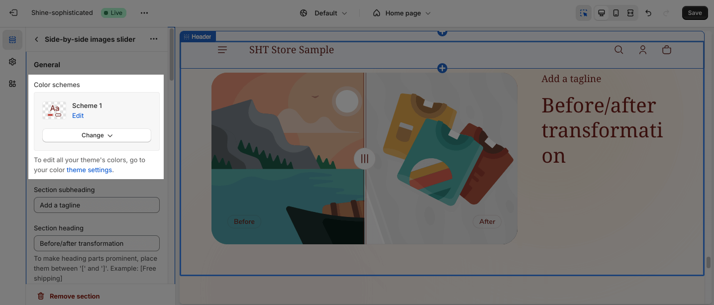
General
Under the Color Scheme, you can choose a specific scheme for the Side-by-side Images Slider section. To modify or add a new color scheme, go to Theme Settings > Color.
You can apply content to the Subheading, Heading, and Description by adding text on the placeholder. If you want to hide it, leave the text box empty.
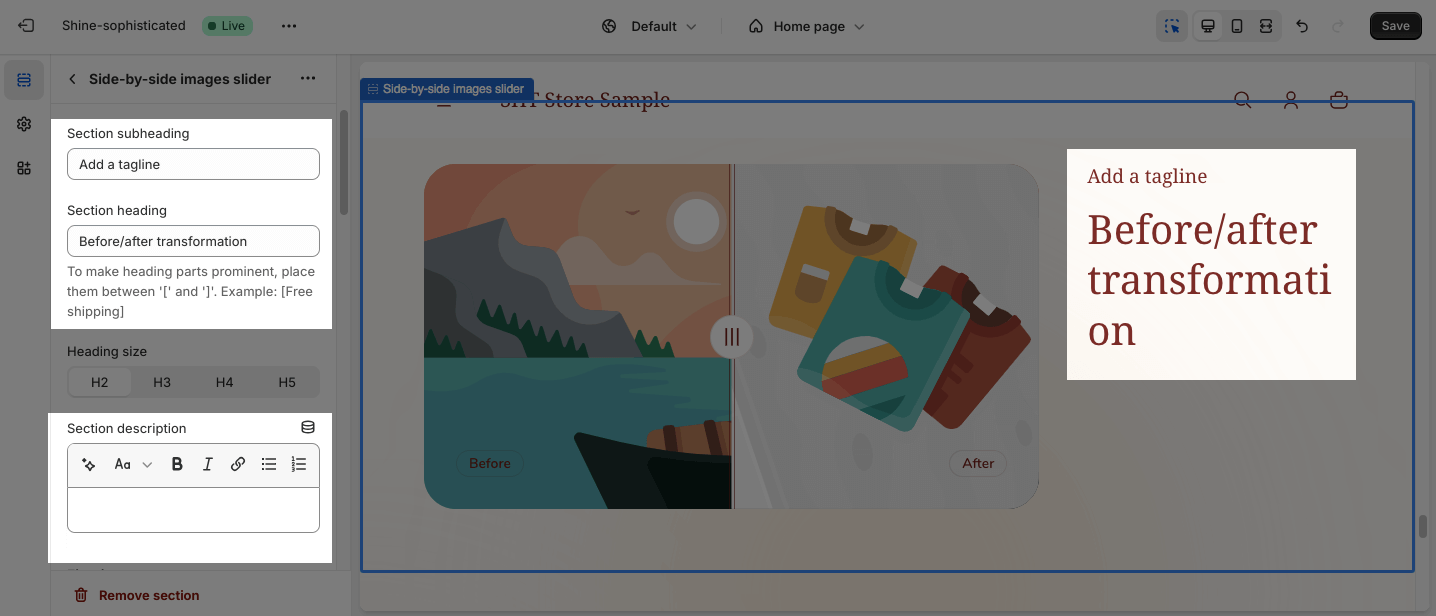
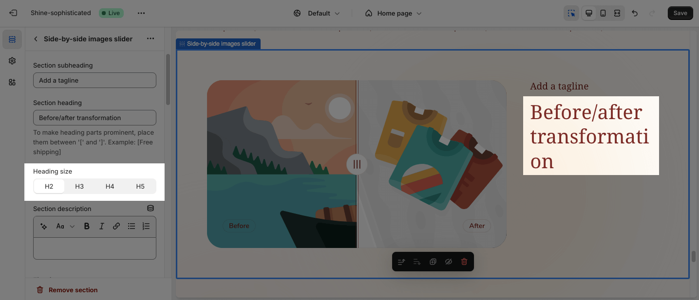
You can also adjust the size of the Heading:
- H2
- H3
- H4
- H5
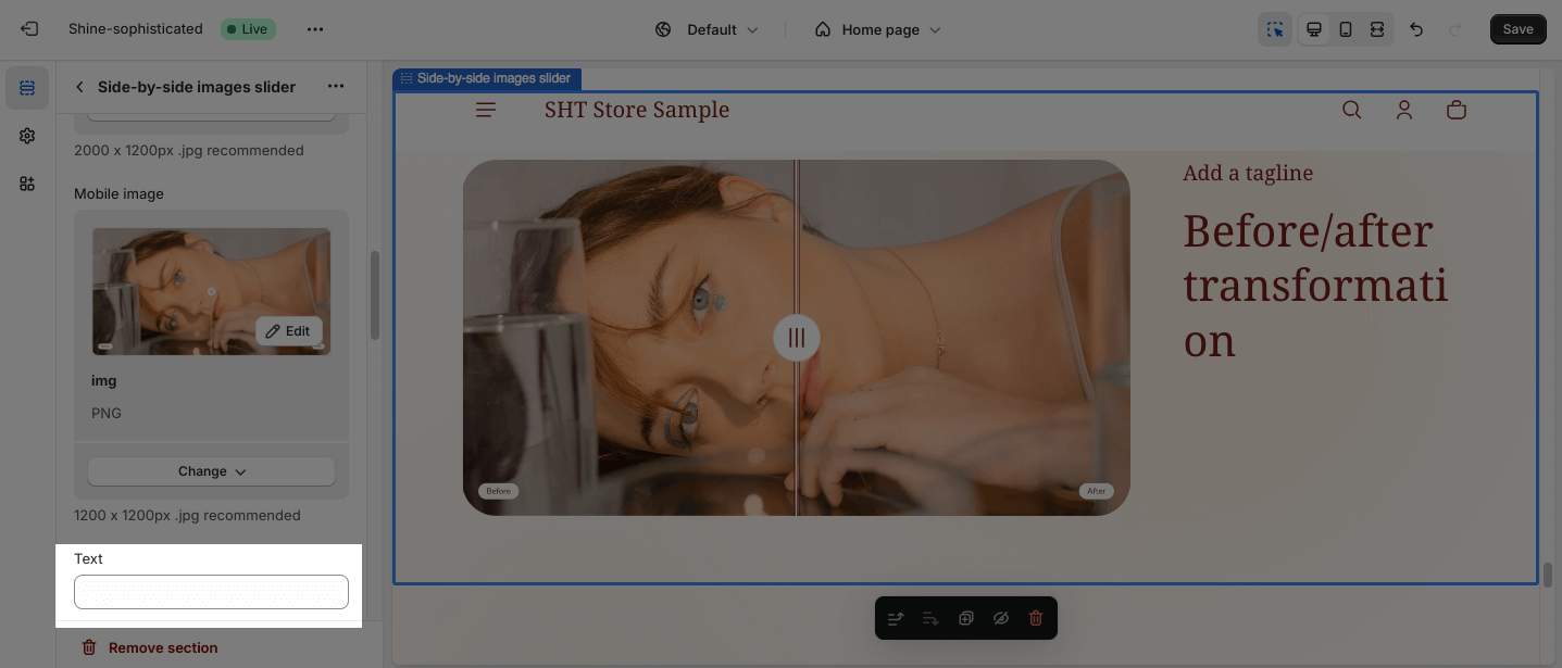
Image
In the Image option, you can image for the First image and Second image.
Click on the Select image to upload the image for large and mobile screens. Or choose an existing image on the media manager. You can set images separately for large and mobile screens.
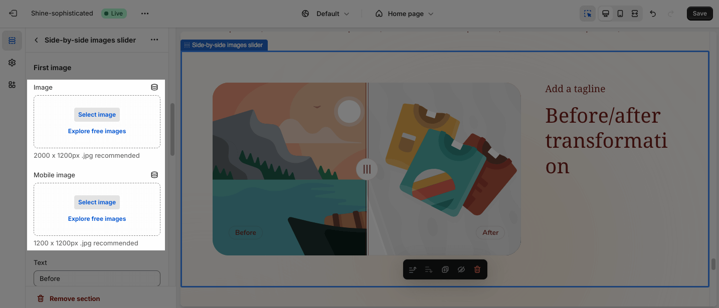
If you set the background image for the large screen and don’t upload the image for mobile screen, the mobile view will automatically inherit the image of the large screen.
If you set the background image only for the mobile screen, the large screen will not inherit the image of the mobile screen.
The recommended size for background images is 2000x1200px and for mobile background images is 1200x1200px.
You can also add text by adding content on the text box.
Large Screen
The section offers four Section heading position options:
- Top left
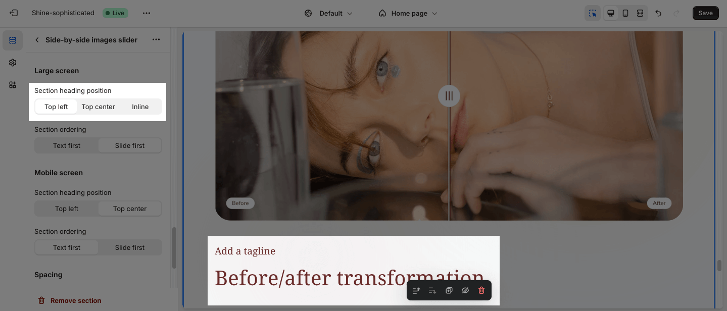
- Top center
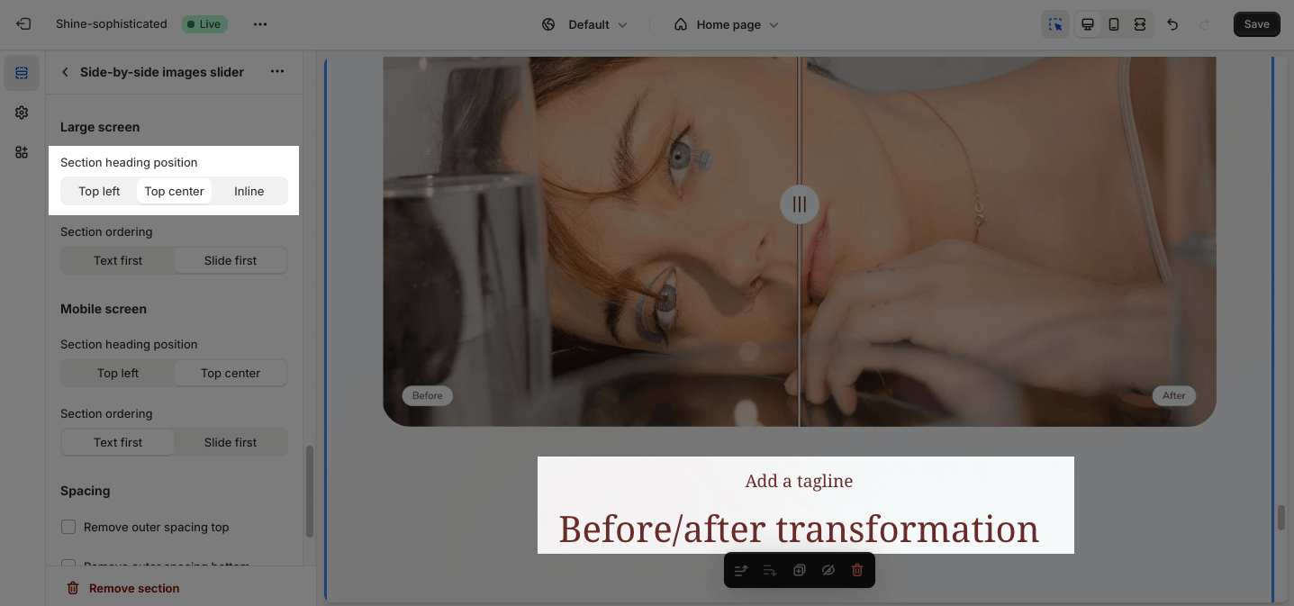
- Inline
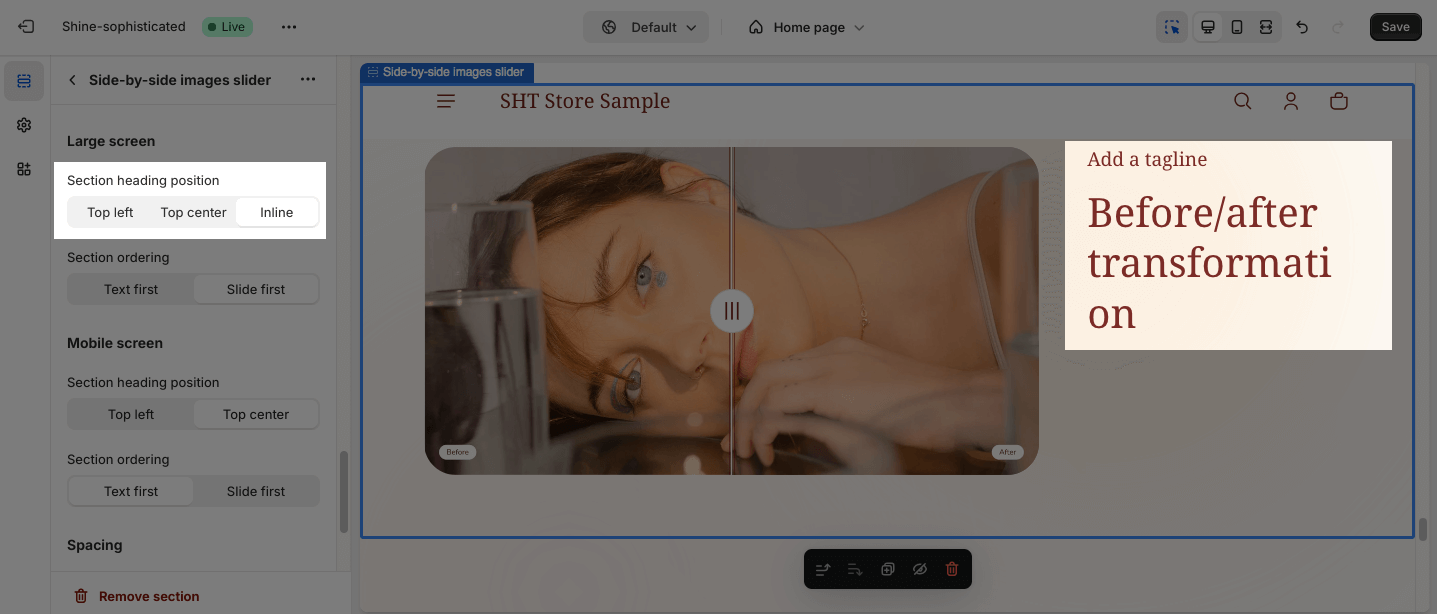
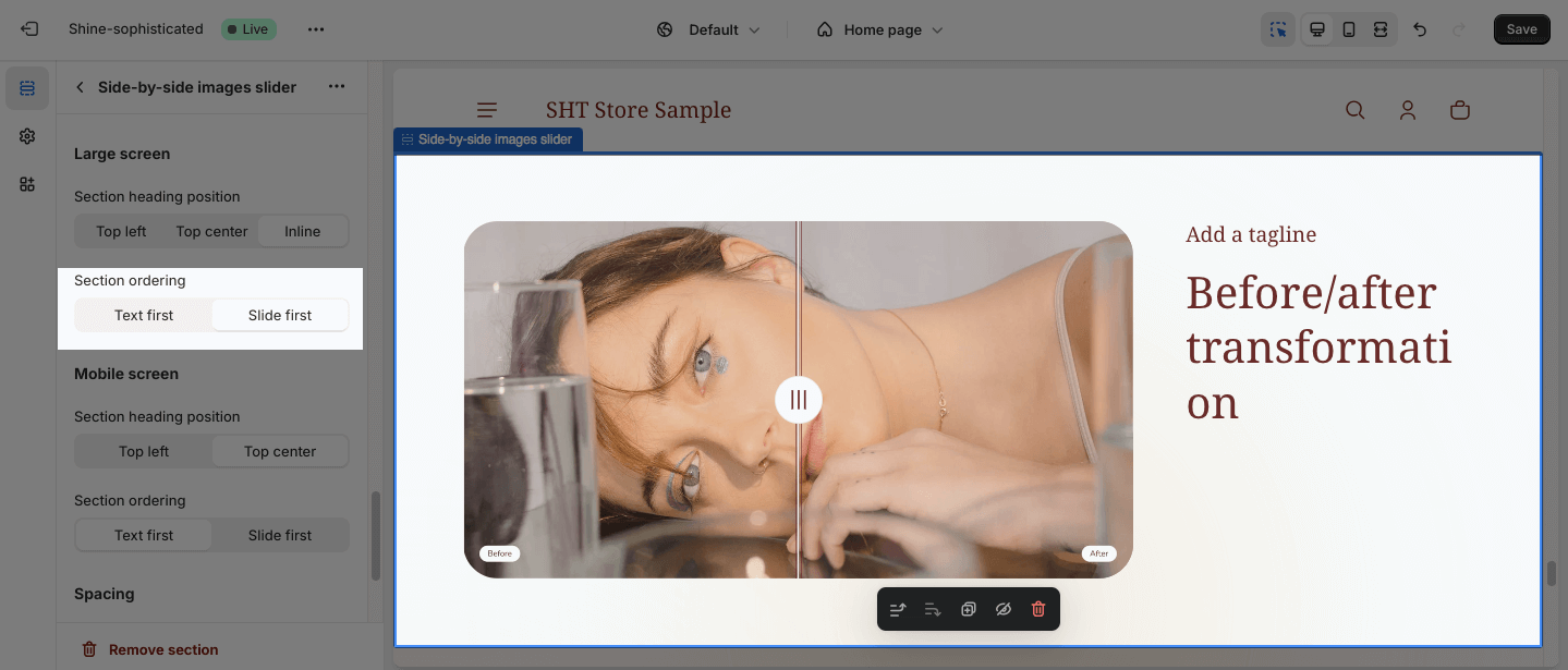
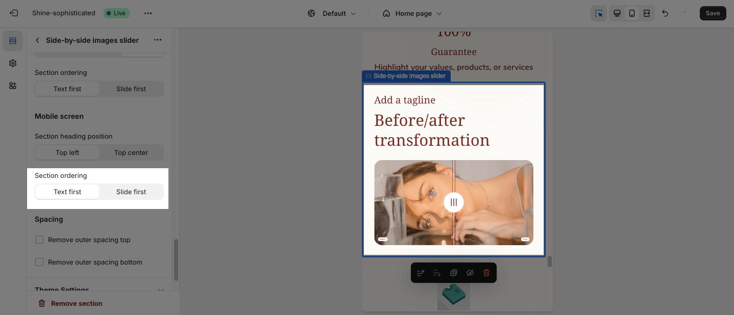
You can adjust the position for the text and slider, which can be changed at Section ordering:
- Text first
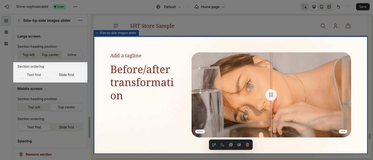
- Slide first
Mobile Screen
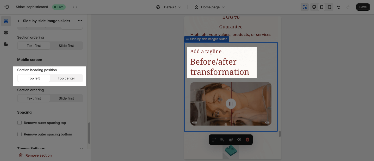
You can set the Section heading position for smaller screens, such as mobile devices:
- Top center
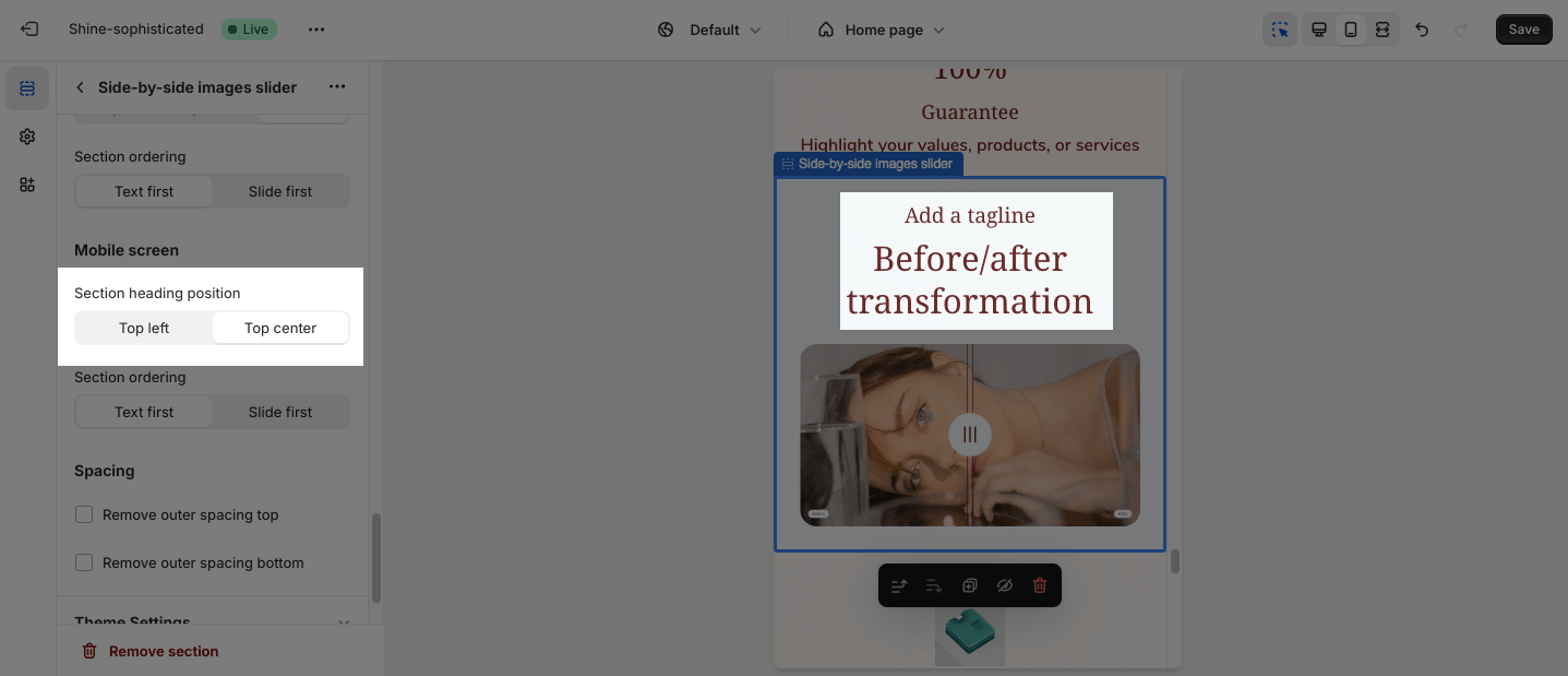
- Top left
The settings for the Section ordering on the mobile screen is the same on the large screen.
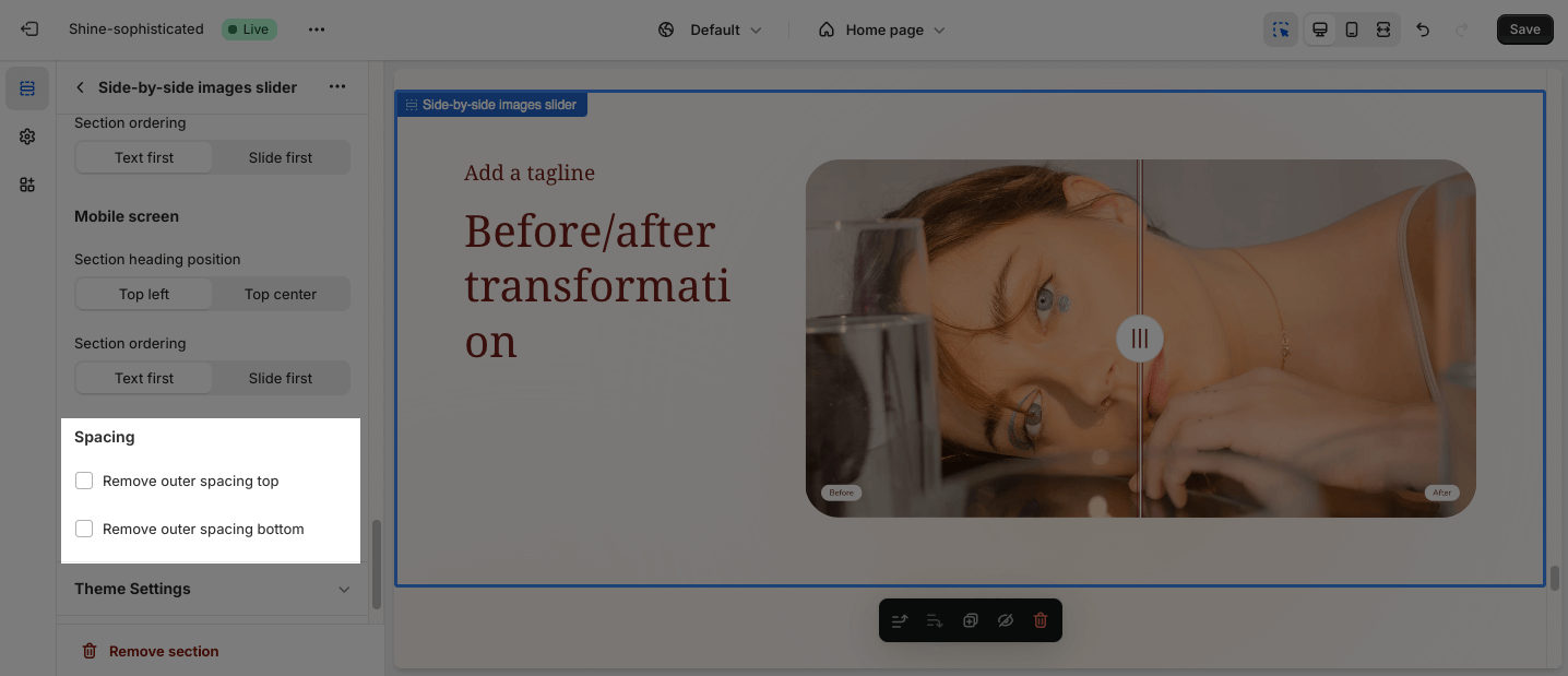
Spacing
The Spacing option will decrease the top/bottom margin of a section, thereby bringing it nearer to the sections above and below it. You can choose to customize the outer spacing top/bottom of the Side-by-side Images Slider section.
- Remove outer spacing top
- Remove outer spacing bottom