Product Details
About Shine Theme Product Details Section
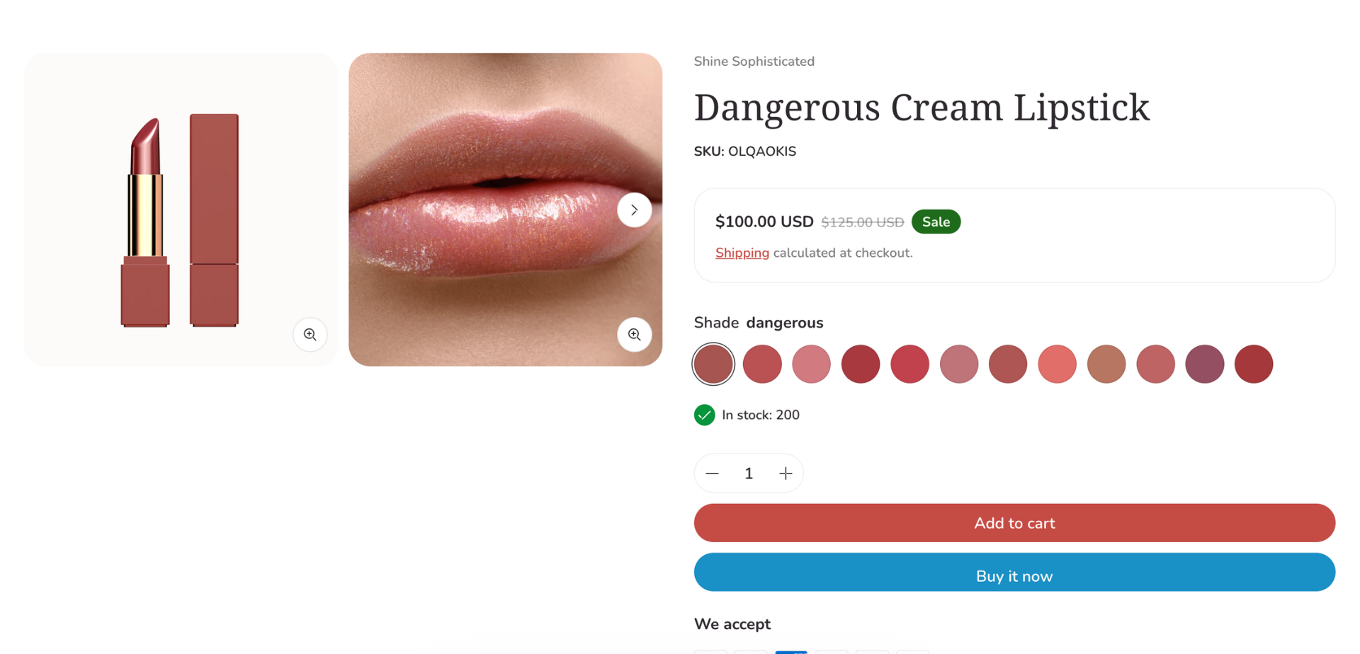
The Shine Theme Product Details section showcases all the details of your products including product name, image, description, price, variant, add-to-cart button, etc.
The Product Details section cannot be removed. However, it can be hidden on the Product template.
Access Shine Theme Product Details Section
On the top center bar, click the dropdown button > Products.
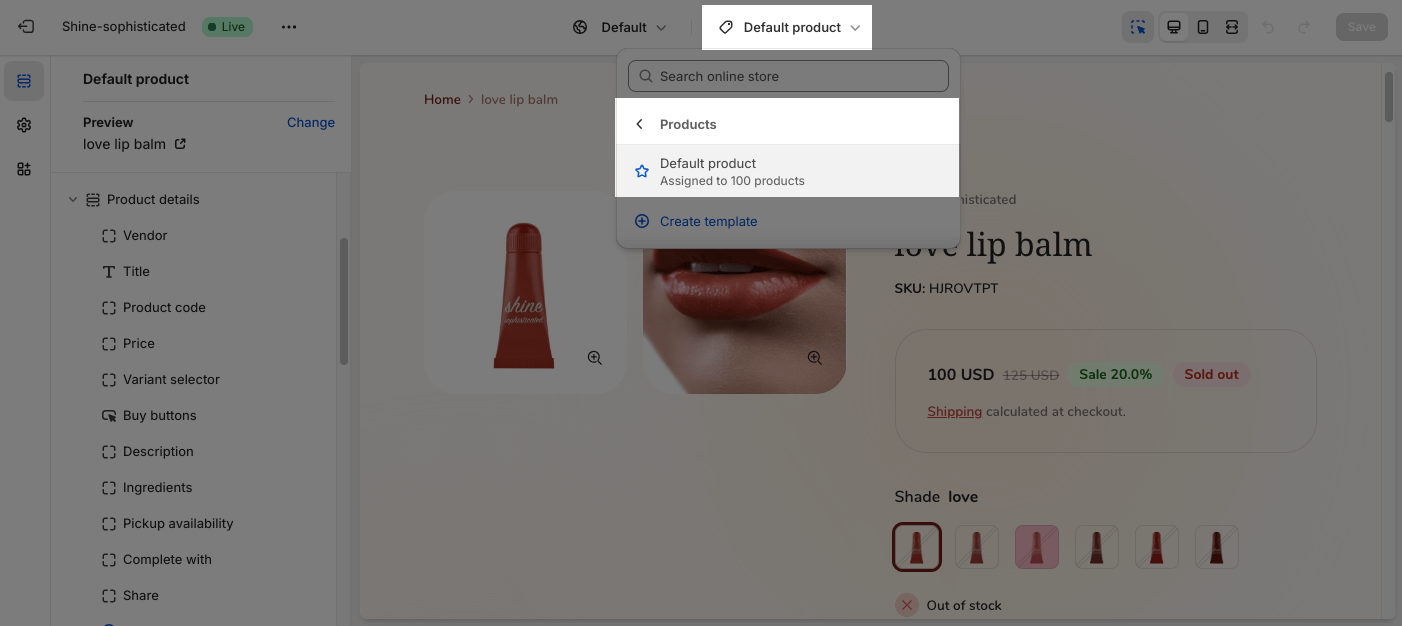
On the left sidebar, head to Template > Product details. 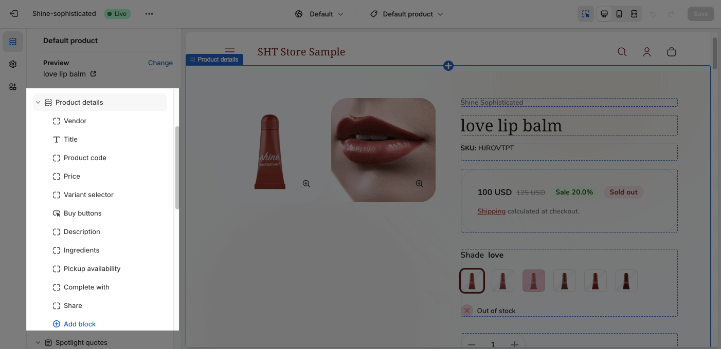
Shine Theme Product Details Section Configuration
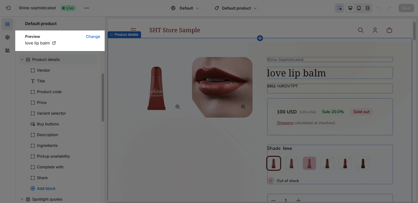
The Product Details section has several settings that can be adjusted. To change the product, on the top left sidebar, click on Change > Select product.
To configure the Product Details section, click on the section to access the configuration settings.
General
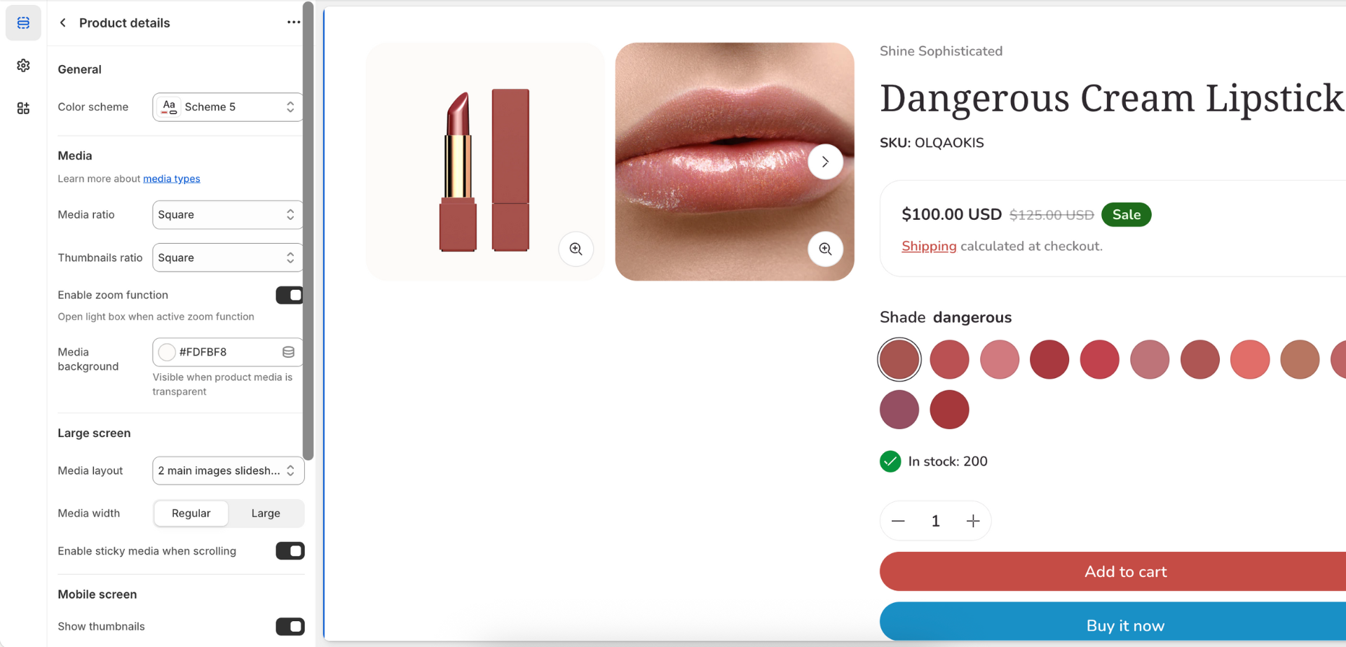
Under the Color Scheme, you can choose a specific scheme for the Product details section. To modify or add a new color scheme, go to Theme Settings > Color.
Media
In Product Details, you can set the Media Ratio:
- Square
- Portrait
- Landscape
- Adapt to image
You can also adjust the image ratio of the thumbnail. There are 2 main types: Fit and Fill. Each type has 3 styles for you to choose (Square, Portrait, Landscape)
- Fit: The image will be scaled up and resized to fit the ratio style you choose. However, the image may be cropped to fit within the container.
- Fill: The image will be nested within the ratio style you choose.
The zoom function lets visitors hover to zoom the product images. Once they click on the product image, it will be displayed in a stunning detail popup view. Click on the check box to Enable zoom function.
You can also change the color of the Media background. This function works when your product medias are transparent.
Large Screen
On large screen, there are four different media layouts for you to choose from:
- Main media with thumbnails (left)
- Main media with thumbnails (below)
- Image grid
- 2 main images slideshow
You can also adjust the Media width between Regular and Large. If you choose Large, the product media column (left column) will take a larger space in the product details section.
Moreover, you can Enable sticky media when scrolling. It will help customers scan more information while still viewing the product images.
Mobile Screen
On the mobile screen, there is an option for you to show/hide the product media list.
Sticky Add To Cart
The sticky add to cart option is a bar that displays at the bottom of the screen while visitors scrolling your store.
For further customization, you can switch the Sticky add to cart position between Buttom left and Bottom right.
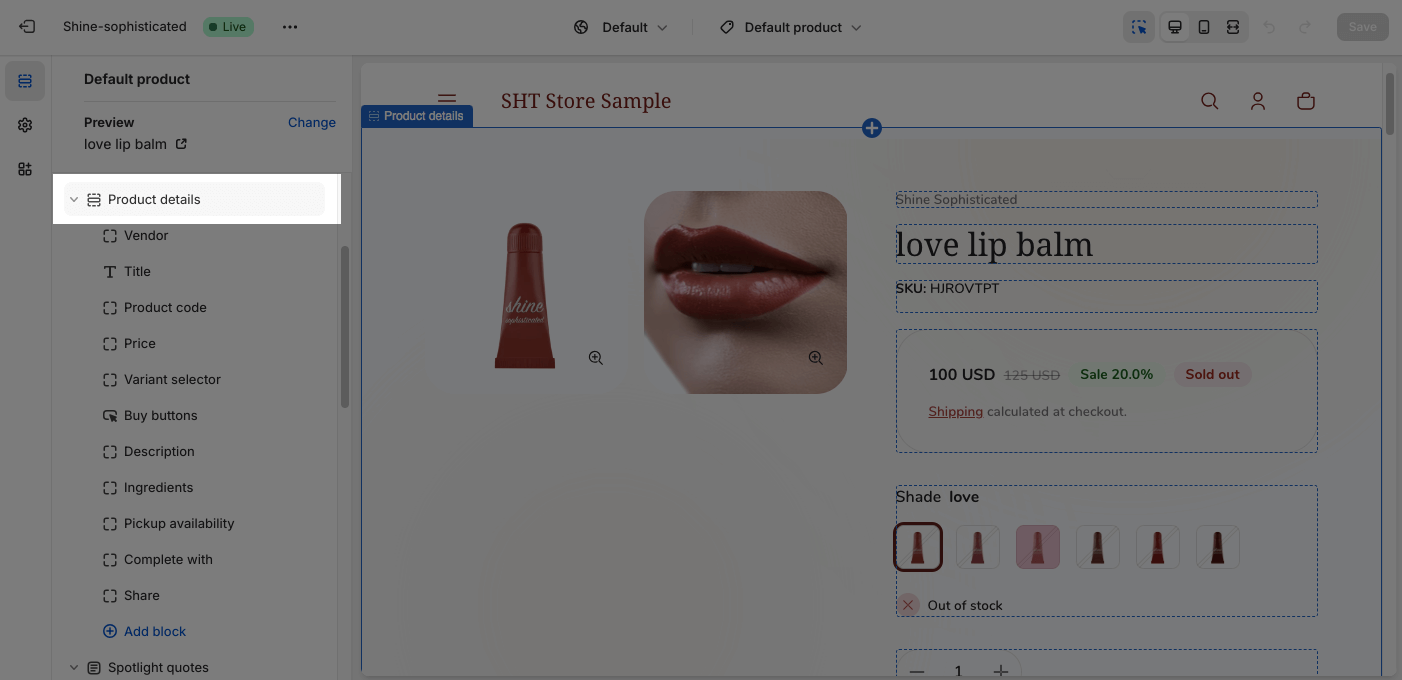
Shine Theme Product Details Section Blocks Configuration
The Shine Theme Product Details section provides many default types of blocks:
- Vendor
- Title
- Product code
- Price
- Variant sector
- Buy buttons
- Collapsible item
- Pickup availability
- Complementary products
- Share
Click on Add block to add more blocks to the Product Details section.
- Descripion
- Icon with text
- Collapsible item
- Popup content
- Custom text
- Custom liquid
If you want to remove/hide any block, click on the block you want to remove/hide and choose Remove block/Hide block icon.
To customize each item in the Product Details section, click on the block you want to edit.
The settings for the Title, Price, Variant Selector, Buy Buttons, Share are similar to the Featured Product block settings.
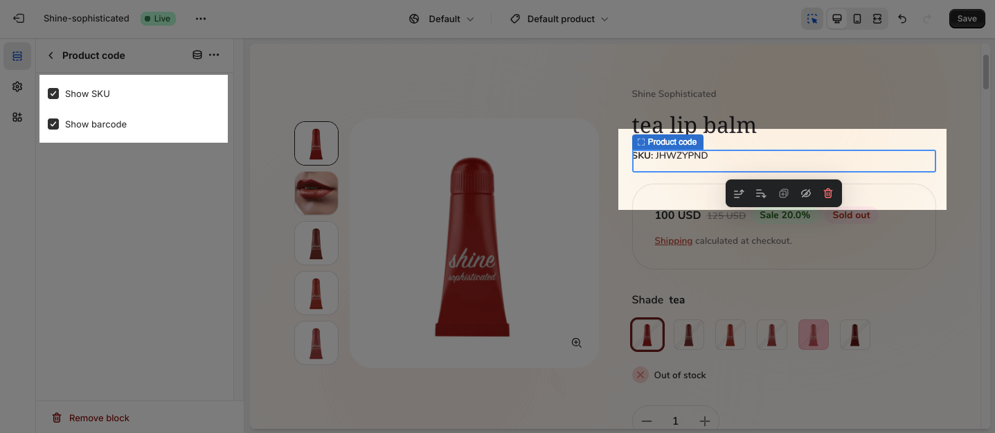
Product Code
You can choose to Show SKU and Show barcode.
Collapsible Item
This block is designed to help display more information about your product in separate collapsible tabs.
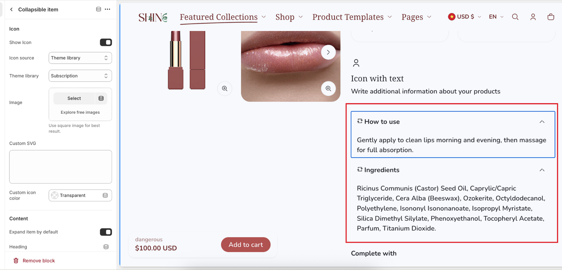
You can add an icon or an image next to the collapsible item heading. With an icon, you can custom its color.
You can also choose to expand item by default by clicking on the checkbox “Explan item by default”
Icon with text
This block is design to preset your product benefit in short.
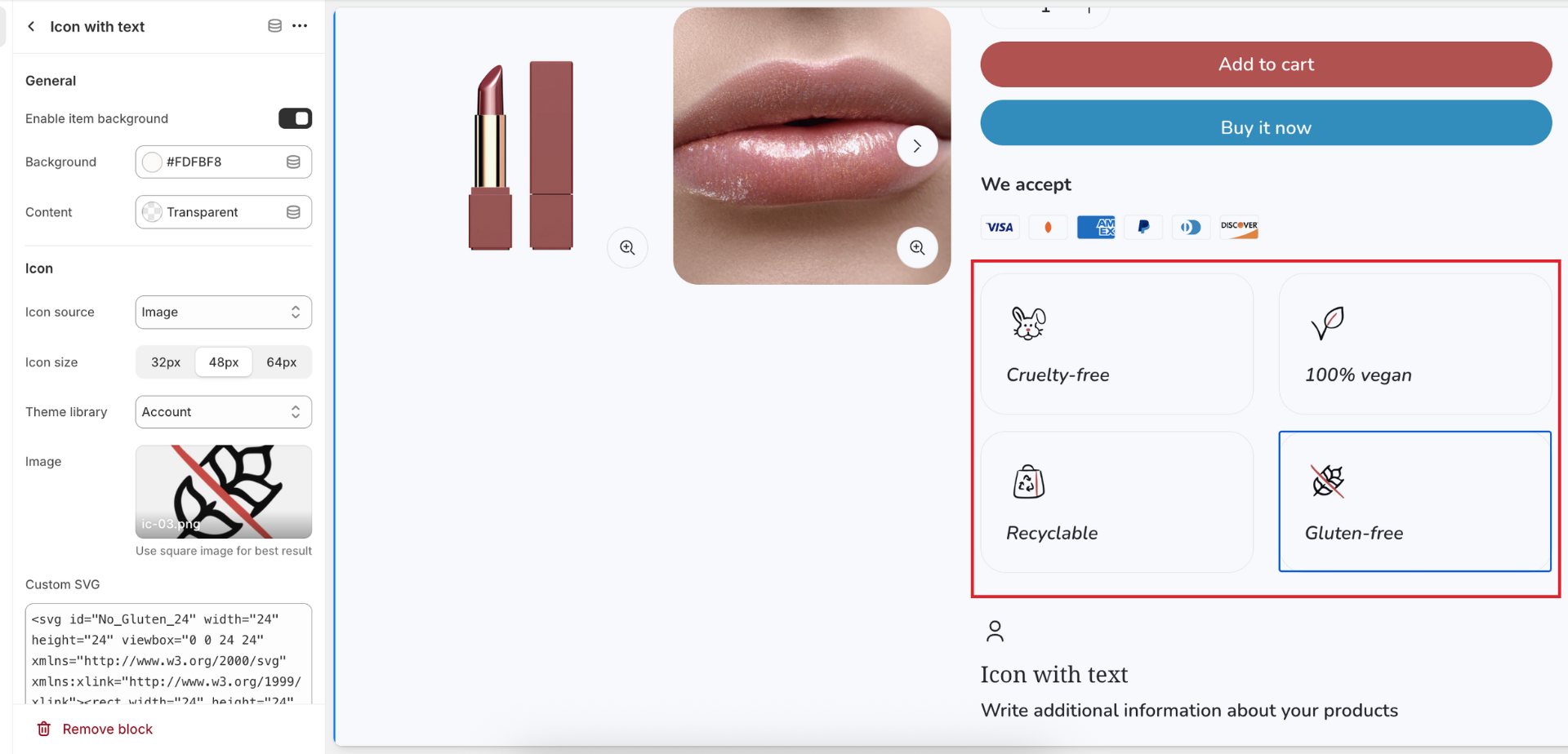
By default, the item has transparent background but you can add a background color to it.
Each item includes:
- One icon: there are 3 types of icon source (Theme library, Your own imag, or Custom SVG)
- Content: Heading and Description
On large screen and mobile screen, the item will show fullwidth by default. You can show 2 items in a row by disabling Enable full container width option.
Pickup Availability
On the Pickup Availability option, you can Show expected pickup time. To configure all the settings for the Pickup Availability, check out the article about Local pickup.
Complementary Products
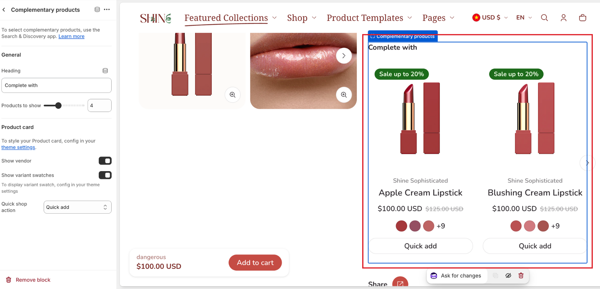
The Complementary products option displays complementary and related products to customers. To configure all the settings for the Complementary products, check out the Shopify Search & Discovery article.
You can add a heading to this block and set up the number of products to show (from 1 to 10)
Inside each product card, you can show vendor, variant swatches, and add a quick shop action (Quick add, Quick view, or both).