Header
About Shine Theme Header
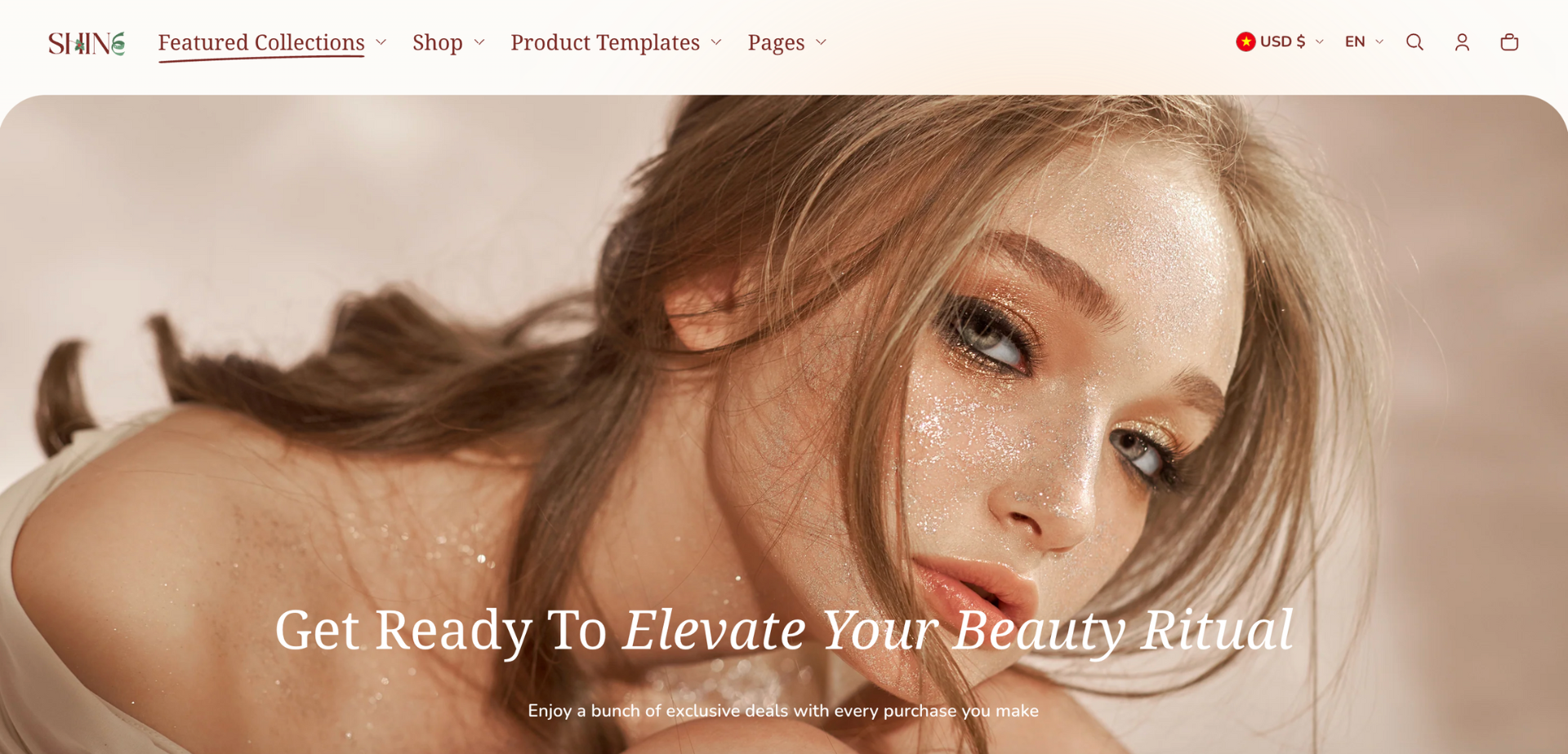
The Shine theme header is the top section of your website that appears on every page. When first-time visitors land on your website, a well-crafted header offers a treasure trove of benefits for branding, navigation, and ultimately leading to more satisfied customers.
You have all the freedom to customize the Shine theme header to align with your brand identity.
Access Shine Theme Header
From any page in your Shine Admin Dashboard, choose Header.
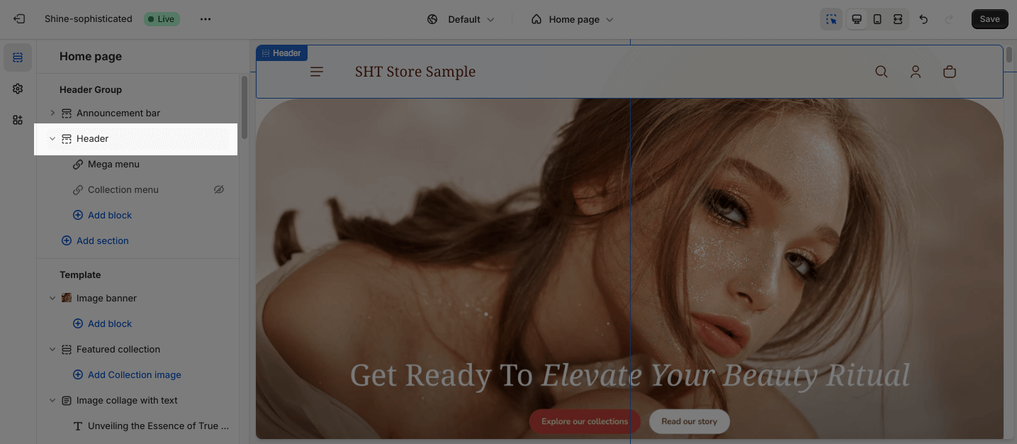
Shine Theme Header Configuration
General
You can change the color scheme for this section by selecting the scheme here. To change the theme color, please go to Theme settings > Colors.
The sticky header stays fixed at the top of the website while scrolling. To customize the sticky header, you can choose:
- Not use: unable sticky header
- Always: remain visible as you scroll up and down
- When scroll up: remain visible as you scroll up
Open menu by: This controls how customers trigger the mobile menu to open. There are 2 options for it: Click and Hover.
Logo
This is the picture that represents your store brand. It appears on the left side of the header.
There are 2 types of logo:
- Main logo: This is the first logo that your customers see when visiting your store
- Stickey logo: A separate logo that appears only when the header becomes “sticky”
The recommended size for logo is 280 × 80px PNG
You can also set maximum logo widths for desktop and mobile. The default width is 40px for both desktop and mobile, but you can drag the slider or enter a number between 40px and 200px for desktop and 40px and 140px for mobile in the box.
Navigation
Choose the menu you want to show on the header. This menu shows product categories and pages.
To edit the navigation menu, click Select menu > Choose an existing menu or create a new one. To change or remove the selected menu, click on Change button.
You can manage your navigation menus under Online Store > Navigation.
You can choose whether to open external links in a new tab or not. This option can help improve your store’s SEO and increase visitor engagement by keeping them on your website longer.
Menu highlight
This is a special visual styling that highlights certain menu items to draw attention.
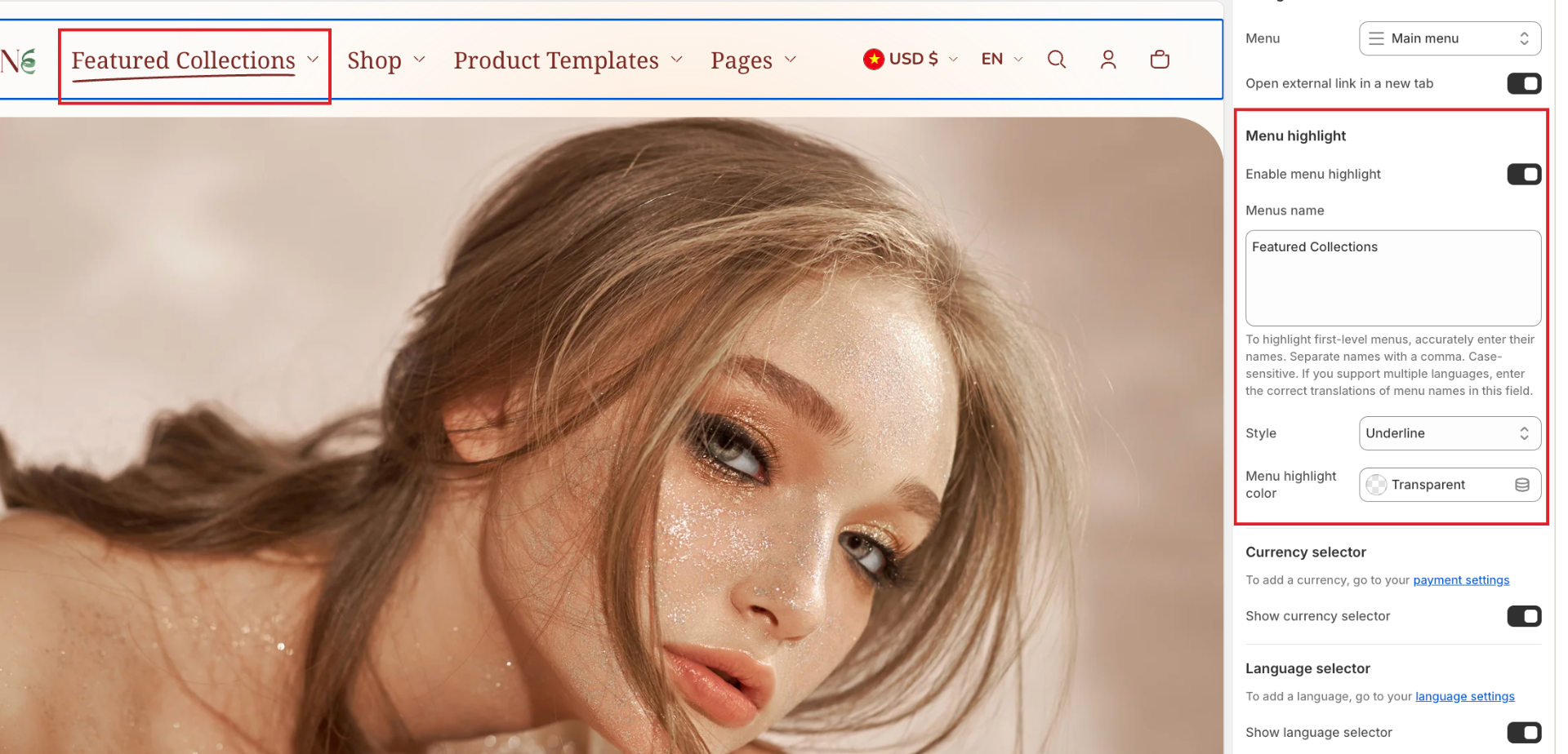
How to use it:
-
Toggle the “Enable menu highlight” switch ON
-
Enter the exact name of the first-level menu item you want to highlight. Separate names with a comma if you want to highlight multiple menu items
- Choose the style for the effect: Underline, Circle, and Glowing Stars
- Set a color of the highlight effect or leave it transparent as default.
Currency selector
To enable the currency selector, check the Show currency selector box.
On small screen, the currency selector will appear at the bottom of the drawer menu of the header.
To enable the currency selector, you must first add countries to your Shopify store’s Markets.
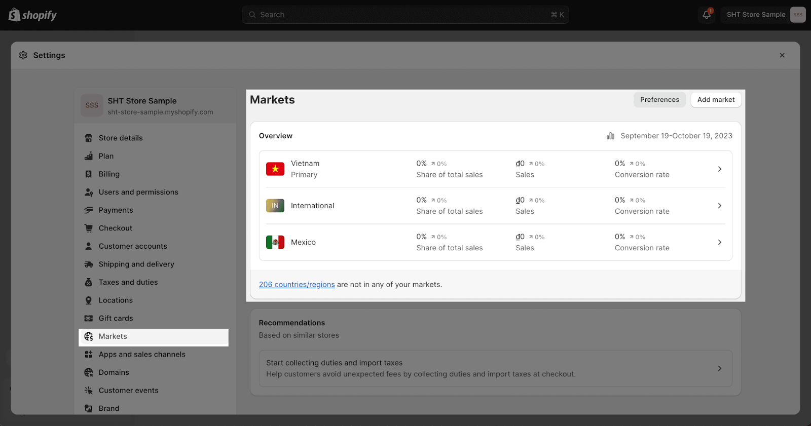
Language selector
The Language selector appears next to the Currency selector.
This feature only works if your store has multiple languages. To set this up, please follow the Shopify guide on adding and managing languages on your site.
To enable the Language selector, you must first add a language to your Shopify store’s Language settings and assign it to the market you want to show.
Large screen
Shine theme provides several Header layout options for large screens.
For the full menu, you can change:
- Logo left, menu left
- Logo left, menu below
- Logo left, menu center
- Logo center, menu below
For the drawer menu, you can change:
- Logo left, menu left
- Logo left, menu center
The default layout for both the full menu and drawer menu are logo left, menu left. To change the layout, select your preferred option from the Header layout dropdown.
Mobile screen
For mobile screens, the drawer menu will be enabled as default so the layout settings will not apply.
Shine theme provides two Header layout options for mobile screens:
- Logo left, menu left
- Logo left, menu right
The default layout for the mobile screen is the logo left, menu left. To change the layout, select your preferred option from the Header layout dropdown.
Custom color
You can customize the colors of the Sticky header background and Sticky header content by clicking on the color picker.
The default color of the Sticky header background and Sticky header content are transparent.
Shine Theme Header Blocks Configuration
The Header section provides two menu types: Mega Menu and Collection Menu. These menus allow you to organize and display your website’s content in a visually appealing and user-friendly manner.
To add a Mega Menu or Collection Menu to the header, click the Add Block button. This will open a menu selection dropdown, where you can choose the desired menu type.
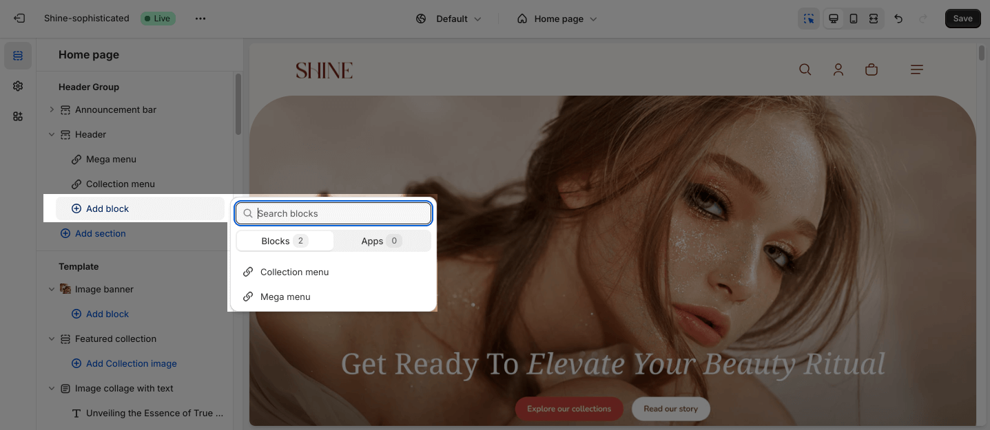
To modify an existing block, click on it to open the settings modal.
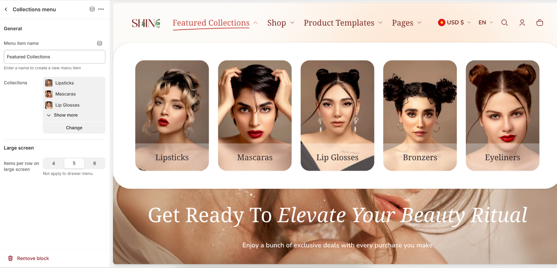
Collection menu
The Shine theme allows you to display a dropdown menu of product collections in the header. This will be a new, separate menu on the header. This makes it easy for customers to browse your store catalog.
General
The Menu item name is the name of the Collection menu you want to apply (for example: Collections, Shop)
Click Select Collections > Choose collections to display (maximum 6 collections).
Large screen
You can customize the number of collections displayed on large screens, such as desktops and laptops, to ensure a visually appealing and organized layout. The Item per row on large screens can be set from 4 to 6 items.
Once enabled, customers will see the collection browsing menu appear next to the main navigation menu in the header. It will contain clickable links for each collection you selected.
Mega menu
You can add more details to the Header by adding the Mega menu block.
To add the Mega menu block, firstly, you need to set up menu items for the main menu from Navigation.

In the Mega menu, you can set up a Promotion card along with the Mega item name. Each Promotion card has the heading, image, link, and mask overlay color settings.
General
The Menu item name is the name of the menu item you want to apply to this mega menu.
Menu image
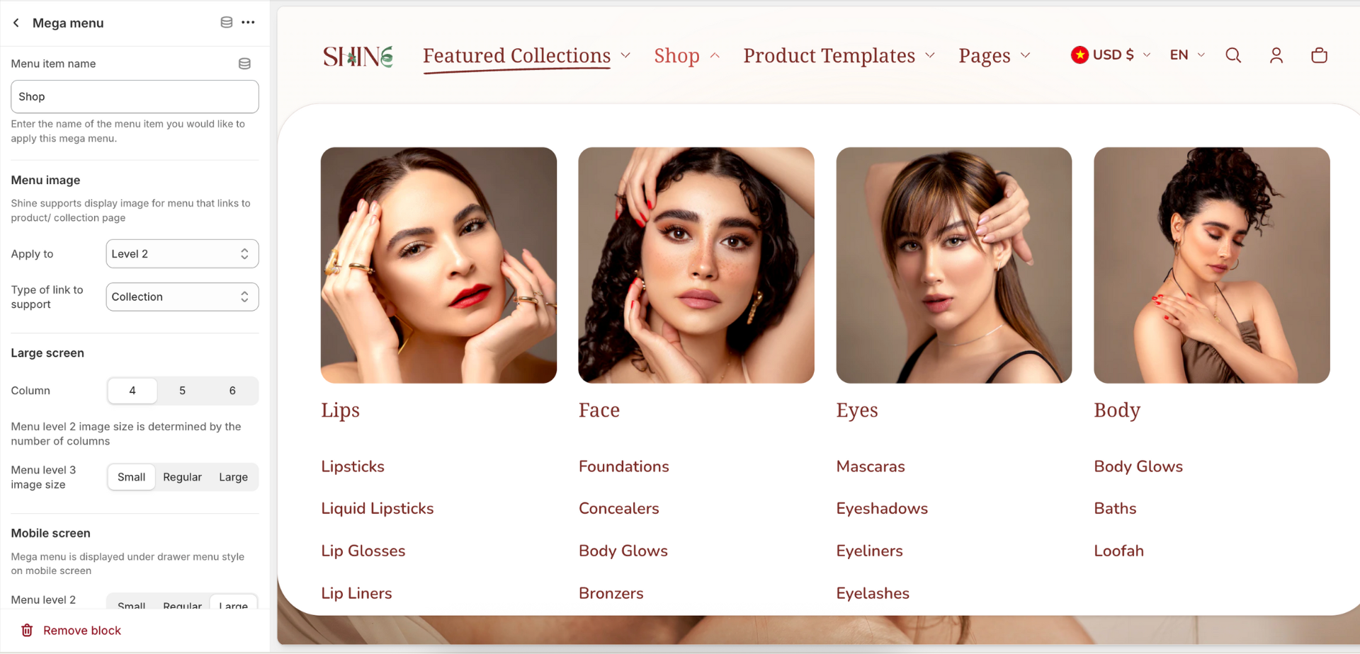
You can display image for menu level 2 and/or level 3 (menu level 1 is the drop-down menu on the header). Please note that this function only support for product and collection link.
Large screen
You can set up the column per row in the mega menu. If the menu enables the promotion card (explained below), it occupies as 1 column.
The size of menu level 2 image is is determined by the number of columns.
There are 3 sizes for menu level 3 image: Small, Regular, Large.
Mobile screen
Change the size of menu level 2/3 image. There are 3 sizes: Small, Regular, Large.
Promotion card
This section displays as promotion image that is designed to promote your campaign or featured product/ collection.
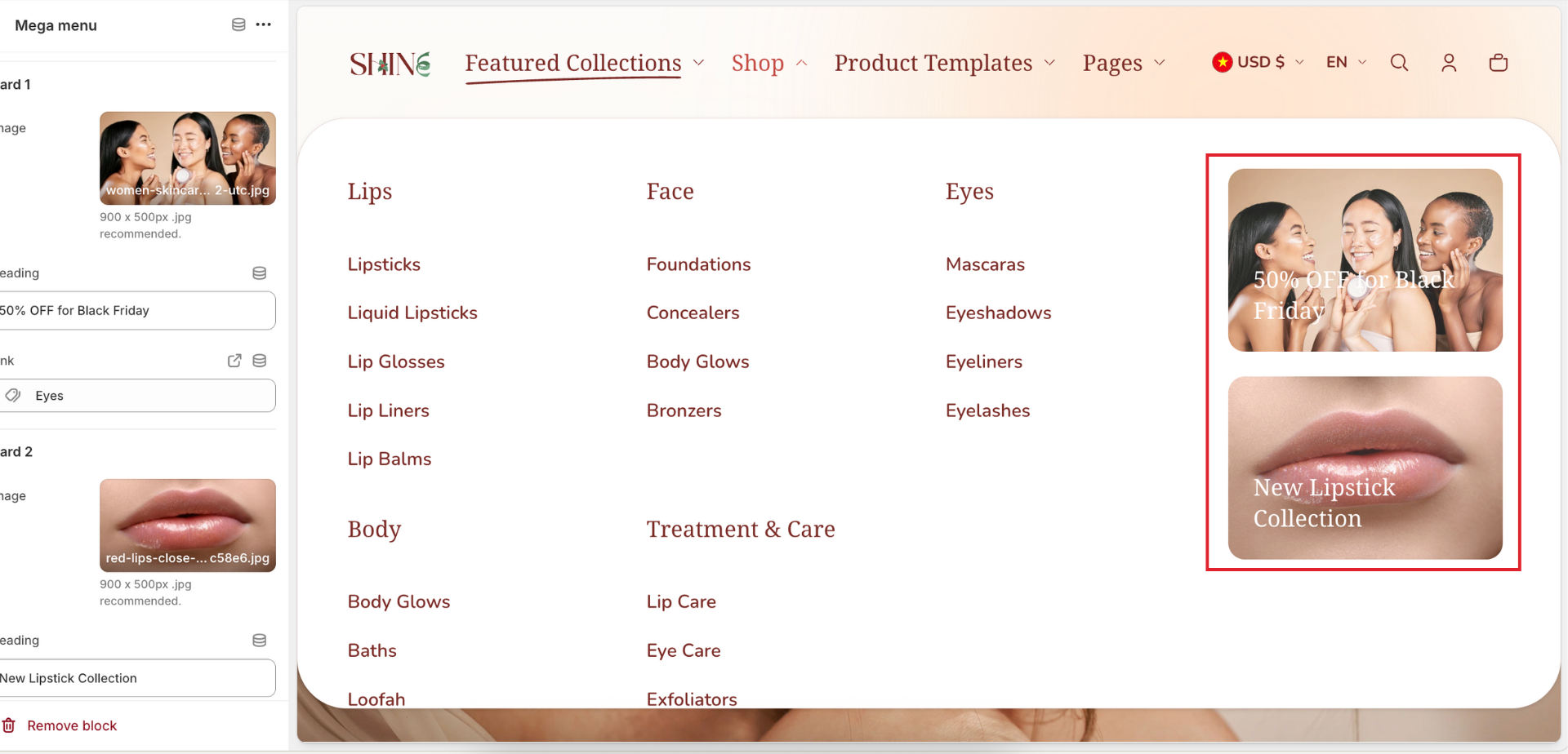
You can adjust the Image ratio for the Promotion card:
- Square
- Portrait
- Landscape
There are some settings for the card:
- Background overlay style: Compacted or Full
- Add the Mask overlay color
- Set the Overlay capacity
- Change the Text overlay color
There are 2 promotion cards added at max. To apply the Promotion card image, click the Select Image button > Select an existing image or upload a new one. The recommended image size is 900 x 500px .jpg.
You can also edit the Heading text on the content box, and paste or search a link in the Link field.