Content Collage
About Shine Theme Content Collage
The Shine Theme Content collage section empowers you to curate a visually stunning display of diverse content, including images, product collections, and products.
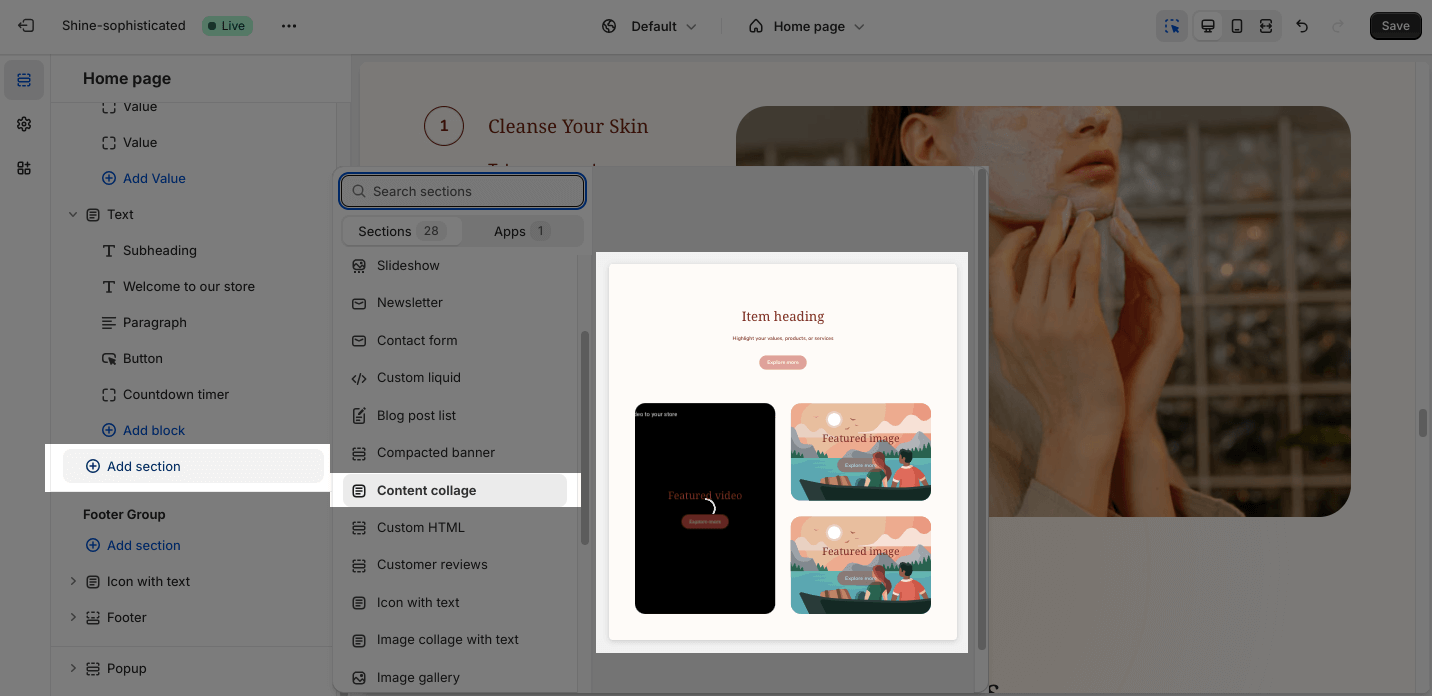
Access Shine Theme Content collage
From any page in the Shine Admin Dashboard, click on the Add section button > Search for Content collage > Click on it to add the Content collage section to your page.
Shine Theme Content Collage Configuration
To configure the Content Collage section, click on the section to access the configuration settings.
General
Under the Color Scheme, you can choose a specific scheme for the Content collage section. To modify or add a new color scheme, go to Theme Settings > Color.

Add content to the content collage section:
- Section subheading
- Section heading
- Section subheading
- And setup the heading size
“Show layout grid” option: it helps set up the layout accurately in the theme editor, not appear on live page.
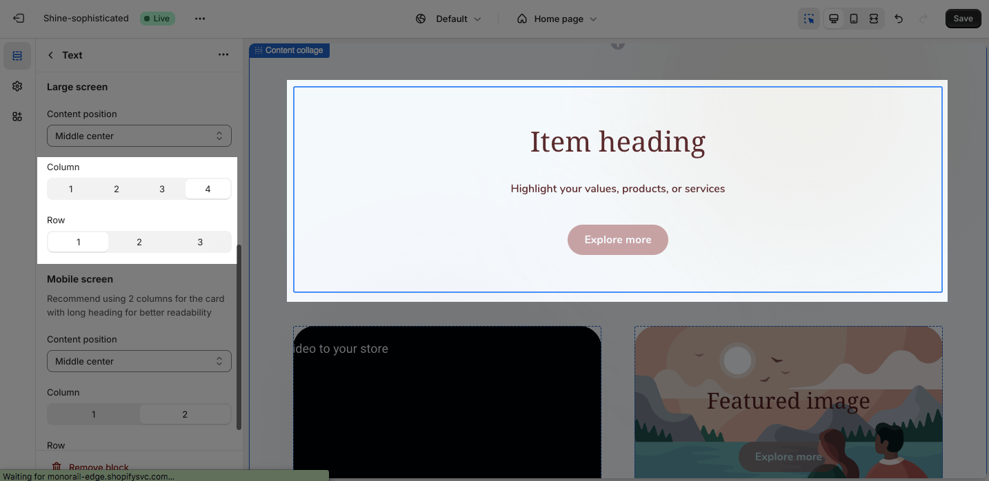
Large screen
There are 2 options for section heading alignment: Left and Center
On a large screen, you can adjust the slider to change the Row height between 150px and 400px. The Row height is set as 300px as default.
Mobile screen
There are 2 options for section heading alignment: Left and Center
On a mobile screen, you can change the Row height between 100px and 350px by adjusting the slider. The Row height is set as 300px by default.

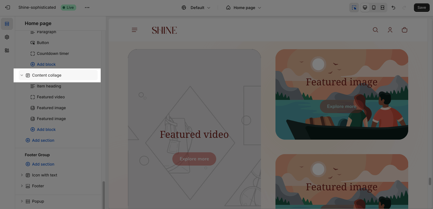
Shine Theme Content Collage Blocks Configuration
Content collage section as main container with content block items. There are 3 types of content blocks:
- Text
- Video
- Image
Click “Add block” button to add content block items into the content collage section
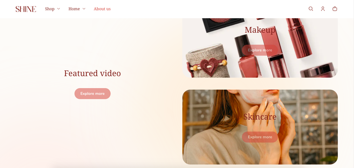
Text block
A Text block displays content that consists of a heading, description text, and an optional button. Use it to highlight your brand message, value proposition, or calls to action.
You can display the button in three different styles:
- Filled
- Outlined
- Text link
You can also paste a link or link directly to Shopify pages.
Large Screen
On the Large screen option, there are 6 different Content position options:
- Top left
- Top center
- Middle left
- Middle center
- Bottom left
- Bottom center
You can also adjust the layout for the text block.
Mobile screen
On a mobile screen, there are 6 different Content position options:
- Top left
- Top center
- Middle left
- Middle center
- Bottom left
- Bottom center
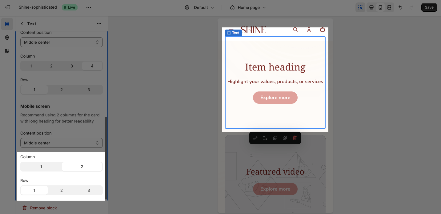
You can customize the column of the first Item heading between 1 and 2. With a long heading, you should use two columns for better readability.
You can also change the row between 1, 2, and 3 to make this block fully responsive on the mobile screen.
Custom color
These settings control the appearance of background and text colors.
If the setting is transparent, the color is inherited from the color scheme of the parent section.
Video block
A Video block displays a video with optional heading, description text, and a call-to-action button. Use it to showcase product demonstrations, customer testimonials, or brand stories.

Card content
This place is to add content to the video block, including a heading and a button with a link.
Video
For further customization about the Video item, please discover the Video banner article.
Large screen and Mobile screen
Set up similiarly to the Text block
Custom color
You can change the color for Mask overlay and Text overlay on the video. You can also adjust the Mask overlay opacity between 0 and 90 by dragging the slider.

Image block
An Image block displays a high-quality image with optional heading, and a call-to-action button. Use it to showcase products, brand aesthetics, lifestyle images, or promotional graphics.

Card Content
This place is to add content to the image block, including a heading and a button with a link.
Image
In the Image block, you can set background images separately for large screens and mobile (this is recommended). Click on the Select image to upload the image for a large screen and mobile screen. Or choose an existing image on the media manager.
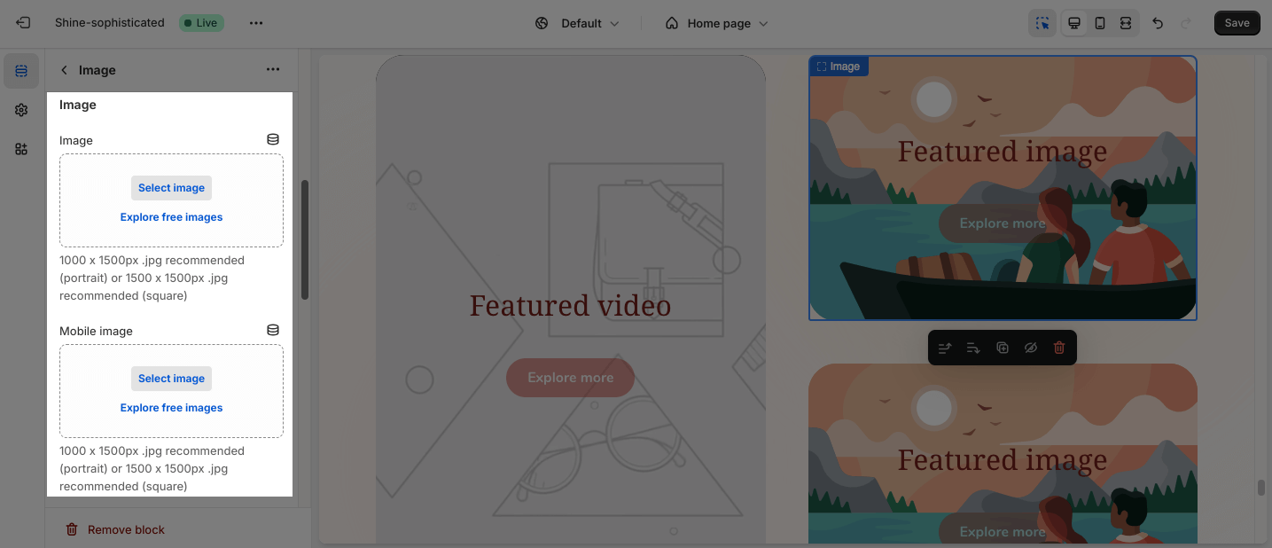
- If you set the image for the large screen and don’t upload the image for the mobile screen, the mobile view will automatically inherit the image of the large screen.
- If you set the image only for the mobile screen, the large screen will not inherit the image of the mobile screen.
The recommended sizes for images are 1000x1500px (portrait) and 1500 x 1500 px (square).
Large screen and Mobile screen
Set up similiarly to the Text block
Custom color
You can change the color for Mask overlay and Text overlay on the image. You can also adjust the Mask overlay opacity between 0 and 90 by dragging the slider.