Contact Form
About Shine Contact Form Section
Shine Contact Form Section is designed to gather contact details from visitors to your website. This flexible section enables the collection of various types of information, including names, email addresses, and phone numbers.
Access Shine Contact Form Section
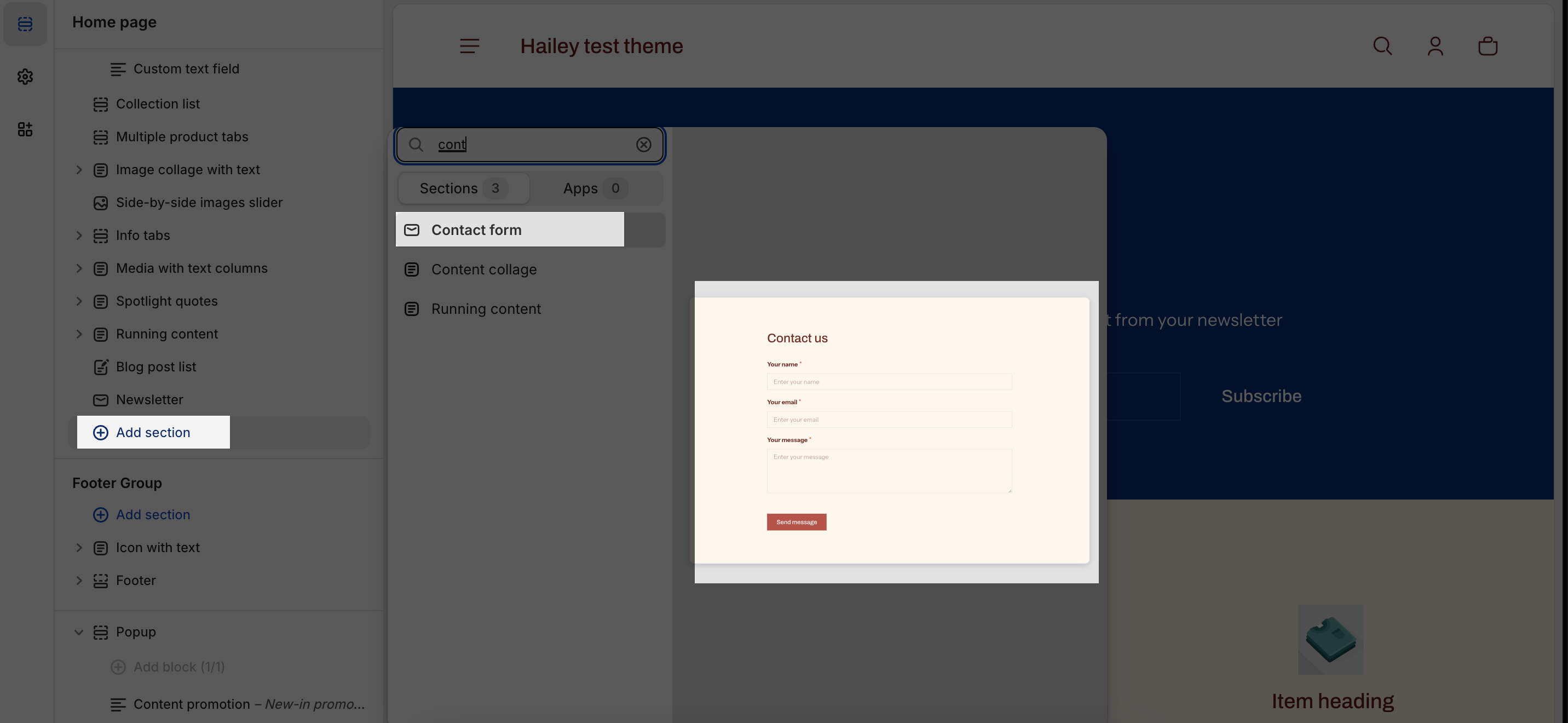
From any page, please click on ‘Add Section’ on the left side bar, then choose ‘Contact Form’.
Shine Contact Form Section Configuration
The Shine Contact Form section has several settings that can be adjusted. These include:
General
Firstly, you can change the color scheme for this section by selecting the scheme here. To change the theme color, please go to Theme settings > Colors.

After that, you can change the heading for this section by entering the content on the text box.
You can also change the heading size by selecting: H2, H3, H4 or H5.
Image
To add an image to the section, click the Select image button. This will open the media manager. You can drag and drop your image into the media manager, or select it if it is already uploaded.
Large Screen
On this part, you can select to display text first or image first on the large screen like desktop, laptop.
Mobile Screen
The settings for the mobile screen are similar to those for the large screen, you can select to display text first or image first on the mobile screen.
Button
- Button label: The text displayed on the submit button (the button customers click to send their message).
- Clear the current text and type your desired button text
- Example: If you want the button to say “Send inquiry”, type that
- Style: Controls the visual appearance/design of the submit button.
- Filled – Button has a solid background color (most prominent)
- Outlined – Button has just a border/outline, transparent background (subtle)
- Text link – Button looks like a clickable text link (minimalist)
Contact Form Block
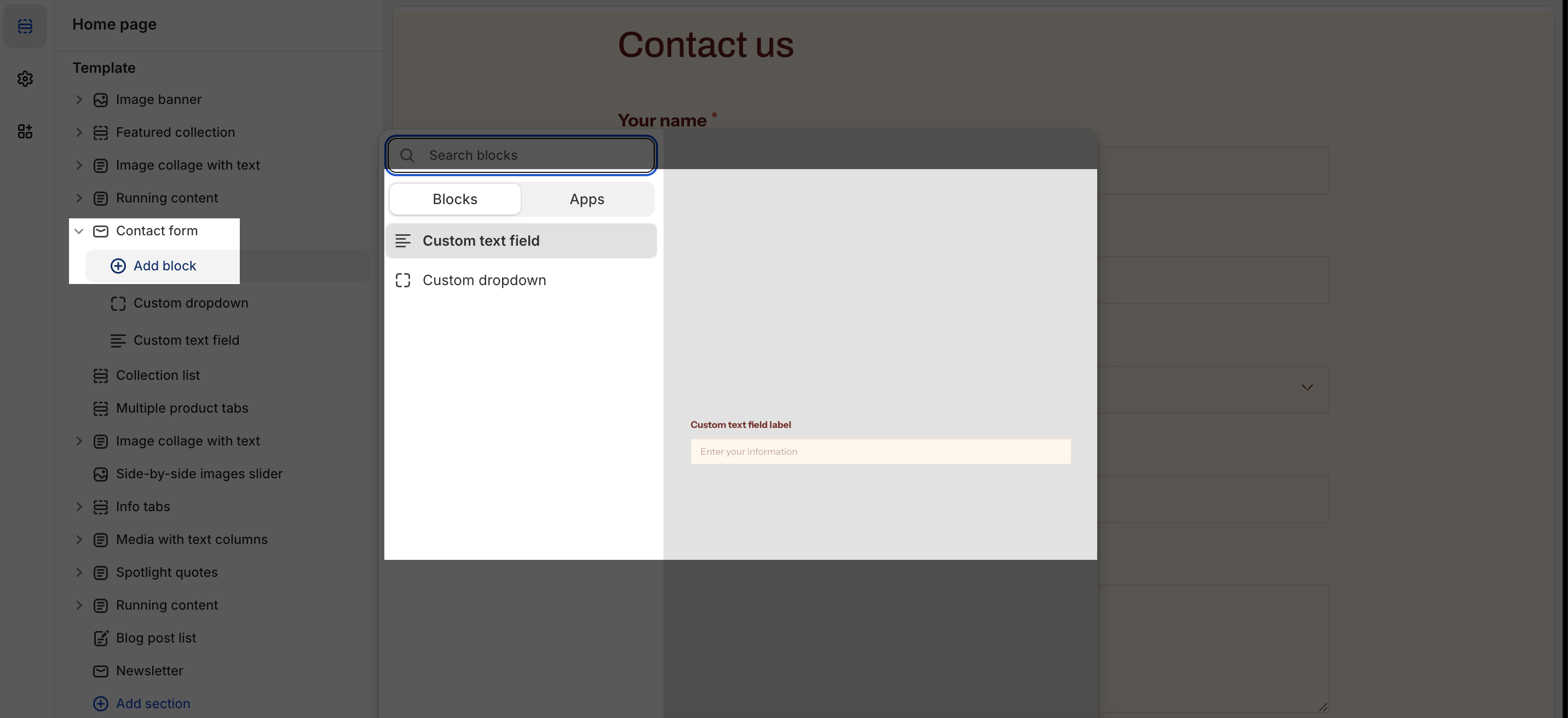
To add theme blocks, click the Add block icon.
There are 2 types of block that you can add on the Contact form section:
- Custom text field
- Custom dropdown
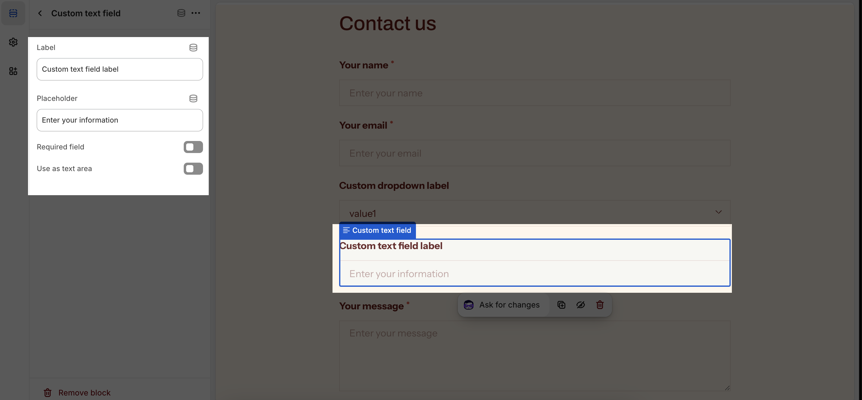
Custom Text Fields
You can customize the text field label and placeholder. You can also make the field required or use it as a text area.
- Text field label: This is the text that appears above the text field. You can freely adjust it to fit your needs.
- Placeholder: This is the text that appears in the text field when it is empty. You can also freely adjust it to fit your needs.
- Field is required: This option makes the field required. This means that the user must enter a value in the field before they can submit the form.
- Use as text area: This option makes the text field a text area. This means that the user can enter multiple lines of text in the field.
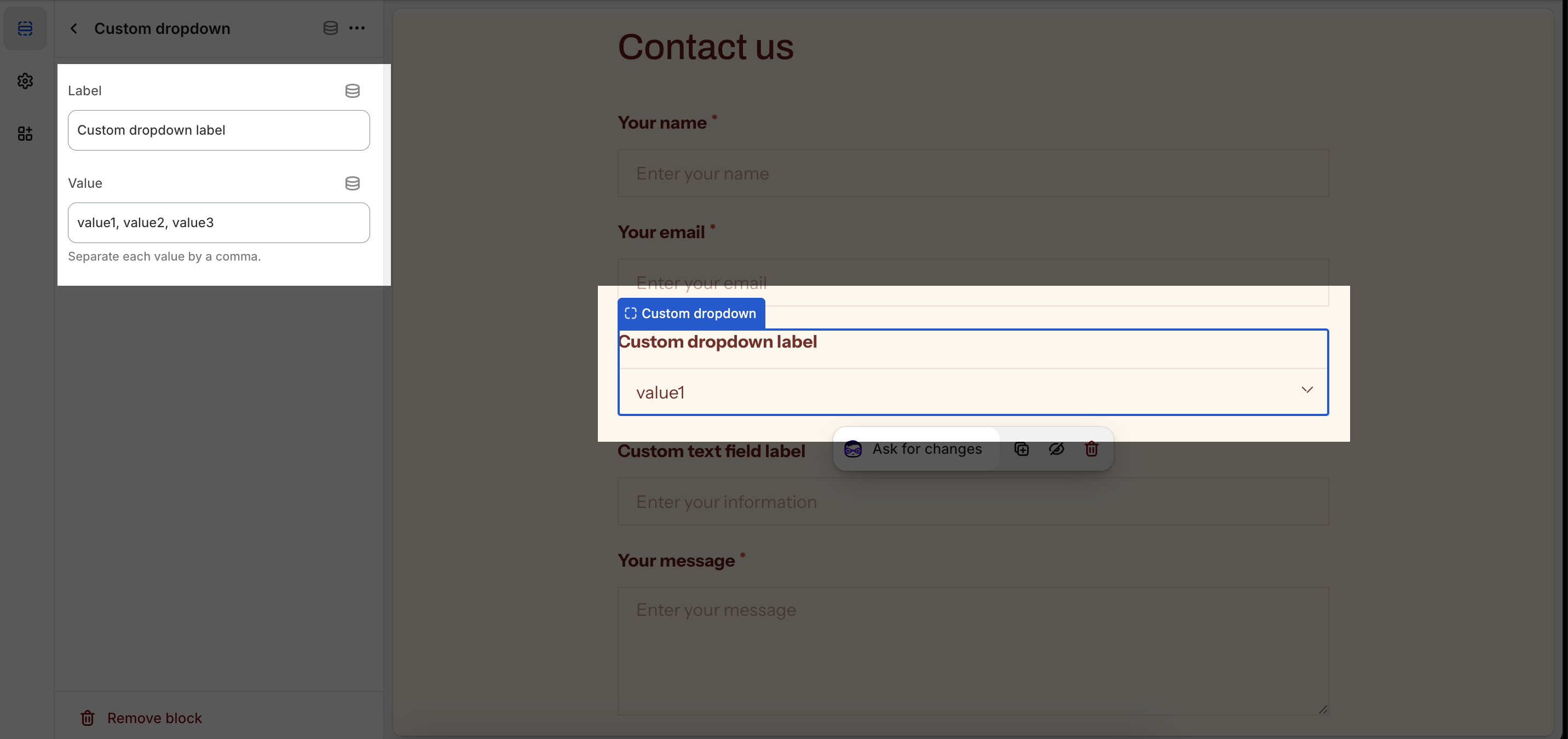
Custom Dropdown
You can customize the dropdown label and value for each option. By default, the dropdown will have 3 sample values.
- Dropdown label: This is the text that appears next to the dropdown option. You can freely adjust it to fit your needs.
- Dropdown value: This is the value that is submitted to the server when the user selects the option. You can also freely adjust it to fit your needs.
To add more values or change the value names, simply add or change the text in the box. Remember to separate the values by commas.