Theme Settings
About Normcore Theme Settings
The Theme Settings is your control center for customizing your Normcore store’s appearance and functionality. It provides comprehensive options to align your store with your brand identity and optimize the B2B shopping experience. With Theme Settings, you can:
- Create a professional storefront that builds trust with business buyers
- Configure product displays to highlight bulk purchasing options
- Customize typography and colors to match your brand guidelines
- Optimize the layout for wholesale catalog browsing
- Set up social proof and business verification elements
How to Access Theme Settings
From any page in your Normcore Admin Dashboard, locate the “Theme settings” icon in the left-hand panel. Click it to open the Theme Settings menu where you’ll find all customization options organized by category.
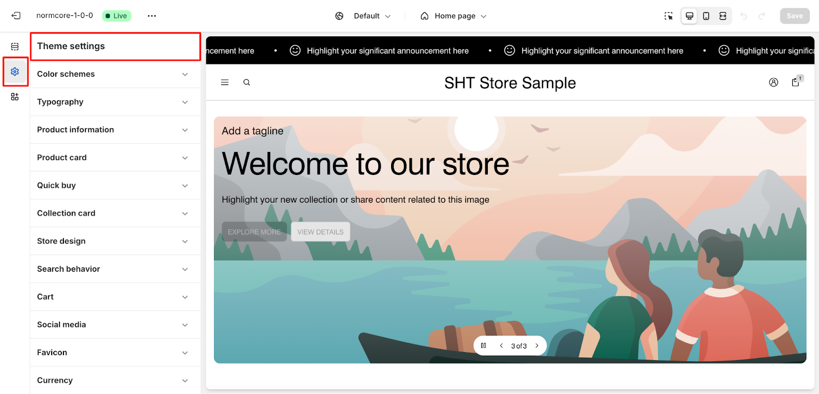
Select the category you want to customize (e.g., Color schemes, Typography, Product information).
How to Configure Theme Settings
Below are the key customization categories available in Theme Settings:
Color Schemes
Create and manage color schemes that reflect your brand identity across your entire store:
- Navigate to the Color Schemes section
- Choose from preset schemes or create your own:
- Default scheme (recommended for most sections)
- Accent scheme (for highlighting key business features)
- Custom schemes (for specific promotional areas)
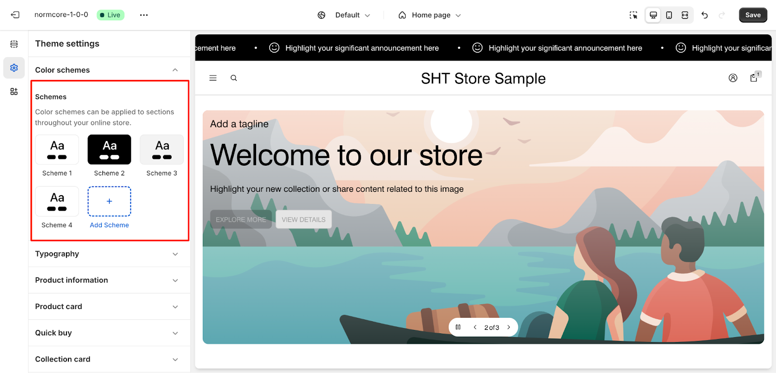
Each scheme lets you customize:
- Primary and secondary colors
- Background colors
- Text colors
- Button styles
- Border colors
Typography
Applies to: Text throughout the store, including buttons, headings, and promotional banners.
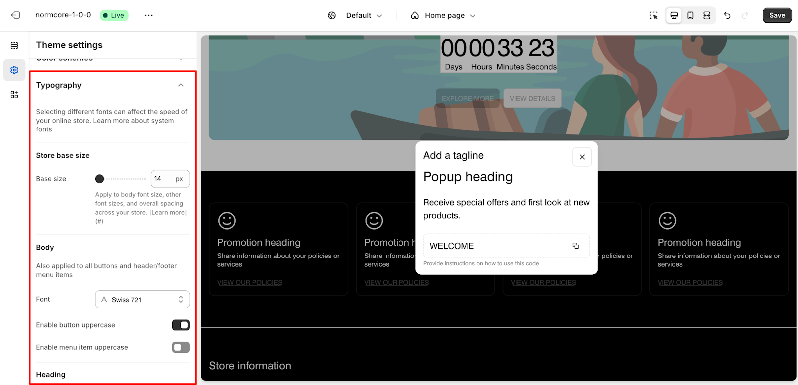
Under Typography, we have:
Store base size
- Base size: 14px
- Apply to body font size, other font sizes, and overall spacing across your store.
Body
Also applied to all buttons and header/footer menu items
- Select font
- Enable button uppercase
- Enable menu item uppercase
Heading
Applied to section headings and subheadings
- Font: Swiss 721
- Promotional heading sizes: Small | Regular | Large
- Used for promotional sections like Image banner, Video banner, Image with text, Video with text, etc
- Enable promotional heading uppercase
- Enable subheading uppercase
- Regular heading sizes: Small | Regular | Large
- Used for listing sections like Product list, Collection list, Blog post list, etc
- Enable regular heading uppercase
Extra
We designed Normcore with typography in mind. We designed Normcore with typography in mind. To enhance the visual aesthetics, you can use extra fonts to emphasize specific elements in your online store. When the “Enable Extra Font” option is checked, an additional font is subtly integrated into small labels, refining their appearance without making a powerful impact.
Check it out HERE to improve visual consistency and readability.
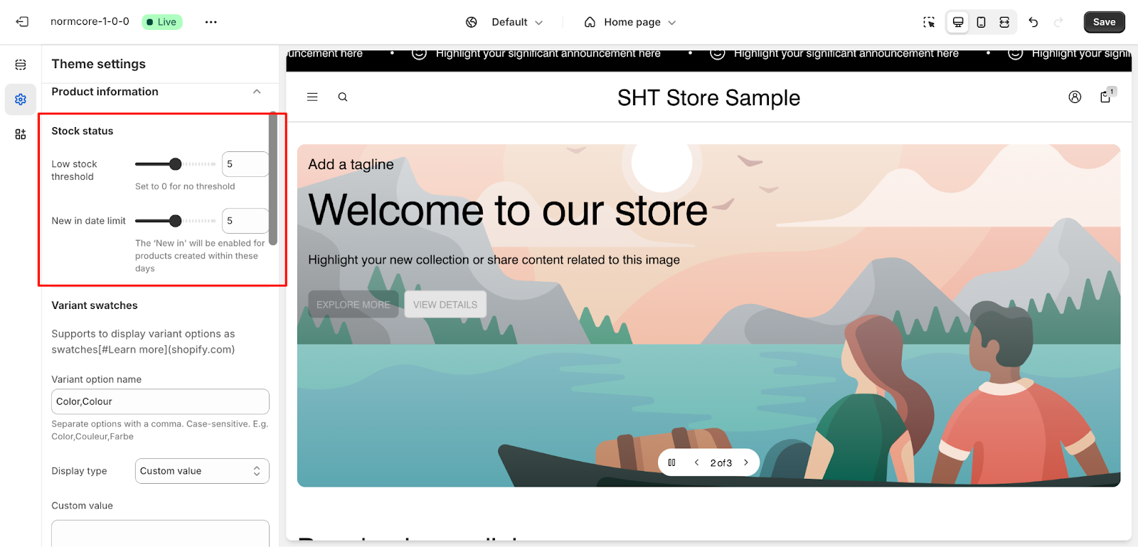
Product Information
Applies to: Product pages and listings where product availability and options are displayed.
Under Product Information, we have:
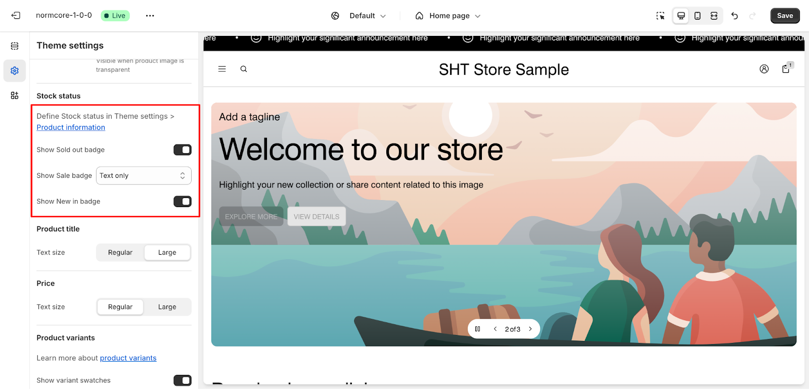
Stock Status
- Set a low-stock threshold
- Define the “New in” date limit
Variant Swatches
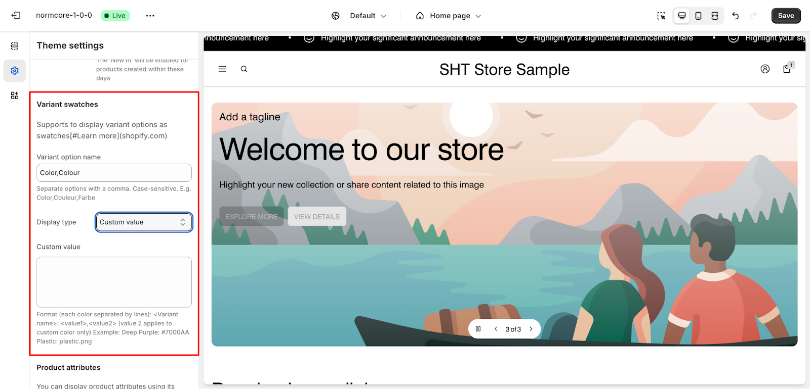
This is a powerful feature that enhances product customization in your Normcore theme. It enables you to display product variants as visual swatches instead of traditional dropdown menus. Please refer to this article to learn how to set up variant swatches.
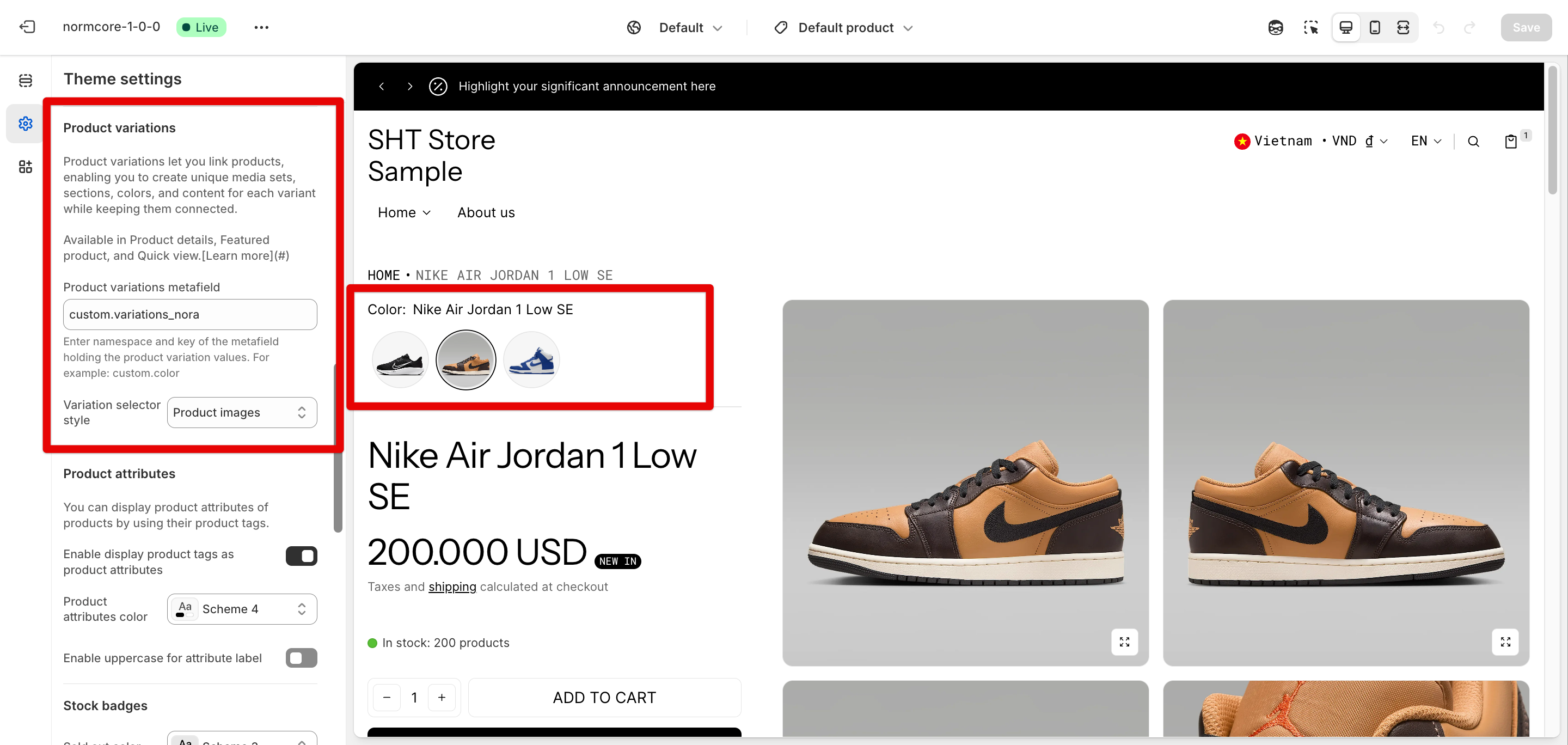
Product variations
Product variations let you link products, enabling you to create unique media sets, sections, colors, and content for each variant while keeping them connected.
Available in Product details, Featured product, and Quick view. Check this article about how to set up Product variations on Normcore.
Product Attributes
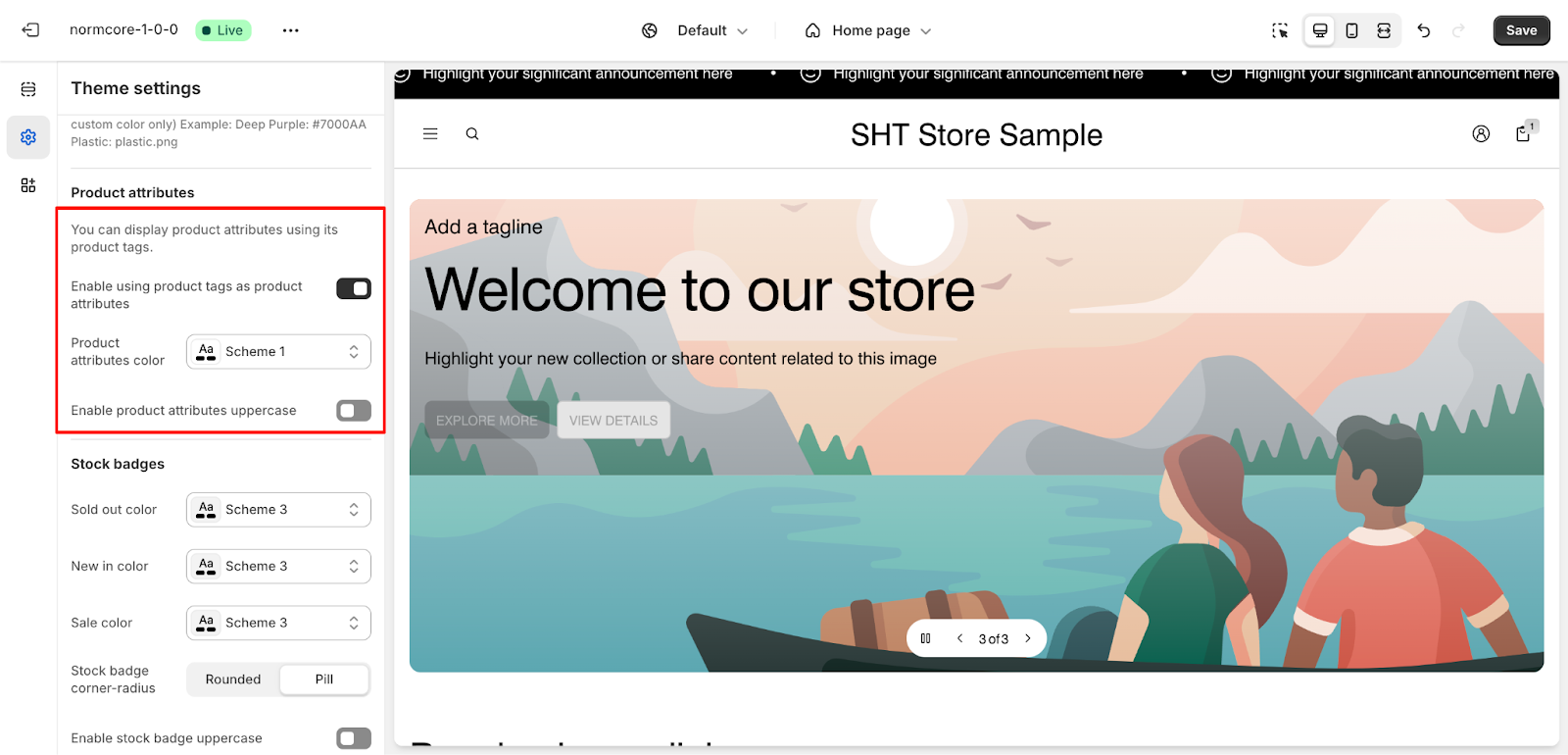
- Display product attributes using tags.
- Assign specific colors to product attributes.
- Enable uppercase for product attributes.
Stock Badges
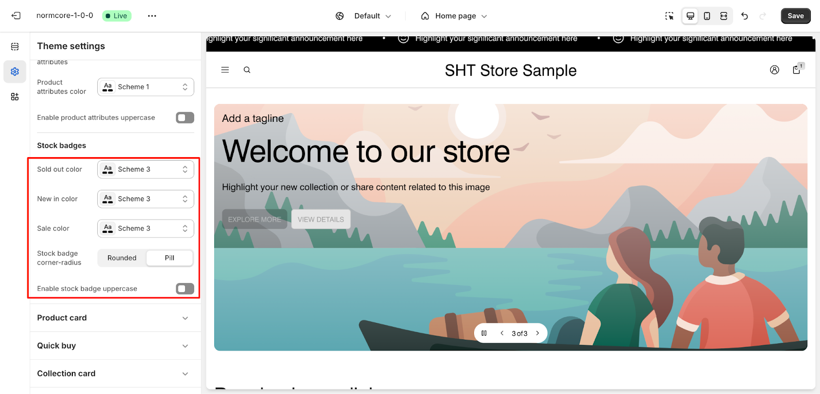
- Configure badge colors for statuses like “Sold Out,” “New In” and “Sale“
- Choose badge styles: Rounded or Pill.
- Enable uppercase for stock badges if required.
Product Card
Applies to: Product lists, featured product sections, and collection pages.
Under Product Card, we have:
General Options
- Select the card style
- Adjust text alignment
Image Settings

- Choose image ratio
- Image fit: Fill or Fit
- Configure hover effects
- Set background transparency for product images.
Stock Status
- Define Stock Status in the Product Information section.
- Show badges like “Sold Out” or “Sale” as text or icons.
- Enable or disable “New In” badges for products.
Product Title
- Customize text sizes
Price
- Customize price text sizes
Product Variants
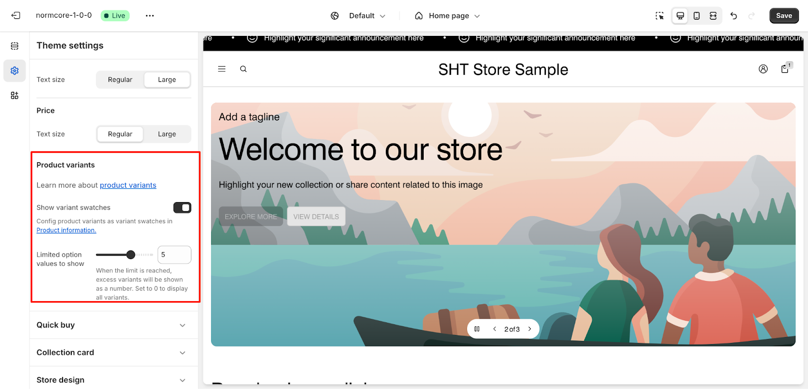
- Enable or disable variant swatches.
- Limit the number of variant options displayed
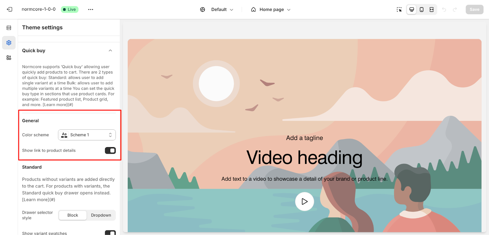
Quick Buy
Normcore supports “Quick Buy” to allow users to quickly add products to the cart. Applies to sections like featured product lists, product grids, and promotional sections.
Types of Quick Buy:
- Standard: Allows users to add a single variant at a time. Products without variants are added directly to the cart, while products with variants open a Quick Buy drawer.
- Bulk: Allows users to add multiple variants at a time. Variants are grouped based on the first variant option listed.
General Settings
- Color Scheme: Scheme 1 (customizable)
- Option to Show Link to Product Details
Standard
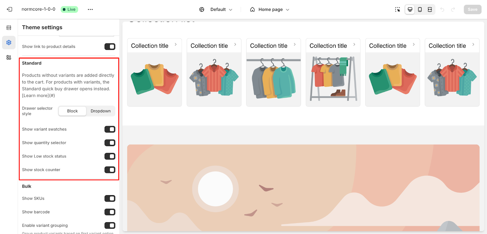
- Drawer Selector Style: Block or Dropdown
- Enable settings to show:
- Variant swatches
- Quantity selector
- Low stock status
- Stock counter
Bulk
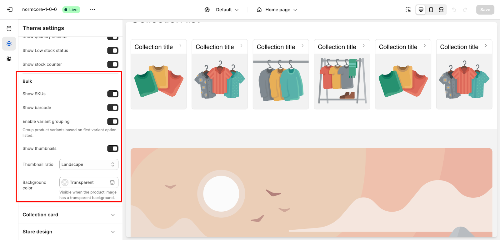
Enable options to display:
- SKUs
- Barcodes
- Variant grouping
- Thumbnails (with 4 options for ratio and customize background color)
Check this article on how to use Bulk Purchasing in Quick Buy.
Collection Cards
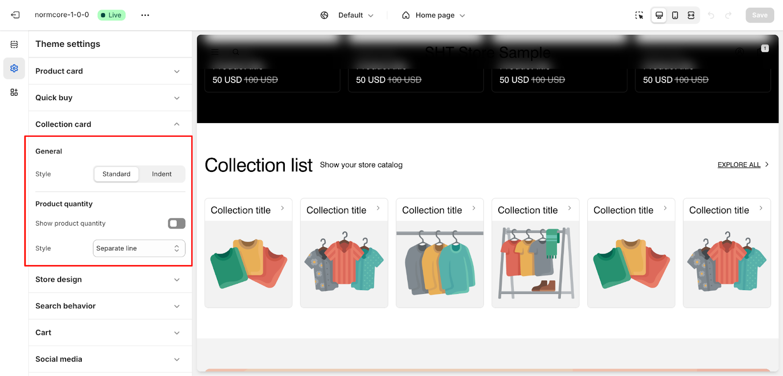
- Style collection cards with options such as “Standard” or “Indent.”
- Display product quantity with styles like Separate line or Supperscript
Store Design
Applies to: Overall store layout and interactive components.
Under Store Design, we have:
Spacing
- Adjust content maximum width (e.g., 1400px).
Overlay Background Mask
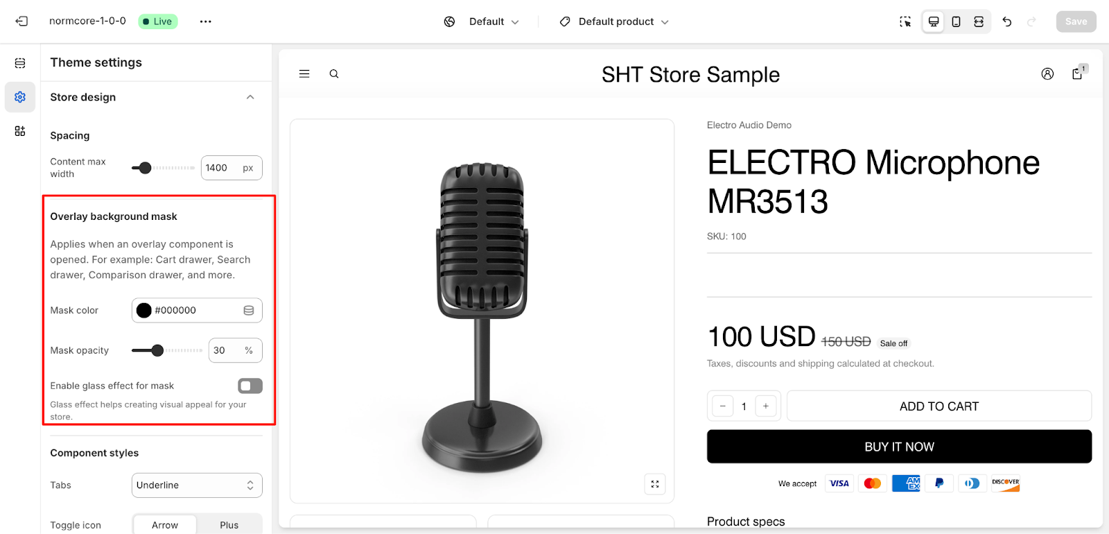
- Customize mask color and opacity (e.g., 30%).
- Enable glass effect for visual appeal.
Component Styles
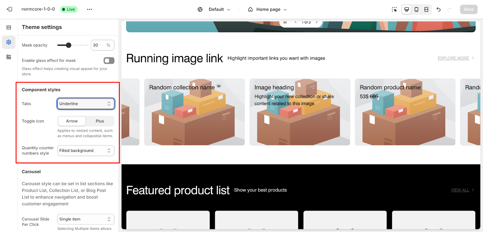
- Tabs: Choose style (Underline, Solid background).
- Toggle icon: Arrow or Plus.
- Quantity counter style: Filled or Number only.
Carousel
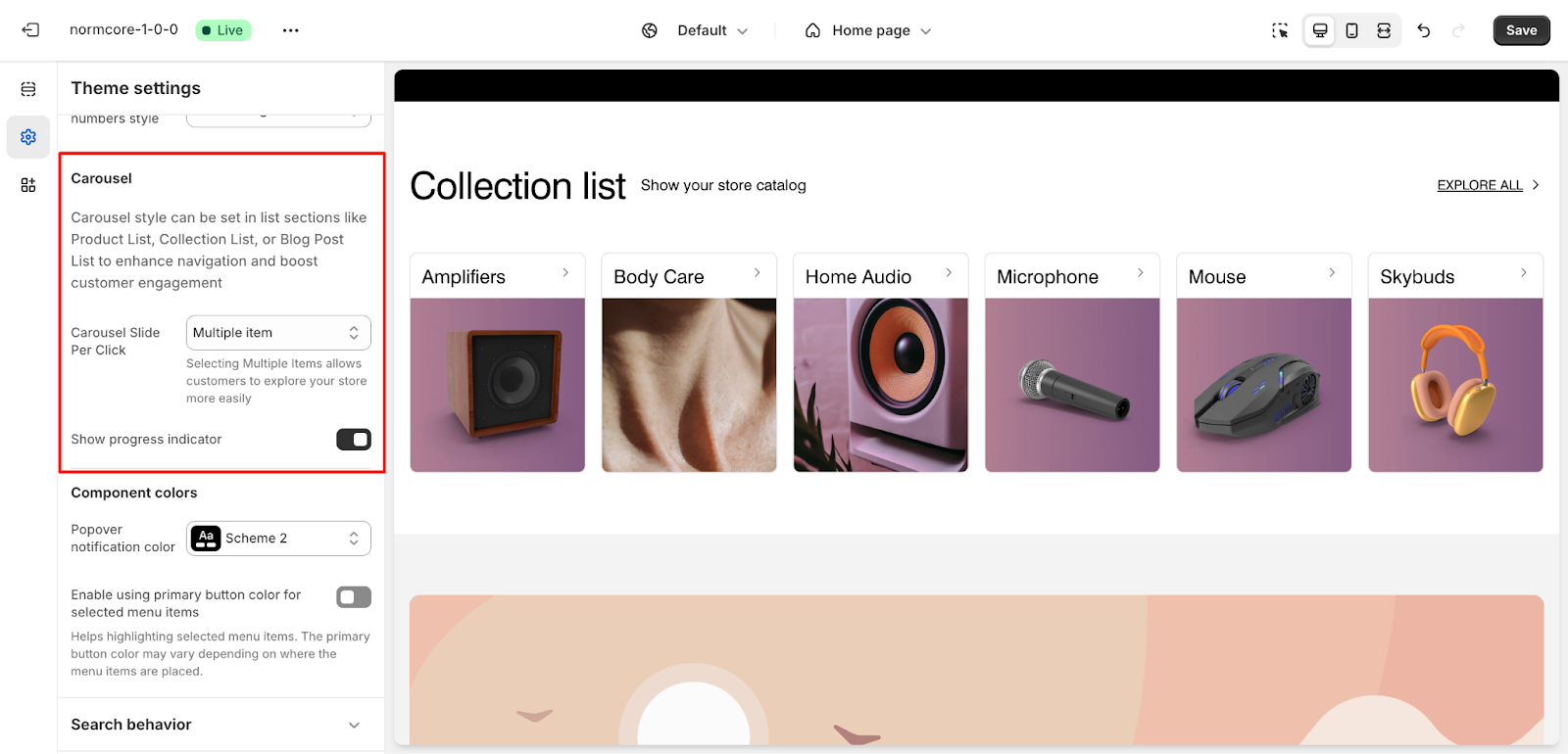
- Configure carousel style for list sections (e.g., Product List, Collection List).
- Options include Single Item or Multiple Items per click.
- Show progress indicator.
Component Colors
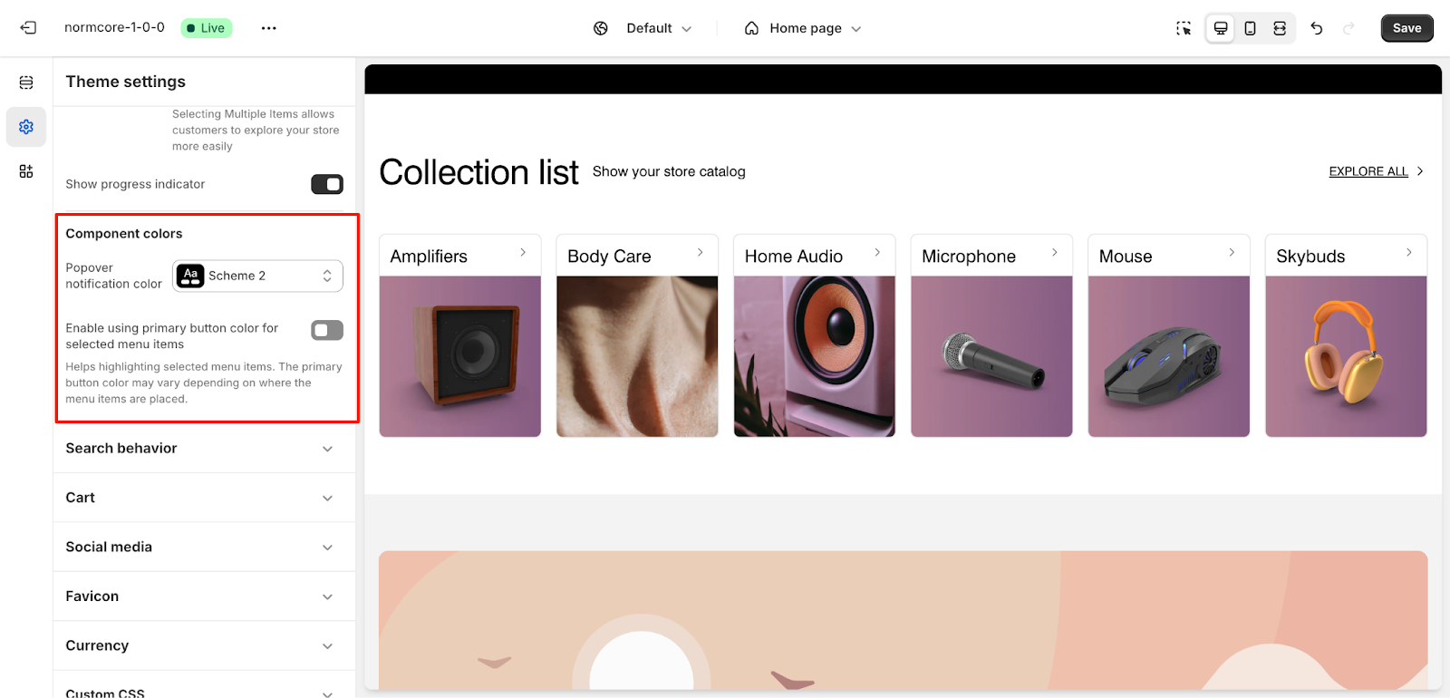
- Set popover notification color (e.g., Scheme 2).
- Enable primary button color for selected menu items.
Breadcrumbs
This section lets you control which pages show breadcrumbs.
Enable toggle to control breadcrumbs for different page types:
- Products
- Collection
- Collection list
- Blog
- Blog posts
Link
Link settings control how links behave on your store from a performance perspective.
When ON, the next page starts loading as soon as user hovers over a link
Languages
Language settings control multi-language support and right-to-left (RTL) text direction for languages like Arabic, Hebrew, etc.
How to use:
-
Toggle “Enable RTL” ON if you serve customers in RTL languages (OFF by default)
- List language codes supporting RTL in “Languages support RTL” box. For example: ar,he,fa,ur,ps,ckb,sd,ug,prs
Search Behavior
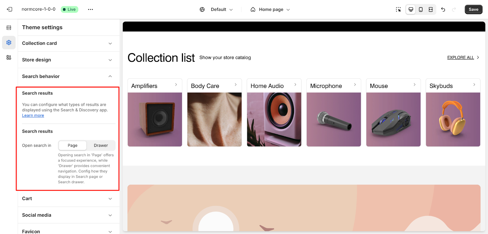
- Configure search result display:
- Open search in “Page” or “Drawer.”
- Use the Search & Discovery app for advanced settings.
Cart
Applies to: Cart drawer and checkout pages.
Under Cart, we have:
General

- Choose how the cart opens (Page or Drawer).
- Added-to-cart notification style: Popover notification, Cart notification or not use.
Cart Information
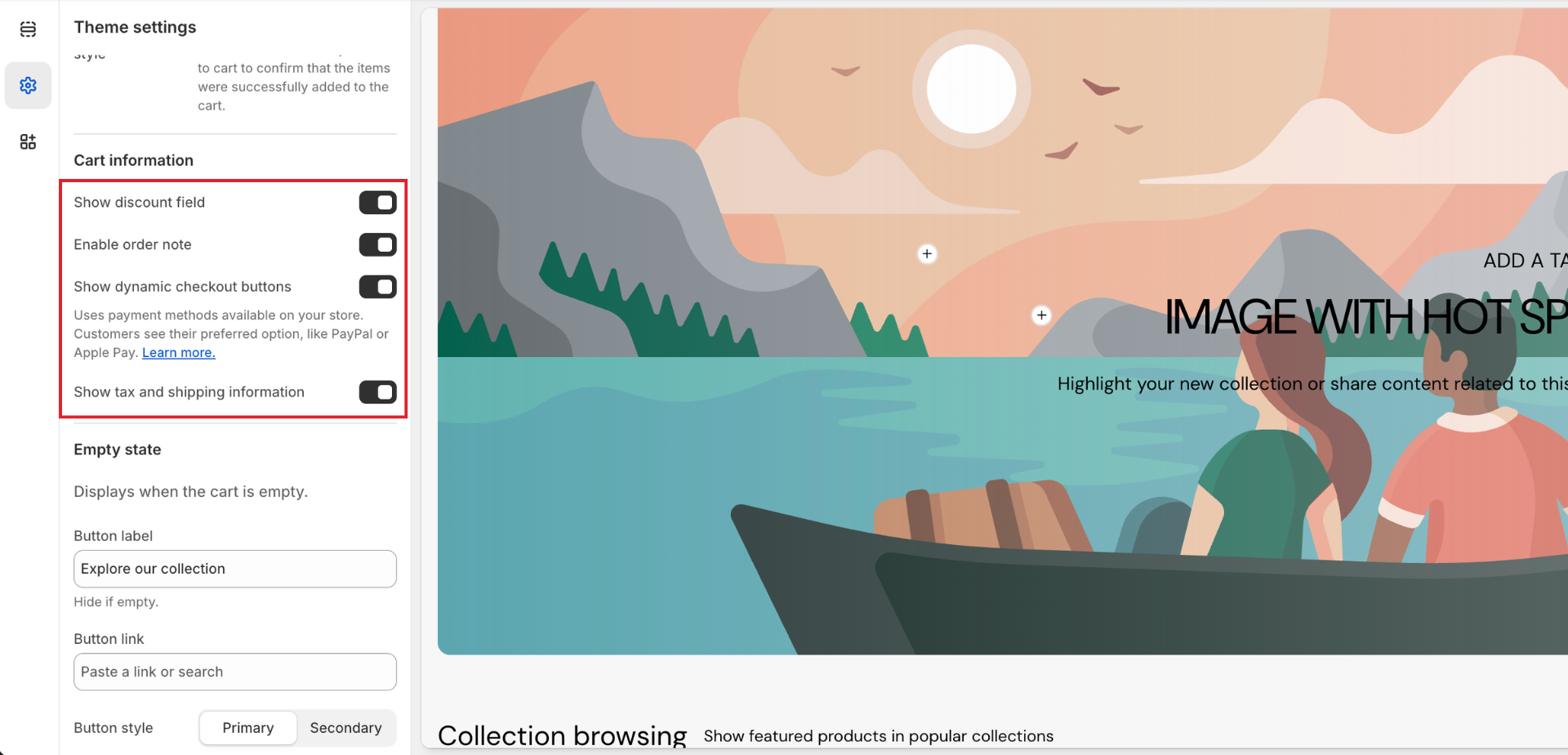
- Show discount field to apply your discount code in the cart. You can setup the discount code in Discounts tab in Shopify Admin.
- Enable order notes and dynamic checkout buttons.
- Show dynamic checkout button to show available payment methods on your store.
- Show tax and shipping information.
Empty State

- Customize button labels, links, styles, and icons for empty cart messages.
- Example:
- Button label: “Explore our collection.”
- Button style: Primary or Secondary
- Enable the show icon and select the icon.
Payment Method
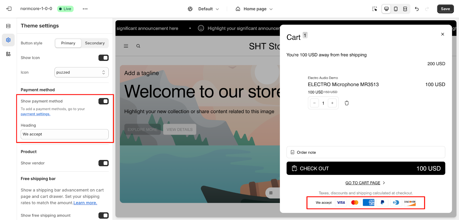
- Show available payment methods (e.g., PayPal, Apple Pay).
- Add customized heading
Product Display
- Option to show the vendor name.
Free Shipping Bar
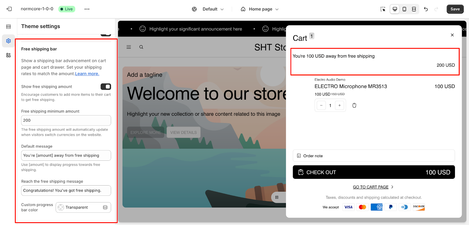
- Show a shipping progress bar on the cart page or drawer.
- Configure the free shipping amount (e.g., $500 minimum).
- Customizable messages:
- Default: “You’re [amount] away from free shipping.”
- Success: “Congratulations! You’ve got free shipping.”
- Set a custom progress bar color (e.g., Transparent).
Social Media
Applies to: Footer, header, and dedicated social sections.
- Add and customize social media links for the following platforms:
- Facebook, X, Instagram, YouTube, TikTok, Threads, Pinterest, Vimeo, WhatsApp, Tumblr, LinkedIn, Snapchat, Reddit, WeChat, Spotify, Discord, LINE, Telegram, Signal, Clubhouse
- Ensure these links are visible and correctly styled across your store.
Favicon and Currency
- Favicon: Upload a custom favicon to represent your brand in browser tabs.
- Currency code: Option to enable or disable showing the currency code depending on your store’s preferences..
Custom CSS
- Add custom CSS to implement advanced design changes not covered by default settings.
Common Questions and Use Cases
1. How do I ensure consistent branding across my store?
Utilize the Color Schemes and Typography sections to apply consistent styles.
2. Can I customize product badges?
Yes, you can set colors and styles for stock badges like “Sold Out” or “Sale.”
3. What is the purpose of Extra Fonts?
Extra fonts allow you to highlight specific elements in your store with a distinct typeface.