Footer
About NormcoreTheme Footer
The Normcore Theme Footer section is the bottom section that appears on every page. A well-crafted footer enhances user experience, improves navigation, and ultimately increases conversion rates.
You have all the freedom to customize the Normcore theme footer to align with your brand identity.
Access Normcore Theme Footer
You can access the theme editor and set up the footer from the last section on any page, and the footer setting will be visible for the entire website. Normcore Footer section is a default section on the Footer group. This can not be removed, only can be hidden.
How to Configure Normcore Footer Section
General
You can:
- Color scheme: Select from predefined color schemes using the dropdown menu.
- Enable full-width content: set the section to full-width.
- Show layout grid: This setting highlights the Grid System in color, making it easier to edit the Footer layout. It appears only in the theme editor and divides the header into 12 columns to help set block widths.
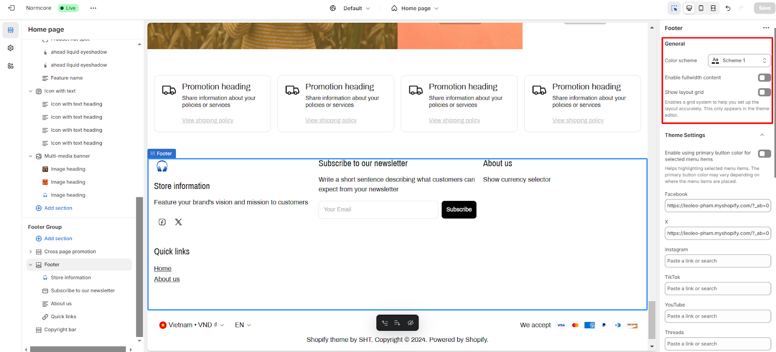
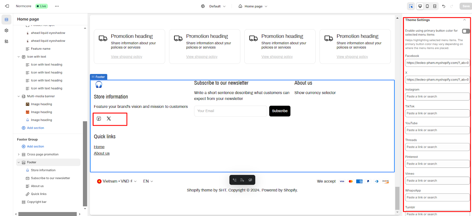
Theme Settings
From this Theme settings tab here, you can add social network links to each respective button so that it can be displayed or back to the Theme settings to configure it.
How to Configure Normcore Footer Blocks
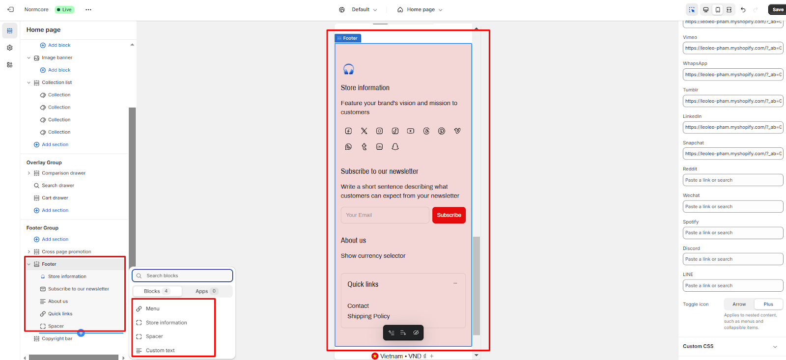
In the footer section, there will be blocks:
- Store Information
- Newsletter
- Custom text
- Menu
- Spacer
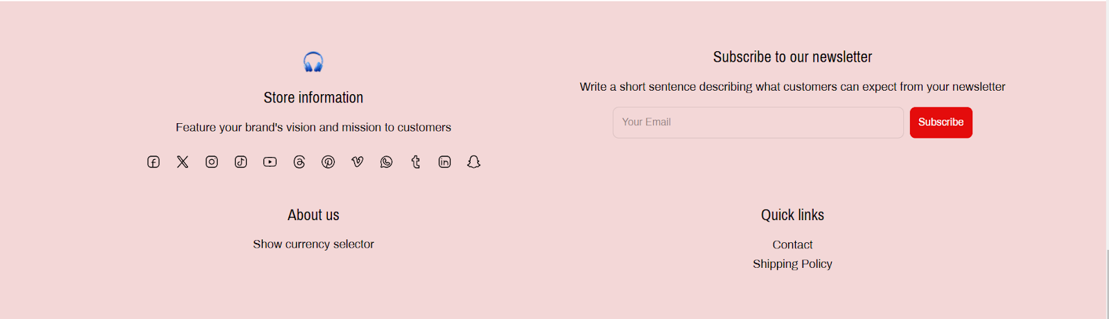
Store Information
You can:
- Add your logo to the footer and customize the logo size.
- Add heading and description to footer.
- Show Follow on Shop: To let customers follow your store on the Shop app from your storefront, Shop Pay must be enabled.
- Show social icon: You can customize hide/unhide social icons on the information block.
- Set the Block width and the Block alignment of this information
Newsletter
Customers who subscribe will have their email added to the ‘Accepts marketing’. You can:
- Add Heading and description content to this block
- Submit button: You can change the content of the submit button
- Set the Block width and the Block alignment of this form
Custom text
Similar to the previous blocks, you can also add Heading and description content to this block. Then, you can set the Block width and the Block alignment of this text.
Menu
You can:
- Set the block heading
- Change the menus previously set up in Shopify to display in the footer
- Set the Block width and the Block alignment of this block
- Only the Menu Block in the footer has a dedicated mobile layout, here you can:
- Show as a collapsible item: The Quick Links can be displayed in a collapsible format for a cleaner look on mobile devices.
- Expand collapsible by default: You can set the collapsible item to be expanded by default for easier access to links.
Spacer
Visible on desktop only, used to create negative space between footer blocks by choosing the Block width.
Common Cases and FAQs
1. How to align 3 blocks in 1 row in the footer section?
You should select the same “block width” option for all blocks in the footer. (recommend: 4 cols 1/3)
2. Should I display social media icons in your footer?
Yes, you should display social media icons to increase engagement with the products you are selling and increase your brand awareness.
3. Can the Newsletter block be added more than once on the footer?
No, it cannot. Because the Newsletter block contains the email form, and the form mechanism only allows it to be displayed once on a page.