Contact Form
About Contact Form Section
The Contact Form section is a versatile communication tool that enables direct interaction between your customers and your business. This section allows you to create customized forms with:
- Custom text fields for gathering specific information
- Custom dropdown menus for structured responses
- Professional form layout that matches your store’s design
The section excels at providing a seamless way for customers to reach out while maintaining your store’s professional appearance and brand consistency.
How To Access Contact Form Section
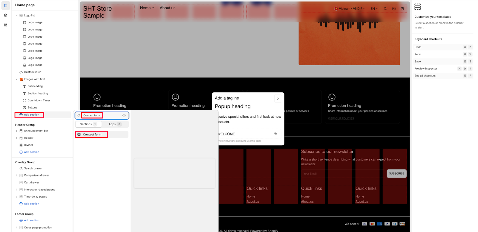
From any page in your Normcore Admin Dashboard, click the “Add section” button, search for “Contact Form” and select it.
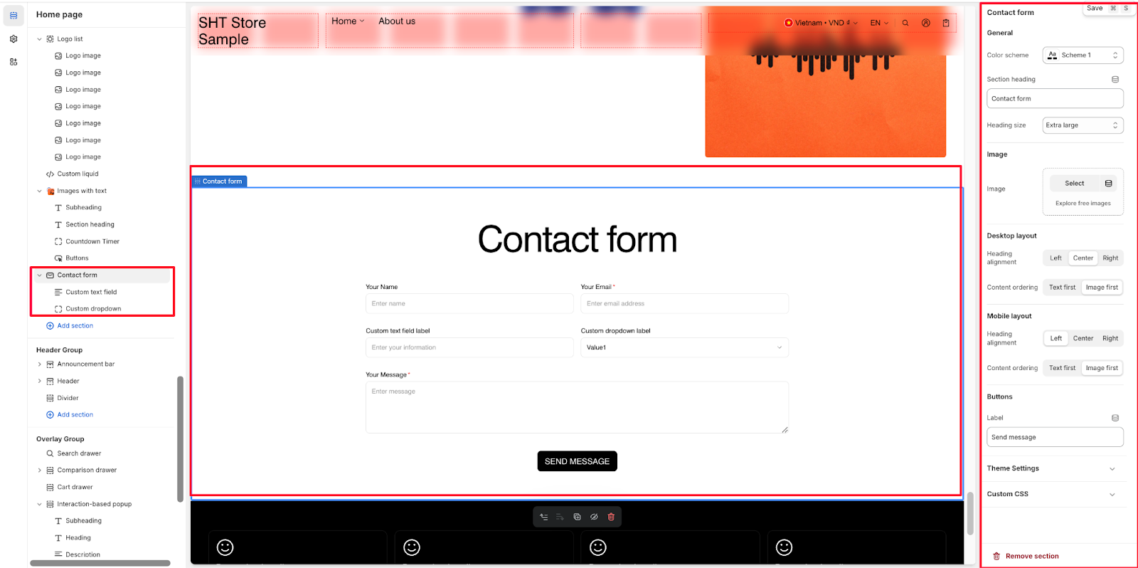
After adding the Contact Form section, customize its appearance and functionality using the available settings.
How To Configure Contact Form Section
Basic Components
Each Contact Form section includes two default components:
- Custom text field
- Custom dropdown
You can customize these components to gather the specific information you need from your customers.
General
Within General settings, you can configure:
- Color scheme with Scheme 1 option
- Section heading text
- Heading size with Extra large option
Image
You can enhance your contact form with:
- Custom image upload option
- “Explore free images” feature for selecting stock photos
Desktop Layout
Configure your desktop presentation with:
- Heading alignment
- Content ordering
Mobile Layout
Customize the mobile experience with:
- Heading alignment
- Content ordering
Buttons
Customize the form button with:
- Custom label text
Theme Settings
Fine-tune your form’s appearance with:
- Content max width
- Toggle icon choice
Custom CSS
Access custom CSS options for advanced styling needs.
How To Configure Contact Form Section’s Blocks
Custom Text Field Block
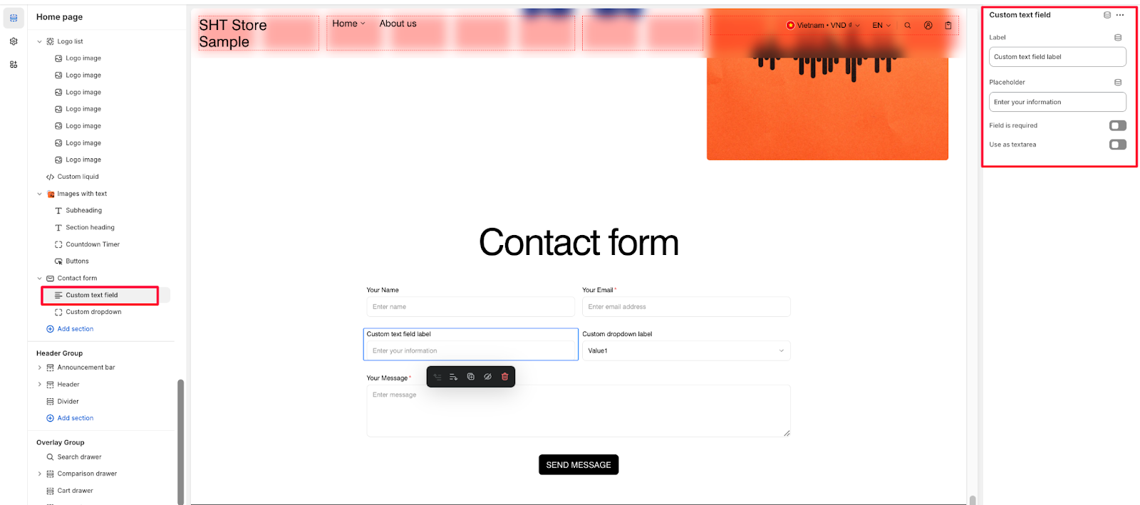
The Custom Text Field block allows you to create form fields that gather specific customer information. You can configure:
- Label – Add a descriptive label for the field (e.g., “Custom text field label”)
- Placeholder – Set helper text that appears inside the field (e.g., “Enter your information”)
- Field is required – Toggle to make this a mandatory field
- Use as textarea – Toggle to create a larger text input area
Custom Dropdown Block
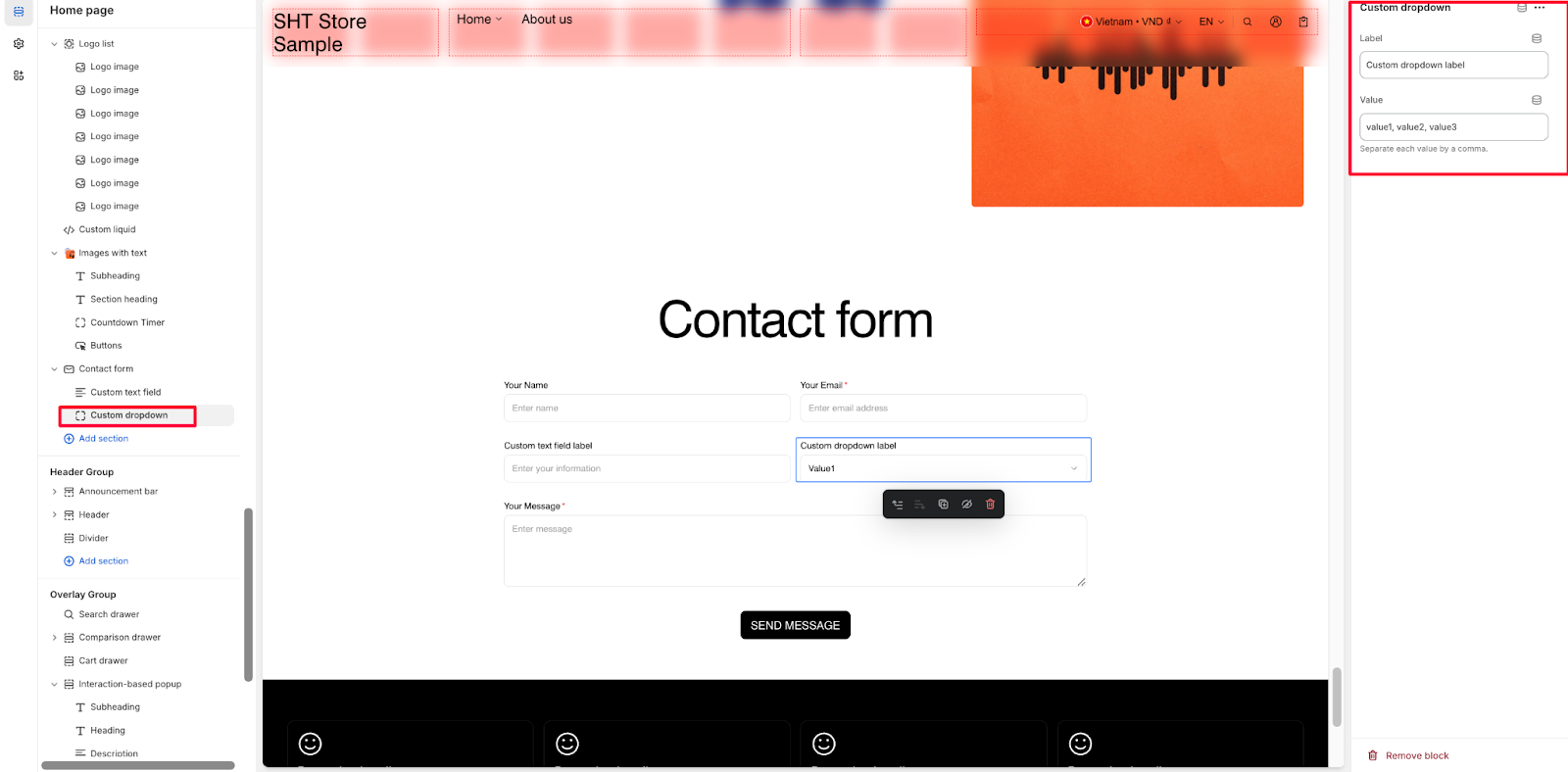
The Custom Dropdown block enables you to create pre-defined customer selection options. Configure it with:
- Label – Add a descriptive label for the dropdown (e.g., “Custom dropdown label”)
- Value – Enter the options customers can select from, separated by commas (e.g., “value1, value2, value3”)
Common Cases and FAQs
1. How can I make certain fields mandatory?
When configuring a Custom Text Field block, you can toggle “Field is required” to ensure customers complete this field before submitting the form.
2. How do I create a larger text input area?
Enable the “Use as text area” option in the Custom Text Field block settings to create an expanded text input area, perfect for longer messages or detailed inquiries.
3. Can I customize the dropdown options?
Yes, you can add multiple options in the Value field of the Custom Dropdown block. Simply separate each option with a comma (e.g., “Option 1, Option 2, Option 3”).
4. How do I optimize my contact form for mobile users?
Use the Mobile Layout settings to adjust heading alignment and content ordering specifically for mobile devices, ensuring a seamless experience across all screen sizes.
5. Can I change the submit button text?
Yes, you can customize the button label text in the Buttons settings to match your brand voice and form purpose.


