Collection Template
About Normcore Collection Template
The Collection Template is a powerful page for organizing and showcasing your product groups in a professional, organized manner. It enables you to create customized product listings with filtering options, ideal for:
- Displaying product categories effectively
- Creating focused product segments
- Organizing wholesale catalogs
- Managing bulk product displays
- Setting up buyer-specific collections
The template stands out for its ability to present products with detailed information while maintaining full customization control for both desktop and mobile displays. With Collection Template, you can organize your products systematically, making it easier for your B2B customers to find and purchase the items they need.
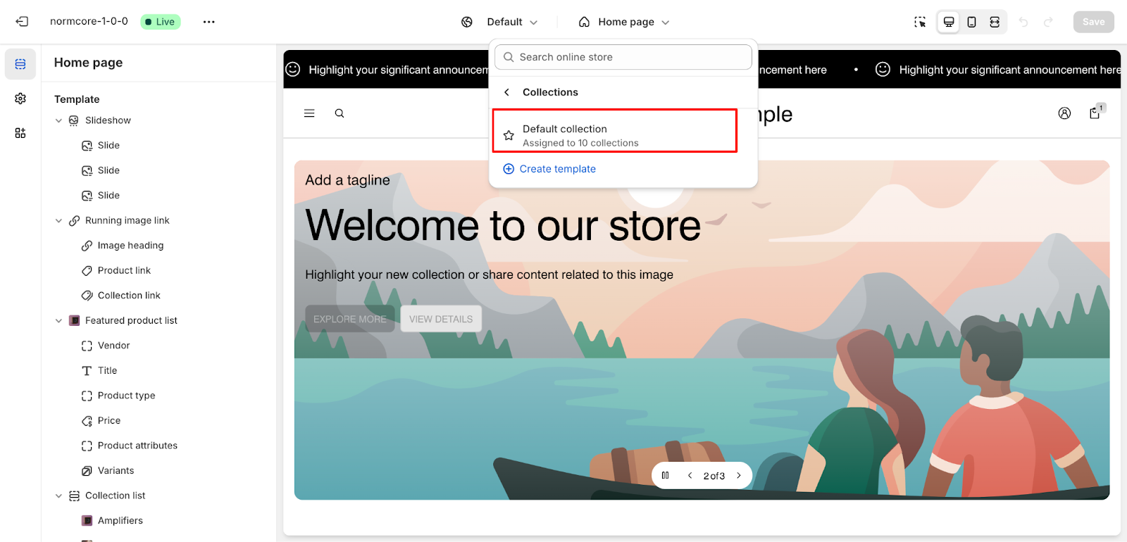
How To Access Collection Template
On the top center bar, click on the dropdown button > Default collection.
How To Configure Collection Template
Basic Components
The collection template is structured into the following key sections:
- Collection Banner
- Product grid
You can add or modify these sections to achieve the desired layout and functionality.
Collection Banner
The Collection Banner section serves as the header for your collection page, featuring:
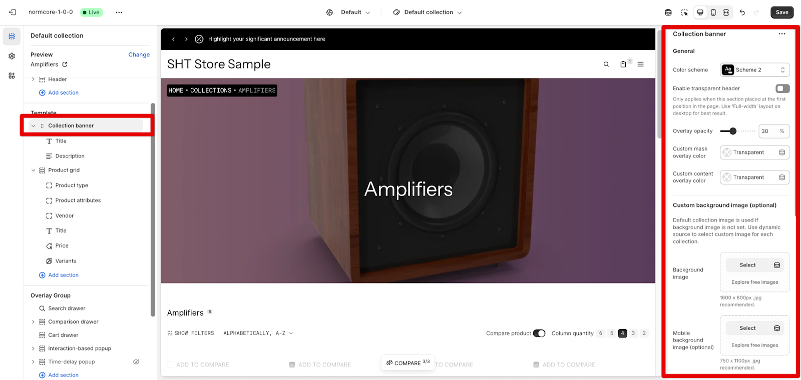
General Settings
- Color Scheme: Select a theme color (e.g., Scheme 2) to match your store’s style.
- Enable Transparent Header: Toggle to enable a transparent header (best with a “Full-width” layout).
- Overlay Opacity: Adjust the overlay transparency to control the background visibility.
- Custom Mask & Content Overlay Colors: Set custom colors or keep them transparent.
Custom Background Image (Optional)
- Background Image: Upload or select an image for the banner background (recommended size: 1600 x 800 px).
- Mobile Background Image: Upload a separate background image optimized for mobile view.
Layout Settings
You can adjust the layout for Desktop and Mobile here.
Product Grid
The Product Grid section is the primary display area for your collection products, offering extensive customization options:
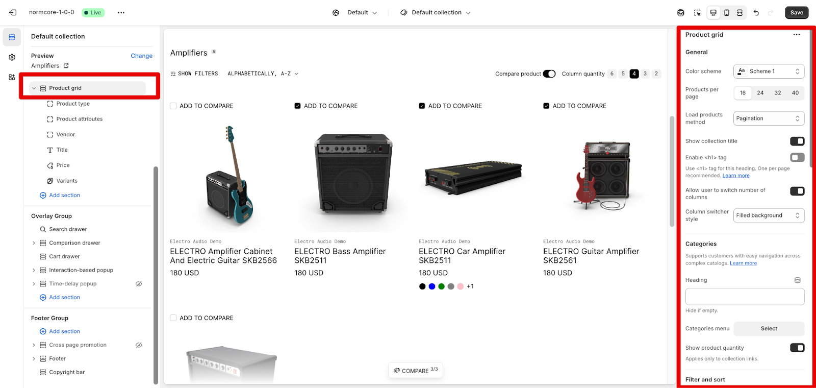
General Settings
- Color Scheme: Select a color scheme (e.g., “Scheme 1”) to align with your store’s theme.
- Products per Page: Choose how many products to display per page (options: 16, 24, 32, 40).
- Load Products Method: Select how to load products on the page (options: Pagination, “Show more” button, and Infinite scroll).
- Show Collection Title: Toggle this option to display the collection title above the products.
- Enable <h1> tag: Enable the h1 tag for the logo to optimize SEO, but it can be turned off if you want to leave the h1 tag in other sections
- Allow User to Switch Columns: Enable this option to let users change the number of columns for better navigation.
- Switcher Style: Choose the style for the column switcher (e.g., “Filled buttons”).
Categories
- Heading: Set the heading for the category section.
- Categories Menu: Select the categories menu for easy navigation.
- Show Product Quantity for Collection Links: Toggle to show the number of products in each collection.
Filter and Sort
- Enable Product Filter: Allow customers to filter products (custom filters can be added using the Search & Discovery app).
- Show Group Name in Selected Filters: Toggle to show filter group names when selected.
- Enable Sort: Enable product sorting options for users.
- Limited Filter Options: Set a limit for the number of filter options displayed (use the slider).
Product Comparison
- Enable Comparison: Let users compare products in the collection.
- Custom Panel Background: Set a custom background for the comparison panel.
- Custom Panel Content: Choose custom content for the comparison panel.
Layout Options
- Desktop Layout:
-
- Filter and Sort Layout: Choose whether to display filters and sorting options in a sidebar or drawer.
- Default Columns per Row: Set the number of columns (2–6) to display on desktop.
- Close All Filters by Default: Toggle to close all filters by default on desktop.
- Mobile Layout:
-
- Default Columns per Row: Set the number of columns (1–2) for mobile display.
- Close All Filters by Default: Toggle to close all filters by default on mobile.
Quick Shop
- Show Quick View: Toggle to show a quick view for products in the grid.
- Quick Buy: Select to use “Standard” or “Bulk” Quick buy or “Not use” it
Common Cases & FAQs
1. How do I customize the banner’s background image for mobile and desktop?
In the Collection Banner settings, you can upload custom background images specifically for desktop and mobile devices.
2. How can I adjust the number of products displayed per page in the Product Grid?
In the Product Grid settings panel on the right under “General“, you can adjust the “Products per page” using the available options: 16, 24, 32, or 40. This controls how many products are displayed before pagination occurs.
3. Why isn’t my collection banner text visible even though I’ve added it in the settings?
First, check if the Collection Banner section actually contains a Text block by expanding the “Collection banner” menu item in the left sidebar. Then, verify that both the Title and Description components are added and have content. If the text still isn’t showing, ensure the “Show collection title” toggle in the settings panel is enabled, as this controls the visibility of collection banner content.