Before/After Section
About Before/After Section
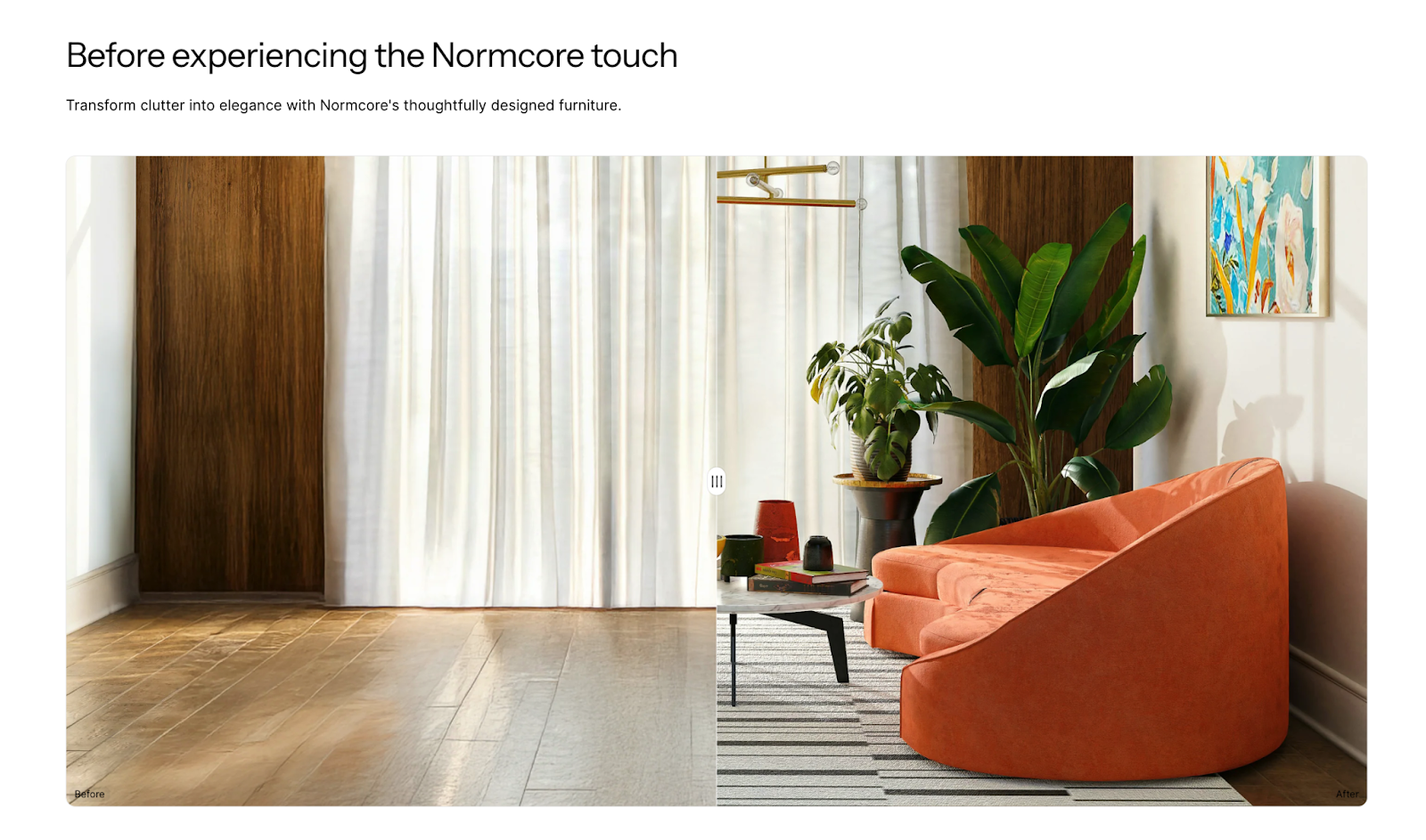
The Before/After section is a powerful tool for showcasing product transformations, demonstrating changes, or highlighting improvements in your store. It enables you to display two comparative images side by side, ideal for:
- Product transformations
- Service results
- Renovation projects
- Design changes
- Product customizations
The section stands out for its ability to present visual comparisons effectively while maintaining full customization control for both desktop and mobile displays.
How to Access Before/After Section
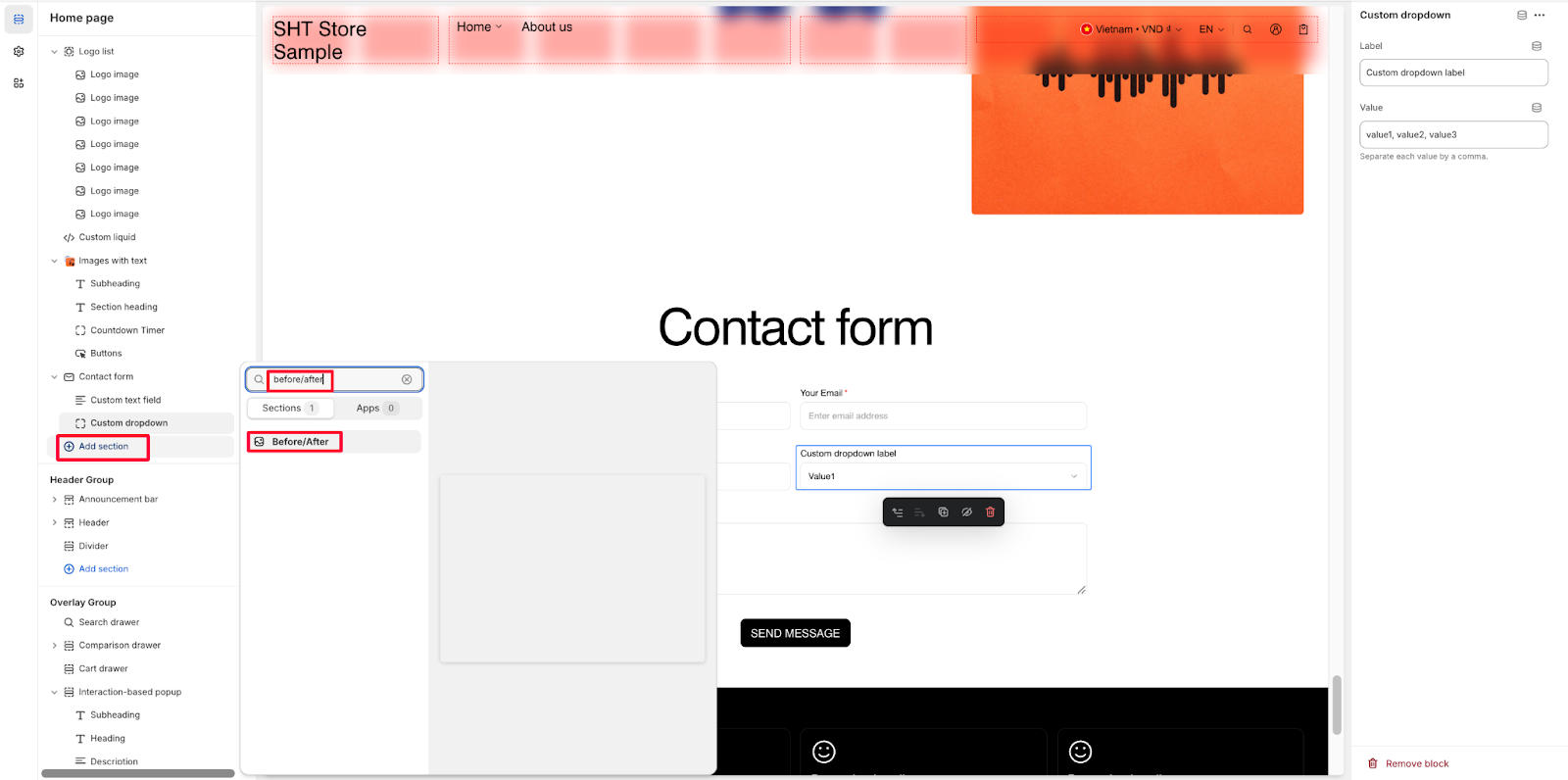
From any page in your Normcore Admin Dashboard, click the “Add section” button, search for “Before/After” and select it.
After adding the Before/After section, customize its appearance and functionality using the available settings.
How to Configure Before/After Section
Basic Components
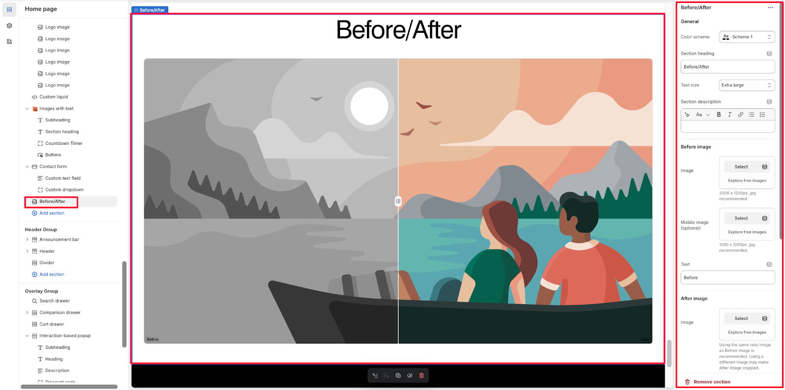
The Before/After section only has one component: Before/After.
To begin customizing, click the Before/After section to access its settings.
General
Within General settings, you can configure:
- Color scheme
- Section heading
- Text size
- Section description
Image Settings
Before Image
- Upload main image or use “Explore free images”
- Recommended size: 2000 x 1200px .jpg
- Optional mobile-specific image
- Supports “Explore free images” option
After Image
- Upload main image or use “Explore free images”
- Using the same ratio image as Before image is recommended
- Note: Using a different image may make After image cropped
- Optional mobile-specific image with same recommendations
Text Configuration
- Customize “Before” text label
- Customize “After” text label
Layout Options
Configure two types of screen resolutions:
- Desktop layout: Heading alignment
- Mobile layout: Heading alignment
Custom CSS
Custom CSS options available for advanced customization
Common Cases and FAQs
1. How to ensure the best image quality for Before/After comparisons?
When uploading images for the Before/After section, follow these recommendations:
- For desktop: Use 2000 x 1200px .jpg images
- For mobile: Use 1200 x 1200px .jpg images
- Maintain the same aspect ratio between Before and After images to prevent cropping
- Use high-quality, well-lit images for the best comparison results
2. Why should I use separate mobile images?
Consider using separate mobile images when:
- Your desktop images don’t display well on smaller screens
- The comparison details are hard to see on mobile devices
- You want to optimize loading times for mobile users
- The aspect ratio needs adjustment for better mobile viewing
3. How can I ensure my Before/After section is responsive?
The Before/After section offers independent desktop and mobile layout settings:
- Configure separate heading alignments for desktop and mobile
- Use dedicated mobile images when needed
- Text adjusts automatically for different screen sizes
- Layout automatically optimizes for mobile viewing
4. What’s the best way to use the text customization options?
For effective text customization:
- Keep labels clear and concise (“Before”/”After” are recommended defaults)
- Use the section heading to provide context
- Utilize the section description to add necessary details
- Consider your color scheme for optimal text visibility
5. When should I use Custom CSS?
Custom CSS is beneficial when:
- You need specific brand styling beyond the default options
- You want to adjust spacing or alignment precisely
- You’re creating a unique layout for special promotions
- You need to match existing store design elements


