Horizontal Menu
About Horizontal Menu Block
The Horizontal Menu block is a versatile navigation tool that enhances your store’s header layout with customizable menu options. It’s designed to provide:
- Easy access to important store pages and collections
- Flexible desktop and mobile navigation
- Customizable text sizing and alignment
- Adaptable block width settings
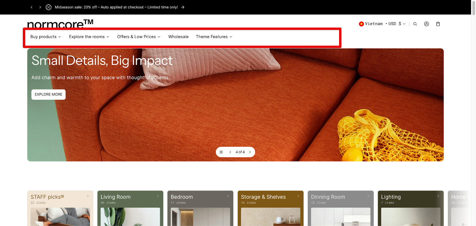
Combining a horizontal menu with a mega menu is a fantastic way to showcase your products or services right from the top of your website. This approach is particularly effective for desktop and laptop users, providing a visually appealing and user-friendly browsing experience. Here’s a step-by-step guide to setting it up.
How to Access Horizontal Menu Block
From your Normcore Admin Dashboard, Access Header group > choose Header section > click the “Add section” button, search for “Horizontal menu” and select it from the Blocks category.
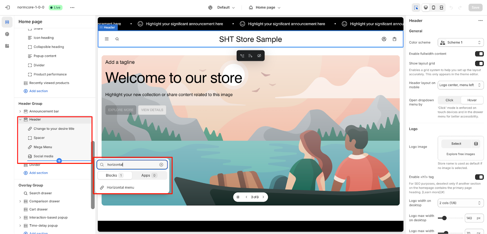
After adding the Horizontal Menu block, you can customize its appearance and functionality through the available settings in the sidebar.
How to Configure Horizontal Menu Block
Basic Components
The Horizontal Menu section includes several core components:
- Menu selection
- Text size options
- Desktop layout settings
- Mobile layout configuration
- Block width and alignment controls
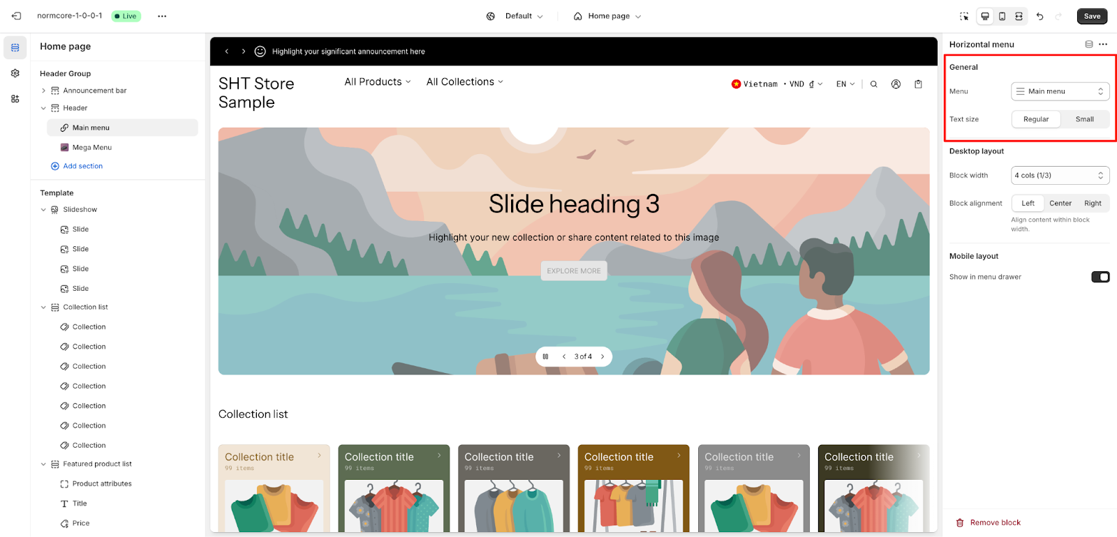
To begin customizing, click the Horizontal Menu section to access its settings.
General
Within General settings, you can configure:
- Menu: Select your desired menu from the dropdown
- Text size: Choose between Regular and Small options
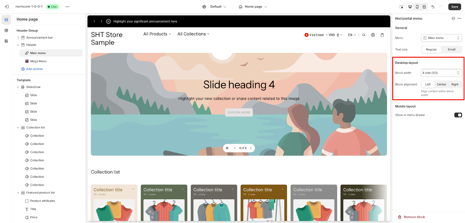
Desktop Layout
The Desktop Layout settings allow you to control:
- Block width: Select from multiple options. A header divides into 12 columns to help set block widths, you can choose a suitable menu’s width beside the other blocks in the header.
- Block alignment: Choose between Left, Center, or Right to align content within block width
Mobile Layout
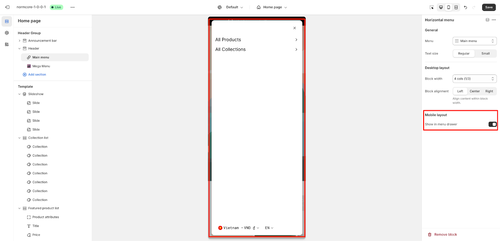
For mobile devices, you can show in the menu drawer: Toggle this option to control mobile menu visibility.
Common Cases and FAQs
1. How to create a responsive menu for both desktop and mobile?
In the Normcore theme, you can independently configure desktop and mobile layouts for optimal viewing. Set your preferred desktop block width and alignment, then use the “Show in menu drawer” option for mobile to ensure a seamless experience across all devices.
2. What’s the best block width setting for my store?
Your block width choice depends on your menu content and layout goals:
- 4 cols (1/3): Ideal for standard navigation menus
- 6 cols (1/2): Best for medium-length menus
- 12 cols (fullwidth): Perfect for extensive menu items or when you want the menu to span the entire width
3. How can I combine Horizontal and Mega Menu to create an engaging main navigation?
You can enhance your store’s navigation by using a Horizontal layout for your main menu while customizing specific categories with Mega Menu blocks. This combination creates an attractive catalog display right at the top of your page. For detailed instructions on setting up Mega Menu blocks for your categories, please refer to our Mega Menu block article.
4. Can I use different text sizes for desktop and mobile views?
While text size settings apply to both views, you can choose between Regular and Small to optimize readability. Regular is recommended for primary navigation, while Small works well for secondary menus.