Vertical Menu
About Vertical Menu Block
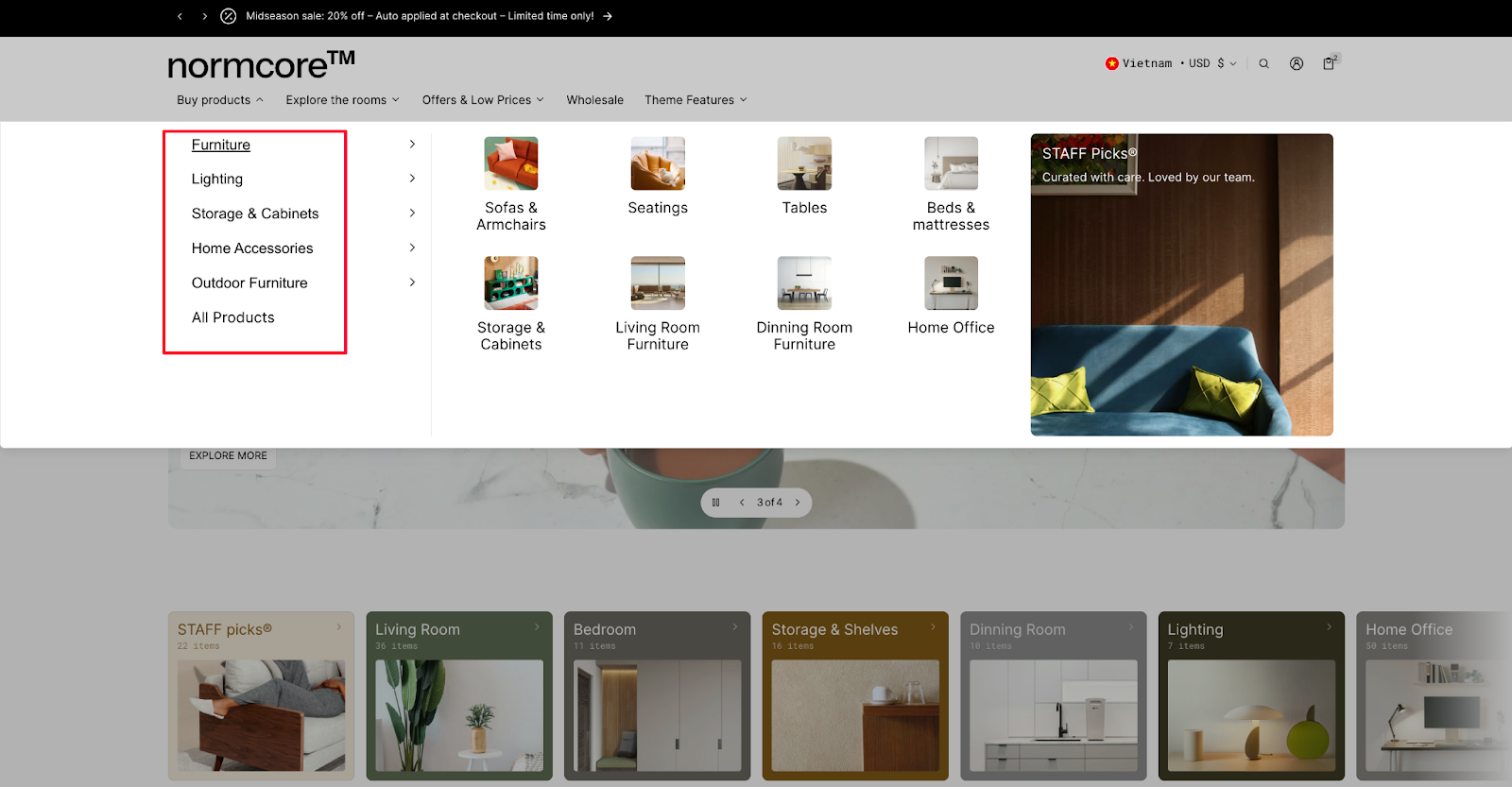
The Vertical Menu block is a versatile navigation tool that helps organize and display your store’s menu items in a vertical format. It’s particularly beneficial for:
- Complex product catalogs with multiple categories
- B2B stores with extensive product lines
- Category-focused navigation
- Specialized product collections
- Multi-level menu structures
The block stands out for its ability to provide clear hierarchical navigation while maintaining full customization control for both desktop and mobile displays.
How to Access the Vertical Menu in Normcore
From your Normcore Admin Dashboard, Access Header section > click the “Add Block” button, search for “Vertical menu” and select it from the Blocks category.
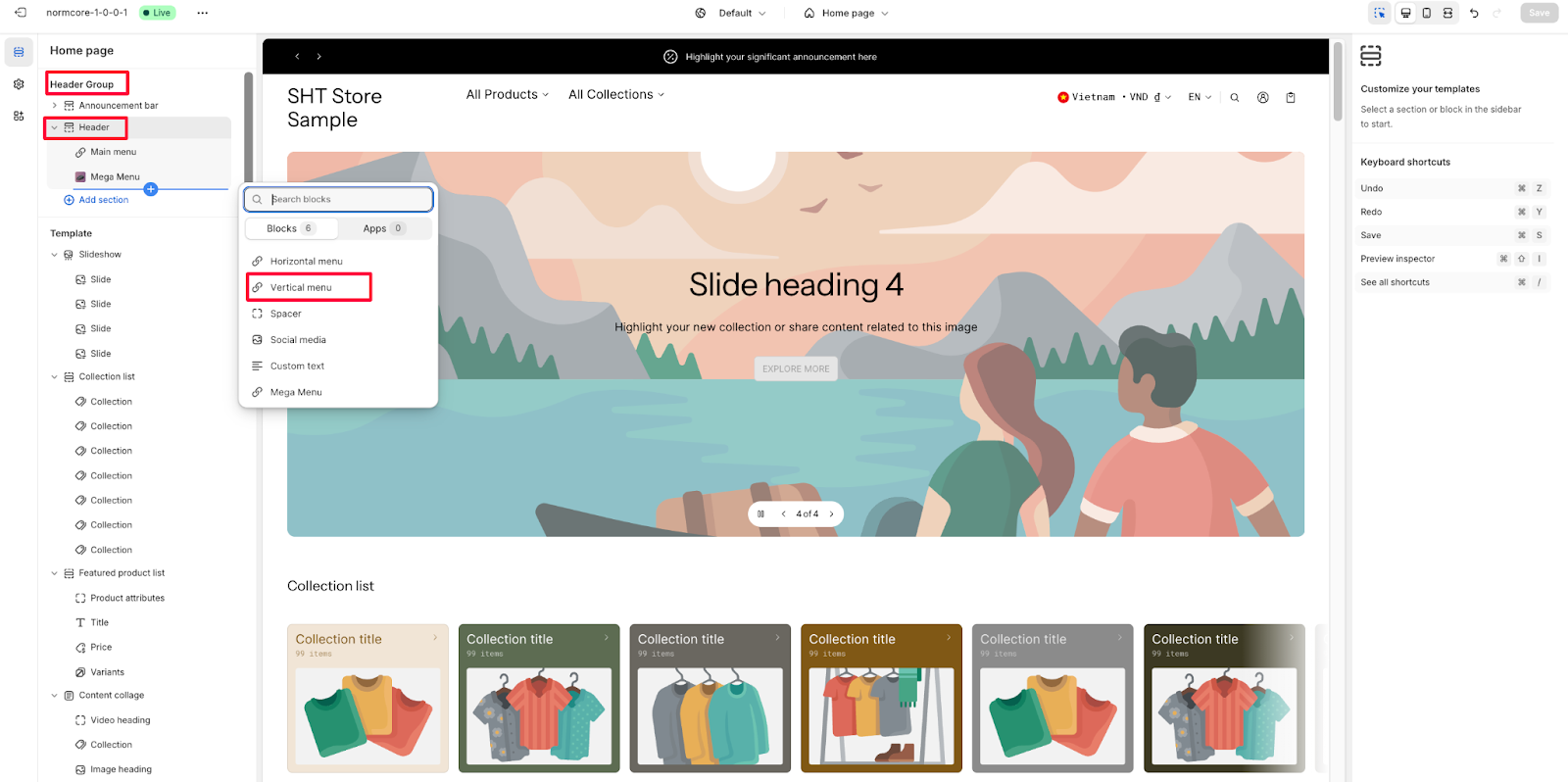
After adding the Vertical Menu block, you can customize its appearance and functionality through the available settings in the sidebar.
How to Configure Vertical Menu Block
Basic Components
Each Vertical Menu block includes the following components:
- Menu selection
- Text size options
- Block width settings
- Block alignment controls
- Mobile display settings
To begin customizing, click the “Vertical menu” block to access its settings.
General
Within General settings, you can configure:
- Menu: Choose your preferred menu from the dropdown
- Text size: Select between Regular and Small options
Desktop Layout
For desktop view, you can adjust:
- Block width: Choose from 4 cols (1/3) and other width options
- Block alignment: Set to Left, Center, or Right to align content within block width
Mobile Layout
For mobile devices, you can:
- Show in menu drawer: Toggle the visibility of the menu in the mobile menu drawer
The mobile layout inherits other settings from the desktop configuration while optimizing for smaller screens.
Common Cases & FAQs
1. How can I create a multi-level menu structure?
In the Normcore theme, you can create hierarchical menus by:
- Setting up parent categories as top-level items
- Adding subcategories as child items
- Organizing products within appropriate subcategories
2. What’s the best practice for menu organization in B2B stores?
For B2B stores, we recommend:
- Grouping products by industry or application
- Using clear, professional category names
- Limiting menu depth to 3 levels for optimal navigation
- Including important B2B-specific categories like bulk ordering or customer support
3. How to optimize the vertical menu for mobile users?
To ensure the best mobile experience:
- Enable the “Show in menu drawer” option for easy access
- Use concise category names that fit mobile screens
- Test navigation flow on various mobile devices
- Consider using the Small text size option for better readability