Featured Product
About Featured Product Section
The Normcore Featured Product section is a powerful tool for showcasing your key products prominently in your store. It enables you to highlight specific products with complete product details and purchase options, ideal for:
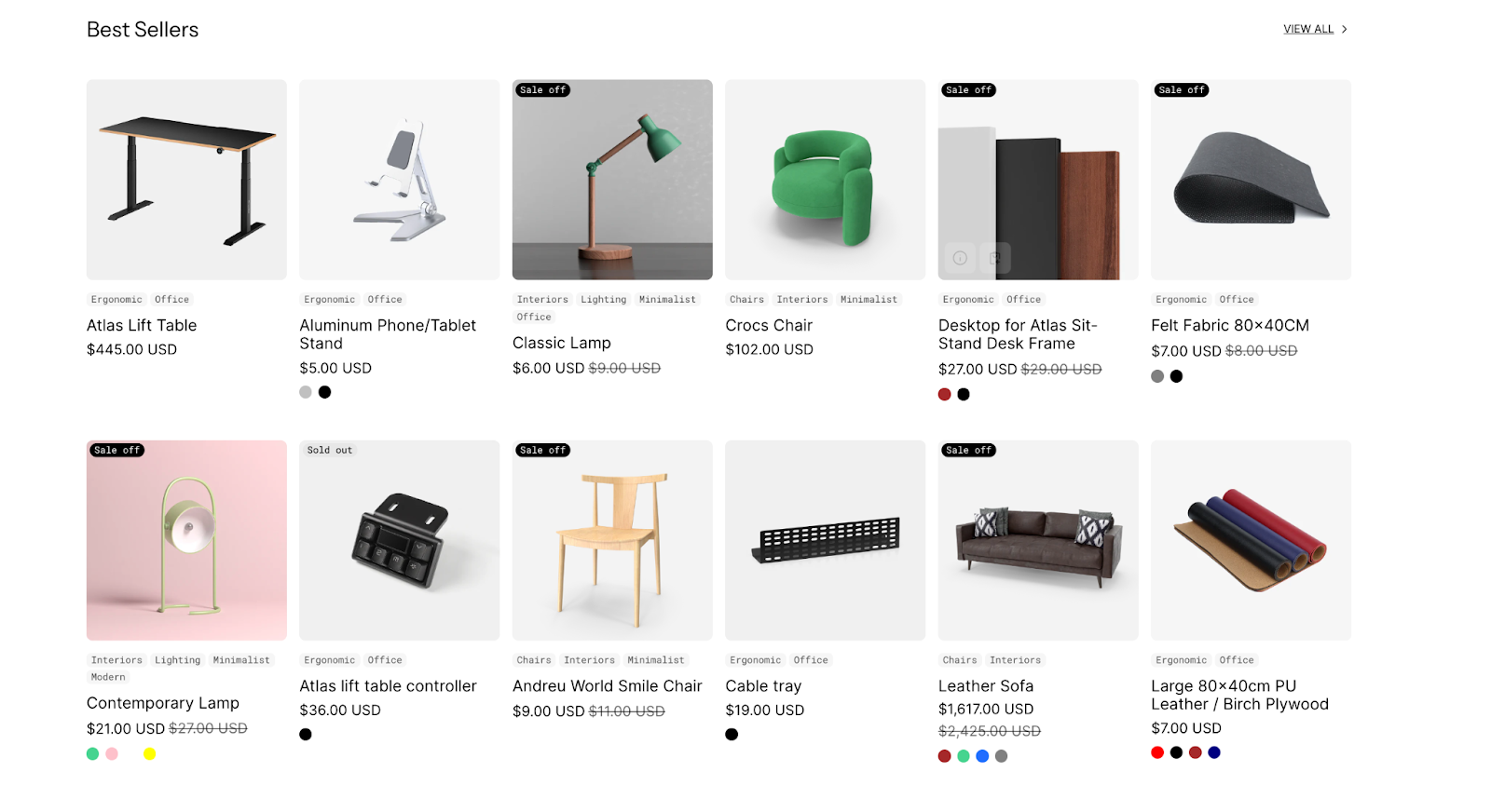
- New product launches
- Best-selling items
- Seasonal promotions
- Limited-time offers
- Special collections
The section stands out for its ability to display comprehensive product information including title, vendor, price, variant options, and detailed specifications while maintaining full customization control for both desktop and mobile displays.
How to Access Featured Product Section
From any page in your Normcore Admin Dashboard, click the “Add section” button, search for “Featured Product” and select it.
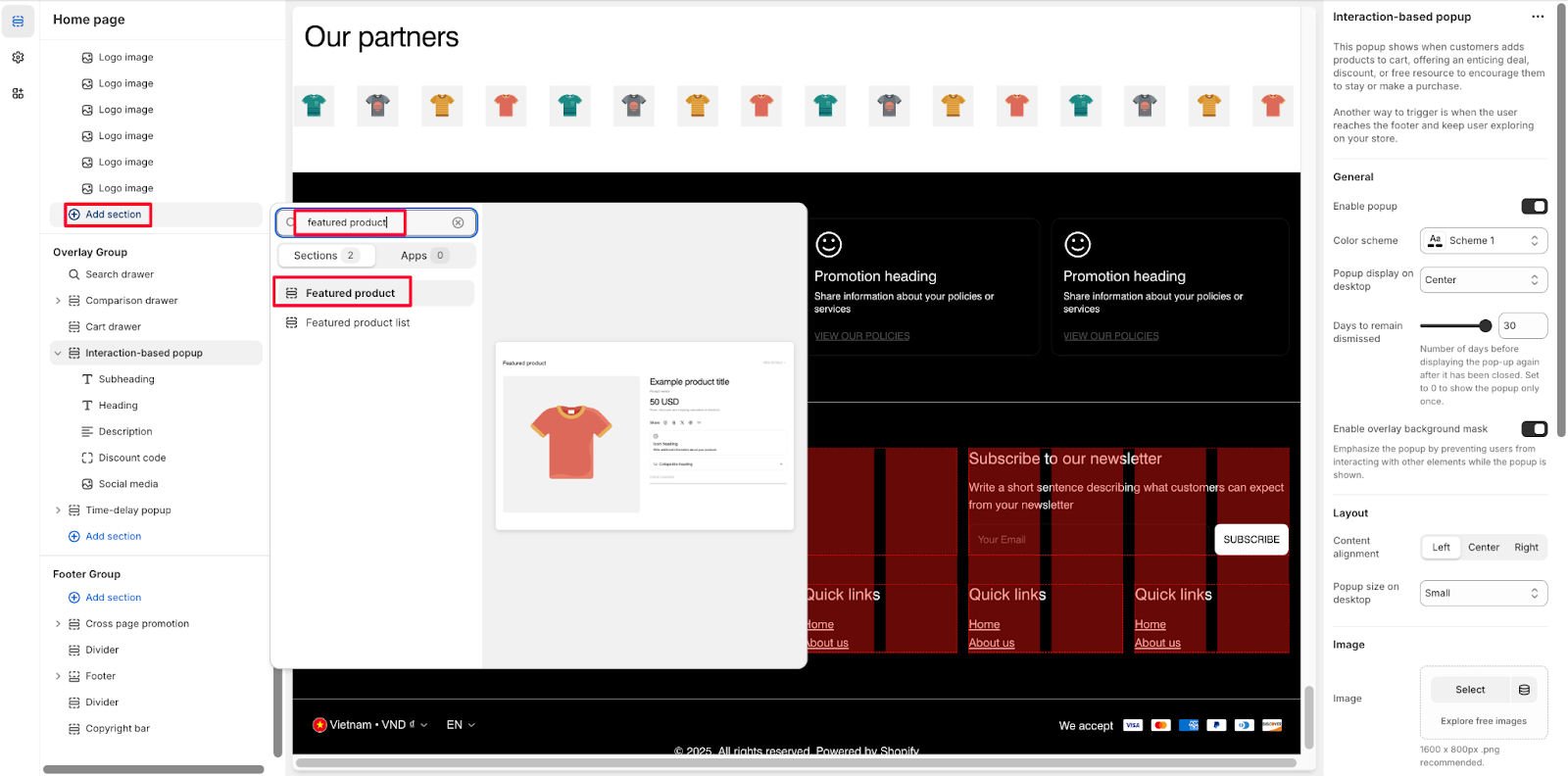
After adding the Featured Product section, customize its appearance and functionality using the available settings.
How to Configure Featured Product Section
Basic Components
Each Featured Product section includes several components: Title, Vendor, Price, Variant selector, Buy buttons, Description, Share, Icon with text, Collapsible item, Popup content, Performance Graphs, Customization note, Complementary products, Product type, Product code, Attributes, Custom text, Custom liquid, Pickup availability, Divider.
The “Featured Product” section shares similarities with the “Product Details” section but is simplified by excluding features such as zoom, lightbox on media, and collapsible content, while also including a dedicated section for heading, description, and button, with other layout adjustments tailored for desktop and mobile.
To begin customizing, click the “Featured Product” section to access its settings.
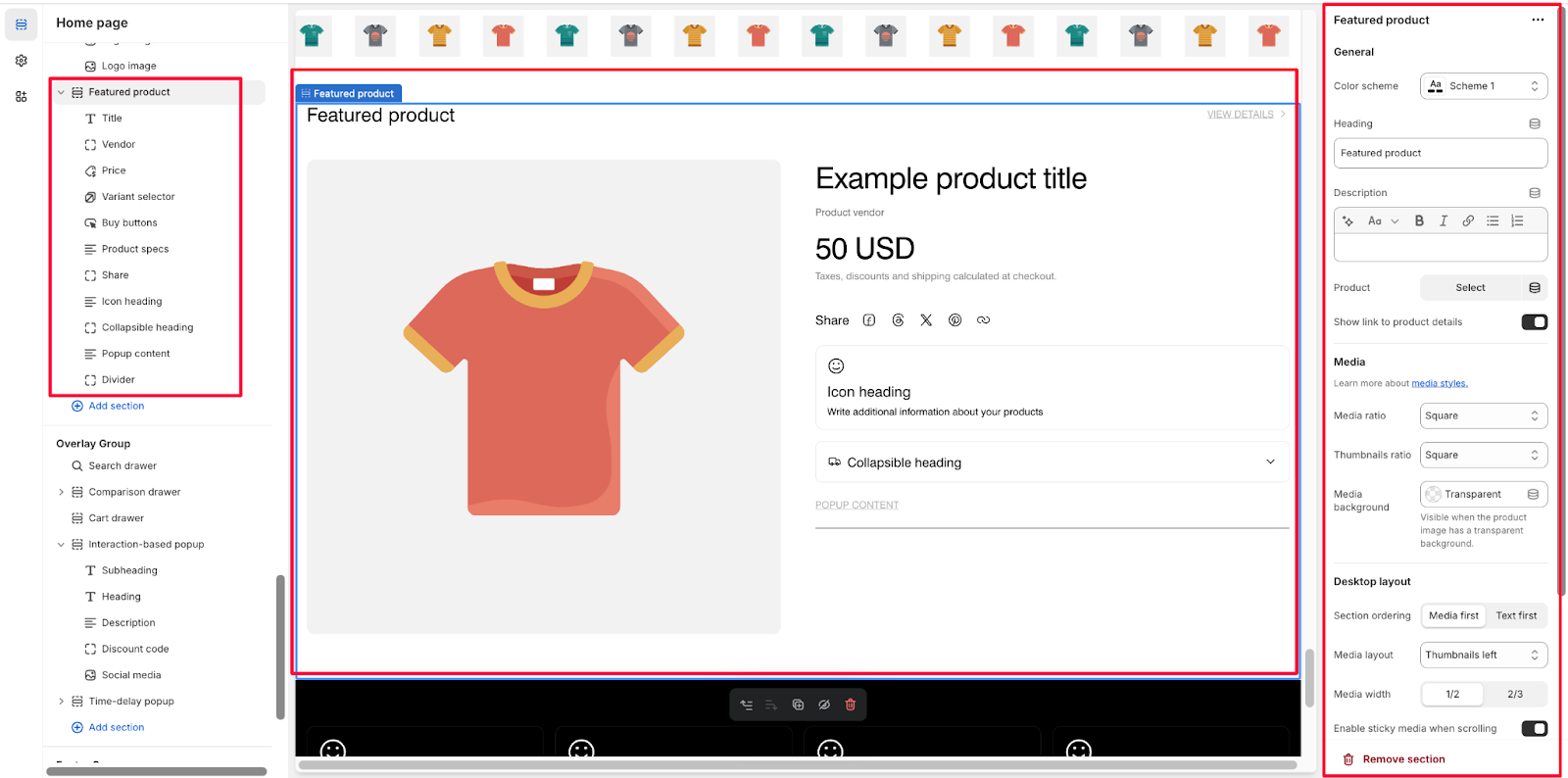
General
Within General settings, you can:
- Choose color scheme
- Customize heading
- Add description
- Select product
- Show/hide link to product details
Media Settings
The Media section allows you to:
- Select media ratio
- Choose thumbnails ratio
- Set media background
Control Layouts
In Normcore, configure two types of screen resolutions:
- Desktop layout:
- Section ordering
- Media layout
- Mobile layout:
- Show/hide media thumbnails
Theme Settings
Configure additional theme settings (note that these settings affect the whole site):
- Variant option name
- New in date limit
- Enable/disable button uppercase
- Show/hide currency code
- Text size
- Toggle icon
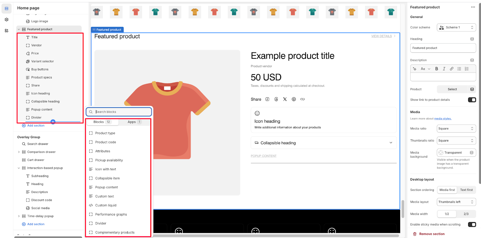
How to Configure Featured Product Section’s Blocks
You can choose “Add block” to add more blocks to the Featured Product section. The following blocks are available:
Title
You can adjust the product tile size by selecting among options: Extra large, Large, Regular, Small
Vendor
You can customize the Vendor block in Theme Settings.
Price
For Price, you can customize:
- Text size options
- Custom color settings
- Display options: Show/hide tax and shipping policy
- Stock status settings:
- Define Stock status in Theme settings > Product information
- Show/hide Sold out badge
- Show Sale badge
- Show/hide New in badge
Variant Selector
- Stock Status Configuration:
- Define Stock status in Theme settings > Product information
- Show/hide Low stock status
- Show/hide stock counter
- Selector Settings:
- Choose selector style
- Show/hide variant swatches (Config product variants as variant swatches in Theme settings > Product information)
- Size Guide Options:
- Automatically applies to variant option
- Enable/disable size guide
- Customize heading
- Select content
Buy Buttons
- Quantity Selector: Show/hide quantity selector
- Buy Buttons Options:
- Show/hide dynamic checkout buttons
- Show/hide recipient information form for gift card products
- Payment Method Display:
- Show/hide payment method
- Add payment methods in payment settings
- Customize heading
Description
- Heading customization
- Display options:
- Show as Regular
- Expand collapsible by default
Share
The merchants can share this product by clicking buttons of social media. This feature enhances user experience and page performance. If you don’t want this default block, you can hide or delete it.
Product Type
- Customize background with transparent color option
- Add custom color settings for product type display
Product Code
- Configure product code display:
- SKU only
- Barcode only
- Both SKU and barcode
- Set custom color for background
Attributes
- Display product attributes by configuring in Theme settings > Product information
- Manage how attributes appear in your store
Pickup Availability
- Shows available offline stores for the selected variant
- Option to show expected pickup time
- Customize background and content colors
Icon with Text
- Icon Settings:
-
- Choose icon source from Theme library
- Select theme library icons
- Upload custom image
- Add Custom SVG
- Set custom icon color
- Text Settings:
-
- Add heading
- Include description
- Layout Options:
-
- Set block width
- For 1/2 width, use 2 blocks to make 2 items per row
Collapsible Item
- Icon Configuration:
-
- Toggle icon visibility
- Choose from Theme library
- Upload custom image
- Add Custom SVG
- Set custom icon color
- Content Settings:
- Option to expand collapsible by default
- Add heading
- Include descriptive text
Popup Content
- Text configuration
- Select popup content
- Customize button color
- Icon Settings:
-
- Toggle icon visibility
- Choose from Theme library
Custom Text
- Add additional product text
- Set custom content color
- Option to truncate text when reaching limit
Custom Liquid
- Add app snippets or other Liquid code for advanced customizations
Performance Graphs
This block displays single or multiple graphs using metaobject. You can find more details from here.
Customization Note
Customization Note block, which collects additional customer information during the product selection process, includes these default components:
- Label: The text that appears above the input field
- Input type:
- Text: Choose between single-line text or expandable text area
- Checkbox: Include a selectable option with a customizable value. Value when selected (for checkbox type): Determines what text is added to cart when a checkbox is checked. If left empty, defaults to “yes“
You can add multiple Customization Note Blocks to the same section by clicking “Add block” again. Each block will appear under the variant selector on your product page.
Divider
Using a divider to clearly separate sections or blocks. You can customize the divider color within this block.
Complementary Products
- Configure using the Search & Discovery app
- Add heading
- Set the number of products to show
- Display options:
-
- Show/hide vendor
- Show/hide price
- Show/hide quick view
- Quick buy options: Normcore supports ‘Quick buy’ allowing user quickly add products to cart. You can choose Quick Buy options in Theme settings. There are 2 types of quick buy:
-
- Standard: Allows users to add a single variant at a time
- Bulk: Allows users to add multiple variants at a time
Common Cases and FAQs
1. What are the key differences and similarities between the “Featured Product” section and the “Product Details” section in terms of features, layout, and functionality?
The “Featured Product” section shares similarities with the “Product Details” section. However, the “Featured Product” section excludes zoom, lightbox, and collapsible content features present in “Product Details”.
2. What’s the best way to showcase product attributes?
Configure product attributes in Theme settings > Product information first, then add the Attributes block to display them. This ensures consistent attribute presentation across your store.
3. How do I set up pickup availability information?
Add the Pickup Availability block and enable “Show expected pickup time” to provide customers with clear collection options for your offline stores.
4. How do I optimize complementary product displays?
Use the Search & Discovery app to select relevant complementary products. You can show up to 3 products and customize their display with vendor information, pricing, and quick view options. For bulk purchase products, select the “Bulk” quick buy option.