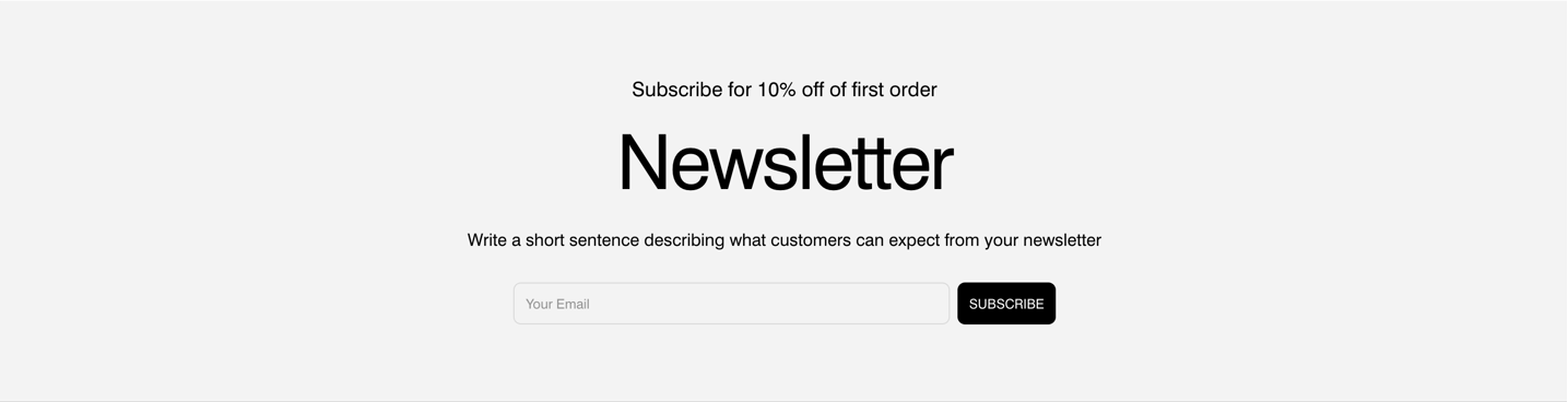
Newsletter
About Normcore Newsletter section
The Normcore Newsletter section is a customizable newsletter signup feature. It allows users to create visually appealing and functional newsletter sections with various settings for background images, content, and styling. This section is designed to be flexible, catering to different design needs with options for both desktop and mobile displays. The settings include options for a transparent header, background images, content blocks and button customizations.
How to access this section
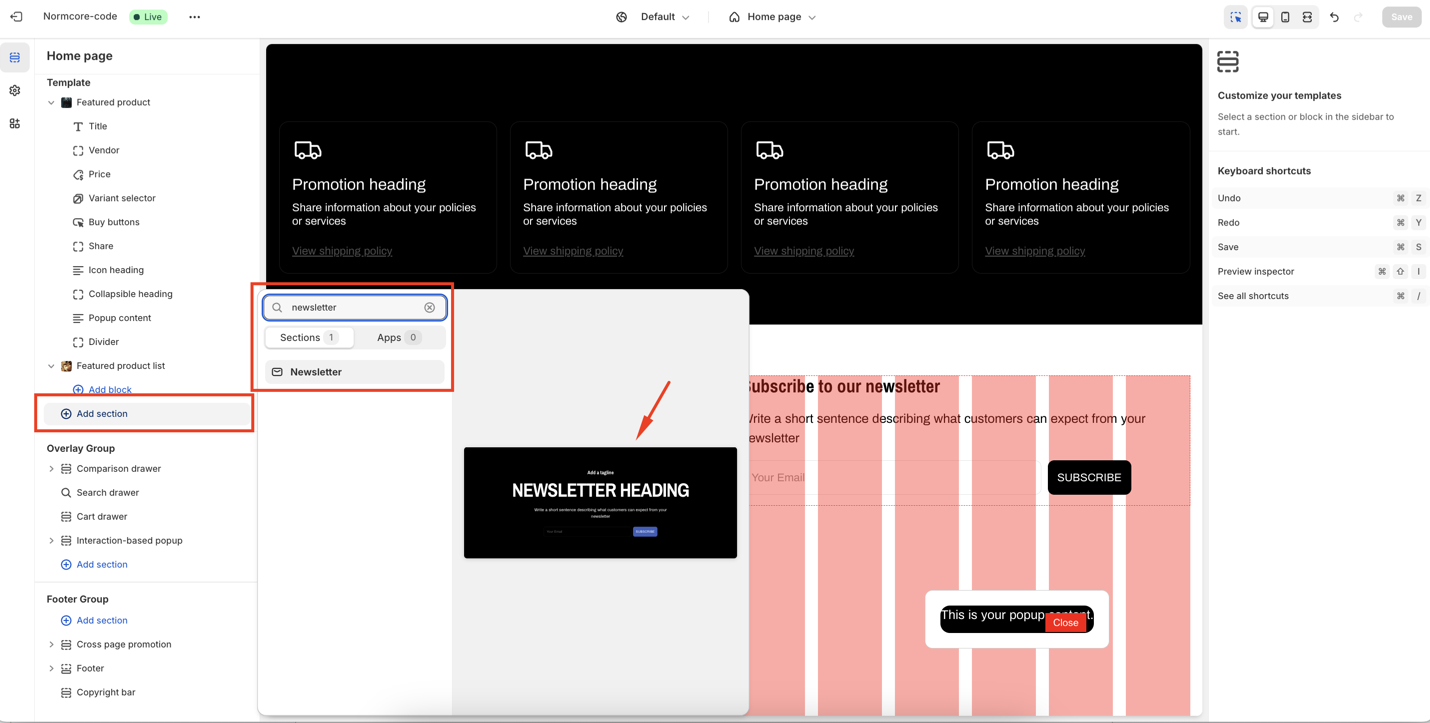
You can follow the steps to access Newsletter section:
- Navigate to your Admin Dashboard
- Click the “Add section” button
- Search for “Newsletter“
- Select to add the section to your page
How to Configure The Newsletter section
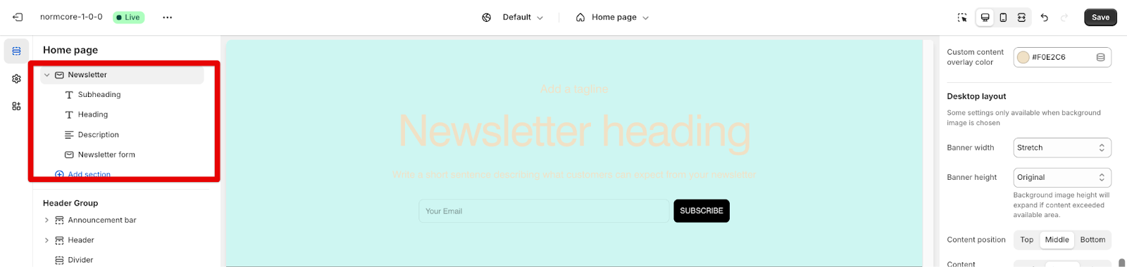
Basic components
Each Newsletter section includes five default components:
- Subheading
- Heading
- Description
- Newsletter form
To begin customizing, click the “Newsletter” section to access its settings.
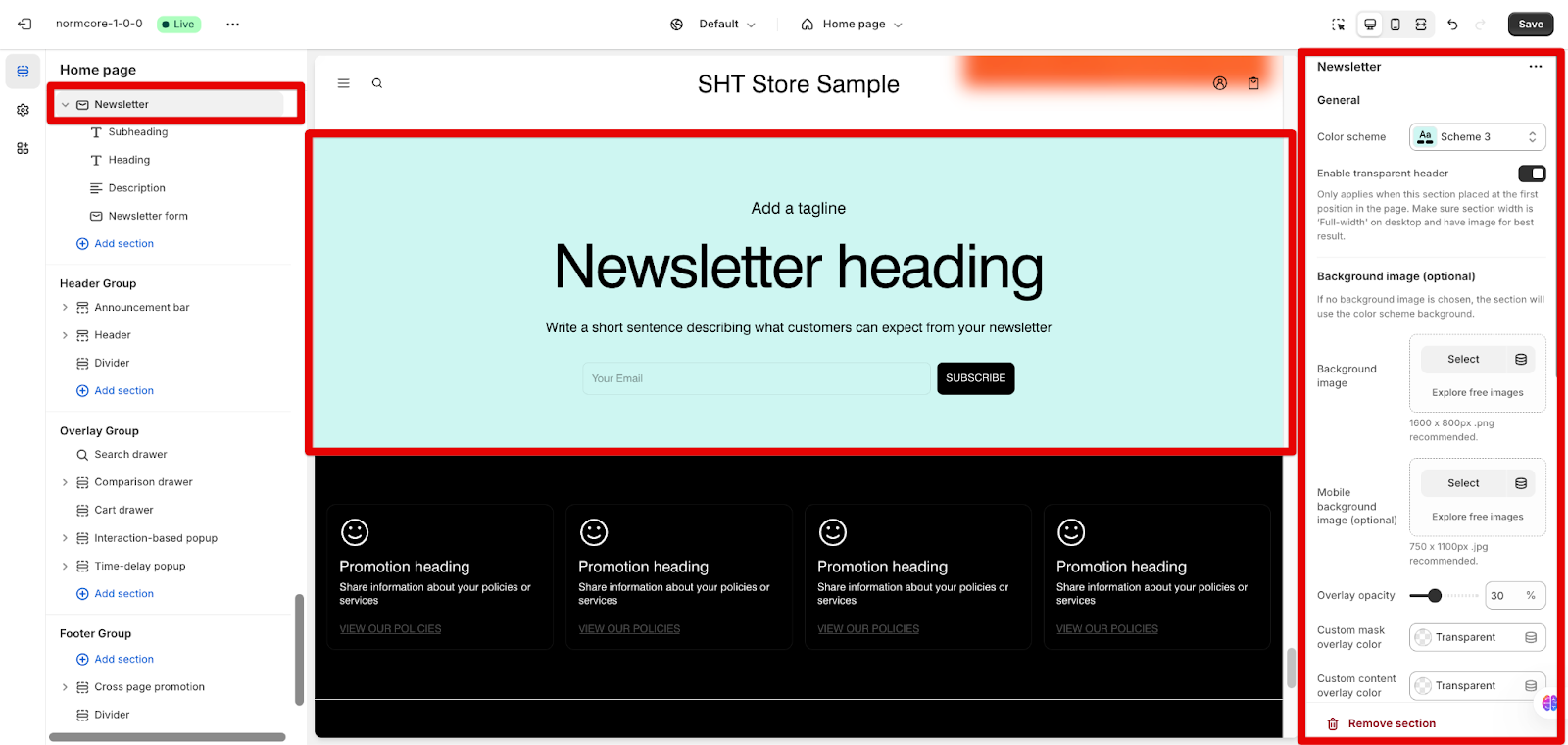
General Settings
- Color Scheme: The overall color scheme can be modified.
- Transparent Header: A transparent header can be enabled when the section is at the top of the page. This feature is active only if a background image is set.
- Spacing: Spacing is automatically adjusted to accommodate the header when it is transparent.
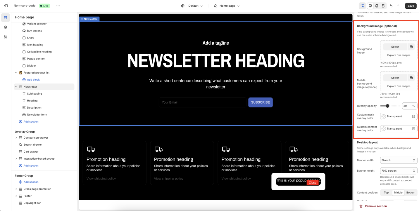
Background Image
Separate images can be chosen for desktop and mobile views.
An overlay with adjustable opacity can be applied. The overlay color defaults to the color scheme or a custom color. You can custom overlay color for:
- Custom mask overlay color: for the section background
- Custom content overlay color: for the heading, subheading, and description
Desktop and Mobile Layouts
- Banner Width: Options “Max width”, “Full width” (with padding), and “Stretch” (stretches to fill the screen) are available for desktop layout only. These settings are only applicable when a background image is selected. If no image is selected, the section defaults to “Hug content”.
- Banner Height: Select an appropriate section height type to achieve the desired visual impact on desktop and mobile views. The available options, include original height, “hug content”, and predefined percentages such as 50%, 70%, or fill screen height.
- Content Position: The content can be positioned at the top, middle, or bottom of the banner.
- Content Alignment: Content can be aligned to the left, right, or center.
How To Configure Section’s Blocks
The section uses a block-based system which enables you to configure each section block separately.
The following are some ways to configure the blocks:
- Subheading: The text can be modified, and uppercase can be enabled…
- Heading: The heading text and size can be changed, and the heading can be set to H1 for SEO configuration.
- Description: The text of the description can be changed, and multiple description blocks can be added.
- Newsletter Form: The submit button text can be customized. If leaving blank, its default value is “Subscribe”
Common Cases and FAQs
1. What happens if I don’t use a background image?
If no background image is selected, the section defaults to “Hug content” and the background is in the default color of the color scheme.
2. Why doesn’t the transparent header work?
The transparent header only works when it lies right below the header. You should set the background image/color to see the difference.
3. Is the background color the same as the text color?
A: No, the background color only affects the content text color, it does not change the color from Theme settings > Colors > Color Scheme.