Content Collage
About Content Collage Section
The Content Collage section is a versatile tool for creating dynamic, multi-element layouts on your website. It enables you to combine different types of content blocks, ideal for:
- Product showcases
- Mixed media presentations
- Brand storytelling
- Campaign layouts
- Custom landing pages
The section stands out for its ability to display various content types including video headings, text headings, image headings, products, and collections while maintaining full customization control for both desktop and mobile displays.
How to Access Content Collage Section
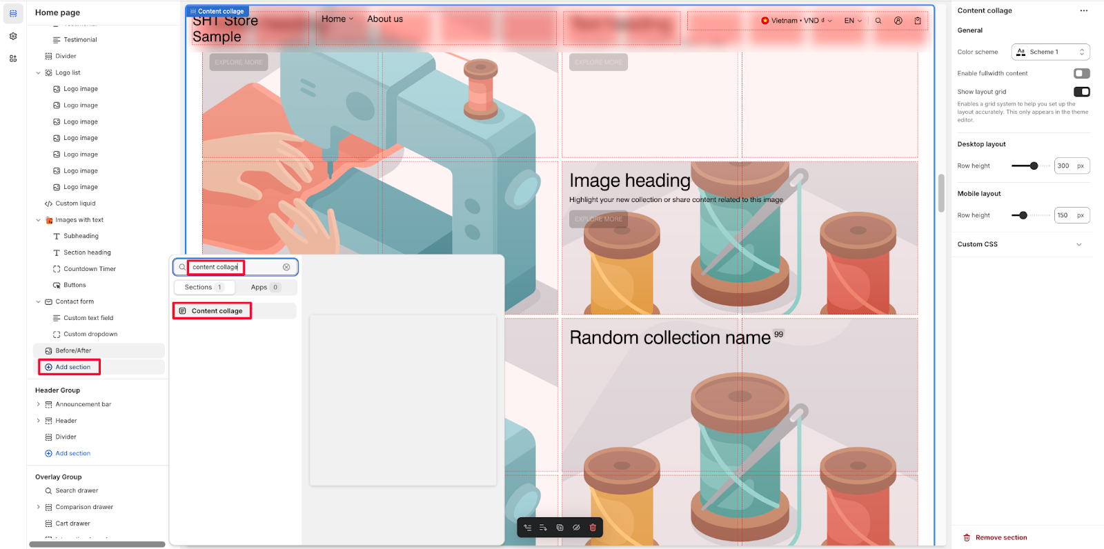
From any page in your Normcore Admin Dashboard, click the “Add section” button, search for “Content Collage” and select it.
After adding the Content Collage section, customize its appearance and functionality using the available settings.
How to Configure Content Collage Section
Basic Components
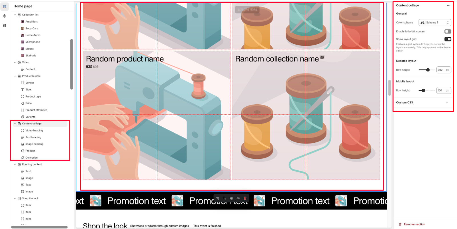
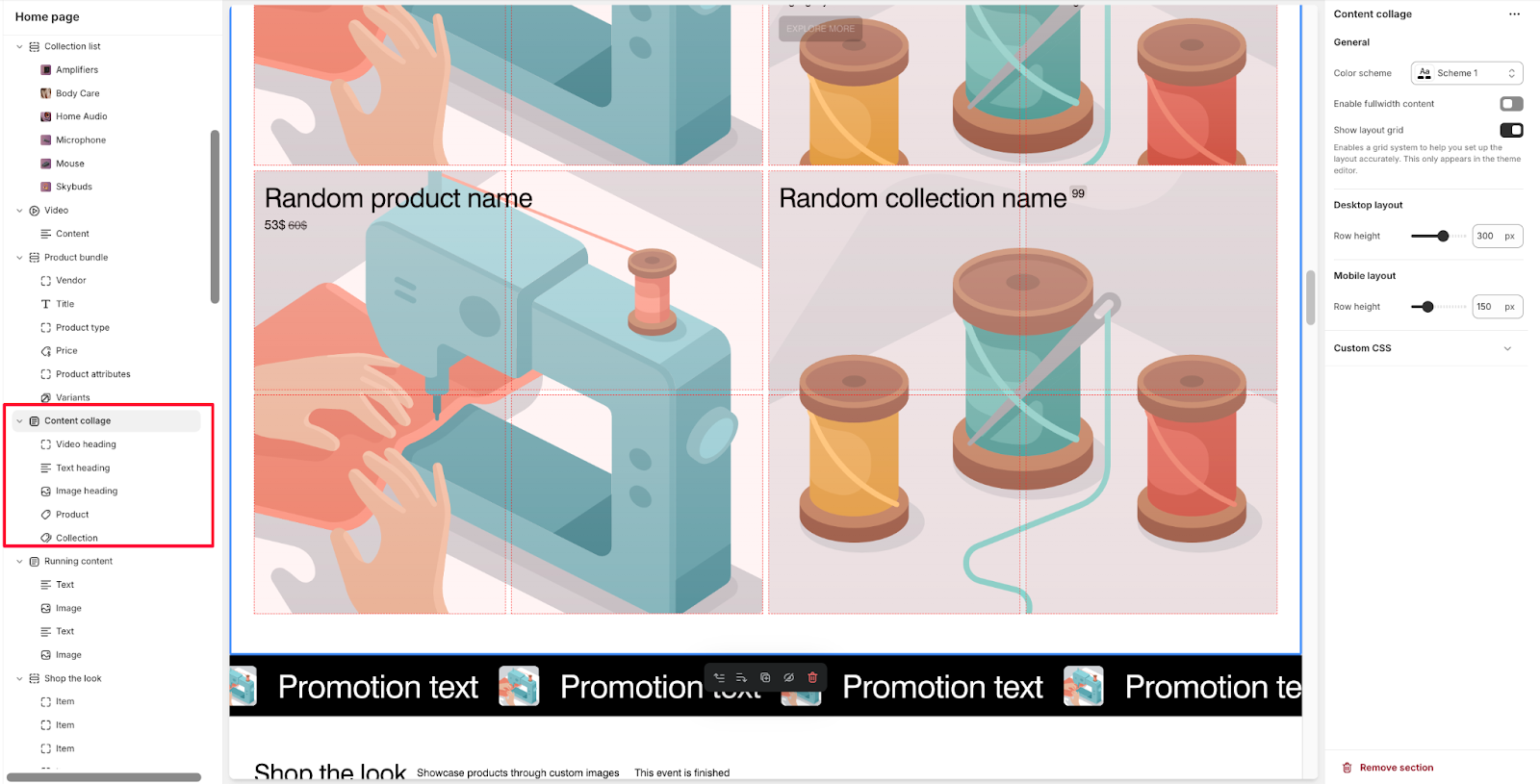
Each Content Collage section includes five default components:
- Video heading
- Text heading
- Image heading
- Product
- Collection
You can choose to add and arrange these components based on your layout needs by using the Content collage dropdown menu.
General
Within General settings, you can:
- Change color scheme with Scheme 1 option
- Enable fullwidth content
- Show layout grid (Enables a grid system to help you set up the layout accurately. This only appears in the theme editor)
Control Layouts
In Normcore, configure two types of screen resolutions:
- Desktop layout: Customize row height (up to 300 px)
- Mobile layout: Adjust row height separately (up to 150 px) for optimal mobile viewing
How to Configure Content Collage Section’s blocks
Video Heading Block
In the Video heading block, you can configure:
Text Settings
- Customize heading text
- Enable <h1> tag (Use <h1> tag for this heading. One per page recommended)
- Select heading size (Small, Medium, Large)
- Add description with rich text formatting options
- Highlight your new collection or share content related to this video
Background Video
- Choose video source (Shopify-hosted)
- Add external video (Accepts YouTube or Vimeo links)
- Select Shopify-hosted video
Overlay Settings
- Adjust overlay opacity (up to 30%)
- Customize mask overlay color
- Set custom content overlay color
Text Heading Block
The Text heading block includes these customization options:
Text Settings
- Add text heading
- Enable <h1> tag (One per page recommended)
- Choose heading size (Small, Medium, Large)
- Add description for your collection, product, or other content
Image Heading Block
Configure the Image heading block with:
Text Settings
- Set image heading text
- Enable <h1> tag (One per page recommended)
- Select heading size (Small options available)
- Add description to highlight your new collection or share content related to this image
Image Settings
- Upload background image or explore free images
- Add mobile background image separately
- Adjust overlay opacity (30%)
- Customize mask overlay color
- Set custom content overlay color
Product Block
The Product block offers these settings:
General Settings
- Select product
- Show/hide product title
- Choose product title size (Small)
- Toggle price display
- Set custom color
- Show variant swatches
- Limit variant options (up to 5 variants)
- Add custom background image (First product image is used if no custom background is selected)
Collection Block
For Collection blocks, configure:
General Settings
- Select collection
- Show/hide collection title
- Choose collection title size (Small)
- Show collection quantity
- Select quantity style (Title supplement)
- Add custom background image (Collection image is used if no custom background is selected)
Layout Settings for All Blocks
Each block type includes these layout controls:
Desktop Layout
- Content position
- Content alignment
- Column selection
- Row selection
Mobile Layout
- Recommend using 2 columns for cards with long heading
- Content position
- Content alignment
- Column selection
- Row selection
Button Options For All Blocks
For each block, you can customize button options:
- Add button label
- Choose button style
- Add link
- Customize button colors
Common Cases and FAQs
1. How to improve SEO with Content Collage headings?
In Normcore theme, you can enhance SEO by using the <h1> tag option available in video, text, and image heading blocks. Remember that only one <h1> tag per page is recommended for optimal SEO performance. You can enable this feature in the block settings under the heading options.
2. What’s the best way to layout content for mobile devices?
For optimal mobile display:
- Use 2 columns for cards with long headings to ensure better readability
- Set separate content positions and alignments for mobile layout
- Adjust row height specifically for mobile viewing
- Consider using the mobile background image option for image heading blocks
3. How can I customize the appearance of product variants?
When displaying products in your Content Collage:
- Enable “Show variant swatches” to display product options
- Use the variant limit option to control how many variants appear (up to 5)
- When the limit is reached, excess variants will be shown as a number
- Set to 0 to display all variants
4. How do I make the entire block clickable?
To make an entire block clickable:
- Add a link in the Link field under Button settings
- Leave the button label empty
- The link will automatically apply to the whole block
5. How do I optimize video content in the Content Collage?
For the best video presentation:
- Choose between Shopify-hosted videos or external sources (YouTube/Vimeo)
- Adjust overlay opacity to ensure text readability (recommended 30%)
- Position content strategically using the content position options
- Customize overlay colors to match your brand and improve visibility
6. What’s the best way to display collections?
To effectively showcase collections:
- Enable collection title and adjust its size for visibility
- Use the collection quantity display to show available products
- Choose between “Title supplement” style for quantity display
- Add a custom background image or use the default collection image
- Position content using the desktop and mobile layout options


