Shop The Look
About Shop The Look Section
The Shop the Look section is a powerful tool for creating engaging product showcases in your Normcore theme. It enables you to display curated product collections with custom images, ideal for:
- Lifestyle product photography
- Product bundle showcases
- Complete outfit presentations
- Themed collection displays
- Visual merchandising
The section stands out for its ability to present products in both grid and carousel layouts while maintaining full customization control for both desktop and mobile displays.
How To Access Shop The Look Section
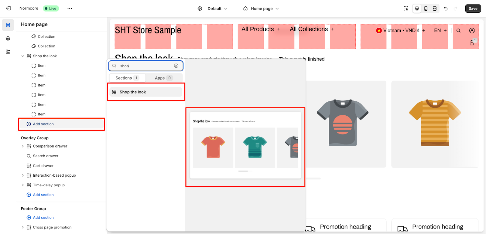
From any page in your Normcore Admin Dashboard, click the “Add section” button, search for “Shop the Look” and select it.
After adding the Shop the Look section, customize its appearance and functionality using the available settings.
How To Configure Shop The Look Section
Basic Components
Each Shop the Look section includes these basic elements that you can customize:
- General settings
- Gallery items
- Product cards
- Layout options
- Countdown timer
To begin customizing, click the “Shop the Look” section to access its settings.
General Settings
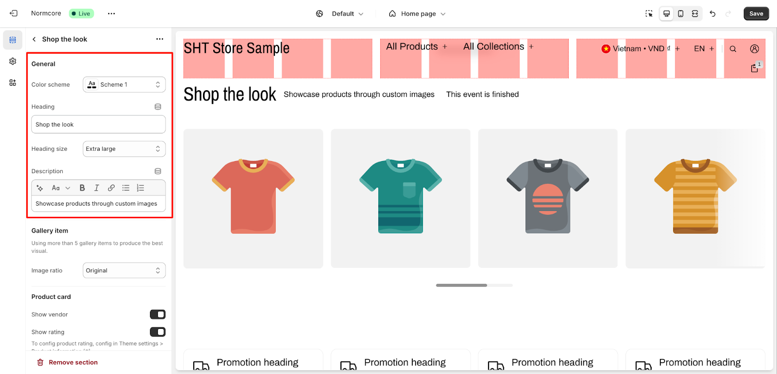
Within General settings, you can configure:
- Color scheme: Choose from preset options
- Heading: Set your section title
- Heading size: Select from options including “Extra large”
- Description: Add descriptive text to showcase your products
Gallery Item
For gallery items, you can:
- Add up to 5 gallery items for optimal visual presentation
- Adjust image ratio: Select “Original” or other preset ratios
Product Card
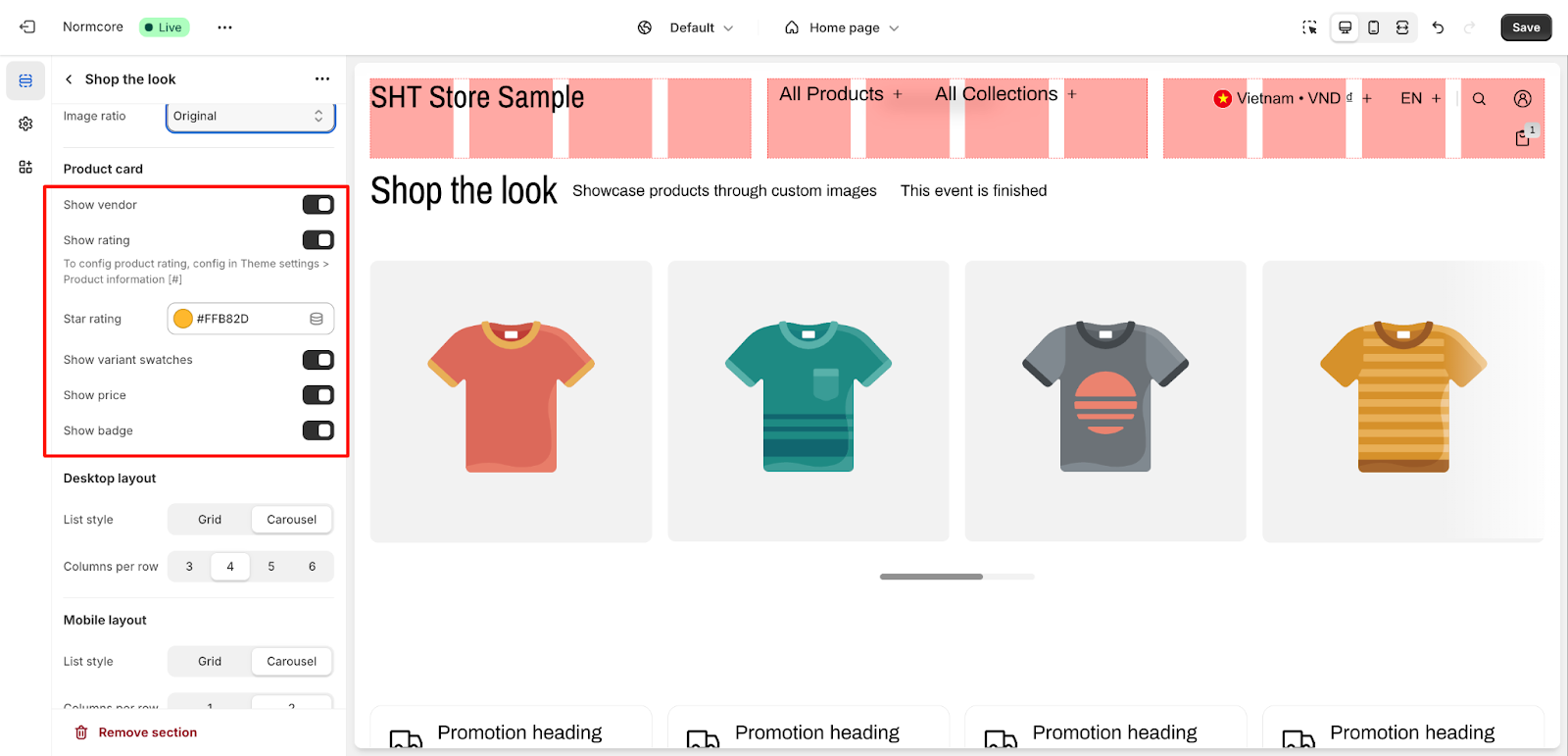
In the product card section, you can control:
- Vendor display: Toggle show/hide vendor information
- Rating display: Enable/disable product ratings, select the color for the star rating
- Variant swatches: Toggle the display of product variants
- Price display: Show or hide product prices
- Badge display: Enable or disable product badges
Layout Controls
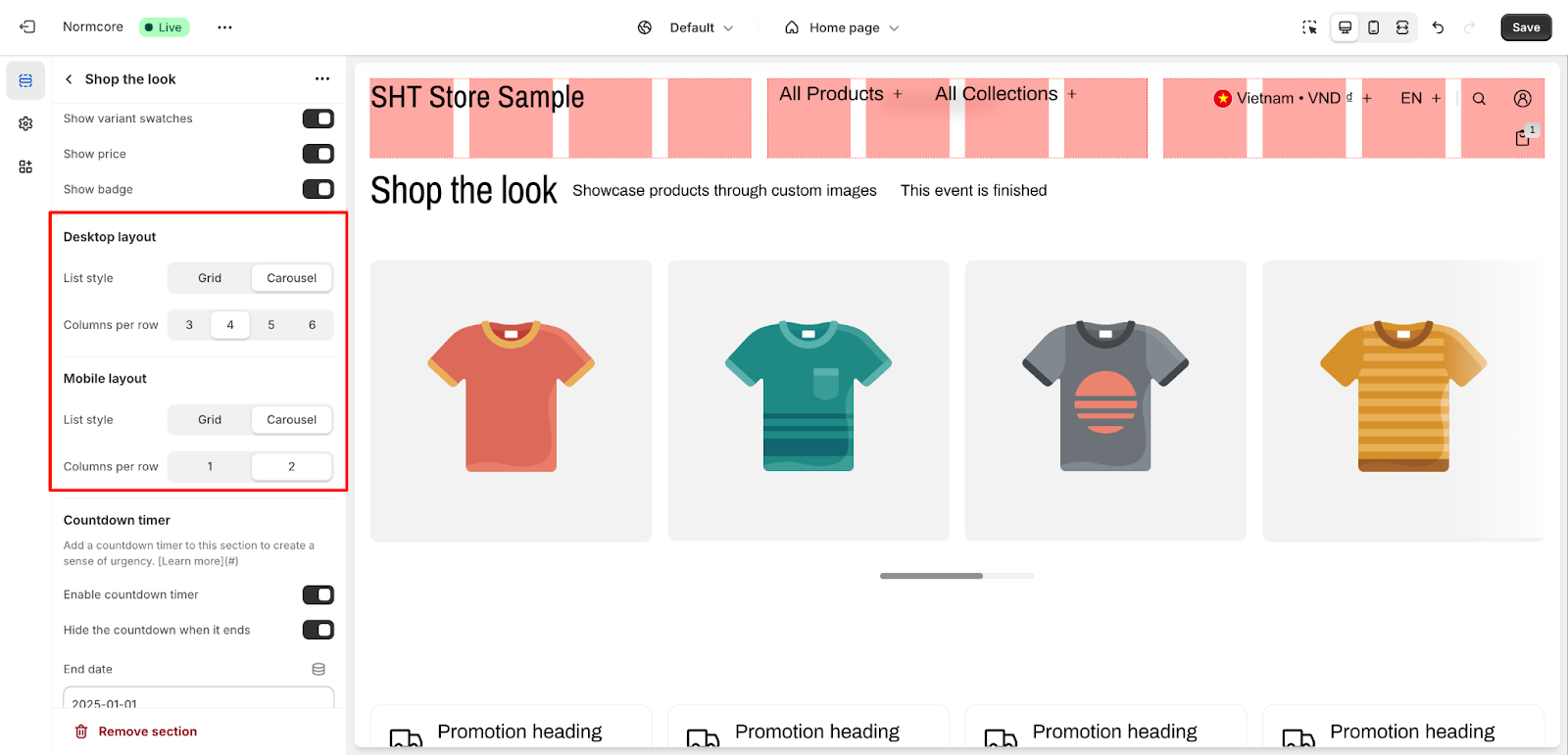
Configure two types of screen layouts:
Desktop Layout
- List style: Choose between Grid or Carousel
- Columns per row: Select from 3, 4, 5, or 6 columns
Mobile Layout
- List style: Select Grid or Carousel
- Columns per row: Choose between 1 or 2 columns
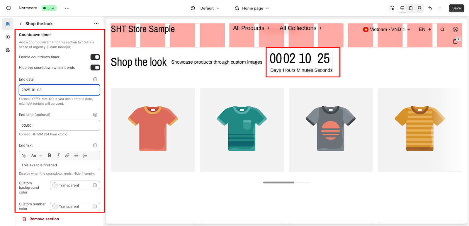
Countdown Timer
Add urgency to your showcase with these timer settings:
- Enable countdown timer: Toggle the timer feature
- Hide countdown when finished: Control timer visibility after completion
- End date: Set in YYYY-MM-DD format (defaults to midnight if not specified)
- End time: Optional setting in HH:MM format (24-hour clock)
- End text: Customize message displayed when countdown ends
- Custom background color: Set timer background
- Custom number color: Adjust timer number display
How to Configure Shop The Look Section’s Blocks?
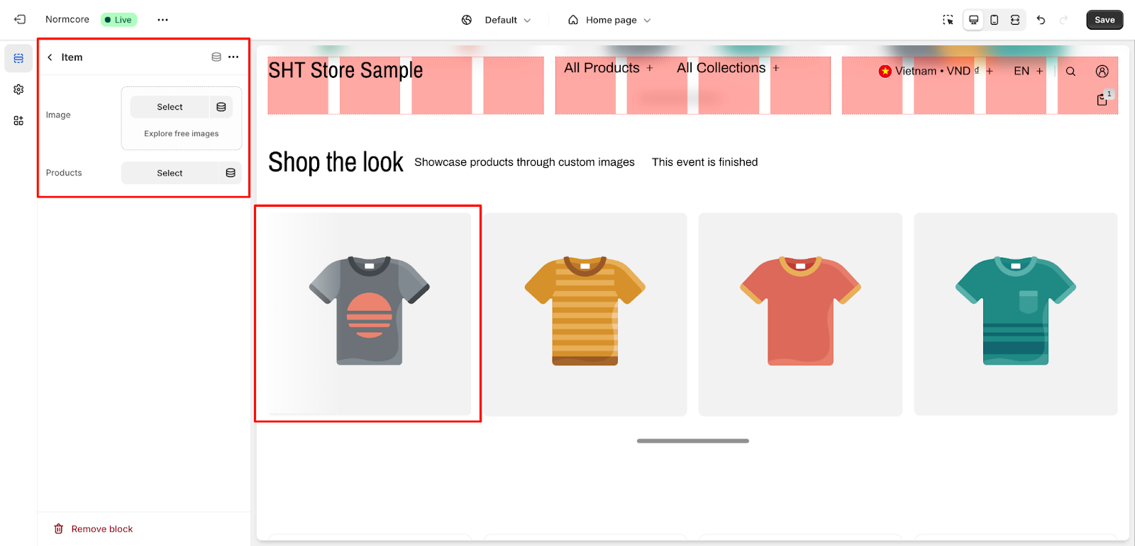
Each Shop the Look section can include up to 6 items, which you can manage through the sidebar navigation. To configure an individual item, click on the item you want to edit in the sidebar.
Configure these settings for each item:
- Image: Click “Select” to choose an image or use “Explore free images“
- Products: Click “Select” to choose products to feature in this item
Common Cases and FAQs
1. What’s the optimal layout for mobile viewing?
For mobile optimization:
- Choose between Grid or Carousel layout based on your content
- Limit columns to 1-2 per row for better visibility
- Ensure product cards are easily readable on smaller screens
2. How to optimize product card information?
Configure your product cards by:
- Enabling vendor information for product sourcing
- Showing ratings to build trust (configure in Theme settings > Product information)
- Displaying variant swatches for quick selection
- Showing prices and badges for important product information
3. What’s the best way to organize gallery items?
Best practices for gallery items:
- Use more than 5 gallery items to produce the best visual results
- Maintain consistent image ratios across items
- Organize products in a visually appealing grid or carousel
- Consider your target audience when selecting layout options
