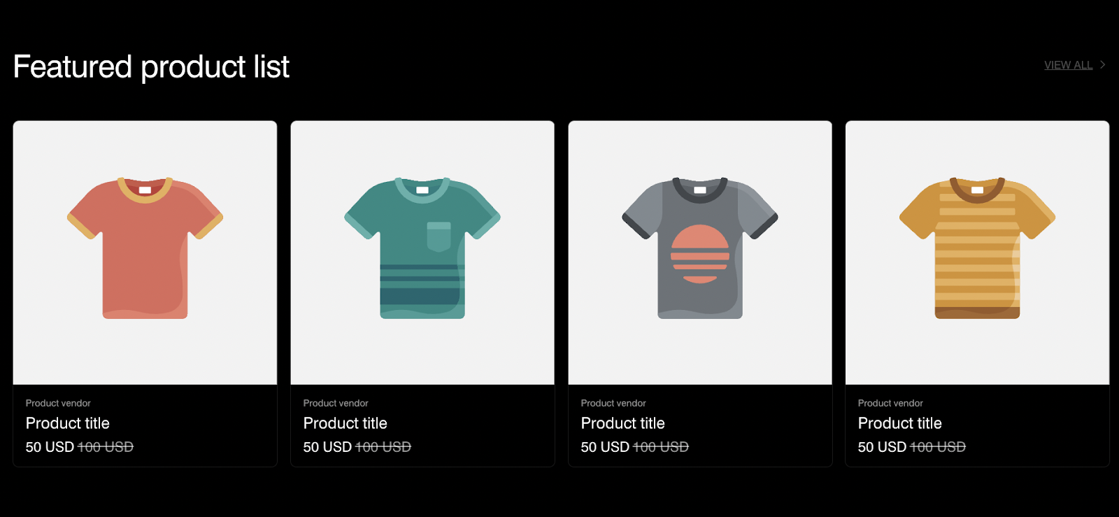
Featured product list
About Normcore Feature product list Section
About the Normcore Feature product list Section
The Normcore Feature product list Section is an excellent tool for creating impactful, visually engaging headers on your website. It lets you pair stunning background videos with dynamic, overlaid content. This makes it an ideal choice for a variety of purposes, including:
- Highlighting featured collections or products
- Announcing new arrivals
- Running promotional campaigns for specific products
- Curating seasonal or themed products
With complete customization options for both desktop and mobile views, the Feature Product List Section ensures your products are presented beautifully across all devices.
How to Access Feature product list Section
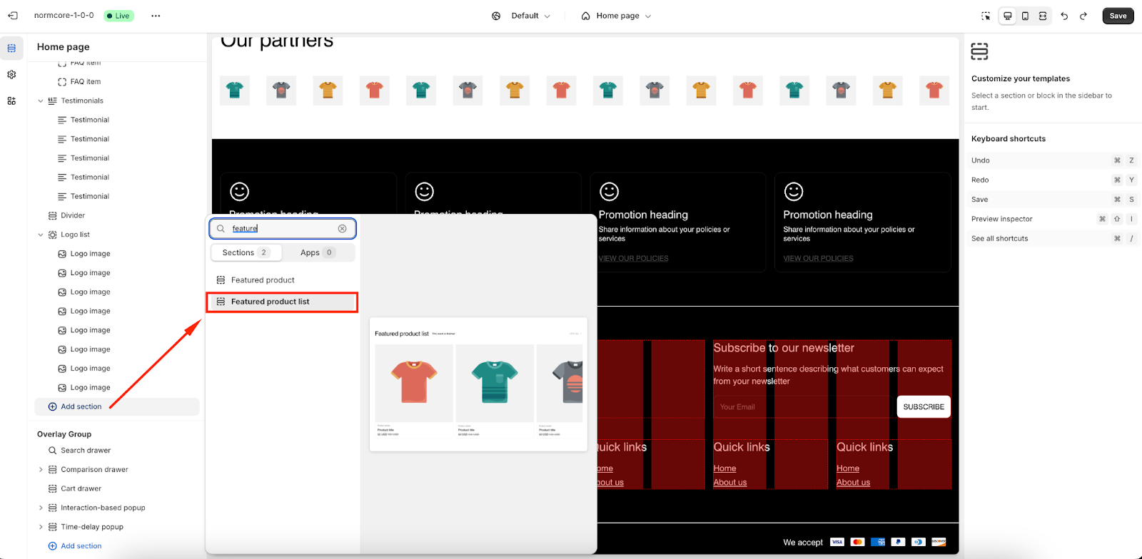
From any page in your Normcore Admin Dashboard, click the “Add section” button, search for “Feature product list” and select it.
Once the Feature product list section is added, you can customize its appearance and functionality using the available settings.
How to Configure Feature Product List Section
Basic Components
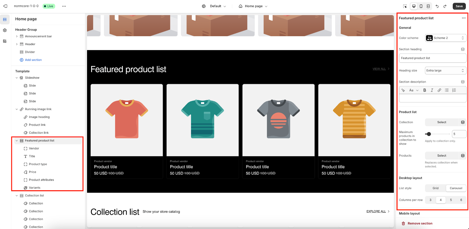
On each Feature product list section, we have 6 default blocks:
- Vendor
- Title
- Product type
- Price
- Product attributes
- Variants
You can choose “Add block” to add more “Description” blocks to add more paragraphs to the banner but the maximum will be 6 blocks.
To start customizing your Feature product list, click on the “Feature product list” section to access its settings.
General
In General, you can:
- Change Color Scheme
- Adjust Heading Size
- Add a Section Heading/ Description
Product list
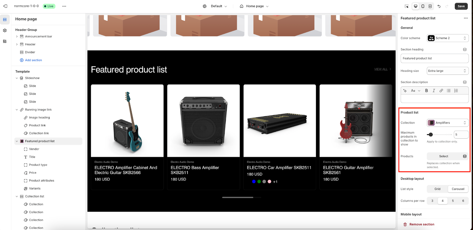
The Feature Product List Section offers two methods to display products:
- Collection: Choose an existing collection to showcase a curated group of products. The section will display all products within the selected collection, up to the specified limit.
- Products: Manually select specific products to feature in this section.
When the Product option is used, it overrides the selected collection and displays only the chosen products.
Control Layouts
On Normcore, you can configure for 2 types of screen resolutions:
- Desktop layout: List Style and Columns per Row
- Mobile layout: List Style and Columns per Row
Button Settings
- Label: Customize the button text.
- Link: Paste a URL or search for a page/product to link the button.
Please note that the button will be automatically hidden if there’s no link.
Quick Shop Options
You can enable a pop-up for customers to view product details and choose Quick Buy options: Standard for regular purchases, Bulk for bulk-optimized purchasing or none.
Countdown Timer
By displaying a countdown timer, you can create a sense of urgency for customers. With this setting, you can add:
- End Date: Specify the date when the countdown ends (format: YYYY-MM-DD).
- End Time (Optional): Add a specific end time (format: HH:MM, 24-hour clock).
- End Text: Display a message after the countdown ends (e.g., “This event is finished”).
- Hide Countdown When It Ends: Automatically remove the countdown after it ends.
Theme settings
From here, you can configure and customize the Featured Product List settings for your theme.
Carousel Slide Per Click
- Single Item: Displays one product at a time in the carousel.
- Multiple Items: Allows customers to explore multiple products simultaneously, improving navigation.
Text and Image Alignment
- Text Alignment: Options for text placement within the product list
- Image Ratio: Choose the shape of product images
Content and Image Adjustments
- Content Max Width: Set the maximum width of the product content (default: 1400).
- Image Fit: Determine how images fit their containers
- Hover on Image Action: Choose what happens when a user hovers over a product image
New Product Badge
- New In Date Limit: Set the number of days for which a product is marked as “New In” (default: 5 days).
Style Options
- Style:
- Standard
- Card
- Image Background: Choose whether to have a Transparent background (useful for transparent product images).
Text and Currency Display
- Text Size: Options for text size:
- Regular
- Large
- Show Currency Code: Enable or disable displaying the currency code.
Product Attributes
- Enable Using Product Tags as Product Attributes: Use product tags to display attributes such as color or size.
- Product Attributes Color Scheme: Select from predefined color schemes (e.g., Scheme 2).
- Variant Option Name: List names for variant options (e.g., Color, Colour). Separate with commas; case-sensitive.
Variant Display
- Limited Option Values to Show: Set a limit for visible variant options (default: 5). Excess variants will display as a number. Set to 0 to show all.
- Show Variant Swatches: Display product variants as swatches in the product information section.
Display and Indicators
- Display Type: Choose custom values for how product variants are displayed.
- Show Progress Indicator: Enable a progress indicator for product availability or related features.
Common Cases and FAQs
1. If I choose to display specific products, will my products in the collection still show?
No, selecting specific products will override the collection. Only the manually selected products will display in the section.
2. How can I set up Quick Shop?
You can enable Quick Shop in the theme settings. This allows customers to view product details in a pop-up and choose between Standard or Bulk purchasing options.
3. Can I add more than blocks to this section?
No, you can add up to 6 blocks, including options like Vendor, Title, Product Type, Price, Attributes, and Variants.


