Images with Text Section
About Images with Text Section
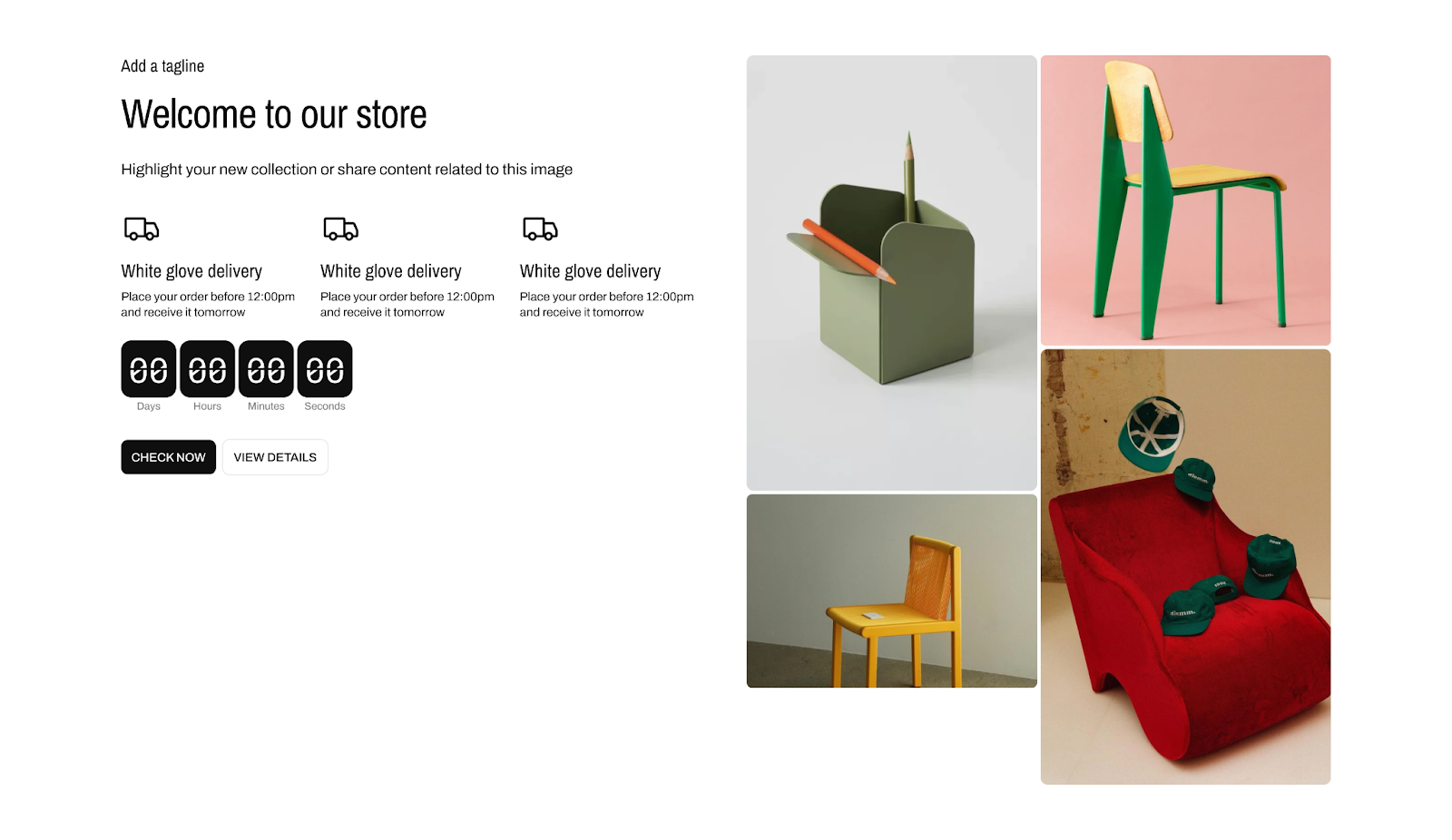
The Normcore Images with Text section is a versatile tool for creating engaging content layouts that combine visual elements with text. This section enables you to showcase your products and brand through a dynamic combination of images, text content, and interactive elements.
This section is particularly useful for:
- Product features and benefits showcases
- Brand storytelling and value propositions
- Service explanations with visual context
- Team member introductions
- Process breakdowns
- Multi-image promotional displays
The section stands out for its flexibility in image arrangements and content organization while maintaining full customization control for both desktop and mobile displays.
How to Access Images with Text Section
From any page in your Normcore Admin Dashboard:
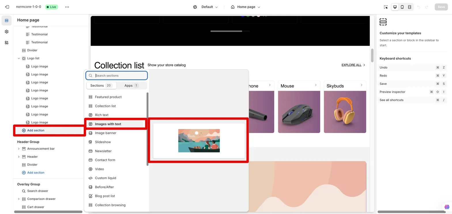
- Click the “Add section” button
- Search for “Images with text” in the Sections category
- Select it to add the section to your page
After adding the Images with Text section, customize its appearance and functionality using the available settings.
How to Configure Images with Text Section
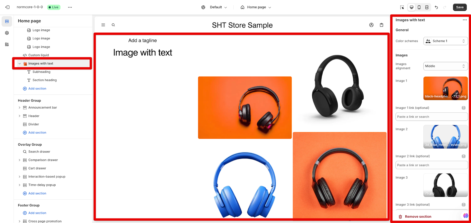
By choosing Images with Text section on the left menu, you can configure the section’s color, the images and the layout:
General Settings
You can select from predefined color schemes for the section
Images Display
- Choose Images alignment from four options:
-
- Top
- Middle
- Bottom
- On scroll
- Add optional image links for each image (up to 4 images). The section offers flexible image display options:
-
- Upload up to four images
- Add optional links for each image
- Choose “Explore free images” option for each image slot
- Arrange images automatically based on quantity:
-
-
- Single image shows in full size
- Two images are displayed side by side
- Three images are arranged with two in one column and one in another
- Four images are arranged in two columns of two images each
-
Desktop Layout
Configure the desktop view with these options:
- Content ordering: Text first or Image first
- Images width ratio: 1/2 of screen or 2/3 of screen
- Content alignment: Left, Center or Right
Mobile Layout
Customize the mobile experience with Content ordering and Content alignment options as desktop layout. We cannot choose the image width ratio on mobile.
How to Configure Images with Text Blocks
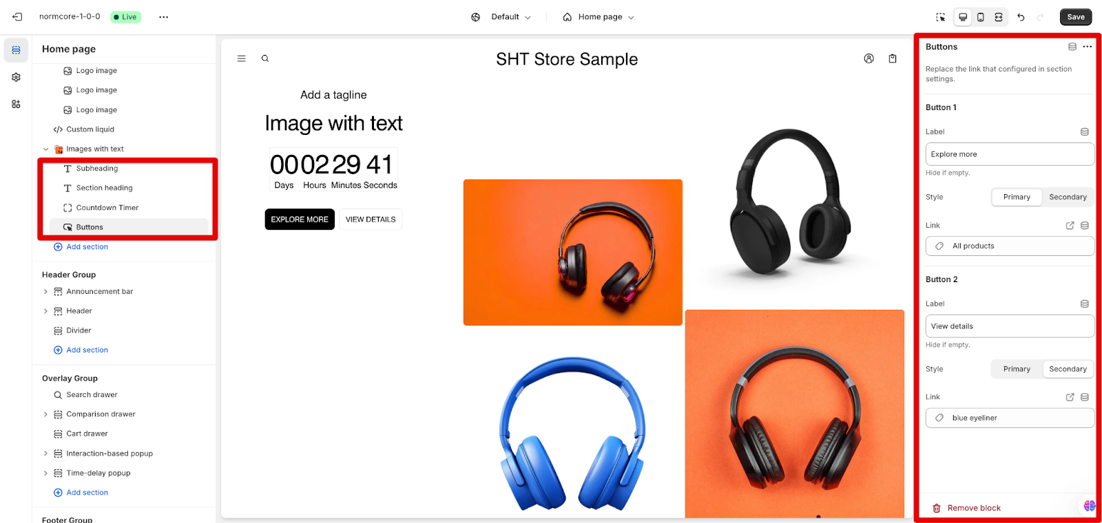
Each Images with Text section includes an image(s) as the default item, but you can add more blocks by clicking the “Add block” button:
- Section heading
- Subheading
- Description
- Countdown Timer
- Buttons
- Our feature block
Select/ Add each block you want to customize. We will learn how to set up these components below:
Section Heading
You can add your main heading text, and choose the heading size option. When you turn on <h1> tags in headings, it helps search engines identify the most important topic of a webpage, improving its ranking in search results.
Subheading
You can add a tagline to support your main heading.
Description
Description allows you more content length than subheading. You can use the rich text editor to highlight your new collection or share content related to the image. Format options include bold, italic, links, and bullet points.
Countdown Timer
The Countdown Timer element allows users to create a sense of urgency by displaying a countdown to a specified end date and time. In this block, you can:
- Hide countdown when finished: Control timer visibility after completion
- Set the end date and time: The default is midnight if it is not specified. The end time is an optional setting.
- End text: Customize message displayed when countdown ends
- Custom background color: Set timer background
- Custom number color: Adjust timer number display
Buttons
You can configure the buttons by adding labels and links, and choosing their styles. If you delete the label text, the button will be removed.
Text Block with Icon
It allows you to create a visually appealing block with customizable text and icon. You can:
- Add a heading, a descriptive text using a rich text editor for enhanced formatting
- Select an icon from a theme library, upload images, or add custom SVG icons, with the ability to set a specific icon color (defaulting to transparent)
- For layout options, you can adjust the desktop and mobile block widths. By using a suitable block width, you can put up to 3 Text blocks with icon per row
Common Cases and FAQs
1. How can I improve SEO with the Images with Text section?
When configuring your section heading, you can enable the <h1> tag option. When you turn on <h1> tags in headings, it helps search engines identify the most important topic of a webpage, improving its ranking in search results.
2. What’s the best way to use the countdown timer feature?
The countdown timer is effective when you:
- Set clear end dates in YYYY-MM-DD format
- Configure an end-time message
- Consider hiding the timer when it ends
3. How do I optimize image layouts for different screen sizes?
The section automatically adjusts image layouts based on the number of images:
- Single image displays full-width
- Two images show side-by-side
- Three and four images are arranged in balanced columns
- Use the sticky scroll feature for engaging desktop experiences
4. How can I create effective call-to-action buttons?
To create impactful call-to-action buttons, start by using clear, action-oriented labels that convey exactly what you want users to do. Choose appropriate button styles, distinguishing between Primary buttons for key actions and Secondary buttons for supplementary options. Ensure that the links attached to the buttons are relevant to the surrounding content, guiding users smoothly through their journey. Additionally, consider using both types of buttons to cater to different user actions, such as “Learn More” for information and “Shop Now” for purchasing, enhancing engagement and conversion rates.


