Multiple Product Tabs
About Shine Theme Multiple product tabs
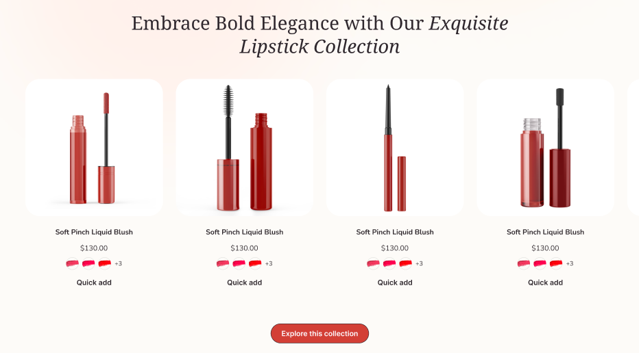
The Shine Theme Multiple product tabs section featured multiple collections with a tab bar to encourage customers to explore and then buy more products.
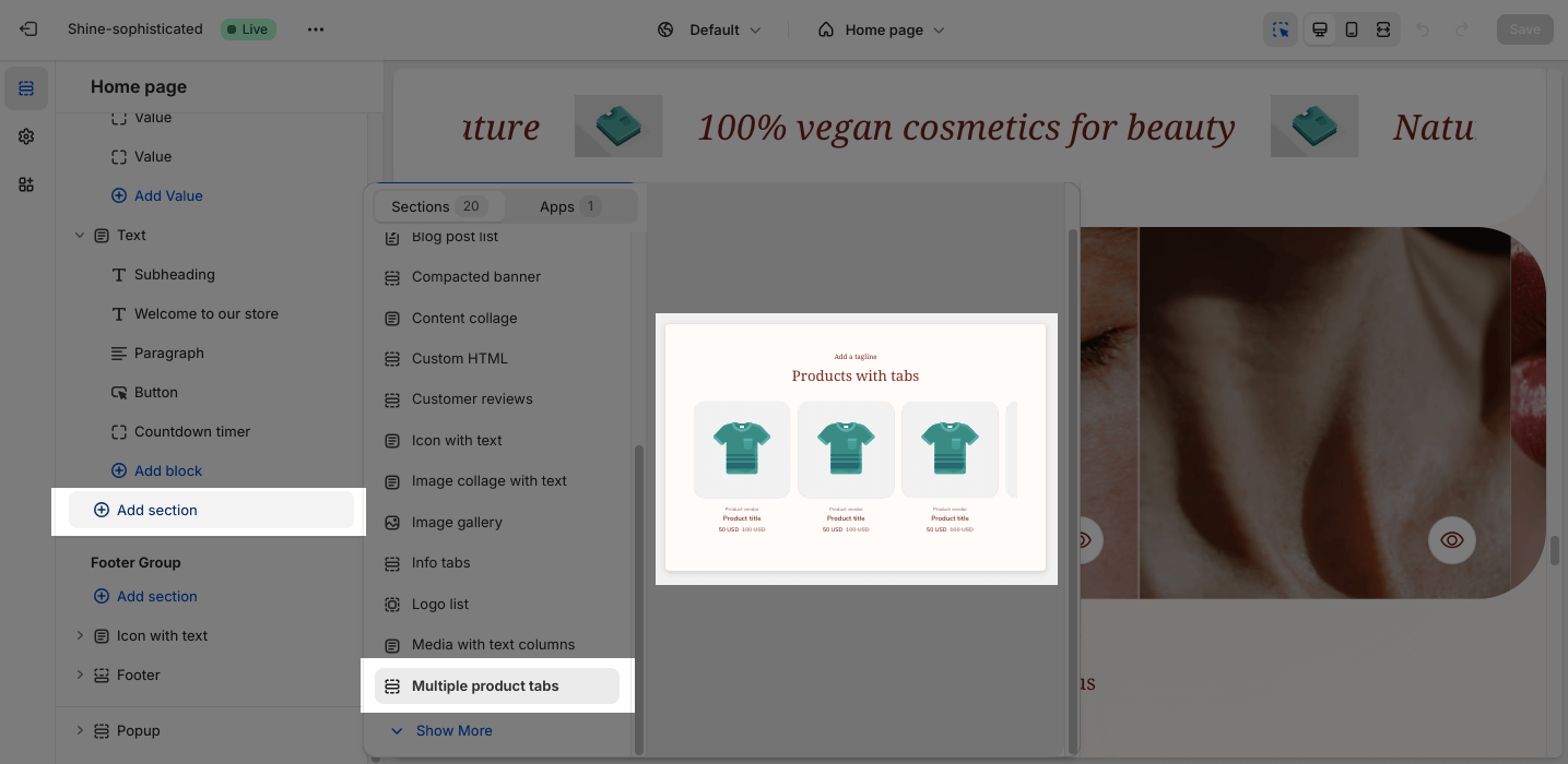
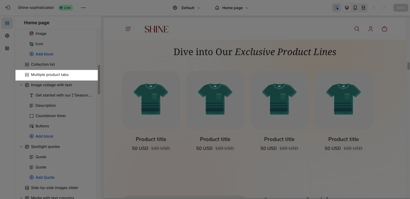
Access Shine Theme Multiple product tabs
From any page in the Shine Admin Dashboard, click on the Add section button > Search for Multiple product tabs > Click on it to add the Multiple product tabs section to your page.
Shine Theme Multiple product tabs Configuration
To configure the Multiple product tabs section, click on the section to access the configuration settings.
General
Under the Color Scheme, you can choose a specific scheme for the Multiple product tabs section. To modify or add a new color scheme, go to Theme Settings > Color.
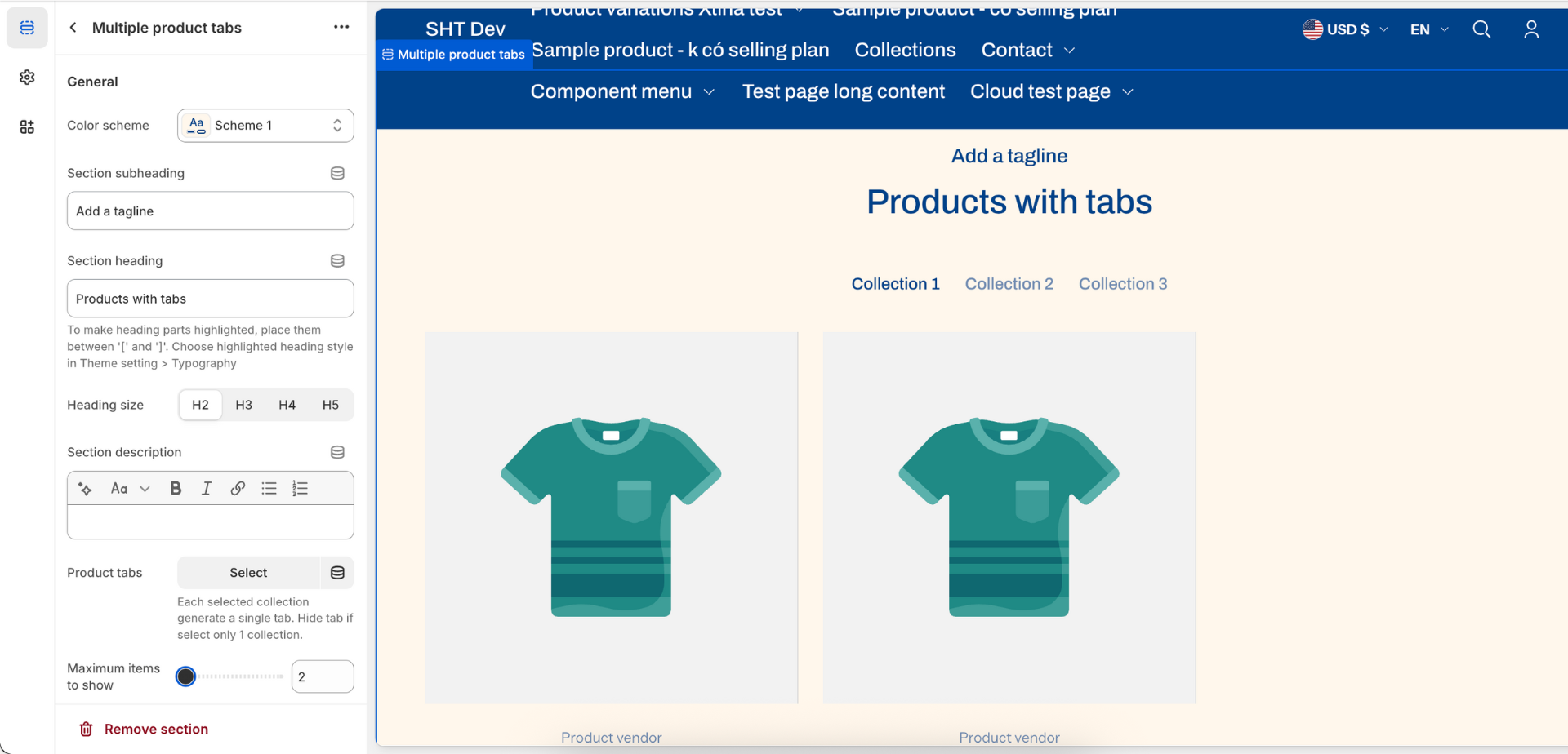
The Shine theme Multiple product tabs section allows you to apply content for the Section subheading, Section heading, and Section description. If you want to hide the message, leave the placeholder empty.
To adjust the Heading size, there are four options:
- H2
- H3
- H4
- H5
To display product collection, from Product tabs > click Select > Choose existing collection or Create a new one > Hit Select.
You can also change or remove the assigned collection by clicking on Change > Change collection button or Remove collection button.
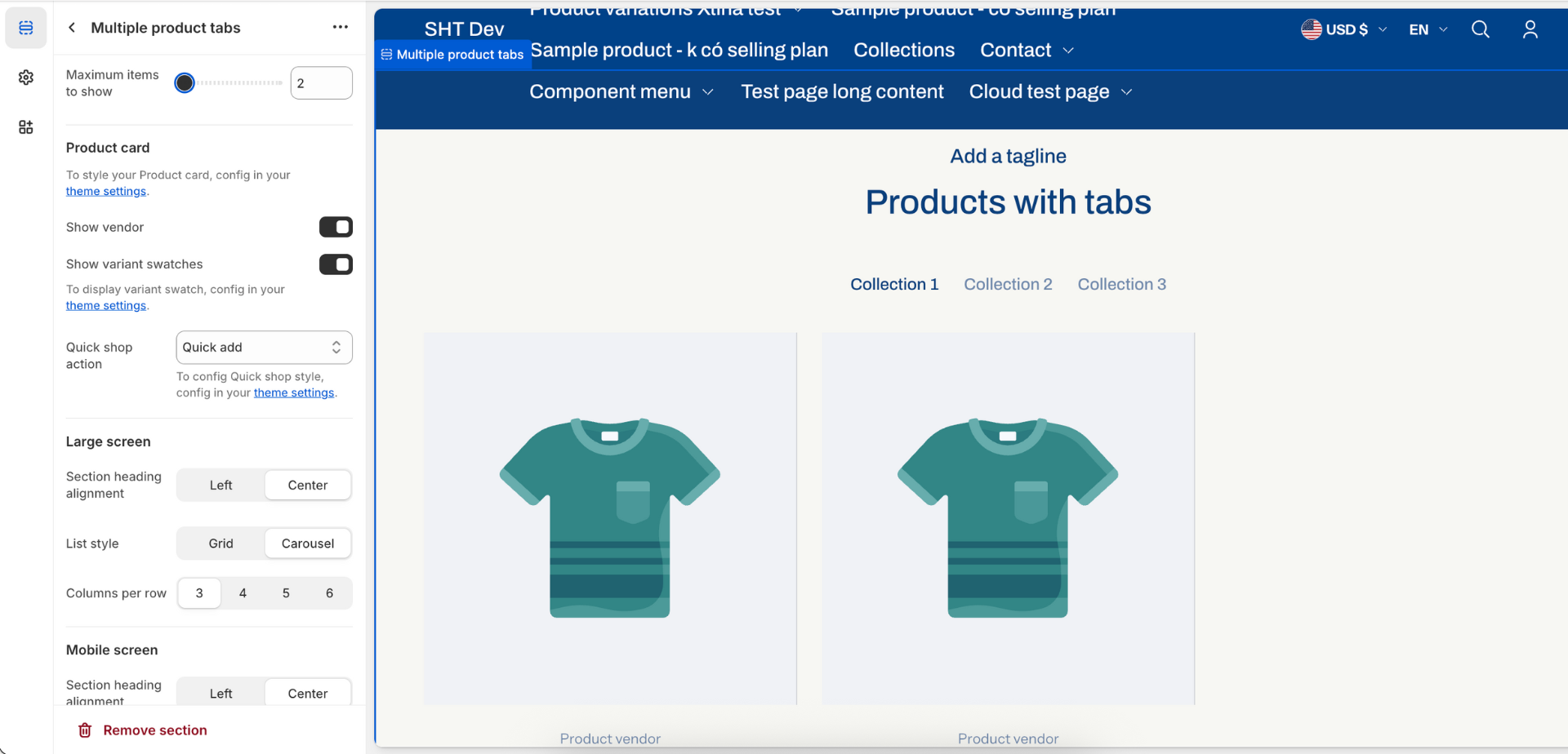
In addition, you can change the Maximum items to show between 2 and 12 by adjusting the slider. The product items option is set as 4 by default.
Product Card
Before customizing the Product card option, you need to configure all the settings in the theme settings first.
You can choose to:
- Show vendor
- Show variant swatches
To change the Quick shop action, switch between three styles which are Not use, Quick view, and Quick add.
Large Screen
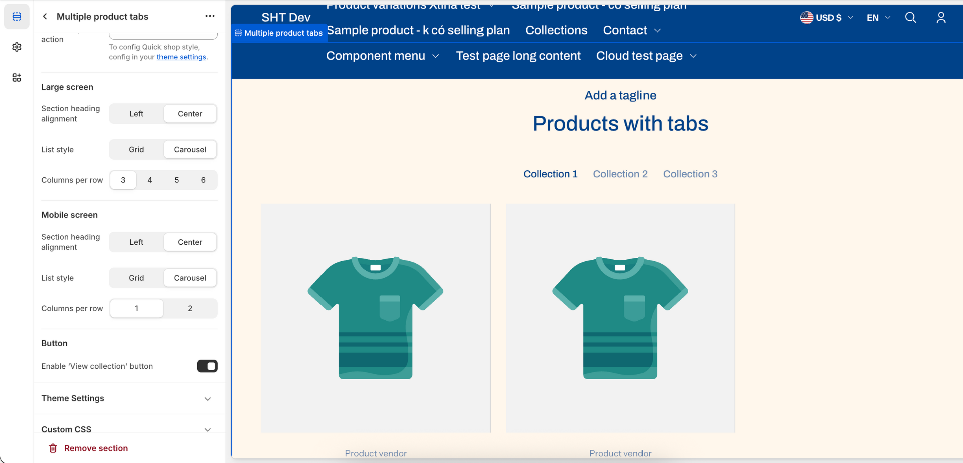
On the Large screen option, you can select the position to display the heading of the section:
- Left
- Center
Next, you can style the product list:
- Grid
- Carousel
You can also change the Columns per row from 3, 4, 5 to 6.
Mobile screen
Similarly, on a mobile screen, you can change the Section heading alignment between the Center and Left.
You can also display the list in Grid or Carousel style. As shown on a smaller screen, you can choose 1 or 2 Columns per row.
Button
On Button option, you can Enable “View collection” button. It will link directly to the collection list page.