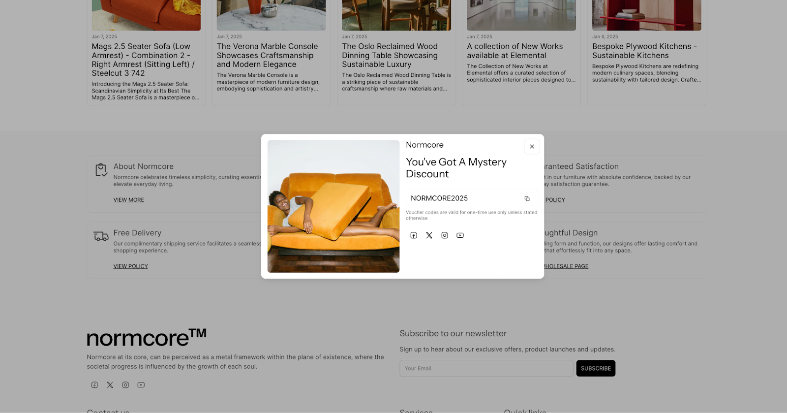
About Interaction-based Popup Section
The Normcore Interaction-based Popup section is a powerful engagement tool that displays strategically-timed content to your store visitors. It enables you to show targeted messages, offers, and promotions triggered by specific user actions, ideal for:
Cart abandonment prevention
Email list building
Special offer promotion
Customer engagement
Newsletter signup campaigns
The section stands out for its ability to display content based on two key user interactions – when products are added to the cart or when visitors reach the footer area. This allows you to engage customers at crucial moments in their shopping journey while maintaining full customization control over timing and display settings.
How to Access Interaction-based Popup Section
From any page in your Normcore Admin Dashboard, click the "Add section" button in Overlay Group, search for "Interaction-based popup" and select it.
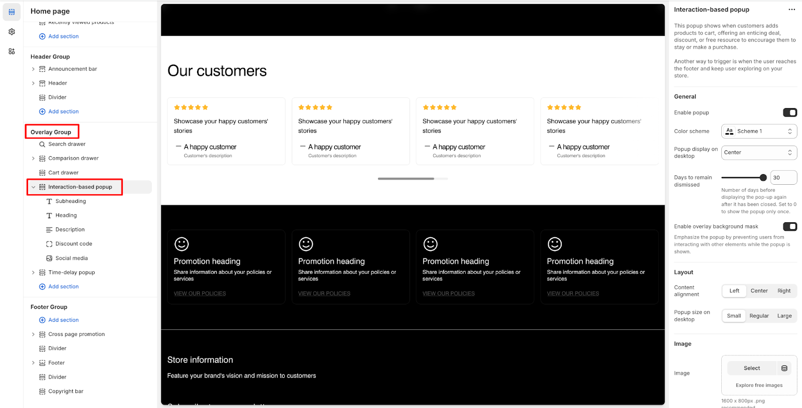
After adding the Interaction-based Popup section, customize its appearance and functionality using the available settings.
To begin customizing, click the "Interaction-based popup" section to access its settings.
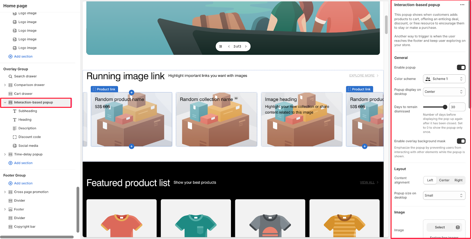
General Settinngs
Within General settings, you can:
Enable/disable popup display
Change color scheme
Set popup display position on desktop
Configure days to remain dismissed
Enable overlay background mask
The "Days to remain dismissed" setting determines the number of days before displaying the popup again after it has been closed. Set to 0 to show the popup only once.
The overlay background mask, when enabled, prevents users from interacting with other elements while the popup is shown.
Layout
Control the visual presentation with these layout options:
Content alignment
Popup size on desktop
Image Settings
Configure image elements with these options:
Main image
Set image position on desktop
Set image position on mobile
Choose image ratio
Background image (optional)
Desktop image
Mobile image
Customize appearance:
Adjust overlay opacity
Set custom mask overlay color
Set custom content overlay color
Background Images
You can enhance your popup with background images:
Add a background image (optional)
Upload separate images for desktop and mobile
Use the "Explore free images" option for both desktop and mobile
Configure overlay opacity percentage
Customize mask overlay color
Set custom content overlay color to ensure text readability
Theme Settings
In Theme Settings, you can configure your social media links such as Facebook, X, Instagram, Youtube,…
How to Configure Interaction-based Popup Section's Blocks
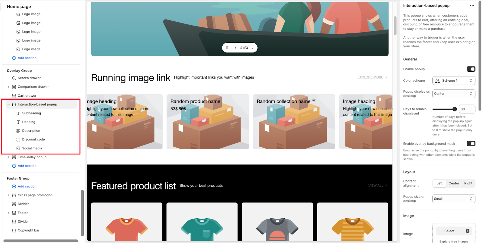
The Interaction-based Popup section has the same basic components as the Time-delay Popup section: Subheading, Heading, Description, Discount code, Newsletter form, Countdown Timer, Button, and Social media. For more details, refer to the guide for setup instructions. Note that you can only show 5 blocks in this pop-up, so select from the available block types.
Note: You can only add up to 5 active blocks from the available components at a time.
Common Cases and FAQs
1. When will the popup be displayed to customers?
The popup has two trigger points:
When customers add products to their cart, offering an enticing deal, discount, or free resource to encourage them to stay or make a purchase.
When customers scroll down to the footer area
Note: Ensure "Enable popup" is turned on in section settings for these triggers to work.
2. How do I manage popup frequency?
You can control how often the popup appears by:
Setting up the number of days before displaying the pop-up again after it has been closed.
Setting to 0 days means popup will only display once
Adjust based on your marketing strategy and customer engagement goals
3. Can I customize the popup's visual appearance?
Yes, the popup offers several customization options:
Add main images with configurable ratios and positions
Include background images for both desktop (1600 x 800px .png) and mobile (750 x 1100px .jpg)
Adjust overlay opacity and colors
Position images on desktop (Left/Right/Top) and mobile (Top/Hidden)